As you navigate digital interfaces, you’ll increasingly find a sparkle icon used to represent ‘AI’, ‘AI features’ or ‘AI-driven processes’. In the following blog post, Berk Alkoç traces the emergence of this visual metaphor and unpacks the implications of using sparkles to represent AI. In his own 5 steps of statistical sorcery, Berk criticises the corporate narratives about AI as a magical transformation embedded in the sparkle icon, which masks the human labour, data, investment, and materials required to generate AI outputs.
Gather ’round, aspiring data wizards, as I teach you the most mystical art known to computational science: making people think your massive statistical pattern-matching system, trained on human-generated data, is magic, only in 5 steps.
Step One: Add Sparkles
It’s 2023. Every tech company on Earth is scrambling to slap “AI” on their product roadmaps before their next investor call. There’s just one problem: how do you show users where the AI is?
Google had been quietly using sparkles since 2016 for its “Explore” feature in Docs. By 2024, they had deployed nearly 100 different sparkle icon variations across their products, with quarterly growth of 37% in sparkle usage. Notion added purple sparkles. Zoom also added sparkles. Spotify’s shuffle button got sparkles. ChatGPT-4 ditched its lightning bolt for sparkles.
The Wall Street Journal documented this phenomenon in August 2024, noting that seven of the top ten software companies by market capitalisation had embraced the sparkle. But nobody actually asked users if this made any sense.
To test the effectiveness of the sparkles icon, Kate Kaplan from Nielsen Norman Group showed 107 participants sparkles icons in isolation and asked what they meant, and not a single participant mentioned “AI” or “artificial intelligence.”
Instead, interpretations included:
- Fav or save (16.82%)
- Visual effects or optimisation (16.82%)
- Special information (11.22%)
- “Just plain unsure” (a disturbingly large percentage)
One user captured the confusion perfectly: “In the absence of a heart, I think the star would allow me to save items. Or maybe it’s a wishlist [because] you wish on a star.” One cannot learn a system when the same symbol means radically different things, and sparkles do exactly that. They have such fluidity that, depending on the app and context, people can attribute them with different potential meanings. This is different from an icon for save or search. The floppy disk means “save” because it represents physical save media. The magnifying glass means “search” because that’s how you make small things visible. The problem is not that users misunderstand the sparkle icon, but that the icon makes misunderstanding structurally unavoidable.
Step Two: Train Users Through Sheer Repetition
Google’s own 2024 research with 2,000 participants across eight countries found that users did recognise sparkles signified AI; however, even in this research, Google’s researchers noted: “they didn’t have a consistent definition of what AI meant” and couldn’t distinguish machine learning from generative AI from image generation. The conclusion Google’s own team reached was clear:
“Ubiquity leads to a lack of specificity and can diminish an icon’s effectiveness.”

Nearly 100 Google system icons include an AI Sparkle (Source: Google Design Blog)
This means that the sparkles work because Google trained users to recognise them through sheer repetition, not because the metaphor is sound.
The industry defense is simple: Doesn’t “AI feel like magic?” Because basically, “You type words and it writes an essay! That’s wizardry!”
And here’s where we need to question what magic is.
Step Three: Invoke the Magic Metaphor
Kate Crawford and Alex Campolo coined the term “enchanted determinism” in their 2020 paper. They argued that AI systems are framed as simultaneously magical (unknowable, mysterious, operating through forces we don’t understand) and deterministic (accurate, reliable, producing correct results).
This combination is insidious: it shields creators from accountability while amplifying AI’s power to classify and control. The mechanism is simple. Magic can’t be questioned. It just is. When results go wrong, no one is responsible. The wizard explains: “The spell was cast correctly; the universe responded in mysterious ways.” Replace “spell” with “model” and “universe” with “training data,” and you’ve got the standard AI liability dodge, word-for-word.
M.C. Elish and danah boyd put it more bluntly in their 2018 paper: framing AI as magic denies “an accounting of what went into making something work, or that it required work at all.” Magic is “costless in terms of the kind of drudgery, hazards, and investments that actual technical activity inevitably requires.”
But AI isn’t costless—and neither, historically, is magic. Actual magic is expensive. Research on magic practices notes that practitioners typically know it doesn’t work every time and requires significant effort, cost, and risk. Machine learning follows the same pattern. It’s not an effortless transformation; it’s finding optimal data variables, communicating with systems to access data, cleaning datasets of faulty values, evaluating ML library outputs, designing comprehensible interfaces, and iterating when you get AI slop. You cast the spell, check if it worked, and cast it again with adjustments.

Both magic rituals and ML systems suffer from domain disjunction, where you perform actions in one symbolic system hoping to affect outcomes in another. In magic, you might perform a ritual with certain tools (symbolic domain), hoping to heal someone, or influence the weather (material domain). In ML, you run statistical operations on numerical representations (symbolic domain), hoping to optimise ship propulsion (material domain). The gap between domains necessitates interpretation.
| ✨ Magic Ritual Domain | 🤖 Machine Learning Domain | |
| Symbolic Space | The Ritual: Rain dance | The Math: Statistical operations on massive numerical datasets. |
| Material Outcome | The Goal: Influencing the weather. | The Goal: Optimising ship propulsion or detecting bank fraud. |
| Reason for Failure | The Excuse: Incorrect ritual performance or poor cosmic conditions. | The Excuse: Poor data quality, bad architecture, or “hallucinations.” |
As anthropological research notes:
“something is performed to influence the relations in a different space.”
Both systems require experts to translate between domains, ritual specialists for magic, and data scientists for ML. And both systems require explaining why things fail. Magic practitioners blame incorrect ritual performance, cosmic conditions, or counter-magic. ML practitioners blame data quality, model architecture, or adversarial inputs. One could argue that “magic” is simply a metaphor for the complexity that no user can realistically understand large-scale machine learning systems. But complexity does not require mystification.
Step Four: Repeat, Repeat, Repeat
So how and why were sparkles forced into UX (User Experience) and UI (User Interface) Design processes despite the fact they didn’t work?
This Wall Street Journal article framed it as:
“Design and marketing executives at software companies said they started using sparkles because everyone else was doing it.”
Dan Saffer, who designed Twitter’s sparkle toggle “as a joke,” later observed that subsequent adoption reflects “FOMO rather than intentional design,” companies copied each other to maintain consistency with user expectations (Jakob’s Law). However, Jakob’s Law says users expect systems to work like ones they already know. It doesn’t say you should create bad patterns just because others did. The sparkle standardisation happened too quickly for users to learn the pattern naturally. Instead of allowing intuitive understanding to emerge, companies used brute force repetition to teach users a metaphor that actively undermines accurate mental models.
When your bank’s fraud detection algorithm flags your transaction, do you want to think of it as “magic” or as a statistical model with false positive rates that you can dispute? When an AI hiring system rejects your resume, should that feel like inscrutable sorcery or like a technical system whose biased criteria you can understand and challenge? The sparkle icon succeeded not because it communicates well, and we have overwhelming evidence it doesn’t, but because it aligned with corporate narratives about AI as magical transformation. But that’s exactly backwards. Icons that don’t need explaining work because they map to shared understanding. Sparkles mean “magic” because that’s their cultural association, and magic is precisely the wrong metaphor for the technology we want people to understand, question, and hold accountable. What emerged was not a shared language shaped by users, but a visual convention enforced by corporate anxiety.
Step Five: Wait for Everyone to Forget
So here we are with sparkles everywhere, an icon that succeeded despite failing every measure of good design. Interface design is political work. Sparkles prove it. But we’re not stuck.
There are two scenarios ahead. In the first one, companies aggressively integrate AI into every product. In the second one, a more balanced, accountable approach emerges. In both, sparkles will fade, but for very different reasons.
In the first scenario, AI integration becomes so aggressive and comprehensive that the distinction between “AI features” and core functionality disappears entirely. Visual editing software where every tool uses ML, email clients where every function involves algorithmic processing, productivity apps where AI is woven into every interaction. Here, sparkles become meaningless. Not because the mystification problem is solved, but because there’s nothing left to distinguish. If everything is AI, then nothing gets the sparkle. We don’t mark every website with an “Internet Inside!” badge. Ubiquity eliminates the need for announcement, but not the need for accountability.
In the second scenario, responsible tech practices and comprehensive AI literacy create pressure for differentiation rather than blanket mystification. Here, sparkles fade because they’re replaced by something better: context-specific disclosure that distinguishes low-stakes autocomplete from high-stakes algorithmic decision-making. The non-deterministic nature of ML (the errors, the biases, the “hallucinations”) doesn’t disappear through normalisation, so the ethical case for explicit signalling remains. Sparkles become inadequate precisely because AI use cases vary so wildly in consequence and reliability.
We’re already seeing this second path emerge in certain cases.
For instance, at Molo, a German civic engagement app where I lead the UX/UI design processes, we faced this exact choice when implementing AI-powered search. I advocated for using a search icon with ‘KI’ (Künstliche Intelligenz) rather than copying the sparkle to prioritise clear, specific, and understandable visual communication. It’s these small decisions that add up to either mystification or transparency. The BBC’s recent approach offers another example on a more systematic level. Instead of adopting the industry-standard sparkle, they developed a neutral hexagon derived from their brand blocks, paired with context-specific disclosure language following a “How we used AI” formula. Their research confirmed what Nielsen Norman found: users want specifics, not mystification.
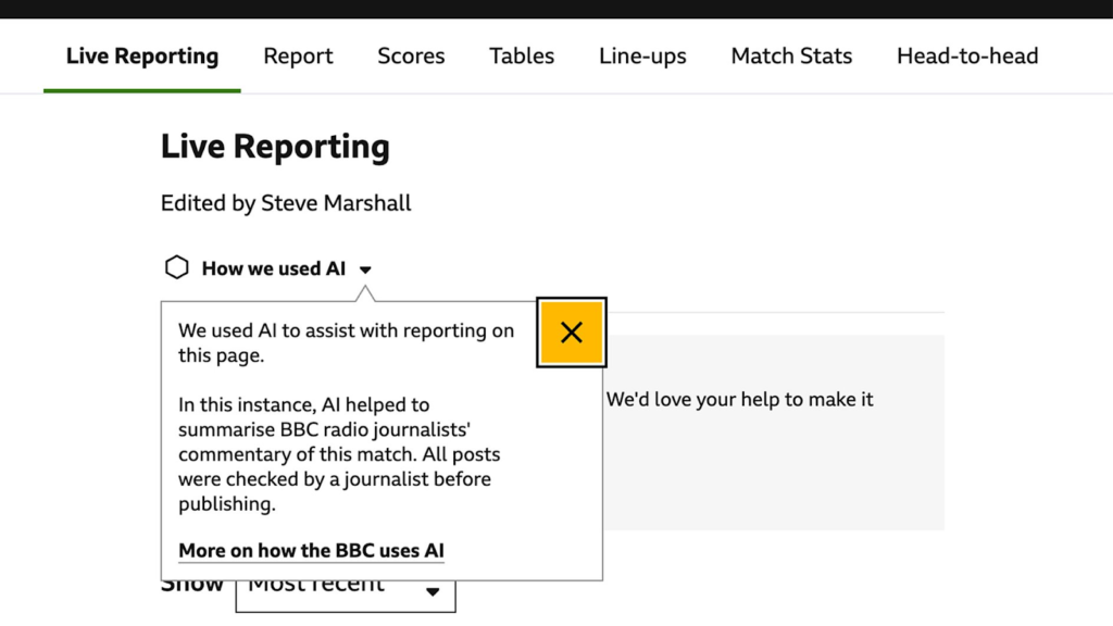
This particular disclosure label is being trialled in BBC Sport live reporting (Source: BBC Media Centre, 2025)
I believe that the sparkles will fade either way, through ubiquitous integration or through intentional replacement. But only one of these paths solves the actual problem. They’ll disappear meaningfully only when the people who build these systems decide that our responsibility isn’t to make technology feel magical, but to make it understandable. That means different choices in product development: disclosure rather than sparkles, specificity rather than mystification.
When you see those sparkles next time, remember: you’re witnessing the tech industry’s commitment to mystification over clarity, vibes over user research, and enchantment over explanation. The question isn’t whether sparkles communicate clearly. It’s whether we’ll accept a digital future where corporate magic tricks replace technical literacy.
About the author

Berk Alkoç (he/him) is a designer–researcher based in Germany exploring the intersections of technology, cities, and everyday life through a critical (and unapologetically queer) lens. At ZeMKI, University of Bremen, he designs for Molo, a civic media platform. At the Institute for Technology Assessment and Systems Analysis (ITAS) at the Karlsruhe Institute of Technology (KIT), he researches nature conservation through a relational values lens and how digital tools shape environmental governance. Outside of work, he’s likely outdoors or immersed in something visual, whether behind a camera, sketching, or experimenting with graphic design.