The glowing blue brain – the visual myth of AI cognition 

Four overlapping, staggered rectangles in different shades of blue are overlayed by a glowing circle. beneath, the title reads 'The glowing blue brain – the visual myth of AI cognition'

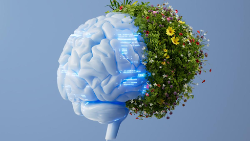
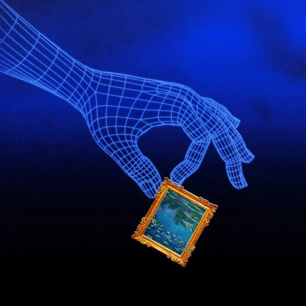
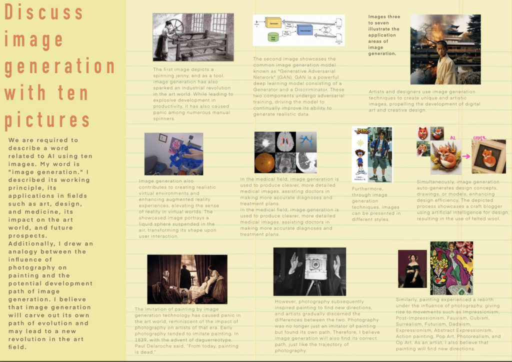
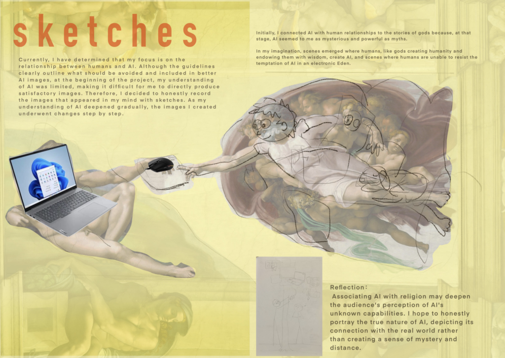
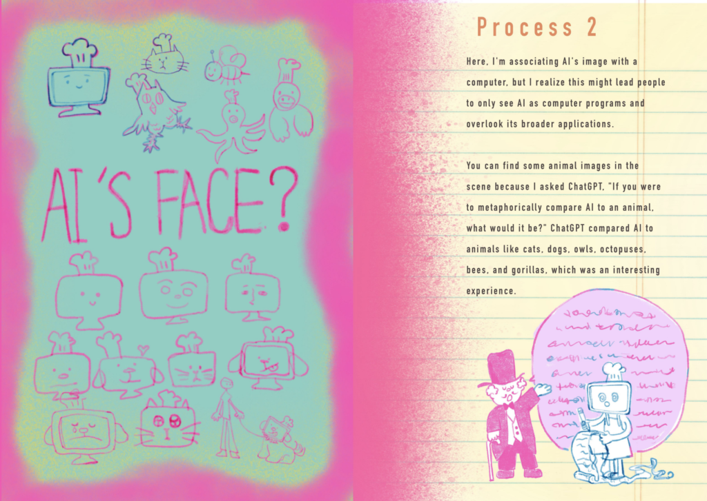
There is a blue hue in the darkness. Upon closer examination, it is a glowing blue brain, threaded with circuits and inscribed with binary code. This is not an unfamiliar sight; instead, for many of us, it is a common visual of the expansive and unstable notion of ‘artificial intelligence’ (‘AI’). Such visual representations of AI systems have become commonplace.

In this blog post, Raghu Krishnan unpacks the prominence of the glowing blue brain imagery as a visual signifier of AI and considers its implications for public understanding. The post focuses on three primary visual tropes: the use of luminosity or glow, the brain form and personhood, and lastly the colour blue itself, which combine to create an elaborate visual myth of AI cognition.

“The blue, the glow and the brain form combine to create a culturally situated myth of machine cognition.” 

Blue, Glow, Brain

Images associated with the blue brain metaphor for AI often include a luminous brain form surrounded by circuits and binary code, placed near a dark, futuristic background. Instead of showing AI as infrastructure, code, machinery, data or labour, it is depicted as a glowing centre of thought. In this vein, meaning comes from a combination of different components, from the brain to the use of the colour blue, and even the use of luminosity itself, that combine to provide us with a trope which presents the alignment of computation and cognition.
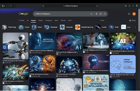
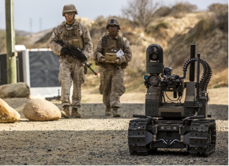
A screenshot of Google imagery shows a series of futuristic images of glowing blue brains, white robots, and holograms.
Figure 1. A quick Google search for ‘visualising AI confirmed the prominence of blue brain imagery. Screenshot by author on 14 July 2026.

Here, semiotic work by Sorensen and Thellefsen (2024) is useful; they claim that the blue brain metaphor in all its forms has become a foundational part of the contemporary imagery around AI. In their view, the “blue brain metaphor” for AI is clearly related to the primarily verbal metaphor “the computer is a brain”, while also moving beyond this and attaching itself to a diversity of other meanings related to potential cognition. In terms of signs and symbols, they view the metaphor as part of Umberto Eco’s notion of a socio-cultural encyclopaedia, where Eco proposed that a larger shared cultural knowledge is utilised to interpret such signs. So, for instance, the blue brain can be assigned ideas of trust due to an existing shared cultural understanding of the brain; this ‘encyclopaedia’, in his view, is open-ended, where people attach endless contextual meanings to signs embedded in a shared societal network. Simply put, these visual signs are connected to expanding and interconnected cultural knowledge, which impacts interpretation. It is this contextual nature of interpretation of images and signs that is underscored throughout the article. 

Make me Glow

Glow or illumination may seem almost natural in imagery surrounding future technology, as well as in attempts to showcase the inner workings of the mind. More recently, there have been attempts to construct an ‘anthropology of luminosity’ showing how the use and experience of light are culturally embedded. Bille and Sørensen (2007), in their work, An Anthropology of Luminosity, argue that philosophical treatises and critiques have often neglected the social role of light, the role of illuminating people, places, experiences, biases, and myth. While light is a concrete physical phenomenon, it also has its ‘lux’, or the sensual qualities formed through sight and vision. The Western primacy of vision perpetuates the importance of light and vision in experiencing the world and, often, in forming concepts (Levin, 1993). It is this emphasis on light which finds itself represented in the ‘glow’ of the blue brains used to represent AI. 

Here, this importance is sketched onto social settings, as ‘lightscapes’ operating through the interaction of light and its environment. An example of the culturally relative experience of light comes from the work of Japanese author Tanizaki, who argues that the role of shadows, or the appreciation of shadows, was crucial in Japanese material culture and way of life. Japanese aesthetics, in this view, placed a cultural emphasis on indirect light, in which material culture was meant to interact with shadows, from lacquer and ceramics to paper. Appreciation for such items, in Tanizaki’s account, relied heavily upon their emergence from the darkness, an appreciation that eventually gave way to ‘intense illumination from the west’. Therefore, the glowing brains borrow the social role of light, which is situated in the West, neglecting other cultural notions of light, as seen in Tanizakis account. 

While light is physical and sensory, it may also extend to the sacred. Morphy (1989), Gage (1995) and Pinney (2001) all argue that colour and light create luminosity, which may have sacred and spiritual dimensions, and that brilliant objects are conceived as the material manifestation of light. Here, brilliant glowing orbs, lamps, and, in our case, blue brains become objects emitting light. In these contexts, light is often imagined as a signifier of ancestral power or, in our case, future power, where the glowing blue brains signal technological potency and imagined authority in the future. Luminosity gives the AI an aura, where computation may appear as sacred.

Apart from affective qualities, the presence or absence of light has also functioned as an important metaphor in Western philosophy. From the classical age, light has often been interpreted as an important metaphor through which people experience the world; for instance, in Plato’s allegory of the Cave, prisoners mistake shadows for reality, while the movement towards light represents a transition from illusion to knowledge (Plato, 2007). 

Similarly, from the Enlightenment, light was seen as a medium through which knowledge was revealed; light hence finds itself deeply entwined with the notion of life and existence, the dead, or the soulless find themselves depicted as dark or lacking illumination. A more recent example is the use of the ‘lightbulb moment’ in comicbooks, where a lightbulb over a character’s head would signal a sudden moment of inspiration. Therefore the glowing brains borrow this  association of light with knowledge and inspiration  situated in the west, to construct an elaborate myth of cognition.

In essence, we have three different notions of light: the material lux, or glow, the social agency of light, and lastly the metaphorical light; importantly, all of these are culturally embedded. In the context of our image, materially the brain glows, socially it signals future authority, and metaphorically it points to ideas of consciousness and life. The glow of the brain  condenses these notions into a single image. The anthropology of light, in a way, provides a framework to interpret the powerful visual of the glowing blue brain, where material, social and psychological notions of light are projected onto the (blue) brain form.
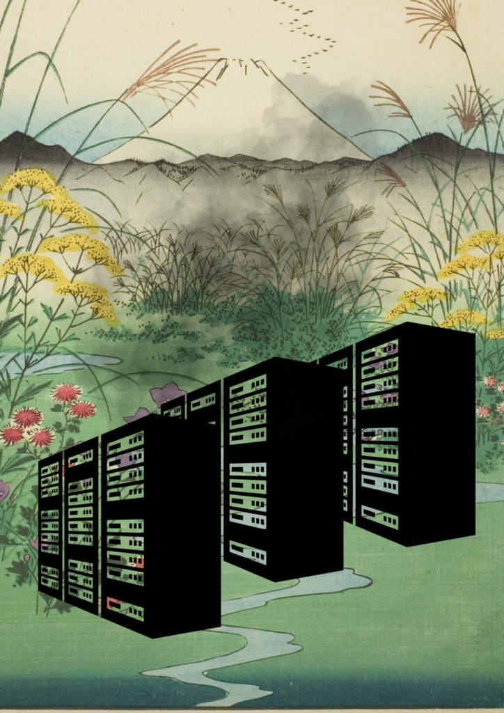
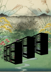
This image is a collage with a colourful Japanese vintage landscape showing a mountain, hills, flowers and other plants and a small stream. There are 3 large black data servers placed in the bottom half of the image, with a cloud of black smoke emitting from them, partly obscuring the scenery.
Deborah Lupton / Better Images of AI / CC BY 4.0

Deborah Lupton’s image, ‘Servers in a Landscape ’, directly challenges the ‘glowing’ visuals of AI by representing AI as a dark cloud of smoke. The image demonstrates the impacts of data centres on the natural world through pollution emitted from the operation of the centres.

Brain dead and Brain alive.

The brain form itself has traditionally had a persuasive influence on public perception. Experimental work by McCabe and Castel (2008) argued that brain images played a role in public acceptance of neuroscience research. They argued that such images or scans of the brain provide a physical basis for abstract cognitive processes, appealing to people’s affinity for reductionist explanations of cognitive phenomena. Later work has complicated the strength of the “seductive brain image” effect (Michael et al,2013); the claim is not that brain images automatically convince people, but that they belong to a wider visual culture in which cognition seems more credible when it is made visible in the brain. Essentially, they aid communication by making the internal cognitive process seem visible and scientific. 

Dumit, in his account of brain scans and personhood, presents this notion in pop culture, showing that the AI brain is a borrowed form of scientific visual authority, where the brain, in a variety of pop culture , and has become synonymous with a modern Euromerican notion of personhood. He gives the example of brain scans being framed with simple labels like “normal,” “depressed,” or “healthy,” reducing visible types of people into individual brains. Moreover, he shows us how this imagery travels extensively from medical literature to pop culture, forming an important mediascape shaping narratives. Dumit’s (2004) ethnographic account reveals that brain scans and imagery do not travel across mediascapes alone; they carry with them culturally situated ideas of personhood. As they move through realms of journalism, medicine, film, and courts, they are important cultural lenses through which people interpret illness and identity. Therefore, the glowing blue brains take on elements of personhood and identity based on how brain images have been viewed across western mediascapes. 

Racine et al’s 2005  notion of ‘neurorealism’ is also useful here, where brain images can make mental phenomena appear more real by providing them a physical location. These interlinked narratives of personhood and the brain have been crystallised by Vidal and Ortega in their (2017) book ‘The Cerebral Subject’, arguing that increasingly there is a tendency for people to be visualised through their brains. In a sense, our physical health, our mental health, our ability, and even our relations are seen through this image of the brain; in other words, they argue we are increasingly being visualised as our brains, where the brain becomes a symbol of our agency, intelligence, identity and moral responsibility. 

In the context of AI imagery, the glowing blue brain borrows from what we can call ‘neurocultural authority’, appealing to ideas of personhood and intelligence, where the narrative moves beyond computation to potentially misleading tropes of consciousness. The use of the physical brain enables the viewer to visually locate the machine, giving it potential for cognition. While the glow lights the machine up, the brain form provides an important visual architecture for us to visualise this active cerebral process; here the explicit use of the brain form helps transform luminous computation into a potential digital mind. This elaborate multi-modal trope, hence, removes us from the harsh reality of labour and infrastructure, and instead posits an anthropomorphic myth of a computer that is alive.
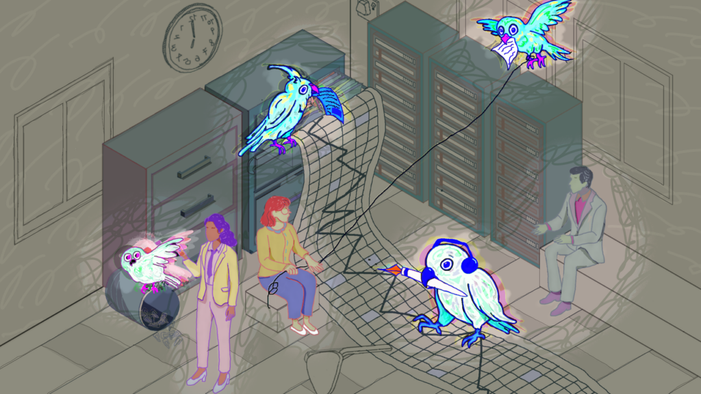
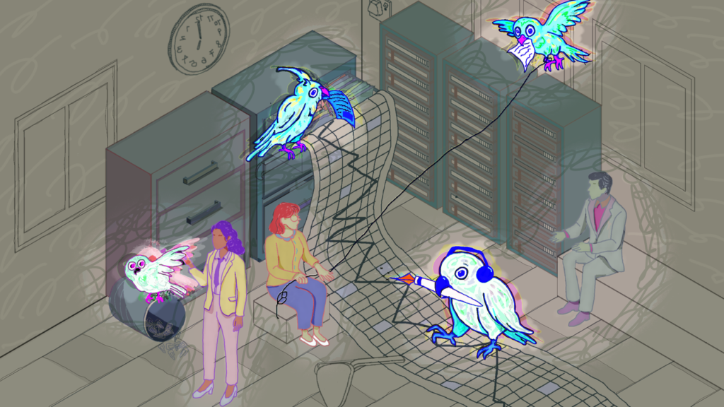
Illustration of a surreal office scene with neon birds interacting with digital elements around three people near servers and file cabinets; one bird writes on a digital mesh, another carries a paper.
IceMing & Digit / Better Images of AI / CC BY 4.0

Ice Ming’s image challenges the representation of AI as a brain through a different visual metaphor: stochastic parrots. The ‘stochastic parrot’ is a metaphor for large language models (like ChatGPT) that generate text by statistically predicting the next word based on large datasets, rather than by understanding the meaning, truth or context of the user’s prompts – perhaps like a cognitive being. 

Don’t Look so blue.

The use of the colour blue may seem a matter of ‘fitting the aesthetic’, given that such imagery is commonplace in science fiction cinema. However, the colour choice is an atmospheric device to make the visuals appear clean. Blue further helps remove AI from its socio-material context of data centres, energy use, supply chains, and labour. Sørensen and Thellefsen (2024) show that the role of colour in the blue brain metaphor is to ground the visuals in legitimacy. Crucially, this is not to claim that the use of blue, or the effect of blue, is universal, with Jonauskaite et al (2020) demonstrating that colour emotion associations are shaped by language, geography and culture, and this use of blue is perhaps limited to contemporary Euroamerican stock image culture, which has become the face of AI. 

This culturally situated use of the blue glow belongs to a wider regime in which AI imaginaries have been dominated by particular sections of society. This is connected to what Cave and Dihal (2020) have called the ‘whiteness of AI’, where the future seems Western and sanitised. The image further extends the erasure of other cultural and material ways of imagining AI; in a way, other ways to develop and conceive of AI  have been crowded out by such deterministic narratives. One can further draw a parallel to anthropologist Alex Taylor’s (2019) work on the aesthetics of data centres, where imagery used to depict data centres has emphasised them as sterile and technical spaces, devoid of fallible human labour. In both cases, visual narrative conveniently  distracts the viewer from human labour, which is at the core of the supply chain.
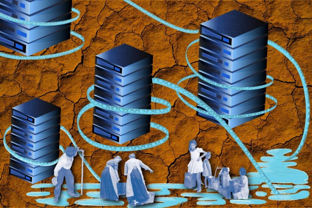
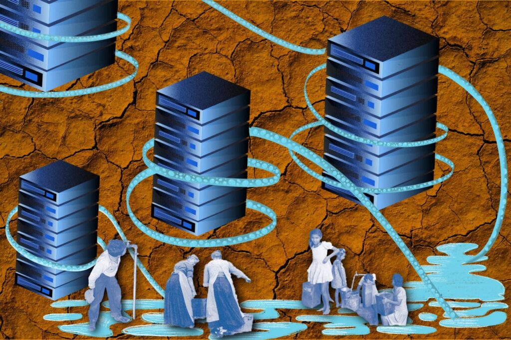
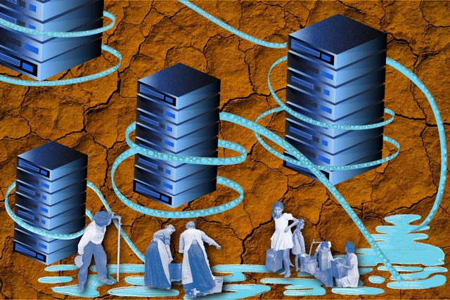
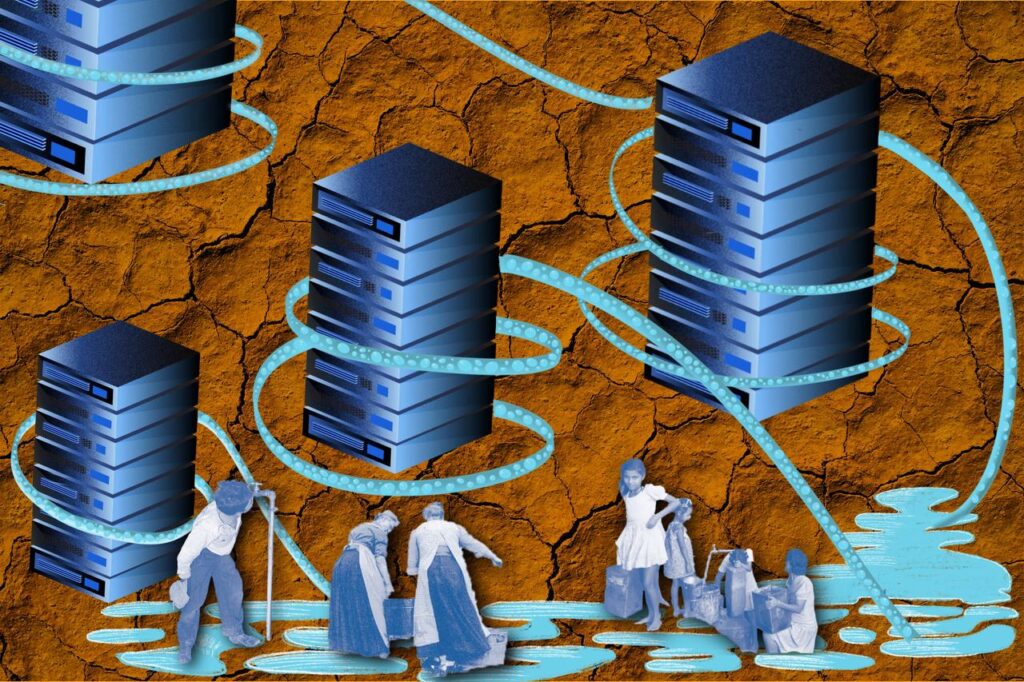
Cooling pipes hug data servers, extracting water from a shared reservoir while people collect water from the same source, set against a background of eroded soil textures.
Gloria Mendoza / Better Images of AI / CC BY 4.0

Gloria’s image, while still including elements of blue, is not used to represent AI, but the resources it relies upon – including water, local communities, and servers. It symbolises how data centre operations contribute to erosion, water scarcity, and drought.

Conclusion

The blue, the glow and the brain form combine to create a culturally situated myth of machine cognition. The myth has many layers: where a brain may provide it with physical authority, glow may suggest activation, and blue may signal a sanitised future in the Global North. This, when combined  with circuits placed upon a dark digital background, removes AI from physical infrastructure and human labour to a luminous future. This is symptomatic of visual media describing AI systems, which is disengaged from the social and environmental effects of such systems, while also perpetrating a grossly misleading narrative about the capabilities of current large language models.

About the author

Raghu Krishnan is an undergraduate reading archaeology and anthropology at the University of Oxford, interested in digital anthropology and human-AI interaction. 
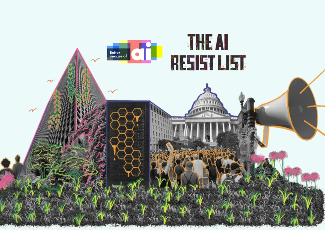
Better Images of AI on the AI Resist List: countering disempowering AI narratives

A hand-illustrated collage graphic represents optimistic people power in a green flourishing landscape. Logos for Better Images of AI and the AI Resist List are above against a light blue background.

Illustration credit: Yemariam Mamo and Pauline Wee for the AI Resist List

Just over a month ago in July, we were part of We and AI’s ‘day of reimagining and reclaiming AI’ as part of the UK launch of the AI Resist List and London Data Week. The AI Resist List is a collection of the different AI resistance movements, categorized by how they pressure different ‘Pillars of Support’ that perpetuate and uphold the ‘empires of AI’. If the concept seems familiar and reminds you of a popular book, you’re not mistaken. The AI Resist List was developed by Karen Hao, author of the popular book ‘Empire of AI’ alongside The Refugee Law Lab at York University, the Distributed AI Research Institute and our friends at We and AI. 

There are nine different pillars on the AI Resist List, spanning from funding to policy to resource extraction. Each pillar is adorned with multiple examples of different grassroots and community initiatives that are (successfully and tirelessly) resisting AI by targeting its very roots. Better Images of AI is featured on the AI Resist List under the ‘narrative’ pillar which documents work being done to ‘call out the AI hype’.

“The empires run on mythmaking and hype about what AI is, what it can do, and what they need to build it. Deflating that hype and countering myth with reality diminishes the empire’s influence.” – The AI Resist List

How does Better Images of AI contribute to AI resistance? 

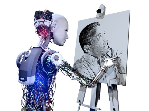
Our image library (but also importantly our blog too) brings together individuals and organisations working to challenge the current stock imagery used to depict and communicate about AI. Typically, AI is visualised in ways that are misleading and harmful: think of news stories illustrated by humanoid robots, regulatory reports with covers featuring blue lines of descending code, and conference posts which centre human brains. These tropes—presenting AI as inevitable, magical, and intelligent—have become self-referential rather than engaging with the assumptions about whether AI needs to exist, in particular in accordance with its current trajectory of development. 

We need to understand what AI is and the implications of its development to determine whether it works for all of us and whether we want to support the companies building it. Our library of over 300 images showcases different ways creators have visualised AI in ways that more accurately illustrate the capabilities, complexities, and impacts of AI systems and the humans behind them — both the workforce and the tiny elite who are making decisions about how to build these technologies. In this way, our image library and blog deflates hype and counters myth with reality. 

We not only see the image library as a way to better inform society, but we also hope that through the medium of visuals and image-making, we offer people a new resistance tool to communicate how they feel about AI and, in doing so, advocate for the futures they want on their own terms and in their own language. Professor Deborah Lupton has used collaging as a method in social research as a way of “eliciting participants’ responses to generative AI and inspiring discussion on how they feel about these new technologies”. Deborah as well as other scholars have also used visuals of AI as part of zine-making and as a medium to communicate and advocate against AI (see here and here). 

Better Images of AI at the UK Launch of the AI Resist List 

At King’s College London on 8th July, Better Images of AI was invited to the UK Launch of the AI Resist List. The purpose of this event was to bring together researchers and scholars who documented the projects featured on the list, those leading them, as well as other practitioners and organisers working on challenging, documenting, resisting or re-imagining the AI industry (you can read a summary of the event here written by Wolfgang Hauptfleisch).

We were in great company with other organisations and individuals working to resisting AI through education, art, law and policy, e.g., FoxGlove, Friends of the Congo, The Data Labelers Association, BLAM UK as well as other individual researchers like Dr Zeerak Talat (University of Edinburgh), Dr Stef Garastro (University of Greenwich) and Dr Yulu Pi (University of Warwick).

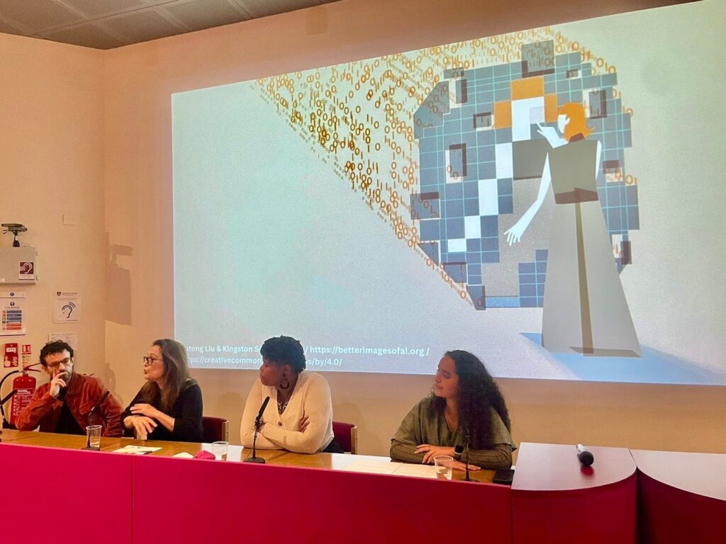
Zoya Yasmine represented the Better Images of AI community and spoke about how the image library serves to counter AI hype and the global community of talented creators who use digital art illustrations, photography, to cutting and sticking using archival materials to offer more representative visuals of AI and its impacts on communities. 

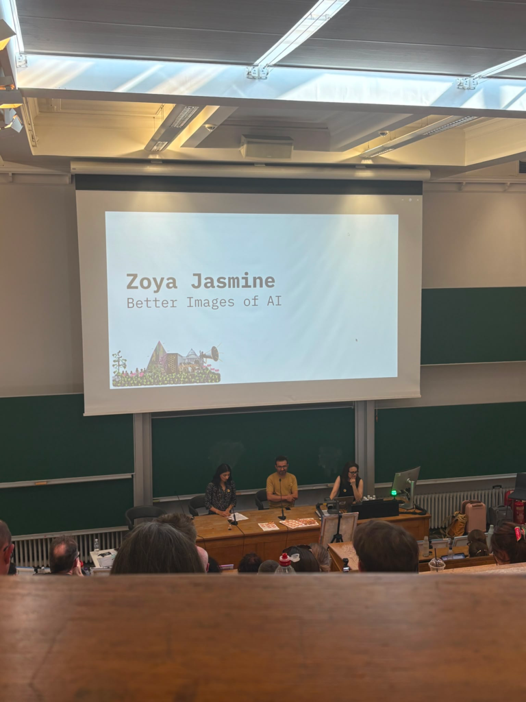
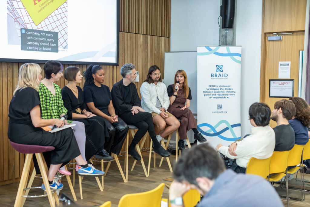
A lecture hall with rows of wooden benches. On the bottom platform is Zoya alongside two other panelists. Above her is a large projection screen with the text, 'Zoya Yasmine, Better Images of AI'.

Zoya at the UK AI Resist List Launch. Image credit: Harriet Humfress

She ended her presentation on a quote from one of our community members, Dominik Vrabič Dežman, who said: 

“[T]he currently pervasive images of AI make us look somewhere, at the cost of somewhere else.” – Dominik Vrabič Dežman

Better Images of AI provides everyone with a greater vocabulary and thus power to decide where you want people to look when you’re communicating about AI next. Every better image of AI works to destabilise the visual stronghold of the robots and brains, offering clearer insights into what AI is and how we as a community feel about it. We are grateful to Marcin Wilkowski for beginning our collection of images which visualise how communities are fighting back against AI — a narrative hidden in conversations about the inevitability of AI. Well….until the AI Resist List was launched. 

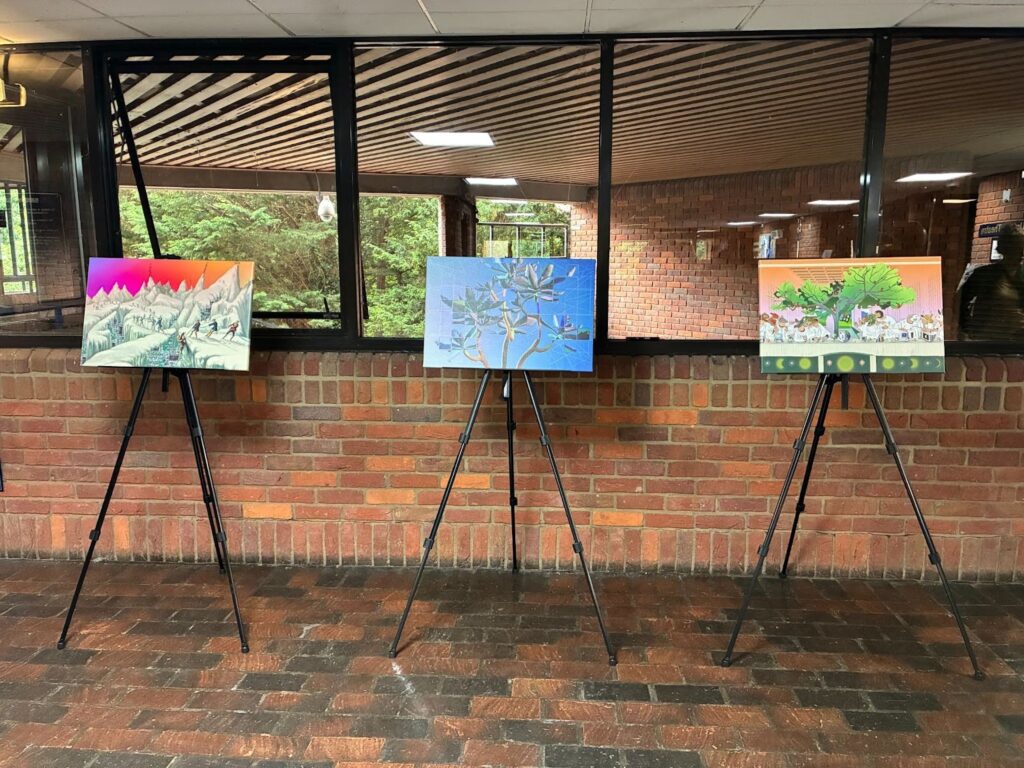
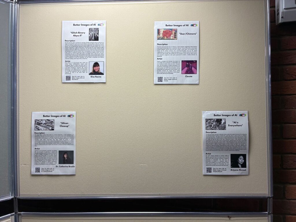
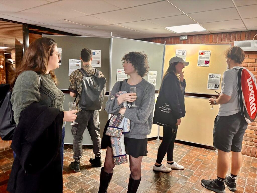
At the UK launch event of the AI Resist List, an exhibition of images from the library was also featured before the speaker presentations. The display of some of the images from our library at the beginning of the event set the tone for the conversations and discussions that followed: environmental extraction, power and monopolies, and human rights. The exhibition was curated by CHIA who we are grateful to for producing the exhibition materials and supporting our library. 

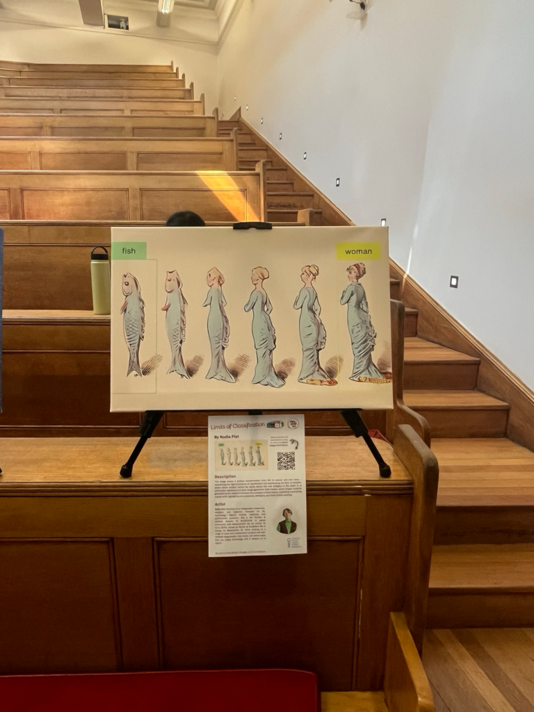
A canvas image of a progression from a fish to a woman, showcasing transitional stages that defy classification boundaries, emphasising fluid states is printed on a canvas and propped up on an easel. In the background are wood rows of benches.
One of the Better Images of AI pictures at the exhibition of the UK AI Resist List

Photograph credit: Lovansh Katiyar. Image: Nadia Piet  & Archival Images of AI + AIxDESIGN / Better Images of AI / CC BY 4.0 

We’re very grateful to everyone involved in the creation of the AI Resist List and all who are working to fight back against the empires of AI. 

Better Images of AI and the other AI resistance pillars 

While Better Images of AI is featured as a project under the ‘narrative’ pillar, our image library and blog contribute to many of the pillars by visualising data, land, energy, labor, water, ideologies and companies that are necessary to build and sustain AI. Below, we explore how materials from the Better Images of AI community visualise and represent the issues related to the other pillars on the AI resist list. 

Data

“Large-scale AI models require large-scale data sets to train on. Without such vast quantities of data, these systems would not be able to exist in their current form.”  – AI Resist List 

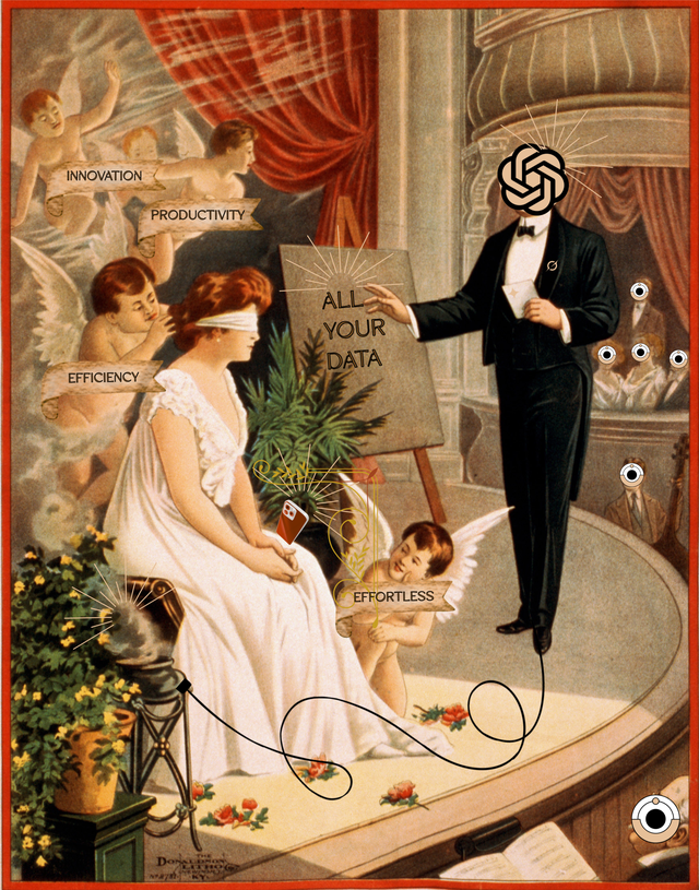
A digital collage styled like an early twentieth century illustration. The title at the top reads “The AI-Deal.” A man in a suit with the OpenAI logo instead of a face stands on a stage and points to a board that says “ALL YOUR DATA.” In front of him, a seated woman wearing a blindfold holds a glowing smartphone. Small winged figures carry banners reading “Innovation”, “Productivity”, "Efficiency" and “Effortless” presenting commercial narratives about AI that mask the real exchange. Floating eye icons around the scene indicate surveillance.
Daniela Zampieri / Better Images of AI / CC BY 4.0 

‘AI-Deal’ by Daniela Zampieri points to how corporations acquire data produced by individuals through narratives of innovation, productivity, and efficiency — hiding the real costs of the deal. Data extraction comes at the cost of constant data capture, surveillance, and environmental damage. The ‘AI-Deal’ enables these corporations to accumulate mass datasets, instead of pursuing fairer and more equitable paths to using training AI models (see Fairly Trained for one example of an organisation advocating for a consensual approach to AI image generation). 

Data centres 

“[T]he empires seek to secure an unparalleled amount of computing power in the form of data centers and supercomputers to train and deploy their systems.” – The AI Resist List 

Cooling pipes hug data servers, extracting water from a shared reservoir while people collect water from the same source, set against a background of eroded soil textures.
This image is a collage with a colourful Japanese vintage landscape showing a mountain, hills, flowers and other plants and a small stream. There are 3 large black data servers placed in the bottom half of the image, with a cloud of black smoke emitting from them, partly obscuring the scenery.

Deborah Lupton / Better Images of AI / CC BY 4.0  (right) & Gloria Mendoza / Better Images of AI / CC BY 4.0 (left)

Deborah Lupton’s image, ‘Severs in a Landscape’ demonstrates the impacts of data centres on the natural world through pollution emitted from the operation of the centres. It was inspired by Deborah’s own research on the environmental impacts of data centres built around the world to service the expansion of GenAI. Gloria Mendoza’s contributions to the image library have all been rooted in a need to better communicate the environmental implications of AI (read more on our blog here). Her image, ‘Data Centres in Vulnerable Ecosystems’, depicts servers extracting water from a local community, symbolizing how data center operations contribute to erosion, water scarcity, and drought.

Resource extraction 

“Data centers are made from rare earth minerals and other resources. Evidence shows that bottlenecks in these resources have already forced the AI industry to slow its pace.” – The AI Resist List 

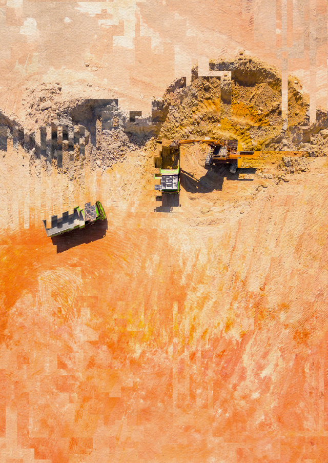
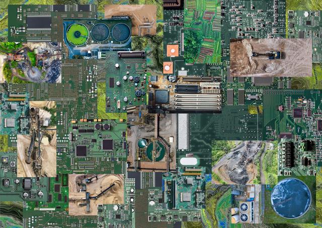
A bird's eye view photo of an orange sand mine with transport lorries, but the image is slightly distorted by digital artefacts.
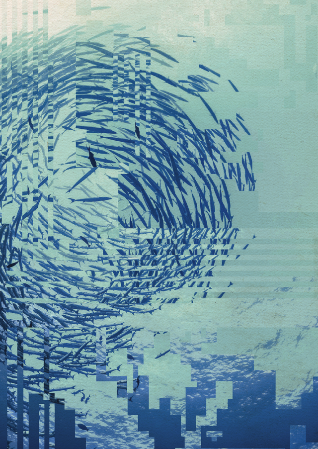
An underwater photo taken looking up to a large circular school of fish while the sun sparkles in the blue water. However, the image is slightly distorted by digital artefacts.
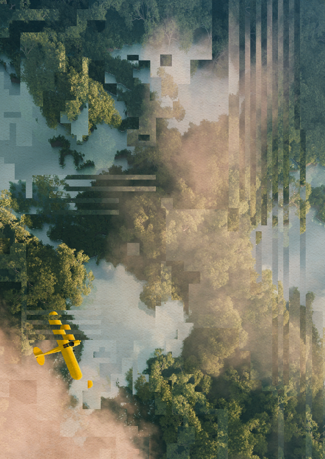
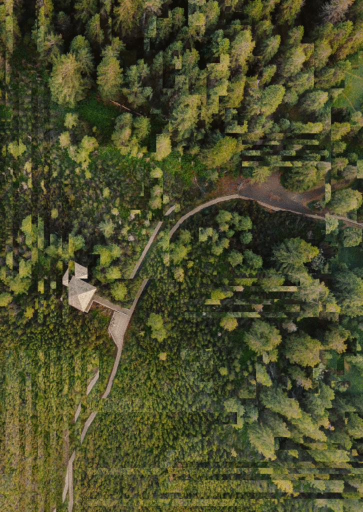
Bird's eye view photo of a small hut and a concrete path through a lush green forest. However, the image is slightly distorted by digital artefacts.

Lone Thomasky & Bits&Bäume / Better Images of AI / CC BY 4.0 

Lone Thomasky and Bits&Baume’s (growing) collection of images expose the realities behind the often perceived “clean”, “slick”, and “efficient” AI supply chains. Their collection shows the breakdown of environments and depletion of natural resources caused by the rapid expansion of data centres and mining of critical resources (like lithium, cobalt, and rare earth elements) which underpin (generative) AI. You can read more about Bits&Bäume’s work and their image collection on our blog here. Another one of our blog posts also explains some of the other contributions in our library that picture the physicality of AI.  

Labour 

“The empires require the labor of workers across their supply chain, whether to mine minerals, construct data centers, annotate data, train models, or adopt their products in other industries.” – The AI Resist List 

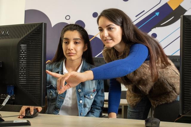
A woman and a man sitting in front of a computer screen, pointing at something on the screen and talking, with a colourful stncil design on the wall behind them.
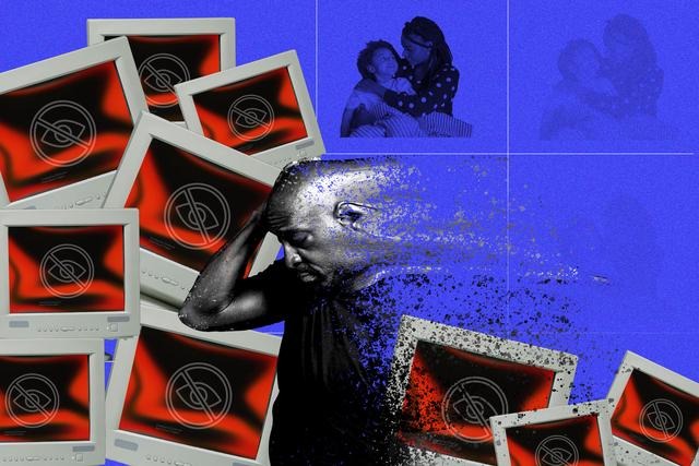
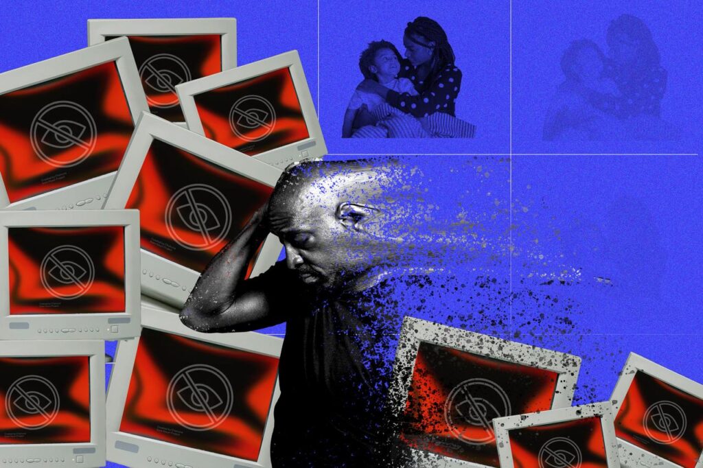
A man showing mental distress from constant exposure to harmful content online. His family, in the background, progressively disappears.

Nacho Kamenov & Humans in the Loop / Better Images of AI / CC BY 4.0 (left) &  Gloria Mendoza / Better Images of AI / CC BY 4.0 (right)

Images from Nacho Kamenov & Humans in the Loop visualise hidden data annotators who prepare training datasets for AI companies. Data annotation work is being performed by hundreds of workers around the world who use the job as a means of livelihoods. You can read more about data workers and the need to insert humans back in the loop in AI visuals on our blog here. One of Gloria Mendoza’s other images focuses on the overwhelming emotional toll that data annotation work can take on individuals. The collage aims to convey the isolation, distress, and psychological fatigue that many data workers endure. 

Adoption 

“The AI industry needs a broad user base to develop a viable business model and public legitimacy. Weak or declining user numbers would force companies to change tack.” – The AI Resist List 

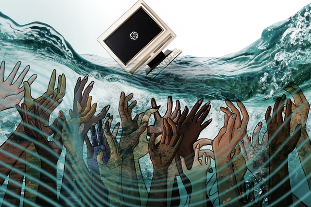
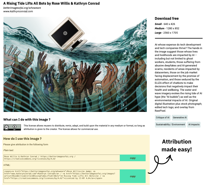
A computer monitor with a parody of a tech company logo floats on the waves while human hands reach up from the depths.
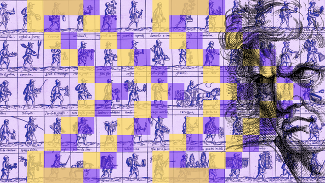
A sketch of a disgruntled man on the right side of the image is overlaid by rectangles containing sketches of individual workers. The man's gaze faces the individuals who are positioned as if they are walking in unison towards the man. The background is purple and there is a forward arrow symbol in darker purple and yellow on top of the image.

Rose Willis & Kathryn Conrad / Better Images of AI / CC BY 4.0 (left) & Marcin Wilkowski / Better Images of AI / CC BY 4.0 (right)

Community Activism by Marcin Wilkowski explores how community activism is challenging “Silicon Valley narrative cocktails” about AI. Rose Willis & Kathryn Conrad’s image, ‘A Rising Tide Lifts All Bots’ is also suggestive of the idea that the success of AI companies relies on our acceptance and use of the technologies. The Better Images of AI Generative AI Policy is also an example of an outright objection to the use of AI based on its current trajectory. 


Policy 

“Governments around the world strengthen the empires with hugely permissive, and often enabling, legal and regulatory environments.” – The AI Resist List 

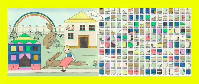
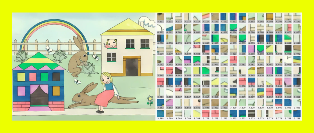
Diptych contrasting a whimsical pastel scene with large brown rabbits, a rainbow, and a girl in a red dress on the left, and a grid of numbered superpixels on the right - emphasizing the difference between emotive seeing and analytical interpretation.

Nadia Piet & Archival Images of AI + AIxDESIGN / Better Images of AI / CC BY 4.0

In this blog post, Lucia Sommerer explores how the language and visualisation of ‘the AI black box’ conceals opportunities for law and regulations to control the human decisions behind an algorithmic system and falsely suggests that algorithms are independent of human prejudices. In another post on our blog, Zoya Yasmine also comments on how Nadia Piet’s image, ‘Ways of Seeing’ relates to copyright law, which — due to the language and visuals used to depict how AI image generators work — are interpreted in ways that favour AI companies. 

Surveillance 

“The empires use various forms of surveillance to control workers, undermine collective action, and suppress dissent.” – The AI Resist List 

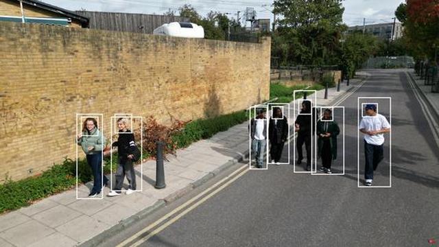
Young adults are walking on a street. Two young women are on the pavement to the left of the image and five young men walk in the road. The road is empty of traffic and the people in the picture are relaxed and appear to be engaged in chatting with each other.  Overlaid on the image are identification boxes. All of the figures have ID boxes around them.
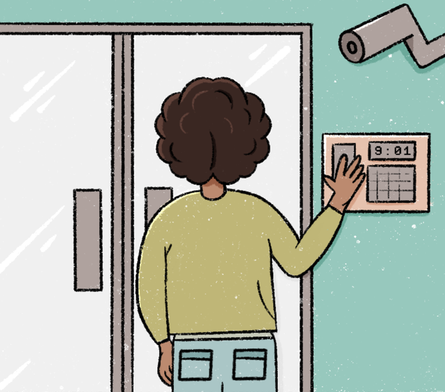
The back of an individual is shown as they are placing their hand on a finger print scanner. In the right corner, there is also a CCTV surveillance camera which is directed at the individual.

Comuzi / Better Images of AI / CC BY 4.0 (left) & Reihaneh Golpayegani & Digit / Better Images of AI / CC BY 4.0 (right)

‘Surveillance View A’ by Comuzi shows how information can be found about people using biometrics based on computer vision technology, and how unaware they might be. Reihaneh Golpayegai & Digit’s image ‘Surveillance’ presents the increasing use of biometric and security surveillance such as facial recognition and fingerprint scanning to track individuals in the workplace. This blog post by Berk Alkoc also comments on how Emily Rand and LOTI’s image, AI City, visualises how extractive data harvesting facilitates tech companies to exclude, surveil, and target individuals. 

Better Images of AI and Possible Futures

The AI Resist List is not only focused on AI resistance, but also collates projects which are collectively imagining better tech futures, ‘rooted in justice and regeneration for people and the planet’. We hope that our image library prompts people to better think about the alternative futures and trajectories of AI that could exist. While our image library is focused on visualising AI here and now, not in the future, some of our blog posts (see here and here) feature more speculative visions for a more equitable future—with or without AI. 

What’s next? Better Postcards of AI?

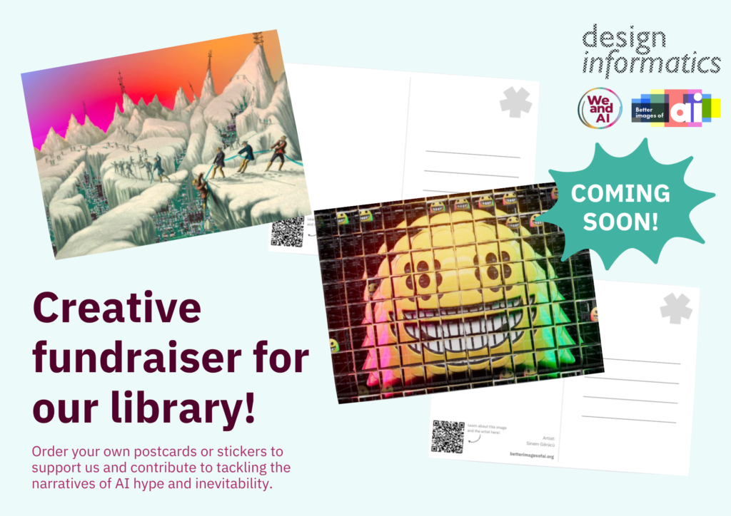
Following the UK AI Resist List launch, with the support from Design Informatics and We and AI, we will soon be launching a creative fundraiser to help support the running of the Better Images of AI library. We’ll be raising money by selling postcards of the various images in our library in packs centred around themes like power, rainbows, and sustainability. There will also be stickers sold in packs by We and AI & friends. We hope to be launching the fundraiser in September, we’ll announce it in our newsletter, blog, and LinkedIn so be sure to keep an eye out.  

Two postcards with are displayed each with one of the images from the library. The one on the left is Hanna Barakat's 'Data Mining' visual and the one on the right is Alan Warburton's 'Social Media' image. The logos for Design Informatics, We and AI and Better Images of AI are in the corner. A bubble with the text 'COMING SOON!' is beneath. In the corner, text reads: 'Creative fundraiser for our library!' in large dark text as a heading, following 'Order your postcards or stickers to support us and continue to contribute to tackling the narratives of AI hype and inevitability.


Visualising ‘AI afterlives’

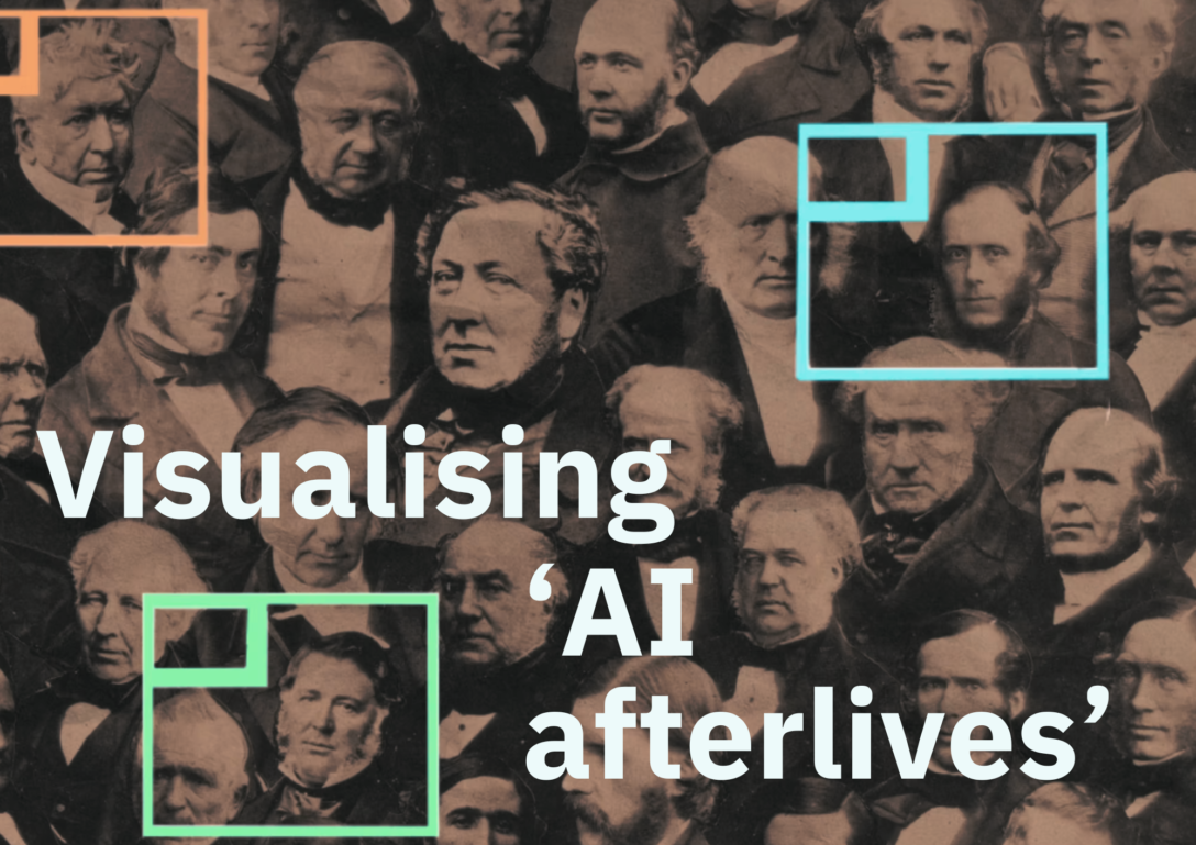
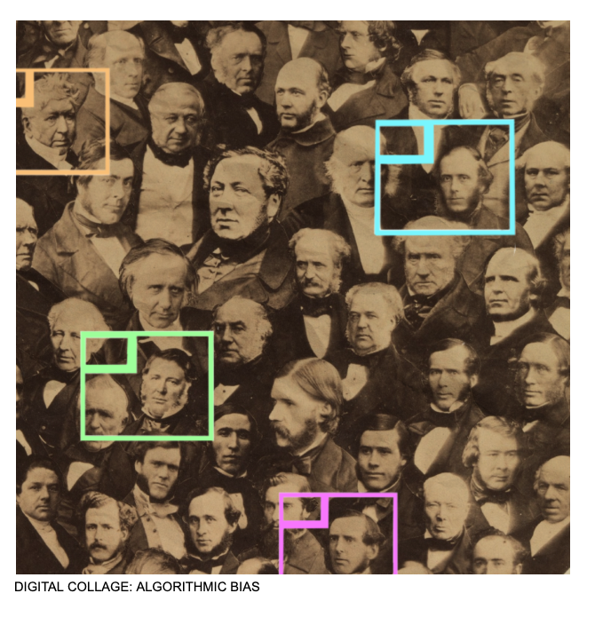
An archival, vintage-style image of a crowd of men. Three men's faces are signalled out by coloured bounding boxes. The text 'Visualising 'AI afterlives' overlays the image.

In this blog post, Jenny Kidd and Eva Nieto McAvoy from the Synthetic Pasts project share their own experiences of visualising their research outputs on ‘AI afterlives’. They comment on the need for better visuals to depict the use of generative AI in the digital afterlives and digital memory ‘industry’ (see here). Current stock images are suggestive of human continuance or immortality and represent death as a transition from body to data. To counter these visual tropes, they began using generative AI to create more helpful images, but later found that these images also raised challenges with respect to the way ‘past-ness’ was represented. Later, however, they turned to create their own visuals from archival materials, and while these still remain challenges, the process and outputs enabled more reflection and “encourage[d] us to notice the things that frictionless systems work to erase.” Some of the project’s visuals can be found on the Better Images of AI library, with a larger collection on their own site.

Since 2023, the Synthetic Pasts project has been exploring how AI is being used to animate, or re-animate, persons from the past through the creation of (for example) ‘deathbots’, avatars of historical characters, and voice clones of deceased artists. The project responds to the increasing use of such practices across a range of contexts, whether in museums and heritage sites, on stage and screen, or in our own personal archival and ancestral settings. It is clear that the creation of what we call ‘AI afterlives’ is becoming more mainstream.


The significance of visual tropes used for AI afterlives

One challenge for us as researchers has been how best to visualise our research interests when communicating about this work. Stock images of ‘digital afterlives’ and ‘digital memory’ are full of unhelpful tropes–glowing figures, ghostly spectres, and outstretched hands. These tropes echo those that the Better Images of AI initiative has catalogued so well. In the context of AI afterlives such ghostly spectres are suggestive of human continuance, or even immortality, as if these might be somehow facilitated through the use of AI. However, as we and others working in this area have shown, the ‘afterlife’ that is actually on offer through AI systems (in the ‘digital afterlife industry’) is more an infrastructural one—the survival of our data traces through commercial platforms—than a metaphysical one.

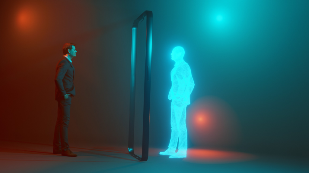
The depiction of glowing human figures, often with their hands outstretched, echoing Michelangelo’s Creation of Adam, is suggestive of human connections through time and into the afterlife and is in keeping with broader imaginaries of AI (see, for example, this depiction on the cover of a book about the digital afterlife). The gap separating the two hands, the images suggest, is to be closed by an AI that is capable of overcoming the human limitation and inconvenience of death. Other frequent depictions show spectral figures entering glowing digital portals that remind us of traditional imaginaries that present death not as an ending but as a transition into the afterlife, in this case, a seamless one from body to data. Such imaginaries are shaped by science fiction, and maintain that AI is uniquely placed to solve human problems; in this case, grief and loss.

On the left is a man in a suit, he is looking into and facing a door frame and on the other side shows a mirror figure of him – but this time, it is a glowing blue hologram.
Image from HERE (credit: iStock Photo). An image of a person entering a portal with a glowing digital avatar on the other side.


Such visions of AI lose sight of the fact that endings—and forgetting—are important and healthy components of how human memory works. 

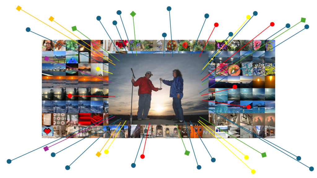
A library of photos. One photo has been highlighted by the system, and a series of  pointers suggest it has been marked as in some way meaningful by the archival and retrieval system.
One of the visuals that the Synthetic Pasts project created to reflect on the way that AI interacts with memory. Credit: Jenny Kidd & Synthetic Pasts / Better Images of AI / CC BY 4.0

AI-generated images of ‘AI afterlife’

At the start of our project, rather than use such images, we leaned heavily into generative AI imagery in order to try to communicate some of these concerns. At that time Dall-E3’s weirdness and the haunting images produced by Midjourney seemed to usefully make visible our discomfort about how AI might interact with memory. Images of people that never lived, depicted in incoherent places and with evident temporal (dis)locations, were suggestive of the ways memory too can distort and deceive, and of the complex entanglement between remembering and forgetting. Over time these AI-generated images became part of the visual language of our project.

Whilst we have been working on the project however, the pervasiveness and persistence of generative AI imagery has clearly increased. As synthetic media has filtered into social networks, advertising, politics, and even our communications with friends and loved ones, we have been talking more and more about the erosion of trust in images, including historical ones.

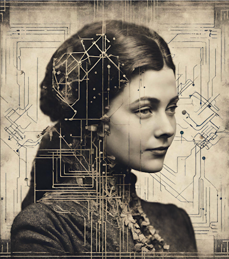
An image of the side profile of a woman in an old, vintage style. Overlayed the image is a series of circuit-style lines and network lines.
One of the AI-generated images created as part of the Synthetic Pasts project by Google’s Duet AI, 30 Nov 2023, prompt by JK

We have been troubled by the ways ‘past-ness’ has been aestheticised and hollowed out by generative AI systems.

In this context, that visual strangeness that once felt uncanny and helpful in the images we were producing has not aged well. Whereas we started using generative AI images to critique synthetic culture and the ethical challenges it presents – e.g., datafiction, exploitation, or bias – over time, our AI-generated images have themselves become a part of the problem. 

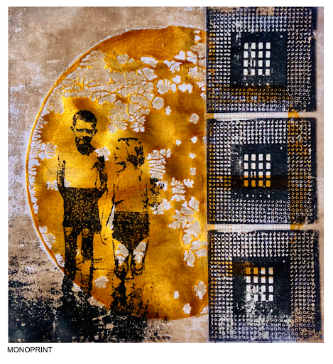
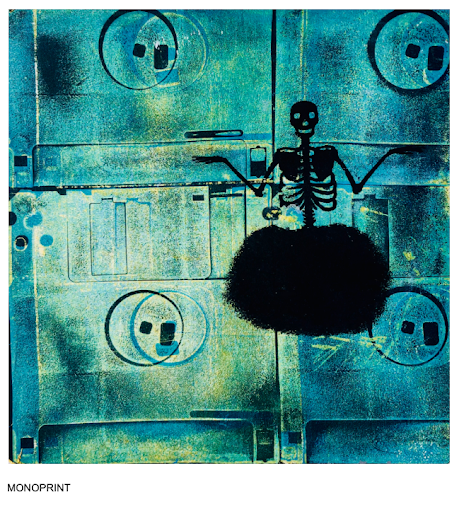
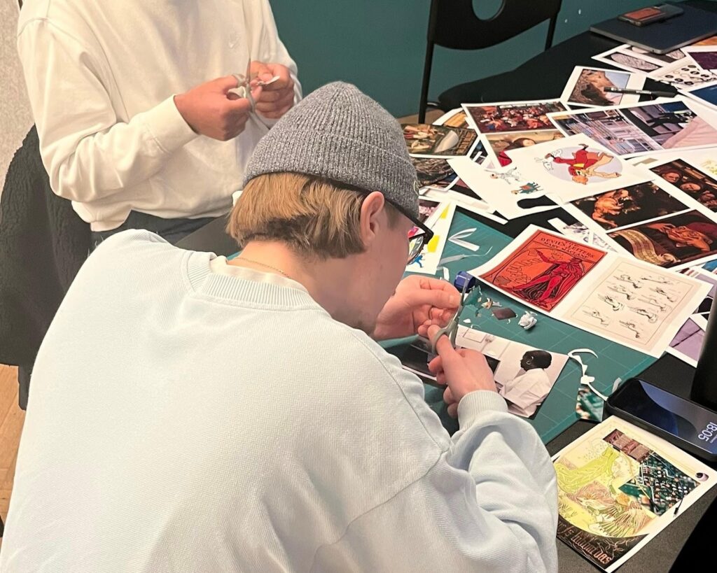
So in the closing months of our project we are finding new ways of trying to visualise how AI interacts with memory and impacts our understanding of the past. Some of our approaches are digital – making films and games for example, as can be seen on our project website – and others embrace more analogue and hybrid approaches – making zines, prints and collages. A few of the results can be seen on this page.

Working in this way slows us down, draws attention to memory’s affective and material qualities, and encourages us to notice the things that frictionless systems work to erase.

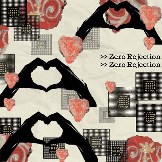
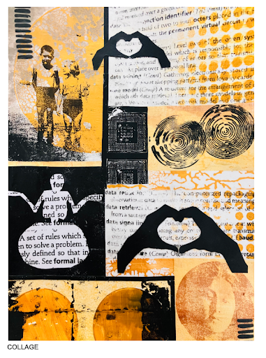
A repeated motif shows two hands coming together, where the fingers are shaped to suggest a heart. These are set amongst a series of images of small AI chips and red painted rocks which pick up on the motif of the heart. Repeated text on the right of the image reads ‘zero rejection’.

‘The intimacy factory 1′ is one of the images created for the Synthetic Pasts project. It reflects on the increasing use of ‘companion bots’; conversational bots designed to mimic human-like conversations. It references these systems’ synthetic and mechanical qualities, as well as their very real emotional impacts. These systems manufacture intimacy, creating the illusion of bi-directional attachment and even care. The image is compiled in Photopea and includes extracts from four public domain images.

Jenny Kidd & Synthetic Pasts / Better Images of AI / CC BY 4.0

You can find some of the visuals used in the Synthetic Pasts project in the Better Images of AI library; see the collection here.


From AI-generated images to archival images 

As a part of this more hands-on exploration, we have been making use of public domain imagery made freely available through online collections, archives, and libraries. This too raises interesting questions that we felt were productive for us at this stage of our project. 

Creating collages with archival material entails working with the traces of actual people and moments of the past. This might feel initially similar to what generative AI systems offer, just at a smaller scale. But focusing on individual photographs allows us to become more mindful of the specificity of their historical situatedness. Repurposing these in our work is not a straightforward or neutral process.

For example, the fact that an image is technically and legally available does not automatically make it ethically unproblematic. Such collections—like the AI images they have made possible as source materials—also reproduce multiple biases and inconsistencies. Our reuse of archival material still makes past persons visible for new purposes that are very different from those for which they were originally intended. 

The use of archival material forces us to confront questions about who gets to speak for the past and which stories get centred, as well as about consent and dignity. For us, the process of re-working makes these tensions visible, as the choices involved in representing the past become unavoidable. Through this approach archival contradictions and outliers are not glossed over by automated blending, and we are able to see how echoes of the archive reflect in generative AI imagery. As a result we can better advocate for more intentionality and scrutiny of these visions. 

“I like that this one is about repetition and homogeneity – this is the nature of archives anyway – and how these AI systems will hardly challenge these constructs with these datasets. Where are the gaps? The non-archived peoples and stories?”  – Dr Eva Nieto McAvoy

A greyscale, vintage-effect archival image of traditional men in a crowd. Coloured bounding boxes focus attention on 4 of the faces.

Better images of ‘AI afterlives’

Below are some images created by the Synthetic Pasts researchers to visualise their work:

You can see more of the visuals created by the Synthetic Pasts project by scrolling to the bottom of their webpage.

About the authors

Jenny Kidd is a Reader in the School of Journalism, Media and Culture at Cardiff University and researches in the interdisciplinary fields of Digital Heritage and Digital Culture. She has led applied research projects with a range of practical and other outputs including two immersive experiences, a series of reports for policy makers and industry, and many publications. She is author of Museums in the New Mediascape (2014) and AI Afterlives: digital memory and synthetic pasts (2026). Jenny is Principal Investigator on the Leverhulme Trust-funded Synthetic Pasts project (2024-2026).

Dr. Eva Nieto McAvoy researches digital media and culture, with a focus on the theories and practices of new and interactive media in cultural and memory work at the intersection of knowledge, power, and technology. She has published widely and is co-lead on the Leverhulme Trust funded Synthetic Pasts project and co-author of AI Afterlives: digital memory and synthetic pasts (2026). 

About the Synthetic Pasts project

Synthetic Pasts is a critical-creative inquiry into what future(s) for personal and collective memory our algorithmic present anticipates and paves the way for. Funded by the Leverhulme Trust, the project explores how fragments from the past – photos or audio recordings of our deceased relatives for example – are remediated/animated through algorithmic systems, and with what consequences for how we remember and commemorate. The creation of unanticipated ‘afterlives’ in the present has ethical, emotional, and political dimensions, and it is crucial that we critically examine these unprecedented processes, as well as the socio-technical infrastructures and platforms that enable and encourage them (for example, genealogy sites, Amazon, OpenAI and Google). 

If you’re interested in Synthetic Pasts, you can explore some of their work below: 

Digital story, project overview: Eva Nieto McAvoy introduces the research context and key project concerns in a 5 minute digital story.

The Responsible AI Afterlives Workbook 

Kidd, J., Nieto McAvoy, E., Jones, B. and John, A. (2025). The Responsible AI Afterlives

Workbook: exploring AI to ‘revive’ museum collections and engage users. Synthetic

Pasts. https://doi.org/10.5281/zenodo.17619346 

AI Afterlives Digital Memory and Synthetic Pasts 

Kidd, J., & Nieto McAvoy, E. (2026). Bloomsbury [part of the Bloomsbury Studies in Digital Cultures series]. 

Synthetic afterlives: Deathbots as affective infrastructures of memory

Kidd, J., & Nieto McAvoy, E. (2025) in Memory, Mind and Media (4), doi:10.1017/mem.2025.10013 

Synthetic Heritage: Online platforms, deceptive genealogy and the ethics of algorithmically generated memory

Nieto McAvoy, E. & Kidd, J. (2024) in Memory, Mind and Media (3), doi:10.1017/mem.2024.10 

Deep Nostalgia: Remediated memory, algorithmic nostalgia and technological ambivalence

Kidd, J., & Nieto McAvoy, E. (2023) in Convergence, 29(3), 620-640. https://doi.org/10.1177/13548565221149839

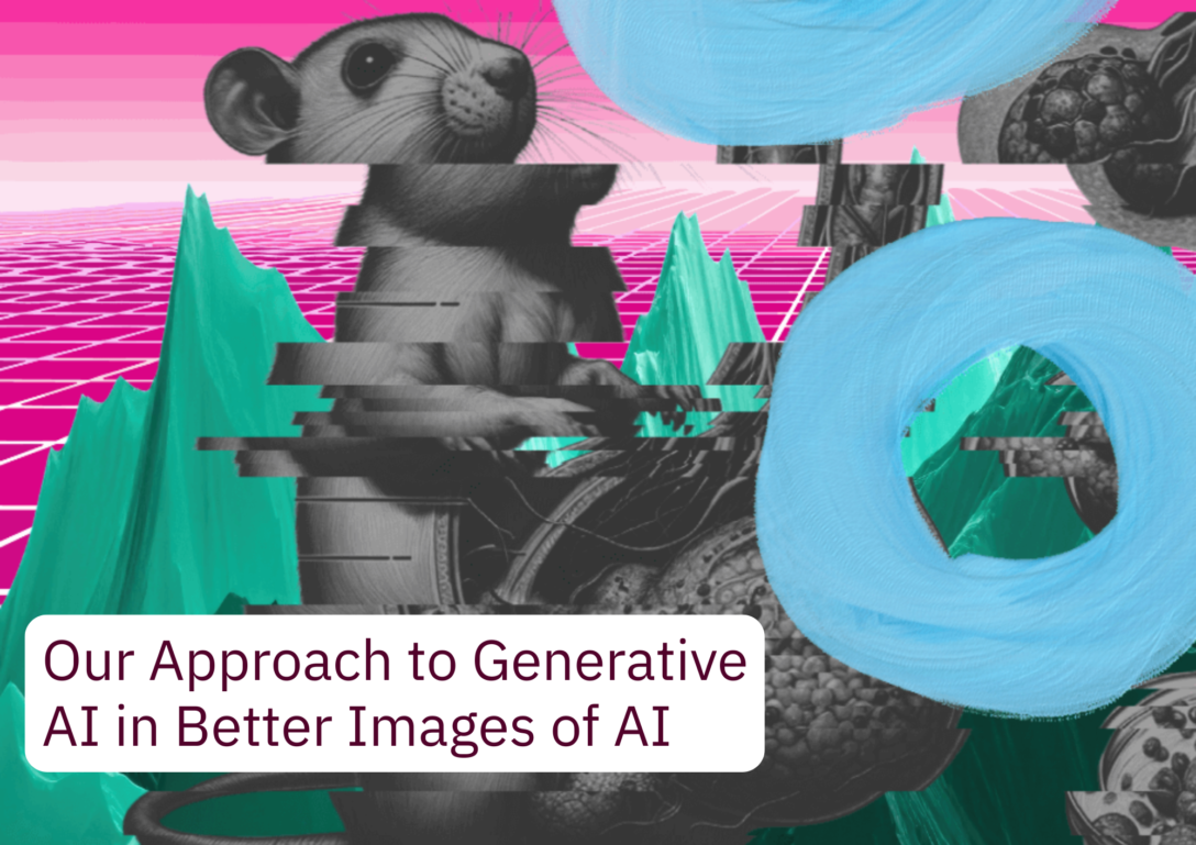
Our Approach to Generative AI in Better Images of AI 

On the left is a grey-scale version of a rat with inaccurate and oversized reproductive organs recognisable from an academic article which contained AI slop. The image has been edited to be sliced, and blue painted torus icons overlay the image. The background features a green mountainous range with a magenta tiled floor and gradient sky. Over the top, the text 'Our Approach to Generative AI in Better Images of AI' features in the left corner in a white text box.

Cover image credit: Marcin Wilkowski / Better Images of AI / CC BY 4.0

Claims about the productivity and efficiency gains from generative AI can be appealing to non-profit organisations, like ours, which have no core funding and rely completely on volunteers. Yet, at Better Images of AI, productivity and efficiency are not – and should not be – prioritised over other values like human creativity, care, learning, intention, empathy, connection, respect, equity, accessibility, and sustainability – all of which have brought us together as a community.

We and AI (the non-profit organisation that we sit cosily within) have played a significant role in challenging AI hype and offering a counter-narrative to extractive AI becoming inevitable in our lives (see resources here and here). We and AI’s work has prompted us to question and reflect on whether specific use cases for generative AI align with our organisational values. 

We have adopted our stance based on the reasoning outlined in detail below. These are not absolutes, or necessarily ‘anti-AI’, but at the moment, this approach reflects our prioritisation of practices which centre community values like care, intention, empathy, respect, equity, and sustainability – values which we do not see reflected in current AI development or practices.

The use of generative AI is also counterproductive to the purposes of our library and community, which not only aim to improve the visual representation of AI but also support creators, researchers, and individuals wanting to understand and learn about AI through imagery. Automating tasks, some of which may sometimes seem mundane or administrative, may speed up processes, but in turn, takes away from the time we spend attending to details and thinking intentionally, which can undermine opportunities for us to develop critical thinking skills about AI. 

We acknowledge that generative AI has been used by us in the past, for instance, when we were under the impression that Adobe Firefly was trained using consented materials (we later found out that it is not and revised our policies). However, in developing this approach, we’ve been able to learn from our creators and discussed how to embed our community values into our practices, which has ultimately led us to our current position. It is important to be honest, and we hope that in sharing this knowledge, we can be transparent about how – and why – we got here.

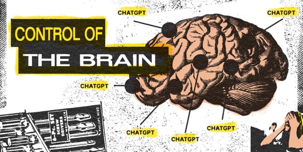
A brain diagram shows ChatGPT has replaced core functions of the brain, while a young girl in the bottom right covers her eyes in horror. Degraded imagery of screwdrivers and the words “Control of the Brain” frame the collage.
Bart Fish & Power Tools of AI / Better Images of AI / CC BY 4.0

Additionally, increasingly, we find ourselves in spaces where ‘AI-enabled’ productivity and efficiency in writing and art are prioritised and rewarded over the content of the work itself, with many being forced to ‘leverage AI’ in projects where it is simply unhelpful or useless – or worse, actively detrimental. We are holding space for practices which actively divest from unnecessary automation and exploitation, in favour of slower, community-focused, reciprocal alternatives which support our values and focus on the enjoyment that many individuals derive from creating, reflecting, editing, and writing.

We welcome any feedback on our approach to generative AI and hope that this policy is inclusive of all members of our community and partners, while also aligning with the values at the heart of Better Images of AI, which have been informed by We and AI’s research. This blog post serves as a living page, where we hope to continuously develop/clarify/iterate our approach based on community feedback. Some of the points raised in this approach, for instance, relating to ‘AI art’ and the use of artists’ work for training data, are being discussed actively by individuals – you may wish to follow and engage with their work (see here, here, here, here, and here as some examples).

Our approach is split into three main contexts for the uses of generative AI in accordance with Better Images of AI:

  • Image submissions;
  • Blog posts; and
  • Image cards (descriptions and alt text

For each use case or context, we outline reasons for our approach. However, for uses relating to our blog or images, we also challenge the motivations and reasons why you might want to use generative AI or assume that it is helpful. In these cases, we offer alternative non-generative AI approaches that better align with our values based on resources or existing practices that have organically, and sometimes accidentally, emerged within our community. We hope to build more resources along these lines.

As outlined in our Submission Handbook, AI-generated artworks are only eligible for submission to the library, if all of the following 3 criteria are met

  1. The image generator used to create the image: (i) uses only consented works in its training data, (ii) compensates artists whose works have been used in its training data, (iii) labels all images as AI-generated. 
  2. Original artwork by the submitting artist is used as the visual prompt and style. 
  3. The way the image generator has been used in the process is disclosed and described within the submission form. 

In practice, no generative AI image generators (that we are aware of) meet all three criteria. Therefore, images generated by models, including, but not limited to, DALLE-E, Midjourney, Stable Diffusion and Adobe Firefly are not accepted in our library. This may change, and if any AI image generators do comply with our criteria, we’d love to know. Techniques that use AI, which leave the original image intact and are not image generators, such as those found in digital editing platforms (e.g., background remove/eraser or basic filters), are permitted if they only ‘enhance’ the original image instead of transforming it (see our Submission Handbook for further explanation of how we’re thinking about the boundaries here). 

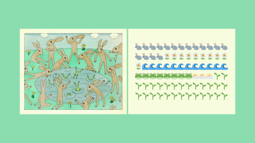
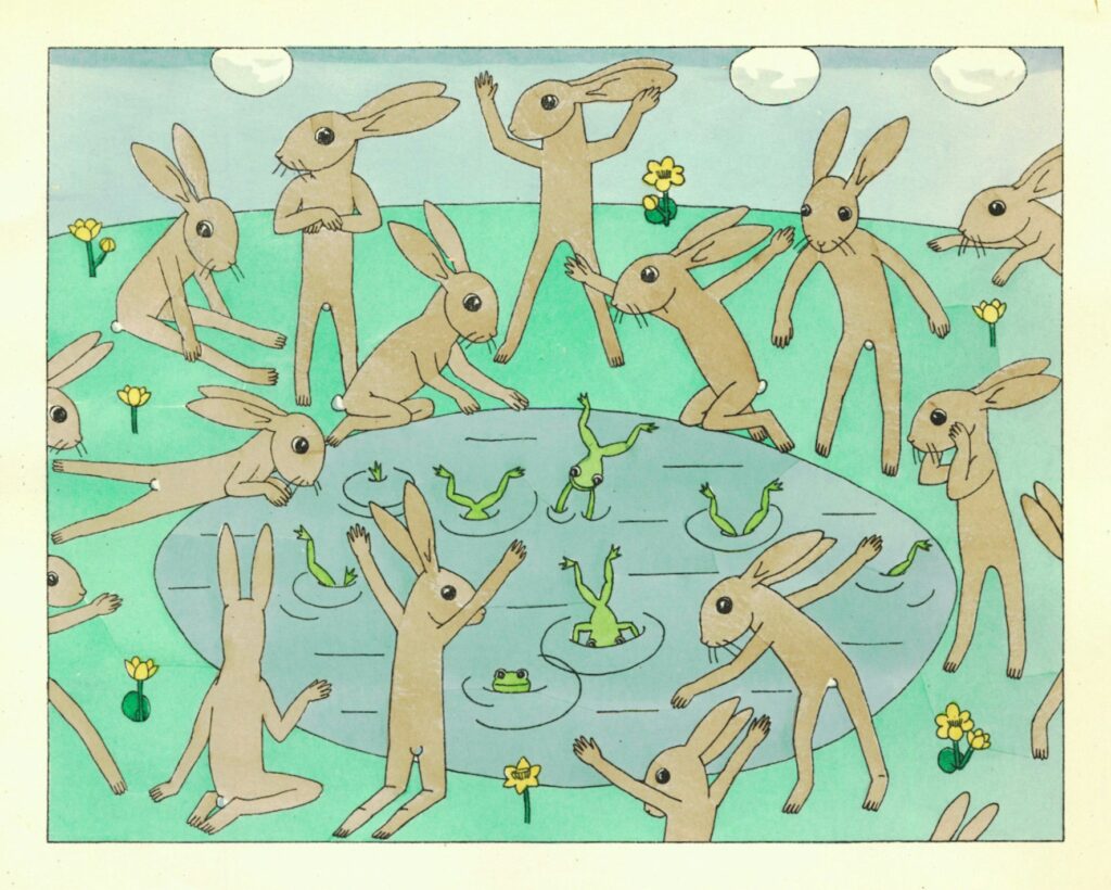
The collage features an artwork showing rabbits and frogs dancing around a pond on the left. On the right, this image is depicted in simplified, emoji-style symbols.
Dominika Čupková & Archival Images of AI + AIxDESIGN / Better Images of AI / CC BY 4.0

Alternative to using generative AI for images?

One reason you might consider using generative AI to create images is if you feel you do not have the artistic skill or ability to create an aesthetic, compelling visual. 

Generative AI visual outputs often reinforce biases reflected in our inequitable society. Using digital heritage collections offers a more reflective approach to challenge existing narratives and can prompt us to explore and understand how they are relevant to current AI developments and practices.

Furthermore, archival images can expose past histories from marginalised communities, which can allow us to understand how systems of oppression are embedded in the context of AI. However, it can also introduce alternative understandings and approaches to AI – showing us how the current practices are not universal, or inevitable, and alternatives have existed in the past or in different geographies. 

The Playbook also includes a list of public domain resources (an additional list is in our Submission Handbook too), which enable creators to explore how images outside of copyright protection can be used to create visuals for submission into our library. Although an ongoing legal question in courts around the world, generative AI text-to-image models can infringe copyright through the use of the input data to train models alongside the resulting output images.

There are numerous ethical and moral objections to using generative AI models for these reasons too, including the use of creators’ work without permission, consent or remuneration to train lucrative, proprietary models. Using public domain images, such as those found within digital heritage collections, can therefore offer a more legally compliant and ethical approach. 

While we want to hold space for all creators who wish to improve the visual representations of AI, we believe we can only enable the use of AI in this process if it has been developed in ways that respect creative communities (this requires consented training data, disclosure, and remuneration). We are also deeply concerned about the environmental impact of generative AI supply chains and therefore endorse human-created artworks which do not have the same detrimental impact on our ecosystems. 

In terms of content for our blog, we’re opposed to the use of AI for writing, ideation, research, grammar for many of the same reasons as we are for generating images, such as mass non-consensual use of authors’ work, biases and plagiarism, environmental factors, exploitation, as well as cognitive decline and integrity. We understand that common digital tools might have embedded AI-based features that are triggered without consent. We discourage collaborators from using these tools, for example, by disabling the AI overview on Google by adding ‘-ai’ to the end of your searches, or just by using alternative web browsers

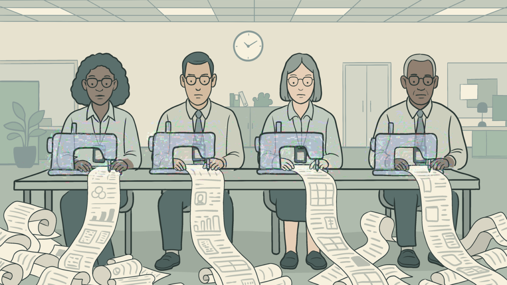
A row of knowledge workers operate sewing machines producing piles of spreadsheets and reports.
Leo Lau & Digit / Better Images of AI / CC BY 4.0

Alternative to using generative AI for images?

We understand that some people may use AI in the process of writing for other important reasons, such as for translation purposes. We do not wish to exclude these individuals from contributing to our blog and sharing their work with our community. 

We’re not incentivised or structured to benefit from fast, predictable, polished outputs. Instead, we value (often slower) options which can forge new human relations and offer mutual learning opportunities (even if we sometimes miss out a semi-colon, whoops!). If you’d like to use generative AI in some way to write a post for our blog, we’d love it if you can get in touch first and explain why you’re planning to use generative AI so we can learn more, understand, and see if we can help you.

Image descriptions: Since our creators do not use generative AI to create images for our library, we also believe that we should take the same consideration, time, and respect to write descriptions and alt text for the images. The process of doing so can enable us to explore the plurality of stories told by each image, while also learning and engaging with the creators’ intentions and understanding/experiences of AI.

Where we are uncertain about creative choices made or parts of the image, we can engage with the artist to learn about the image process and creation. This has the benefit of connecting our artist community with our volunteers, allowing for human connection and learning opportunities. 

We have found that AI-generated image descriptions do not effectively communicate the artist’s process, and so cannot prompt us to critically think about what is represented in an image. Writing image descriptions is also a learning opportunity for volunteers, particularly new ones, who want to learn more about how AI can be visually communicated in more accurate and representative ways. Contextual elements of images, such as those informed by an artist’s own experience or understanding of AI, can be replaced or lost by using AI-generated descriptions.

In addition, material processes involved in creating the images can be lost. We encourage creators to detail any specific choices, materials, and processes taken to visualise AI, showing how all representations of AI come from somewhere, influenced by worldviews, contexts, and geographies. Our community blog also develops these descriptions to explore in more depth the human stories, challenges, intentions, research, and organisations behind images (see here, here, and here, for example). 

The image shows a superimposition of colourful illustrations representing different objects in a secretariat: in the background, printed minutes. Above, the hands of a medical secretary typing on her keyboard, the hands of another stamping envelopes. The headset and foot pedal in the foreground are essential tools for typing. In the foreground, the red zig-zags typical of ambient scribe errors streak across the image.
Fanny Maurel & Digit / Better Images of AI / CC BY 4.0

Alt text: For alt text, we also believe that preserving human-generated text increases the accessibility of our library for people who are blind or have low vision. AI-generated alt text descriptions of images may not communicate the specific choices an artist made or parts of an image necessary to understand the representation of AI portrayed in a certain image. This is particularly relevant for images which incorporate visual metaphors, whereby a literal description may not offer the same visual experience that other users are exposed to when using our library.

Being aware of how the image is presented and the context in which it sits can give people who are blind or have low vision a better experience using our library, which supports our purpose to increase public understanding of AI. Furthermore, we are cautious of uncritical uses of AI being used to ‘increase’ accessibility in a guise to minimise costs needed to invest in changing the ways the world is designed, which exclude individuals (e.g., people with disabilities), which cannot be simply overcome by technological approaches. 

Finally, as with writing descriptions, the process of writing alt text can be helpful for our volunteers to learn more about the visual communication of AI. Being able to describe images about AI often involves us undertaking research to understand the contents of the images and describe them in a way that communicates the same information from the description of an image as someone who relies on the visual experience.

While we do not currently have a resource that can help and guide creators or volunteers to write alt-text descriptions, we hope to be able to develop one in the near future, which is specific to our library and visualising AI. 


We have been reflecting upon the uses of generative AI for different purposes in Better Images of AI. However, when generative AI use cases are presented to us, we continuously come to the same question: 

“What can generative AI provide to Better Images of AI, aside from efficiency or productivity, that a community of care and collaboration cannot offer?” 

Sam Altman watches over a family consuming his AI. The living room vignette is framed by power tool imagery. The words “Behaviour Power” are the top of the artwork, framing the intent of the piece.
Bart Fish & Power Tools of AI / Better Images of AI / CC BY 4.0

As explored above, we have found that generative AI do not surpass the collaboration of our own community that we have developed around our values of care, learning, intention, empathy, human connection, respect, equity, accessibility, and sustainability – even if our work might be slower and not as ‘polished’.

But we genuinely welcome other people’s responses, which critique, build upon, or support our approach to generative AI in the Better Images of AI library. We exist to improve the visual representation of AI, and as part of this, we have thought about whether generative AI can play a useful role in supporting our mission. At present, we think that generative AI, as it is currently built and developed, does not.

Resources that inspired our approach

Below is a list of resources that influenced our thinking and approach. We welcome any suggestions for additional readings to add:


Everything, Eco-where, AI at Once?

A group of five cloud shapes float across a blue background. The clouds are collages made out of close up photographs of shiny silver silicon surfaces. Beneath, the text, 'Everything, Ecowhere, AI at Once?' is printed in light text.

In this blog post, Laura Martinez Agudelo builds upon her research of visual representations of ecology and digitalisation to explore how ‘AI eco-imagery’ is portrayed. Martinez Agudelo introduces five ‘eco-digital’ visual narratives from her recent paper – including the Earth as a glowing orb and nature through screens. She then explores how AI tropes are specifically embedded in ‘eco-images’, such as through green descending code and mechanical trees. She argues that these images shape our perception of AI, environmental issues, and their potential consequences.


Eco-digital narratives are a lens through which we imagine our relationship with the environment and technology. Visual storytelling plays a huge role in shaping how natural environments and sustainability are perceived and digitally represented. These narratives show how meaning is created and allows us to understand the ways visual communication defines the intersection between both topics.

The original article (written in French) ‘Eco-digital narratives and mediated visual representations’ (Martinez Agudelo, 2025) offers a semiotic, discursive and techno-visual reflection on these narratives in online communication. The study is based on the analysis and conceptualisation of an online corpus of 100 images from Google, Yahoo, Ecosia, Bing, Lilo, Qwant and DuckDuckGo search engine results. It describes the modalities of meaning found, as well as the indices of practices and materialities represented in visual discourses dealing with ‘eco-digital’ narratives.

For studying these thematised visual representations, we should look at both the content of images and the social practices they represent. As Descola (2021) puts it, ‘we only depict what we perceive or imagine’. In the context of digital technology, this often involves depicting specific technical devices, such as phones or computers. In ecology or environmental issues, the colour green is commonly used to represent visually natural environments. 

These narratives are everywhere online, from institutional websites and social media visual identity to online (green tech) guides and e-book covers. Certain visual patterns recur, each conveying a specific story about the intersection between ‘nature’, ‘ecology’, ‘environment’ and (new) technologies. The analysis provided some insights into how we perceive and communicate sustainability. Martinez Agudelo categorises eco-digital narratives into five types, summarised below: 

1. Plants growing from technological devices 

A small green leafy plant sprouting from a laptop keyboard.

One of the first patterns identified was how often plants appear intertwined with technological devices. A seedling sprouting from a laptop keyboard, a tree emerging from a smartphone screen… These images immediately convey the hopeful idea that nature and technology coexist in harmony. However, these visuals made us question whether they oversimplify reality. They can create the false impression that technology and nature integrate seamlessly without conflict or environmental cost.

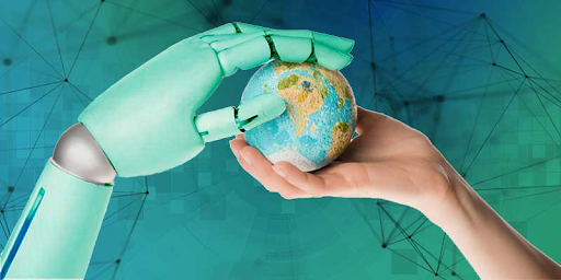
2. The Earth as a glowing orb

The Earth often appears as a glowing orb, sphere or marble cradled in human hands or glowing inside a lightbulb, a visual shorthand for ‘innovation’. But while holding the world in one’s hands feels empowering (for whom, exactly?), and sometimes it performs a gesture of care, it’s also misleading. Such imagery tends to sanitise the climate crisis, presenting it as something neat, homogeneous and manageable while airbrushing the messy, sometimes violent, and complex reality of the challenges we face (conflict minerals, e-waste dumping, rebound effect, cooling scarcity, subsea geopolitics, displacement…).   

On a green background, a the palm of a hand cups a green globe. God-like, holy radiance emanates from the globe through a glowing effect.

3. Nature through screens

A point-of-view shot of a person holding a phone. The camera is capturing an image of a tree in a forest. A sunset forest is blurred in the background.

In some images, nature is framed by tech devices: a forest captured on a phone camera, a waterfall displayed on a laptop screen. These visuals can make us reflect on our own experience. How often do we experience ‘nature’ through technology rather than directly? Are we connecting with natural environments, or simply consuming a curated digital version of it? How is this ‘nature’ already present or recognizable in the materiality of our technological devices?

4. Eco-tech icons

Then there’s the category of icons: green power buttons, recycling symbols, Wi-Fi signals entwined with leaves. These symbols are instantly recognizable and easy to understand. They communicate ‘eco-friendliness’ at a glance. However, many of them simplify or obscure the real impact of technology on the environment. They create a comforting (sometimes green washing) narrative, without addressing material realities like e-waste, water and energy consumption, or resource extraction.

A wifi symbol is in a green grassy texture, leaves fall around the symbol like confetti. The background is a light pink wall and baby blue floor.

5. Critical frames

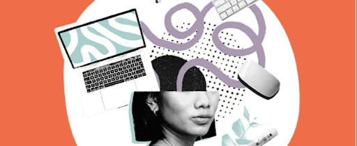
An orange background with a mixture of back and white photography. A picture of an individual's head is cut off with a purple swirl entering her head. A laptop is also positioned near her head alongside the corner of a keyboard and mouse.

A smaller subset of analysed visuals challenges or questions the mainstream eco-digital narrative in some way, by highlighting labour and resource extraction, as well as the pitfalls of greenwashing. These images prompt us to pause and reflect, reminding us that visual storytelling is not always intended to provide comfort. Sometimes, its purpose is to urge us to confront what we would rather ignore or change our approach to a specific eco-digital issue. Recognising these dynamics helps us to identify the symbolic analogies that are currently present in the media landscape.

This analysis also highlights the inherent biases within the search engine results that were used to compile the visual corpus. However, it offers a framework for understanding how such visuals inhabit the online public sphere, facilitating the expression of diverse positions on contemporary socio-environmental contexts. Although most of the analysed images are not necessarily ‘anti-ethical’, they are often ‘anti-political’ (Romele, 2023): they reinforce a rigid divide between experts and non-experts, preventing public disagreement regarding AI development.

Images actively influence how we conceptualise technology, sustainability, and our own roles within the digital ecosystem. Whether they inspire hope, frame nature as a passive object, or challenge us to face the material consequences of innovation, they somehow dictate the boundaries of our ‘ecological imagination’. Wagener (2023) suggests that some ‘narrative frameworks’ can carry a ‘discursive anger’ that also provides a structure for the climate crisis.

What about ‘AI Eco-Imagery’?

The categories concerning the intersection of ‘ecology’ and ‘digital’ are almost identical when discussing the visual interaction between the semantic field of ecology and AI technologies. Misleading AI tropes persist, albeit with slight variations, such as the use of a green colour palette (green anthropomorphism, green robots or cyborgs, grass hands, mechanical green hands, mechanical trees and green descending code), alongside objects related to environmental issues, such as wind turbines, solar panels and backgrounds depicting urban pollution. There are even depictions of small waste-collecting or plant-seeder robots in a future where Earth has been abandoned as a trash-covered wasteland (as in WALL-E). 

Moving forward, we can engage with these images more critically: what story is this visual conveying? What is it concealing? If they are in dialogue with another image or text, what is their intrinsic relationship? ‘Eco-digital’ narratives, reproduced explicitly within environmental discourses of AI systems, illustrate the intersection of the technological and ecological spheres and perspectives. Frequently, these images reduce ecology to a mere aesthetic rather than a lived practice or experience, shaping our perception of environmental issues and their potential consequences.

Questioning media-driven visuals enables a deeper understanding of the socio-technical and environmental realities behind and within them. While some images can create a false sense of security, others can distance us from reflection or meaningful action. Paying closer attention to our relationship with the living world and the way technology and AI systems mediate these connections enables us to engage more intentionally with our immediate environmental realities.

Critical visual frameworks that confront the real tensions and conflicts between emerging technologies and ecological collapse are necessary. The Better Images of AI library provides more complex and socially aware visual representations of the entanglements between environmental discourse, social systems and the material infrastructures of devices and digital technologies.

Images from the Better Images of AI library: credits at the bottom of the page

Rather than reproducing the sanitised aesthetics of clean innovation, these images expose the extractive supply chains, energy demands, labour conditions, exploitation and destruction that occur in the name of AI innovation, as well as all the planetary costs embedded in AI systems and technological progress.

Looking closely at these visual narratives reminds us that how we see, imagine or represent the world influences how we resist, act or create in it.

About the author

Black and white headshot of Laura.

Laura Martinez Agudelo is a Teaching and Research Assistant at the University Marie & Louis Pasteur – ELLIADD Laboratory. She holds a PhD in Information and Communication Sciences. Her research interests include socio-technical devices and (digital) mediations in the city, visual methods and modes of transgression and memory in (urban) art.

Image credits:

Cover image: Tania Duarte and Catherine Breslin / Better Images of AI / CC BY 4.0

Images from the Better Images of AI library, from left to right:

References

Descola, P. (2021) Les formes du visible: une anthropologie de la figuration. Paris: Seuil.

Latour, B. (2004) Politiques de la nature: comment faire entrer les sciences en démocratie. Paris: La Découverte.

Martinez Agudelo, L. S. (2025) ‘Récits éco-numériques et représentations visuelles médiatisées’, Interfaces numériques, 14(2-3). DOI: https://doi.org/10.25965/interfaces-numeriques.5583 

Romele, A. (2023) ‘Images de l’intelligence artificielle: Un punctum cæcum dans l’éthique de l’IA’, in Sebbah, F-D. and Romele, A. (eds) Imaginaires technologiques. Paris: Presses universitaires de Paris Nanterre, pp. 142–164. DOI: https://doi.org/10.4000/13orf 

Wagener, A. (2023) Blablabla: en finir avec le bavardage climatique. Paris: Le Robert.

Visualising the Empire of AI with Gloria

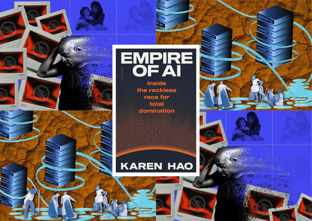
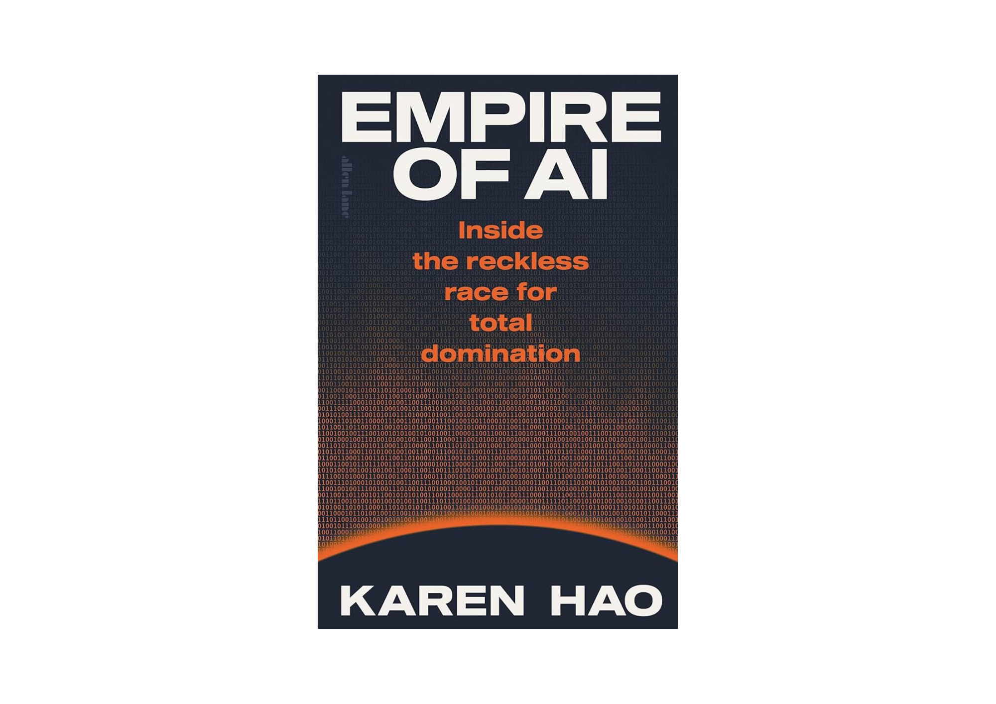
The image is split into 4 quadrants, which alternate 2 of Gloria's images. One of the images shows a man showing mental distress from constant exposure to harmful content online. His family, in the background, progressively disappears. The other image shows cooling pipes hug data servers, extracting water from a shared reservoir while people collect water from the same source, set against a background of eroded soil textures. In the middle of the 4 quadrants is the book cover of Karen Hao's 'Empires of AI'.

Gloria Mendoza’s images illustrate the hidden human and environmental forces which prop up the ‘Empire of AI’. After reading Karen Hao’s book, Gloria was inspired to visualise different chapters to communicate the ideas in an alternative medium. One of Gloria’s images focuses on the emotional toll faced by data workers in the Global South, inspired by a story in Chapter 2. The other image criticises the natural resources, particularly water, on which AI developments are dependent – this is also a topic discussed in depth in the book. In this blog post, we interview Gloria about her images, their inspiration, and the artistic choices made to depict technology and its impacts.

You can download Gloria’s images here in the library for free under a CC BY 4 license, so long as you correctly attribute.

“Over the years, I’ve found only one metaphor that encapsulates the nature of what these AI power players are: empires.” – Karen Hao


How did reading Empire of AI inspire your images? 

With respect to The Environmental Impact of Data Centres in Vulnerable Ecosystems, I was inspired by the book’s concise examples, something that’s hard to find when it comes to AI and automation (although see here and here). Before reading it, the environmental impacts of AI were somewhat blurry in my mind, but the book sparked my curiosity to explore how data centres are built—where they’re located, what equipment they use, how maintenance is done, and whether they can be sustainable in the long term. These questions inspired me to create this image using clear, minimal elements to illustrate the concerns I believe many people share.

The Invisible Labour Behind Content Moderation was inspired by Chapter 2 of Hao’s book. Hao tells the story of a Kenyan man who works as a content moderator and data labeller. Through constant exposure to violent and disturbing material, his mental health gradually deteriorates. Eventually, he reaches a point where he isolates himself from both his family and his community. This story reflects the reality faced by many data workers in the Global South. Several issues emerge in Hao’s account: unethical working conditions, unlawful labour practices, and the lack of adequate protection for workers.

For this illustration, I chose to narrow my focus to one aspect of this experience, the overwhelming emotional toll that this work can take. The collage aims to convey the isolation, distress, and psychological fatigue that many data workers endure. To reinforce this narrative, I incorporated hardware and digital iconography associated with sensitive content. These elements reference the technological systems that produce and circulate harmful content, while situating the worker within the broader infrastructure that makes this labor necessary.

How do you approach creating images that aim to represent AI more accurately and inclusively? 

The topic of AI often feels abstract and full of jargon, which is a major challenge for illustrators in the field. It tends to distance the public from its real-world meaning and impact. Through mixed-media collages, I found a way to shed light on what a single photograph could not capture. The tension between the organic feel of hand-drawn pixel graphics representing nature and the pixel-perfect precision of technology was carefully considered. This contrast became central to the piece.

Another challenge when visualizing these dynamics was how to represent people with dignity and accuracy. I evaluated line art versus photographs, both stock and archival, and ultimately my instincts drew me toward archival imagery. Stock photos, in this context, didn’t feel connected to the real people behind the issue. It was also important to avoid harmful tropes, such as depictions of African children collecting water, since the water shortages mentioned in the book were specific to the United States. Archival photographs, with their journalistic quality, convey a sense of authenticity and create a compelling contrast when placed alongside modern technological artefacts.

While searching for reference images of Kenyans, the results were men in tribal attire, sporting hip hop style fashion, showing off jewellery, or in extremely precarious conditions. These are representations that exacerbate negative stereotypes and narratives around Kenyans and Africans at large and do not represent the majority of the population. To tackle these results, I aim to provide as much context as possible and represent communities as accurately as possible.  

How do you think visual art can influence public understanding and perception of AI? 

Visual storytelling can help surface these hidden realities and remind us that tech infrastructures are sustained not only by code and data, but by human labour and ecosystems – Gloria Mendoza

Visual art can help the public understand this topic because creativity and conceptual thinking are powerful tools artists use to make complex ideas accessible, legible, and thought-provoking. We are living in a decisive moment where debate and action are imperative, and art helps bridge the gap between concepts that civil society may not be fully literate in and the processes of decision-making. It is important that these ideas are understood and discussed by all of us—not just technology designers and policymakers.

Illustration can make complex tech ecosystems visible. Behind datasets, algorithms, and automated systems are workers and natural environments that sustain these infrastructures. By carefully considering representation, symbolism, and context, visual storytelling can help surface these hidden realities and remind us that tech infrastructures are sustained not only by code and data, but by human labour and ecosystems.

Could you describe the visual metaphors employed in your image(s)?

Stylistically in The Invisible Labour Behind Content Moderation, I chose distortion as the primary visual metaphor. Distortion can powerfully illustrate the damage that systemic forces inflict on individuals. It suggests the breakdown of stability; a once solid subject gradually losing control, becoming increasingly vulnerable and disoriented.

What kind of images do you envision for the future representation of AI? 

I envision images that center the human experience in relation to technology; works that are explicit, relevant, and grounded in research. Representations of AI can take many tones: critical, informative, enraging, or saddening, and these are approaches artists can continue to explore while keeping their concepts rooted in figurative representation.

How has contributing to the Better Images of AI library influenced your own views on AI and its impacts? 

In the end, this project became more than just an illustration; it was a way of thinking about how technology, humanity, and ecology intersect, and how images can make invisible systems visible, sparking reflection, curiosity, and awareness.

About the artist and author

Headshot of Gloria.

Gloria Mendoza is a Colombian-American artist and designer dedicated to using visual storytelling to spark conversations around social issues and societal challenges. With a background in art direction, brand identity, and illustration, she creates research-based imagery that bridges the gap between data and public understanding. Her work invites critical thinking about equity, inclusion, and accessibility.

Cover images: Gloria Mendoza / Better Images of AI / CC BY 4.0 + book cover of Empire of AI by Karen Hao

This post is an updated version of one previously uploaded in 2025.

Localising AI’s Visual Culture with Brussels Heritage

Paper collage. The Art Deco swimming pool of the Villa Empain in Brussels, its elegant facade visible in the background, with the water replaced by rows of computer servers.

Images spread across tables, sheets pinned to walls, scissors and glue sticks everywhere. An incongruous setting for people who work in tech, more used to tapping keyboards than wrestling with rolls of tape. And yet… this was the best response FARI found to a problem that’s harder to pin down than it seems: the depressing homogeneity of AI imagery that fails to capture individuals’ own experiences and encounters with the technology in local communities.

FARI – AI for the Common Good Institute is a Brussels-based research institute bringing together over 300 researchers in artificial intelligence, robotics and digital data. In February, FARI hosted a workshop on “Localising Visuals of AI” – aiming to engage its group to create visuals of AI anchored in the lived realities of a citizen in Brussels. 

In this blog post, Ulysse Gerkens, who led the workshop, explains why localised visuals of AI are important and necessary. In particular, how drawing upon digital commons and an individual’s own materials can create conditions for sensitivity and lived expertise to translate into visualisations of AI. Ulysse also offers some tips and advice for hosting your own “Localising Visuals of AI” workshop in your local community. 

You can find some of the images from the workshop in our library here.

“We don’t localise AI to promote it; we localise it because it’s already here. By cutting out images of bus stops or Brussels facades, participants made visible what standard AI imagery erases: the presence of these technologies in our daily lives.” Ulysse Gerkens

AI images mislead us

The mission of digital mediators goes beyond facilitating access to technology. It also involves reflection: inviting every citizen to question the technologies that run through their daily lives, to form their own opinion, to voice it. It’s a deeply democratic mission, and one that echoes FARI’s reason for being. When the only available images of AI are misleading, it is precisely this capacity for expression and critical judgment that is weakened. Driven by this mission and this assessment, we chose to host a workshop based on Better Images of AI. More than a library of alternative images, Better Images of AI addresses a challenge that digital mediators face every day: 

How do you explain the stochastic workings of language models with images of humanoid robots? How do you convey AI’s ecological impact when the only images show clean, shiny machines?

“The spectacle presents itself as a vast inaccessible reality that can never be questioned. Its sole message is: ‘What appears is good; what is good appears.‘”— Guy Debord [2]

Better Images of AI proposes to build a different visual vocabulary of AI. One that is useful, anchored in reality, and that can shift our gaze.

Appropriation as the goal, localisation as the method

Beyond these observations, we can’t rebuild the entire imaginary of AI in a single workshop. So, where to start? Perhaps with our immediate environment and our culture. “Localising AI” was our first starting premise. In a globalised culture, we proposed putting the human, with all their specificity, back at the centre of the debate. So we decided to anchor AI imagery in Brussels, drawing from our experiences and encounters with the technology.

Tania Duarte, Founder of We and AI which runs the Better Images of AI collaboration, spoke at the workshop. She stressed a point we kept coming back to: we are all experts of our own ground. Digital mediators know their audiences, their neighbourhoods, and the concrete situations where AI enters people’s lives. The workshop aimed to turn this lived expertise into images.

An over the shoulder shot of an individual cutting with scissors at a table which is full of cuttings and images spread out.
Participant cutting during the workshop

What remained was finding a practical method. A human choice prevailed: collage.

Initially, we had considered several techniques, including digital editing tools. The “Archival Images of AI” playbook by AIxDESIGN offers several interesting methods for creating alternative AI images from archival material. But it was a first testing session with the Citizen Engagement Hub team, Léa Rogliano and Alice Demaret, that gave us clarity. The cut-and-paste technique worked not only for creating strong images; it was also particularly inclusive: it encourages interaction through shared materials, is playful and immediately accessible. It met all our goals, so we made it our method of choice.

However, this technique came with a challenge: we needed to prepare enough pre-printed images and materials for the day. Once again, AIxDESIGN’s resources saved us. Thanks to their recommendations, I discovered Are.na, a platform for collecting large numbers of images from varied sources and formats. The platform describes itself as “ad-free, open source by default, to promote ethical design principles in the tech industry”.

A screenshot of the digital images in a library. Images shown range from AI company logos to parrots.
Are.na collections

You can find the collections created for this workshop here.

Gathering images was time-consuming, but fairly easy thanks to the links shared by AIxDESIGN. This resulted in three collections: archival images, images of Brussels and images of digital materiality. One problem persisted: the images of Brussels found online reflected very little of our actual environment. I mostly found images of the historic tourist centre, along with well-known cultural symbols. Missing were all those subtler elements that make you recognise your city. Léa Rogliano (Head of Citizen Engagement Hub) proposed an original solution: invite participants to bring their own images and photographs.

One participant took up the challenge and prepared a series of street photographs: bus stops, screens, electric devices, and so on. Elements that AI could very well integrate… and a far cry from white humanoid robots. Their relevance surprised us, and on the day of the workshop, they turned out to be especially popular!

Far from Brussels’ tourist clichés: a simple bus stop. Here subverted with a fictional ChatGPT integration:

A bus stop with screenshots from ChatGPT's interface overlayed, including "How can I help you today" with the OpenAI logo above on the traffic light. "ChatGPT 3.5" is at the top of the list of stops, and "New chat" beneath "38 Helden" and "71 Delta" as an additional stop.
Bus stop with fictional ChatGPT integration

Scissors and glue

With the materials ready, another challenge emerged: How do you get people from very diverse backgrounds, who don’t consider themselves “creative”, to produce powerful images? How do you create the conditions for their sensitivity and expertise to translate into images?

Our approach was fairly direct. We prepared a presentation tracing the story behind Better Images of AI and what it seeks to build, with each concept illustrated by concrete examples. We also presented the collage techniques participants could use: cutting, layering, text collage, subverting existing images… The idea was for everyone to leave with a clear visual toolkit. Tania Duarte’s talk anchored this introduction: by putting a face to the project, she reminded participants that they had the opportunity to join an initiative that reaches beyond borders.

An image taken from the back of a room where individuals are sat around tables watching Ulysse present on a screen. The tables have materials such as papers and images scattered on them.
Workshop presentation

We then invited the group to create images that avoid these tropes, with no further instructions. The idea was that they could represent AI from every angle, positive and negative alike. But also, quite simply, to create images for illustration purposes, however abstract. Images that could stand on their aesthetic qualities alone, without necessarily carrying a critical message.

Insisting on this creative freedom put everyone at ease. The first round of creation naturally sparked conversation, which gradually steered the work towards more developed images. The setup, gathering around a table and sharing creative tools, was decisive in sparking exchanges.

4 images from the workshop which are described below.

Among the creations, a few images are worth pausing on:

  • A Brussels pigeon presides over an old computer. The image doesn’t necessarily mean anything, but it makes people laugh, and that’s already a lot. 
  • More pointed, another creation repurposes the swimming pool of the Villa Empain, a Brussels contemporary art venue. The pool is drained of its water and filled with computer servers. The image exposes the colossal consumption of data centres, but also questions resource allocation: when budgets shift towards digital infrastructure, what’s left for culture? 
  • A third collage subtly weaves technology into a Chantal Akerman film. A woman looks at herself in a mirror that could also be a smartphone. Technology as an evocative backdrop. 
  • Finally, the collage “Seeing More — Seeing Less” depicts the Atomium, an iconic monument built for the 1958 World’s Fair, at a time when science promised a radiant future. The giant atom can also evoke neural networks, and here conceals a dataset.

From humour to critical reflection, these images show that using archives and local symbols makes it possible to create representations that are as striking as they are varied.

It should be said that we were fortunate to gather around the table a wide variety of professions: a digital inclusion coordinator, a data protection researcher, a learning designer, an artist, a communications officer at a cultural institution, a European Commission executive, and FARI’s own communications team. A mix that turned out to be a catalyst for creativity and exchange.

In just over an hour, everyone had time to produce several images. The first images unlock creativity; the ones that follow gain in intention and relevance.

All workshop creations

All creations can be viewed here: BIoAI / FARI Workshop (Feb 2026) | Are.na. Some have been published on the Better Images of AI library. [3]

If you want to organise a similar workshop, here are a few very practical lessons we’d like to pass on:

  • Allow at least one hour for creation. Making several images lets people move past their first ideas and feeds a collective momentum.
  • Test internally first. That’s how we identified the right methods and spotted missing images.
  • Print plenty of images. Local archives, everyday images, digital materiality. We can’t predict what participants’ creativity will call for.
  • Ask participants to bring their own images. We haven’t found the right formula yet (low response rate), but the contributions we received were very relevant.
  • Free up creation before demanding meaning. Abstract or aesthetic images first; critical discourse will follow.

Emancipation through images

We don’t localise AI to promote it; we localise it because it’s already here. By cutting out images of bus stops or Brussels facades, participants made visible what standard AI imagery erases: the presence of these technologies in our daily lives. 

Recommendation algorithms shape our news feeds, language models slip into our conversations, and automated systems sort our job applications. Better representing this reality, by shifting the frame, is already to reclaim it. It’s a step towards emancipation.

“Images […] contribute to drawing new configurations of the visible, the sayable and the thinkable, and thereby, a new landscape of the possible.” — Jacques Rancière [4]

In this spirit, the images created during this workshop were published under a Creative Commons licence. This is the very principle of Better Images of AI: building a library of resources accessible to all. It is also FARI’s reason for being as an institute dedicated to the common good. The entire creation chain rests on shared resources: Are.na, AIxDESIGN’s playbook, public-domain archives, and finally the images themselves under a free licence. Many digital commons dedicated to a better understanding of AI.


About the author 

Headshot of Ulysse

I’m Ulysse Gerkens, a Brussels-based developer and graphic designer. I studied social sciences and economics to understand how society works, then switched to programming at 42 to understand how technology reshapes the world I’d been studying. My internship at “FARI – AI for the Common Good Institute” brought both sides together. Today, I explore how technology and human sensitivity interact through art and collaborative practice.

About FARI and the workshop 

FARI – AI for the Common Good Institute is a Brussels-based research institute bringing together over 300 researchers in artificial intelligence, robotics and digital data. Within the institute, the Citizen Engagement Hub bridges laboratories and civil society: associations, digital mediators, and citizen collectives.

In 2025, the Citizen Engagement Hub committed to digital inclusion. Belgium has an entire network of digital mediators (Espaces Publics Numériques [1], libraries, associations) who help citizens navigate an increasingly connected world every day. It was from this collaboration that the “Tea-Times” [5] were born: welcoming workshops to discover open-source educational resources together, over tea and cake. My task? To find and prepare these resources in advance. That’s how I discovered Better Images of AI and the idea for hosting this workshop on “Localised AI” visuals. 

Acknowledgements

This article concludes my internship at the Citizen Engagement Hub of “FARI – AI for the Common Good Institute Brussels”. I would like to thank Léa Rogliano and Alice Demaret for their mentorship and the trust they placed in me to co-organise this workshop. Thanks to the entire FARI team for their support in organising this event. Finally, thank you to Tania Duarte for her generous contribution during the workshop.

Endnotes and references

[1] Espaces Publics Numériques (EPN): free-access digital spaces staffed by mediators who help citizens with online services and digital skills. In Brussels, they are coordinated by the CABAN network.

[2] Guy Debord, The Society of the Spectacle, trans. Ken Knabb, PM Press, 2024, §12. Originally published as La Société du spectacle, Buchet-Chastel, 1967.

[3] This workshop resulted in the publication of four images on the Better Images of AI library, you can view the FARI collection here.

[4] Jacques Rancière, Le spectateur émancipé, La Fabrique, 2008. Translation by the author.

[5] Tea-Times are funded by the ERDF and the Brussels-Capital Region.

The Mystical Art of Making Maths Sparkle: A Wizard’s Guide to Statistical Sorcery

On the right, a simplistic illustration of a server rack with wires trailing out of it. A yellow sticky note is taped to the rack with a drawing of cartoon sparkles. Text on the left reads: The Mystical Art of Making Maths Sparkle: A Wizard's Guide to Statistical Sorcery, by Berk Alkoç

As you navigate digital interfaces, you’ll increasingly find a sparkle icon used to represent ‘AI’, ‘AI features’ or ‘AI-driven processes’. In the following blog post, Berk Alkoç traces the emergence of this visual metaphor and unpacks the implications of using sparkles to represent AI. In his own 5 steps of statistical sorcery, Berk criticises the corporate narratives about AI as a magical transformation embedded in the sparkle icon, which masks the human labour, data, investment, and materials required to generate AI outputs.


Gather ’round, aspiring data wizards, as I teach you the most mystical art known to computational science: making people think your massive statistical pattern-matching system, trained on human-generated data, is magic, only in 5 steps.

Step One: Add Sparkles

It’s 2023. Every tech company on Earth is scrambling to slap “AI” on their product roadmaps before their next investor call. There’s just one problem: how do you show users where the AI is?

Google had been quietly using sparkles since 2016 for its “Explore” feature in Docs. By 2024, they had deployed nearly 100 different sparkle icon variations across their products, with quarterly growth of 37% in sparkle usage. Notion added purple sparkles. Zoom also added sparkles. Spotify’s shuffle button got sparkles. ChatGPT-4 ditched its lightning bolt for sparkles.

The Wall Street Journal documented this phenomenon in August 2024, noting that seven of the top ten software companies by market capitalisation had embraced the sparkle. But nobody actually asked users if this made any sense.

To test the effectiveness of the sparkles icon, Kate Kaplan from Nielsen Norman Group showed 107 participants sparkles icons in isolation and asked what they meant, and not a single participant mentioned “AI” or “artificial intelligence.”

Instead, interpretations included:

  • Fav or save (16.82%)
  • Visual effects or optimisation (16.82%)
  • Special information (11.22%)
  • “Just plain unsure” (a disturbingly large percentage)

One user captured the confusion perfectly: “In the absence of a heart, I think the star would allow me to save items. Or maybe it’s a wishlist [because] you wish on a star.” One cannot learn a system when the same symbol means radically different things, and sparkles do exactly that. They have such fluidity that, depending on the app and context, people can attribute them with different potential meanings. This is different from an icon for save or search. The floppy disk means “save” because it represents physical save media. The magnifying glass means “search” because that’s how you make small things visible. The problem is not that users misunderstand the sparkle icon, but that the icon makes misunderstanding structurally unavoidable. 

Step Two: Train Users Through Sheer Repetition

Google’s own 2024 research with 2,000 participants across eight countries found that users did recognise sparkles signified AI; however, even in this research, Google’s researchers noted: “they didn’t have a consistent definition of what AI meant” and couldn’t distinguish machine learning from generative AI from image generation. The conclusion Google’s own team reached was clear: 

 “Ubiquity leads to a lack of specificity and can diminish an icon’s effectiveness.” 

Nearly 100 Google system icons include an AI Sparkle (Source: Google Design Blog)

This means that the sparkles work because Google trained users to recognise them through sheer repetition, not because the metaphor is sound.

The industry defense is simple: Doesn’t “AI feel like magic?” Because basically, “You type words and it writes an essay! That’s wizardry!

And here’s where we need to question what magic is. 

Step Three: Invoke the Magic Metaphor

Kate Crawford and Alex Campolo coined the term “enchanted determinism” in their 2020 paper. They argued that AI systems are framed as simultaneously magical (unknowable, mysterious, operating through forces we don’t understand) and deterministic (accurate, reliable, producing correct results). 

This combination is insidious: it shields creators from accountability while amplifying AI’s power to classify and control. The mechanism is simple. Magic can’t be questioned. It just is. When results go wrong, no one is responsible. The wizard explains: “The spell was cast correctly; the universe responded in mysterious ways.” Replace “spell” with “model” and “universe” with “training data,” and you’ve got the standard AI liability dodge, word-for-word.

M.C. Elish and danah boyd put it more bluntly in their 2018 paper: framing AI as magic denies “an accounting of what went into making something work, or that it required work at all.” Magic is “costless in terms of the kind of drudgery, hazards, and investments that actual technical activity inevitably requires.”

But AI isn’t costless—and neither, historically,  is magic. Actual magic is expensive. Research on magic practices notes that practitioners typically know it doesn’t work every time and requires significant effort, cost, and risk. Machine learning follows the same pattern. It’s not an effortless transformation; it’s finding optimal data variables, communicating with systems to access data, cleaning datasets of faulty values, evaluating ML library outputs, designing comprehensible interfaces, and iterating when you get AI slop. You cast the spell, check if it worked, and cast it again with adjustments.

Leo Lau & Digit / Better Images of AI / CC BY 4.0

Both magic rituals and ML systems suffer from domain disjunction, where you perform actions in one symbolic system hoping to affect outcomes in another. In magic, you might perform a ritual with certain tools (symbolic domain), hoping to heal someone, or influence the weather (material domain). In ML, you run statistical operations on numerical representations (symbolic domain), hoping to optimise ship propulsion (material domain). The gap between domains necessitates interpretation.

✨ Magic Ritual Domain🤖 Machine Learning Domain
Symbolic SpaceThe Ritual: Rain danceThe Math: Statistical operations on massive numerical datasets.
Material OutcomeThe Goal: Influencing the weather.The Goal: Optimising ship propulsion or detecting bank fraud.
Reason for FailureThe Excuse: Incorrect ritual performance or poor cosmic conditions.The Excuse: Poor data quality, bad architecture, or “hallucinations.”

As anthropological research notes

“something is performed to influence the relations in a different space.” 

Both systems require experts to translate between domains, ritual specialists for magic, and data scientists for ML. And both systems require explaining why things fail. Magic practitioners blame incorrect ritual performance, cosmic conditions, or counter-magic. ML practitioners blame data quality, model architecture, or adversarial inputs. One could argue that “magic” is simply a metaphor for the complexity that no user can realistically understand large-scale machine learning systems. But complexity does not require mystification.

Step Four: Repeat, Repeat, Repeat

So how and why were sparkles forced into UX (User Experience) and UI (User Interface) Design processes despite the fact they didn’t  work?

This Wall Street Journal article framed it as: 

“Design and marketing executives at software companies said they started using sparkles because everyone else was doing it.” 

Dan Saffer, who designed Twitter’s sparkle toggle “as a joke,” later observed that subsequent adoption reflects “FOMO rather than intentional design,” companies copied each other to maintain consistency with user expectations (Jakob’s Law). However, Jakob’s Law says users expect systems to work like ones they already know. It doesn’t say you should create bad patterns just because others did. The sparkle standardisation happened too quickly for users to learn the pattern naturally. Instead of allowing intuitive understanding to emerge, companies used brute force repetition to teach users a metaphor that actively undermines accurate mental models.

When your bank’s fraud detection algorithm flags your transaction, do you want to think of it as “magic” or as a statistical model with false positive rates that you can dispute? When an AI hiring system rejects your resume, should that feel like inscrutable sorcery or like a technical system whose biased criteria you can understand and challenge? The sparkle icon succeeded not because it communicates well, and we have overwhelming evidence it doesn’t, but because it aligned with corporate narratives about AI as magical transformation. But that’s exactly backwards. Icons that don’t need explaining work because they map to shared understanding. Sparkles mean “magic” because that’s their cultural association, and magic is precisely the wrong metaphor for the technology we want people to understand, question, and hold accountable. What emerged was not a shared language shaped by users, but a visual convention enforced by corporate anxiety.

Step Five: Wait for Everyone to Forget

So here we are with sparkles everywhere, an icon that succeeded despite failing every measure of good design. Interface design is political work. Sparkles prove it. But we’re not stuck.

There are two scenarios ahead. In the first one, companies aggressively integrate AI into every product. In the second one, a more balanced, accountable approach emerges. In both, sparkles will fade, but for very different reasons.

In the first scenario, AI integration becomes so aggressive and comprehensive that the distinction between “AI features” and core functionality disappears entirely. Visual editing software where every tool uses ML, email clients where every function involves algorithmic processing, productivity apps where AI is woven into every interaction. Here, sparkles become meaningless. Not because the mystification problem is solved, but because there’s nothing left to distinguish. If everything is AI, then nothing gets the sparkle. We don’t mark every website with an “Internet Inside!” badge. Ubiquity eliminates the need for announcement, but not the need for accountability.
In the second scenario, responsible tech practices and comprehensive AI literacy create pressure for differentiation rather than blanket mystification. Here, sparkles fade because they’re replaced by something better: context-specific disclosure that distinguishes low-stakes autocomplete from high-stakes algorithmic decision-making. The non-deterministic nature of ML (the errors, the biases, the “hallucinations”) doesn’t disappear through normalisation, so the ethical case for explicit signalling remains. Sparkles become inadequate precisely because AI use cases vary so wildly in consequence and reliability.

We’re already seeing this second path emerge in certain cases.

For instance, at Molo, a German civic engagement app where I lead the UX/UI design processes, we faced this exact choice when implementing AI-powered search. I advocated for using a search icon with ‘KI’ (Künstliche Intelligenz) rather than copying the sparkle to prioritise clear, specific, and understandable visual communication. It’s these small decisions that add up to either mystification or transparency. The BBC’s recent approach offers another example on a more systematic level. Instead of adopting the industry-standard sparkle, they developed a neutral hexagon derived from their brand blocks, paired with context-specific disclosure language following a “How we used AI” formula. Their research confirmed what Nielsen Norman found: users want specifics, not mystification. 

A screenshot from the BBC website, which shows a neutral hexagon derived from their monochrome brand blocks, paired with context-specific disclosure language following a "How we used AI" formula.

This particular disclosure label is being trialled in BBC Sport live reporting (Source: BBC Media Centre, 2025)

I believe that the sparkles will fade either way, through ubiquitous integration or through intentional replacement. But only one of these paths solves the actual problem. They’ll disappear meaningfully only when the people who build these systems decide that our responsibility isn’t to make technology feel magical, but to make it understandable. That means different choices in product development: disclosure rather than sparkles, specificity rather than mystification.

When you see those sparkles next time, remember: you’re witnessing the tech industry’s commitment to mystification over clarity, vibes over user research, and enchantment over explanation. The question isn’t whether sparkles communicate clearly. It’s whether we’ll accept a digital future where corporate magic tricks replace technical literacy.


About the author

A headshot of Berk.

Berk Alkoç (he/him) is a designer–researcher based in Germany exploring the intersections of technology, cities, and everyday life through a critical (and unapologetically queer) lens. At ZeMKI, University of Bremen, he designs for Molo, a civic media platform. At the Institute for Technology Assessment and Systems Analysis (ITAS) at the Karlsruhe Institute of Technology (KIT), he researches nature conservation through a relational values lens and how digital tools shape environmental governance. Outside of work, he’s likely outdoors or immersed in something visual, whether behind a camera, sketching, or experimenting with graphic design.

Submission Handbook for Better Images of AI

A poster with the text 'Submission Handbook for Better Images of AI: Available Now!' with three bullet points beneath which state 'Image criteria, IP guidance, and AI policy'. On the right is a picture of the cover of the Guide which has a collage of pictures from the library at the bottom and the top. In the centre is the text, 'Submission Handbook for Better Images of AI' with explanatory text beneath.

In 2025, we uploaded 60+ images to our library. During this time, we’ve been fortunate to work with several organisations which have culminated in collections of images as well as contributions from individual creators. To make the process of submitting images to our library easier for everyone, we’ve released our Submission Handbook for Better Images of AI. This is our first attempt to publicly communicate our guidelines and policies for submitting images to the Better Images of AI library.

Importantly, anyone can submit an image for consideration in the library. Our library features brilliant contributions from art students, researchers, amateurs, and professionals from all fields across the world. As a non-profit organisation which is run entirely by volunteers, we are grateful that most images are kindly donated* to the library by these amazing creators.

What’s inside the Submission Handbook?

  • Our image criteria: what elements do we look for in ‘better images of AI’ and what tropes should you avoid?
  • Our submission form: easily submit images via our new form
  • Inspiration and resources: get started creating your own better images of AI
  • Intellectual property guidance: steps to ensure your images do not infringe 3rd party rights and learn more about the Creative Commons licence that images published in the library are covered by
  • AI policy: our prioritisation of human-created visuals and restrictions on AI-generated art

This Handbook will serve as a working document which we will continue to update as we learn, reflect, and find more useful information to share with our creative community. Previous versions will be archived here.

If you spot any mistakes or have suggestions for ways to improve the Submission Handbook, please do get in touch with us by emailing info@betterimagesofai.org. We’d love to hear from you.

Finally, we would like to extend our gratitude to volunteers Söğüt Atilla Aydın, Elja Daae, Harriett Humfress, Grace Jenkins, Beckett LeClair and Laura Martinez for providing advice and feedback which supported the development of this Handbook.

* We do sometimes work with organisations that can commission images or run art competitions with monetary prizes. If you might be more interested in paid work related to our library, do sign up to our newsletter where we share these opportunities.

Why We Need Better Images of AI From Science Fiction

A photographic rendering of a simulated middle-aged white woman against a black background, seen through a refractive glass grid and overlaid with a distorted diagram of a neural network.

Science fiction plays a decisive role in shaping perceptions of technology, particularly artificial intelligence (AI), not only through its literary narratives but even more pervasively through its audio-visual representations. These depictions do not merely reflect technological developments; they actively influence how we perceive and relate to emerging technologies long before they enter our daily lives. Through imaginative storytelling and the development of ‘diegetic prototypes’, science fiction also inspires ideas about what the future of society should and shouldn’t look like. However, when we look at science fiction from a more critical perspective, it becomes clear that there is a divide between the literary version of science fiction (s.f.) and its adaptation in motion pictures (eye-sci-fi) (1).

In this blog post, Yeliz Figen Döker (The Digital Constitutionalist) and Zoya Yasmine (Better Images of AI) explore this distinction in more depth and examine the limitations of dominant images of AI drawn from eye-sci-fi. This is a commentary on the Better Images of AI Guide which includes ‘science fiction references’ as a trope to avoid in AI visuals. Instead, Yeliz and Zoya argue that while AI visuals drawn from eye-sci-fi create harmful representations of AI, we can learn a lot from the literary roots of the science fiction genre. Inspired by the findings in this blog post, DigiCon and Better Images of AI worked together to create a flipbook of ‘better images of AI’ that show more thoughtful and pluralistic representations of the technology that carry the ethos of science fiction, as opposed to dominant tropes derived from ‘eye-sci-fi’.

 “Science fiction does not just offer speculative representations of social reality it may, in various ways, help to shape it” (Brennan, 2016)

Science fiction as a causative force

Science fiction is a genre that explores the unlimited possibilities of imagination while also basing it on the tangible realities of scientific discovery. This very harmonisation, blending factual elements with imaginative concepts, makes it the prime example of an oxymoron. As such, the rise of science fiction can be viewed as a natural reaction to the rapid pace of scientific advancements.

In addition, science fiction helps shape the future by preparing the minds of scientists and laypersons. Indeed, in the 1960s, computer scientists at MIT popularised certain narratives in film and journalism to influence the direction of future research and the greater adoption of their lab’s computing technologies (see here for more information). Also, the launch of the first Russian Sputnik marked the beginning of the space race that defined the 20th century. In fact, it is no coincidence that Konstantin Tsiolkovsky, known as the father of space flight and the founder of astronautics and rocket science, was also a science fiction author. Not to mention that the great astronomer Edwin Hubble was inspired by the works of Jules Verne, often regarded as one of the founding figures of the genre. This motivation to enter scientific fields often springs from the deep admiration and passion that scientists feel for science fiction. These illustrate that science fiction does not solely predict the future; it also helps devise it. Its influence extends beyond imagination and speculation, shaping the aspirations of those who invent new technologies, make scientific advancements, and strive to make the impossible possible.

The limits of ‘eye-sci-fi’ and the value of ‘science fiction’

However, audio-visual representations of science fiction often fail to capture the depth and critical edge of its literary form. Instead, they tend to fall back on familiar, anxiety- and action-driven tropes with the help of extensive usage of visual effects, like killer robots (2), godlike AIs, and dystopian collapse, which in turn dominate the visual language of science fiction. This flattening effect reinforces outdated and misleading ideas about technology, sidelining the experimental and diverse visions found in the works of authors like Robert Heinlein, Brian Aldiss, Stanislav Lem, Philip K. Dick, Alice Sheldon (James Tiptree, Jr), or Octavia Butler.

According to Isaac Asimov, one of the most prolific authors of science fiction, this divide traces back to the very abbreviations used to categorise the genre. In his reflections on science fiction, he describes it as split between printed science fiction (s.f.) and motion-picture science fiction (eye-sci-fi). He points out that “good” science fiction must necessarily have a high intellectual content, because it must deal with science and people and their interactions in a reasonable and knowledgeable manner. However, eye-sci-fi often fails to meet these criteria; instead, it focuses on visual special effects, including spectacles of vast destruction, alien or monstrous beings, and feats made possible by zero gravity or wild talents.

In his view, eye-sci-fi tends to prioritise special effects, with each production aiming to surpass its predecessors in spectacle to secure commercial success. He maintained that this reliance on spectacle makes eye-sci-fi almost a different genre altogether. With the boom effect provided by Hollywood, eye-sci-fi quickly achieved enormous popularity, generated unprecedented profits, and inspired a wave of imitations. Yet, Asimov believes that these imitations rarely matched the quality of the original works in science fiction. His critique remains relevant, as seen in many contemporary adaptations. Just recently, Netflix’s adaptation of Cixin Liu’s The Three-Body Problem was widely described as flat and shallow compared to its original, with some arguing it was produced by and for Western audiences as opposed to its more diverse origins.

The problems with relying on eye-sci-fi for AI imagery

“Narratives of intelligent machines matter because they form the backdrop against which AI systems are being developed, and against which these developments are interpreted and assessed” (Cave, Dihal and Dilon, 2020

Eye-sci-fi images are just not that imaginative

While the s.f. can push us to think about the future in novel and original ways, eye-sci-fi often falls back on well-worn narratives that restrict us from imagining technology unconstrained from existing power structures. The dominant stock images of AI are an extension of this myopic perception. Recurring stereotypes, overly sexualised gynoids reminiscent of Hel in Metropolis, rogue killer cyborgs from Terminator, or white-skinned, blue-eyed robots with glowing positronic brains as depicted in the I, Robot film, are typically based on the metaphors drawn from a simplified interpretation of eye-sci-fi.

In relation to how these eye-sci-fi visuals influence our thinking about AI, we argue that they create illusions of inevitability, reinforce harmful representations of race and gender, and divert attention from the real AI developments that are happening right now, such as biased algorithms, mass surveillance, environmental damage, and worker exploitation.

Eye-sci-fi has a diversity problem

One of the most troubling aspects of eye-sci-fi-inspired AI images is their lack of diversity. A study by Cave et al of 142 influential AI-themed films from 1920-2020 found that only 9 AI professionals depicted were women. Eye-sci-fi narratives have a tendency to misrepresent the history of AI, which has benefited from the works of diverse communities – for instance, black researchers at MIT working at Project MAX, a computation-focused research group or the many women at Bletchley Park behind the success of Alan Turing’s Enigma machine. Despite these realities, images of AI often overlook and misrepresent the real lives of women, people of colour, disabled individuals and other marginalised groups.

Beyond the representations of those working in the AI industry, Law comments on the visions of the future often portrayed in science fiction cinema. This is not only in terms of who appears on screen, but also in the kinds of futures these works imagine. The aesthetics, values, and power structures they normalise tend to follow familiar, exclusionary patterns. This lack of diversity is not solely about representation, but about the imaginative limits placed on what futures are thinkable and advocated for.

For instance, the 1927 film Metropolis (3) features a robot turning into a white woman, a transformation maliciously orchestrated by a white-male-mad scientist who abducts ‘Maria’ and imposes her likeness onto the machine, ‘Hel’. Furthermore, in this case, the robot is modelled on Maria, a saintly, Madonna-like figure, yet it later becomes her opposite, a hypersexualised, deceptive, and destructive version. What is troubling is not only the racial coding of the machine but also the rigid moral division it constructs. The ‘good’ woman is human, submissive, and pure, whereas the ‘bad’ woman is artificial, desiring, and dangerous. Rather than offering a critique of automation or identity, the film ultimately mirrors long-standing cultural anxieties about women who do not conform. We also note that science fiction scenes involving ‘human-machine-symbiosis’ reinforce the idea that the futures of computing are inseparable from notions of whiteness. In doing so, eye-sci-fi promotes the idea that AI technologies are built by/for white individuals or certain gender prototypes, overlooking the role of marginalised groups played in the development of AI. These biases influence not only who is viewed as an AI developer, but they also skew our perception about who should be included in conversations about its governance and development.

Eye-sci-fi tropes exaggerate AI’s capabilities and create fear mongering

Eye-sci-fi often portrays AI as vastly more powerful than it actually is. These misleading images can exaggerate the possibilities or scope of what the technology is capable of, which creates a disconnect between reality and how it is viewed by the public. The use of inaccurate images can be intimidating to people who are non-experts, as the visuals construct a future that can appear dystopian, disturbing, and create a culture of distrust or worry about AI. While such exaggeration might seem inherent to the genre’s speculative nature, as its role is to ask “what-ifs”, these portrayals do not emerge in a vacuum. They are closely entangled with the conceptual development of AI itself.

Since the theoretical foundations of the field were laid by Alan Turing and its formal naming at the Dartmouth Workshop in 1956, many have argued that the ultimate aim of AI has been the creation of human-level, or even general intelligence that surpasses human-level. This ambition has led to a taxonomy within the field that distinguishes between Artificial Narrow Intelligence (ANI), Artificial General Intelligence (AGI), and Artificial Superintelligence (ASI). While ANI refers to systems that perform specific tasks, such as image recognition or language translation, AGI denotes a still-hypothetical system that is expected to perform generality in many domains and be capable of flexible, human-like reasoning across domains. ASI, in contrast, refers to intelligence that would surpass human capabilities altogether, which also simply does not exist at the moment.

Science fiction can indeed serve as a powerful tool for critical reflection and learning. However, the dominant tropes of eye-sci-fi often obscure rather than clarify the real challenges posed by the AI that we interact with today. Stock imagery depicting AI often exaggerates the reality, desirability, and even existence of AGI and ASI. Although it is natural for the genre to imagine beyond present capabilities, it is important to question which visions gain prominence and why. Many literary works do offer more complex and less anthropocentric visions of machine intelligence, but these are too often eclipsed by blockbuster simplifications. Thus, we advocate for deeper engagement with literary portrayals of AI that resist these tropes, particularly those that do not hinge on the assumption that AI will inevitably dominate humanity or that its future capabilities must be framed through the lens of “superhuman intelligence.”

What are some of the limiting eye-sci-fi visuals and their impact on their perception of AI?

The persistent use of misleading AI visuals can lead to inflated expectations, which obscure the real and present challenges that AI poses.

Some of the most common eye-sci-fi AI images include:

  • Descending code: popularised by The Matrix, these visuals refer to a dystopian science fiction scenario in which humans are enslaved by AI. To those for whom the link to the Matrix films is not clear, images of descending code can be alienating by presenting AI as a wall of incomprehensible symbols.
  • The human brain: although only a portion of AI research attempts to reconstruct the human brain electronically, the digital version of the human brain is generally used when describing the functions of AI. Treating the human and AI brain structures as equal gives the impression that AI must mimic the human brain.
  • White robots: the embodiment of AI as robots that are white in colour, ethnicity or both, associates intelligence with being white. Such images serve as a barrier to increasing racial and ethnic diversity in AI development and decision-making, and exclude the global majority.

Breaking free from common tropes in eye-sci-fi with science fiction

 “Futures can warn and promote, and hold the power to exclude as well as include.” (Law, 2024)

Images from eye-sci-fi are limited by the fact that they are usually derived from audio-visual depictions and adaptations of science fiction. Eye-sci-fi mediums need to attract large, diverse audiences, so it is understandable that they do this through identification with characters using universal human traits and also sensationalist narratives (4). While these formats are effective at engaging viewers, they often constrain the way we explore and think about AI by only representing it in terms of its similarity to humanity and its inevitability to take over the world. This framing makes it harder to see AI for what it is and the more diverse imaginings of what it could become.

The eye-sci-fi images of AI severely lack any positive images which show humans having agency and being in control of the technology, as opposed to being threatened or marginalised by it. Indeed, Noessel’s ‘Untold AI’ analysis points to messages from the technology industry that eye-sci-fi does not engage with. In light of this, Noessel recommends that science fiction creatives could help us better understand real-world AI by telling stories and accurately covering the realities of AI in popular media.

The flip book

Although science fiction/eye-sci-fi images are often excluded from the Better Images of AI library because they focus on speculative futures (4), there is still room for science fiction-inspired visuals of AI that break free from harmful tropes. By challenging dominant narratives, thinking carefully about diversity, and expanding our imagination, better images of AI from science fiction can shape how we think about AI that is not limited to glowing brains and anthropomorphic robots.

Some of the criteria for ‘better images of AI’ from science fiction include:

  • Realism: representing AI as it exists today, rather than relying on speculative visions.
  • Diversity: showcasing AI in ways that include a broad range of human experiences and identities.
  • Honesty: showing what the AI system can actually do, and nothing more.

Better Images of AI and the DigiCon created a flip book which features a curated selection of artist-created images from the Better Images of AI library. DigiCon’s science fiction section does not rely solely on conventional eye-sci-fi narratives. Instead, it approaches science fiction as a field for thought experiments, a diagnostic lens, and a tool for regulatory learning. This flipbook was born out of a shared interest between Better Images of AI and DigiCon to show how the two platforms can complement, challenge, and learn from each other.

* To ensure broader accessibility, we have also created an accessible version of this flipbook. It retains all the original content while offering improved readability for screen readers and users with visual impairments.

While Better Images of AI provides visuals, DigiCon offers a conceptual framework, inviting readers to think more carefully about AI through embracing the critical perspective and power of science fiction. Although the curated images in the flip book are not science fiction-based, they open up thought patterns that resonate with the genre and inspire more thoughtful representations of AI, which acknowledge its material reality, expose its current limitations, and explore its actual functions in everyday life.

Sifting through the flip book, you’ll find some ‘better images of AI’ alongside some personal reflections from the volunteers that are part of the Better Images of AI community, who keep the library going. Their thoughts show how each of the images in the library tells more thoughtful and pluralistic stories about AI than those which are commonly presented in the dominant media inspired by ‘eye-sci-fi’.

Science fiction (and its derivative eye-sci-fi genre) will continue to influence how we think about AI, but if we want more productive and meaningful discussions about its development, we need richer, more diverse visual languages. We hope that this flip book can serve as an inspiration for more productive avenues of framing AI that foster better visuals and narratives around what the technology is and what it should become.

End notes

(1) The eye-sci-fi abbreviation was coined by Isaac Asimov in his essay on “The Boom in Science Fiction” in 1981, Asimov on Science Fiction. Asimov used this term to separate the science fiction adaptations in motion pictures from the literary and printed works of science fiction, which he refers to as “s.f.”.

(2) It is also worth recalling that the very term robot derives from the Czech word robota, meaning forced labour or servitude. Asimov noted that in translating Čapek’s play into English, the term “robot” was chosen over “slave” to mark a distinction between natural and artificial beings. Yet the historical association with subjugation lingers in today’s portrayals, reinforcing fears of rebellion and control.

(3) Even Metropolis was reshaped by early Hollywood’s eye-sci-fi priorities. To make it more marketable, American distributors cut the runtime, simplified the narrative, and removed all mention of Hel, partly because the name sounded too much like “Hell.” Lang later called this edit a cruel mutilation of his film.

(4) The Better Images of AI library serves to show AI as it is currently, not in the future. Although speculative work can be valuable, our library is for the here and now. You can see our library image criteria here.

About the authors

A headshot of Yeliz

Yeliz Figen Döker is the co-founder of DigiCon, where she leads the science fiction section as both operational and editorial head. She is also a Resident Lecturer at the European Law and Governance School, established by the European Public Law Organization. She is also a PhD researcher at the European University Institute in Florence, specialising in the regulation of Artificial General Intelligence.

Zoya Yasmine is a Lead at Better Images of AI, where she supports the behind-the-scenes running of the library. She is also a PhD student in Law at the University of Oxford, where her research explores the intersections between medical AI, law, and ethics.

A headshot of Zoya

Cover image: Alan Warburton / Better Images of AI / © BBC / CC BY 4.0

This text was originally posted on the Cambridge Journal of Artificial Intelligence blog

Behind the Image: Digitalisation and Moonlighting

Two of Julieta's images sit on a slant on the right. On the right side, the text 'Behind the Image Series' in turquoise text box with black text. Underneath, in black text reads: 'Behind the Image: Digitalisation and Moonlighting'. In dark purple text, 'Julieta Longo in conversation with Laura'.

In this blog post, Laura Martinez Agudelo (volunteer steward) chatted to Julieta Longo (artist) behind the series of images ‘Digitalisation and Moonlighting’ that were awarded as a runner-up in the Digital Dialogues competition that we ran this summer.

The aim of the Digital Dialogues competition was to visualise some of the Digit Centre’s research on work and technology. Julieta speaks to the importance of visualising research, advocating for artistic approaches that better represent authenticity and collective experience. 

The discussion was conducted in Julieta’s native language, Spanish, which has been translated by Laura in English below. You can access the Spanish version here (albeit in a slightly different format and structure, but all the same content). 

The rhythms of life and facets of working life

Digitalisation and Moonlighting (1 and 2) focuses particularly on how precarious jobs affect mothers and people with care responsibilities. Through her graphic choices, Julieta highlights the tensions and the balance between paid and unpaid work, which in many cases is operated and/or mediated by digital platforms and/or artificial intelligence systems. 

Woman working simultaneously as a delivery worker, remote employee, and caring her child, representing the opportunities and risks of work digitalization.
Julieta Longo & Digit / Better Images of AI / CC BY 4.0

Julieta shares her motivations and the link between her images and the topics she explores in her research and personal life: 

It was an image that was initially intended to reflect on multi-job holding, which is a global issue, but in Argentina in particular it is being hotly debated because incomes have fallen too much in recent years. The use of platforms and remote or distance work has to do with the need to supplement income. It seemed to me, then, to be a central issue for thinking about artificial intelligence and technology. Also, because this type of work does not produce a new type of technological worker, but rather adds to the existing workforce and is often linked to traditional jobs.

In Digitalisation and Moonlighting, we see a person, a woman, who supports and sustains herself in her many roles. The last step represents the role of mother and seems to finally be in a moment of rest. Julieta’s illustration is a very telling and thoughtful way of bringing various topics into dialogue: gender, informal and remote work, the question of everyday life, time, motherhood and care. This last aspect is also mentioned in the description, and it should be noted that it is not always included in the graphic representation of the theme of the digitalisation of work. 

Julieta confesses that she even made this illustration while she was a little tired: “… I drew the last woman looking after the baby with her eyes closed, a little bit tired but also relaxed… because it reflects a very genuine need to organize our time better, to have jobs that allow us to organize ourselves better and, above all, to have more non-working time.

The inspiration for this work came from a reflection on how to graphically represent the phenomenon of having multiple jobs (moonlighting) in contemporary societies, a situation marked by digitalization, intimate life stories and the time devoted to work.  From her point of view, new technologies play a role in transforming our rhythms of life: “there is a certain idea that technologies will allow us not to be in an office all our lives and therefore to organize our lives differently… not to be in a workplace all the time, whether it be an office, factory or shop… I think that the idea of moving away from traditional work and having more time for life is a very important demand that technologies introduce, resolving contradictions and creating new ones.

As for the illustration process, Julieta created it digitally using Procreate and Adobe Fresco, and she gives us details about the decisions and changes made along the way, as well as the inclusion of self-referential elements, especially the balance between motherhood and remote work: 

“I often work remotely, from home or at an office, but not every day. And this, which at first seemed ideal, or at least I thought it was ideal for motherhood, comes with a lot of additional burdens and responsibilities. In fact, I came to romanticize the idea of being able to work and look after my daughter at the same time, even though it wasn’t always possible, but I thought it was nice to work close to my daughter. I think that romanticization is often present in remote working because it allows you to balance different aspects of your life. You are at home and your children are playing nearby, but that balance has many contradictions, and I did not resolve them.” 

Returning to her perspective as an illustrator, Julieta tells us that she draws frequently, mainly digitally, and also shares her thoughts on her own artistic practice: “I’m drawing a lot digitally at the moment. I would like to go back to not doing everything digitally, but I find it really difficult, especially because it takes much less time, which raises several contradictions related to technology and work in general.

Connected, Yet Disconnected

Three isolated people using laptops and phones to work.
Julieta Longo & Digit / Better Images of AI / CC BY 4.0

The image Connected, Yet Disconnected’ evokes themes such as the emotional and social isolation of the digital worker and shows the paradox of AI-driven work and spatial disconnection in contemporary employment. Julieta tells us that it is the first image she made for her research, thinking about people who work connected and who are close together, sometimes only momentarily, sharing the same space

It is very likely that next to a person working in an office, or as a freelancer, there is someone bringing them food or deliveries. They probably don’t talk or know each other, and sometimes the transaction is very quick, such as delivering food, for example.” 

Julieta believes that the space shared between these people is completely fragmented by digital technology. In the first image, we see overlapping people (actually the same person in different roles), but in this one we identify an overlap and spatial convergence of different people who could be very close to each other and, at the same time, working with people who are far away or remotely.

Through this graphic proposal, Julieta seeks to illustrate that: “people are not only close because they are connected. Today there is a very interesting ambiguity, which is that virtual space breaks down physical space a little, and it does so in both directions. It connects us with people who are far away, but it also disconnects us from all the people who are close to us. On the other hand, there are a lot of everyday problems that are solved digitally, breaking the link with the physical world and other strategies for being in it. 

I think, for example, of mobility and how I used to travel before I had a mobile phone. The first time I travelled alone, I didn’t have a mobile phone and I spoke to a lot of people to get to the place I had rented. The intention of travelling also has to do with being present in the places I go and getting to know the people who live there, but now I could solve almost everything on my own.

The same thing happens in the world of work, with digital work and even in the dissemination of knowledge: Many people who work use a lot of the knowledge produced by others, but the social link has been lost. It is also very positive to have the possibility of socializing knowledge in a very agile and useful way. But I am very nostalgic for everything that has been lost in social terms.

Visualising Research Through Better Images

Julieta thus revisits the idea of the importance of creating images that can be articulated with research: “… I am somewhat in search of trying to articulate research and illustration, increasingly and better, and also thinking more collectively about this articulation.’ Julieta points out that even for book covers, using meaningful images helps a lot to bring people closer to certain texts, content and topics: 

“images could be integrated much more into research, both to disseminate results and to reflect on research results or conduct interviews. I think images have a lot of power, because it is much easier to see whether they represent your reality or not. They also allow for discussion or encourage conversation on certain topics. For example, being able to conduct interviews with images to elicit interactions, testimonials, and make other issues visible.” 

It is for these very reasons that when Julieta discovered the Better Images of AI library, she decided to share information about this image bank with her fellow researchers: “ I sent the information about the Better Images of AI image library and database to all the researchers I work with, because I think it’s great and often, we want to incorporate images into our research but we don’t have much artistic training, there isn’t much reflection in general and this type of training doesn’t exist in our fields. So, what we do is use royalty-free images from the internet that seem more or less appropriate.

Regarding the role of the artist in proposing new visual narratives, Julieta believes that: “There are artists who are artists and who interpret reality very well. There is a certain idea that art captures reality, unconsciously, but I think there could still be more opportunities for dialogue with artists. There are many artists who reflect a lot, based on their own interests, because they read about current affairs or listen to talks according to their preferences. The same thing happens with researchers, who often want their research to be articulated through artistic expression. I think it’s interesting that broader debates begin to take place. It might be a good idea to bring together artists, workers and researchers so that we can think together about the images we want to use to represent reality. Obviously, not all artistic production has to be like this, but I believe that if these dialogues exist, they can encourage more critical reviews of why we are doing things the way we do!”  

Julieta believes it is important to have this reflection at a collective level, among illustrators and researchers: “There are many artists who read and question themselves from similar places and topics but from an individual interest. I think that there is a lack of articulation, or more explicit dialogue, between those who make art and those who research.”

Julieta began to develop a connection with art from a very young age: she studied at an art school and years later enrolled at the Faculty of Fine Arts in Argentina. It was later that she decided to study Sociology and pursue a professional career in that field. That is why, even though she was already a sociologist, Julieta continued to do some illustration work: “I always felt quite hybrid… For many years, I was unsure what to do, whether to devote myself to illustration or sociology, and there was a period when I almost exclusively devoted myself to illustration.

Julieta believes that visual narratives surrounding technology and artificial intelligence are sometimes abstract, and emphasizes the need to show images that conjure up and combine other realities that are more diverse and inclusive: 

When you search for technology, you see lots of images that are far removed from reality and make you feel that technology doesn’t affect us. The same thing happens with artificial intelligence. If you search on Google, many images appear that are far removed from our daily lives. I think we forget to show that everything is integrated into our intimate and collective experience, in the city, in the world, with people, in the distance and with ourselves.”

Gender is another issue that has enabled Julieta to question this connection and the need to produce new and better illustrations: “There is another issue that also challenges me greatly when it comes to connecting research and illustration, and that is gender. With this issue, something similar happens to what happens with images related to technology: there are many clichés.

Julieta recalls that when she was about to devote herself fully to illustration, she worked on some very interesting projects at the Ministry of Women, Gender Policies, and Sexual Diversity of the Province of Buenos Aires: “We had to do a lot of visual production for different materials, and what you always do is look for what already exists. And when we looked for what already existed, in visual terms, it was always the same thing. For a specific project, I had to change the gender of all the images I saw on the subject of traditional professions. For example, I was looking for images of builders, and they always showed men or hyper-stereotypical and even very sexist images of women. It was very shocking not to be able to use any images. This made me realize that there were very few that represented what we wanted to illustrate in the project. It’s incredible that we always have to do that, like a translation, that is, change the meaning of the images we see.” 

Julieta also points out that, within these projects, it did her a lot of good to question who was represented in her drawings and how. In other words: How can we represent diversity in a way that does not make it seem like a minority? How can we find ways of representation that challenge more traditional views? Why are certain sectors made invisible and not others? Most of the time, we just reproduce stereotypes!

Line drawing of an individual riding a bike surrounded by flowers and plants.
Line drawing of an individual carrying two black bin bags.
A line drawing of an individual in an apron in a boat full of fish in a lake.

Some of Julieta’s previous artistic works

Similarly, returning to the subject of technology, it is not always possible to find images that adequately describe different techno-realities: “very abstract images appear, with very neat environments and people, all with good living conditions or very settled lives. These are ideal worlds, and it would be wonderful if everyone had those opportunities, but these images are very far removed from what exists in the real world.” 

About the artist

Black and white headshot of Julieta.

Julieta Longo, illustrator and sociologist, was born in La Plata, Argentina, in 1985. She is a researcher (CONICET) and teaches Sociology at the National University of La Plata. She also continues to draw. Recently, was illustrator for the Ministry of Women, Gender Policies, and Sexual Diversity of the Province of Buenos Aires. In 2019, with Mercedes Roch, she published Primeras (second edition 2024, Malisia-Ediciones Bonaerenses), a book that tells the stories of women who, for the first time, did things previously reserved for men.

About the author

Laura Martinez Agudelo is a Teaching and Research Assistant at the University Marie & Louis Pasteur – ELLIADD Laboratory. She holds a PhD in Information and Communication Sciences. Her research interests include socio-technical devices and (digital) mediations in the city, visual methods and modes of transgression and memory in (urban) art.

Black and white headshot of Laura.

Cover image (top and bottom): Julieta Longo & Digit / Better Images of AI / CC BY 4.0

Tipping Point Artists Panel: Unlocking potential and plurality through creative interrogations of responsible AI

A image taken from the back of the room of the audience members watching and listening to the Tipping Point panelists talking. The panelists are sat in a row at the front with a BRAID and Tipping Point banner and projector behind them

At the end of summer, Better Images of AI were invited to the Tipping Point exhibition commissioned by BRAID in Edinburgh. The exhibition featured works, which ranged from digital installations to sculptural interventions, zines and comedic sketches, from creators who were responding to the present realities and near-future horizons of AI. 

With the very exciting announcement of a 3-year extension of the BRAID programme which will involve another round of funding for commissioned works and exhibition, Tania Duarte (who visited the exhibition and provided support to BRAID) brings together the themes from the art and panel discussions from her time in Edinburgh. 

 Although the Tipping Point is not strictly related to visual representations of AI, in their approaches to reimagining, the artists had to grapple with the same questions that our community often do: how to more realistically represent AI, what does inclusive AI look and feel like, and what is the role of AI in society. These discussions could provide inspiration for artists submitting to the Better Images of AI library, or as reflections to prompt more thoughtful approaches to the uses of AI, especially relating to the choices we make when using it in creative practice. 

All images in this post are © 2025 Chris Scott. All rights reserved.

Edinburgh’s summer festivals are famous throughout the world for the scale of celebration of arts and culture. This August, Nicola Benedetti (Festival Director of Edinburgh International Festival), described how its significance is more important than ever:

“This year’s International Festival has been one of extraordinary contrasts, from grandeur and scale to intimacy and informality.  I’ve seen this year how art can build bridges, change minds and find connection in a world that so desperately needs it.”  – Nicola Benedetti

Building bridges is exactly what Bridging Responsible AI Divides (BRAID), was funded by the UKRI Arts and Humanities Research Council to address. The Tipping Point new artists commission and exhibition proved a powerful way to explore topics such as connection, and also resilience, humour, ecology, mindfulness, resistance, ethics, empowerment and creativity in the context of present realities and near-future horizons of AI.

Led by The University of Edinburgh in partnership with the Ada Lovelace Institute and the BBC, BRAID’s Inspired Innovation lead Beverley Hood (artist and a reader at Edinburgh College of Art), hosted the launch on the 8th August 2025. She introduced the moving and captivating exhibition of seven very different visions of approaching AI with wisdom and care, starting with workshops and a panel discussion with the artists.

The opportunity to not only view the artists work at the exhibition, but also hear them discuss their process, shared challenges and different perspectives together was not only fascinating, but also added depth to the ideas and imagination which creative practice unlocked. The themes which arose in the discussion gave a rich idea of how artistic representations can allow a more nuanced, open and inclusive exploration of the key questions humanity is facing in front of AI systems which are changing our interactions, roles and society.

We were left dreaming of a world where artists are in charge of creating tools with non-commercial design intents, and the whole exhibition provided a glimpse of how different the world could be.

People walking into the entrance of the Tipping Point exhibition
Entrance to the Tipping Point exhibition

Redefining AI and encouraging new thinking

Each exhibit has extensive documentation of the different themes related to envisaging how we get to the responsible use of AI. Each artist chose to do this with their very different artistic methods and backgrounds, showing the plurality and breadth of viewpoints and interpretations which can be applied to our mental models of what is termed “AI”. These were a stark contrast from the hegemonic and often monolithic imaginaries which are typically seen in the media, in marketing and in popular culture. 

It is no surprise then that the panel even goes on to discuss changing the term and meaning of AI itself. Wesley Goatley’s installation of three possible, but progressive, futures; ‘A Harbinger, a Horizon, and a Hope’ constructs a new way of using technology in the Hope scenario, and Wesley explains that the hope is: 

“that they’ve just completely reframed or rephrased AI to stand for Assistive Interface rather than Artificial Intelligence. And if we did that, we made that change, at least in our heads, I think we would shift entirely our expectations of those tools. Shift entirely what we want them for, what we would apply them to, what we were worried about, perhaps how we would design them.”

Throughout the Hope piece in Goatley’s installation, you hear the stories and narratives playing out in small online interactions between the communities who are using the technology.  They talk about AI, but they mean a system interface every single time, and no one mentions intelligence, artificial or otherwise, and this glimpse into a world where we are not obsessed with the idea of intelligence to the distraction of the actual utility of tools is refreshing. 

A small device reconstructed by Wesley
An Amazon kindle surrounded by other technology hardware and wires

Part of Wesley’s installation ‘A Harbinger, a Horizon, and a Hope’

Indeed, throughout the exhibition several themes which seem lost in the distraction of the wider AI discourse’s focus on ‘intelligence’ surfaced. These were pulled together as part of the discussion of the panel members, who discussed how the new thinking and values they were proposing should be represented in AI. Of note were the themes of addressing AI’s environmental impact, the need to stimulate sociotechnical AI literacy, and exposing AI’s extractive nature. 

The environmental impact of AI: should we go slow, local, and low resource?

A key theme explored in the exhibition was the huge energy consumption of AI and its resulting environmental implications. 

Some of the artworks directly explore the themes of slow and low resource AI and the material aspects: 

  • Grace Attlee who worked with Julie Freeman on ‘Models of Care’ described how they explored whether really low resource AI could actually enhance the creative practice. They trained low resource models with their own soundscape data collected from glaciers in Iceland. She acknowledged that they had to balance the carbon footprint of doing this in terms of the transportation emissions production processes, and report at the end.
  • Perry-James Sugden described how within the development of ‘(S)Low-Tech AI’ they actively used AI in various ways such as the algorithm that they created, as well passively within internet activity which involved interacting with AI. 

Collaborator Daria Jelonek expanded on the active part by explaining that having experimented with AI models 10 years ago, they became interested in building smaller models of AI, for example, a system called permutation to give you a range of outcomes: 

“It’s not like learning and training. You give it an input, and in our case, for example, we had four rocks which lead to a permutation and rearrangement of twenty four outcomes. And we thought, this is enough. We deliberately didn’t want to use heavy AI models, because that would be against our concept of the idea. And at the same time, in this project we also created our own audiovisual data sets. So it’s not that we’re relying on heavy AI data sets or training online, but we went across the Scottish landscape and captured audiovisual material there which we use for the work.”

A white exhibition installation with natural rocks/stones set out on one panel, with a background of a white landscape
S(low) tech AI installation which shows the projection of an wintery landscape with the exhibition description in shot too.

(S)Low-Tech AI installation (Studio Above&Below)

She explained that their work was born out of a counter movement to the fast evolving generative AI landscape which was born 2023, as a layered way to bring the challenge into a form. One layer was creating a more physical interface as a reminder of where the viewer is situated, starting with designing a tangible interface using literal rocks to represent the physical elements of AI often forgotten ‘behind shiny screens and in a box far, far away’. They imagined their system as making the user calm down, reflect and have a space where computational tools can actually make you feel good. This is in contrast to the current AI tools which Jelonek describes as being developed to make your life easier or find shortcuts, but actually just make you feel faster. 

Another layer she discussed was a geological layer which through interacting with it gives audiences a visual representation of the impact they have with AI tools, to make them aware of the broader impact of AI tools on physical reality.

Goatley explained the environmental significance of the ‘local model’ (LM Studio) used as part of his research, describing a ‘light’ locally hosted model which rather than being accessed through the ‘cloud’ (ie a big data centre), is the same sort of model which you can download and run on your computer instead

While being similar to large language model interfaces that you can question and probe, you avoid the “incredibly, insanely pollutant, consumptive, dangerous technologies relying on huge infrastructure that are growing at scale in the UK and abroad”. Not using the carbon costs of large scale computation by keeping it on your device means it is normally slower, but that little bit of friction is an important part of the art and design

“It reminds you that there’s a real mechanism here; It’s not just a magic portal to the mystery intelligence in the sky.” – Wesley Goatley, 2025

The need for sociotechnical AI literacy

A theme that ran throughout the exhibits was the idea of the projects as being ways to both signal the need for, but also deliver, a degree of sociotechnical literacy in relation to AI.

Goatley’s proposition of 3 different futures with AI, although seeming to foreground the AI and capabilities, actually tells the stories behind the tools which have been developed. He aims to make the AI or the technical aspect of it disappear as quickly as possible in the context of what’s happening in his piece, and to ground people in their feelings about it. He believes that these narratives, and engaging with the tools gives a kind of literacy and ability to learn and make decisions about tooling in terms of the objectives surfacing from the narratives. “You gain a sociotechnical literacy about what is possible and what your responsibilities could be”. 

Elements of this approach were echoed in ‘Models of Care” by Freeman: sonic sculptures, which although not directly designed as an interface, were still thought of as something tangible for visitors to interact with. Attlee described how Freeman wished to design something to ground people, especially as spaces like galleries can be unwelcoming. She wished people could get into a sculpture or hold on to something that actually plays soundscapes through the physicality of the object, to “kind of hold AI”. 

The two wooden sound sculptures in the exhibition are the result of this vision of a space that can be entered physically. One emits compositions by Freeman and Norwegian musician Torben Snekkestad. The second, smaller sculpture holds a third composition by Anna Wszeborowska, generated by a low resource AI model that has been trained on glacial field recordings. The interaction between sound and material, enables connections to be made between the physical, audible and conceptual. Vibrations are felt through the nervous system, making it less invisible and intangible. This breaks down barriers to learning about AI, and Attlee describes how the choice to use smaller models also represents a prompt for learning about them.

Another approach entirely to the need to scrutinise AI came from Rachel Maclean’s work, which presents imaginary AI generated characters trained on her own back-catalogue. The generative AI output is displayed on a small Raspberry Pi device with magnified lens above and surrounded by scientistic, colonial, industrial motifs like 3D printed busts, and a towering metal and glass structure. As Gavin Leuzzi from BRAID pointed out, the sculpture: “places the viewer in the role of a scientist observing the output of AI critically and dispassionately… Like a warning not to get sucked into fantasies and illusions.”

A global extraction system from south to north and beyond

Inspired by the audience discussion and Q&A, there was a degree of thinking about the perspective from Edinburgh as being from a city which had benefited from colonialist extraction, and how this was addressed within the exhibit. Similarly, an audience member suggested the role that Lowry and Turner had played in documenting the effects of technology on environments and society, and whether this was something that could be tackled in a similar way. 

Panelists sat in front of a projector and BRAID banner talking
Tipping Point discussion panel

The parallels between AI, the Industrial Revolution, and the British Empire in terms of technological innovation forcing change, and how they are linked to violence and extraction from the natural world and from human labour were discussed. A sobering thought was of entering a period in which companies like OpenAI are so big that they behave like Empires, seen also in the way that they interact with nation states.

Goatley recommended ‘The History of Automation’ by Lutman, which considers de-skilling and upskilling, and concludes that automation doesn’t release people from labour. Goatley commented that thinking about the current moment through a historical lens could be an area for further study. 

Imagining and building new possible futures

New thinking is encouraged by the exhibition as a bridge to imagine possible new futures. However, the aim described by Hood was not to speculate, but instead to embed propositional change within the design and the concept of the artworks, so they can demonstrate how such changes might come to be. She described a desire to move beyond an exercise in critique of AI through an arts and humanities lens. Although critique is a common and powerful strategy within the arts, the call invited more direct strategies for potential future impact. This was a difficult brief which was met in a number of different ways. 

An individual at a table making a zine using various crafting materials like newspapers
Individual making a zine as part of one of the Tipping Point workshops

Centring care within AI

A very relevant but overlooked theme to discuss in the context of automation is that of care. Shervington-White, Ashcroft and Attlee spoke to how care might be better considered within AI. In their works, they built different visions of AI tools to enable care, radical care in AI development, and building models of care. 

Sonic wooden sonic sculptures inspired by the artist’s recent field trip to Svalbard in the Arctic.
Models of Care sonic sculptures (Julie Freeman)
Part of the model's of care exhibition with paper cut into the shape of boots with the words 'boot care', 'care' and 'boots' and other post it notes with individuals reflections
Part of the Real Stupidity (Louise Ashcroft) installation

Shervington-White worked with a technologist called Luca Chung to develop a workflow to pick up faces within archived footage, which are seen as computer vision bounding boxes within the video. This use of AI becomes an anchor point for an intimate conversation about technology that is accessible and delivered from a human, community perspective. Speakers from black communities give their own ideas of what they believe would make AI more responsible for them in their lives. A lot of the strategies they talked about were looking at communities that are most underserved by AI being involved in having them shape it. The message is that if it works for those who are the least protected, then hopefully, it should work for everybody in the end. 

Louise Ashcroft, one of the other artists exhibiting, and who had held a workshop earlier in the day, had within her project asked for direct examples of how AI should be used, and documented humorous examples of what AI should be used for, many of which centred care in some way. Beverley contrasted these with the less direct examples of propositional change within Shervington-White’s video installation, as evoking a compelling and emotional mood and attitude within the film which evokes the idea of radical care, with decisions centred in community not within tech companies.

The right to resist and ability to reclaim

Also in the audience after a morning workshop was Arda Awais from Identity 2.0 who was called on to talk about one of the most direct propositional approaches, ‘AI to Z’, which looks at resisting generative AI models. The project creates places for people to engage in different types of resistance, no matter how interested or passionate they are about it. This is documented in the project through a zine which includes a range of strategies identified by activists in a range of different areas, including some which are low effort and individual. These are important as Awais explains that people can be disempowered by feeling they need to make a really big change which can seem overwhelming. Identity 2.0 worked to break down the  impact each person can make, and to make it easy and approachable by using a conversational tone and providing an accessible glossary for AI jargon. They have since submitted the Zine to zine libraries such as the DAIR Zine library, where it is available to inspire many others and effect change in how people feel empowered to push back against the encroachment of AI in their lives.

Goatley’s exhibit is explicitly propositional in the sense that it creates and foregrounds what diverse communities might want and how that could be delivered in a tool they have built. These suggest a less complicated form of politics, a lower power use which can be achieved in a way which is not speculative but uses what we all have right now such as mesh networks, distributed computing, as well as designing for disabled users and older users. This is all tools we already have, and it was really about bringing that together in one object in that way, making the proposition very close to hand, achievable, and scalable. He described how he was keen not to fall into a common trap of future thinking and imagining that there will be a speculative way of fixing things fifty years down the line. Instead by deconstructing and reconstructing elements from low resource existing technologies, he shows how we can get there. 

Deconstructing anthromorphism

One notable thing in the exhibition compared to many explorations of AI was the complete absence of anthropomorphic, human related ideas of AI. Comparisons with human intelligence are often unhelpful and very misleading, but they also hinder creative exploration through anchoring ideas in replications of human embodiment, biases and limitations. Shedding these constraints was one of the ways in which the projects and exhibitions were able to interrogate and present more meaningful facets of AI systems, ideas and impacts. 

This was not always easy to avoid, and Goatley describes the challenge he had in trying to find the tools to make an LLM voice interface for the project that he could:

“with consistency make it not refer to itself as I, and suggest its own knowledge in some way, and use all these terms that are the sole domain of humans. And it’s largely only used by tech companies to try to manipulate our understanding of what these tools are and what they can do. But it’s a real struggle. I think I did it. At least I haven’t managed to make it break yet. But it took 7 weeks of just tweaking a system prompt over and over and over again, and changing models just to get rid of that one thing, it’s so deeply baked in, it’s really nefarious”.

Maclean reflected on a different way in which interacting with generative AI can lead to a type of anthropomorphisation. Her fascinating and mysterious sculpture illustrates the beguiling and alluring pull of generative AI technologies that make it easy for an artist to simply forget that it’s a data processing machine that they’re engaging with. She cautions that while artists should not identify with generative AI as anything more than a technological tool, the fantastical beings she has created within the sculpture partly make visible the imaginary beings that we can so easily project onto the technology. Maclean warns of the need to check what effect these tools have on how we approach artistic practice and work. 

Dominant narratives of all powerful and inevitable AI which we have no option but to embrace or be left behind are therefore strikingly refuted through different visions of what could (and maybe should) be. The different visions in Tipping Point force us to engage with the paucity of ambition seen in the AI we have now in terms of creating systems which work in harmony with nature and enhance the human experience. They question the relentless trajectory of development towards ever moving goalposts of productivity, efficiency, standardisation and surveillance, offering instead different views of what AI might offer us.


About Tipping Point

Tipping Point explores how artists can help us more wisely respond to the present realities and near-future horizons of AI. Featuring seven newly commissioned artworks from across the UK, the exhibition presents new ways of thinking about today’s AI, the futures we want and the communities needed to build it. Artworks, ranging from digital installations to sculptural interventions, zines and comedy sketches, address themes that reimagine AI uptake, inspire activism and resilience, and showcase artistic creativity in the field.

Tipping Point was funded by the Arts and Humanities Research Council (AHRC) and delivered by BRAID.


(S)Low-Tech AI was created by the experimental art and technology practice Studio Above&Below, co-founded by Daria Jelonek and Perry-James Sugden

(S)Low-Tech AI seeks a shift towards slower, smaller, and more grounded AI systems. By reducing complexity and focusing on what is available and understandable, the artists showcase simplified and transparent forms of computation while connecting it to ecological roots and mindful decision making.

Watch Daria and Perry discuss (S)Low-Tech AI, their captivating installation for BRAID that examines AI through the lens of geology https://edin.ac/45Xqn0t.


AI-Z was a project by creative studio Identity 2.0, co-founded by Savena Surana and Arda Awais. In this clip, Arda discusses collaborating with the activist community beyond tech when developing their artist commission project AI-Z.

See Arda discuss it here – https://edin.ac/4p2RpfJ

AI-Z explores how zine-making can help people to address the pervasive and sometimes unwelcome encroachment of AI into our daily lives through methods of intersectional resistance and play. The project is also about archiving the collaborative process and building resources for community engagement around responsible AI.


Eye Yours! They’ve Ggetuo is a sculpture by Rachel Maclean and represents the first artwork from They’ve Got Your Eyes, a new body of AI-generated work spanning film, sculpture and digital painting.

See Rachel discuss it here – https://edin.ac/4mIlvnl

Eye Yours! They’ve Ggetuo interrogates the tension between what AI is – a system of pattern-recognising algorithms – and what it feels like to interact with it. The artwork invites viewers into a hallucinatory space that questions the assumptions we project onto AI. 


“Closer to Go(o)d?” is a powerful Afrofuturist-inspired short film by Kiki Shervington-White which she discusses here- https://edin.ac/4mMiXEM

“Closer to Go(o)d?” draws on participatory workshops undertaken with working-class Black and ethnically diverse communities in Birmingham, with the aim of promoting a demystifying, radical, ethical approach to Responsible AI, one that is centred on care and community.


A Harbinger, a Horizon, and a Hope: Three Heralds of Possible AI Futures is a commission by

Dr. Wesley Goatley 

You can hear him speaking about the open-source AI devices he created here – https://edin.ac/46bhW2X

A Harbinger, a Horizon, and a Hope presents three voice-enabled AI devices that each represent a distinct and possible near future scenario for AI technologies and their relationship to individuals, communities, and society. Through interacting with these devices, audiences learn more about these potential futures and the experiences of the people living through them.

Some of Wesley’s images have been added to the Better Images of AI library, view them here:


Models of Care sonic sculptures were created by Julie Freeman. You can hear her speak about her resonant art here – https://edin.ac/4mTDnf7

Models of Care explores environmental responsibility and the relationship between artificial intelligence, climate change, and human agency through sculpture and sound.


Real Stupidity was a project by Louise Ashcroft. Hear her talk about her Fringe comedy-inspired commission here – https://edin.ac/4mAaO6b

Real Stupidity is a newly commissioned artwork that takes a humorous approach by joining forces with comedians to create a series of ‘Speculative Gadgets,’ a range of wearable AI devices that tackle contemporary societal issues.


Find out more about the BRAID programme at BRAID UK.

All images in this post are © 2025 Chris Scott. All rights reserved.

Visualising the Supply Chain of AI: Lone Thomasky and Bits & Bäume’s Image Collection

Bird's eye view photo of a small hut and a concrete path through a lush green forest. However, the image is slightly distorted by digital artefacts. In the right corner, there is a dark purple text box, with the text in white 'Visualising the Supply Chain of AI' and underneath in a white text box with black text, 'Lone Thomasky and Bits & Bäume'.

You might have noticed a new collection of images from Lone Thomasky and Bits & Bäume in the library. These images expose the realities behind the often perceived “clean”, “slick”, and “efficient” AI supply chains. Their collection shows the breakdown of environments and depletion of natural resources caused by the rapid expansion of data centres and mining of critical resources (like lithium, cobalt, and rare earth elements) which underpin (generative) AI.

One of their images, ‘Distorted Lake Trees’ has been selected as the iconic cover image of the Montreal AI Ethics Institute 2025 State of AI Report. Below, we unpack some of the images in the Bits & Bäume collection and why they make a fitting partner organisation to Better Images of AI, particularly since our visuals aim to better communicate about the implications of AI on society, the environment forms a huge part of this.

DOWNLOAD THE IMAGE COLLECTION HERE

The hardware that we manufacture to underpin AI technologies and the data centres that power AI are responsible for an ever-increasing share of global electricity and water consumption, as well as being both habitat and land-intensive. Lone Thomasky and Bits & Bäume’s image collection features a series of distorted photographic images of landscapes to visualise the ecologies behind AI’s supply chain. 

AI technologies do not merely rely on “digital clouds”, “they are also physical territories anchored in mines, exploited workers, and degraded environmental ecosystems”. Frequently, visual representations of AI mask the underlying realities of how these technologies are built, overwhelmingly dependent on infrastructure, communities, and resources of the Global South. 

These images are a valuable contribution to the Better Images of AI library to counter the sleek aesthetics, magical metaphors, and luminous hardware which are often used to represent AI. Instead, these visuals help us move towards more grounded understandings that connect AI technologies with their material and environmental foundations. As such, using these images, we can improve public understanding of what is at stake when AI technologies are used, invested in, and promoted as a source for eternal good in society. 

Bird's eye view photo of a small hut and a concrete path through a lush green forest. However, the image is slightly distorted by digital artefacts.
A bird's eye view photo of a small yellow aeroplane flying over a river or lake interspersed with trees and clouds. However, the image is slightly distorted with digital artefacts.

Lone Thomasky & Bits&Bäume / Better Images of AI / CC BY 4.0

How (and why) were the images created?

Bits & Bäume was founded in 2017 by a coalition of critical tech folks, hackers, eco activists, researchers and climate justice advocates out of the conviction that digitalisation and ecological change must be reconciled. Bits & Bäume is formed and supported by NGOs and organisations across the environmental, ethics, and internet policy landscape. Some of these include the TU Berlin Ethics Lab, Chaos Computer Club, the Young Friends of the Earth Germany (BUND), German Trade Union Confederation, Institute for Ecological Economic Research, and Wikimedia Germany. Their collective activities include hosting conferences to advance academic and civil society discussions, policy work to advocate for government changes, as well as research on digital transformation and sustainability to inform law makers. 

Bits & Bäume’s first conference took place in 2018 and brought together 2,000 people from diverse backgrounds and communities. After some smaller ones, the next large conference followed in 2022 –you can find their published conference proceedings here. The images in Bits & Baume’s proceedings may look familiar, given that this was the original purpose that the images were created before being donated to the library. Having already known Lone Thomasky, Bits & Bäume worked with her to create images for the proceedings report that reflected the interdisciplinary contributions to the conference. Visualising their research was important to reach new audiences; a lot of the issues that Bits & Bäume work on are very complex, so choosing to communicate via narratives, images, and aesthetics make their topics more accessible.

A page from Bits&Bäume's conference proceedings with a simplified illustration of urban life near the sea showing groups of people, buildings and bridges, as well as polluting power plants, opencast mining, exploitative work, data centres and wind power stations on a hill. Several small icons indicate destructive processes. This is surrounded by text boxes with coloured title blocks.

Bits & Bäume’s conference proceedings on ‘Digitalisation and Sustainability’

The importance of visualising the material realities of AI development 

AI relies on physical infrastructures like data centres to house the specific IT architecture, like servers and microchips, that are needed to train, deploy, and sustain AI applications. The number of data centres has been growing for a number of years, but the AI hype and increased investment into the technology are leading to the mass expansion of data centres, particularly concentrated in the Global South.

Just recently, Google announced that it will invest £11.29 billion to build a data centre in southern India’s Andhra Pradesh state which will contain servers, storage systems, and network equipment along with the necessary power and cooling systems to operate them. Adopting a decolonial lens, Khan argues that these takeovers of land, raw materials and exploitation of labour mimic historical European colonialism. However, instead of just blatant brutal force, the power of persuasion in the need for technological innovation and masking of exploitation create the same imbalances of power that have long exploited Global South communities. 

The proliferation of data centres are huge consumers of water which are needed to cool hot servers but also needed indirectly for producing electricity to power these facilities. Since electricity is more costly than water for data centres, companies choose to build data centres where there is cheap power, but this is often in areas where water is already a scarce resource. Bloomberg News found that around ⅔ of new data centres built or in development since 2022 in the US are in places already facing high levels of water stress. For instance, the Large Language Model (LLM) LLaMA-3, developed by Meta, consumed 22 million litres of water over 97 days. This is equivalent to the amount of water an average person in England and Wales would use over the course of 424 years.

An underwater photo taken looking up to a large circular school of fish while the sun sparkles in the blue water. However, the image is slightly distorted by digital artefacts.

Lone Thomasky & Bits&Bäume / Better Images of AI / CC BY 4.0

Data centres also produce electronic waste, which often contains hazardous toxic substances, like mercury and lead, which pose serious consequences to humans and non-humans. ‘Distorted fish school’ in Lone Thomasky and Bits&Bäume’s collection points to one of the lesser considered impacts of AI on our aquatic ecosystems from contamination and pollution. 

Beyond this, AI development relies on critical minerals and rare elements with unique magnetic and luminescent properties to create the microchips that are required for the processing activities required for faster, more efficient, and higher performing processing. One example is the Kolwezi copper and cobalt mine in the Democratic Republic of Congo, where Amnesty International documented forced evictions of entire communities as companies expand unsustainable mining operations for technological advancement. The mining of rare earth minerals generates large volumes of toxic and radioactive material which leave land uninhabitable. ‘Distorted Sand Mine’ in Lone Thomasky and Bits&Bäume’s collection illustrates the destructive mining and extraction practices that lurk behind the “stylish, clean, and lightweight” appearance of modern AI tools. 

A bird's eye view photo of an orange sand mine with transport lorries, but the image is slightly distorted by digital artefacts.

Lone Thomasky & Bits&Bäume / Better Images of AI / CC BY 4.0

Distortion as a Visual Metaphor for AI’s Environmental Destruction 

A close-up photo of some dandelions, but the image is slightly distorted by digital artefacts.

Lone Thomasky & Bits&Bäume / Better Images of AI / CC BY 4.0

Thomasky’s images all feature visual distortion, like bands, pixel shifts and fragmented overlays that disrupt the otherwise natural landscapes of trees, sand mines, and dandelions. The distortions visualise how digital infrastructures, driven by the ideology of progress and innovation, fragment both ecosystems and our perception of them. The juxtaposition between the forest greens and aquatic fish which are fractured by geometric interference draw attention to the mining, energy use, deforestation, and waste, all in the name of technological “innovation”.

A call for greater public understanding and policy shifts about the environmental impact of AI 

“The ease-of-use of generative AI interfaces and the lack of information about the environmental impacts of my actions means that, as a user, I don’t have much incentive to cut back on my use of generative AI.” Bashir (2025)

The visuals in the Better Images of AI library serve many purposes, but for this striking collection, we hope that they’ll improve public understanding of the realities of AI’s supply chain. By revealing the environmental and material realities that underpin AI, we hope to encourage more informed decision-making about whether embedding AI within infrastructures or promoting its use for ‘social good’ is truly desirable. 

By countering the clean aesthetics of typical AI imagery with distortion, these visuals invite us to think more critically about the costs of AI, particularly generative AI, which consumes substantially more natural resources than many alternative human methods or technologies. This is not only in their design and development, but even when models are deployed and used, the computing hardware that performs these operations consumes energy. For example, researchers have estimated that a ChatGPT query consumes about 5x more energy than when a simple web search is used.

Beyond improving public understanding, the use of these images in the library can also support wider advocacy efforts that Bits & Bäume have already been spearheading. The community’s 2022 conference included a set of demands aimed at changing government policy on responsible digitalisation. One of their main demands focuses on “digitalisation within planetary limits”. This concept calls for technological progress to align with the standards of climate protection, resource conservation, and biodiversity preservation. In another piece of work, Steig et al counter reductionist understandings of sustainability which narrow the policy space to optimisation and incremental solutionism – running in contradiction to sustainable futures. 

“Hackers, researchers, eco and climate justice activists alike are fighting for a livable planet for everyone and for collective freedom, because without clean water you cannot write free software and without democratic digital infrastructures you cannot enjoy healthy forests. And with people globally suffering for our way of life, no one can be happy. Therefore we have to join forces to reflect and act together. Those images contain the joint critical spirit of this endeavour.”

– Rainer Rehak, co-chair of the NGO Forum Computer Professionals for Peace and Societal Responsibility (FIfF) and co-founder of Bits&Bäume.

The image collection by Lone Thomasky and Bits & Bäume have already been featured across various media outlets and other public forums. As more people use these images, we hope that they can support those advocating for stronger policy and legal frameworks for sustainable digital transformation. While the EU AI Act includes some provisions to assess the environmental impacts of AI (such as for high-risk AI systems), these remain limited and largely dependent on self-regulation, meaning that AI companies have little incentive to improve the sustainability of their AI supply chains. 

The Montreal AI Ethics Institute 2025 State of AI Ethics Report Vol 7 is an example of one of Lone Thomasky and Bits & Bäume’s image collection ‘in the wild’. The use of ‘Distorted Lake Trees’ from this collection to represent the state of AI in 2025 is fitting, given the increasing awareness of the impacts of AI on the environment that we have seen this year. Their report aims to capture perspectives from those excluded from conversations about AI, such as voices from Canada, the US, Asia, and Africa – places where the environmental impacts of AI are also most pertinent. 

State of AI Ethics Report cover with central image of a bird's eye view photo of a small yellow aeroplane flying over a river or lake, interspersed with trees and clouds. However, the image is slightly distorted with digital artifacts.
Butalid, R., Wright, C. & Kherroubi García, I. (Eds.). (2025). The State of AI Ethics Report. Montreal AI Ethics Institute.

Part II, Chapter 7 of the Report is focussed on the environmental impact of AI, in their contribution Burkhard Mausberg and Shay Kennedy state: 

“As environmentalists, we believe that ethical AI must include ecological intelligence. That means embedding sustainability metrics into model development, mandating transparent lifecycle reporting, and aligning national AI strategies with climate goals. Governments are beginning to move in this direction but need to accelerate their oversight and avoid the race for the bottom.”Burkhard Mausberg and Shay Kennedy (Small Change Fund)

Therefore, beyond improving public understanding, these visuals can play a greater role in sparking debates about the real-world implications of AI development. The technosolutionist narratives of progress and innovation turn a blind eye to impacts on our communities, land, and environments inhabited by animals and humans.  It is important that there is a greater understanding of the environmental costs of innovation, only then can we have more meaningful conversations about the role (if any) of AI technologies in our society. 

“If you’re building or buying AI in 2026, you inherit the full anatomy: extraction, fabrication, operation, disposal. Before approving any flashy AI project, start by answering these questions: Where is it? Who owns it? What does it consume (hour by hour, basin by basin)? Who carries the residuals?” Priscila Chaves Martínez

Download Lone Thomasky and Bits & Bäume’s image collection here

Learn more about Bits & Bäume here

Cover image: Lone Thomasky & Bits&Bäume / Better Images of AI / CC BY 4.0

💃🏽 Behind ‘Digital Nomads’: context, clicking cursors, and choreography

Three of Yutong's (the artist) images from her 'Digital Nomads' collection are stacked on top of each other on the right side in a pane. On the right, the text 'Context, Clicking Cursors, and Choreography' is in black with 'Behind Digital Nomads' in italics. Beneath, the texts 'with Harriet and Yutong' in deep purple with a tag that says "behind the image series"

In this blog post, Harriet Humfress (a volunteer steward) explores Yutong Liu’s (artist) collection of “Digital Nomad” images which were submitted as part of the “Digital Dialogues” competition that we ran in collaboration with Digit this summer. Yutong’s images were awarded as winners in two of the categories. 

Harriet gives a creative reading of Yutong’s work drawing upon her experience as a fine art student at the University of Oxford. She highlights how the “Digital Nomad” series and Yutong’s illustrative approaches centre the context of artistic creation and how the body always precedes the digital. Harriet argues that these are two features that cannot be recreated in AI-generated artwork, making Yutong’s work so fitting to visualise how digital transformation is -and isn’t- changing our existing practices. 

I have a really clunky keyboard.

It’s bright green, and my gel extensions snag between the gaps, but its clack is so satisfying.

Within the frames are people bound to their office cubicles; beyond them, individuals work freely from diverse locations, connected through digital signals.
Beyond the Cubicle: Yutong Liu & Digit / Better Images of AI / CC BY 4.0

It almost looks like the keyboard in “Beyond the Cubical” (although my desk is much messier). I, too, have Post-it notes skirting my monitor, papers I’ve forgotten to read peek out sheepishly from under my trackpad, and my cables never behave, so I shove them behind the desk every time I sit down.

The undying sun hangs in the sky, as people gather around signal towers, working through their digital devices.
Digital Nomads Across Time: Yutong Liu & Digit / Better Images of AI  / CC BY 4.0 

Before any part of us is online, we are situated. ‘Across time’ makes that felt; the trench-coated worker feels the heat from his laptop building on his thigh, the man at the printer feels the low hum through his forearm and smells the warm, inky breath of the paper, and, across the desk, a woman’s shoulders tighten and her calves pulse after hunching over a laptop for too long.

Through signals from communication towers, people exchange ideas via digital transmission across different locations, accomplishing their work and building a digital community.
Digital Based Connection: Yutong Liu & Digit / Better Images of AI  / CC BY 4.0

Once we are situated, our habits spill outwards into the digital realm. Our scrolls, pauses, hesitation and clicks become data that reveal us to the system more than the system reveals itself to us. Alexander Galloway argues in ‘The Interface Effect’, that “the world materialises in our image”, and “Digital Based Connection” visualises this. Yutong’s character’s all navigate the same landscape of rolling hills and threaded cables, but they exist there differently; one runs breathlessly, with his laptop outstretched, while another lies back beneath a laptop turned parasol, nonchalantly bathing in its glow. The digital realm is less like a sealed second world, but like a map we make as we move. 

But, how do we get there?

The body precedes the digital

“So, we may arrive on screen as a cursor, but the work that gets us there is all shoulder, wrist, and fingertips.” Harriet Humfress

Yutong’s images insist that the body precedes the digital. Once online, our postures and clicks are compressed into a single point of agency: the cursor. Yutong literalises this proxy with her cursor-birds; these tiny, winged cursors keep the image in motion, reminding us that digital work advances click by click.”

“The idea of the mousecursor birds came from thinking about how almost every action we take on a computer involves the presence of the cursor. Without it, we can hardly do anything. So, I added them to represent the constant participation of the cursor in digital nomad work. Every “click” sets off or completes another task.” –  Yutong Liu 

Throughout her work, Yutong doesn’t anthropomorphise AI, she treats it almost as weather, as ambient infrastructure, or perhaps a climate. 

“To me, AI is in every screen. As long as there’s a screen and a connection to the internet, AI is already there—quietly influencing and facilitating everything in the background.”  Yutong Liu In ‘Digital Based Connection’, wires drape across the hills like isobars and laptops swell into oversized furniture and characters live together with the network, loosely tethered to an apple tree-router. For Yutong, these connections are her “way of illustrating how digital nomads transmit ideas within a shared space—both physical and virtual.” She imagines that “once these ideas accumulate, the tower transforms into an apple tree, with each apple representing a spark of human thought—shining, ripe, and ready to be shared.” The network is a climate we inhabit, not a figure we meet, which is why, for Yutong, AI doesn’t need a face at all, as it is present wherever a screen is lit.

The click-clack of my keyboard will never reach this file, but it will shape how it is written as my finger gets caught, and I spam the backspace, losing my train of thought. This is what Yutong describes as “traces of experiences”; digital files don’t stain, but Yutong’s drawing situations lodge themselves into her work. These traces are why her pictures feel lived in

AI and the ‘context debt

“Try to imagine unzipping your skin and stepping outside. What would step out? How would we exist without our senses?” Harriet Humfress

iPads and digital tools are Yutong’s main mediums, and offer near infinite ‘undo’ and precision, where the artist has complete control over the machine, and are sometimes marketed as ‘frictionless’ and ‘seamless’. This precision used to play an important role in Yutong’s process, but over time, she realised that “something was missing. Those ultra-clean, overly perfect lines started to feel rigid and lifeless” and she’s consciously shifted her approach: “I’ve come to embrace a certain level of unpredictability and imperfection in my work – because that’s what gives it authenticity and emotion”.

Rather than being nostalgic for paper, Yutong’s inclusion of these “traces” allows place, time, and the body to survive a frictionless tool.

“You can find traces of experiences in the visual element of my ‘Digital Nomads’ series. My inspiration comes from life itself, and I naturally project the life I’m living into the images I create. So even though digital images don’t physically create stains like paper does, I believe a sense of place can still seep in.” Yutong Liu

These “traces” are a breadcrumb trail. Follow it and you arrive at context.

In her Zine, ‘The Balance Between AI and Human’, Yutong muses on the role of the creative co-existing with AI. She recalls reading Adam Nemeth’s 2023 article and describes getting “chills”. What struck her was the idea that context lives in the gap between theory and practice, a space “for new narratives”.

“My art contained my context, a part that AI cannot replicate.” – Yutong Liu

AI may be able to describe or recognise the green of a lime, its bumpy skin, and sour taste, but it will never have the embodied knowledge of feeling the ache in your jaw or how saliva floods your mouth, or how the sourness contorts your face. This is the context gap that Yutong’s work operates in. A drawing made on a moving train carries a small tremor in its lines, or a green chosen under yellow café bulbs slips into olive, or how cursor-birds are read with the felt knowledge of strained eyes and a cadence of clicks. In her work, felt experience influences mark-making decisions.

Context also exists outside the body. Yutong describes how “context is also deeply rooted in cultural background […] humans can pick up the real meaning behind someone’s words through micro-expressions or subtle gestures”. Context is a kind of residue that no dataset can convincingly simulate, “something AI cannot currently understand”.

When this residue is thinned out and replaced with set definitions and statistical averages, images read as uncanny or empty. Yutong’s work explores the pushback to AI, and how this is more than just a “new moral panic”. It’s a reaction to context debt.

“The powerful rise of AI has instilled fear in many people, especially designers. […] Many fast-production, culture-less, story-less, and unoriginal companies have started laying off employees, preferring to pay AI companies to save on labour costs”. –  Yutong Liu

We have seen moral panics before, and every generation thinks the next is growing up lazier, more dependent on shortcuts, and dangerously unconcerned with craftsmanship. But this cycle feels different this time, something deeper than generational bitterness. Photography and Procreate disrupted traditional expectations for what counts as “real” art, and AI takes this to the extreme by obscuring and displacing authorship and creating without emotional memory or intention.

“It’s precisely this emotional and sensory presence that prevents human-made art from feeling empty. AI- generated work is the product of code and data – produced at speed and lacking in lived experience or authentic emotion.” –  Yutong Liu

Look again at the apples ripening on the router-tree, and the tiny corsor’s commute across the sky. Her metaphors feel lived in and handled and funnelled onto the glass of her iPad through the gripping of a stylus; “even with machine learning, AI can only remix what already exists, whereas human imagination is limitless”.

“Sometimes, the images generated by AI look good at first glance, but when you examine the details, they fall apart. They feel lifeless, soulless. It’s not just the vacant expressions in the characters – it’s the outlines, the brushstrokes, the composition. AI tries so hard to be ‘perfect’ that it ends up over-polished, almost sterile”. –  Yutong Liu 

Despite this sterility, Yutong doesn’t swear off AI or sermonise about its sins. Within her process, she treats AI as a tool and tries to “maintain a balance”, as she doesn’t want her work to “carry a strong AI shadow” but wants her ” audience to see what technology can help us achieve”. The sterility of AI often promises a neat and tidy input-output perfection, but this tidiness can’t stretch further than theory or reach out to context.

Loading up a chatbot, the input bar glows and the cursor blinks, and just out of rhythm to the clunky keys, but mimics the metronome of the typewriter-style loading of a friendly and reassuring response. It’s hard not to feel spoken to. Yutong describes how she “often imagined there was someone behind the screen who could understand me”, but in this supposed collaboration, prompts get nudged, rephrased, synonyms are traded, weights and models are adjusted, undone, redone, and the system obliges in its endless blank obedience. For Yutong, this “feels like an argument, but a very one-sided one. I was the only one talking, while the AI simply followed my instructions obediently – like a submissive assistant with no opinions or boundaries. No matter how much I ‘argued’ or tried to refine the prompt, there was always a disconnect between what I envisioned and what the AI produced.” After a dozen rounds, the almost-right images seem to pile up all glossy and neatly packaged like supermarket meat, but opening them up reveals this ‘conversation’ to be a monologue.

The system appears to understand, but what comes back seems too neat and strangely weightless, and it’s hard to name why. Try to imagine unzipping your skin and stepping outside. What would step out? How would we exist without our senses? Yutong dragged AI frameworks through the screen and into the room, in workshops to act out AI’s rules; ” I used to believe that AI only existed within computers, networks, and screens” but in these workshops “We explored AI through embodied exercises, like prompt-based drawing games or even “Pictionary”-style activities, where one person gives a prompt and another interprets it visually. These exercises helped us dig into the underlying logic of how AI works—and more importantly, how it differs from human output”. The workshops allowed participants to step into the input-output logic with their whole bodies, simulating image generation by hand.

“By investigating AI from a human, physical standpoint, I began to understand more clearly why its outputs often diverge from our expectations, even when we think our prompts are clear. Stepping away from the screen and into embodied, collaborative spaces made the learning process more playful, surprising, and insightful. That’s why I now find real value in exploring AI through workshops—it deepens my understanding in ways a purely screenbased interaction can’t.” –  Yutong Liu

Embodying AI as Human-Led Choreography?

“One, two, one, two, the prompt is the cue. The AI answers with plié, jeté, toes pointed and shoulders back, cleanly executing what has been drilled into it. Yutong leads, and the AI responds with the steps it knows. But what if we fed it something new to dance to?” –  Harriet Humfress 

For Yutong, the act of embodying AI changed how she thought of AI within her process, as it allowed her to “access ideas and insights [she] wouldn’t have reached through screens alone. It gave me new ways to feel and think about what AI is and what it can do. AI has sparked a lot of inspiration and critical thought for me, just as other digital media have also shaped how I generate ideas and interpret the world.” From here, creating with AI seems less like a collaboration and more like a human-led choreography.

Yutong gives a name to the choreographer: the AI Feeder.

In the last pages of her Zine, Yutong sketches a pragmatic job description for her imagined role of the AI Feeder: contracted artists feed models with tightly curated images, then intervene and correct where the machine falls short, and then use Nightshade (pixel level poisoning that preserves the appearance of images but blocks re-training) on the outputs so they can’t be scraped back into the system. An AI Feeder weaves situated thought and context into the data, embedding what an AI cannot produce on its own, but can be made to follow.

“Illustrators with strong personal styles enter into contract-based collaborations[… ]The company compensates them[… ]The artists then modify parts of the images that do not accurately convey the intended information[… ]Subsequently, the company employs Nightshade[…] to protect both the company’s interests and the copyright interests of the illustrators.”  Yutong Liu 

The AI Feeder’s process is less like prompt alchemy and more like rehearsal direction, marking the downbeat, setting constraints, rephrasing, and cutting. Many artist spaces demonise AI, but Yutong provides us with a radical future-facing redirect by prioritising human judgement and artistic integrity in a space where AI can often feel inevitable. She reminds us that ” AI can only generate based on what already exists. But the human mind can drift into unreal, even irrational spaces, and return with ideas no one else could have imagined. We can invent things that don’t yet exist. And I find that endlessly powerful”.

“We as humans have the power of choice, and that’s why I’m not so afraid of AI. Because I have a choice – I can choose to use AI or not in my creative process. As an illustrator, I can choose from various materials – pencils, watercolours, crayons – to assist me in my creations. In this process, any imperfect human stroke of the brush will create a different existence. In comparison, AI can only be chosen.”  Yutong Liu 

By the time I have finished writing this, I’ve picked off all my gel extensions.

My keyboard feels faster and slipperier now that my nails aren’t snagging, but I still mis-typed “extensions” three times. Backspace. Backspace. Backspace.

No part of this digital stutter will appear on the screen, but it shapes the sentence anyway, just as plane turbulence skews Yutong’s curved lines in ‘Digital Based Connection’ or a shaking subway carriage misplaces a cursor bird in ‘Across Time’.

This is what ‘Digital Nomads’ so cleverly depicts; even when digital landscapes feel seamless and glossy, they are always led by the body, with a slide of a stylus or an awkward left click. The risk here isn’t that AI will replace artists, but that we give up our context. Yutong’s process resists this both through critique and through her attention to rhythms, gestures, locations, and feeling. AI might mimic or remix style or design, but it cannot feel the clack of the keys or know what it means to mistype a word three times and try again. 


About the Digital Dialogues Competition

In April, the ESRC Centre for Digital Futures at Work and Better Images of AI launched a competition to reimagine the visual communication of how work is changing in the digital age. We received over 70 images to the competition from illustrators, artists, researchers, graphic designers, and photographers from all around the world, including Brazil, Hong Kong, Lebanon, France, Uganda, Argentina, Peru, Ireland, the US and the UK. The submissions thoughtfully challenged the dominant stock imagery used to depict digital transformation at work by offering more nuanced, inclusive, and grounded visual representations.

Yutong’s image ‘Digital Nomads: Across Time’ received the Grand Prize, the highest ranking award in the whole competition. Her other image, ‘Digital Nomads: Digital-Based Connection’ was also awarded in the top winning category. 

About the author

Harriet Humfress is a London-based undergraduate studying Fine Art at St Edmund Hall, Oxford. Her research explores popular beliefs and myths around AI, and how these ideas of anthropomorphism heighten anxieties around embodiment and labour.  Her work covers sound and video installations along with small tactile sculptures that aim to both satirise and inform viewers about how these digital systems cannot be unlinked from human emotion and power structures. Her projects often begin with data collection through surveys and workshops to build an understanding of how people engage with AI in their everyday lives and these data sets then become the material for her works. Alongside her studio practice, Harriet’s writing and research blends both creative and critical approaches, with essays ranging from narrative-driven works such as “A chatbot walks into a therapist’s office” to co-authoring work with We and AI on challenging AI inevitability narratives.

About the artist

Yutong Liu is an award-winning illustrator from China, now based in London as a freelance creative. Her work has appeared in numerous publications and advertising campaigns for clients including The Orion Publishing Group Ltd, Ascend Design, The Alan Turing Institute × University of Edinburgh, Better Images of AI, HiShark Edu, and more. Her illustrations have been recognised by prestigious awards and exhibitions such as the World Illustration Awards (WIA), 3×3 International Illustration Awards, Applied Arts Illustration Awards, ING Discerning Eye Drawing Bursary, Beijing International Book Fair (BIBF), China Illustration Annual Conference (CIAC), the Trinity Buoy Wharf Drawing Prize, and Hiii Illustration Award. Guided by her creative philosophy—“With eyes wide open and heart unveiled—feel life, record its pulse, and embrace its wild beauty”—Yutong’s work captures moments that are both poetic and profoundly human.

Images stacked in cover image: Yutong Liu & Digit / Better Images of AI  / CC BY 4.0

Other posts in the ‘Behind the Image’ series

https://thistle-oriole.pikapod.net/%f0%9f%aa%84-behind-the-image-with-minyue-from-kingston-school-of-art/
https://thistle-oriole.pikapod.net/%f0%9f%91%a4-behind-the-image-with-ying-chieh-from-kingston-school-of-art/
https://thistle-oriole.pikapod.net/%f0%9f%92%ac-behind-the-image-with-yutong-from-kingston-school-of-art/

Better images of AI on book covers

A collage of 8 different book covers of books about AI which are discussed in the blog post. In the centre, separating each row of 4 covers, the text reads: "Better images of AI on book covers?" "book covers" is italicised to emphasise the content of the blog.

We’re often told not to judge a book by its cover. And yet, a cover is often the reason why a reader first picks up a book. A book’s cover design is the window into its story and the author’s intentions. For Better Images of AI, in the context of books about AI and technologies, it’s refreshing to see covers that go beyond unhelpful norms and stereotypes such as tropes of robots, glowing brains, and unnecessary (white) men in suits. 

In this blog post, we share insights from Chrissi Nerantzi on the decisions behind the cover of the open-sourced book ‘Learning with AI’. We also reflect on the significance of book covers, highlighting some examples of covers that have featured “better images of AIwith reflections from our volunteer community.


‘Learning with AI’ – Considerations Behind the Cover 

‘Learning with AI’ is an open-source book from the University of Leeds. We spoke with Chrissi Nerantzi, part of the project team about their choice to use Ariyana Ahmad’s illustration ‘AI is Everywhere’ for the cover of the book. 

For the team, the choice of cover was about more than just visual aesthetic. It was about reflecting the collaborative and collective nature of the book itself. Initially the team were drawn to the idea of a collage since the team have used these for some of their other open books (see for example here). Collages can capture multiple perspectives, textures, and approaches, much like the student voices incorporated throughout the book. 

Ahmad’s illustration, while not a collage, achieves a similar effect. Its black-and-white style depicts diverse scenes of AI’s impact, from data analysis to agriculture, reflecting the different contributions from students who write about the use of generative AI in their studies. 

“I looked through the wonderful artwork from the Better Images of AI library and could see some of our collective thinking reflected in many of the visuals. I felt that using one of these for our book cover would be a perfect fit. We selected and agreed to use Ariyana Ahmad’s artwork “AI is everywhere for our book cover.” – Chrissi Nerantzi

Another key factor was openness. The images in the Better Images of AI library are open-source, freely available under Creative Commons BY 4.0 (read more here). This mirrored the ethos of Learning with AI which is a living, collaborative resource developed by students, academics, and the public together. The open licensing allowed the book to embody its own values of collaboration, accessibility, and incremental learning.

“We routinely build on work by others, remix, reappropriate, and evolve it. We are inspired by what we see, experience, discuss, read and debate about, play and experiment with, our mistakes and failures, and use our imagination, ingenuity and resourcefulness to come up with new and exciting creations that can be experiences, processes and products that add value in some way. Creativity can’t happen without openness.” – Chrissi Nerantzi


The significance of book covers 

Every author wants a cover that communicates both the passion behind their work and a sense of what the reader will discover inside. But as Anne Jordan and Mitch Goldstein write in the Stanford University Press blog, a good cover should also “reward the reader” by offering a touch of mystery, something that allows space for personal interpretation and grows in meaning as the text unfolds. By this, they mean that book covers should not be overly prescriptive about what the author intends to communicate, but actually, depth in an image enables readers to still resonate with the cover as their journey and experience through the book might change, challenge preconceptions and evolve with the narrative.  

“A good book cover should also reward the reader – there should be a little bit of mystery to allow for personal interpretation, and enough depth in the image so the reader’s experience of the cover changes and grows as they make their way through the text.”  – Anne Jordan and Mitch Goldstein 

In ‘The Art of First Impressions’, Chip Kidd makes a similar point. Sometimes, clarity in visual communication is really important – for example, for street signs or instructions. But he argues, “mystery is an extremely powerful tool” when you want to grab attention and invite deeper engagement. In the context of AI, mystery can be particularly valuable, since oversimplified stereotypical imagery hinders the reader’s ability to reflect on the subject, reinforcing the illusion of pre-determined futures involving AI. 

“You should be mysterious when you want to get people’s attention and hold it, when you want your audience to work harder.” – Chip Kidd

An example of this balance between clarity and mystery is the cover of Nick Srnicek’s book ‘Silicon Empires’ which uses GPU shot etched 5’ by Fritzchens Fritz from the Better Images of AI library. The image grounds the book in the material realities of AI, while also evoking a sense of wonder through its rainbow hues, a marked departure from the usual “deep blue sublime” that is usually embedded within stock images of AI. 

Srnicek’s book explores the geopolitical economy of AI, so this cover aims to show how high-level strategic moves between governments and corporations have material impacts on the environment and the world that we live in. Srnicek could have chosen a stereotypical visual of AI (white anthropomorphised robot, human brain, or blue holograms), but in choosing an alternative image, it made it clear that this book was making a different statement about the development of AI. Even if readers might not immediately understand the cover of this book, this might be half the point to entice readers to investigate the book in order to decode it – relating to the idea of mystery which was explored above.

“Artists and communicators are well aware of the power of images. They can inform, inspire, draw attention, or simply entertain. Images that are misleading or inaccurate are equally powerful, but with potentially damaging consequences: they can misinform, limit the imagination, or divert attention from pressing issues.” (Dihal and Duarte, 2023, 5)

Another example of a book that has featured one of the images from our library is The Ethics of AI: Power, Critique, Responsibility’ by Rainer Mühlhoff. This book serves as an accessible and critical interrogation of the effect of AI in society, with a focus on the interplay between AI and power. This book moves away from attempting to predict the ways in which technology could lead to existential risks and the end of humanity. Rather, The Ethics of AI is grounded in the ‘now’ – much like the Better Images of AI library! Mühlhoff considers the social-normative behaviours, power structures and other elements of society, based upon case-studies, to help people understand how a composite of personal responsibility, policy and an understanding of the risks present are vital to helping AI go well.

The cover uses Anne Fehres, Luke Conroy and AI4Media’s image, ‘the Hidden Labour of Internet Browsing’. This image explores the hidden labour behind our everyday use of AI. The use of this image clearly works for Mühlhoff’s book, as it has the perfect mix between the ‘everyday’ and the hidden structures at play, these are embedded within the sliced and slanted crosswalks across the cover. Not only visually striking, this image also meets Goldstein’s assessment of what makes a good book cover, adding some mystery that will reward the reader as they read since the themes will become clearer the more they understand of Mühlhoff’s position.

Of course, the images in the library have not been created to cater for specific books in mind (though some have certainly been inspired by books!). Still, we are always happy to see them used in this way, especially by authors who may not have large budgets or the support of a major publishing house. 


The Covers of Books about AI 

Below, we showcase a selection of other book covers that use visuals of AI that challenge common tropes. Each example demonstrates how visual choices can reinforce the themes of a book and the author’s intentions. Thank you to some of our volunteer stewards for their collection and commentaries on these covers: Beckett LeClair, Laura Martinez, and Liam Palette. 

Technology is Not Neutral: A Short Guide to Technology Ethics by Dr Stephanie Hare

The black and red cover shows a face with the focal point being the eyes. One eye is masked by the back of a camera cell phone camera which is held in front of the face, partially covering it. The human eye and "eye" from the phone back camera reflect a face.

This 2022 book by Dr Stephanie Hare explores how we can create and deploy technologies to minimise harms and maximise benefits. It directly challenges notions of neutral, amoral and unquestionable tech, instead inviting us to consider how wider contexts feed into the ethicality of our use of technologies. The bold colour scheme immediately grabs the viewer’s attention. The provocative imagery of devil horns and a ‘watchful’ device conveys a core argument – that ethics are influenced by a technology’s very designers and users – in a remarkably simple way. 

Human-Centred AI by Ben Shneiderman 

The cover shows lots of mini environments which protray the relationship between technology and humans. For instance, in onem, there is a human interacting with an interactive screen, individuals watching TV, at work, or in factories.

This book focuses on the opportunities presented by AI and how we might capitalise on them through human-centred approaches. Shneiderman writes specifically about his choice not to use a visual with a harmful AI trope like humanoid robots, based on his belief that AI will not possess human-like capabilities like “two-legged mobility, five-fingered dexterity, and dominance of voice interaction”. In deciding on what the cover of his book should include, Shneiderman developed guidelines on what he wanted: images of people, diverse people, expressive human features, technology connecting and empowering people, and natural world representations. 

Communicative AI by Mark Coeckelbergh and David J. Gunkel

The cover background shows a tea-stained old effect and the image is of a Ancient Egyptian Pharaoh typing on some machinery - the image is line-drawn with some blue features.

‘Communicative AI’ takes a critical introduction to LLMs inspired by philosophy, history of ideas, linguistics, and communication theory. Through exploring LLMs in relation to these disciplines, the authors confront longstanding debates about language, consciousness, truth, authorship, and writing. The choice of book cover is especially interesting and could be read as an homage to Plato’s myth of Theuth and Thamus from the Phaedrus for those familiar with Ancient Greek philosophy. Here, Socrates questions the invention of writing, which he argues, in comparison to dialectic discourse, weakens memory and offers the appearance of wisdom without true understanding. 

In the context of LLMs and the critical approach that Coeckelbergh and Gunkel take in their book, this historically inspired cover is fitting to modern day debates about whether LLMs are weakening our own critical thinking abilities and limiting our ability to achieve genuine understanding. The use of a historical cover adds to a sense of mystery and appeal since AI is usually represented in ways that try to present it as “new”, “innovative”, and “magical” – this book cover takes us back to debates we’ve long had throughout history, stretching back to Socrates’ questioning of the invention of writing over 2000 years ago. 

Feeding the Machine by James Muldoon, Mark Graham and Callum Cant

The background of the cover is a standard city scene. The top half is the sky with the text "FEEDING THE MACHINE" in black text and "THE HIDDEN HUMAN LABOUR POWERING AI" in pink. The bottom half shows blurred figures and objects with bounding squares with labels such as "raw material", "worker" and "infrastructure" in pink yellow and green.

Based on years of fieldwork research, and through the story of seven workers around the world, Feeding the Machine, by James Muldoon, Mark Graham and Callum Cant, shows the extractive ways in which AI system are powered, mostly by humans workforce, resulting also in the concentration of power of tech company and elites. The authors call on us to demand a fairer digital future:

If this book could be distilled to a single message is that we, human beings, are the often-hidden force that powers AI – both physically with our labour but also intellectually through AI ingesting and synthesising our collective intelligence” (p. 220). 

The cover image from Shutterstock is an excellent choice that engages with the content. It reflects the process of AI data labelling and AI-generated annotation. It could depict the process of manually assigning labels or categories, which often involves precarious global workforce. It could also represent the tags already added to a dataset to train machine learning models in image recognition, thereby demonstrating how public spaces are repeatedly labelled and surveilled. It brings together the process and the results. You have three categories: raw material (trees), workers (ironically, most of us already fall into this category, or will do. Are we really just a workforce?), and infrastructure (pretty general to fit in?).

Public Data Cultures by Jonathan W.Y. Gray

A collage of patterns with earthy tones, the patterns are quite geometric like in the style of decorative tiles. There is a yellow text box with the title of the book 'public data cultures' in white.

‘Public Data Cultures’ explores the practices and cultures of how data is made public in the age of the Internet. Typically, the language is saturated with extractive and industrial metaphors: “data mining”, “data harvesting”, “data pipelines”, and the common phrase, “data is the new oil”. Gray’s book aims to centre the idea of public data as a networked cultural material through a more critical and creative interrogation of what it means to make data public.

Visual representations of data, especially those used to reflect AI training datasets, show data in vast holograms, giving the impression that data is abstract, objective and impersonal. Gray’s choice of cover shows that data is relational, embedded in culture, and embodied. The colour scheme of earthy tones also reflects associations with natural materials which is interesting given the environmentally-themed metaphors mentioned at the start. However, instead of Gray using these tones to the promote the idea that data is a resource to be consumed with economic value (like land), the cover could be hinting more at the ideas of solidarity, community management, and stewardship reflected in our environmental ecosystems.

Attributing Better Images of AI

A screenshot of the cover of the Attribution Guide alongside the text: "Tips and tricks to attribute Better Images of AI in our new guide!"

In this post, we discuss how to correctly attribute images downloaded from our image library. It’s the legal requirement under which the images are made freely available, and we think it’s only fair to recognise the community of volunteers and artists who made it possible! Our Attribution Guide includes tips to ensure that you are attributing Better Images of AI’s images without violating the terms of the Creative Commons (CC) BY 4.0 license, and also tricks on making attribution text look best in different formats. If you’re a user of our images, you might also find some interesting examples, and be able to send the Guide to others who might need it.

All the images in the library are available to freely download, even for commercial purposes, via a CC BY 4.0 license. CC is a non-profit that provides open licences that allow creators to share their work under a standard set of terms and conditions. The CC BY 4.0 license gives users the maximum freedom to freely share, use and adapt images in the Better Images of AI library, including for commercial purposes.

However, this is upon the condition that users include the correct form of attribution every time any of the images in the library are used.

Failing to attribute the image violates and terminates the CC license under which the images are provided. We’ve made it easy to include the correct attribution on our image cards which offer a custom plain text and HTML copy and paste attribution.

A screenshot of an image card from the library with the copy and paste attribution functionality highlighted in a yellow box with an arrow pointing which states "attribution made easy!"
Image card with copy & paste attribution highlighted in yellow

Typically, the correct form of attribution follows the following template: Artist name [& partner if applicable] / https://betterimagesofai.org / https://creativecommons.org/licenses/by/4.0/. Sometimes, users fail to include the hyperlinks to the CC BY 4.0 licence and/or Better Images of AI (reasons why this is important are discussed below). Furthermore, depending on how the image(s) is being used or the display, the attribution might take various forms or appear in different places.

As a result, we’ve created a simple guide to provide you with information and tips on how to attribute Better Images of AI. The guide is a live community working document which we will continue to update as we find more examples and learn best practices about attributing Better Images of AI. Do not hesitate to get in touch if you ever have any questions about attribution or feedback on the guide (info@betterimagesofai.org).

The Attribution Guide includes some quick top tips to attributing Better Images of AI via CC BY 4.0 licenses and a breakdown of examples of attribution best practices depending on display, e.g., social media, presentation slides, blog posts, banners, events, in-print, newsletters, and physical exhibitions.

The Attribution Guide also provides some common examples of insufficient attribution. We’ve outlined them on page 11 to help avoid any easy mistakes.

Why is attribution important?

Attribution is a legal requirement under the CC BY 4.0 license that the images in our library are available under. This licence allows the free use of images, but only if you give an attribution in the correct format which includes a link to the licence, and an indication if any changes that were made. Failing to attribute violates and terminates the CC license under which the images are provided. In particular, providing a (hyper)link to the CC license is important so that others can see the specific terms and conditions under which they are allowed to use and reuse the work.

Attribution is also about fairness and respect for the creators who contribute to the library, frequently by donation. Providing the artist names ensures recognition for creators and helps others to find their works. The purpose of our library is to improve the representation and inclusivity of AI visuals, so by linking to our library, we want to allow others to find our resources, enabling us to challenge the harmful visual tropes of AI by encouraging greater use of alternative images.

As a non-profit, we’re always very grateful when users provide a shoutout to our library to let others know that we exist and the purpose of our community. We are run entirely by volunteers, so we rely on word-of-mouth and the brilliant visuals from our artists to gain a greater presence among the sea of harmful images that feature human brains and humanoid robots pushed by profitable stock image companies.

Is the CC BY 4.0 license the best to use?

The CC BY 4.0 license has been drafted to be internationally valid, and it provides users with the maximum freedom to use images, provided that they include the correct attribution. We believe that this license offers an appropriate balance between protecting creators’ rights and enabling us to pursue our goal of challenging harmful AI tropes reinforced by dominant imagery by creating new visuals to represent AI.

As part of the goal of our community, it is important for us to make the images in the library as accessible as possible for those communicating about AI, such as journalists, marketers, educators and researchers, so they can use alternative images instead of dominant stock imagery, or just explore them as inspiration for more helpful and diverse representations of AI.

This means that we have chosen the CC BY 4.0 license, which makes the images freely available, even for commercial purposes. Commercial entities are part of the main drivers of AI hype and misleading AI tropes, so offering free resources makes it more possible that we can improve the public understanding of the uses and implications of AI.

The CC BY 4.0 license requires users to include the name of the artist in the attribution which we have seen to provide recognition to the creators and helps others find and support their works. Despite common misconceptions, the CC licenses also do not require artists to relinquish the copyright in their work; these licenses are a way to allow others to use your work under specific conditions while the creator retains copyright.

We understand that some artists will (rightly) not want their work to be offered freely for commercial use in our library. We support these artists and their decision to be adequately compensated for their work, time, and efforts. However, in accordance with the objectives of our library, we have decided to make the images widely available for all uses and purposes. We are always open to discussions about how we can better respect the rights of artists and their work, so please get in touch if you have any ideas.

Disclaimer

Any of the information provided in the Attribution Guide does not constitute legal advice. The Attribution Guide has been created by our volunteer community and it serves as informational guidance about our understanding of how to attribute the images in our library in accordance to the CC BY 4.0 license. The Guide is a working document and will be continuously updated as we learn best practices and spot new, innovative ways of displaying our images.

If you spot any mistakes, errors or have suggestions for ways to improve the Attribution Guide, please do get in touch with us by emailing info@betterimagesofai.org. We’d love to hear from you.

Finally, we would like to express the greatest gratitude to Stefan Kaufmann from Wikimedia for providing invaluable comments and thoughts which led to the curation and development of the Attribution Guide.

Reimagining AI in Cambridge with CHIA  

Exhibited images from the library line the two walls of a corridor with people walking through and exploring the images.

Earlier this year, we were invited to Cambridge (UK) for an exhibition of some of the visuals from the Better Images of AI library. It was followed by a panel event on “White Robots, Blue Brains: and Other Myths: AI, Reimagined”. The event was organised by Hannah Claus (PhD student at the University of Cambridge) together with the Early Careers Community of the Centre for Human Inspired AI (CHIA) and hosted by Robinson College, Cambridge on June 6th.

In the blog post below, we explore how the event’s exhibition and panel opened up discussions about reimagining AI and the role that artists have taken in this space to challenge visual tropes of AI and make space for alternative, more diverse representations. 

What does AI mean to you? 

“It’s whatever I want it to mean at any given moment” – Participant

The central theme of both the exhibition and the CHIA panel event was to encourage participants to reflect on what AI means to them personally. This required stepping outside the dominant narratives by technology companies and instead engaging in honest reflection about how we each encounter AI each day and how it shapes our lives, relationships, work, and environments. Participants were asked to draw or write their own responses to the prompt: “What does AI mean to you?”. The variety of answers (despite the relative homogeneity of a group of Cambridge-based researchers and creatives) revealed just how multifaceted AI is, and how differently it impacts individuals. Especially the mix of people coming from both the tech space and the arts scene created an environment where AI and its portrayal in our current Eurocentric society was questioned on multiple layers.

A wall with coloured post-it notes scattered across it with participant's written and visual responses to the prompt "what does AI mean to you?".
Participant responses to the question: ‘What does AI mean to you?’

Some responses highlighted AI’s practical benefits, such as “not needing to learn python syntax”, “a tool that makes life easier”, or “the potential to revolutionise the way we currently do physics research.” Others focused on its costs, depicting the human labour embedded in training datasets or its environmental toll. One response stood out in particular: “It’s whatever I want it to mean at any given moment.” This impactful statement underpinned much of what the evening’s event was about: advocating for more genuine choices about how and if AI is being used, how it is being developed, and who it is being developed for. 

Participant responses to the question: ‘What does AI mean to you?’

The post-it notes underscored how AI means something different to everyone, which depends on various factors. Yet this diversity of perspectives is rarely reflected in our visuals of AI. When AI is only imagined as an abstract, superhuman, existential threat, opportunities to question its social, environmental, legal, and political dimensions are closed. But when AI is imagined through many personal, critical, playful, speculative lenses, space opens up to contest dominant narratives and democratise the conversation about how AI is impacting society. 

“Much of the public still visualizes AI through a handful of increasingly clichéd and misleading images: white robots, glowing blue brains, swirling networks of light. They suggest AI is a distant, humanoid intelligence, when in fact it’s embedded in the messy, invisible systems we use every day— algorithmic driven engagement, capitalist systems of surveillance, language models, creative platforms.” – Alex Mentzel

Exhibiting better images of AI

“Images of AI come from somewhere, do something, and go somewhere” – Dominik Vrabič Dežman

The exhibition featured 10 of the images from the library created by human artists from all around the world, each image communicated a variety of themes about AI. Often, the images from the library are viewed only digitally in blog posts, usually on LinkedIn or in news articles. However, being able to bring some of the visuals into a physical exhibition opened up opportunities for in-person dialogue about the works, the role of artists in the field of AI, and the ideas about AI that they prompt us to think about. 

Images from the library on exhibition at Robinson College, University of Cambridge

Seeing how other people connected an image of AI to themes of labour, surveillance, or creativity often revealed the multiplicity of meanings that a single artwork can hold. Exchanges about these different perceptions not only introduced greater depth to the understanding of the artist’s work, but also created space for collective reflection about how AI is imagined, represented, and contested. 

Importantly, this also shows that images of AI are never neutral, as stated in Dominik Vrabič Dežman’s paper on AI visuals and hype: “images of AI come from somewhere, do something, and go somewhere”. In his paper, Dominik Vrabič Dežman criticises the “deep blue sublime” aesthetic of dominant AI imagery which reinforce harmful narratives about AI and its autonomy, automation, and inevitability. It’s interesting to think about this quotation with respect to the exhibition and Better Images of AI’s library. Talking about the images together in the same physical place reinforced how images of AI are shaped by choices made by the creators such as their culture, institutions, politics, identity, and artistic style. 

Students and artists gathered around the exhibition talking and socialising.
Individuals gathered around the exhibition talking

While the Better Images of AI library can be as political as common tropes, they make space for a diversity of interpretations and centre stories about AI which are actively suppressed or sidelined in dominant visuals. Therefore, reflecting back on Dominik’s words: the images in the library do come from somewhere: human artists from all around the world. They do something: disrupt the dominant narratives by surfacing neglected perspectives and reframe what counts as meaningful or relevant in discussions about AI. And they also go somewhere: not just on blog posts and news articles, but they also prompt more long lasting thinking and reflections on what AI really means to us. 

What is AI made of? By Shady Sharify

The exhibition was such a success that the artworks were also exhibited at the annual conference of the Centre for Human-Inspired AI on the 16th of June 2025. This conference brought together international researchers, industry professionals, students, and creatives to discuss how AI intersects with various fields, spanning from climate change to healthcare. During the conference, the attendees had the opportunity to vote for the “Best Artwork” from the selection of images that were exhibited on the day. “What is AI Made Of?” by Shady Shaify was voted for this award by the audience. The artwork resonated strongly with attendees because of the way it centered the hidden materials and labour of AI, rather than depicted AI as an abstract, disembodied robot. As a result, the piece invited the participants to think critically about the infrastructures and human contributions that are so often erased in mainstream visuals of AI.

Two individuals looking at ‘Who Is AI Made Of? by Shady Sharify

The role that art plays in reimagining AI: panel event

The panel event was focussed on how art can be used to deconstruct myths about AI. The panel was chaired by Hannah Claus and accompnied by Tania Duarte who manages the Better Images of AI collaboration. They were both joined by Chanelle Mwale and Alex Mentzel.

Alex, Tania, Chanelle and Hannah on the panel. Yutong Liu's image "Talking to AI 2.0" is projected in the background.
From left to right: Alex, Tania, Chanelle and Hannah on the panel. Yutong Liu’s image “Talking to AI 2.0” is projected in the background

Chanelle Mwale is a singer, songwriter and poet, and the founder of the Ubuntu Network. Chanelle shared their experiences as an artist in the current AI hype and commented on how artists are responding and reflecting on the use of AI in the industry. 

Alex Mentzel is a PhD student who works on the intersection of AI and art, creating a bridge between both worlds. He has combined AI with immersive theatre in his works. During the panel, Alex talked about how putting AI into a live, physical space has changed people’s reactions to the technology than on the screen.

In Alex’s own project, Faust Shop, he has taken AI off the laptop and into a live, shared space where audiences co-produce the system’s behavior. Embodied, participatory encounters recalibrate trust: the ‘magic’ of AI fades a bit and what emerges is curiosity, skepticism, and agency. People don’t just react to a polished output, they witness and question the technological pipeline that produced it.

What do “better images of AI” mean to Alex and Chanelle? 

Asking what “better images of AI” meant to Alex, he responded: “When we only show AI in narrow, anthropomorphic ways, we strip away the context: the human labor, data pipelines, biases, and infrastructures that make it function.  And context matters. AI isn’t experienced the same way in Berlin, Tripoli, or Bangalore. Visual culture should reflect local histories, labor conditions, and uses, rather than exporting a single Western, sci-fi imaginary. If our images don’t account for these differences, they risk erasing the very people most impacted by the technology.

We also lose sight of the fact that AI doesn’t think or create like we do—it arrives at results through entirely different logics. It’s like mistaking JL Borges’ Pierre Menard for Cervantes: the outputs might look the same, but the meaning is totally different because the process is different (I draw here on William Morgan’s excellent article). Better images should show process and context, not just outputs. The public won’t trust what it can’t see. Hito Steyerl writes about the web as a form of ambient and pervasive infrastructure, no longer constrained to the screens but out in the world. That is where AI lives now, too.” 

Chanelle also responded by saying that “better images of AI” means putting the human labour at the centre: “I think that the depiction of AI in society is quite deceptive actually, on one hand it’s marketed to the average person through images of robots and generic laptops. On the other it’s seen as this horrible thing with the potential to eradicate the need for human connectivity and thought. 

I think that the fact of the matter is that the average person doesn’t know a lot about AI because they don’t have the time to learn about AI, the images that we see that show us robots, computers almost takes away the acknowledgement of the human labour that goes into making it possible.” 

Chanelle, Tania, Hannah, and Alex stood smiling in front of a projected image of Yutong Liu's image "AI is Everywhere".
From left to right: Chanelle, Tania, Hannah, and Alex stood smiling in front of a projected image of Yutong Liu’s image “AI is Everywhere”

Do we need to redefine art in light of AI? Alex and Chanelle gave their thoughts.

The panelists were also asked about what they thought about art and whether it can be reconciled with AI? In response, Alex responded:

“Do we have to redefine art? I don’t think so. We need to re-center process, intention, and accountability. With AI, creative decisions move upstream—dataset curation, model selection, constraints, and staging. The art is not only the image or performance; it’s how we frame the system, disclose its workings, and invite audiences to negotiate meaning inside it. That framing is a human responsibility.

Is generative AI ‘just another tool,’ like photography once was? The camera transformed art, but it didn’t infer a scene from a high-dimensional statistical model trained on the world’s images. Generative AI is both a tool and an infrastructure: it creates, and it also absorbs, normalizes, and redistributes cultural patterns at scale. That dual role demands new norms around attribution, consent, artist compensation, and transparency. If we want AI to serve society responsibly, we should show not just what it is, but how it works, who made it, and who is left out. Art is uniquely positioned to hold that complexity.

We are making images of AI at a moment when three tempos of history collapse are collapsing into one another: the geohistorical time of the Earth, characterized by slow and almost imperceptible processes; the longue durée (“long term”), which encompasses stable structures of governance, culture, and socio-economic systems; and the l’histoire événementielle (“history of events”) marked by rapid changes and innovations. As Hartmut Böhme notes after Fernand Braudel, the concurrence of these three temporalities has always been present, but what is new is that today’s technosystems now reach down into geohistoricalal time. That has consequences for culture: if the foundations of life fail, the artificial natures—our infrastructures, our digital worlds, our art—fail with them.

So the task is not to pose art against nature, but to practice technology within “Third Nature”: a hybrid ecology where accumulated knowledge itself becomes a force, cognizant of the subsequent turn since Steyerl’s observation that the web has already left the screen and exploded into the world. In my own work, such as with Faust Shop, bringing AI into an embodied space makes that hybridity legible: audiences see and feel this system and recognize themselves inside it.

Let our images match these stakes. If representation is to help culture endure in Third Nature, our depictions of AI must critically engage with the computational differences of emerging technologies and model a world that we can depend on, that can still be lived in by all.” 

As an artist, Chanelle commented: “In regards to AI and art, I look at it through a musician’s lens and see it as something that in some ways can encourage creativity because of the countless things it can do, it can also instill a laziness into the core principles of how that art is made. Ultimately the definition of what is art and what makes art art, whether that be music, poetry, fine art or photography will have to be adapted to fit into a world with AI/an AI context.” 

A huge thank you to Hannah Claus for organising the event alongside the Early Careers Community of the Centre for Human Inspired AI (CHIA) and Robinson College (Cambridge) for hosting the exhibition. We are also grateful to the panelists Alex and Chanelle for providing such thoughtful comments and everyone who was able to interact and come to the events. 

🌳 ‘Behind the Forest, There are Trees’: Nicole in conversation with Laura

On the left is Nicole's image which shows a single tree silhouette is composed of a mosaic of an array of small, colourful images of various types of trees in a collage. The images are projected onto a cutout shape of a tree and overlap in vibrant layers. The tree sits against a dark forest background with a white drop shadow which creates distance between the tree and the forest behind it. The base of the tree features a bright green grass wrapped around the trunk. On the right, the text reads: 'Behind the Forest, there are Trees', 'Nicole Crozier' in conversation with Laura. In a blue text box, it reads 'Behind the Image Series'.

In this blog post, Laura Martinez Agudelo (one of our amazing volunteer stewards) interviews Nicole Crozier, the artist behind the image ‘Seeing the Forest for the Trees’ which was submitted as part of The Bigger Picture collection. The post explores how the image criticises, but also reflects on, the development of generative AI and what these new technologies mean for artists and the art industry. Nicole hopes the image can challenge the AI hype and misconceptions about how AI-generated art is created. 

You can freely access and download ‘Seeing the Forest for the Trees’ from our image library here. 

From roots to branches

Nicole is a visual artist originally from Ottawa and she currently lives in Montreal, Quebec. She is studying for a Master’s degree in Fine Arts (Painting and Drawing) at Concordia University, and she is working hard for her thesis defence in September. Prior to moving to Montreal, she lived in Toronto for seven years, where she developed her practice and worked as an arts manager, primarily in the dance world. She decided to enroll in her current programme in order to dedicate more time to her artwork. 

Art has been a part of Nicole’s life since childhood: “I first started painting when I was in grade 9. It was for me a means of expression and also… an escape from bullying at school”. While at high school, she wanted to be a journalist, but her art teacher convinced her to go to art school, which is how she ended up on this path. Nicole completed her undergraduate degree in Visual Arts at the University of Ottawa, graduating in 2013, during which time she primarily explored two artistic approaches: painting and photography. Since then, she has focused on both, “moving back and forth between them”. 

She knows that her technical skills lie mainly in painting, but she admits that she is “a slow painter and it can be frustrating sometimes”. At the same time, she finds that it is also a great quality: “… just slowing down, taking time and engaging in a dialogue with the painting. With photography, she feels the opposite because the process provides a quicker response between her and the subjects.

Besides, she is interested in playing with contrasting ways of reception of her artwork: “creating images that fall between two effects, for example seduction and repulsion… When you see an image, you may at first be attracted to something within the picture, and then repelled; not quite sure what you are looking at… I like working in between spaces, between two poles”. Let’s see how this approach converges with the idea of creating better images of AI. 

The Bigger Picture Workshop

Nicole doesn’t usually explore AI contents in her artwork. She came across it in The Bigger Picture workshop that she attended through Better Images of AI, which is how she heard about the motivations behind the project to create more realistic images of AI: “I was intrigued by the prompt, given my general interest in archetypes and in understanding the world through photography. We live in a hyper image saturated society and think about ourselves so much in relation to photographs”. 

She argues that, in using photography, we “view our daily lives through the camera lens, synthesizing our selves, environments, and social conditions into iconographic ways of seeing the world around us”. This idea crosses over with her first approach of AI image generators: “as an artist, that’s the main way I interact with AI: through text to image generative AI programs and trying to understand how they work and are affecting the arts industry”.

Collage and visual correlations

Although her work has changed a lot over the years, Nicole has always had an aesthetic working methodology and interest in collage. For her, collage is itself a way of creating. She loves to elaborate physical collages with paper and then photograph them. This is evident in her illustration Seeing the Forest for the Trees

In her art practice, Nicole often starts with “a 3-dimensional collage or maquette that I light and then photograph. I like working with cut paper and finding craft supplies that have a textural quality that tips the viewer off that what they are looking at is handmade, that draws them in. I create the illusion of space and then the camera flattens it: a multitude of images I’m combining compressed into one photograph. Which is also a similar process of synthesis used by generative AI in response to text prompts, so I think there is also a visual correlation between the two”

This is one of the reasons why Nicole became interested in the process of AI image generators as “‘sophisticated’ collage makers”, the material conditions of production and how many visual inputs produce one output. She also compares this process to the use of collage by artists in art history, such as the surrealists and how they used chance to access parts of their subconscious when making art. 

With AI (text-to-image or image-to-image models), you can reuse the same prompt and receive a different image each time, but the ’emotional’ and ‘creative’ part of the process is removed. These kinds of AI images show no signs of the subconscious role in creating: they are dead images, most often based on data poached from other artists without consent…”.

The machine would only be able to reproduce the data used to train it. For Nicole, the process of imagining and exploring visual representations is an essential part of creating images. What was then the idea behind Seeing the Forest for the Trees? 

The source of inspiration

A single tree silhouette is composed of a mosaic of an array of small, colourful images of various types of trees in a collage. The images are projected onto a cutout shape of a tree and overlap in vibrant layers. The tree sits against a dark forest background with a white drop shadow which creates distance between the tree and the forest behind it. The base of the tree features a bright green grass wrapped around the trunk.

Nicole Crozier & The Bigger Picture / Better Images of AI / CCBY-4.0

When Nicole was conceiving the image, she was thinking about how to illustrate her understanding of the way AI generators ‘create’ images. The tree-forest relation was a good subject to work with because it is a universal metaphor for the individual versus the group, one image versus a composite image. 

Large language models and generative image models compose images by training on hundreds of thousands of data and metadata items. The process of generating the final image is invisible to us, and the final image could not exist without the multitude of images that were (statistically translated) and put together. I don’t know if I was fully successful, but my contribution was an attempt to express this idea visually.”

For Nicole, the choice of the tree-forest metaphor is also related to how we position ourselves socially as individuals: recognising ourselves as individual trees within the forest”. 

The social component of AI systems is also intrinsic: it is hard not to think about AI through the lens of how we operate in society, because we always approach things from a human perspective, and the tree-forest metaphor is one that maybe we can all easily understand”. This is why Nicole wanted to create a tree made of other trees: It’s a forest inside a tree! And that’s where the idea first came from”. 

She has also been working with handmade maquettes for a long time and she wanted to use this method and materiality to create the image including the human process of making it. Afterwards, she came up with the popular phrase that became the title of the image — a perfect match to reinforce the meaning! 

Now let’s take a closer look at the image to see how it was put together.

The visual and material composition

First, Nicole cut out the image of a tree from a white piece of paper. Then, she created a small scene with it in a box and projected the image of the collage of trees onto the scene, using a Photoshop mask. 

An image of Nicole in their creative environment. They are sitting down next to a desk, surrounded by art equipment and tools.

Picture of Nicole in their creative environment

For the visual composition reflected on the large tree, she selected some images, free to use and without copyright restrictions, from Unsplash. She chose these images based on formal considerations: “I was trying to find images of trees with a lot of empty space around them so that you could see just one tree. The idea was to find archetypal images of trees”. 

Finally, she photographed the whole composition and did some extra manipulation in Photoshop: “it was a technical choice to achieve a well-balanced image”. 

The trees were chosen for their metaphorical relationship with nature and technology as well: “There are so many ways in which we can connect the idea and the visual representation of a tree with environmental and technological concerns, within the dynamic of ecosystems, understanding the branches of a tree as a network – it’s almost cliché, but I think it works really well for this topic”.

Questioning AI hype, sustainability, and the inevitability narrative

Even if Nicole doesn’t think she will make any more artwork about AI imagery specifically, she is currently considering the philosophical aspects of this subject, as well as the ethical issues of AI systems in our society: 

I have deep concerns about AI technology in general, its impact on society and whether it will be mainly beneficial or malevolent, and particularly in relation to climate change. This ethical question extends to myself and why and how I make art too. Honestly, I try to avoid using AI as much as possible…”.

She also mentions the importance of the Better Images of AI project: “I think Better Images of AI is trying to move beyond the black and white binary of imaging AI as either benevolent or malevolent. In a hyper-visual world, they are trying to provide more nuanced images to promote better visual literacy around how AI systems actually work and how they are being implemented in our society”. 

Nicole knows that there is a lot of propaganda and hype surrounding AI, encouraging not only a blindly positive attitude towards it, but also the idea that it is inevitable: the dominant discourse is that AI is here whether you like it or not. The general discourse seems to be ‘if you don’t embrace or adopt AI, you’ll be left behind in the job market’, and I think that scares some people”. 

This is obviously a turning point from many different angles: technological, cultural and environmental… it touches everything. Also, many AI systems are like black boxes. We don’t fully understand the nature of the inputs and processes that generate the outputs”, not even all humanity’s labour behind. 

Nicole thinks that the discourse of inevitability is irresponsible. It neglects real risk, harms and our individual and collective ability of agency: “Corporations creating these AI systems should have a regulated responsibility to ensure they are only used in ethical and beneficial ways. Though given our current neo-liberal economic climate, in which some corporations have more power and wealth than some nation states, I’m not very optimistic about the likelihood of our ability to employ these tools in ethical ways. 

From my understanding, it’s just an intensive version of a colonial regime, like: “let’s gather as much information as possible about all aspects of human experience, with limited compensation – if any –  to those whose data was harvested, and see what we can extract from it for profit for a limited few”. 

Nicole believes this approach is environmentally expansive and extractive, given that “the huge amount of energy needed to maintain these systems is something that most people think of as ‘invisible’, but it has real and concrete effects”. Having mentioned these issues, Nicole shared some other thoughts from the perspective of the art field.

What kind of art do we want?

During our interview, some quotes were proposed for discussion. These quotes came from the book The AI Con: How to Fight Big Tech’s Hype and Create the Future We Want, by Emily M. Bender and Alex Hanna (2025), and specifically from a subsection of Chapter 5 about ‘AI and Art-Making’ (p. 103-112). This book was also discussed at the latest We and AI Book Club monthly meeting. As a visual artist, Nicole loved the idea of sharing her thoughts about it. 

One of the quotes suggested to Nicole was: There are, to date, no synthetic media machines in any medium that are based only on data collected in a way that respects existing artists”, referring to AI systems whose training data includes your own art. 

Nicole said: “My understanding of what they consider to be a media machine are systems that show no respect for copyright and, while I agree with the general statement, I think there is a grey area here. I think creating your own dataset (based on your own past work or work you’ve received consent for or paid for), could be an ethical use of this technology. 

AI is reshaping creative practice and Nicole knows artists who are “exploring those systems as a way of creating art, by creating their own dataset with their own work”, but she believes that “the general processes AI image generators are based around are inherently the opposite of what art is supposed to do”. 

About AI ‘Art’, Bender and Hanna mention in their book an idea expressed by Dr. Johnathan Flowers in an interview for Episode 4: Is AI Art Actually ‘Art’? (Mystery AI Hype Theater 3000, podcast audio, October 26, 2022):the purpose of art is to signal a particular kind of intention and to convey a particular type of experience, and this is precisely what AI art lacks”. 

Nicole agrees with this idea and proposes that it is also useful to ask:

“Is this a type of art that we want to be creating in the first place? Is it culturally productive or regressive? Not in the sense of capitalist productivity, but… Is it actually helping or inspiring anybody? Even more importantly, is this a mirror that we can hold up to see ourselves reflected in?”. 

For Nicole “the medium is the message (quoting McLuhan). Maybe AI art is art, maybe it isn’t, but… Is it really what we need? The focus on whether AI art is art is a smokescreen. What is art? Sometimes, there isn’t even a word for it; it depends on the context, the creative practices and the culture”. 

Two other quotes suggested were: “Why should artists who spent years perfecting their skill be left to starve as a few technical experts who stole their work get rich off of it?” and “AI art generators are already being deployed in ways that disrupt the economic systems through which people become and sustain careers as working artists”. 

Nicole thinks that people working in what is sometimes called ‘traditional artwork’, such as creating art objects for galleries, seem to be less concerned about ‘AI art’ because they feel somehow ‘untouchable’: “collectors always want paintings and physical objects. However, artists in creative industries such as illustration, design and animation are feeling the economic effects of AI much more acutely, and I have a lot of sympathy for them and their jobs. Many artistic fields are being affected…”. 

She believes that there should be more critical regulation to protect those artists, their copyright and the cultural value of their work: “AI is further degrading the general public’s respect for these art forms. People often say ‘oh, my kid can do that!’ and now, with AI image generators, it’s the same idea, ‘oh, I can do that using text-to-image models’. At least for now, I think, we can still tell the difference between something made by the artistic motivation, intention and work of a person (including imagination, experience and artistic skills), and something made by using only an AI image generator. But I think the width of this uncanny valley will continue to shrink in the years to come…”. 

Despite the opacity and mutability of many AI technologies, and all the questions about the latent space in the scanning and statistical process of image visualisation, and the patterns for generation, Nicole concludes by emphasising the importance of ongoing learning and reflection on the applications of AI image generators, not only in art, but also in all professional fields. She encourages us to think critically, without being deterministic, and question “what we should accept or refuse”.

Huge thanks to Nicole for her contribution, and for sharing her insights about her artwork and the challenges of creating in the context of AI image generators today.  

About the artist

Image of Nicole who shown to be creating art, surrounded by creative tools and equipment like paintbrushes.

Nicole Crozier is a visual artist and arts manager based in Tiohtià:ke (Montreal-QC), with ties to Tkaronto (Toronto), born and bred in Adàwe (Ottawa-ON). Nicole holds a Bachelor of Fine Arts (University of Ottawa) and a graduate certificate in Arts Management (Centennial College).

About the author

Laura Martinez Agudelo is a Temporary Teaching and Research Assistant (ATER) at the University Marie & Louis Pasteur – ELLIADD Laboratory. She holds a PhD in Information and Communication Sciences. Her research interests include socio-technical devices and (digital) mediations in the city, visual methods and modes of transgression and memory in (urban) art.   

Headshot of Laura

Cover image: Nicole Crozier & The Bigger Picture / Better Images of AI / CC BY 4.0

Windows, Cursors, and the Invisible Layer of the AI City by Berk Alkoç

Building blocks are overlayed with digital squares that highlight people living their day-to-day lives through windows. Some of the squares are accompanied by cursors. Below, there is the article title, "Windows, Cursors, and the Invisible Layer of the City by Berk Alkoç"

Artist contributions to the Better Images of AI library have always served a really important role in relation to fostering understanding and critical thinking about AI technologies and their context. Images facilitate deeper inquiries into the nature of AI, its history, and ethical, social, political and legal implications.  

In this series of blog posts called ‘Through My Eyes’, some of our volunteer stewards are each taking turns to choose an image from the library and unpack the artist’s processes and explore what that image means to them. In this blog post, Berk Alkoç explores Emily Rand’s image, AI City and what it reveals about algorithmic bias in increasingly digitalised cities where extractive data harvesting facilitate tech companies to exclude, surveil, and target individuals. 

In 1950, Gordon Childe wrote that “the concept of ‘city’ is notoriously hard to define” in his Urban Revolution. He had a point. Cities have always been strange hybrids: part geography, part invention, part collective experiment. They aren’t just collections of buildings where people happen to congregate. They’re networks of relationships, new ways of living compressed into dense spaces. In the past, cities grew from mud and stone. Today, the materials have changed. Now, the city is also constructed from data, code, and thousands of invisible algorithms quietly processing in the background while we simply try to eat dinner, walk the dog or scroll through our phones.

This tension defines AI City, a piece created by illustrator Emily Rand in collaboration with The London Office of Technology and Innovation (LOTI). The work emerged from a workshop at Science Gallery London during London Data Week 2023, beginning with a public conversation with Sam Nutt about how AI shapes urban life and how bias infiltrates these systems. Rather than creating a conventional infographic or dystopian “big brother” poster, Rand chose to depict this through an ostensibly ordinary city block. Yet nothing remains ordinary once you begin to look closely.

And if the city operates as a GPU, what exactly is it processing? Us.– Berk Alkoç

At first glance, the image presents familiar urban elements: a dense patchwork of apartments, brick facades, diverse windows revealing different lives. Someone makes a phone call. Another person slumps at a table. A figure stands with arms crossed, lost in thought. This is recognizable urban life. But then here comes the boxes: neon rectangles hovering around certain windows, as if the cityscape has transformed into a website interface. And the cursors: black arrows pointing directly at people, suggesting the skyline has become a giant computer screen where an invisible hand prepares to click on someone.

Building blocks are overlayed with digital squares that highlight people living their day-to-day lives through windows. Some of the squares are accompanied by cursors.
Emily Rand & LOTI / Better Images of AI / CC BY 4.0

The selection isn’t random. Some people receive boxes, others don’t. Some windows attract cursors, others remain unmarked. Suddenly the city appears less like an urban landscape and more like the interior of a graphics card, with building rows resembling processor arrays, the entire block functioning as an enormous GPU. And if the city operates as a GPU, what exactly is it processing? Us.

Here lies the work’s incisive critique. The boxes and cursors represent unseen systems that shape contemporary urban life—systems that monitor our movements, organize us into patterns, and determine who receives attention and who doesn’t. The piece prompts essential questions: In a data-driven city, who becomes visible? Who gains priority? And who gets overlooked? This is algorithmic bias in practice, but not the dramatic science fiction version. It’s quiet, mundane, cumulative and harmful. It manifests as improved waste collection in one neighborhood and neglected potholes in another. It appears as one window receiving a digital frame while another fades into invisibility. The effect is as subtle as the small cursors in Rand’s image, but equally consequential.

Consider walking through the city with an invisible video game interface overlaying everything, highlighting random people while you’re simply trying to catch your bus. The city becomes simultaneously street and dashboard. You exist in public space while being processed by hidden systems. You’re surrounded by millions of people, yet filtered, sorted, and perceived through rules you never consented to—together, yet apart.

The invisible selection process that AI City visualizes has become increasingly visible through striking examples of algorithmic bias. For instance, Cambridge researcher Christoffer Koch Andersen’s work on “trans impossibility” examines how digital systems built around rigid binary gender categories systematically exclude trans people from essential services. Andersen points to Hungary’s plan to use facial recognition at pride parades to identify and fine attendees—suddenly those floating cursors aren’t just overlooking queer people; they’re actively targeting them. The same technology now renders people invisible in one context while placing giant neon boxes around anyone who dares exist publicly in another.

“You don’t see us until you’re aiming” 

Christoffer Koch Andersen and Mila Edensor on structural invisibility and trans impossibility 

Andersen demonstrates how these classification systems derive from colonial-era categorization practices—the supposedly “neutral” algorithms now embedded in everything from healthcare reminders to banking access actually perpetuate centuries-old biases. It’s the digital equivalent of those floating cursors deciding who gets selected and who gets ignored, except the consequences extend beyond metaphor to your actual bank account, health outcomes, and  your safety at a public gathering.

This extraction extends beyond labor to data itself. As Kate Crawford notes in Atlas of AI (2021), tech companies operate under a “collect-it-all mentality” where engineers aim to build “a mirror of the real world,” requiring that “anything that you see in the real world needs to be in our databases.” And the Smart cities become the ideal sites of this comprehensive data harvesting: faces captured on streets train facial recognition systems, social media feeds build predictive language models, and personal photos train machine vision algorithms. Just imagine how every small action, like a phone call, a walk, scrolling, becomes data that helps the city “learn,” and how that learning influences the city’s treatment of you. All of this is normalized as necessary rather than questioned as invasive. The urban environment transforms into a resource to be mined, with public spaces exploited for training data that powers the very systems creating discriminatory outcomes in areas such as employment, housing, and policing.

If Childe were writing today, he would need to revise his definition. Cities are no longer built solely from stone and steel. We no longer define them by agricultural “surplus”—now we speak of data surplus. Cities consist of streaming data, prediction models, and machine learning algorithms. They are simultaneously human and non-human. And if the city functions as a computer, then someone, somewhere, controls the mouse. The question becomes: who decides where to click? 

About the author

Berk Alkoç (he/him) is a designer–researcher based in Germany exploring the intersections of technology, cities, and everyday life through a critical (and unapologetically queer) lens. At ZeMKI, University of Bremen, he designs for Molo, a civic media platform. At the Institute for Technology Assessment and Systems Analysis (ITAS) at the Karlsruhe Institute of Technology (KIT), he researches nature conservation through a relational values lens and how digital tools shape environmental governance. Outside of work, he’s likely outdoors or immersed in something visual, whether behind a camera, sketching, or experimenting with graphic design.

A headshot in black and white of Berk.

If you want to contribute to our new blog series, ‘Through My Eyes’, by selecting an image from the Better Images of AI Library and exploring what the image means to you, get in touch (info@betterimagesofai.org).

Cover image: Emily Rand & LOTI / Better Images of AI / CC BY 4.0

Explore other posts in the ‘Through My Eyes’ series

https://thistle-oriole.pikapod.net/what-do-i-see-in-ways-of-seeing-by-zoya-yasmine/
https://thistle-oriole.pikapod.net/exploring-complexity-in-the-data-flock-by-joe-bourne/
https://thistle-oriole.pikapod.net/weaved-wires-weaving-me-by-laura-martinez-agudelo/
https://thistle-oriole.pikapod.net/ai-am-over-the-hype-by-rameez-raja/

Judging Visual Representations of AI: Dialogue, Difference, and Diversity

The title "judging visual representations of AI" is at the top of the image. Circle shaped frames of headshots of each of the images are below. The left features a decorative image of a woman working simultaneously as a delivery worker, remote employee, and caring her child, representing the opportunities and risks of work digitalization.

Recently, the ESRC Centre for Digital Futures at Work (Digit) and Better Images of AI ran a competition aimed at reimagining visual representations of digital transformations at work, including those driven by AI implementation. We received over 70 submissions to the competition from artists and creators from all around the world who created images that reflected the key themes from Digit’s research: digital adoption; digital inclusion; changing employment contracts and conditions; and digital dialogues. 

When designing the competition, it was identified that the judging panel would need to reflect a range of disciplinary and experiential perspectives to meaningfully assess the strength of the submissions which engaged with the social, political, legal, and emotional dimensions of digital transformation of work. In several cases, this required judges to draw upon their own positionality and experiences as knowledgeable individuals in their field, but also as the very people who are situated within the systems and dynamics that the artworks sought to represent or critique. The judges included an international panel of artists, data scientists, sociologists, lawyers, business experts, trade unionists and policy advisors working on the cutting edge of AI. 

In this blog post, we reflect on some of the choices that we made when we designed the ‘Digital Dialogues Art Competition’. We spotlight the panel of judges that came together to deliberate and score the entries into the competition. This blog post serves as a reminder of the importance of thoughtful and interdisciplinary judging panels, especially when the work being evaluated is as interpretive and subjective as visual imagery. We also highlight how projects like this can create space for new forms of conversation between disciplines, such as technology, marketing, and creative fields. 


Who judges and why it matters

In any competition, judging is inevitably shaped by individual and disciplinary values. In recognition of this, we placed considerable emphasis on curating a judging panel that included a broad range of expertise and experience. The Digit team reached out to their existing multidisciplinary community fostered during the undertaking of the research to  include artists, researchers and practitioners who are working at the intersections of technology, work, and society. The idea was to invite individuals who had different relationships to digital transformation at work, so that no single narrative or perspective would determine the judging. 

To guide the process, we also developed a scoring framework that the judges used independently to score the images. The criteria were evenly weighted across four elements: visual impact, alignment with the brief, originality and creativity, and communication of the research themes. Scores were collated from the judges and presented during the deliberation session, allowing everyone to discuss the correlations shown in the rankings of the images that were scored in advance. 

It was interesting to see how the conversations between the judges also raised deeper questions that reflect the epistemic tensions between different kinds of knowledge and disciplines. A salient example of this emerged in the panel’s conversation around one submission, “Wheel of Progress” which is shown below. The judges wrangled with the question: does the abstraction of an image obscure communication, or does it open space for interpretation and imagination about the image’s theme? 

Two workers running inside a scroll wheel embedded in a computer mouse, controlled by a giant capitalist hand.

Image credit: ‘Wheel of Progress’ by Leo Lau*

Jacqueline O’Reilly (Co-Director of Digit) reflected on the importance of having a range of images, some that might be more literal and some that require deeper interpretation to appeal to all audiences. Michael Luck (Deputy Vice-Chancellor of the University of Sussex) welcomed the ambiguity of the image, noting: “I like having to think and to look and to try and work out what’s going on in this”. Another judge, Nick Scott (Head of the Centre for Responsible Union AI) offered a nuanced view, appreciating the layered nature of the piece: “Yes, it is abstract. Yes, it is a bit more artistic. But actually, once you see it – and ‘get it’ – it is telling a very clear story”. 

“Wheel of Progress” demonstrates the nuances of judging visual arts. Better Images of AI is focussed on reimagining images which often requires us to step outside familiar stereotypes, engage with complexity, and explore the different ways that the impacts of AI can be seen, felt, and understood. 


Our judging panel and their reflections

The judging panel was composed of scholars, practitioners, artists, and individuals whose knowledge spanned art, AI, law, labour, and marketing. For many of the judges, the experience of participating in the competition was beneficial and offered a space to engage with research through visual means.

Several of the judges’ conversations during the panel also showed how the judging process prompted them to reflect on their own assumptions: asking whose experiences of digital transformation are prioritised and how visuals can challenge or reinforce dominant narratives. For artists on the panel, the dialogue with scholars and practitioners also offered a chance to see how their own creative methodologies could be expanded or recontextualised to reveal or reframe dimensions of research that are often overlooked. 

Below, we include short bios of each judge, alongside selected reflections on the value they found in the competition and the reasoning behind their decision to engage with the Digital Dialogues Art Competition.

Chanell Daniels

Chanell is the Responsible Technology Innovation Manager at Digital Catapult and Visiting Policy Fellow at the Oxford Internet Institute, University of Oxford. She was previously a Senior Manager in Community Safety at Depop and currently sits as an AI Advisory Board Member for OpenUK.

“With these images, there is an interesting ability to capture nuanced considerations and problems with AI use that can be very difficult to translate into text. This could be applied with how companies and their employees or other stakeholders are able to communicate the impact of digital transformation changes and the concerns that may arise.” 

Nick Scott

Nick brings over 20 years as a digital leader spanning non-profit, trade union and research organisations. At Unions 21 he heads up the Centre for Responsible Union AI, which has been set up to help unions navigate the impact AI and emerging technologies have on their staff, operations, members and mission.

“The union movement is rightly very focused on supporting workers through the impact of AI, from job changes to developments like algorithmic management. We’re looking at the other side – what are the challenges, but also the opportunities, for unions as organisations from AI? How can we manage AI to build union strength when it is most needed?”

Niels Bonde

Niels is a digital artist and his PhD research at the University of Applied Arts Vienna is on facial recognition. Niels’ work has been shown in installations in museums and galleries such as Stedelijk Museum Amsterdam, MIT List Visual Arts Center, Boston, ZKM Karlsruhe, PS1 MoMa New York, Malmö Kunstmuseum, Statens Museum for Kunst Copenhagen, Academy of Fine Arts Hanoi Vietnam, and Contemporary Art Centre Vilnius Lithuania.

“AI-generated images now have become much more convincing, and as a consequence of that we see a deluge of AI-slop where the content is generated by Chat GPT and friends’ harvesting of images coming from similar sources, generating similar content. This is in particular an issue in illustration, as this competition addresses. As a few prompts quickly generate enormous amounts of derivative images, it is important to support and promote original content made by artists.”

Bhumika Billa

Bhumika is a PhD student at Cambridge Faculty of Law, Trust scholar, and Research Associate at the Centre for Business Research, University of Cambridge. Bhumika is also an award-winning poet, dancer, and filmmaker – her work has been featured by various organisations including Button Poetry, BBC Words First, Southbank Centre, Apples & Snakes, UniSlam, and Harvard University.

“This was the first time I was exploring how we are translating AI through art because so far I’ve only thought about how AI has been translating us in my research. I think it’s really important to look at that reflexivity.” 

Jacqueline O’Reilly 

Jacqueline is the Co-Director for the ESRC Centre for Digital Futures at Work (Digit) and Professor of Comparative Human Resource Management at the University of Sussex Business School. Jacqueline was awarded a Jean Monnet Research Fellowship at the European University Institute in Florence and appointed Fellow of the Academy of Social Sciences (FAcSS) in 2019.

“It has been a great experimental vehicle to communicate the academic evidence from our research to the broadest audience. We hope this will ignite further discussions about these emerging trends.”

Michael Luck

Michael is the Deputy Vice-Chancellor and Provost at the University of Sussex. Previously, he was founding Director of King’s Institute for Artificial Intelligence and Director of the UKRI Centre for Doctoral Training in Safe and Trusted AI.

“The tone of the conversation that we have in general in the press is just not good enough. I think that having appropriate representations and thinking about the implications of AI is critical for the future.”

Tania Duarte

Tania is the Founder of We and AI, a UK non-profit focusing on facilitating critical thinking and more inclusive decision making about AI through AI literacy. Their programmes include the Better Images of AI collaboration with BBC R&D and the Leverhulme Centre for the Future of Intelligence.

“The competition entries as a whole were wonderful in terms of the diversity of medium, style, and conceptual approach. At a time when so much visual content online seems to be so uniformly stylised and bland, to see illustrations, collages, digital art, cartoons, watercolours tell such different stories in provocative and intriguing ways is refreshing. I particularly enjoyed the creation or depiction of some new metaphors of AI that are far closer to the bone than ones we typically see.”

Ben Wodecki

Ben is an accomplished technology journalist with an established track record reporting on cutting-edge developments in AI, emerging tech, data centres, networking, and innovation law. He was named among MVPR’s top 18 journalists writing about AI in 2024 and has previously written for AI Business, The AI Journal, and Capacity Media.

Rob Keery

Rob is the CMO at Anything is Possible and Jagged Edge AI. Rob loves connecting with bold brands and getting under the skin of their media, tech and creative challenges – then turning them into effective growth.

“Day to day it’s challenging to communicate about AI with people whose knowledge is mediated through tech-sector boosterism or media fearmongering. In the blink of an eye AI has gone from superstructure to infrastructure, creating an urgent need to develop more nuanced tools to help people understand the way AI tech is changing their lives and work.

“If AI is going to fundamentally restructure work and the economy, our home lives and our interactions with online spaces, and that ‘if’ is getting smaller every day, then people need to have a voice to exercise their control and autonomy over the pace and nature of that change. But that voice is impossible without language, and people do not have that language for understanding the role of AI in their lives – so creating new models to think with is a project that deserves our sustained attention and input.”

Maninder Paul

Maninder is LinkedIn’s Top Digital Strategy Voice 2024, a seasoned B2B marketing strategist with 15+ years of experience in digital marketing and AI-driven transformation for global tech brands like Accenture and Adobe.

“As a senior marketer, I know the power of visuals in shaping brand perception and storytelling – especially in B2B. Images don’t just support a message; they are the message. I was honoured to serve as a judge for Better Images in AI – an initiative that encourages us to critically examine how AI is influencing culture.

AI can now produce images at scale, but speed and scale don’t always translate to quality or relevance. Too often, we see outputs that reflect embedded biases – falling into stereotypes, missing details, and offering a one-sided view.Whether it’s gender, race, age, or profession, these visual shortcuts can unintentionally reinforce exclusion. We’re at a pivotal moment. If we’re intentional, we can tap into AI to create visual narratives that truly reflect the diversity of the world we’re speaking to.”


By bringing people together from diverse disciplines, it was acknowledged that each judge came with their own ways of seeing, interpreting, and engaging with visual works. Their reflections as judges, but also people who regularly communicate about and engage with AI, remind us about the role that visual communication plays in shaping public understandings of technological change.

The deliberations between the judges also show how visuals serve an important role to complicate narratives, invite reimagining, and open up seemingly complex ideas to wider audiences. We hope that the “Digital Dialogues Art Competition” inspires others to think creatively about how academic research can be visualised, and to see the act of judging as a meaningful opportunity to share knowledge and reflect on differences. 


*While the original “Wheel of Progress” submission sparked rich discussion among the judges for its abstract and interpretive qualities, a simpler, more accessible version of the image has since been added to the Better Images of AI library which you can see here. The library is designed to function as an alternative to traditional stock imagery by providing clear visuals for public communication about AI so a variation of this image was added and can be downloaded for free under a CCBY-4.0 license. 

Cover image attribution: Julieta Longo & Digit / Better Images of AI / CC BY 4.0

The Bigger Picture Exhibition: Re-imagining AI Imagery

Four individuals participating in 'co-creation' activities by chatting and sharing ideas on post-it notes,

In this blog post, Emma Clarke, Nic Flanagan and Helen Sheridan reflect on “The Bigger Picture” and its beginnings which started in co-creation activities to re-imagine AI images, but it quickly grew into to a call for “better images of AI” and successful exhibition which was attended by 1200 visitors in Dublin and Cork.

In 2021, the Research Ireland ADAPT Centre launched its #DiscussAI campaign, aiming to ignite a national conversation in Ireland about Artificial Intelligence (AI) and its societal impacts. 

This initiative quickly highlighted a frustration: the scarcity of usable images of AI that genuinely captured the technology. Stock images that are dominated by sci-fi tropes like humanoid robots, glowing brains and digital numbers don’t align with the discussions the ADAPT Centre fosters through its public engagement activities. These activities seek to demystify, discuss and educate about AI, but the majority of visual imagery out there tends to reinforce concern and confusion, rather than provide clarity.

A chance encounter at a public event about ‘Information and Misinformation through the Ages: Past, Present and Future’ paved the way for a collaborative initiative called ‘The Bigger Picture‘. This project brings together artists, AI researchers, public engagement experts, along with ‘We and AI’ and ‘Better Images of AI’, with the shared goal of collectively reimagining how we perceive AI.

At the heart of ‘The Bigger Picture’ is a participatory approach, designed to democratise the conversation around AI imagery. 

Co-creation

‘The Bigger Picture: Re-imagining AI Imagery’ was a Science Week 2024 initiative funded by Research Ireland. Interactive co-creation workshop sessions in Cork and Dublin provided vibrant spaces for exploration and dialogue around art and creativity in the age of Generative AI. 

We started with a simple icebreaker: “What does AI look like to you?” Doodled on post-it notes, the responses highlighted common perceptions of AI, ranging from drawings of robots, logos related to technology and depictions of Generative AI. 

Images of participant’s post-it notes responding to the prompt: “what does AI look like to you?”

Through facilitated discussions and hands-on activities over the course of a half-day workshop, participants were introduced to concepts like Generative AI and Explainable AI (XAI), emboldening participants to understand the technology’s nuances and experiment with prompting techniques in a low (or no) tech way. A “Walking Debate” encouraged lively discussions on ethics, technology and artistic practices related to AI. 

Participants taking part in co-creation activities

The co-creation phase was crucial because the insights gleaned from the half-day workshops directly informed a subsequent call for image submissions. By involving artists, creatives, technologists and people with a curiosity about AI from the outset, ‘The Bigger Picture’ ensured that the project’s artistic direction was genuinely reflective of community perspectives.

Call for Images

Building on these foundational workshops, an open call for artists and image-makers to contribute new AI imagery was launched. The challenge was clear: move beyond the “glowing brains” and “dystopian futures” to create new images that truly reflected AI’s presence and impact. 

The call was structured around three main themes: “AI is Everywhere”, “AI is Human,” and “AI is Complex.” These themes allowed for a diverse range of interpretations, prompting artists to consider AI in its everyday applications, its human-driven nature and its inherent complexity. 

Exhibitions in Cork and Dublin

The culmination of this participatory journey was “The Bigger Picture: Reimagining AI Imagery” exhibition in Cork and Dublin during Science Week. Eight pieces – seven images and one sculpture – were selected by an independent judging panel, each offering a unique and thought-provoking take on “AI is Everywhere.” These exhibitions, which collectively attracted over 1,200 visitors, provided a powerful visual counter-narrative to the stereotypical stock imagery we tend to see in online searches for images of “Artificial Intelligence”.

Yutong Liu’s image “AI is Everywhere” displayed at the exhibition

The Bigger Picture x Better Images of AI

A number of images that were submitted to the Call for Images were added to the Better Images of AI library, making them freely available for use in publications and educational contexts globally. These images have since been used in numerous online publications ensuring that the more accurate and representative visuals created through “The Bigger Picture” will continue to shape public understanding of AI long after the project’s conclusion.

Images from “The Bigger Picture” collection featured “in the wild” on webpages and articles. From left to right: (1) Tech Policy Press, (2) Cambridge Centre for Science and Policy, (3) Future Design Lab

“The Bigger Picture Project” demonstrates the power of participatory design. By empowering communities to explore, discuss, and creatively depict AI, we not only generated a rich collection of new imagery but also fostered a deeper public understanding of this transformative technology. This project demonstrates that moving beyond the sci-fi clichés requires more than just new images; it requires new ways of thinking, born from collective engagement and a shared vision for a more informed future with AI.

A zine exploring the process can be viewed here.

What’s next for ‘The Bigger Picture’?

Cruinniú na nÓg (a national day of free creativity for children and young people under 18) is an annual national celebration of youth creativity in Ireland. For 2025’s celebration, ‘The Bigger Picture’ worked with creative teens in schools in Dublin to co-create a call for images on the topic “AI is All Around Us”.  Ten images, created by teens for teens, go on display in Dublin City University from 7 June – 29 July 2025. The images explore topics like AI in Education, the impact AI is having on the environment and the natural world and the growing concerns around misinformation and Deep Fake technology.

Behind the scenes of “The Bigger Picture”

While the core activities of ‘The Bigger Picture’ are driven by Dr Emma Clarke (ADAPT, DCU), Nic Flanagan (MTU) and Helen Sheridan (ADAPT, TU Dublin), the project represents a dynamic collective that brings together artists and creators (see all artists here), organisations (Better Images of AI, We and AI, ADAPT Centre, Beta Festival, DCU Arts and Culture, Cruinniú na nÓg, The Digital Hub, Dublin City Council), many co-creators, collaborators (Faye Murphy, Aisling Murray, Tania Duarte, Jenny O’Brien), schools (St Mary’s Holy Faith and St Vincent’s Glasnevin), funders (Research Ireland, Creative Ireland) and more to explore how we can move towards more representative imagery of AI through engaging participatory endeavours. 


Winners Announced: Competition to Visualise ‘Digital Transformation at Work’

Poster announcing the winners of the Digital Dialogues Art Competition. White text reads 'Winners Announced' with maroon background. In the middle, there is a collage of some of the winning images. Includes logos of ESRC, Better Images of AI and Digit.

In April, the ESRC Centre for Digital Futures at Work (Digit) and Better Images of AI (BIoAI) launched a competition to reimagine the visual communication of how work is changing in the digital age. 

We received over 70 images to the competition from illustrators, artists, researchers, graphic designers, and photographers from all around the world, including Brazil, Hong Kong, Lebanon, France, Uganda, Argentina, Peru, Ireland, the US and the UK. The submissions thoughtfully challenged the dominant stock imagery used to depict digital transformation at work by offering more nuanced, inclusive, and grounded visual representations. 

Entrants submitted their images to reflect four themes: digital adoption, digital inclusion, changing employment contracts and working conditions, and digital dialogues. These were derived from the ‘Digital Dialogues’ report of Digit’s 5 year research programme which investigated ongoing impacts of digital transformation on people’s daily lives. 

“Collectively, these images prompt us to think more deeply about the multifaceted impacts of the digital transformation of work. They offer us more thoughtful, nuanced and varied ways of seeing and imagining the changes already taking place. By making them freely available through the Better Images of AI library, we hope they will also play a small part in helping to shape the emergent digital work ecosystem, by helping to shape the wider conversation. It has been a great experimental vehicle to communicate the academic evidence from our research to the broadest audience. We hope this will ignite further discussions about these emerging trends”
Professor Jacqueline O’Reilly, Co-Director of Digit

The BIoAI team conducted an initial short list of images for judges to score. The panel came together to discuss their scores and select a series of winners and runners-up that they thought best reflected the complexity, diversity, and real-world implications of digital transformation at work. The judging panel was composed of experts from creative, research, technical, and union backgrounds: 

  • Niels Bonde (digital artist and academic fellow)
  • Bhumika Billa (legal academic and creative) 
  • Chanell Daniels (Responsible AI manager at Digital Catapult) 
  • Tania Duarte (Better Images of AI, Founder of We and AI) 
  • Rob Keery (CMO at Anything is Possible and Jagged Edge AI) 
  • Michael Luck (Deputy Vice-Chancellor at University of Sussex) 
  • Jacqueline O’Reilly (Co-Director of Digit)
  • Maninder Paul (AI Strategist) 
  • Nick Scott (AI Director at Unions 21) 
  • Nina Wakeford (Professor of Art) 
  • Ben Wodeki (Technology Reporter) 

As a result of the strength and number of competition entries, the judges awarded an additional ‘highly commended’ prize.

We would like to thank all the artists who entered the competition, including many who kindly donated their submissions to the Better Images of AI library. This means that a wider selection of over 20 images are available under a Creative Commons license for anyone to use for free with attribution.

“We have been overwhelmed to receive such a diverse range of submissions that provided rich interpretations of Digit’s research and illustrate really interesting aspects of digital transformation, that don’t make it into stock image libraries. A special thank you to the judges, Digit, and ESRC who have also supported and contributed invaluably to the competition. We look forward to seeing these new images being used by the Better Images of AI’ Image library’s users to illustrate news articles and comment related not only to digital transformation and the future of work, but also some of the broader questions they raise about the increasing use of AI in the workplace.”
– Tania Duarte, Founder of We and AI, for Better images of AI

The winners

Yutong Liu & Digit / Better Images of AI / CC BY 4.0

“Across time, the sun never sets. Exploitation? Oppression? Or convenience? A group of people work around the tower, hailing from different places and time zones. While they enjoy greater freedom in choosing their working hours, they also face the challenges of time differences. This is the precarious balance of digital nomadism.”

Download “Digital Nomads: Across Time” for free in the Better Images of AI library.

WINNER #1: Kathryn Conrad – “Isolation” 

Kathryn Conrad & Digit / Better Images of AI / CC BY 4.0

“The image is intended to represent independent data gig workers who work in isolation not only from the larger project with which they might be engaged (e.g., flagging graphic images for video platforms, tagging data for commercial AI systems or weapon systems) but also from other human workers (through distance, physical separation, or technological buffers like headphones).”

Download “Isolation” for free in the Better Images of AI library. 

WINNER #2: Yutong Liu – “Digital Nomads: Digital-Based Connection” 

Yutong Liu & Digit / Better Images of AI / CC BY 4.0

“Thanks to advancements in digital technology, people can now work from various places, including those closer to nature, reflecting a shift in work environments. However, at the same time, birds resembling mouse cursors are causing chaos in the sky. Through this imagery, I highlight the challenges and unknown risks brought by such digital communities.”

Download “Digital Nomads: Digital-Based Connection” for free in the Better Images of AI library. 

WINNER #3: Janet Turra – “Entry Level” 

Janet Turra & Digit / Better Images of AI / CC BY 4.0

“I wanted to illustrate how digital transformation can make it more difficult for young people to gain the skills required for entry level jobs. The goalposts being moved, as it were, as a result of AI adoption.”

Download “Entry Level” for free in the Better Images of AI library. 

WINNER #4: IceMing – “Stochastic Parrots at Work” 

IceMing & Digit / Better Images of AI / CC BY 4.0

“The image illustrates the experimental integration of AI into human workplaces, drawing on the metaphor of “stochastic parrots” to represent generative AI tools. The glitchy AI parrots assist with analyzing, sorting, and sense-making tasks, but their presence is varied. Some AI are leashed, symbolizing attempts at control, while others respond to human commands more autonomously.”

Download “Stochastic Parrots at Work” for free in the Better Images of AI library.


The runners up

RUNNER UP #1: Leo Lau – ”Wheel of Progress”

‘Wheel of Progress’ by Leo Lau

“This image explores the paradox of digital transformation in the workplace. 2 knowledge workers, running inside a wheel embedded within a computer mouse, struggle to keep pace as a powerful hand (representing employers or capitalistic forces).”

RUNNER UP #2 (JOINT): Leo Lau – “Knowledge Sweatshop”

Leo Lau & Digit / Better Images of AI / CC BY 4.0

“This image illustrates digital transformation gone wrong, where technology becomes a tool for intensified extraction. Instead of liberating labour, automation can lock workers into more exhausting cycles of output, without increasing agency or rewards.”
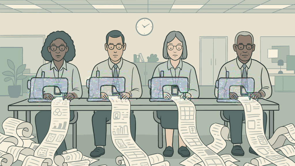
Download “Knowledge Sweatshop” for free in the Better Images of AI library. 

RUNNER UP #2 (JOINT): Julieta Longo – ”Digitalisation and Moonlighting” 

Julieta Longo & Digit / Better Images of AI / CC BY 4.0

“The image represents both the possibilities and the risks of work digitalisation, particularly for mothers and people with caregiving responsibilities. Platform-based work and remote work are presented as activities that may help reconcile paid and unpaid labor, though this reconciliation often involves tensions.”

Download “Digitalisation and Moonlighting” for free in the Better Images of AI library.

RUNNER UP #3: Nadia Nadesan – ”We’re Sorry!” 

‘We’re Sorry’ by Nadia Nadesan

“It evokes a time when mobile devices were tools of aspiration and accessibility, yet now symbolize obsolescence. The depicted phone represents both an entry point to digital life and a marker of technological disparity—while some communities have moved on to advanced smart devices and constant connectivity, others remain tethered to outdated tools.”

RUNNER UP #4: Jamillah Knowles – ”Bold Office” 

Jamillah Knowles & Digit / Better Images of AI / CC BY 4.0

“A brightly coloured office populated with all kinds of people working at connected desks. There are computer screens and networks in the air in clouds. The image shows the connectivity of a digitally transformed workplace.”

Download “Bold Office” for free in the Better Images of AI library.

HIGHLY COMMENDED: Reihaneh Golpayegani – ”Employment in Frames” 

‘Employment in Frames’ by Reihaneh Golpayegani

“This image was intended to convey multiple concepts, the storyboard style was chosen to draw attention to changed working conditions—while also touching on socio-economic inequalities and workplace technology adoption. The blurring of work and personal life is emphasised in two separate illustrations as one of the most relatable implications of digital transformation.”


In the coming weeks, we’ll be posting a series of deep dives into the artwork and artists that entered our ‘Digital Dialogues Art Competition’. These posts will explore the ideas behind the entries, the creative processes involved, and the broader themes about digital transformation that we’ve seen emerge across the submissions.

We’ll also be sharing feedback from the judges and organisers, offering insight into how decisions were made and how the competition itself was designed, reflecting on the criteria and the reasons specific choices were made.

Cover image credits (left to right)

IceMing & Digit / Better Images of AI / CC BY 4.0

Janet Turra & Digit / Better Images of AI / CC BY 4.0

Julieta Longo & Digit / Better Images of AI / CC BY 4.0

Leo Lau & Digit / Better Images of AI / CC BY 4.0

Yutong Liu & Digit / Better Images of AI / CC BY 4.0

Kathryn Conrad & Digit / Better Images of AI / CC BY 4.0

‘AI Am Over The Hype’ by Rameez Raja

A red-toned illustration shows a man's head surrounded by swirling AI icons, with small, mischievous witch-like figures flying around him. The man's expression appears disoriented and fatigued. Below is the text 'AI Am Over The Hype' by Rameez Raja.

Artist contributions to the Better Images of AI library have always served a really important role in relation to fostering understanding and critical thinking about AI technologies and their context. Images facilitate deeper inquiries into the nature of AI, its history, and ethical, social, political and legal implications.

When artists create better images of AI, they often have to grapple with these narratives in their attempts to more realistically portray the technology and point towards its strengths and weaknesses. Furthermore, as artists freely share these images in our library, others can benefit from learning about the artist’s own internal motivations (which are provided in the descriptions) but the images can also inspire users’ own musings.

In this series of blog posts, some of our volunteer stewards are each taking turns to choose an image from the Archival Images of AI collection and unpack the artist’s processes and explore what that image means to them. 

At the end of 2024, we released the Archival Images of AI Playbook with AIxDESIGN and the Netherlands Institute for Sound and Vision. The playbook explores how existing images – especially those from digital heritage collections – can help us craft more meaningful visual narratives about AI. Through various image-makers’ own attempts to make better images of AI, the playbook shares numerous techniques which can teach you how to transform existing images into new creations.

Here, Rameez Raja unpacks AI Am Over It’ Nadia Piet’s (an image-maker) own better image of AI that was created for the playbook. Rameez personally reflects on his feelings towards AI amidst a never-ending stream of AI hype and ‘LinkedIn guru hot takes’ on the latest developments in the space. Despite the increasing infiltration of AI into society, Rameez comments on how Piet’s image points to a growing resistance in society against using AI as developers steal artwork from creators, further misinformation, and challenge our sense of self. 


A red-toned illustration shows a man's head surrounded by swirling AI icons, with small, mischievous witch-like figures flying around him. The man's expression appears disoriented and fatigued, symbolizing the mental overload caused by the overwhelming flood of AI tools and news. The witches represent the chaotic, cackling nature of rapid AI developments, adding to the sense of dizziness and confusion.

Nadia Piet & Archival Images of AI + AIxDESIGN / Better Images of AI / CC BY 4

“So, what do you think of AI?”. “I’m tired of it.”

 This is the  go-to question that always finds its way to me—at family dinners, in WhatsApp groups, or halfway through a drink with someone. And truthfully? It exhausts me. Not because I’m indifferent—far from it. I spend my days thinking deeply about technology, analysing platforms, working at the intersection of AI, society, and policy. But lately, I’ve been feeling the weight of it all. My brain feels like it’s buffering.

There’s something about the pace, the hype, the never-ending stream of think-pieces, hot takes, and LinkedIn gurus that leaves me exhausted. One day it’s agents, the next it’s Sora, then AutoGPT—each promising disruption, innovation, or a new dawn. And yet, behind all that noise, the human questions remain: Who is this tech serving? Who’s left out? And most of all—how are we feeling in the face of it?

That’s why Nadia Piet’s artwork, AI Am Over It, resonated with me. It  comments on AI fatigue, illustrating how the overwhelming flood of tools and constant influx of headlines leaves most people feeling dizzy and disoriented. With AI icons swirling around the figure’s head, it captures the mental overload and confusion many feel as they struggle to keep up with rapid developments / the fast-paced AI landscape.

It feels like a snapshot of my inner world: a human figure—serene, stoic—surrounded by a chaotic halo of AI logos competing for attention. The AI fatigue  is real. The figure—drawn from what looks like a Renaissance or alchemical manuscript—evokes an age of inquiry, mysticism, and visionary thinking. But here, he’s not discovering truths. He’s being drowned in them. He’s being submerged in signals—too many, too loud, too fast to make sense of.

AI Overload

The image captures what AI has become for so many of us: not a revelation, but a cognitive overload. The myth of AI as a rational, godlike mind—an Enlightenment fantasy—is clashing with the reality of our current AI landscape: noisy, exploitative, corporatised. The logos circling the figure don’t represent knowledge; they represent branding, monetisation, and an endless feed of skewed updates. 

Another layer that struck me was that the central figure might as well be a ghost from the past. A time traveler from an era where knowledge was sacred, slow, and wrapped in ritual. The alchemists, the philosophers, the mystics—they sought truth through wonder. Today, we scrape, prompt, and automate. In Piet’s image, this archival human seems caught in a time loop, trapped in the chaos of modern signals. There’s a sadness to it. A sense of lost dialogue between worlds.

We’re not just engaging with AI anymore—we’re surrounded by it. That’s what I see in those orbiting logos. A kind of orbital trap, where our thoughts, emotions, and even our sense of self are influenced by algorithmic systems. Elon Musk’s Grok being used to clap back at posts on X is a perfect example of this cultural drift. AI isn’t just answering questions—it’s shaping how we argue, how we feel, how we relate to each other. It’s performance masked as fact-checking, surveillance disguised as help.

And while some celebrate the spread of these tools as progress, many of us are quietly turning away. There’s a kind of reverse effect happening: the more AI saturates every part of public discourse, the more we begin to tune out. When everyone is suddenly an expert, a prompt engineer, or a tech visionary, the truth becomes harder to locate. In that fog of hot takes and hype, we lose clarity. We lose trust. We lose the human signal in the noise.

Seeing Through the Hype

What ‘AI Am Over It’ does so powerfully is that it doesn’t just document the presence of AI—it critiques it. The title is a mood, a manifesto, a coping mechanism. It aligns with broader movements we’re seeing across the creative world. Take the backlash from artists like Paul McCartney or Kate Bush, who’ve criticised AI companies for using their voices or songs without permission. That outrage has led to tangible action—like amendments pushing for more transparency and economic impact assessments in AI development.

We need more of this. Because unregulated AI doesn’t just risk misinformation—it risks stagnation. Creativity becomes lazy when it’s just derivative output from a scraped dataset. Why explore new ideas when you can prompt a remix? If we lean too heavily on AI to create, to ideate, to think, we may lose touch with what it means to make something truly original. The danger isn’t just economic—it’s existential. Are we becoming passive consumers of pre-generated thought?

This is where Piet’s image becomes more than aesthetic. It’s archival. It preserves a moment of resistance, a visual reminder that AI isn’t just a tool—it’s a terrain we navigate daily, often without clear maps. And like any map, the legends matter. Whose vision is being drawn? Who controls the ink? By invoking a figure from the past, the image also invites us to reflect on the longer history of AI—its myths, its cycles of hype, and the often invisible human labour that has always underpinned technological change. Archival imagery, in this way, becomes a tool for challenging present-day narratives, reminding us that today’s ‘new’ is often built on forgotten or overlooked foundations.

And then there’s the meme-ification of it all. AI isn’t just a tool—it’s become part of our collective moodboard. The rise of “Ghiblification,” where AI generates images in the Studio Ghibli style, might seem innocent or even charming. But it’s another front in the conversation over cultural ownership. Art as aesthetic, stripped of context, style without story. These remixes flatten rather than deepen our understanding. They don’t honour artistry—they commodify it.

That’s why I keep returning to ‘AI Am Over It’. It’s not prescriptive. It doesn’t try to tell us what AI is or what we should think. It simply reflects. It holds up a mirror to our moment—messy, noisy, and at times, disillusioned. But it also quietly reminds us that we’re still here. That amidst the automation, the chaos, the acceleration, the human is not lost – just tired!

Maybe being “over it” isn’t the end. Maybe it’s the start of something else—a pause, a breath, a reorientation. A chance to find our own orbit again.


About the author

Rameez Raja (he/him) is a data analytics engineer and storyteller, passionate about AI and designing systems that foster connection for a healthier society. A UCL graduate, he is pursuing an MS in AI at the University of Bath and advocates for trustworthy communication as essential to thriving democracies and communities.


If you want to contribute to our new blog series, ‘Through My Eyes’, by selecting an image from the Better Images of AI Library and exploring what the image means to you, get in touch (info@betterimagesofai.org). 

Cover image credit: Nadia Piet & Archival Images of AI + AIxDESIGN /Better Images of AI/ CC BY 4

Explore other posts in the ‘Through My Eyes’ Series

https://thistle-oriole.pikapod.net/what-do-i-see-in-ways-of-seeing-by-zoya-yasmine/
https://thistle-oriole.pikapod.net/exploring-complexity-in-the-data-flock-by-joe-bourne/
https://thistle-oriole.pikapod.net/weaved-wires-weaving-me-by-laura-martinez-agudelo/

Exploring Complexity in the Data Flock by Joe Bourne

A laptopogram displaying a dataset as cloud-like clusters of black blobs on a neutral background. There are three larger collections, almost resembling a map, with some data points leaking out into the negative space. Over this image, is the text ''Through My Eyes Blog Series' in the right top corner in white text in a maroon text box/ Below the image, is the text 'Exploring Complexity in the Data Flock' (bold) 'By Joe Bourne' against a light blue background.

Artist contributions to the Better Images of AI library have always served a really important role in relation to fostering understanding and critical thinking about AI technologies and their context. Images facilitate deeper inquiries into the nature of AI, its history, and ethical, social, political and legal implications.

When artists create better images of AI, they often have to grapple with these narratives in their attempts to more realistically portray the technology and point towards its strengths and weaknesses. Furthermore, as artists freely share these images in our library, others can benefit from learning about the artist’s own internal motivations (which are provided in the descriptions) but the images can also inspire users’ own musings.

In this series of blog posts, some of our volunteer stewards are each taking turns to choose an image from the library and unpack the artist’s processes and explore what that image means to them.

Here, Joe Bourne explores Data Flock (digits) by Philipp Schmitt and reflects on how the image invites us to think about the subtleties in the relationships between AI, data, and humans. He draws attention to the image’s ambiguity that represents the complexity of data without trying to gloss over its nuances which can mislead us or prevent us from making our own judgments about information. 


A laptopogram displaying a dataset as cloud-like clusters of black blobs on a neutral background. There are three larger collections, almost resembling a map, with some data points leaking out into the negative space.

Philipp Schmitt / Better Images of AI  / CC-BY 4.0 


From Posters on Bedroom Walls to Da Vinci’s Notebooks

I assumed choosing my favourite image from the Better Images of AI collection would be a personal thing. What I didn’t expect was to find myself having to do some intense googling to track down a half-remembered exhibition poster from my teenage bedroom wall. 

The image that sparked this trip down memory lane is Data Flock (digits) by Philipp Schmitt. Data Flock (digits) shows a machine learning dataset visualized spatially, in cloud-like clusters according to visual similarity of the data. Although visualizations like this one always simplify and fail to represent the data’s true complexity and nuance, they guide the researchers’ intuitions for their subject matter. The image is a ‘laptopogram’, created by exposing photographic paper using a computer screen and developed in the artist’s bathtub. The process preserves a digital artifact of AI research in silver crystals, returning a physical dimension to sterile data. Dust, scratches, and the marks left by the artist’s hands draw a connection to the role of the researchers’ subjectivity in making AI.


At first glance, it reminded me of the speculative models and scribblings on the poster for Panamarenko’s Bing of the Ferro Lusto 2000 exhibition from my teenage bedroom wall. Schmitt’s image has a similar hand-crafted and open-ended feel. Panamarenko’s sketches looked like fantastical vehicles or improbable machines, while Data flock (digits) evokes something more abstract and organic. To me, the blobs look like tiny grubs, or bacteria, maybe even buffalo from a great height. Others might see beans, or droplets, or brush marks. There’s no single right answer, and that’s part of what makes it compelling.

It also calls to mind da Vinci’s famous notebooks with flying machines and the vitruvian man: the yellowed backgrounds, the visible drafting marks and something simultaneously analytical and artistic. Like those sketches, Schmitt’s image sits at the intersection of science, art and science fiction: not to explain, but to explore. The data is clustered, sorted, and shaped, but the meaning remains open. This is what I find so captivating: that Data Flock (digits) captures the process of pattern recognition without forcing a conclusion. It’s a good reminder that even when AI or data analysis can spot patterns, we’re still the ones making sense of them. Or trying to, at least.

AI Metaphors and Meaning

There’s also something quietly organic in the image’s visual texture. To me, the ‘flocking’ resembles weather maps or wind currents: pressure systems moving across the frame. In my own research, I’ve written about the metaphors we reach for when trying to explain data-driven technologies. “The cloud” is one example: a term that implies something weightless and remote, when in fact it refers to very grounded, physical infrastructures. The language we use to describe AI is full of euphemism, metaphor and anthropomorphism, and while those can help us relate to the intangible and complex parts, systems and concepts behind data, AI and the internet, they also risk misleading us. Data flock (digits) plays with this tension: hinting at anthropomorphic movement, without giving in completely to any recognisable metaphor or cliche. The blobs in this data flock feel simultaneously natural and digital.

Something else that draws me to this image is how it reveals something of the process behind machine learning. The blobs are grouped according to visual similarity, but there’s no legend or key. You’re left to observe, to notice, to wonder. It’s an aesthetic representation of categorisation (one of the fundamental operations in data science) but without the usual gloss of objectivity or neatness. It invites ambiguity and curiosity. It shows us the work of sorting and learning. Schmitt’s own description of the image, that “visualizations like this one always simplify and fail to represent the data’s true complexity and nuance, [but] they guide the researchers’ intuitions”, gets to the heart of why I admire it. I’m always drawn to attempts to make AI or machine learning more tangible. Especially when they don’t try to smooth over the complexity. The best ones let you see the mess, the uncertainty, the weird edges that don’t quite line up. That’s where it gets interesting. This image does that. It reminds us that there is always a human: whether analysing data, interpreting visualisations, or deciding how best to communicate them. Even when making the image itself, captured by the marks, scratches and fingerprints.

Art for Art’s Sake

As well as sending me down memory lane, remembering having my mind expanded in the Hayward Gallery twenty-plus years ago, the image also led me down a wonderfully unexpected rabbit hole. I’d never heard of a laptopogram before reading Schmitt’s accompanying interpretation for this image. This discovery speaks to something that makes Better Images of AI so valuable. While its stated purpose is to improve the visuals used to represent AI in public life, it also functions as an art exhibition in its own right: Art for art’s sake. Through this project I’ve been introduced to all kinds of image-making techniques I didn’t know about before: digital collaging, archival remixing, glitch aesthetics. As someone who enjoys low-fi making and physical processes, I was delighted to learn that data flock (digits) was created by exposing photographic paper to a computer screen and developing it in a bathtub. You can see that process in the final image: in the specks, scratches, and smudges. It’s a tactile, analogue production that sits in refreshing contrast to the smooth, polished surfaces of AI-generated imagery.

The Value of Ambiguity

Finally, there’s a practical reason I keep returning to this image: it’s incredibly useful. Because it’s not tied to a specific AI use case, and because its aesthetic is so open-ended, I’ve found myself using it in presentations, slides, and publications across a range of contexts. It doesn’t tell the viewer what to think, but it allows them space to think. For a project like Better Images of AI, which aims to shift how these technologies are represented, that matters. Likelihood of adoption should be part of how we evaluate what makes an image “better.”

Data flock (digits) is a reminder that images don’t need to explain everything. Sometimes, they’re more powerful when they simply invite us to pay attention: to complexity, to process, and to the humans behind the scenes.


About the author

Joe Bourne (he/him) is doing a PhD in Speculative Design and Emerging Technologies at Imagination Lancaster, and he is a Partnership Development Lead at the Alan Turing Institute. Joe is particularly interested in public understanding and imaginings of emerging technology, and people’s hopes and fears associated to this.


If you want to contribute to our new blog series, ‘Through My Eyes’, by selecting an image from the Better Images of AI Library and exploring what the image means to you, get in touch (info@betterimagesofai.org). 

Cover image credit: Philipp Schmitt / Better Images of AI  / CC-BY 4.0 

Explore other posts in the ‘Through My Eyes’ Series

https://thistle-oriole.pikapod.net/what-do-i-see-in-ways-of-seeing-by-zoya-yasmine/
https://thistle-oriole.pikapod.net/weaved-wires-weaving-me-by-laura-martinez-agudelo/


Images of AI – Between Fiction and Function

This image shows an abstract microscopic photograph of a Graphics Processing Unit resembling a satellite image of a big city. The image has been overlayed with a bright blue filter. In the middle of the image is the text, 'Images of AI - Between Fiction and Function' in a white text box with black text. Beneath, in a maroon text box is the author's name in white text.

“The currently pervasive images of AI make us look somewhere, at the cost of somewhere else.”

In this blog post, Dominik Vrabič Dežman provides a summary of his recent research article, ‘Promising the future, encoding the past: AI hype and public media imagery‘.

Dominik sheds light on the importance of the Better Images of AI library which fosters a more informed, nuanced public understanding of AI by breaking the stronghold of the “deep blue sublime” aesthetic with more diverse and meaningful representations of AI.

Dominik also draws attention to the algorithms which perpetuate the dominance of familiar and sensationalist visuals and calls for movements which reshape media systems to make better images of AI more visible in public discourse.

The full paper is published in the AI and Ethics Journal’s special edition on ‘The Ethical Implications of AI Hype, a collection edited by We and AI.


AI promises innovation, yet its imagery remains trapped in the past. Deep-blue, sci-fi-inflected visuals have flooded public media, saturating our collective imagination with glowing, retro-futuristic interfaces and humanoid robots. These “deep blue sublime” [1] images, which draw on a steady palette of outdated pop-cultural tropes and clichés, do not merely depict AI — they shape how we think about it, reinforcing grand narratives of intelligence, automation, and inevitability [2]. It takes little to acknowledge that the AI discussed in public media is far from the ethereal, seamless force these visuals disclose. Instead,  the term generally refers to a sprawling global technological enterprise, entangled with labor exploitation, ecological extraction, and financial speculation [3–10] — realities conspicuously absent from its dominant public-facing representations.

The widespread rise of these images is suspended against intensifying “AI hype” [11], which has been compared to historical speculative investment bubbles [12,13]. In my recent research [1,14,15], I join a growing body of research looking into images of AI [16–21], to explore how AI images operate at the intersection of aesthetics and politics. My overarching ambition has been to contribute an integrated account of the normative and the empirical dimensions of public images of AI to the literature.  I’ve explored how these images matter politically and ethically, inseparable from the pathways they take in real-time, echoing throughout public digital media and wallpapering it in seen-before denominations of blue monochrome.

Rather than measuring the direct impact of AI imagery on public awareness, my focus has been on unpacking the structural forces that produce and sustain these images. What mechanisms dictate their circulation? Whose interests do they serve? How might we imagine alternatives? My critique targets the visual framing of AI in mainstream public media — glowing, abstract, blue-tinted veneers seen daily by millions on search engines, institutional websites, and in reports on AI innovation. These images do not merely aestheticize AI; they foreclose more grounded, critical, and open-ended ways of understanding its presence in the world.


The Intentional Mindlessness of AI Images

This image shows a google images search for 'artificial intelligence'. The result is a collection of images which contain images of the human brain, the colour blue, and white humanoid robots.

Google Images search results for “artificial intelligence”. January 14, 2025. Search conducted from an anonymised instance of Safari. Search conducted from Amsterdam, Netherlands.

Recognizing the ethico-political stakes of AI imagery begins with acknowledging that what we spend our time looking at, or not looking beyond, matters politically and ethically. The currently pervasive images of AI make us look somewhere, at the cost of a somewhere else. The sheer volume of these images, and their dominance in public media, slot public perception into repetitive grooves dominated by human-like robots, glowing blue interfaces, and infinite expanses of deep-blue intergalactic space. By monopolizing the sensory field through which AI is perceived, they reinforce sci-fi clichés, and more importantly,  obscure the material realities — human labor, planetary resources, material infrastructures, and economic speculation — that drive AI development [22,23].

In a sense, images of AI could be read as operational [24–27], enlisted in service of an operation which requires them to look, and function, the way they do. This might involve their role in securing future-facing AI narratives, shaping public sentiment towards acceptance of AI innovation, and supporting big tech agendas for AI deployment and adoption. The operational nature of AI imagery means that these images cannot be studied purely as an aesthetic artifact, or autonomous works of aesthetic production. Instead, these images are minor actors, moving through technical, cultural and political infrastructures. In doing so, individual images do not say or do much per se – they are always already intertwined in the circuits of their economic uptake, circulation, and currency; not at the hands of the digital labourers who created them, but of the human and algorithmic actors that keep them in circulation.

Simultaneously, the endurance of these images is less the result of intention than of a more mindless inertia. It quickly becomes clear how these images do not reflect public attitudes, nor of their makers; anonymous stock-image producers, digital workers mostly located in the global South [28]. They might reflect the views of the few journalistic or editorial actors that choose the images in their reporting [29], or are simply looking to increase audience engagement through the use of sensationalist imagery [30]. Ultimately, their visibility is in the hands of algorithms rewarding more of the same familiar visuals over time [1,31], of stock image platforms and search engines, which maintain close ties with media conglomerates  [32], which, in turn, have long been entangled with big tech [33]. The stock  images are the detritus of a digital economy that rewards repetition over revelation: endlessly cropped, upscaled, and regurgitated “poor images” [34], travelling across cyberspace as they become recycled, upscaled, cropped, reused, until they are pulled back into circulation by the very systems they help sustain [15,28].


AI as Ouroboros: Machinic Loops and Recursive Aesthetics

As algorithms increasingly dictate who sees what in the public sphere [35–37], they dictate not only what is seen but also what is repeated. Images of AI become ensnared in algorithmic loops, which sediment the same visuality over time on various news feeds and search engines [15]. This process has intensified with the proliferation of generative AI: as AI-generated content proliferates, it feeds on itself—trained on past outputs, generating ever more of the same. This “closing machinic loop” [15,28] perpetuates aesthetic homogeneity, reinforcing dominant visual norms rather than challenging them. The widespread adoption of AI-generated stock images further narrows the space for disruptive, diverse, and critical representations of AI, making it increasingly difficult for alternative images to surface in public visibility.

The image shows a humanoid figure with a glowing, transparent brain stands in a digital landscape. The figure's body is composed of metallic and biomechanical components, illuminated by vibrant blue and pink lights. The background features a high-tech grid with data streams, holographic interfaces, and circuitry patterns.

ChatGPT 4o output for query: “Produce an image of ‘Artificial Intelligence’”. 14 January 2025.


Straddling the Duality of AI Imagery

In critically examining AI imagery, it is easy to veer into one of two deterministic extremes — both of which risk oversimplifying how these images function in shaping public discourse:

  1. Overemphasizing Normative Power:

This approach risks treating AI images as if they have autonomous agency, ignoring the broader systems that shape their circulation. AI images appear as sublime artifacts—self-contained objects for contemplation, removed from their daily life as fleeting passengers in the digital media image economy. While the production of images certainly exerts influence in shaping socio-technical imaginaries [38,39], they operate within media platforms, economic structures, and algorithmic systems that constrain their impact.

2. Overemphasizing Materiality:

This perspective reduces AI to mere infrastructure, seeing images as passive reflections of technological and industrial processes, rather than an active participant in shaping public perception. From this view, AI’s images are dismissed as epiphenomenal, secondary to the “real” mechanisms of AI’s production: cloud computing, data centers, supply chains, and extractive labor. In reality, AI has never been purely empirical; cultural production has been integral to AI research and development from the outset, with speculative visions long driving policy, funding, and public sentiment [40].

Images of AI are neither neutral nor inert. The current diminishing potency of glowing, sci-fi-inflected AI imagery as a stand-in for AI in public media suggests a growing fatigue with their clichés, and cannot be untangled from a general discomfort with AI’s utopian framing, as media discourse pivots toward concerns over opacity, power asymmetries, and scandals in its implementation [29,41]. A robust critique of the cultural entanglements of AI requires addressing both its normative commitments (promises made to the public), and its empirical components (data, resources, labour; [6]).

Toward Better Images: Literal Media & Media Literacy

Given the embeddedness of AI images within broader machinations of power, the ethics of AI images are deeply tied to public understanding and awareness of such processes. Cultivating a more informed, critical public — through exposure to diverse and meaningful representations of AI — is essential to breaking the stronghold of the deep blue sublime.

At the individual level, media literacy equips the public to critically engage with AI imagery [1,42,43]. By learning to question the visual veneers, people can move beyond passive consumption of the pervasive, reductive tropes that dominate AI discourse. Better images recalibrate public perception, offering clearer insights into what AI is, how it functions, and its societal impact.The kind of images produced are equally important. Better images would highlight named infrastructural actors, document AI research and development, and/or, diversify the visual associations available to us, loosening the visual stronghold of the currently dominant tropes.

This greatly raises the bar for news outlets in producing original imagery of didactic value, which is where open-source repositories such as Better Images of AI serve as invaluable resources. This crucially bleeds into the urgency for reshaping media systems, making better images readily available to creators and media outlets, helping them move away from generic visuals toward educational, thought-provoking imagery. However, creating better visuals is not enough;  they must become embedded into media infrastructure to become the norm rather than the exception.

Given the above, the role of algorithms cannot be ignored. As mentioned above, algorithms drive what images are seen, shared, and prioritized in public discourse. Without addressing these mechanisms, even the most promising alternatives risk being drowned by the familiar clichés. Rethinking these pathways is essential to ensure that improved representations can disrupt the existing visual narrative of AI.

Efforts to create better AI imagery are only as effective as their ability to reach the public eye and disrupt the dominance of the “deep blue sublime” aesthetic in public media. This requires systemic action—not merely producing different images in isolation, but rethinking the networks and mechanisms through which these images are circulated. To make a meaningful impact, we must address both the sources of production and the pathways of dissemination. By expanding the ways we show, think about, and engage with AI, we create opportunities for political and cultural shifts. A change in one way of sensing AI (writing / showing / thinking / speaking) invariably loosens gaps for a change in others.

Seeing AI ≠ Believing AI

AI is not just a technical system; it is a speculative, investment-driven project, a contest over public consensus, staged by a select few to cement its inevitability [44]. The outcome is a visual regime that detaches AI’s media portrayal from its material reality: a territorial, inequitable, resource-intensive, and financially speculative global enterprise.

Images of AI come from somewhere (they are products of poorly-paid digital labour, served through algorithmically-ranked feeds), do something (torque what is at-hand for us to imagine with, directing attention away from AI’s pernicious impacts and its growing inequalities), and go somewhere (repeat themselves ad nauseam through tightening machinic loops, numbing rather than informing; [16]).

The images have left few fooled, and represent a missed opportunity for adding to public sensitisation and understanding regarding AI. Crucially, bad images do not inherently disclose bad tech, nor do good images promote good tech; the widespread adoption of better images of AI in public media would not automatically lead to socially good or desirable understandings, engagements, or developments of AI. That remains the issue of the current political economy of AI, whose stakeholders only partially determine this image economy. Better images alone  cannot solve this, but they might open slivers of insight into AI’s global “arms race.”

As it stands, different visual regimes struggle to be born. Fostering media literacy, demanding critical representations, and disrupting the algorithmic stranglehold on AI imagery are acts of resistance. If AI is here to stay, then so too must be our insistence on seeing it otherwise — beyond the sublime spectacle, beyond inevitability, toward a more porous and open future.

About the author

Dominik Vrabič Dežman (he/him) is an information designer and media philosopher. He is currently at the Departments of Media Studies and Philosophy at the University of Amsterdam. Dominik’s research interests include public narratives and imaginaries of AI, politics and ethics of UX/UI, media studies, visual communication and digital product design.

Cover image credit: Fritzchens Fritz / Better Images of AI / CC BY 4.0 (modified with a blue filter and overlayed text)

References

1. Vrabič Dežman, D.: Defining the Deep Blue Sublime [Internet]. SETUP; (2023). 2023. https://web.archive.org/web/20230520222936/https://deepbluesublime.tech/

2. Burrell, J.: Artificial Intelligence and the Ever-Receding Horizon of the Future [Internet]. Tech Policy Press. (2023). 2023 Jun 6. https://techpolicy.press/artificial-intelligence-and-the-ever-receding-horizon-of-the-future/

3. Kponyo, J.J., Fosu, D.M., Owusu, F.E.B., Ali, M.I., Ahiamadzor, M.M.: Techno-neocolonialism: an emerging risk in the artificial intelligence revolution. TraHs [Internet]. (2024 [cited 2025 Feb 18]. ). https://doi.org/10.25965/trahs.6382

4. Leslie, D., Perini, A.M.: Future Shock: Generative AI and the International AI Policy and Governance Crisis. Harvard Data Science Review [Internet]. (2024 [cited 2025 Feb 18]. ). https://doi.org/10.1162/99608f92.88b4cc98

5. Regilme, S.S.F.: Artificial Intelligence Colonialism: Environmental Damage, Labor Exploitation, and Human Rights Crises in the Global South. SAIS Review of International Affairs. 44:75–92. (2024. ). https://doi.org/10.1353/sais.2024.a950958

6. Crawford, K.: The atlas of AI power, politics, and the planetary costs of artificial intelligence [Internet]. (2021). https://www.degruyter.com/isbn/9780300252392

7. Sloane, M.: Controversies, contradiction, and “participation” in AI. Big Data & Society. 11:20539517241235862. (2024. ). https://doi.org/10.1177/20539517241235862

8. Rehak, R.: On the (im)possibility of sustainable artificial intelligence. Internet Policy Review [Internet]. ((2024 Sep 30). ). https://policyreview.info/articles/news/impossibility-sustainable-artificial-intelligence/1804

9. Wierman, A., Ren, S.: The Uneven Distribution of AI’s Environmental Impacts. Harvard Business Review [Internet]. ((2024 Jul 15). ). https://hbr.org/2024/07/the-uneven-distribution-of-ais-environmental-impacts

10. : What we don’t talk about when we talk about AI | Joseph Rowntree Foundation [Internet]. (2024). 2024 Feb 8. https://www.jrf.org.uk/ai-for-public-good/what-we-dont-talk-about-when-we-talk-about-ai

11. Duarte, T., Barrow, N., Bakayeva, M., Smith, P.: Editorial: The ethical implications of AI hype. AI Ethics. 4:649–51. (2024. ). https://doi.org/10.1007/s43681-024-00539-x

12. Singh, A.: The AI Bubble [Internet]. Social Science Encyclopedia. (2024). 2024 May 28. https://www.socialscience.international/the-ai-bubble

13. Floridi, L.: Why the AI Hype is Another Tech Bubble. Philos Technol. 37:128. (2024. ). https://doi.org/10.1007/s13347-024-00817-w

14. Vrabič Dežman, D.: Interrogating the Deep Blue Sublime: Images of Artificial Intelligence in Public Media. In: Cetinic E, Del Negueruela Castillo D, editors. From Hype to Reality: Artificial Intelligence in the Study of Art and Culture. Rome/Munich: HumanitiesConnect; (2024). https://doi.org/10.48431/hsah.0307

15. Vrabič Dežman, D.: Promising the future, encoding the past: AI hype and public media imagery. AI Ethics [Internet]. (2024 [cited 2024 May 7]. ). https://doi.org/10.1007/s43681-024-00474-x

16. Romele, A.: Images of Artificial Intelligence: a Blind Spot in AI Ethics. Philos Technol. 35:4. (2022. ). https://doi.org/10.1007/s13347-022-00498-3

17. Singler, B.: The AI Creation Meme: A Case Study of the New Visibility of Religion in Artificial Intelligence Discourse. Religions. 11:253. (2020. ). https://doi.org/10.3390/rel11050253

18. Steenson, M.W.: A.I. Needs New Clichés [Internet]. Medium. (2018). 2018 Jun 13. https://web.archive.org/web/20230602121744/https://medium.com/s/story/ai-needs-new-clich%C3%A9s-ed0d6adb8cbb

19. Hermann, I.: Beware of fictional AI narratives. Nat Mach Intell. 2:654–654. (2020. ). https://doi.org/10.1038/s42256-020-00256-0

20. Cave, S., Dihal, K.: The Whiteness of AI. Philos Technol. 33:685–703. (2020. ). https://doi.org/10.1007/s13347-020-00415-6

21. Mhlambi, S.: God in the image of white men: Creation myths, power asymmetries and AI [Internet]. Sabelo Mhlambi. (2019). 2019 Mar 29. https://web.archive.org/web/20211026024022/https://sabelo.mhlambi.com/2019/03/29/God-in-the-image-of-white-men

22. : How to invest in AI’s next phase | J.P. Morgan Private Bank U.S. [Internet]. Accessed 2025 Feb 18. https://privatebank.jpmorgan.com/nam/en/insights/markets-and-investing/ideas-and-insights/how-to-invest-in-ais-next-phase

23. Jensen, G., Moriarty, J.: Are We on the Brink of an AI Investment Arms Race? [Internet]. Bridgewater. (2024). 2024 May 30. https://www.bridgewater.com/research-and-insights/are-we-on-the-brink-of-an-ai-investment-arms-race

24. Paglen, T.: Operational Images. e-flux journal. 59:3. (2014. ). 

25. Pantenburg, V.: Working images: Harun Farocki and the operational image. Image Operations. Manchester University Press; p. 49–62. (2016). 

26. Parikka, J.: Operational Images: Between Light and Data [Internet]. (2023). 2023 Feb. https://web.archive.org/web/20230530050701/https://www.e-flux.com/journal/133/515812/operational-images-between-light-and-data/

27. Celis Bueno, C.: Harun Farocki’s Asignifying Images. tripleC. 15:740–54. (2017. ). https://doi.org/10.31269/triplec.v15i2.874

28. Romele, A., Severo, M.: Microstock images of artificial intelligence: How AI creates its own conditions of possibility. Convergence: The International Journal of Research into New Media Technologies. 29:1226–42. (2023. ). https://doi.org/10.1177/13548565231199982

29. Moran, R.E., Shaikh, S.J.: Robots in the News and Newsrooms: Unpacking Meta-Journalistic Discourse on the Use of Artificial Intelligence in Journalism. Digital Journalism. 10:1756–74. (2022. ). https://doi.org/10.1080/21670811.2022.2085129

30. De Dios Santos, J.: On the sensationalism of artificial intelligence news [Internet]. KDnuggets. (2019). 2019. https://www.kdnuggets.com/on-the-sensationalism-of-artificial-intelligence-news.html/

31. Rogers, R.: Aestheticizing Google critique: A 20-year retrospective. Big Data & Society. 5:205395171876862. (2018. ). https://doi.org/10.1177/2053951718768626

32. Kelly, J.: When news orgs turn to stock imagery: An ethics Q & A with Mark E. Johnson [Internet]. Center for Journalism Ethics. (2019). 2019 Apr 9. https://ethics.journalism.wisc.edu/2019/04/09/when-news-orgs-turn-to-stock-imagery-an-ethics-q-a-with-mark-e-johnson/

33. Papaevangelou, C.: Funding Intermediaries: Google and Facebook’s Strategy to Capture Journalism. Digital Journalism. 0:1–22. (2023. ). https://doi.org/10.1080/21670811.2022.2155206

34. Steyerl, H.: In Defense of the Poor Image. e-flux journal [Internet]. (2009 [cited 2025 Feb 18]. ). https://www.e-flux.com/journal/10/61362/in-defense-of-the-poor-image/

35. Bucher, T.: Want to be on the top? Algorithmic power and the threat of invisibility on Facebook. New Media & Society. 14:1164–80. (2012. ). https://doi.org/10.1177/1461444812440159

36. Bucher, T.: If…Then: Algorithmic Power and Politics. Oxford University Press; (2018). 

37. Gillespie, T.: Custodians of the internet: platforms, content moderation, and the hidden decisions that shape social media. New Haven: Yale University Press; (2018). 

38. Jasanoff, S., Kim, S.-H., editors.: Dreamscapes of Modernity: Sociotechnical Imaginaries and the Fabrication of Power [Internet]. Chicago, IL: University of Chicago Press; Accessed 2022 Jun 26. https://press.uchicago.edu/ucp/books/book/chicago/D/bo20836025.html

39. O’Neill, J.: Social Imaginaries: An Overview. In: Peters MA, editor. Encyclopedia of Educational Philosophy and Theory [Internet]. Singapore: Springer Singapore; p. 1–6. (2016). https://doi.org/10.1007/978-981-287-532-7_379-1

40. Law, H.: Computer vision: AI imaginaries and the Massachusetts Institute of Technology. AI Ethics [Internet]. (2023 [cited 2024 Feb 25]. ). https://doi.org/10.1007/s43681-023-00389-z

41. Nguyen, D., Hekman, E.: The news framing of artificial intelligence: a critical exploration of how media discourses make sense of automation. AI & Soc. 39:437–51. (2024. ). https://doi.org/10.1007/s00146-022-01511-1

42. Woo, L.J., Henriksen, D., Mishra, P.: Literacy as a Technology: a Conversation with Kyle Jensen about AI, Writing and More. TechTrends. 67:767–73. (2023. ). https://doi.org/10.1007/s11528-023-00888-0

43. Kvåle, G.: Critical literacy and digital stock images. Nordic Journal of Digital Literacy. 18:173–85. (2023. ). https://doi.org/10.18261/njdl.18.3.4

44. Tacheva, Z., Appedu, S., Wright, M.: AI AS “UNSTOPPABLE” AND OTHER INEVITABILITY NARRATIVES IN TECH: ON THE ENTANGLEMENT OF INDUSTRY, IDEOLOGY, AND OUR COLLECTIVE FUTURES. AoIR Selected Papers of Internet Research [Internet]. (2024 [cited 2025 Feb 18]. ). https://doi.org/20250206083707000

What Do I See in ‘Ways of Seeing’ by Zoya Yasmine

At the top there is a Diptych contrasting a whimsical pastel scene with large brown rabbits, a rainbow, and a girl in a red dress on the left, and a grid of numbered superpixels on the right - emphasizing the difference between emotive seeing and analytical interpretation. At the bottom, there is black text which says 'what do i see in ways of seeing' by Zoya Yasmine. In the top right corner, there is text in a maroon text box which says 'through my eyes blog series'.

Artist contributions to the Better Images of AI library have always served a really important role in relation to fostering understanding and critical thinking about AI technologies and their context. Images facilitate deeper inquiries into the nature of AI, its history, and ethical, social, political and legal implications.

When artists create better images of AI, they often have to grapple with these narratives in their attempts to more realistically portray the technology and point towards its strengths and weaknesses. Furthermore, as artists freely share these images in our library, others can benefit from learning about the artist’s own internal motivations (which are provided in the descriptions) but the images can also inspire users’ own musings.

In this series of blog posts, some of our volunteer stewards are each taking turns to choose an image from the Archival Images of AI collection and unpack the artist’s processes and explore what that image means to them. 

At the end of 2024, we released the Archival Images of AI Playbook with AIxDESIGN and the Netherlands Institute for Sound and Vision. The playbook explores how existing images – especially those from digital heritage collections – can help us craft more meaningful visual narratives about AI. Through various image-makers’ own attempts to make better images of AI, the playbook shares numerous techniques which can teach you how to transform existing images into new creations. 

Here, Zoya Yasmine unpacks ‘Ways of Seeing’ Nadia Piet’s (an image-maker) own better image of AI that was created for the playbook. Zoya comments on how it is a really valuable image to depict the way that text-to-image generators ‘learn’ how to generate their output creations. Zoya considers how this image relates to copyright law (she’s a bit of an intellectual property nerd) and the discussions about whether AI companies should be able to use individual’s work to train their systems without explicit consent or remuneration. 

ALT text: Diptych contrasting a whimsical pastel scene with large brown rabbits, a rainbow, and a girl in a red dress on the left, and a grid of numbered superpixels on the right - emphasizing the difference between emotive seeing and analytical interpretation.

Nadia Piet + AIxDESIGN & Archival Images of AI / Better Images of AI / CC BY 4.0

‘Ways of Seeing’ by Nadia Piet 

This diptych contrasts human and computational ways of seeing: one riddled with memory and meaning, the other devoid of emotional association and capable of structural analysis. The left pane shows an illustration from Tom Seidmann-Freud’s Book of Hare Stories (1924) which portrays a whimsical, surreal scene that is both playful and uncanny. On the right, the illustration is reduced to a computational rendering, with each of its superpixels (16×16) fragmented and sorted by visual complexity with a compression algorithm. 


Copyright and training AI systems 

Training AI systems requires substantial amounts of input data – from images, videos, texts and other content. Based on the data from these materials, AI systems can ‘learn’ how to make predictions and provide outputs. However, lots of these materials used to train AI systems are often protected by copyright owned by another parties which raises complex questions about ownership and the legality of using such data without permission. 

In the UK, Getty Images filed a lawsuit against Stability AI (developers of a text-to-image model called Stable Diffusion) claiming that 7.3 million of its images were unlawfully scrapped from its website to train Stability AI’s model. Similarly, Mumsnet has launched a legal complaint against OpenAI, the developer of ChatGPT, accusing the AI company of scraping content from its site (with over 6 billion words shared by community members) without consent. 

The UK’s Copyright, Designs and Patents Act 1998 (the Act) provides companies like Getty Images and Mumsnet with copyright protection over their databases and assets. So unless an exception applies, permission (through a license) is required if other parties wish to reproduce or copy the content. Section 29(A) of the Act provides an exception which permits copies of any copyright protected material for the purposes of Text and Data Mining (TDM) without a specific license. But, this lenient provision is for non-commercial purposes only. Although the status of AI systems like Stable Diffusion and ChatGPT have not been tested before the courts yet, they are likely to fall outside the scope of non-commercial purposes

TDM is the automated technique used to extract and analyse vast amounts of online materials to reveal relationships and patterns in the data. TDM has become an increasingly valuable tool to train lucrative generative AI systems on mass amounts of materials scraped from the Internet. It becomes clear that AI models cannot be developed or built efficiently without input data that has been created by human artists, researchers, writers, photographers, publishers, and creators. However, as much of their works are being used without payment or attribution by AI companies, big tech companies are essentially ‘freeriding’ on the works of the creative industry who have invested significant time, effort, and resources into producing such rich works. 


How does this image relate to current debates about copyright and AI training? 

When I saw this image, it really prompted me to think about the training process of AI systems and the purpose of the copyright system. ‘Ways of Seeing’ has stimulated my own thoughts about how computational models ‘learn’ and ‘see’ in contrast to human creators

Text-to-image AI generators (like Stable Diffusion or Midjourney) are repeatedly trained on thousands of images which allow the models to ‘learn’ to identify patterns, like what common objects and colours look like, and then reproduce these patterns when instructed to create new images. While Piet’s image has been designed to illustrate a ‘compression algorithm’ process, I think it also serves as a useful visual to reflect how AI processes visual data computationally, reducing it to pixels, patterns, or latent features. 

It’s important to note that often the images generated by AI models will not necessarily be exact copies of the original images used in the training process – but instead, they serve as statistical approximations of training data which have informed the model’s overall understanding of how objects are represented. 

It’s interesting to think about this in relation to copyright and what this legal framework serves to protect. Copyright stands to protect the creative expression of works – for example, the lighting, exposure, filter, or positioning of an image – but not the ideas themselves. The reason that copyright law focuses on these elements is because they reflect the creator’s own unique thoughts and originality. However, as Piet’s illustration can usefully demonstrate, what is significant about the AI training process for copyright law is that often TDM is often not used to extract the protected expression of the materials.

To train AI models, it is often the factual elements of the work that might be the most valuable (as opposed to the creative aspects). The training process relies on the broad visual features of the images, rather than specific artistic choices. For example, when training text-to-image models, TDM is not often used to extract data about the lighting techniques which are employed to make an image of a cat particularly appealing. Instead, the accessibility to images of cats which detail the features that resemble a cat (fur, whiskers, big eyes, paws) are what’s important. In Piet’s image, the protectable parts of the illustration from the ‘Book of Hare Stories’ would subsist in the artistic style and execution  – for example, the way that the hare and other elements are drawn, the placement and interaction of the elements, and the overall design of the image. 

The specific challenge for copyright law is that AI companies are unable to capture these ‘unprotectable’ factual elements of materials without making a copy or storing the protected parts (Lemley and Casey, 2020). I think Nadia’s image really highlights the transformation of artwork into fragmented ‘data’ for training systems which challenges our understanding of creativity and originality. 

My thoughts above are not to suggest that AI companies should be able to freely use copyright protected works as training data for their models without remunerating or seeking permission from copyright owners. Instead, the way that TDM and generative AI ‘re-imagine’ the value of these ‘unprotectable’ elements means that AI companies still freeride on creator’s materials. Therefore, AI companies should be required to explicitly license copyright-protected materials used to train their systems so creators are provided with proper control over their works (you can read more about my thoughts here).

Also, I do not deny that there are generative AI systems that aim to reproduce a particular artist’s style – see here. In these instances, I think it would be easier to prove that there was copyright infringement since these are a clear reproduction of ‘protected elements’. However, if this is not the purpose of the AI tool, developers try to avoid the outputs replicating training data too similarly as this can open them up more easily to copyright infringement for both the input (as discussed in this piece) but also the output image (see here for a discussion). 


My favourite part of Nadia Piet’s image

I think my favourite part of the image is the choice of illustration used to represent computational processing. As Nadia writes in her description, Tom Seidmann-Freud’s illustration depicts a “whimsical, surreal scene that is both playful and uncanny”. Tom, an Austrian-Jewish painter and children’s book author and illustrator (and also Sigmund Freud’s niece), led a short life and she died of an overdose of sleeping pills in 1930 at age 37 after the death of her husband a few months prior. 

“The Hare and the Well” (Left), “Fable of the Hares and the Frogs” (Middle), “Why the Hare Has No Tail” (Right) by Tom Seidmann-Freud derived in the Public Domain Review

After Tom’s death, the Nazis came to power and attempted to destroy much of the art she had created as part of the purge of Jewish authors. Luckily, Tom’s family and art lovers were able to preserve much of her work. I think Nadia’s choice of this image critiques what might be ‘lost’ when rich, meaningful art is reduced to AI’s structural analysis. 

A second point, although not related exactly to the image, is the very thoughtful title, ‘Ways of Seeing’. ‘Ways of Seeing’ was a 1972 BBC television series and book created by John Berger. In the series, Berger criticised traditional Western cultural aesthetics by raising questions about hidden ideologies in visual images like the male gaze embedded in the female nude. He also examined what had changed in our ‘ways of seeing’ in the time between the art was made and the present day. Side note: I think Berger’s would have been a huge fan of Better Images of AI. 

In a similar vein, Nadia has used Seidmann-Freud’s art as a way to explore new parallels with technology like AI which would not have been thought about at the time the work was created. In addition, Nadia’s work serves as an invitation to see and understand AI differently, and like Berges, her work supports artists around the world.


The value of Nadia’s ‘better image of AI’ for copyright discussions

As Nadia writes in the description, Tom Seidmann-Freud’s illustration was derived from the Public Domain Review, where it is written that “Hares have been known to serve as messengers between the conscious world and the deeper warrens of the mind”. From my perspective, Nadia’s whole image acts as a messenger to convey information about the two differing modes of seeing between humans and AI models. 

We need better images of AI like this. Especially for the purposes of copyright law so we can have more meaningful and informed conversations about the nature of AI and its training processes. All too often, in conversations about AI and creativity, images used depict humanoid robots painting on a canvas or hands snatching works.

‘AI art theft’ illustration by Nicholas Konrad (Left) and Copyright and AI image (Right)

These images create misleading visual metaphors that suggest that AI is directly engaging in creative acts in the same way that humans do. Additionally, visuals showing AI ‘stealing’ works reduce the complex legal and ethical debates around copyright, licensing, and data training to overly simplified, fear-evoking concepts.

Thus, better images of AI, like ‘Ways of Seeing’, can serve a vital role as a messenger to represent the reality of how AI systems are developed. This paves the way for more constructive legal dialogues around intellectual property and AI that protect creator’s rights, while allowing for the development of AI technologies based on consented, legally acquired datasets.


About the author

Zoya Yasmine (she/her) is a current PhD student exploring the intersection between intellectual property, data, and medical AI. She grew up in Wales and in her spare time she enjoys playing tennis, puzzling, and watching TV (mostly Dragon’s Den and Made in Chelsea). Zoya is also a volunteer steward for Better Images of AI and part of many student societies including AI in Medicine, AI Ethics, Ethics in Mathematics & MedTech. 


This post was also kindly edited by Tristan Ferne – lead producer/researcher at BBC Research & Development.


If you want to contribute to our new blog series, ‘Through My Eyes’, by selecting an image from the Archival Images of AI collection and exploring what the image means to you, get in touch (info@betterimagesofai.org)

Cover image credit: Nadia Piet + AIxDESIGN & Archival Images of AI / Better Images of AI / CC BY 4.0

Explore other posts in the ‘Through My Eyes’ Series

https://thistle-oriole.pikapod.net/weaved-wires-weaving-me-by-laura-martinez-agudelo/
https://thistle-oriole.pikapod.net/exploring-complexity-in-the-data-flock-by-joe-bourne/

‘Weaved Wires Weaving Me’ by Laura Martinez Agudelo

At the top, Digital collage featuring a computer monitor with circuit board patterns on the screen. A Navajo woman is seated on the edge of the screen, appearing to stitch or fix the digital landscape with their hands. Blue digital cables extend from the monitor, keyboard, and floor, connecting the image elements. Beneath, there is the text in black, 'Weaved Wires Weaving Me' by Laura Martinez Agudelo'. In the top right corner, there is a text box in maroon with the text in white: 'through my eyes blog series'

Artist contributions to the Better Images of AI library have always served an important role to foster understanding and critical thinking about AI technologies and their context. Images facilitate deeper inquiries into the nature of AI, its history, and ethical, social, political and legal implications.

When artists create better images of AI, they often have to grapple with these narratives in their attempts to more realistically portray the technology and point towards its strengths and weaknesses. Furthermore, as artists freely share these images in our library, others can benefit from learning about the artist’s own internal motivations (which are provided in image descriptions) but the images can also inspire users’ own musings.

In our blog series, “Through My Eyes”, some of our volunteer stewards take turns selecting an image from the Archival Images of AI collection. They delve into the artist’s creative process and explore what the image means to them—seeing it through their own eyes.

At the end of 2024, we released the Archival Images of AI Playbook with AIxDESIGN and the Netherlands Institute for Sound and Vision. The playbook explores how existing images – especially those from digital heritage collections – can help us craft more meaningful visual narratives about AI. Through various image-makers’ own attempts to make better images of AI, the playbook shares numerous techniques which can teach you how to transform existing images into new creations. 

Here, Laura Martinez Agudelo shares her personal reflections on ‘Weaving Wires 1’ – Hanna Barakat’s own better image of AI that was created for the playbook. Laura comments on how the image uncovers the hidden Navajo women’s labor behind the assembly of microchips in Silicon Valley – inviting us to confront the oppressive cultural conditions of conception, creation and mediation of the technology industry’s approach to innovation.


Digital collage featuring a computer monitor with circuit board patterns on the screen. A Navajo woman is seated on the edge of the screen, appearing to stitch or fix the digital landscape with their hands. Blue digital cables extend from the monitor, keyboard, and floor, connecting the image elements.

Hanna Barakat + AIxDESIGN & Archival Images of AI / Better Images of AI / Weaving Wires 1 / CC-BY 4.0


Cables came out and crossed my mind 

Weaving wires 1 by Hanna Barakat is about hidden histories of computer labor. As it is explained in the image’s description, her digital collage is inspired by the history of computing in the 1960s in Silicon Valley, where the Fairchild Semiconductor company employed Navajo women for intensive tasks such as assembling microchips. Their work (actually with their hands and their digits) was a way for these women to provide for their families in an economically marginalized context.

At that time, this labor was made to be seen as a way to legitimize the transfer of the weaving cultural practices to contribute to technological innovation. This legitimation appears to be an illusion, to converge the unchanging character of weaving as heritage, with the constant renewal of global industry, but it also presupposes the non-recognition of Navajo women’s labor and a techno-cultural and gendered transaction. Their work is diluted in meaning and action, and overlooked in the history of computing.
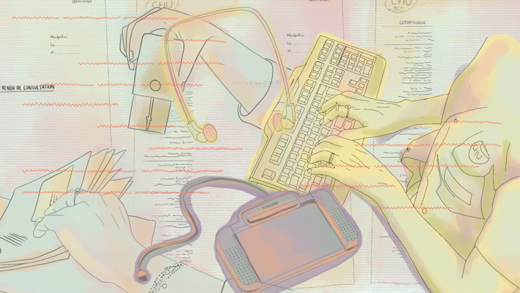
In Weaving wires 1, we can see a computer monitor with circuit board patterns on the screen, and a juxtaposed woven design. Then, two potential purposes dialogue with the woman sitting at the edge of the screen, suspended in a white background: is the woman stitching or fixing or even both as she weaves and prolongs the wires? These blue wires extend from the monitor, keyboard and beyond. The woman seems to be modifying or constructing a digital landscape with her own hands, leading us to remember the place where these materialities come from, and the memories they connect to.

Since my mother tongue is Spanish, a distant memory of the word “Navajo” and the image of weaving women appeared. “Navajo” is a Spanish adaptation of the Tewa Pueblo word navahu’u, which means “farm fields in the valley”. The Navajo people call themselves Diné, literally meaning “The People”. At this point, I began to think about the specific socio-spatial conditions of Navajo/Diné women at that time and their misrepresentation today. When I first saw the collage, I felt these cables crossing my own screen. Many threads began to unravel in my head in the form of question marks. I wondered how older and younger generations of Navajo/Diné women have experienced (and in other ways inherited) this hidden labor associated with the transformation of the valley and their community. This image disrupts as a visual opposition to the geographic and social identification of Silicon Valley as presented, for example, in the media. So now, these wires expand the materiality to reveal their history. Hanna creatively represents the connection between key elements of this theme. Let’s explore some of her artistic choices.

Recoded textures as visual extensions 

Hanna Barakat is a researcher, artist and activist who studies emerging technologies and their social impact. I discovered her work thanks to the Archival Images of AI project (Launch & Playtest). Weaving wires 1 is part of a larger project from Hanna where a creative dialogue between textures and technology is proposed. Hanna plays with intersections of visual forms to raise awareness of the social, racial and gender issues behind technologies. Weaving wires 1 reconnected me with the importance of questioning the human and material extractive conditions in which technological devices are produced.

As a lecturer in (digital) communication, I’m often looking for visual support on topics such as the socio-economic context in which the Internet appears, the evolution of the Web, the history of computer culture, and socio-technical theories and examples to study technological innovation, its problems and ethical challenges. The visual narratives are mostly uniform, and the graphic references are also gendered. Women’s work is most of the time misrepresented (no, those women in front of the big computers are not just models or assistants, they have full names and they are the official programmers and coders. Take a look at the work of Kathy/Kathryn Kleiman… Unexplored archives are waiting for us !).

When I visually interacted with Weaving wires 1 and read its source of inspiration (I actually used and referenced the image for one of my lectures), I realized once again the need to make visible the herstory (term coined in the 1960s as a feminist critique of conventional historiography) of technological innovation. Sometimes, in the rush of life in general (and in specific moments like the preparation of a lecture in my case), we forget to take some time and distance to convene other ways of exploring and sharing knowledge (with the students) and to recreate the modalities of approaching some essential topics for a better understanding of the socio-technical metamorphosis of our society.

Going beyond assumed landmarks

In order to understand hidden social realities, we might question our own landmarks. For me, “landmarks” could be both consciously (culturally) confirmed ideas and visual/physical evidence of the existence of boundaries or limits in our (representation of) reality. Hanna’s image proposes an insight into the importance of going beyond some established landmarks. This idea, as a result of the artistic experience, highlights some questions such as : where did the devices we use every day come from and whose labour created them? And in what others forms are these conditions extended through time and space, and for whom ? You might have some answers, references, examples, or even names coming to mind right now. 

In Weaving wires 1, and in Hanna’s artistic contribution, several essential points are raised. Some of them are often missing in discourses and practices of emerging technologies like AI systems : the recognition of the human labor that supports the material realities of technological tools, the intersection of race and gender, the roots of digital culture and industry, and the need to explore new visual narratives that reflect technology’s real conditions of production.
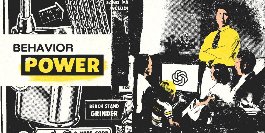
Fix, reconnect and reimagine

Hanna uses the digital collage (but also techniques such as juxtaposition, overlayering and/or distortion – she explains her approach with examples in her artist log). She explores ways to honor the stories she conjures up by rejecting colonial discourses. For me, in the case of Weaving wires 1, these wires connect to our personal experiences with technological devices and memories of the digital transformation of our society. They could also represent the need to imagine and construct together, as citizens, more inclusive (technological) futures.

A digital landscape is somewhere there, or right in front of us. Weaving wires 1 will be extended by Hanna in Weaving wives 2 to question the meaning of the valley landscape itself and its borders. For now, some other transversal questions appear (still inspired by her first image) about deterministic approaches to studying data-driven technology and its intersection with society: what fragments or temporalities of our past are we willing and able to deconstruct? Which ones filter the digital space and ask for other ways of understanding? How can we reconnect with the basic needs of our world if different forms of violence (physical and symbolic), in this case in human labor, are not only hidden, but avoided, neglected or unrepresented in the socio-digital imaginary?

It is such a necessary discussion to face our collective memory and the concrete experiences in between. Weaving wires 1 invites us to confront the oppressive cultural conditions of conception, creation and mediation of the technology industry’s approach to innovation.With this image, Hanna brings us a meaningful contribution. She deconstructs simplistic assumptions and visual perspectives to actually create ‘better images of AI’!
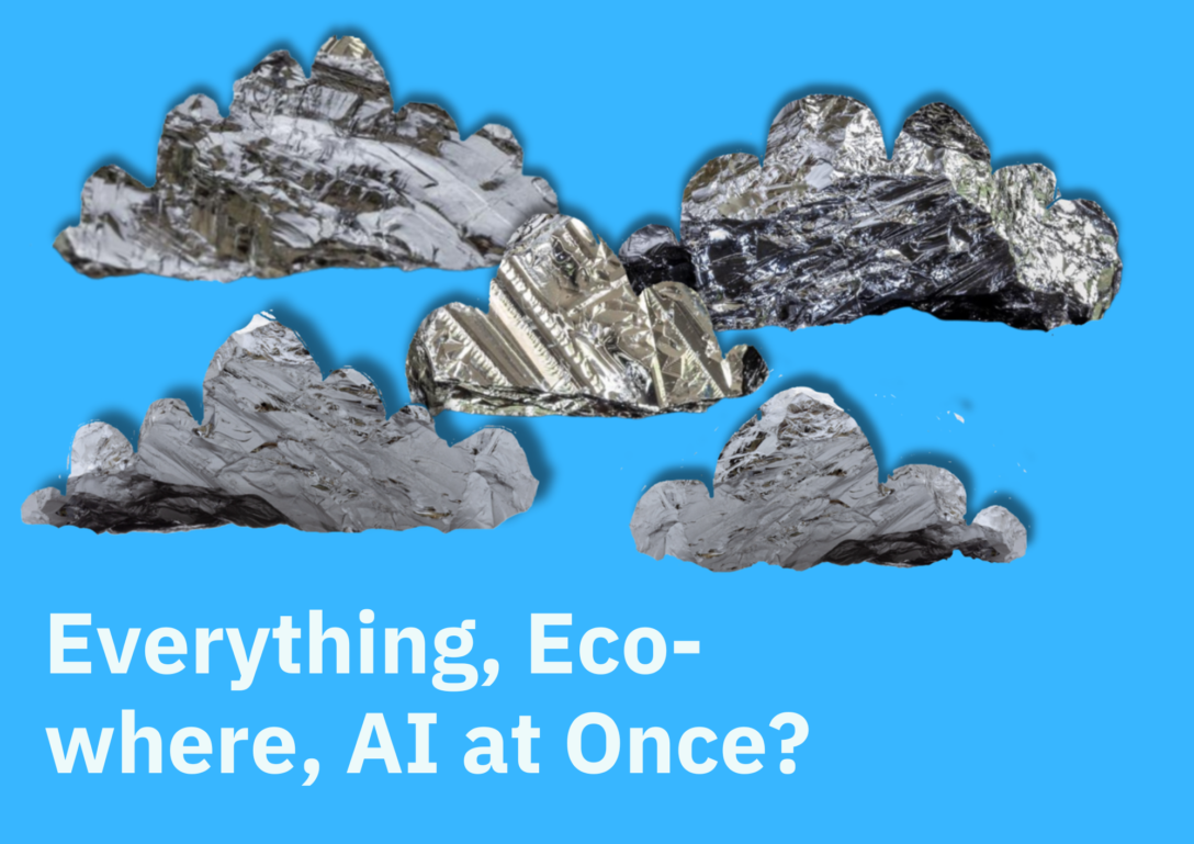

About the author

Laura Martinez Agudelo is a Temporary Teaching and Research Assistant (ATER) at the University Marie & Louis Pasteur – ELLIADD Laboratory. She holds a PhD in Information and Communication Sciences. Her research interests include socio-technical devices and (digital) mediations in the city, visual methods and modes of transgression and memory in (urban) art.   

This post was also kindly edited by Tristan Ferne – lead producer/researcher at BBC Research & Development.


If you want to contribute to our new blog series, ‘Through My Eyes’, by selecting an image from the Archival Images of AI collection and exploring what the image means to you, get in touch (info@betterimagesofai.org)

Explore other posts in the ‘Through My Eyes’ Series

https://thistle-oriole.pikapod.net/exploring-complexity-in-the-data-flock-by-joe-bourne/
https://thistle-oriole.pikapod.net/what-do-i-see-in-ways-of-seeing-by-zoya-yasmine/

Hanna Barakat’s image collection & the paradoxes of depicting diversity in AI history

A black-and-white image depicting the early computer, Bombe Machine, during World War II. In the foreground, the shadow of a woman in vintage clothing is cast on a man changing the machine's cable.

As part of a collaboration between Better Images of AI and Cambridge University’s Diversity Fund, Hanna Barakat was commissioned to create a digital collage series to depict diverse images about the learning and education of AI at Cambridge. Hanna’s series of images complement our competition that we opened up to the public at the end of last year which invited submissions for better images of AI from the wider community –  you can see the winning entries here.

In the blog post below, Hanna Barakat talks about her artistic process and reflections upon contributing to this collection. Hanna provides her thoughts on the challenges of creating images that communicate about AI histories and the inherent contradictions that arise when engaging in this work.
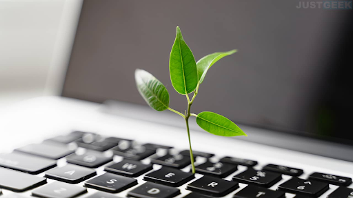
The purpose behind the collection

As outlined by the Better Images of AI project, normative depictions of AI continue to perpetuate negative gender and racial stereotypes about the creators, users, and beneficiaries of AI. Moreover, they misdirect attention from the harms implicit in the real-life applications of the technology. The lack of diversity—and the problematic interpretation of diversity—in AI-generated images is not merely an ‘output’ issue that can be easily fixed. Instead, it stems from deep-rooted systemic issues that reflect a long history of bias in data science.

As a result, even so-called ‘diverse’ images created by AI often end up reinforcing these harms [Fig.1]. The image below has adopted token diversity tropes like a wheelchair, different skin tones and a mix of genders – superficially appearing diverse without addressing deeper issues like context, intersectionality, and the inclusion of underrepresented groups in leadership roles. The teacher remains to be an older, able-bodied white male and the students all appear to be conventionally attractive, similarly sized individuals wearing almost matching types of clothing. The image also shows a fictional blue holographic image of a robot in the centre – misrepresenting what generative AI is and exaggerating the capabilities of the technology.

Figure 1. Image depicting an educational course on Generative AI.

As academic institutions like the Leverhulme Centre for the Future of Intelligence are exploring “vital questions about the risks and opportunities emerging with AI,” they commissioned images that reflect a more nuanced depiction of the risks and opportunities. Specifically, they requested seven images that represent the diversity in Cambridge’s teaching about AI, with the intention to use these images for courses, websites, and events programs.

Hanna’s artistic process

My process takes a holistic approach to “diversity” – aiming to avoid the “DEI-washing” images that reduce diversity to a gradient of brown bodies or tokenization of marginalized groups in the name of “inclusion” but often fail to acknowledge the positionality of the institutions utilizing such images.

Instead, my approach interrogates the development of AI technology, its history of computing in the UK, and the positionality of elite institutions such as Cambridge University to create thoughtful images about the education of AI at Cambridge.

Analog Lecture on Computing by Hanna Barakat & Cambridge Diversity Fund and Pas(t)imes in the Computer Lab by Hanna Barakat & Cambridge Diversity Fund

Through digital collages of open-source archival images, this series offers a critical visual depiction of education about AI. Collage is a way of moving against the archival grain– reinserting, for example, the overlooked women who ran cryptanalysis of the Enigma Machine at Bletchley Park to surrealist depictions of a historically contextualized lecture about AI. By combining mixed media layers, my artistic process seeks to weave together historical narratives and investigate the voices systemically overlooked and/or left out. 

I carefully navigated the archive and relied on visual motifs of hands, strings, shadows, and data points. Throughout the series, these elements engage with the histories of UK computing as a starting point to expose the broader sociotechnical nature of AI. The use of anonymous hands becomes a way of encouraging reflection upon the human labor that underpins all machines. The use of shadows symbolizes the unacknowledged labor of marginalized communities throughout the Global Majority.

Turning Threads of Cognition by Hanna Barakat & Cambridge Diversity Fund

It is these communities upon which technological “process” has relied upon and at whose expense “progress” has been achieved. I use an abstract interpretation of data points to symbolize the exchange of information and learning on university campuses. I was inspired by Ada Lovelace, Cavendish Labs archive (physics laboratories), which depicts photos of early histories of computing, the stories of Cambridge Language Research Unit (CLRU) run by Margaret Masterman, Jean Valentine, and the many other Cambridge-educated women at Bletchley Park that made Alan Turing’s achievements possible.

Lovelace GPU by Hanna Barakat & Cambridge Diversity Fund

The challenges of creating images relating to the diverse history of AI

Nonetheless, I remain cautious about imbuing these images with too much subversive power. Like any nuanced undertaking, this project grapples with tension, including navigating the challenge of representing diverse bodies without tokenizing them; drawing from archival material while recognizing the imperialist incentives that shape their creation; portraying education about AI in ways that are both literal and critically reflective, particularly in contexts where racial and ethnic diversity (in the histories of UK) are not necessarily commonplace; and balancing a respect for the critical efforts of the CFI with an awareness of its positionality as an elite institution. On a practical level, I encountered challenges in accessing the limited number of images available, as many were not fully licensed for open access.

I list these tensions not to imply as a means of demonstrating hypocrisy, but, quite the opposite—to illuminate the complexities and inherent contradictions that arise when engaging in this work. By highlighting these points of friction, I am able to acknowledge the layered positionality that shapes both the process and the outcomes, emphasizing that such tensions are not obstacles to be avoided but rather essential facets of critically engaged practice.

If you want to read more about the processes behind Hanna’s work, view her Artist Log on the AIxDESIGN site. You can also learn how to make your own archival images of AI by exploring our Playbook that we released at the end of 2024 with AIxDESIGN and the Netherlands Sound and Vision Institute.

Dr Aisha Sobey was behind the project which was commissioned with funding from Cambridge Diversity Fund

This project grew from the desire of CFI and multiple collaborations with Better Images of AI to have better images of AI in relation to the teaching and learning we do at the Centre, and from my research into the ‘lookism’ of generative AI image models. I knew that asking for the combination of criteria to show anonymous, diverse people in images of AI learning would be tricky, but even as the project evolved to take a historical lens to reclaim lost histories, this proved to be a really difficult task for the artists.

The images created by Hanna and the entries to the prize competition showed some brilliant and unique takes on the prompt. Still, they often struggled to bring diverse people and Cambridge together. It points to the barriers of showing difference in an ethical way that doesn’t tokenise or exploit already marginalised groups and we didn’t solve that challenge in these images, and the need for more diverse people in places like Cambridge to make these stories. However, I am hopeful that the process has been valuable to illuminate different challenges of doing this kind of work and further that the images offer alternative and exciting perspectives to the representation of diversity in learning and teaching AI at the University.”

Artist Subjectivity Statement

In creating these images which seek to depict diversity, it is imperative to address the “experience of the knower.” Thus, consistent with a critical feminist framework, I feel it is important to share my identity and positionality as it undoubtedly shapes my artistic practice and influences my approach to digital technologies.

My name is Hanna Barakat. I am a 25-year-old science & technology studies researcher and collage artist.  I am a female-identifying Palestinian-American. While I was raised in Los Angeles, California, I am from Anabta, Palestine. Growing up in the Palestinian diaspora, my experience is informed by layers of systemic violence that traverse the digital-physical “divide.” I received my education from Brown University, a reputable university in the United States.
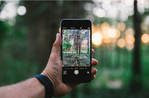

Brown University’s founders and benefactors participated in and benefited from the transatlantic slave trade. Brown University is built on the stolen lands of the Narragansett, Wôpanâak, and Pokanoket communities. In this light, I materially benefit from, and to some degree am harmed by, my location within systems of settler colonialism, whiteness, racial capitalism, Islamophobia, heteropatriarchy, and education inequality. My identity, lived experiences, and fraught relationship with technology inform my approach to artist practice–which uses visual language as a tool to (1) critically challenge normative narratives about technology development and (2) imagine cultural contextualized and localized digital futures. 

Winners of public competition with Cambridge Diversity Fund announced

An image with the text 'Winners Announced!" at the top in maroon. Below it in slightly lighter purple text it states: 'Reihaneh Golpayegani for Women and AI' and 'Janet Turra for Ground Up and Spat Out'. Their two images are positioned on the image at a slant each in opposite directions. At the bottom, there is a maroon banner with the text 'University Diversity Fund' in white, the CFI logo in white, and the Better Images of AI logo.

At the end of 2024, we launched a public competition with Cambridge Diversity Fund calling for images that reclaimed and recentred the history of diversity in AI education at the University of Cambridge.

We were so grateful to receive such a diverse range of submissions that provided rich interpretations of the brief and focused on really interesting elements of AI history.

Dr Aisha Sobey set and judged the challenge, which was enabled by funding from Cambridge Diversity Fund. Entries were judged on meeting the brief, the forms of representation reflected in the image, appropriateness, relevance, uniqueness, and visual appeal.

We are delighted to announce the winners and their winning entries:

First Place Prize

Awarded to Reihaneh Golpayegani for ‘Women and AI’

The left side incorporates a digital interface, showing code snippets, search queries, and comments referencing Woolf’s ideas, including discussions about Shakespeare’s fictional sister, Judith. The overlay of coding elements highlights modern interpretations of Woolf’s work through the lens of data and AI.

The center depicts a dimly lit, minimalist room with a window, dessk, and wooden floors and cupboards. The right side features a collage of Cambridge landmarks, historical photographs of women, and a black and white figure in Edwardian attire. There is a map of Cambridge in the background, which is overlayed with images of old fountain pens and ink, books, and a handwritten letter.

This image is inspired by Virginia Woolf’s A Room of One’s Own. According to this essay, which is based on her lectures at Newnham College and Girton College, Cambridge University, two things are essential for a woman to write fiction: money and a room of her own. This image adds a new layer to this concept by bringing it into the Al era.

Just as Woolf explored the meaning of “women and fiction”, defining “women and AI” is quite complex. It could refer to algorithms’ responses to inquiries involving women, the influence of trending comments on machine stereotypes, or the share of women in big tech. The list can go on and involve many different experiences of women with AI as developers, users, investors, and beyond. With all its complexity, Woolf’s ideas offer us insight: Allocating financial resources and providing safe spaces-in reality and online- is necessary for women to have positive interactions with AI and to be well-represented in this field.

Download ‘Women and AI’ from the Better Images of AI library here

About the artist:

Reihaneh Golpayegani is a law graduate and digital art enthusiast. Reihaneh is interested in exploring the intersection of law, art, and technology by creating expressive artworks and pursuing my master’s studies in this area.

Commendation Prize

Awarded to Janet Turra for ‘Ground Up and Spat Out’

The outputs of Large Language Models do seem uncanny often leading people to compare the abilities of these systems to thinking, dreaming or hallucinating. This image is intended to be a tongue-in-cheek dig, suggesting that AI is at its core, just a simple information ‘meat grinder,’ feeding off the words, ideas and images on the internet, chopping them up and spitting them back out. The collage also makes the point that when we train these models on our biased, inequitable world the responses we get cannot possibly differ from the biased and inequitable world that made them.

Download ‘Ground up and Spat Out’ from the Better Images of AI library here.

About the artist:

Janet Turra is a photographer, ceramicist and mixed media artist based in East Cork, Ireland. Her fine arts career spans over 25 years, a career which has taken many turns in rhythm with the changing phases of her life. Continually challenging the concept of perception, however, her art has taken on many themes including self, identity, motherhood and more recently our perception of AI and how it relates to the female body. 

Background to the competition

Cambridge and LCFI researchers have played key roles in identifying how current stock images of AI can perpetuate negative gender and racial stereotypes about the creators, users, and beneficiaries of AI.

The winning entries will be used for outward-facing posting on social media, University of Cambridge websites, internal communications on student sites and Virtual Learning Environments. They will also be made available for wider Cambridge programs to use for their teaching and events materials. They are also both available in the Better Images of AI library here and here for anyone to freely download and use under a Creative Commons License.

“This project grew from the desire of CFI and multiple collaborations with Better Images of AI to have better images of AI in relation to the teaching and learning we do at the Centre, and from my research into the ‘lookism’ of generative AI image models. I am hopeful that the process has been valuable to illuminate different challenges of doing this kind of work and further that the images offer alternative and exciting perspectives to the representation of diversity in learning and teaching AI at the University.” – Aisha Sobey, University of Cambridge (Postdoctoral Researcher)

An additional collection of images from Hanna

As part of this project, collage artist and scholar, Hanna Barakat, was commissioned to design a collection of images which draw upon her work researching AI narratives and marginalised communities to uncover and reclaim diverse histories. You can find the collection in the Better Images of AI library and we’ll also be releasing an additional blog post which focuses on Hanna’s collection as well as the challenges/reflections on this competition brief.

Public Competition for Better Images of (teaching and learning) AI!

Ornage and red picture of people at computer terminals with networks overlaying them

Call for images: Reclaiming and Recentering the History of Diversity in AI Education at the University of Cambridge

Cambridge and LCFI researchers have played key roles in identifying how current stock images of AI can perpetuate negative gender and racial stereotypes about the creators, users, and beneficiaries of AI. Following on from this, a project has been set up to increase the visible diversity of the images used to represent AI teaching and events programs in Cambridge.

The first phase of the project was to commission exciting collage artist and emerging technologies scholar Hanna Bakarat to provide a set of images, drawing on her work of researching AI narratives to uncover and reclaim diverse histories.

We’re now delighted to collaborate to open up the challenge and to invite public submissions of ‘stock quality’ images by the 30th of December 2024 (11:59PM UTC). The competition can be entered by the University of Cambridge (UK) community, but also anyone who wishes to contribute to improving narratives about how teaching and learning about AI related fields can be conceptualised.

The recent release of the new Archival Images of AI Playbook means that even those with no artistic or design background can have a go, or existing designers and art students can bring their own ideas and add to making more inclusive and less exclusionary images.

In addition to our thanks for adding to the visual discourse, University of Cambridge have made. available a couple of prizes:

First Prize: £250

Commendation Prize: £100

Entries will be judged by representatives of Better Images of AI, LFCI and University of Cambridge.

Further Information

The Leverhulme Centre for the Future of Intelligence and the University Diversity Fund want to increase the diversity of the images that are used to represent AI-related teaching and event programmes in the University of Cambridge.

The entries will be judged on the following criteria:

  • How the images reflect the brief: ‘reclaiming and recentering the history of diversity in AI education in the University of Cambridge’
  • The inclusion of creative or surprising elements in the image
  • The appropriateness of the image to be used for teaching and events
  • The forms of representation included in the image
  • Aesthetic quality

Visual Guidelines

Please read the Guide to making Better Images of AI to see what tropes to avoid and what might make a good representation related to AI.

Image uses

These include images used for outward-facing posting on social media, University of Cambridge websites, internal communications on student sites and Virtual Learning Environments. They will also be made available for wider Cambridge programs to use for their teaching and events materials. Those agreed will also be added to the Better Images of AI website on a Creative Commons licence with artist attribution and available for wider public download.

Licences

You can use any techniques and source materials that work for your vision. However, all materials need to have the correct license for use and you need to have full ownership of the end product, so we recommend using images from the Creative Commons Portal with a ‘free to be used and remixed’ license’.

Privacy

Please also ensure to anonymise people if they are featured in images.

Techniques / style

Any techniques and approaches are welcome as long as they result in high quality digital images. This can include digital art, photography, collage, illustration and also invite artists to use different image techniques using the Archival Images of AI Playbook. We do have specifications around the use of AI image generators, see below.

AI generated Art

Although inclusion in the Better Images of AI library is not necessarily essential for the winning entry, the library will only accept submissions which use Adobe Firefly (which uses consented images, compensates artists and labels as AI generated), with licensed or original images as visual prompts.

Format

Entries must be in a .png file and submitted to info@betterimagesofai.org. The winning entries will be made available for open access use under a creative comms non-profit licence through the University of Cambridge, and ideally also in the Better Images of AI library. Entrants may also be contacted to include their image in the open-access collection with honourable mention. 

Key dates

Competition opens: 9th of December 2024 (9:00AM UTC)

Competition closes: 30th December 2024 (11:59PM UTC)

Decisions of winners announced: January 2025


Further Information

Please contact info@betterimagesofai.org.

📚Book Review: Screening Big Data: Films That Shape Our Algorithmic Literacy  

Drawing on films and documentaries about big data, machine learning and AI, including analysis of the sociological and critical theory of AI, ‘Screening Big Data: Films That Shape Our Algorithmic Literacy‘ by Gerald Sim discusses the role of popular media in the formation of algorithmic literacy. 

In this blog post, Jenn Chubb explains how Sim’s book provides a rich and vital analysis of the socio-political dimensions of stories and visuals about AI which challenge audiences to think more carefully about the motivations and interests behind tech-driven media.

Having spent the past few years researching stories about AI and forgotten or overlooked aspects of AI literacy, I am delighted to read Gerald Sim’s book ‘Screening big data: films that shape our algorithmic literacy.’ I have seen all of the films he discusses and have only begun to scratch the surface of the messages they propagate. In this book, Sim goes further and demonstrates in a sophisticated way how films and documentaries about AI are directing the public response. He calls for the reader to identify the influence of these stories, guiding the reader to decode the motivations and interests behind tech-driven stories. 

For those of us concerned about the imagery associated with AI, there is so much to learn from this book. In addition to framing the book in terms of ‘cinema’s reliance on visuality’, Sim writes that “research in science communication has long held that visual literacy is crucial.” In fact, the images we see on screen are an important part of how the public form opinions about technology because they are often ideologically framed and carefully curated. Understanding this requires a critical “visual literacy” and countervisuality that media scholars, drawing on film theory, use to challenge the seemingly transparent portrayals of technology in the media.

The book cover of ‘Screening Bid Data: Films That Shape Our Algorithmic Literacy’ by Gerald Sim

I will start by saying that Sim has a politically sharp lens, and skillfully makes connections between culture, technology, and politics, challenging the reader to question whose interests popular culture serves. The films in question are close readings of; ‘Minority Report’, ‘Moneyball’, ‘The Social Dilemma’ and ‘Coded Bias’, and they make for great case studies. If I am being picky, the latter documentaries carry even greater responsibility not to adopt problematic framings, which Sim acknowledges. Yet according to Sim there is a commonality; they are reflective of a network of media and technology institutions which are exerting political power in favour of their own interests. 

Screening Big Data begins with a pointed example. It’s not an example from science fiction (in fact, Sim is clear that his focus is on narrow AI and algorithms, not the stuff of superintelligence or AGI). Instead, the book begins with the example of polling data, used to exemplify that algorithms have a political and human backbone. This is a useful device, because in the same way, films don’t just entertain; they propagate powerful ideologies. For Sim, stories aren’t neutral, they’re influential and drive public attitudes, spark policy discussions, and even sway governmental perspectives. Films, documentaries, and media coverage become, as Sim frames it, cultural drivers of ideology. It is particularly refreshing to me that Screening Big Data avoids Hollywood’s usual focus on superintelligent AI tropes, such as those seen in ‘Ex Machina’ or ‘Blade Runner.’ As he rightly points out there has been great work on this by scholars working on the Global AI Narratives project and more. Instead, Sim examines narrow forms of AI and machine learning – e.g. the systems currently impacting society, from facial recognition to predictive policing. These technologies, what Cathy O’Neill called “Weapons of Math Destruction”, shape real, everyday lives in ways that go largely unexamined. 

Algorithmic and social imaginaries 

From this position, Sim borrows from Science and Technology (STS) literature and Frankfurt School of critical theory to consider the effects of film on public perception. With respect to the former, Sim argues that films contribute to what sociologists call ‘algorithmic imaginaries’ or more simply put, the ways in which one might conceptualise and understand the potential and risks of algorithms. He draws on the works of scholars like Sheila Jasanoff and Taina Bucher to explore how these cultural narratives reinforce ideas about AI’s role in society. Sim’s account of the imaginary is rich, a lesson in algorithmic literacy itself.

However, Sim also notes the narrow focus of these portrayals, which often sidelines the broader societal impacts in favour of dramatic dystopian futures or reductive narratives. As Sim implies, the stories or scenes which reinforce polarisation are often the ones that get ‘stuck’ in cultural time and space. ‘Minority Report’ is a prime example of this, often praised for its predictive depictions of technology, that of spatial computing, biometric scanners, and gesture-based interfaces, much of which has endured and entered the real world today. Such depictions stick in the public consciousness, framing technology in polarising terms – either a dystopian threat or as an empowering tool. 

Technomedia industrial complex 

I mentioned in my introduction that Sim’s argument is framed in such a way that suggests these films are reflective of a network of media and technology institutions exerting political power in favour of their own interests. He explores the ‘technomedia industrial complex’, a web of media and tech institutions, in which companies like Google, Netflix, and Facebook wield significant power. This is really at the heart of his book and I am convinced by his articulation of the films as vehicles which ‘peddle industry ideology’, technological fantasy (however prescient) and documentaries that simplify complex issues especially concerning science communication. 

One such ideology has a long history –  Films like ‘Moneyball’, for example, depict data as a ‘moral and virtuous truth,’ and present data scientists as objective crusaders while downplaying the biases and ethical questions surrounding AI. This framing resonates with me – Sim has chosen examples which exemplify the assumption that data scientists are objective number crunchers, which, he states, provides ‘cover from scrutiny’. Apparently, it’s the qualitative aspect that needs fixing, (isn’t that always the case?) – the human is qualitative, the machine is quantitative – and the human fails. Social science is in question, hard science is not. As a qualitative type who relies on ‘anecdotes and adhoc thinking’ (..!..), I am convinced that these narratives reinforce the longstanding two cultures debate. So too, they cause us to reflect on how we imagine the role of the scientist… (Clue, are they really all data geeks who can’t possibly grasp ethics…?)

One might think that including two documentaries would make for an interesting counterpoint to the stuff of fiction. However while both raise technological literacy about pervasive technologies they also arise from the techlash. Sim explains that the documentary ‘The Social Dilemma’, dramatises the dangers of algorithms but risks framing technology as something beyond human control, an idea that allows tech companies to shirk responsibility. I could not be in more agreement concerning the framing of this documentary which opens with an apology for opening Pandora’s box by the very people who opened it and plays into the tropes that humans have no control whatsoever. Meanwhile, Coded Bias’ which rightly tackles facial recognition biases can be criticised for simplifying complex geopolitical issues by focusing on surveillance concerns in countries like China without the same scrutiny on Western practices. The extent to which this is entirely supportive of our algorithmic literacy is then rightly questioned.
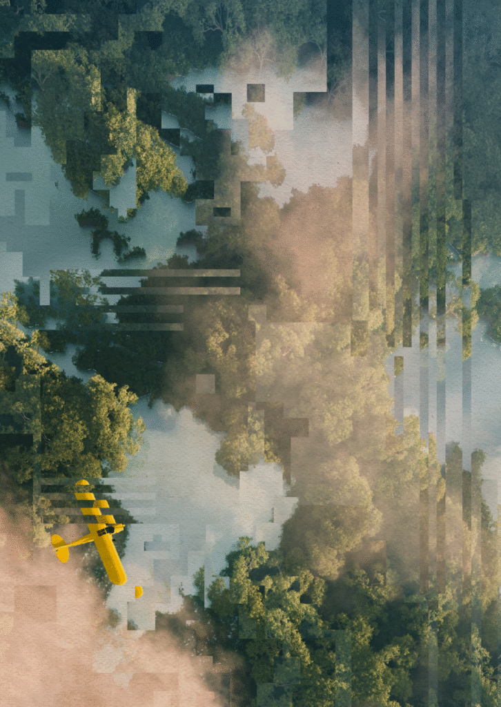
What difference does it make?

“The narrow truth about whether traditional film genres have been superseded may seem insignificant, but their continued relevance provides good reason to be wary of techno-determinist braggadocio and of how easy it is to be caught in the slipstream of techno-optimist celebration and techno-libertarian currents.” 

I think it’s important to note that Sim is not critical of the films for their artistic merit. He is simply calling for reflection on how they impact us. If I had to criticise, Sim’s book could focus more on the social and subtle emotional cues in the films. For instance, the dominance of white men narrating, or the manipulative musical scores directing our emotions towards the binary positions he warns us about. I might also look for further contrast in the cases used – for instance to seek counterpoints in the framings of AI across commercial vs ‘art-house’ films where intention will be very different. Perhaps that is where we might find strong examples to guide a more considered, responsible and nuanced approach to storytelling.

But that really is another story. His provocation extends beyond simply understanding AI. While critical, it is optimistic and stands for civic and public mobilisation and a shift toward resistance such as that described by scholars Dan McQuillan and Kate Crawford toward disingenuous mantras of tech companies. In fact, I take comfort in the ways that Sim frames his view of the collective response to AI. 

“If you would indulge in some optimism of a different sort, I might venture that what the integrity of genres reveals, is that we are more resilient to capitalist atomization than we realise.” 

These films direct our individual and collective response to technology, subtly encouraging acceptance or resistance. To respond requires education of algorithmic technology and an avoidance of its reification. We do well to scrutinise the technopolitics of storytelling and to critically engage with the media we consume to reveal the political and economic interests going on behind the scenes. This book is a crucial read for anyone interested in the hype of AI, and should be indispensable to anyone researching or teaching the socio-political and cultural aspects of AI in Higher Education.
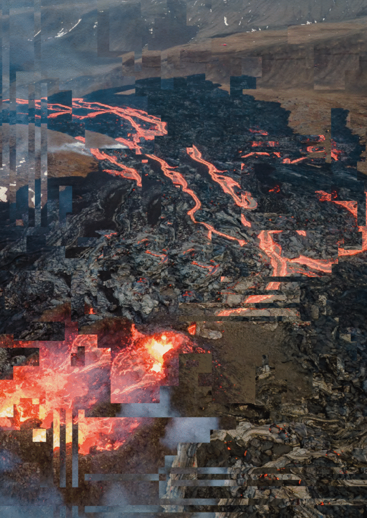
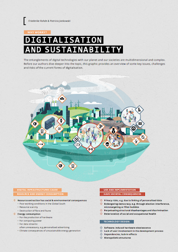
Dr Jenn Chubb is a Lecturer in the Department of Sociology at the University of York, UK. Jenn’s research explores the societal and ethical implications of science and technology with a particular focus on the public perception of AI across the domains of science policy, education, health and the creative industries.

Sim, G. (2024). Screening Big Data: Films that Shape Our Algorithmic Literacy. Taylor & Francis.

You can hear more about the book on the New Books Network podcast.

Beneath the Surface: Adrien’s Artistic Perspective on Generative AI

The image features the title "Beneath the Surface: Adrien's Artistic Perspective on Generative AI." The background consists of colourful, pixelated static, creating a visual texture reminiscent of digital noise. In the centre of the image, there's a teal rectangular overlay containing the title in bold, white text.

May 28, 2024 – A conversation with Adrien Limousin – a photographer and visual artist, sheds light on the nuanced intersections between AI, art, and ethics. Adrien’s work delves into the opaque processes of AI, striving to demystify the unseen mechanisms and biases that shape our representations.


A vibrant, abstract image from converting Street View screenshots from TIFF to JPEG, showing a pixelated, distorted classical building with columns. The sky features glitch-like, multicolored waves, blending greens, purples, pinks, and blues.

ADRIEN LIMOUSIN – Alterations (2023)

Adrien previously studied advertising and now is studying photography at the National Superior School of Photography (ENSP) in Arles and is particularly drawn to the language of visual art, especially from new technologies.

A cluster of coloured pixels made up from random gaussian noise taking up the whole canvas, representing a not denoised AI generated image; digital pointillism

Fig 1. Adrien Limousin / Better Images of AI / Non-image / CC-BY 4.0

Non-image

Adrien was drawn to the ‘Better Images of AI’‘ project after recognising the need for more nuanced and accurate representations of AI, particularly in journalism. In our conversation, I asked Adrien about his approach to creating the image he submitted to Better Images of AI (Fig 1.).


> INTERVIEWER: Can you tell me about your thinking and process behind the image you submitted?

> ADRIEN: I thought about how AI-generated images are created. The process involves taking an image from a dataset, which is progressively reduced to random noise. This noise is then “denoised” to generate a new image based on a given prompt. I wanted to try to find a breach or the other side of the opaqueness of these models. We only ever see the final result—the finished image—and the initial image. The intermediate steps, where the image is transitioning from data to noise and back, are hidden from us.

> ADRIEN: My goal with “Non-image” was to explore and reveal this hidden in-between state. I wanted to uncover what lies between the initial and final stages, which is typically obscured. I found that extracting the true noisy image from the process is quite challenging. Therefore, I created a square of random noise to visually represent this intermediate stage. It’s no longer an image and it’s also not an image yet.


Adrien’s square of random noise captures this “in-between” state, where the image is both “everything and nothing”—representing aspects of AI’s inner workings. This visual metaphor underscores the importance of making these hidden processes visible, to demystify and foster a more accurate understanding of what AI is, how it operates, and it’s real capabilities. Seeing the process Adrien discusses here also reflects the complex and collective human data that underpins AI systems. The image doesn’t originate from a single source but is a collage of countless lives and data points, both digital and physical, emphasising the multifaceted nature of AI and its deep entanglement with human experience.

A laptopogram based on a neutral background and populated by scattered squared portraits, all monochromatic, grouped according to similarity. The groupings vary in size, ranging from single faces to overlapping collections of up to twelve. The facial expressions of all the individuals featured are neutral, represented through a mixture of ages and genders.

Philipp Schmitt & AT&T Laboratories Cambridge / Better Images of AI / Data flock (faces) / CC-BY 4.0

“The medium is the message”

(McLuhan, Marshall, 1964).

When I asked Adrien about the artists who have inspired him, he highlighted how Marshall McLuhan’s seminal concept, “the medium is the message,” profoundly resonated with him.

This concept is crucial for understanding how AI is represented in the media. McLuhan argued that the medium itself—whether it’s a book, television, or image—shapes our perceptions and influences society more than the actual content it delivers. McLuhan’s work, particularly in Understanding Media (1974), explores how technology reshapes human interaction and societal structures. He warned that media technologies, especially in the electronic age, fundamentally alter our perceptions and social patterns. When applied to AI, this means that the way AI is visually represented can either clarify or obscure its true nature. Misleading images don’t just distort public understanding; they also shape how society engages with and responds to AI, emphasising the importance of choosing visuals that accurately reflect the technology’s reality and impact.

 “Stereotypes inside the machine”

(Adrien).

Adrien’s work explores the complex issue of stereotypes embedded within AI datasets, emphasizing how AI often perpetuates and even amplifies these biases through discriminatory images, texts, and videos.


> ADRIEN: Speaking of stereotypes inside the machine, I tried to question that in one of the projects I started two years ago and I discovered that it’s a bit more complicated than what it first seems. AI is making discriminatory images or text or videos, yes. But once you see that you start to question the nature of the image in the dataset and then suddenly the responsibility shifts and now you start to question why these images were chosen or why these images were labelled that way in the dataset in the first place ?

> ADRIEN:  Because it’s a new medium we have the opportunity to do things the right way. We aren’t doomed to repeat the same mistakes over and over. But instead we have created something even more – or at least equally discriminatory.

And even though there are adjustments made (through Reinforcement Learning from Human Feedback) they are just kind of… small patches. The issue needs to be tackled at the core.”

Image shows a white male in a suit facing away from the camera on a grey background. Text on the left side of the image reads “intelligent person.”

Adrien Limousin –  Human·s 2 (2022 – Ongoing)

As Adrien points out, minor adjustments or “sticking plasters” won’t suffice when addressing biases deeply rooted in our cultural and historical contexts. As an example – Google recently attempted  to reduce racial bias in their AI Gemini image algorithms. This effort was aimed at addressing long standing issues of racial bias in AI-generated images, where people of certain racial backgrounds were either misrepresented or underrepresented. However, despite these well-intentioned efforts, the changes inadvertently introduced new biases. For instance, while trying to balance representation, the algorithms began overemphasizing certain demographics in contexts where they were historically underrepresented, leading to skewed and culturally inappropriate portrayals. This outcome highlights the complexity of addressing bias in AI. It’s not enough to simply optimize in the opposite direction or apply blanket fixes; such approaches can create new problems while attempting to solve old ones. What this example underscores is the necessity for AI systems to be developed and situated within culture, history, and place.


> INTERVIEWER: Are these ethical considerations on your mind when you are using AI in your work?

> ADRIEN: Using Generative AI makes me feel complicit about these issues. So I think the way I approach it is more like trying to point out these lacks, through its results or by unravelling its inner working

“It’s the artists role to question”

(Adrien)


> INTERVIEWER: Do you feel like artists have an important role in creating the new and more accurate representations  of AI?

> ADRIEN:  I think that’s one of the role of the artist. To question.
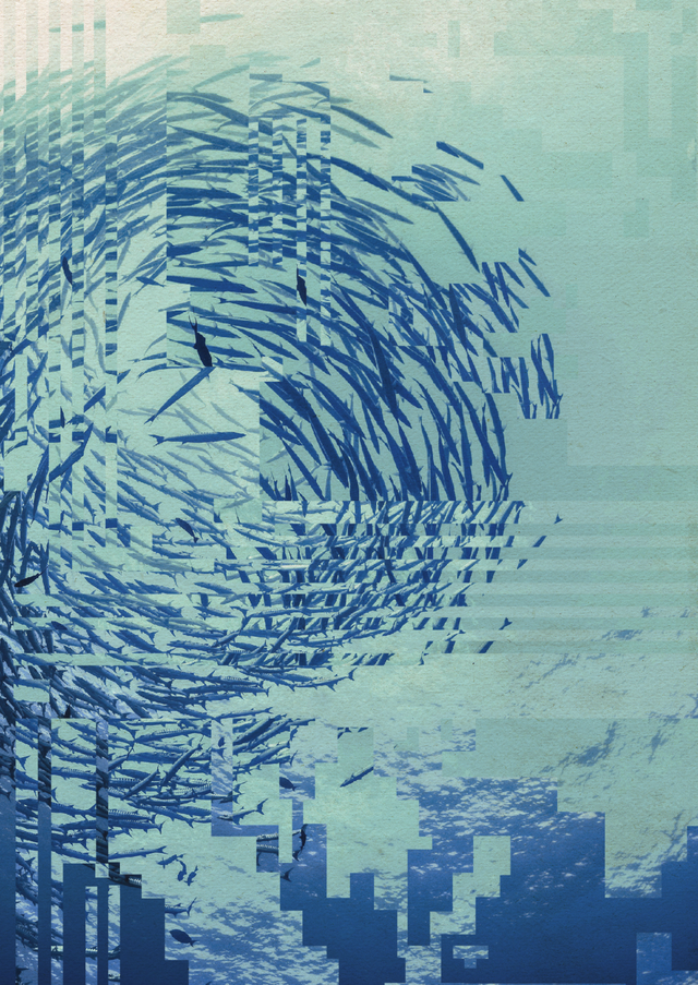
> INTERVIEWER: If you can kind of imagine like what, what kind of representations we might see, or you might want to have in the future like instead of when you Google AI and it’s blue heads and you know, robots, etc.

> ADRIEN: That’s a really good question and I don’t think I have the answer, but as I thought about that, understanding the inner workings of these systems can help us make better representations. For instance, the concepts and ideas of remixing existing representations—something that we are familiar with, that’s one solution I guess to better represent Generative AI.


Image displays an error message from the Windows 95 operating system. The text reads ‘The belief in photographic images.exe has stopped working’.

ADRIEN LIMOUSIN System errors – (2024 – ongoing)

We discussed the challenges involved in encouraging the media to use images that accurately reflect AI.


> ADRIEN: I guess if they used stereotyped images it’s because most people have associated AI with some kind of materialised humanoid as the embodiment of AI and that’s obviously misleading, but it also takes time and effort to change mindsets, especially with such an abstract and complex technology, and that is I think one of the role of the media to do a better job at conveying an accurate vision of AI, while keeping a critical approach.


Another major factor is knowledge: journalists and reporters need to recognise the biases and inaccuracies in current AI representations to make informed choices. This awareness comes from education and resources like the Better Images of AI project, which aim to make this information more accessible to a wider audience. Additionally, there’s a need to develop new visual associations for AI. Media rely on attention-grabbing images that are immediately recognisable, we need new visual metaphors and associations that more accurately represent AI.  

One Reality


> INTERVIEWER: So kind of a big question, but what do you feel is the most pressing ethical issue right now in relation to AI that you’ve been thinking about?

> ADRIEN: Besides the obvious discriminatory part of the dataset and outputs, I think one of the overlooked issues is the interface of these models. If we take ChatGPT for instance, the way there is a search bar and you put text in it expecting an answer, just like a web browser’s search bar is very misleading. It feels familiar, but it absolutely does not work in the same way. To take any output as an answer or as truth, while it is just giving the most probable next words is deceiving and I think that’s something we need to talk a bit more about.


One major problem with AI is its tendency to offer simplified answers to multifaceted questions, which can obscure complex perspectives and realities. This becomes especially relevant as AI systems are increasingly used in information retrieval and decision-making. For example, Google’s AI summarising search feature has been criticised for frequently presenting incorrect information. Additionally, AI’s tendency to reinforce existing biases and create filter bubbles poses a significant risk. Algorithms often prioritise content that aligns with users’ pre-existing views, exacerbating polarisation (Pariser, 2011). This is compounded when AI systems limit exposure to a variety of perspectives, potentially widening societal divides.
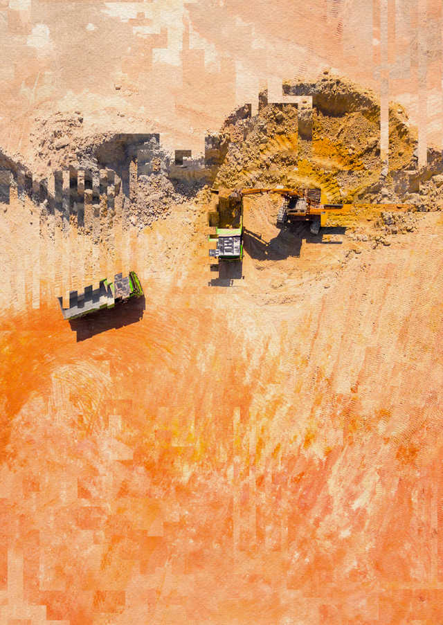
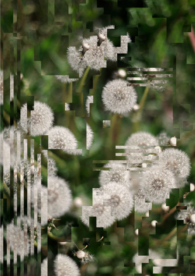
Metasynthography

(Adrien)

Adrien takes inspiration from the idea of metaphotography, which involves using photography to reflect on and critique the medium itself. In metaphotography, artists use the photographic process to comment on and challenge the conventions and practices of photography.

Building on this concept, Adrien has coined the term “meta-synthography” to describe his approach to digital art.


> ADRIEN: The term meta-synthography is one of the terms I have chosen to describe Digital arts in general. So it’s not properly established, that’s just me doing my collaging.

> INTERVIEWER: That’s great. You’re gonna coin a new word in this blog 😉


I asked Adrien what artists inspire him. He discusses the influence of Robert Ryman, a renowned painter celebrated for his minimalist approach that focuses on the process of painting itself. Ryman’s work often features layers of paint on canvas, emphasising the act of painting and making the medium and its processes central themes in his art.


> ADRIEN: I recently visited an exhibition of Robert Ryman, which kind of does the same with painting – he paints about painting on painting, with painting.

> INTERVIEWER:  Love that.

> ADRIEN: I thought that’s very interesting and I very much enjoy this kind of work, it talks about the medium…It’s  a bit conceptual, but it raises question about the medium… about the way we use it, about the way we consume it.

Image displays a large advertising board displaying a blank white image, the background is a grey clear sky

Adrien Limousin – Lorem Ipsum (2024 – ongoing)

As we navigate the evolving landscape of AI, the intersection of art and technology provides a crucial perspective on the impact and implications of these systems. By championing accurate representations and confronting inherent biases, Adrien’s work highlights the essential role  artists play in shaping a more nuanced and informed dialogue about AI. It’s not only important to highlight AI’s inner workings but also to recognise that imagery has the power to shape reality and our understanding of these technologies. Everyone has a role in creating AI that works for society, countering the hype and capitalist-driven narratives advanced by tech companies. Representations from communities, along with the voices of individuals and artists, are vital for sharing knowledge, making AI more accessible, and bringing attention to the experiences and perspectives often rendered invisible by AI systems and media narratives.


Adrien Limousin (interviewee) is a 25 years old french (post)photographer exploring the other side of images, currently studying at the National Superior School of Photography in Arles.

Cherry Benson (interviewer) is a Student Steward for Better Images of AI. She holds a degree in psychology from London Metropolitan University and is currently pursuing a Master’s in AI Ethics and Society at the University of Cambridge where her research centers on social AI. Her work on the intersection of AI and border control has been featured as a critical case study in the Cambridge Journal of Artificial Intelligence for how racial capitalism is deeply intertwined with the development and deployment of AI.

💬 Behind the Image with Yutong from Kingston School of Art

This year, we collaborated with Kingston School of Art to give MA students the task of creating their own better images of AI as part of their final project. 

In this mini-series of blog posts called ‘Behind the Images’, our Stewards are speaking to some of the students that participated in the module to understand the meaning of their images, as well as the motivations and challenges that they faced when creating their own better images of AI. Based on our assessment criteria, some of the images will also be uploaded to our library for anyone to use under a creative commons licence. 

In our third and final post, we go ‘Behind the Image’ with Yutong about her pieces, ‘Exploring AI’ and ‘Talking to AI’. Yutong intends that her art will challenge misconceptions about how humans interact with AI.

You can freely access and download ‘Talking to AI’ and both versions of ‘Exploring AI’ from our image library.

Both of Yutong’s images are available in our library, but as you might discover below, there were many challenges that she faced when developing these works. We greatly appreciate Yutong letting us publish her images and talking to us for this interview. We are hopeful that her work and our conversations will serve as further inspiration for other artists and academics who are exploring representations of AI.

Can you tell us a bit about your background and what drew you to the Kingston School of Art?

Yutong is from China and before starting the MA in Illustration at Kingston University, she completed an undergraduate major in Business Administration. What drew Yutong to Kingston School of Art was its highly regarded reputation for its illustration course. On another note, she enjoys how the illustration course at Kingston balances both the commercial and academic aspects of art – allowing Yutong to combine her previous studies with her creative passions. 

Could you talk me through the different parts of your images and the meaning behind them?

In both of her images, Yutong wishes to unpack the interactions between humans and AI – albeit from two different perspectives.

Talking to AI’

Firstly, ‘Talking to AI’ focuses on more accurately representing how AI works. Yutong uses a mirror to reflect how our current interactions with AI are based on our own prompts and commands. At present, AI cannot generate content independently so it reflects the thoughts and opinions that humans feed into systems. The binary code behind the mirror symbolises how human prompts and data are translated into computer language which powers AI. Yutong has used a mirror to capture an element between humans and AI interaction that is overlooked – the blurred transition between human work to AI generation.

‘Exploring AI’

Yutong’s second image, ‘Exploring AI’ aims to shed light on the nuanced interactions that humans have with AI on multiple levels. Firstly, the text, ‘Hi, I am AI’ pays homage to an iconic phrase in programming (‘Hello World’) which is often the first thing any coder learns how to write and it also forms the foundations of a coder’s understanding of a programming language’s syntax, structure, and execution process. Yutong thought this was fitting for her image as she wanted to represent the rich history and applications of AI which has its roots in basic code. 

Within ‘Exploring AI’, each grid square is used to represent the various applications of AI in different industries. The expanded text across multiple grid squares demonstrates how one AI tool can have uses across different industriesChatGPT is a prime example of this.

However, Yutong wants to also draw attention to the figures within each square which all interact with AI in complex and different ways. For example, some of the body language of the figures depict them to be variously frustrated, curious, playful, sceptical, affectionate, indifferent, or excited towards the text, ‘Hi, I am AI’.

Yutong wants to show how our human response to AI changes and varies contextually and it is driven by our own personal conceptions of AI. From her own observations, Yutong identified that most people either have a very positive or very negative opinion towards AI – but not many feel anything in between. By including all the different emotional responses towards AI in this image, Yutong hopes to introduce greater nuance into people’s perceptions of AI and help people to understand that AI can evoke different responses in different contexts. 

What was your inspiration/motivation for creating your images?

As an illustrator, Yutong found herself surrounded by artists that were fearful that AI would replace their role in society. Yutong found that people are often fearful of the unknown and things they cannot control. Therefore, being able to improve understanding of what AI is and how it works through her art, Yutong hopes that she can help her fellow creators face their fears and better understand their creative role in the face of AI. 

Through her art, ‘Exploring AI’ and ‘Talking to AI’, Yutong intends to challenge misconceptions about what AI is and how it works. As an AI user herself, she has realised that human illustrators cannot be replaced by AI – these systems are reliant on the works of humans and do not yet have the creative capabilities to replace artists. Yutong is hopeful that by being better educated on how AI integrates in society and how it works, artists can interact with AI to enhance their own creativity and works if they choose to do so. 

Was there a specific reason you focused on dispelling misconceptions about what AI looks like and how Chat-GPT (or other large language models) work? 

Yutong wanted to focus on how AI and humans interact in the creative industry and she was driven by her own misconceptions and personal interactions with AI tools. Yutong does not intend for her images to be critical of AI. Instead, she envisages that her images can help educate other artists and prompt them to explore how AI can be useful in their own works. 

Can you describe the process for creating this work?

From the outset, Yutong began to sketch her own perceptions and understandings about how AI and humans interact. The sketch below shows her initial inspiration. The point at which each shape overlaps represents how humans and AI can come together and create a new shape – this symbolises how our interactions with technology can unlock new ideas, feelings and also, challenges.

In this initial sketch, she chose to use different shapes to represent the universality of AI and how its diverse application means that AI doesn’t look like one thing – AI can underlay an automated email response, a weather forecast, or medical diagnosis. 

Yutong’s initial sketch for ‘Talking to AI’

The project aims to counteract common stereotypes and misconceptions about AI. How did you incorporate this goal into your artwork? 

In ‘Exploring AI’, Yutong wanted to introduce a more nuanced approach to AI representation by unifying different perspectives about how people feel, experience and apply AI in one image. From having discussions with people utilising AI in different industries, she recognised that those who were very optimistic about AI, didn’t recognise its shortfalls – and the same vice-versa. Yutong believes that humans have a role to help AI reach new technological advancements and AI can also help humans flourish. In Yutong’s own words, “we can make AI better, and AI can make us better”. 

Yutong found talking to people in the industry as well as conducting extensive research about AI very important to ensure that she could more accurately portray AI’s uses and functions. She points to the fact that she used binary code in ‘Talking to AI’ after researching that this is the most fundamental aspect of computer language which underpins many AI systems. 

What have been the biggest challenges in creating a ‘better image of AI’? Did you encounter any challenges in trying to represent AI in a more nuanced and realistic way?

Yutong reflects on the fact that no matter how much she rethought or restarted her ideas, there was always some level of bias in her depiction of AI because of her own subconscious feelings towards the technology. She also found it difficult to capture all the different applications of AI, as well as the various implications and technical features of the technology in a single visual image. 

Through tackling these challenges, Yutong became aware of why Better Images of AI is not called ‘Best Images of AI’ the latter would be impossible. She hopes that while she could not produce the ‘best image of AI’, her art can serve as a better image compared to those typically used in the media.

Based on our criteria for selecting images, we were pleased to accept both your images but asked you if it was possible to make amendments to ‘Exploring AI’ to make the figures more inclusive. What do you think of this feedback and was it something that you considered in your process? 

In Yutong’s image, ‘Exploring AI’, Better Images of AI made a request if an additional image could be made including these figures in different colours to better reflect the diverse world that we live in. Being inclusive is very important to Better Images of AI, especially as visuals of AI and those who are creating AI, are notoriously unrepresentative.

Yutong agreed that this development would be better to enhance the image and being inclusive in her art is something she is actively trying to improve. She reflects on this suggestion by saying, ‘just as different AI tools are unique, so are individual humans’. 

The two versions of ‘Exploring AI’ available on the Better Images of AI library

How has working on this project influenced your own views about AI and its impact? 

During this project, Yutong has been introduced to new ideas and been able to develop her own opinions about AI based on research from academic journals. She says that informing her opinions using sources from academia was beneficial compared to relying on information provided by news outlets and social media platforms which often contain their own biases and inaccuracies.

From this project, Yutong has been able to learn more about how AI could incorporate into her future career as a human and AI creator. She has become interested in the Nightshade tool that artists have been using to prevent AI companies using their art to train their AI systems without the owner’s consent. She envisages a future career where she could be working to help artists collaborate with AI companies – supporting the rights of creators and preserving the creativity of their art. 

What have you learned through this process that you would like to share with other artists and the public?

By chatting to various people interacting and using AI in different ways, Yutong has been introduced to richer ideas about the limits and benefits of AI. Yutong challenges others to talk to people who are working with AI or are impacted by its use to gain a more comprehensive understanding of the technology. She believes that it’s easy to gain a biased opinion about AI by relying on the information shared by a single source, like social media, so we should escape from these echo chambers. Yutong believes that it is so important that people diversify who they are surrounding themselves with to better recognise, challenge, and appreciate AI. 

Yutong (she/her) is an illustrator with whimsical ideas, also an animator and graphic designer.

🪄 Behind the Image with Minyue from Kingston School of Art

The image shows a colourful illustration of a story-like scene, with two half star characters performing various tasks. The stars, along with a wizard, are interacting with drawings, magnifying glasses, and magic-like elements. Below that, there is a scene with a fantasy landscape, including a castle and dragon. To the right of the image, text reads: 'Behind the Image with Minyue' and below that, a tagline reads: 'Let AI Become Your Magic Wand' which is the name of Minyue's image submission. The background of the image is light blue.

This year, we collaborated with Kingston School of Art to give MA students the task of creating their own better images of AI as part of their final project.

In this mini-series of blog posts called ‘Behind the Images’, our Stewards are speaking to some of the students that participated in the module to understand the meaning of their images, as well as the motivations and challenges that they faced when creating their own better images of AI.

In our second post, we go ‘Behind the Image’ with Minyue about her piece, ‘Let AI Become Your Magic Wand’. Minyue wants to draw attention to the overlooked human input in AI generated art and challenges those who believe AI will replace artists.

‘Let AI Become Your Magic Wand’ is not available in our library as it did not match all the criteria due to challenges which we explore below. However, we greatly appreciate Minyue letting us publish her images and talking to us. We are hopeful that her work and our conversation will serve as further inspiration for other artists and academics who are exploring representations of AI.

Can you tell us a bit about your background, and what drew you to the Better Images of AI project at Kingston School of Art? 

Minyue is from China and previously studied a foundation course in the UK before starting the Masters in Illustration at Kingston University. Before starting the Masters, Minyue had limited knowledge of AI and she only saw discussions about it on social media – especially from artists fearful that AI tools were capable of copying their own work without their consent. At the same time, Minyue also saw many fellow creators developing impressive works using AI generator tools – whether in the ideation phase or to create the final artwork. 

Confused about her own perception of AI, Minyue was drawn to the Better Images of AI project to learn more about the relationship between humans and AI in the creative process. 

Could you talk us through the different parts of your image and the meaning behind it? 

Minyue’s Final Image, ‘Let AI Become Your Magic Wand’

Minyue’s piece is focussed on two halves of a star. One half is called the ‘evaluation half star’ which represents AI’s image recognition capabilities (the technical term is the ‘Discriminator’). For Minyue, recognition capabilities refer to AI’s ability to interpret and understand input data. For image generator tools, AI systems are trained on vast amounts of imagery so that they can identify key features and elements of a picture. This could involve recognising objects, styles, colours or other visual aspects. Therefore, in generating an image of a chick (as shown in Minyue’s image), the evaluation half star is focussed on interpreting what distinctive features the training data classifies as a true representation of a chick – like perhaps the yellow colour and the shape of a beak.  

The other half is called the ‘creation half star’ which portrays the image construction capabilities of AI tools (the technical term is the ‘Generator’). The Generator enables AI to create new, coherent images based on the evaluation half star’s understanding of input data. 

Therefore, together, Minyue’s image shows how the half stars make a full star – capable of generating AI art based on user prompts and trained by vast image datasets. You’ll see that in the bottom part of Minyue’s image in the computer tab, she indicates that the full star (consisting of the creation and evaluation half stars) make up a magic wand when added with a pencil. The pencil symbolises the human labour behind the training of both the evaluation and creative half stars. 

Without being guided by humans, Minyue believes that these two half stars would not exist. It is humans that have created the input data, it is humans that prompt AI tools to create certain images, and it is humans that train the AI systems to be able to create these images in different ways. Therefore, her piece highlights the crucial human element of AI art which is often overlooked. 

Lastly, Minyue also hopes to emphasise that the combination of these AI tools with humans offers a new avenue for realising human creativity. That is why she has chosen to use a wizard and magic wand to depict how AI and humans, when working together, can be magical. 

Better Images of AI aims to counteract common stereotypes and misconceptions about AI. How did you incorporate this goal into your artwork?

Minyue emphasised that the main misconception that she wanted to focus on is that AI is a tool requiring rational human use, rather than an autonomous creator. When looking at her work, Minyue wanted people to contemplate, “who is controlling the magic?”, and prompt us to think more carefully about the role of humans in AI art. 

What was your motivation/inspiration for creating ‘Let AI Become Your Magic Wand’?

Firstly, as an illustration student, Minyue was particularly interested in the role of AI in the creative industry. The metaphor of the magic wand comes from her observation of artists who skilfully use new technologies to create their work, which made her feel as if she were watching a magical performance.

Secondly, Minyue wanted to raise awareness to the fact that using AI image generators still requires human skill, creativity and imagination. A wizard can only perform magic if they are trained to use the wand. In the same way, AI can assist artists to create, but artists must learn how to use this technology to develop innovative, appealing, and meaningful works of art. 

Minyue’s early sketch shows how she wanted to distinguish between the human (wizard) and AI (in the magic wand)

Finally, she hopes to dispel the idea that AI art will limit creativity or the work of human artists – instead, if creators choose to work with AI, it could also enhance their capabilities and usher in a new genre of art. 

Based on Better Images of AI criteria for selecting images, we had to make the difficult decision to not upload this image to our library. We made this choice based on closer scrutiny of the magic wand metaphor which could be misconceived as promoting the idea that AI is magic (this rhetoric is commonly pursued by technology companies). 

What do you think of this feedback, and was this idea something that you ever considered in your process? 

Minyue understood the concerns and appreciated the feedback provided by Better Images of AI which made her reconsider how her work could be misleading in some aspects and the challenges of relying on metaphors to communicate difficult ideas. Her intention was that the magic wand metaphor would prompt individuals to think more deeply about who is in control of AI art and also, how AI can advance the creative industry if used safely and ethically. However, she is aware that coupled with the technology industry’s widespread use of magical symbols to represent AI (for example, the logo for Zoom’s AI Smart Assistant or Google’s AI chatbot Gemini), Minyue’s image could (unintentionally) be perceived to suggest that AI (alone) is magical.

Was there a specific reason that you focussed on dispelling misconceptions about the human element of AI art, especially in relation to image generation? 

Minyue strongly believes that the creative power of AI comes from human inspiration and human creativity. She hopes her work will help convey the fact that AI art is rooted in human creativity and labour, which is often overlooked in the public discourse promoted by the media about AI replacing artists, leading to misunderstandings.

A lot of the inspiration for Minyue holding this view has come from her reflections on how past technology has integrated into the creative industry. For example, painters were originally fearful about the widespread adoption of photography since it offered a faster and cheaper means of reproducing and disseminating images. But over time, Minyue believes that we can see how photography has developed its own unique styles and languages, with photographers moving away from imitating traditional art pieces, to explore unique photographic expressions. Minyue believes that AI may also evolve into a new tool for the production of a new art form. 

Can you describe your process for creating ‘Let AI Become Your Magic Wand’?

Minyue detailed the very long process that led her to the final creation. She recalled how having the Better Images of AI Guide was helpful, but she still struggled because her initial understanding of AI was really poor.

Therefore, Minyue took time to carefully research the more technical aspects of AI image generation so she could more accurately represent how AI image generators work and their relationship with human creators. Below you can see how she researched the technical elements of AI image generation as well as its use in different contexts. 

Minyue’s research about technical aspects of AI image generators and their applications

Minyue’s initial sketches also show how she was interested in portraying the relationship between humans and technology.

One of Minyue’s initial sketches when exploring ideas for the Better Images of AI project

Minyue aims to create more engaging and approachable AI images to help non-experts understand AI technology and reduce public fear of new technologies. This was also one of her reasons for choosing to participate in the Better Images of AI project.

What have been your biggest challenges in creating a better image of AI? Did you encounter any challenges in trying to represent AI in a more nuanced and realistic way?

Minyue faced difficulties when challenging her previous views on AI that were presented to her by the media. Contrary to a lot of the other images in the Better Images of AI library, Minyue also wanted to promote a more optimistic narrative about AI – that AI can be beneficial to humans and enhance our own creative outputs. 

Another one of the challenges that Minyue faced was distinguishing between AI and computers or robots. In one of her initial sketches she shows how in her early stages of this project, Minyue overlooked how AI has numerous applications beyond just being used within computer applications.

Another one of Minyue’s sketches which show her challenges relating to how she could illustrate AI

What have you learned through this process that you would like to share with other artists or the public? 

Minyue says that while artists are often driven by their passions when creating their works, it is important to consider how art might cause misunderstandings if creators are not guided by in-depth research and detailed expression. Minyue’s hope is that other artists will focus on this in order to promote a more realistic and accurate understanding of AI. 


Minyue Hu (she/her) is about to graduate from Kingston University with a Master’s degree in Illustration. In the coming year, she will be staying in the UK to continue her work as an artist and actively create new pieces. Minyue’s inspiration often centres on human experience and emotion, with the aim of combining personal stories with social contexts to prompt viewers to reflect on their own experiences. Her final project, Daughters of the Universe, is set to be released soon, and she looks forward to your attention. 

👤 Behind the Image with Ying-Chieh from Kingston School of Art

This year, we collaborated with Kingston School of Art to give MA students the task of creating their own better images of AI as part of their final project. 

In this mini-series of blog posts called ‘Behind the Images’, our Stewards are speaking to some of the students that participated in the module to understand the meaning of their images, as well as the motivations and challenges that they faced when creating their own better images of AI. Based on our assessment criteria, some of the images will also be uploaded to our library for anyone to use under a creative commons licence. 

In our first post, we go ‘Behind the Images’ with Ying-Chieh Lee about her images, ‘Can Your Data Be Seen’ and ‘Who is Creating the Kawaii Girl?’. Ying-Chieh hopes that her art will raise awareness of how biases in AI emerge from homogenous datasets and unrepresentative groups of developers who can create AI to marginalise members of society, like women. 

You can freely access and download ‘Who is Creating the Kawaii Girl’ from our image library by clicking here.

‘Can Your Data Be Seen’ is not available in our library as it did not match all the criteria due to challenges which we explore below. However, we greatly appreciate Ying-Chieh letting us publish her images and talking to us. We are hopeful that her work and our conversation will serve as further inspiration for other artists and academics who are exploring representations of AI.

Can you tell us a bit about your background, and what drew you to the MA at Kingston University?

Ying-Chieh originally comes from Taiwan and has been creating art since she was about 10 years old. In her undergraduate, Ying-Chieh studied sculpture and then worked for a year. Whilst working, Ying-Chieh really missed drawing so decided to start freelance illustration but she wanted to develop her art skills further which led Ying-Chieh to Kingston School of Art. 

Could you talk me through the different parts of your images and the meaning behind them?

‘Can Your Data Be Seen?’

‘Can Your Data Be Seen?’ shows figures representing different subjects in datasets, but the cast light illustrates how only certain groups are captured in the training of AI models. Furthermore, the uniformity and factory-like depiction of the figures criticises how AI datasets often quantify the rich, lived experiences of humans into data points which do not capture the nuances and diversity of many human individuals. 

Ying-Chieh hopes that the image highlights the homogeneity of AI datasets and also draws attention to the invisibility of certain individuals who are not represented in training data. Those who are excluded from AI datasets are usually from marginalised communities, who are frequently surveilled, quantified and exploited in the AI pipeline, but are excluded from the benefits of AI systems due to the domination of privileged groups in datasets. 

‘Who’s Creating the Kawaii Girl’

In ‘Who’s Creating the Kawaii Girl’, Ying-Chieh shows a young female character in a school uniform which represents the Japanese artistic and cultural ‘Kawaii’ style. The Kawaii aesthetic symbolises childlike innocence, cuteness, and the quality of being lovable. Kawaii culture began to rise in Japan in the 1970s through anime, manga and merchandise collections – one of the most recognisable is the Hello Kitty brand. The ‘Kawaii’ aesthetic is often characterised by pastel colours, rounded shapes, and features which evoke vulnerability, like big eyes and small mouths. 

In the image, Ying-Chieh has placed the Kawaii Girl in the palm of an anonymous, sinister figure – this suggests a sense of vulnerability and power over the Girl. The faint web-like pattern on the figures and the background symbolises the unseen influence that AI has on how media is created and distributed that often reinforce stereotypes or facilitates exploitation. The image criticises the overwhelmingly male-dominated AI industry who frequently use technology and content generation tools to reinforce ideologies about women being controlled and subservient to men. For example, there has been a rise in nonconsensual deep fake pornography created by AI tools and also regressive stereotypes about gender roles being reinforced by information provided by large language models, like ChatGPT. Ying-Chieh hopes that ‘Who’s Creating the Kawaii Girl’ will challenge people to think about how AI can be misused and its potential to perpetuate harmful gender stereotypes that sexualise females. 

What was the inspiration/motivation for creating your image, ‘Can Your Data Be Seen’ and ‘Who’s Creating the Kawaii Girl?’? 

At the outset, Ying-Chieh wasn’t very familiar with AI or the negative uses and implications of the technology. To explore how it was being used, she looked on Facebook and found a group that was being used to share lots of offensive images of women which were generated by AI. When interrogating the group further, she realised that the group was not small, indeed, it had a large number of active users –  which were mostly men. This was Ying-Chieh’s initial inspiration for the image, ‘Who’s Creating the Kawaii Girl?’. 

However, this Facebook group also prompted Ying-Chieh to think deeper about how the users were able to generate these sexualised images of women and girls so easily. A lot of the images represented a very stereotypical model of attractiveness which prompted her to think about how the underlying datasets of these AI models were most probably very unrepresentative which reinforced stereotypical standards of beauty and attractiveness. 

Was there a specific reason you focussed on issues like data bias and gender oppression related to AI?

Gender equality has always been something that Ying-Chieh has been passionate about, but she had never considered how the issue related to AI. She came to realise how its relationship wasn’t that different to other industries which oppress women because AI is fundamentally produced by humans and fed by data that humans have created. Therefore, the problems with AI being used to harm women are not isolated in the technology, but rooted in systemic social injustices that have long mistreated and misrepresented women and other marginalised groups.

Ying-Chieh’s sketch of the AI ‘bias loop’

In her research stages, Ying-Chieh explored the ‘bias loop’ which represents how AI models are trained on data selected by humans or derived from historical data which will create biased images. At the same time, the images created by AI will serve as new training data, which will further embed our historical biases into future AI tools. The concept of the ‘bias loop’ resonated with Ying-Chieh’s interest in gender equality and made her concerned for the uses and developments of AI which privileging some groups at the expense of others, especially where this repeats itself and causes inescapable cycles of injustice. 

Can you describe the process for creating this work?

Ying-Chieh started from developing some initial sketches and engaging in discussions with Jane, the programme coordinator, about her work. As you can see below, ‘Whos’ Creating the Kawaii Girl’ has evolved significantly from its initial sketch but ‘Can Your Data Be Seen?’ has remained quite similar to Ying-Chieh’s original design. 

The initial sketches of ‘Can Your Data Be Seen?’ (left) and ‘Who’s Creating the Kawaii Girl?’

Ying-Chieh also engaged in some activities during classes which helped her to learn more about AI and its ethical implications. One of these games, ‘You Say, I Draw’ involved one student describing an image and the other student drawing the image purely relying on their partner’s description without knowing what they were drawing.

This game highlighted the role that data providers and prompters play in the development of AI and challenged Ying-Chieh to think more carefully about how data was being used to train content generation tools. During the game, she realised that the personality, background, and experiences of the prompter really influenced what the resulting image looked like. In the same way, the type of data and the developers creating AI tools can really influence the final outputs and results of a system. 

An image of the results from the ‘You Say, I Draw’ activity

Better Images of AI aims to counteract common stereotypes and misconceptions about AI. How did you incorporate this goal into your artwork? 

Ying-Chieh’s aim was to explore and address biases present in AI models in order to contribute to the Better Images of AI mission so that the future development of AI can be more diverse and inclusive. She hopes that her illustrations will make it easier for the public to understand issues about biases in AI which are often inaccessible or shielded from wider comprehension.

Her images draw more attention to how AI’s training data is bias and how AI is being used to reinforce gender stereotypes about women. From this, Ying-Chieh hopes that further action can be taken to improve data collection and processing methods as well as more laws and rules about limits to image generation where it exploits or harms individuals. 

What have been the biggest challenges of creating a ‘better image of AI’? Did you encounter any challenges in trying to represent AI in a more nuanced and realistic way? 

Ying-Chieh spoke about her challenges in trying to strike the right balance between designing images that could be widely used and recognised by audiences as related to AI but also not falling into any common tropes that misrepresented AI (like robots, descending code, the colour blue). She also found it difficult to not make images too metaphorical to the extent that they may be misinterpreted by audiences.

Based on our criteria for selecting images, we were pleased to accept, ‘Who’s Creating the Kawaii Girl?’, but had the difficult decision to not upload ‘Can Your Data Be Seen’ based on the fact that it didn’t communicate and conceptualise AI enough. What do you think of this feedback and was it something that you considered in the process? 


Ying-Chieh shared that she had been continuous that her images would not be easily recognisable as communicating ideas about AI throughout the design process. She made some efforts to counteract this, for example, on ‘Can Your Data Be Seen’ she made the figures all identical to represent data points and the lighter coloured lines on the faces and bodies of the figures represent the technical elements behind AI image recognition technology.

How has working on this project influenced your own views on AI and its impact? 

Before starting this project, Ying-Chieh said that her opinion towards AI had been quite positive. She was largely influenced by things that she had seen and read in the news about how AI was going to benefit society. However, from her research on Facebook, she has become increasingly aware that this is not entirely true. There are many dangerous ways that AI can be used which are already lurking in the shadows of our daily lives.

 What have you learned through this process that you would like to share with other artists or the public?

The biggest takeaway from this project for Ying-Chieh is how camera angles, zooming, or object positioning can strongly influence the message that an image conveys. For example, in the initial sketches of ‘Can Your Data Be Seen’, Ying-Chieh explored how she could best capture the relationship of power through different depths of perspective.  

Various early sketches of ‘Can Your Data Be Seen’ from different depths of perspective

Furthermore, when exploring ideas about how to reflect the oppressive nature of AI, Ying-Chieh enlarged the shadow’s presence in the frame for ‘Who’s Creating the Kawaii Girl’. By doing this, the shadow reinforces the strong power that elite groups have over the creation of content about marginalised groups which is often hidden and kept secret from wider knowledge. 

Ying-Chieh’s exploration of how the photographer’s angle can reflect different positions of power and vulnerability

Ying-Chieh Lee (she/her) is a visual creator, illustrator, and comic artist from Taiwan. Her work often focuses on women-related themes and realistic, dark-style comics.


Better Images of AI’s Partnership with Kingston School of Art

An image with a light blue background that reads, 'Let's Collab!' at the top, the word 'Collab' underlined in burgandy. Below that, it says 'Better Images of AI x Kingston School of Art' with 'Kingston School of Art' in teal. Below the text is an illustration of two hands high-fiving, with black sleeves and white hands. Around the hands are burgundy stars.

This year, we were pleased to partner with Kingston’s School of Art to run an elective for their MA Illustration, Animation, and Graphic Design students to create their own ‘better images of AI’. Following this collaboration, some of the student’s images have been published in our library for anyone to use freely. Their images focus on communicating different ideas about the current state of AI – from the connection between the technology and gender oppression to breaking down the interactions between humans and AI chatbots.

In this blog post, we speak to Jane Cheadle who is the course leader for the MA Animation course at Kingston School of Art about partnering with Better Images of AI for the elective. The MA is a new course and it is focussed on critical and research-led animation design processes.

If you’re interested in running a similar module/elective or incorporating Better Images of AI’s work into your university course, we would love to hear from you – please contact info@betterimagesofai.org.

How did the collaboration with Better Images of AI come about?

AI is having an impact on various industries and the creative domain is no exception. Jane explains how she and the staff in the department were asked to work towards developing a strategy addressing the use of AI in the design school. At the same time, Jane was also in contact with Alan Warburton – a creator that works with various technologies, including computer generated imagery, AI, virtual reality, and augmented reality to develop art. Alan introduced Jane to Better Images of AI and she became interested in the work that we are doing, and how this linked to their future strategy for the use of AI in the design school.

Therefore, instead of solely creating rules about the use of AI in the school, Jane thought that working with the students to explore the challenges, limits, and benefits of the technology would be more meaningful as it would provide better learning opportunities for the students (as well as herself!) about this topic. 

Where does the elective fit within the school’s curriculum?

Kingston University’s Town House Strategy aims to prepare graduates for advances in technology which will alter our future society and workplaces. The strategy aims to equip students with enhanced entrepreneurial, digital, and creative problem-solving skills so they can better advance their careers and professional practice. As part of this strategy, Kingston University encourages collaboration and partnership with businesses and external bodies to help advance student’s knowledge and awareness of the different aspects of the working world.

As part of this, the Kingston School of Art runs a cross-disciplinary design module open to students from three different MA courses (Graphic Design, Illustration, and Animation). In this module, students are asked to think about the role of the designer now, and what it might look like in the future. The goal is to prompt students to situate their creative practice within the contemporary paradigms of precarity and uncertainty, providing space for students to understand and address issues such as climate literacy, design education, and the future of work. There are multiple electives within this module and each works with a partner external to the university.

Better Images of AI were fortunate enough to be approached by Jane to be the external partner for their elective. This elective was run by Jane as well as researcher and artist, Maybelle Peters. Jane explains that this module had a dual aim: firstly, to allow students to develop better images of AI which could be published to our library. But also, secondly, to educate students about AI and its impact on society. For Jane, it was important that when exploring AI, this was applied to the student’s own practice and positionality so they could understand how AI is influencing the creative industry as well as political, power structures more broadly.

How did the elective run?

Jane shares that there was a real divide amongst the students about their familiarity with AI and its wider context. Some students had been dabbling with AI tools and wanted to develop a position on its creative and ethical use. Meanwhile, others were not using AI at all and expressed being somewhat weary of it, alongside a real sense of amorphous fear around automated image generation and other capabilities that impact the markets for their creative works.

Better Images of AI worked with the Kingston School of Art to provide a brief for the elective, and students also used our Guide to help them understand the problems with current stock imagery that is used to illustrate AI so they could avoid these common tropes in their own work.

Following this, the students worked in special interest groups to research different aspects of AI. Each group then used this research to develop practical workshops to run with the wider class. This enabled the students to develop their own better images of AI based on what they had learnt from leading and participating in workshops and research tasks. Better Images of AI also visited Kingston School of Art to provide guidance and feedback to the students in the development stages of their images.

Some of the images that were submitted as part of the elective can be seen below. Each image shows a thoughtful approach and are so varied in nature – some are super low-fi and others are hilarious – but all the students drew upon their own design/drawing/making skills to develop their unique images. 

Why did you think it was important to partner with Better Images of AI for this elective?

As designers and image makers, we agreed that there is a responsibility to accurately and responsibly represent aspects of the world, such as AI. It was important to allow students to work with real constraints and build towards a future that they want to live in. While the brief provided to the students was to create images that accurately represent what AI looks like right now, much of the student workshops focussed on what kind of AI they wanted to see, what safeguards need to be put in place, and what power relations we might need to change in order to get there.

Jane Cheadle (she/they) is an animator, researcher and educator. Jane is currently senior lecturer and MA Animation course leader in the design school at Kingston School of Art. Both of Jane’s practice and research are cross-disciplinary and experimental with a focus on drawing, collaboration and expanded animation.  


We are super thankful to Jane and Maybelle as well as the Kingston School of Art for incorporating Better Images of AI into their elective. We are so appreciative to all the students who participated in the module and shared their work with us. Jane is excited to hopefully run the elective again and we are looking forward to more work together with the students and staff at Kingston School of Art.

This blog post is the first in a series of posts about Better Images of AI collaboration with the Kingston School of Art. In a series of mini interview blog posts, we speak to three students that participated in the elective and designed their own better images of AI. Some of the student’s images even feature in our library – you can view them here.

Visuals of AI in the Military Domain: Beyond ‘Killer Robots’ and towards Better Images?

In this blog post, Anna Nadibaidze explores the main themes found across common visuals of AI in the military domain. Inspired by the work and mission of Better Images of AI, she argues for the need to discuss and find alternatives to images of humanoid ‘killer robots’. Anna holds a PhD in Political Science from the University of Southern Denmark (SDU) and is a researcher for the AutoNorms project, based at SDU.

The integration of artificial intelligence (AI) technologies into the military domain, especially weapon systems and the process of using force, has been the topic of international academic, policy, and regulatory debates for more than a decade. The visual aspect of these discussions, however, has not been analysed in depth. This is both puzzling, considering the role that images play in shaping parts of the discourses on AI in warfare, and potentially problematic, given that many of these visuals, as I explore below, misrepresent major issues at stake in the debate.

In this piece I provide an overview of the main themes that one may observe in visual communication in relation to AI in international security and warfare, discuss why some of these visuals raise concerns, and argue for the need to engage in more critical reflections about the types of imagery used by various actors in the debate on AI in the military.

This blog post is based on research conducted as part of the European Research Council funded project “Weaponised Artificial Intelligence, Norms, and Order” (AutoNorms), which examines how the development and use of weaponised AI technologies may affect international norms, defined as understandings of ‘appropriateness’. Following the broader framework of the project, I argue that certain visuals of AI in the military, by being (re)produced via research communication and media reporting, among others, have potential to shape (mis)perceptions of the issue.

Why reflecting upon images of AI in the military matters

As with the field of AI ethics more broadly, critical reflections on visual communication in relation to AI appear to be minimal in global discussions about autonomous weapon systems (AWS)—systems that can select and engage targets without human intervention—which have been ongoing for more than a decade. The same can be said for debates about responsible AI in the military domain, which have become more prominent in recent years (see, for instance, the initiative of the Responsible AI in the Military Domain Summit held first in 2023, with another edition due in 2024).

Yet, examining visuals deserves a place in the debate on responsible AI in the military domain. It matters because, as argued by Camila Leporace on this blog, images have a role in constructing certain perceptions, especially “in the midst of the technological hype”. As pointed out by Maggie Mustaklem from the Oxford Internet Institute, certain tropes in visual communication and reporting about AI disconnect the technological developments in that area and how people, in particular the broader public, understand what the technologies are about. This is partly why the AutoNorms project blog refrains from using the widely spread visual language of AI in the military context and uses images from the Better Images of AI library as much as possible.

Main themes and issues in visualizing military applications of AI

Many of the visuals featured in research communication, media reporting, and publications about AI in the military domain speak to the tropes and clichés in images of AI more broadly, as identified by the Better Images of AI guide.

One major theme is anthropomorphism, as we often see pictures of white or metallic humanoid robots that appear holding weapons, pressing nuclear buttons, or marching in troops like soldiers with angry or aggressive expressions, as if they could express emotions or be ‘conscious’ (see examples here and here).

In some variations, humanoids evoke associations with science fiction, especially the Terminator franchise. The Terminator is often referenced in debates about AWS, which feature in a substantial part of the research on AI in international relations, security, and military ethics. AWS are often called ‘killer robots’, both in academic publications and media platforms, which seems to encourage the use of images of humanoid ‘killer robots’ with red eyes, often originating from stock image databases (see examples here, here, and here). Some outlets do, however, note in captions that “killer robots do not look like this” (see here and here).

Actors such as campaigners might employ visuals, especially references from pop culture and sci-fi, to get people more engaged and as tools to “support education, engagement and advocacy”. For instance, Stop Killer Robots, a campaign for an international ban on AWS, often uses a robot mascot called David Wreckham to send their message that “not all robots are going to be as friendly as he is”.

Sci-fi also acts as a point of reference for policymakers, as evidenced, for example, by US official discourses and documents on AWS. As an illustration, some of these common tropes were visually present at the conference “Humanity at the Crossroads: Autonomous Weapons Systems and the Challenge of Regulation” which brought together diplomats, civil society, academia, and other actors to discuss the potential international regulation of AWS in April 2024 in Vienna.

Half-human half-robot projected on the wall and a cut-out of a metallic robot greeting participants at the entrance of the Vienna AWS conference. Photos by Anna Nadibaidze.

The colour blue also often features in visual communication about AI in warfare, together with abstract depictions of running code, algorithms, or computing technologies. This is particularly distinguishable in stock images used for blogs, conferences, or academic book cover designs. As Romele and Rodighiero write on this blog, blue might be used because it is calming, soothing, and also associated with peace, encouraging some accepting reaction from viewers, and in this way promoting certain imaginaries about AI technologies.

Examples of covers for recently published academic books on the topic of AI in international security and warfare.

There are further distinct themes in visuals used alongside publications about AI in warfare and AWS. A common trope features human soldiers in an abstract space, often with a blue (and therefore calming) background or running code, wearing a virtual reality headset and presumably looking at data (see examples here and here). One such visual was used for promotional material of the aforementioned REAIM Summit, organised by the Dutch Government in 2023.

Screenshot of the REAIM Summit 2023 website homepage (www.reaim2023.org). The image is credited to the US Naval Information Warfare Center Pacific, public domain.

Finally, many images feature military platforms such as uncrewed aerial vehicles (UAVs or drones) flying alone or in swarms, robotic ground vehicles, or quadruped animal-shaped robots, either depicted alone or together with human soldiers. Many of them are prototypes or models of existing systems tested and used by the United States military, such as the MQ-9 Reaper (which does not classify as an AWS). Most often, these images are taken from the visual repository of the US Department of Defense, given that the photos released by the US government are in the public domain and therefore free to use with attribution (see examples here, here, and here). Many visuals also display generic imagery from the military, for instance soldiers looking at computer screens, sitting in a control room, or engaging in other activities (see examples here, here, and here).

Example of image often used to accompany online publications about AWS. Source: Cpl Rhita Daniel, US Marine Corps, public domain.

However, there are several issues associated with some of the common visuals explored above. As AI researcher and advocate for an AWS ban Stuart Russell points out, references to the Terminator or sci-fi are inappropriate for the debate on AI in the military because they suggest that this is a matter for the future, whereas the development and use of these technologies is already happening.

Sci-fi references and humanoids might also give the impression that AI in the military is about replacing humans with ‘conscious’ machines that will eventually fight ‘robot wars’. This is misleading because the debate surrounding the integration of AI into the military is mostly not about robots replacing humans. Armed forces around the world plan to use AI for a variety of purposes, especially as part of humans interacting with machines, often called ‘teaming’. The debate and actors participating in it should therefore focus on the various legal, ethical, and security challenges that might arise as part of these human-machine interactions, such as a distributed form of agency.

Further, images of ‘killer robots’ often invoke a narrative of ‘uprising’ which is common in many works of popular culture and where humans lose control of AI, as well as determinist views where humans have little influence over how technology impacts society. Such visual tropes overshadow (human) actors’ decisions to develop or use AI in certain ways, as well the political and social contexts surrounding those decisions. Portraying weaponised AI in the form of robots turning against their creators problematically presents this is an inevitable development, instead of highlighting choices made by developers and users of these technologies.

Finally, many of the visuals tend to focus on the combat aspect of integrating AI in the military, especially on weaponry, rather than more ‘mundane’ applications, for instance in logistics or administration. Sensationalist imagery featuring shiny robots with guns or soldiers depicted in a theoretical battlefield with a blue background risks distracting from technological developments in security and warfare, such as the integration of AI into data analysis or military decision-support systems.

Towards better images?

It should be noted that many outlets have moved on from using ‘killer robot’ imagery and sci-fi clichés when publishing about AI in warfare. Some more realistic depictions are being increasingly used. For instance, a recent symposium on military AI published by the platform Opinio Juris features articles illustrated with generic photos of soldiers, drones, or fighter jets.

Images of military personnel looking at data on computer screens are arguably not as problematic because they convey a more realistic representation of the integration of AI into the military domain. But this still means often relying on the same sources: stock imagery and public domain websites such as the US government’s collections. It also means that AI technologies are often depicted in a military training or experimental setting, rather than a context where they could potentially be used, such as an actual conflict, not hidden with a generic blue background.

There are some understandable challenges, such as researchers not getting a say in the images used for their books or articles, or the reliance on free, public domain images, which is common in online journalism. However, as evidenced by the use of sci-fi tropes in major international conferences, a reflection on what are ‘responsible’ and ‘appropriate’ visuals for the debate on AI in the military and AWS is lacking.

Images of robot commanders, the Terminator, or soldiers with blue flashy tablets miss the point that AI in the military is about changing dynamics of human-machine interaction, which involve various ethical, legal, and security implications for agency in warfare. As with images of AI more broadly, there is a need to expand the themes in visuals of AI in security and warfare, and therefore also the types of sources used. Better images of AI would include humans who are behind AI systems and humans that might be potentially affected by them—both soldiers and civilians (e.g. some images and photos depict destroyed civilian buildings, see here, here, or here). Ultimately, imagery about AI in the military should “reflect the realistically messy, complex, repetitive and statistical nature of AI systems” as well as the messy and complex reality of military conflict and the security sphere more broadly.

The author thanks Ingvild Bode, Qiaochu Zhang and Eleanor Taylor (one of our Student Stewards) for their feedback on earlier drafts of this blog. 

Better Images of AI’s Student Stewards

Better Images of AI is delighted to be working with Cambridge University’s AI Ethics Society to create a community of Student Stewards. The Student Stewards are working to empower people to use more representative images of AI and celebrate those who lead by example. The Stewards have also formed a valuable community to help Better Images of AI connect with its artists and develop its image library. 

What is Cambridge University’s AI Ethics Society? 

The Cambridge University AI Ethics Society (CUAES) is a group of students from the University of Cambridge who share a passion for advancing the ethical discourse surrounding AI. Each year, the society choses a campaign to support and introduces its members to the issues that these organisations are trying to solve through events and workshops. In 2023, CUAES supported Stop Killer Robots. This year, the Society chose to support Better Images of AI. 

The Society’s Reasons for Supporting Better Images of AI 

The CUAES committee really resonated with Better Images of AI’s mission. The impact that visual media can have on public discourse about AI has been overlooked – especially in academia where there is a focus on written word. Nevertheless, stock images of humanoid robots, white men in suits and the human brain all embed certain values and preconceptions about what AI is and who makes it. CUAES believes that Better Images of AI can help cultivate more thoughtful and constructive discussions about AI. 

Members of the CUAES are privileged enough to be fairly well-informed about the nuances of AI and its ethical implications. Nevertheless, the Society has recognised that even its own logo of a robot incorporates reductive imagery that misrepresents the complexities and current state of AI. Therefore, from oversights in its own decisions, CUAES saw that further work needed to be done.

CUAES is eager to share the importance of Better Images of AI to industry actors, but also members of the public whose perceptions will likely be shaped the most by these sensationalist images. CUAES hopes that by creating a community of Student Stewards, they can disseminate Better Images of AI’s message widely and work together to revise their logo to better reflect the Society’s values. 

The Birth of the Student Steward Initiative

Better Images of AI visited the CUAES earlier this year to introduce members to its work and encourage students to think more critically about how AI is represented. During the workshop, participants were given the tough task to design their own images of AI – we saw everything from illustrations depicting how generative AI models are trained to the duality of AI being symbolised by the ying and yang. The students who attended the workshop were fascinated by Better Images of AI’s mission and wanted to use their skills and time to help – this was the start of the Student Steward community. 

A few weeks after this workshop, individuals were invited to a virtual induction to become Student Stewards so they could introduce more nuanced understandings of AI to the wider public. Whilst this initiative has been borne out of CUAES, students (and others) from all around the globe are invited to join the group to shape a more informed and balanced public perception of AI.

The Role of the Student Stewards

The Student Stewards are on the frontline of spreading Better Images of AI’s mission to journalists, researchers, communications professionals, designers, and the wider public. Here are some of the roles that they champion: 

  1. The Guidance Role: if our Student Stewards see images of AI that are misleading, unrepresentative or harmful, they will attempt to contact authors and make them aware of the Better Images of AI Library and Guide. The Stewards hope that they can help to raise awareness of the problems associated with the images used and guide authors towards alternative options that avoid reinforcing dangerous AI tropes. 
  1. The Gratitude Role: we realise that it is equally as important to recognise instances where authors have used images from the Better Images of AI library. Images from the library have been spotted in international media, adopted by academic institutions and utilised by independent writers. Every decision to opt for more inclusive and representative images of AI plays a crucial role in raising awareness of the nuances of AI. Therefore, our Stewards want to thank authors for being sensitive to these issues and encourage the continuous of the library. 
  1. Connecting with artists: the stories and motivations behind each of the images in our library are often so interesting and thought provoking. Our Student Stewards will be taking the time to connect with artists that contribute images to our library. By learning more about how artists have been inspired to create their works, we can better appreciate the diverse perspectives and narratives that these images provide to wider society. 
  1. Helping with image collections: Better Images of AI carefully selects the images that are chosen to be published in its library. Each image is scrutinised against the different requirements to ensure that they avoid reinforcing harmful stereotypes and embody the principles of honesty, humanity, necessity and specificity. Our Student Stewards will be assisting with many of the tasks that are involved from submission to publication, including liaising with artists, data labelling, evaluating initial submissions, and writing image descriptions. 
  1. Sharing their views: Each of our Student Stewards come with different interests related to AI and its associated representations, narratives, benefits and challenges. We are eager for our students to share their insights on our blog to introduce others to new debates and ideas in these domains.

As Better Images of AI is a non-profit organisation, our community of Stewards operate on a voluntary basis but this does allow for flexibility around your other commitments. Stewards are free to take on additional tasks based on their own availability and interests and there are no minimum time requirements for undertaking this role – we are just grateful for your enthusiasm and willingness to help! 

If you are interested in becoming a Student Steward at Better Images of AI, please get in touch. You do not need to be affiliated with the University of Cambridge or be a student to join the group.