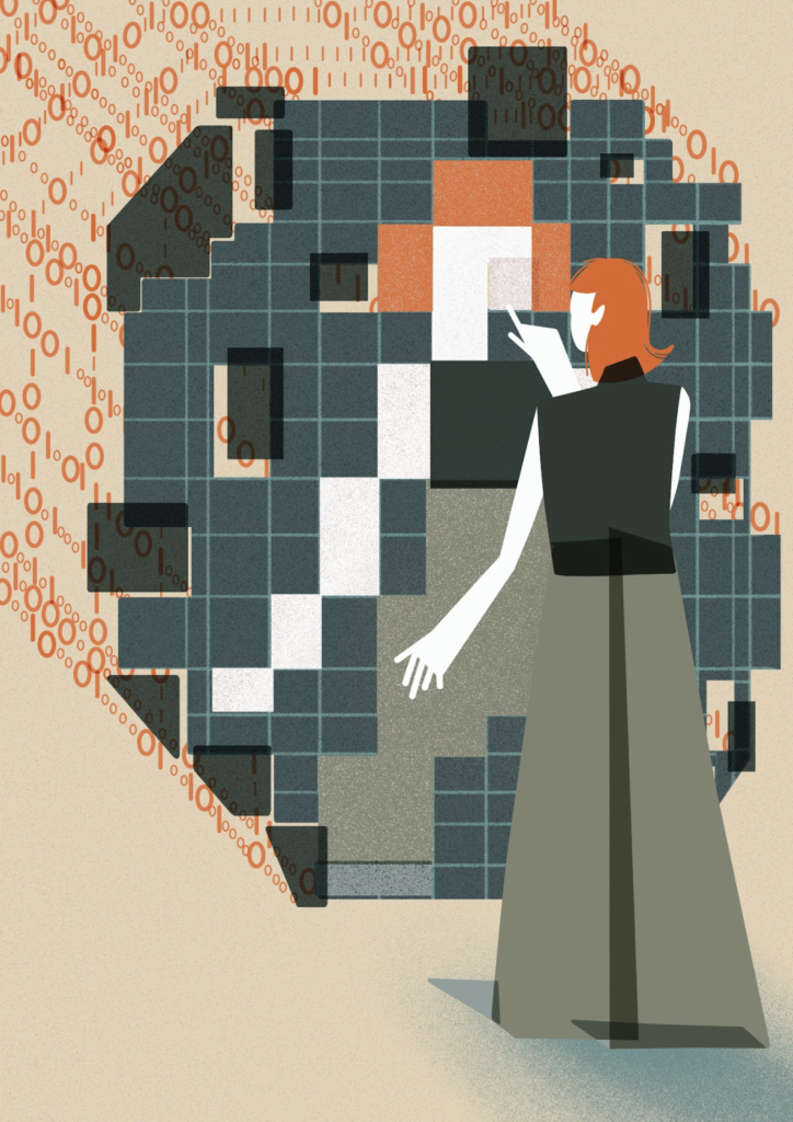
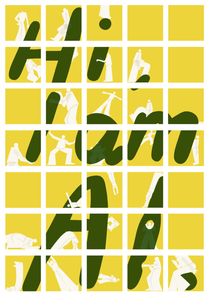
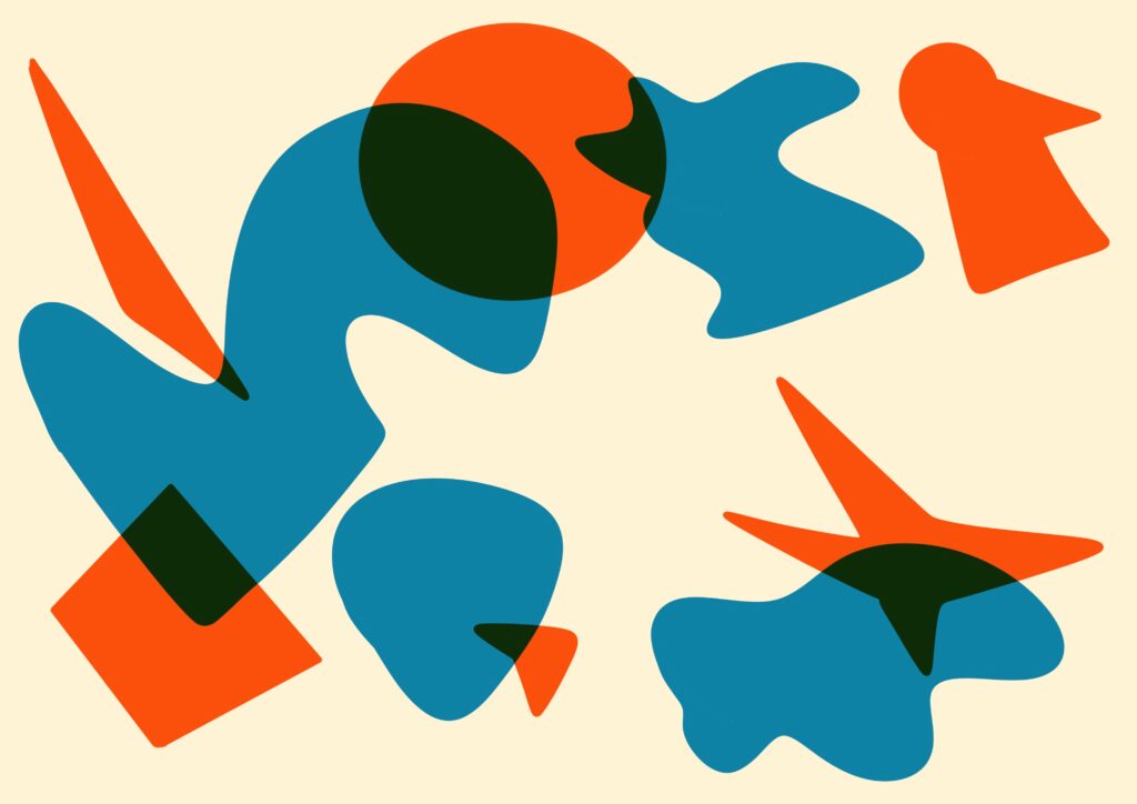
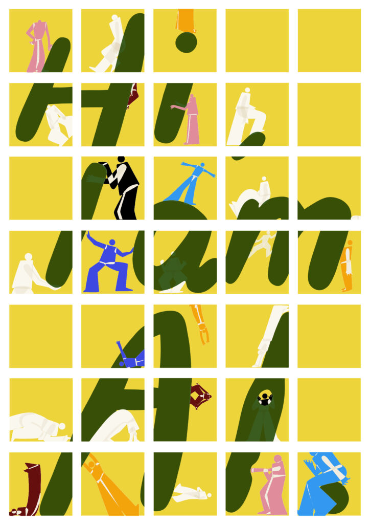
In 2025, we uploaded 60+ images to our library. During this time, we’ve been fortunate to work with several organisations which have culminated in collections of images as well as contributions from individual creators. To make the process of submitting images to our library easier for everyone, we’ve released our Submission Handbook for Better Images of AI. This is our first attempt to publicly communicate our guidelines and policies for submitting images to the Better Images of AI library.
Importantly, anyone can submit an image for consideration in the library. Our library features brilliant contributions from art students, researchers, amateurs, and professionals from all fields across the world. As a non-profit organisation which is run entirely by volunteers, we are grateful that most images are kindly donated* to the library by these amazing creators.
What’s inside the Submission Handbook?
Our image criteria: what elements do we look for in ‘better images of AI’ and what tropes should you avoid?
Inspiration and resources: get started creating your own better images of AI
Intellectual property guidance: steps to ensure your images do not infringe 3rd party rights and learn more about the Creative Commons licence that images published in the library are covered by
AI policy: our prioritisation of human-created visuals and restrictions on AI-generated art
This Handbook will serve as a working document which we will continue to update as we learn, reflect, and find more useful information to share with our creative community. Previous versions will be archived here.
If you spot any mistakes or have suggestions for ways to improve the Submission Handbook, please do get in touch with us by emailing [email protected]. We’d love to hear from you.
Finally, we would like to extend our gratitude to volunteers Söğüt Atilla Aydın, Elja Daae, Harriett Humfress, Grace Jenkins, Beckett LeClair and Laura Martinez for providing advice and feedback which supported the development of this Handbook.
* We do sometimes work with organisations that can commission images or run art competitions with monetary prizes. If you might be more interested in paid work related to our library, do sign up to our newsletter where we share these opportunities.
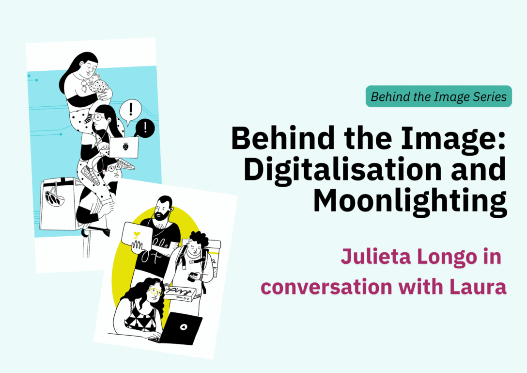
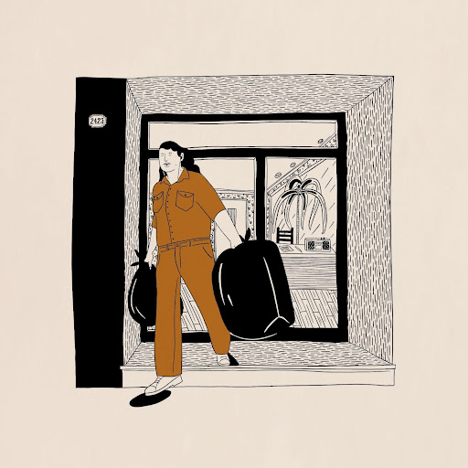
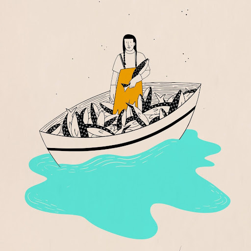
The aim of the Digital Dialogues competition was to visualise some of the Digit Centre’s research on work and technology. Julieta speaks to the importance of visualising research, advocating for artistic approaches that better represent authenticity and collective experience.
The discussion was conducted in Julieta’s native language, Spanish, which has been translated by Laura in English below. You can access the Spanish version here (albeit in a slightly different format and structure, but all the same content).
The rhythms of life and facets of working life
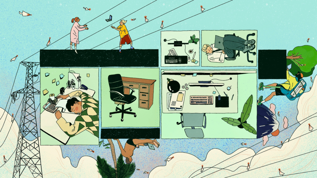
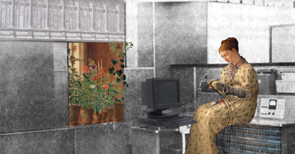
Digitalisation and Moonlighting (1 and 2) focuses particularly on how precarious jobs affect mothers and people with care responsibilities. Through her graphic choices, Julieta highlights the tensions and the balance between paid and unpaid work, which in many cases is operated and/or mediated by digital platforms and/or artificial intelligence systems.
Julieta shares her motivations and the link between her images and the topics she explores in her research and personal life:
“It was an image that was initially intended to reflect on multi-job holding, which is a global issue, but in Argentina in particular it is being hotly debated because incomes have fallen too much in recent years. The use of platforms and remote or distance work has to do with the need to supplement income. It seemed to me, then, to be a central issue for thinking about artificial intelligence and technology. Also, because this type of work does not produce a new type of technological worker, but rather adds to the existing workforce and is often linked to traditional jobs.”
In Digitalisation and Moonlighting, we see a person, a woman, who supports and sustains herself in her many roles. The last step represents the role of mother and seems to finally be in a moment of rest. Julieta’s illustration is a very telling and thoughtful way of bringing various topics into dialogue: gender, informal and remote work, the question of everyday life, time, motherhood and care. This last aspect is also mentioned in the description, and it should be noted that it is not always included in the graphic representation of the theme of the digitalisation of work.
Julieta confesses that she even made this illustration while she was a little tired: “… I drew the last woman looking after the baby with her eyes closed, a little bit tired but also relaxed… because it reflects a very genuine need to organize our time better, to have jobs that allow us to organize ourselves better and, above all, to have more non-working time.”
The inspiration for this work came from a reflection on how to graphically represent the phenomenon of having multiple jobs (moonlighting) in contemporary societies, a situation marked by digitalization, intimate life stories and the time devoted to work. From her point of view, new technologies play a role in transforming our rhythms of life: “there is a certain idea that technologies will allow us not to be in an office all our lives and therefore to organize our lives differently… not to be in a workplace all the time, whether it be an office, factory or shop… I think that the idea of moving away from traditional work and having more time for life is a very important demand that technologies introduce, resolving contradictions and creating new ones.”
As for the illustration process, Julieta created it digitally using Procreate and Adobe Fresco, and she gives us details about the decisions and changes made along the way, as well as the inclusion of self-referential elements, especially the balance between motherhood and remote work:
“I often work remotely, from home or at an office, but not every day. And this, which at first seemed ideal, or at least I thought it was ideal for motherhood, comes with a lot of additional burdens and responsibilities. In fact, I came to romanticize the idea of being able to work and look after my daughter at the same time, even though it wasn’t always possible, but I thought it was nice to work close to my daughter. I think that romanticization is often present in remote working because it allows you to balance different aspects of your life. You are at home and your children are playing nearby, but that balance has many contradictions, and I did not resolve them.”
Returning to her perspective as an illustrator, Julieta tells us that she draws frequently, mainly digitally, and also shares her thoughts on her own artistic practice: “I’m drawing a lot digitally at the moment. I would like to go back to not doing everything digitally, but I find it really difficult, especially because it takes much less time, which raises several contradictions related to technology and work in general.”
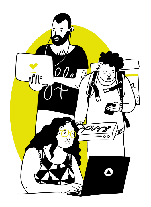
The image ‘Connected, Yet Disconnected’evokes themes such as the emotional and social isolation of the digital worker and shows the paradox of AI-driven work and spatial disconnection in contemporary employment. Julieta tells us that it is the first image she made for her research, thinking about people who work connected and who are close together, sometimes only momentarily, sharing the same space:
“It is very likely that next to a person working in an office, or as a freelancer, there is someone bringing them food or deliveries. They probably don’t talk or know each other, and sometimes the transaction is very quick, such as delivering food, for example.”
Julieta believes that the space shared between these people is completely fragmented by digital technology. In the first image, we see overlapping people (actually the same person in different roles), but in this one we identify an overlap and spatial convergence of different people who could be very close to each other and, at the same time, working with people who are far away or remotely.
Through this graphic proposal, Julieta seeks to illustrate that: “people are not only close because they are connected. Today there is a very interesting ambiguity, which is that virtual space breaks down physical space a little, and it does so in both directions. It connects us with people who are far away, but it also disconnects us from all the people who are close to us. On the other hand, there are a lot of everyday problems that are solved digitally, breaking the link with the physical world and other strategies for being in it.
I think, for example, of mobility and how I used to travel before I had a mobile phone. The first time I travelled alone, I didn’t have a mobile phone and I spoke to a lot of people to get to the place I had rented. The intention of travelling also has to do with being present in the places I go and getting to know the people who live there, but now I could solve almost everything on my own.”
The same thing happens in the world of work, with digital work and even in the dissemination of knowledge: “Many people who work use a lot of the knowledge produced by others, but the social link has been lost. It is also very positive to have the possibility of socializing knowledge in a very agile and useful way. But I am very nostalgic for everything that has been lost in social terms.”
Visualising Research Through Better Images
Julieta thus revisits the idea of the importance of creating images that can be articulated with research: “… I am somewhat in search of trying to articulate research and illustration, increasingly and better, and also thinking more collectively about this articulation.’ Julieta points out that even for book covers, using meaningful images helps a lot to bring people closer to certain texts, content and topics:
“images could be integrated much more into research, both to disseminate results and to reflect on research results or conduct interviews. I think images have a lot of power, because it is much easier to see whether they represent your reality or not. They also allow for discussion or encourage conversation on certain topics. For example, being able to conduct interviews with images to elicit interactions, testimonials, and make other issues visible.”
It is for these very reasons that when Julieta discovered the Better Images of AI library, she decided to share information about this image bank with her fellow researchers: “ I sent the information about the Better Images of AI image library and database to all the researchers I work with, because I think it’s great and often, we want to incorporate images into our research but we don’t have much artistic training, there isn’t much reflection in general and this type of training doesn’t exist in our fields. So, what we do is use royalty-free images from the internet that seem more or less appropriate.”
Regarding the role of the artist in proposing new visual narratives, Julieta believes that: “There are artists who are artists and who interpret reality very well. There is a certain idea that art captures reality, unconsciously, but I think there could still be more opportunities for dialogue with artists. There are many artists who reflect a lot, based on their own interests, because they read about current affairs or listen to talks according to their preferences. The same thing happens with researchers, who often want their research to be articulated through artistic expression. I think it’s interesting that broader debates begin to take place. It might be a good idea to bring together artists, workers and researchers so that we can think together about the images we want to use to represent reality. Obviously, not all artistic production has to be like this, but I believe that if these dialogues exist, they can encourage more critical reviews of why we are doing things the way we do!”
Julieta believes it is important to have this reflection at a collective level, among illustrators and researchers: “There are many artists who read and question themselves from similar places and topics but from an individual interest. I think that there is a lack of articulation, or more explicit dialogue, between those who make art and those who research.”
Julieta began to develop a connection with art from a very young age: she studied at an art school and years later enrolled at the Faculty of Fine Arts in Argentina. It was later that she decided to study Sociology and pursue a professional career in that field. That is why, even though she was already a sociologist, Julieta continued to do some illustration work: “I always felt quite hybrid… For many years, I was unsure what to do, whether to devote myself to illustration or sociology, and there was a period when I almost exclusively devoted myself to illustration.”
Julieta believes that visual narratives surrounding technology and artificial intelligence are sometimes abstract, and emphasizes the need to show images that conjure up and combine other realities that are more diverse and inclusive:
“When you search for technology, you see lots of images that are far removed from reality and make you feel that technology doesn’t affect us. The same thing happens with artificial intelligence. If you search on Google, many images appear that are far removed from our daily lives. I think we forget to show that everything is integrated into our intimate and collective experience, in the city, in the world, with people, in the distance and with ourselves.”
Gender is another issue that has enabled Julieta to question this connection and the need to produce new and better illustrations: “There is another issue that also challenges me greatly when it comes to connecting research and illustration, and that is gender. With this issue, something similar happens to what happens with images related to technology: there are many clichés.”
Julieta recalls that when she was about to devote herself fully to illustration, she worked on some very interesting projects at the Ministry of Women, Gender Policies, and Sexual Diversity of the Province of Buenos Aires: “We had to do a lot of visual production for different materials, and what you always do is look for what already exists. And when we looked for what already existed, in visual terms, it was always the same thing. For a specific project, I had to change the gender of all the images I saw on the subject of traditional professions. For example, I was looking for images of builders, and they always showed men or hyper-stereotypical and even very sexist images of women. It was very shocking not to be able to use any images. This made me realize that there were very few that represented what we wanted to illustrate in the project. It’s incredible that we always have to do that, like a translation, that is, change the meaning of the images we see.”
Julieta also points out that, within these projects, it did her a lot of good to question who was represented in her drawings and how. In other words: “How can we represent diversity in a way that does not make it seem like a minority? How can we find ways of representation that challenge more traditional views? Why are certain sectors made invisible and not others? Most of the time, we just reproduce stereotypes!”
Some of Julieta’s previous artistic works
Similarly, returning to the subject of technology, it is not always possible to find images that adequately describe different techno-realities: “very abstract images appear, with very neat environments and people, all with good living conditions or very settled lives. These are ideal worlds, and it would be wonderful if everyone had those opportunities, but these images are very far removed from what exists in the real world.”
About the artist
Julieta Longo, illustrator and sociologist, was born in La Plata, Argentina, in 1985. She is a researcher (CONICET) and teaches Sociology at the National University of La Plata. She also continues to draw. Recently, was illustrator for the Ministry of Women, Gender Policies, and Sexual Diversity of the Province of Buenos Aires. In 2019, with Mercedes Roch, she published Primeras (second edition 2024, Malisia-Ediciones Bonaerenses), a book that tells the stories of women who, for the first time, did things previously reserved for men.
About the author
Laura Martinez Agudelo is a Teaching and Research Assistant at the University Marie & Louis Pasteur – ELLIADD Laboratory. She holds a PhD in Information and Communication Sciences. Her research interests include socio-technical devices and (digital) mediations in the city, visual methods and modes of transgression and memory in (urban) art.
At the end of summer, Better Images of AI were invited to the Tipping Point exhibition commissioned by BRAID in Edinburgh. The exhibition featured works, which ranged from digital installations to sculptural interventions, zines and comedic sketches, from creators who were responding to the present realities and near-future horizons of AI.
With the very exciting announcement of a 3-year extension of the BRAID programme which will involve another round of funding for commissioned works and exhibition, Tania Duarte (who visited the exhibition and provided support to BRAID) brings together the themes from the art and panel discussions from her time in Edinburgh.
Although the Tipping Point is not strictly related to visual representations of AI, in their approaches to reimagining, the artists had to grapple with the same questions that our community often do: how to more realistically represent AI, what does inclusive AI look and feel like, and what is the role of AI in society. These discussions could provide inspiration for artists submitting to the Better Images of AI library, or as reflections to prompt more thoughtful approaches to the uses of AI, especially relating to the choices we make when using it in creative practice.
Edinburgh’s summer festivals are famous throughout the world for the scale of celebration of arts and culture. This August, Nicola Benedetti (Festival Director of Edinburgh International Festival), described how its significance is more important than ever:
“This year’s International Festival has been one of extraordinary contrasts, from grandeur and scale to intimacy and informality. I’ve seen this year how art can build bridges, change minds and find connection in a world that so desperately needs it.” – Nicola Benedetti
Building bridges is exactly what Bridging Responsible AI Divides (BRAID), was funded by the UKRI Arts and Humanities Research Council to address. The Tipping Point new artists commission and exhibition proved a powerful way to explore topics such as connection, and also resilience, humour, ecology, mindfulness, resistance, ethics, empowerment and creativity in the context of present realities and near-future horizons of AI.
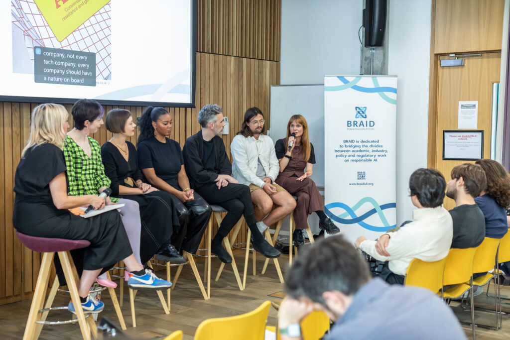
Led by The University of Edinburgh in partnership with the Ada Lovelace Institute and the BBC, BRAID’s Inspired Innovation lead Beverley Hood (artist and a reader at Edinburgh College of Art), hosted the launch on the 8th August 2025. She introduced the moving and captivating exhibition of seven very different visions of approaching AI with wisdom and care, starting with workshops and a panel discussion with the artists.
The opportunity to not only view the artists work at the exhibition, but also hear them discuss their process, shared challenges and different perspectives together was not only fascinating, but also added depth to the ideas and imagination which creative practice unlocked. The themes which arose in the discussion gave a rich idea of how artistic representations can allow a more nuanced, open and inclusive exploration of the key questions humanity is facing in front of AI systems which are changing our interactions, roles and society.
We were left dreaming of a world where artists are in charge of creating tools with non-commercial design intents, and the whole exhibition provided a glimpse of how different the world could be.
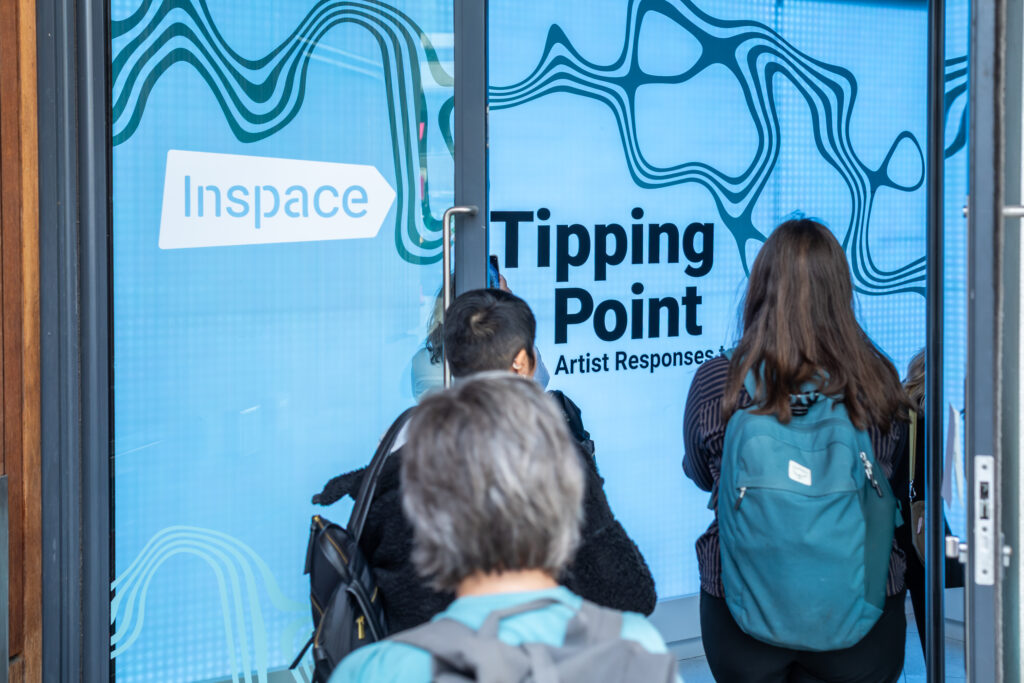
Entrance to the Tipping Point exhibition
Redefining AI and encouraging new thinking
Each exhibit has extensive documentation of the different themes related to envisaging how we get to the responsible use of AI. Each artist chose to do this with their very different artistic methods and backgrounds, showing the plurality and breadth of viewpoints and interpretations which can be applied to our mental models of what is termed “AI”. These were a stark contrast from the hegemonic and often monolithic imaginaries which are typically seen in the media, in marketing and in popular culture.
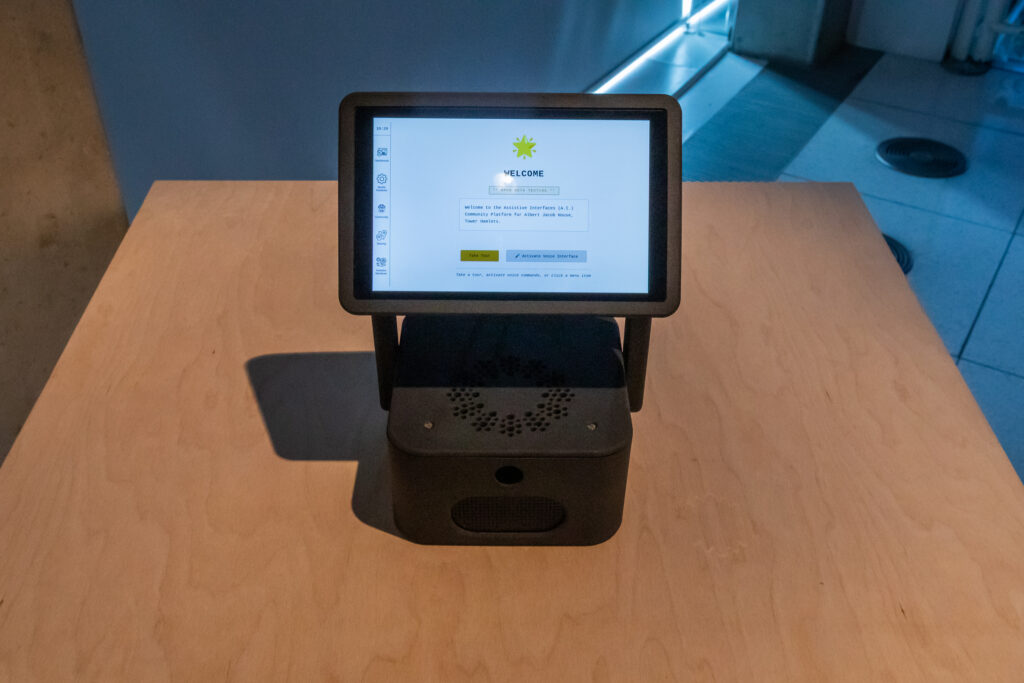
It is no surprise then that the panel even goes on to discuss changing the term and meaning of AI itself. Wesley Goatley’s installation of three possible, but progressive, futures; ‘A Harbinger, a Horizon, and a Hope’ constructs a new way of using technology in the Hope scenario, and Wesley explains that the hope is:
“that they’ve just completely reframed or rephrased AI to stand for Assistive Interface rather than Artificial Intelligence. And if we did that, we made that change, at least in our heads, I think we would shift entirely our expectations of those tools. Shift entirely what we want them for, what we would apply them to, what we were worried about, perhaps how we would design them.”
Throughout the Hope piece in Goatley’s installation, you hear the stories and narratives playing out in small online interactions between the communities who are using the technology. They talk about AI, but they mean a system interface every single time, and no one mentions intelligence, artificial or otherwise, and this glimpse into a world where we are not obsessed with the idea of intelligence to the distraction of the actual utility of tools is refreshing.
Indeed, throughout the exhibition several themes which seem lost in the distraction of the wider AI discourse’s focus on ‘intelligence’ surfaced. These were pulled together as part of the discussion of the panel members, who discussed how the new thinking and values they were proposing should be represented in AI. Of note were the themes of addressing AI’s environmental impact, the need to stimulate sociotechnical AI literacy, and exposing AI’s extractive nature.
The environmental impact of AI: should we go slow, local, and low resource?
A key theme explored in the exhibition was the huge energy consumption of AI and its resulting environmental implications.
Some of the artworks directly explore the themes of slow and low resource AI and the material aspects:
Grace Attlee who worked with Julie Freeman on ‘Models of Care’ described how they explored whether really low resource AI could actually enhance the creative practice. They trained low resource models with their own soundscape data collected from glaciers in Iceland. She acknowledged that they had to balance the carbon footprint of doing this in terms of the transportation emissions production processes, and report at the end.
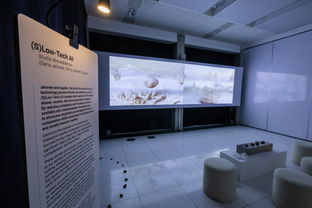
Perry-James Sugden described how within the development of ‘(S)Low-Tech AI’ they actively used AI in various ways such as the algorithm that they created, as well passively within internet activity which involved interacting with AI.
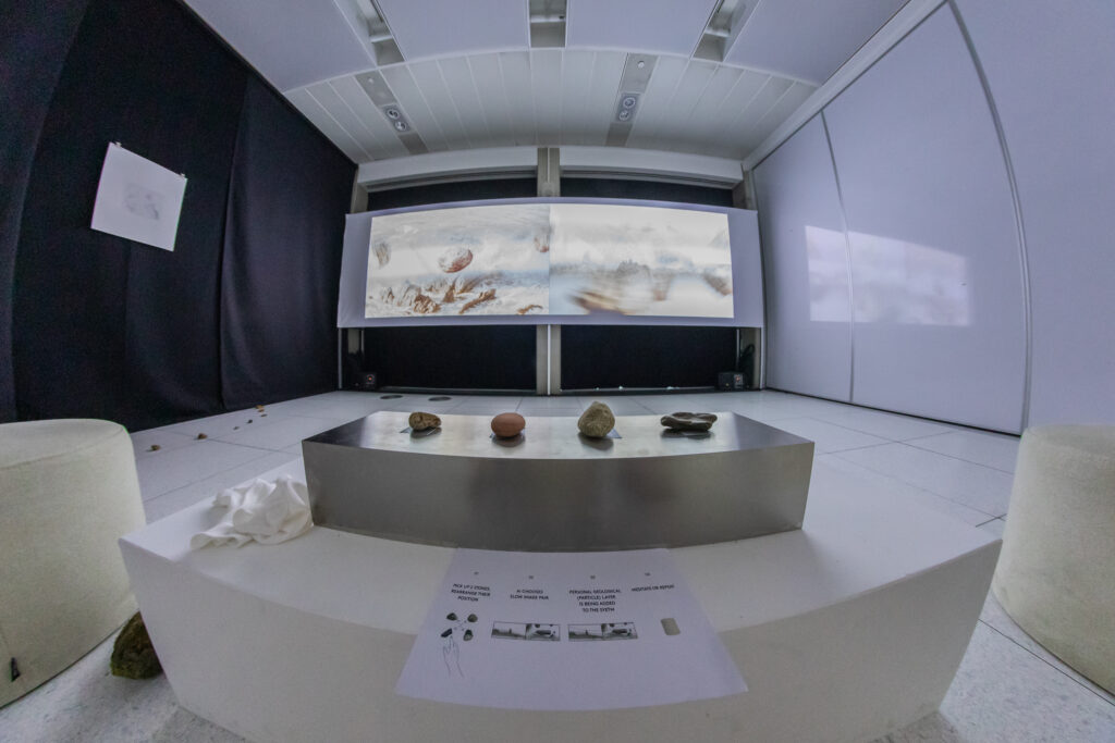
Collaborator Daria Jelonek expanded on the active part by explaining that having experimented with AI models 10 years ago, they became interested in building smaller models of AI, for example, a system called permutation to give you a range of outcomes:
“It’s not like learning and training. You give it an input, and in our case, for example, we had four rocks which lead to a permutation and rearrangement of twenty four outcomes. And we thought, this is enough. We deliberately didn’t want to use heavy AI models, because that would be against our concept of the idea. And at the same time, in this project we also created our own audiovisual data sets. So it’s not that we’re relying on heavy AI data sets or training online, but we went across the Scottish landscape and captured audiovisual material there which we use for the work.”
She explained that their work was born out of a counter movement to the fast evolving generative AI landscape which was born 2023, as a layered way to bring the challenge into a form. One layer was creating a more physical interface as a reminder of where the viewer is situated, starting with designing a tangible interface using literal rocks to represent the physical elements of AI often forgotten ‘behind shiny screens and in a box far, far away’. They imagined their system as making the user calm down, reflect and have a space where computational tools can actually make you feel good. This is in contrast to the current AI tools which Jelonek describes as being developed to make your life easier or find shortcuts, but actually just make you feel faster.
Another layer she discussed was a geological layer which through interacting with it gives audiences a visual representation of the impact they have with AI tools, to make them aware of the broader impact of AI tools on physical reality.
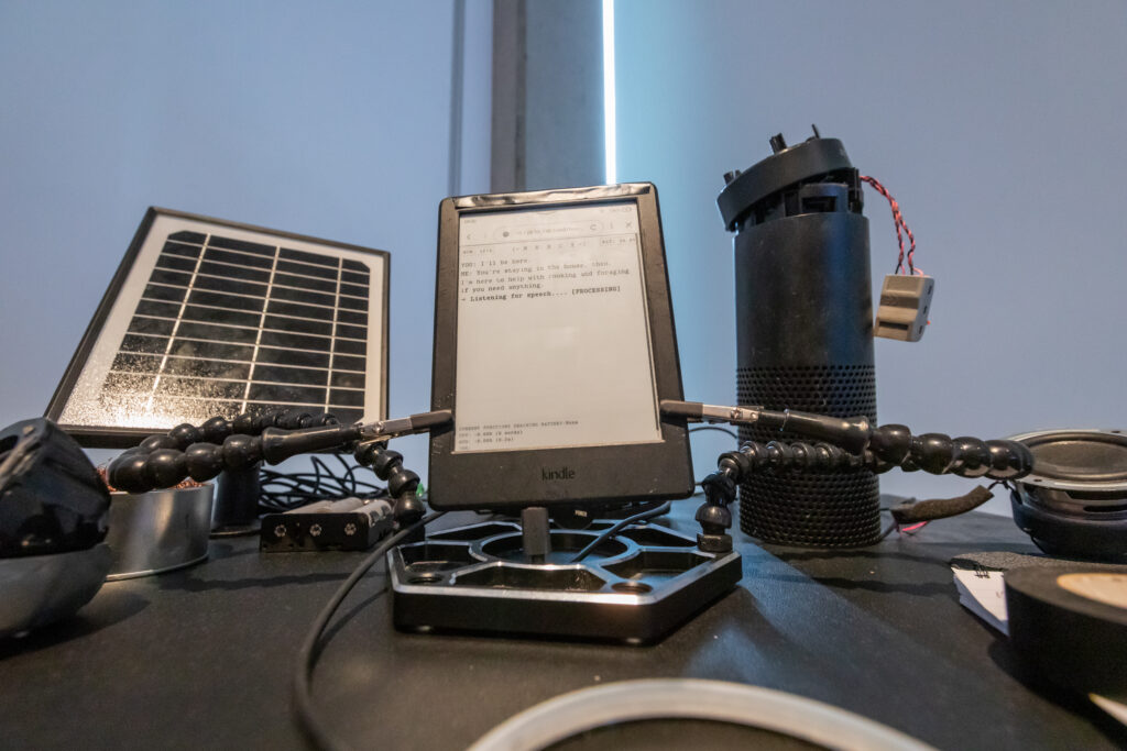
Goatley explained the environmental significance of the ‘local model’ (LM Studio) used as part of his research, describing a ‘light’ locally hosted model which rather than being accessed through the ‘cloud’ (ie a big data centre), is the same sort of model which you can download and run on your computer instead.
While being similar to large language model interfaces that you can question and probe, you avoid the “incredibly, insanely pollutant, consumptive, dangerous technologies relying on huge infrastructure that are growing at scale in the UK and abroad”. Not using the carbon costs of large scale computation by keeping it on your device means it is normally slower, but that little bit of friction is an important part of the art and design:
“It reminds you that there’s a real mechanism here; It’s not just a magic portal to the mystery intelligence in the sky.” – Wesley Goatley, 2025
The need for sociotechnical AI literacy
A theme that ran throughout the exhibits was the idea of the projects as being ways to both signal the need for, but also deliver, a degree of sociotechnical literacy in relation to AI.
Goatley’s proposition of 3 different futures with AI, although seeming to foreground the AI and capabilities, actually tells the stories behind the tools which have been developed. He aims to make the AI or the technical aspect of it disappear as quickly as possible in the context of what’s happening in his piece, and to ground people in their feelings about it. He believes that these narratives, and engaging with the tools gives a kind of literacy and ability to learn and make decisions about tooling in terms of the objectives surfacing from the narratives. “You gain a sociotechnical literacy about what is possible and what your responsibilities could be”.
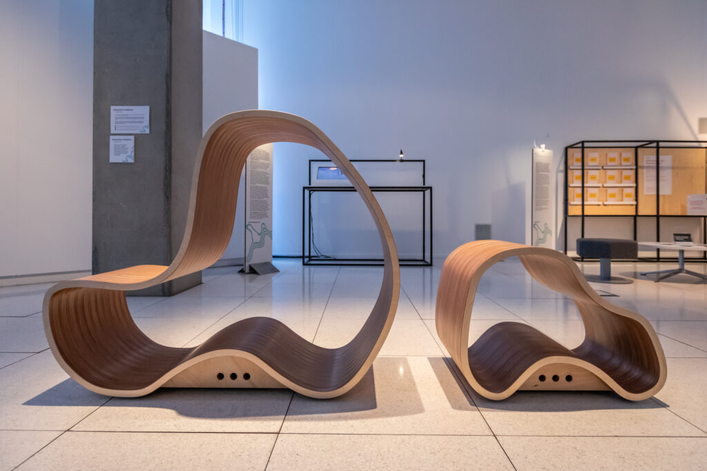
Elements of this approach were echoed in ‘Models of Care” by Freeman: sonic sculptures, which although not directly designed as an interface, were still thought of as something tangible for visitors to interact with. Attlee described how Freeman wished to design something to ground people, especially as spaces like galleries can be unwelcoming. She wished people could get into a sculpture or hold on to something that actually plays soundscapes through the physicality of the object, to “kind of hold AI”.
The two wooden sound sculptures in the exhibition are the result of this vision of a space that can be entered physically. One emits compositions by Freeman and Norwegian musician Torben Snekkestad. The second, smaller sculpture holds a third composition by Anna Wszeborowska, generated by a low resource AI model that has been trained on glacial field recordings. The interaction between sound and material, enables connections to be made between the physical, audible and conceptual. Vibrations are felt through the nervous system, making it less invisible and intangible. This breaks down barriers to learning about AI, and Attlee describes how the choice to use smaller models also represents a prompt for learning about them.
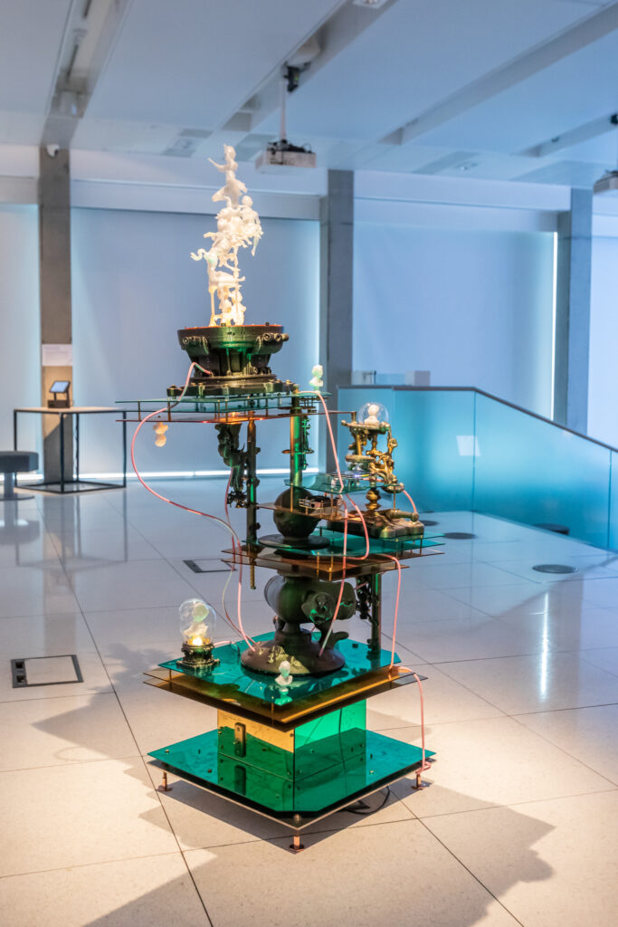
Another approach entirely to the need to scrutinise AI came from Rachel Maclean’s work, which presents imaginary AI generated characters trained on her own back-catalogue. The generative AI output is displayed on a small Raspberry Pi device with magnified lens above and surrounded by scientistic, colonial, industrial motifs like 3D printed busts, and a towering metal and glass structure. As Gavin Leuzzi from BRAID pointed out, the sculpture: “places the viewer in the role of a scientist observing the output of AI critically and dispassionately… Like a warning not to get sucked into fantasies and illusions.”
A global extraction system from south to north and beyond
Inspired by the audience discussion and Q&A, there was a degree of thinking about the perspective from Edinburgh as being from a city which had benefited from colonialist extraction, and how this was addressed within the exhibit. Similarly, an audience member suggested the role that Lowry and Turner had played in documenting the effects of technology on environments and society, and whether this was something that could be tackled in a similar way.
Tipping Point discussion panel
The parallels between AI, the Industrial Revolution, and the British Empire in terms of technological innovation forcing change, and how they are linked to violence and extraction from the natural world and from human labour were discussed. A sobering thought was of entering a period in which companies like OpenAI are so big that they behave like Empires, seen also in the way that they interact with nation states.
Goatley recommended ‘The History of Automation’ by Lutman, which considers de-skilling and upskilling, and concludes that automation doesn’t release people from labour. Goatley commented that thinking about the current moment through a historical lens could be an area for further study.
Imagining and building new possible futures
New thinking is encouraged by the exhibition as a bridge to imagine possible new futures. However, the aim described by Hood was not to speculate, but instead to embed propositional change within the design and the concept of the artworks, so they can demonstrate how such changes might come to be. She described a desire to move beyond an exercise in critique of AI through an arts and humanities lens. Although critique is a common and powerful strategy within the arts, the call invited more direct strategies for potential future impact. This was a difficult brief which was met in a number of different ways.
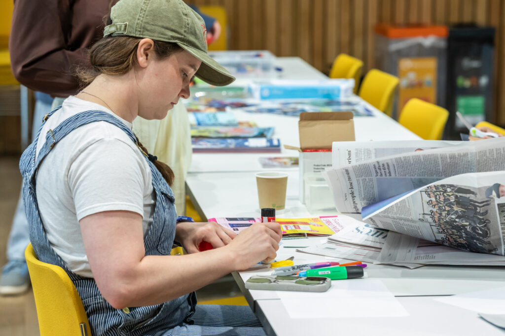
Individual making a zine as part of one of the Tipping Point workshops
Centring care within AI
A very relevant but overlooked theme to discuss in the context of automation is that of care. Shervington-White, Ashcroft and Attlee spoke to how care might be better considered within AI. In their works, they built different visions of AI tools to enable care, radical care in AI development, and building models of care.
Shervington-White worked with a technologist called Luca Chung to develop a workflow to pick up faces within archived footage, which are seen as computer vision bounding boxes within the video. This use of AI becomes an anchor point for an intimate conversation about technology that is accessible and delivered from a human, community perspective. Speakers from black communities give their own ideas of what they believe would make AI more responsible for them in their lives. A lot of the strategies they talked about were looking at communities that are most underserved by AI being involved in having them shape it.The message is that if it works for those who are the least protected, then hopefully, it should work for everybody in the end.
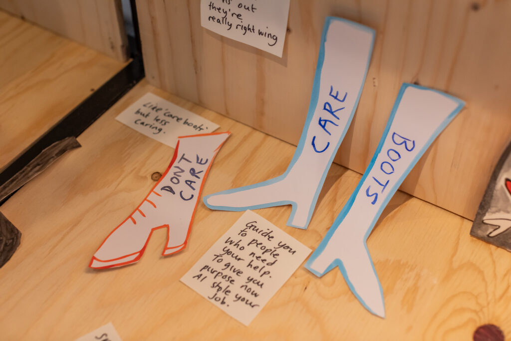
Louise Ashcroft, one of the other artists exhibiting, and who had held a workshop earlier in the day, had within her project asked for direct examples of how AI should be used, and documented humorous examples of what AI should be used for, many of which centred care in some way. Beverley contrasted these with the less direct examples of propositional change within Shervington-White’s video installation, as evoking a compelling and emotional mood and attitude within the film which evokes the idea of radical care, with decisions centred in community not within tech companies.
The right to resist and ability to reclaim
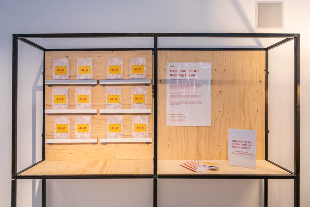
Also in the audience after a morning workshop was Arda Awais from Identity 2.0 who was called on to talk about one of the most direct propositional approaches, ‘AI to Z’, which looks at resisting generative AI models. The project creates places for people to engage in different types of resistance, no matter how interested or passionate they are about it. This is documented in the project through a zine which includes a range of strategies identified by activists in a range of different areas, including some which are low effort and individual. These are important as Awais explains that people can be disempowered by feeling they need to make a really big change which can seem overwhelming. Identity 2.0 worked to break down the impact each person can make, and to make it easy and approachable by using a conversational tone and providing an accessible glossary for AI jargon. They have since submitted the Zine to zine libraries such as the DAIR Zine library, where it is available to inspire many others and effect change in how people feel empowered to push back against the encroachment of AI in their lives.
Goatley’s exhibit is explicitly propositional in the sense that it creates and foregrounds what diverse communities might want and how that could be delivered in a tool they have built. These suggest a less complicated form of politics, a lower power use which can be achieved in a way which is not speculative but uses what we all have right now such as mesh networks, distributed computing, as well as designing for disabled users and older users. This is all tools we already have, and it was really about bringing that together in one object in that way, making the proposition very close to hand, achievable, and scalable. He described how he was keen not to fall into a common trap of future thinking and imagining that there will be a speculative way of fixing things fifty years down the line. Instead by deconstructing and reconstructing elements from low resource existing technologies, he shows how we can get there.
Deconstructing anthromorphism
One notable thing in the exhibition compared to many explorations of AI was the complete absence of anthropomorphic, human related ideas of AI. Comparisons with human intelligence are often unhelpful and very misleading, but they also hinder creative exploration through anchoring ideas in replications of human embodiment, biases and limitations. Shedding these constraints was one of the ways in which the projects and exhibitions were able to interrogate and present more meaningful facets of AI systems, ideas and impacts.
This was not always easy to avoid, and Goatley describes the challenge he had in trying to find the tools to make an LLM voice interface for the project that he could:
“with consistency make it not refer to itself as I, and suggest its own knowledge in some way, and use all these terms that are the sole domain of humans. And it’s largely only used by tech companies to try to manipulate our understanding of what these tools are and what they can do. But it’s a real struggle. I think I did it. At least I haven’t managed to make it break yet. But it took 7 weeks of just tweaking a system prompt over and over and over again, and changing models just to get rid of that one thing, it’s so deeply baked in, it’s really nefarious”.
Maclean reflected on a different way in which interacting with generative AI can lead to a type of anthropomorphisation. Her fascinating and mysterious sculpture illustrates the beguiling and alluring pull of generative AI technologies that make it easy for an artist to simply forget that it’s a data processing machine that they’re engaging with. She cautions that while artists should not identify with generative AI as anything more than a technological tool, the fantastical beings she has created within the sculpture partly make visible the imaginary beings that we can so easily project onto the technology. Maclean warns of the need to check what effect these tools have on how we approach artistic practice and work.
Dominant narratives of all powerful and inevitable AI which we have no option but to embrace or be left behind are therefore strikingly refuted through different visions of what could (and maybe should) be. The different visions in Tipping Point force us to engage with the paucity of ambition seen in the AI we have now in terms of creating systems which work in harmony with nature and enhance the human experience. They question the relentless trajectory of development towards ever moving goalposts of productivity, efficiency, standardisation and surveillance, offering instead different views of what AI might offer us.
About Tipping Point
Tipping Point explores how artists can help us more wisely respond to the present realities and near-future horizons of AI. Featuring seven newly commissioned artworks from across the UK, the exhibition presents new ways of thinking about today’s AI, the futures we want and the communities needed to build it. Artworks, ranging from digital installations to sculptural interventions, zines and comedy sketches, address themes that reimagine AI uptake, inspire activism and resilience, and showcase artistic creativity in the field.
Tipping Point was funded by the Arts and Humanities Research Council (AHRC) and delivered by BRAID.
(S)Low-Tech AI seeks a shift towards slower, smaller, and more grounded AI systems. By reducing complexity and focusing on what is available and understandable, the artists showcase simplified and transparent forms of computation while connecting it to ecological roots and mindful decision making.
Watch Daria and Perry discuss (S)Low-Tech AI, their captivating installation for BRAID that examines AI through the lens of geology https://edin.ac/45Xqn0t.
AI-Z was a project by creative studio Identity 2.0, co-founded by Savena Surana and Arda Awais. In this clip, Arda discusses collaborating with the activist community beyond tech when developing their artist commission project AI-Z.
AI-Z explores how zine-making can help people to address the pervasive and sometimes unwelcome encroachment of AI into our daily lives through methods of intersectional resistance and play. The project is also about archiving the collaborative process and building resources for community engagement around responsible AI.
Eye Yours!They’ve Ggetuo is a sculpture by Rachel Maclean and represents the first artwork from They’ve Got Your Eyes, a new body of AI-generated work spanning film, sculpture and digital painting.
Eye Yours! They’ve Ggetuo interrogates the tension between what AI is – a system of pattern-recognising algorithms – and what it feels like to interact with it. The artwork invites viewers into a hallucinatory space that questions the assumptions we project onto AI.
“Closer to Go(o)d?” draws on participatory workshops undertaken with working-class Black and ethnically diverse communities in Birmingham, with the aim of promoting a demystifying, radical, ethical approach to Responsible AI, one that is centred on care and community.
A Harbinger, a Horizon, and a Hope: Three Heralds of Possible AI Futures is a commission by
You can hear him speaking about the open-source AI devices he created here – https://edin.ac/46bhW2X
A Harbinger, a Horizon, and a Hope presents three voice-enabled AI devices that each represent a distinct and possible near future scenario for AI technologies and their relationship to individuals, communities, and society. Through interacting with these devices, audiences learn more about these potential futures and the experiences of the people living through them.
Some of Wesley’s images have been added to the Better Images of AI library, view them here:
Models of Care explores environmental responsibility and the relationship between artificial intelligence, climate change, and human agency through sculpture and sound.
Real Stupidity is a newly commissioned artwork that takes a humorous approach by joining forces with comedians to create a series of ‘Speculative Gadgets,’ a range of wearable AI devices that tackle contemporary societal issues.
Find out more about the BRAID programme at BRAID UK.
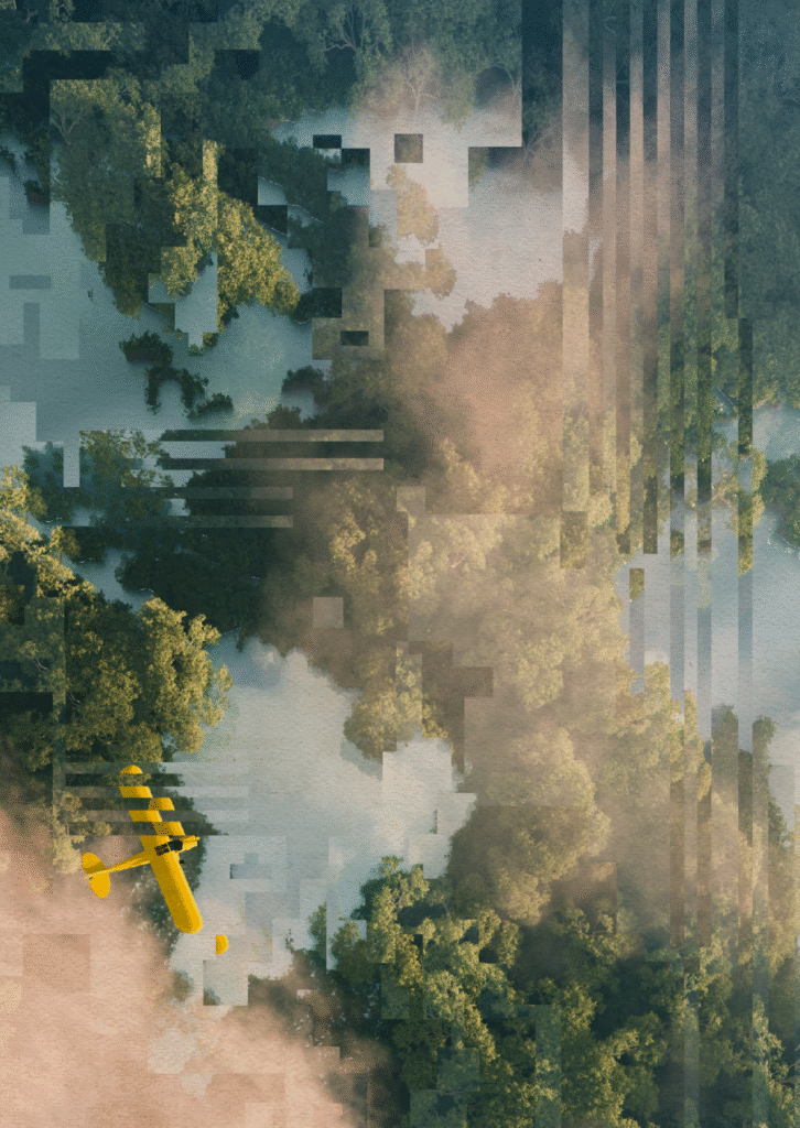
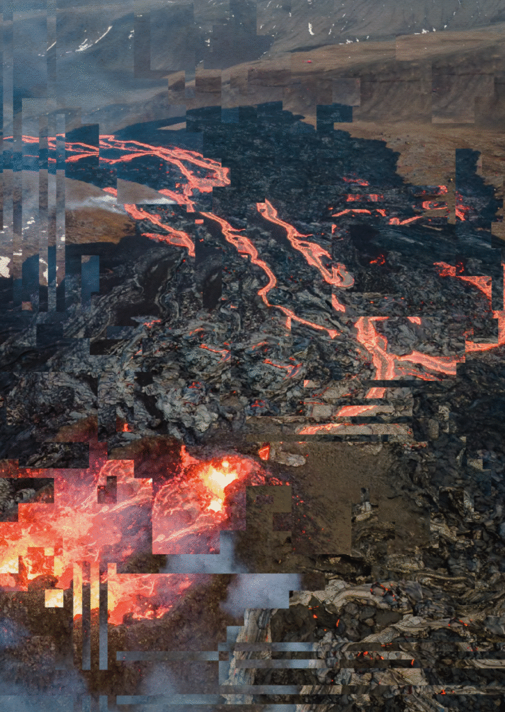
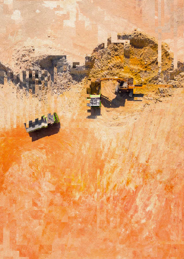
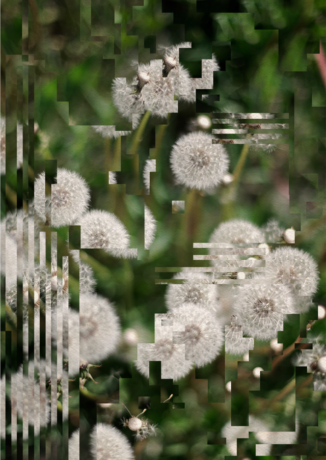
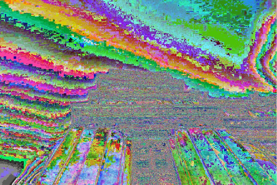
You might have noticed a new collection of images from Lone Thomasky and Bits & Bäume in the library. These images expose the realities behind the often perceived “clean”, “slick”, and “efficient” AI supply chains. Their collection shows the breakdown of environments and depletion of natural resources caused by the rapid expansion of data centres and mining of critical resources (like lithium, cobalt, and rare earth elements) which underpin (generative) AI.
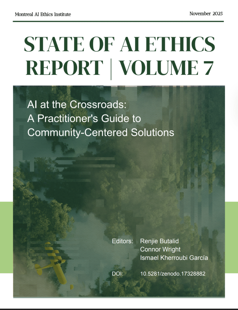
One of their images, ‘Distorted Lake Trees’ has been selected as the iconic cover image of the Montreal AI Ethics Institute 2025 State of AI Report. Below, we unpack some of the images in the Bits & Bäume collection and why they make a fitting partner organisation to Better Images of AI, particularly since our visuals aim to better communicate about the implications of AI on society, the environment forms a huge part of this.
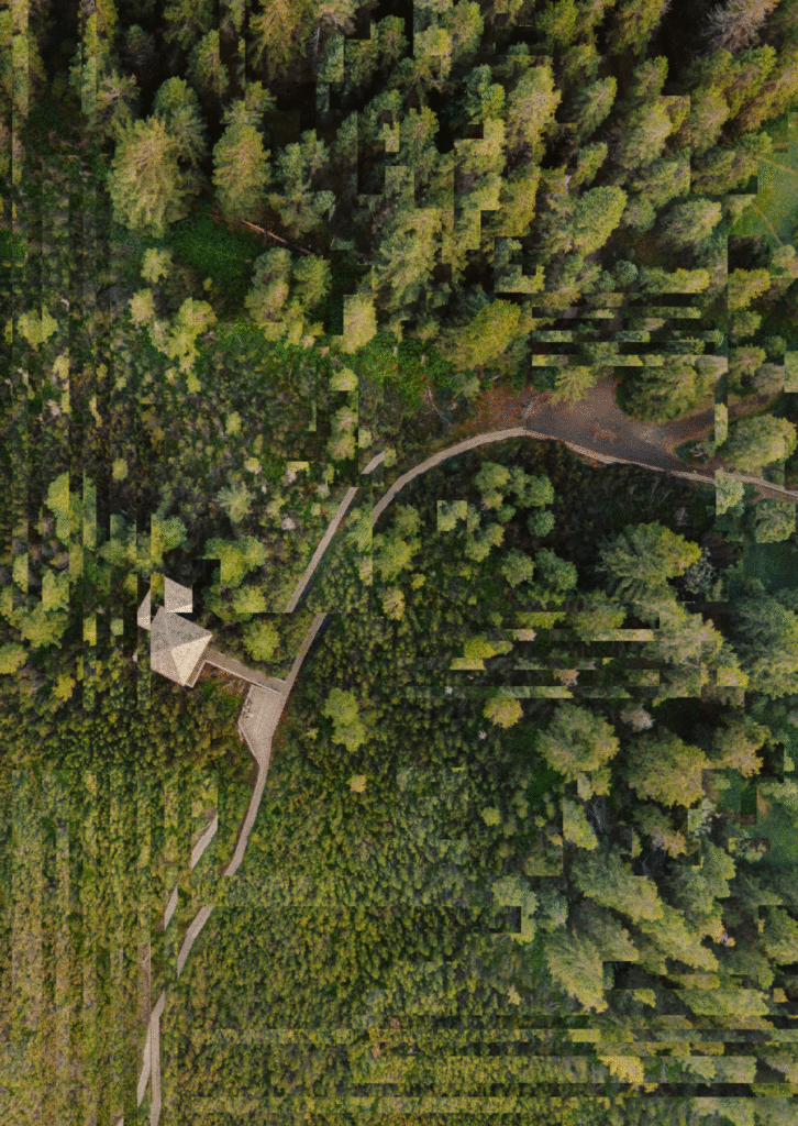
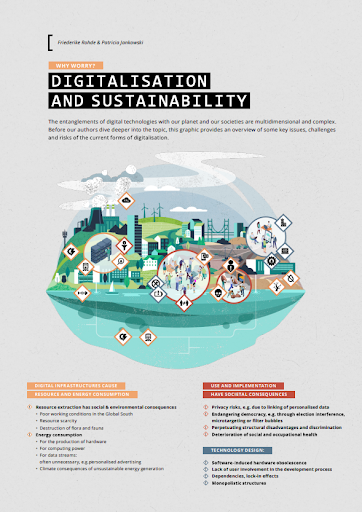
The hardware that we manufacture to underpin AI technologies and the data centres that power AI are responsible for an ever-increasing share of global electricity and water consumption, as well as being both habitat and land-intensive. Lone Thomasky and Bits & Bäume’s image collection features a series of distorted photographic images of landscapes to visualise the ecologies behind AI’s supply chain.
These images are a valuable contribution to the Better Images of AI library to counter the sleek aesthetics, magical metaphors, and luminous hardware which are often used to represent AI. Instead, these visuals help us move towards more grounded understandings that connect AI technologies with their material and environmental foundations. As such, using these images, we can improve public understanding of what is at stake when AI technologies are used, invested in, and promoted as a source for eternal good in society.
Bits & Bäume’s first conference took place in 2018 and brought together 2,000 people from diverse backgrounds and communities. After some smaller ones, the next large conference followed in 2022 –you can find their published conference proceedings here. The images in Bits & Baume’s proceedings may look familiar, given that this was the original purpose that the images were created before being donated to the library. Having already known Lone Thomasky, Bits & Bäume worked with her to create images for the proceedings report that reflected the interdisciplinary contributions to the conference. Visualising their research was important to reach new audiences; a lot of the issues that Bits & Bäume work on are very complex, so choosing to communicate via narratives, images, and aesthetics make their topics more accessible.
The importance of visualising the material realities of AI development
AI relies on physical infrastructures like data centres to house the specific IT architecture, like servers and microchips, that are needed to train, deploy, and sustain AI applications. The number of data centres has been growing for a number of years, but the AI hype and increased investment into the technology are leading to the mass expansion of data centres, particularly concentrated in the Global South.
Just recently, Google announced that it will invest £11.29 billion to build a data centre in southern India’s Andhra Pradesh state which will contain servers, storage systems, and network equipment along with the necessary power and cooling systems to operate them. Adopting a decolonial lens, Khan argues that these takeovers of land, raw materials and exploitation of labour mimic historical European colonialism. However, instead of just blatant brutal force, the power of persuasion in the need for technological innovation and masking of exploitation create the same imbalances of power that have long exploited Global South communities.
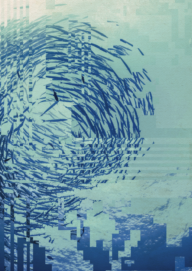
Data centres also produce electronic waste, which often contains hazardous toxic substances, like mercury and lead, which pose serious consequences to humans and non-humans. ‘Distorted fish school’ in Lone Thomasky and Bits&Bäume’s collection points to one of the lesser considered impacts of AI on our aquatic ecosystems from contamination and pollution.
Beyond this, AI development relies on critical minerals and rare elements with unique magnetic and luminescent properties to create the microchips that are required for the processing activities required for faster, more efficient, and higher performing processing. One example is the Kolwezi copper and cobalt mine in the Democratic Republic of Congo, where Amnesty International documented forced evictions of entire communities as companies expand unsustainable mining operations for technological advancement. The mining of rare earth minerals generates large volumes of toxic and radioactive material which leave land uninhabitable. ‘Distorted Sand Mine’ in Lone Thomasky and Bits&Bäume’s collection illustrates the destructive mining and extraction practices that lurk behind the “stylish, clean, and lightweight” appearance of modern AI tools.
Thomasky’s images all feature visual distortion, like bands, pixel shifts and fragmented overlays that disrupt the otherwise natural landscapes of trees, sand mines, and dandelions. The distortions visualise how digital infrastructures, driven by the ideology of progress and innovation, fragment both ecosystems and our perception of them. The juxtaposition between the forest greens and aquatic fish which are fractured by geometric interference draw attention to the mining, energy use, deforestation, and waste, all in the name of technological “innovation”.
A call for greater public understanding and policy shifts about the environmental impact of AI
“The ease-of-use of generative AI interfaces and the lack of information about the environmental impacts of my actions means that, as a user, I don’t have much incentive to cut back on my use of generative AI.” – Bashir (2025)
The visuals in the Better Images of AI library serve many purposes, but for this striking collection, we hope that they’ll improve public understanding of the realities of AI’s supply chain. By revealing the environmental and material realities that underpin AI, we hope to encourage more informed decision-making about whether embedding AI within infrastructures or promoting its use for ‘social good’ is truly desirable.
By countering the clean aesthetics of typical AI imagery with distortion, these visuals invite us to think more critically about the costs of AI, particularly generative AI, which consumes substantially more natural resources than many alternative human methods or technologies. This is not only in their design and development, but even when models are deployed and used, the computing hardware that performs these operations consumes energy. For example, researchers have estimated that a ChatGPT query consumes about 5x more energy than when a simple web search is used.
Beyond improving public understanding, the use of these images in the library can also support wider advocacy efforts that Bits & Bäume have already been spearheading. The community’s 2022 conference included a set of demands aimed at changing government policy on responsible digitalisation. One of their main demands focuses on “digitalisation within planetary limits”. This concept calls for technological progress to align with the standards of climate protection, resource conservation, and biodiversity preservation. In another piece of work, Steig et al counter reductionist understandings of sustainability which narrow the policy space to optimisation and incremental solutionism – running in contradiction to sustainable futures.
“Hackers, researchers, eco and climate justice activists alike are fighting for a livable planet for everyone and for collective freedom, because without clean water you cannot write free software and without democratic digital infrastructures you cannot enjoy healthy forests. And with people globally suffering for our way of life, no one can be happy. Therefore we have to join forces to reflect and act together. Those images contain the joint critical spirit of this endeavour.”
– Rainer Rehak, co-chair of the NGO Forum Computer Professionals for Peace and Societal Responsibility (FIfF) and co-founder of Bits&Bäume.
The image collection by Lone Thomasky and Bits & Bäume have already been featured across various media outlets and other public forums. As more people use these images, we hope that they can support those advocating for stronger policy and legal frameworks for sustainable digital transformation. While the EU AI Act includes some provisions to assess the environmental impacts of AI (such as for high-risk AI systems), these remain limited and largely dependent on self-regulation, meaning that AI companies have little incentive to improve the sustainability of their AI supply chains.
The Montreal AI Ethics Institute 2025 State of AI Ethics Report Vol 7 is an example of one of Lone Thomasky and Bits & Bäume’s image collection ‘in the wild’. The use of ‘Distorted Lake Trees’ from this collection to represent the state of AI in 2025 is fitting, given the increasing awareness of the impacts of AI on the environment that we have seen this year. Their report aims to capture perspectives from those excluded from conversations about AI, such as voices from Canada, the US, Asia, and Africa – places where the environmental impacts of AI are also most pertinent.
Butalid, R., Wright, C. & Kherroubi García, I. (Eds.). (2025). The State of AI Ethics Report. Montreal AI Ethics Institute.
Part II, Chapter 7 of the Report is focussed on the environmental impact of AI, in their contribution Burkhard Mausberg and Shay Kennedy state:
“As environmentalists, we believe that ethical AI must include ecological intelligence. Thatmeans embedding sustainability metrics into model development, mandating transparentlifecycle reporting, and aligning national AI strategies with climate goals. Governments arebeginning to move in this direction but need to accelerate their oversight and avoid therace for the bottom.” – Burkhard Mausberg and Shay Kennedy (Small Change Fund)
Therefore, beyond improving public understanding, these visuals can play a greater role in sparking debates about the real-world implications of AI development. The technosolutionist narratives of progress and innovation turn a blind eye to impacts on our communities, land, and environments inhabited by animals and humans. It is important that there is a greater understanding of the environmental costs of innovation, only then can we have more meaningful conversations about the role (if any) of AI technologies in our society.
“If you’re building or buying AI in 2026, you inherit the full anatomy: extraction, fabrication,operation, disposal. Before approving any flashy AI project, start by answering thesequestions: Where is it? Who owns it? What does it consume (hour by hour, basin bybasin)? Who carries the residuals?” – Priscila Chaves Martínez
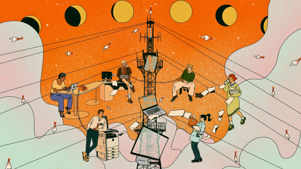
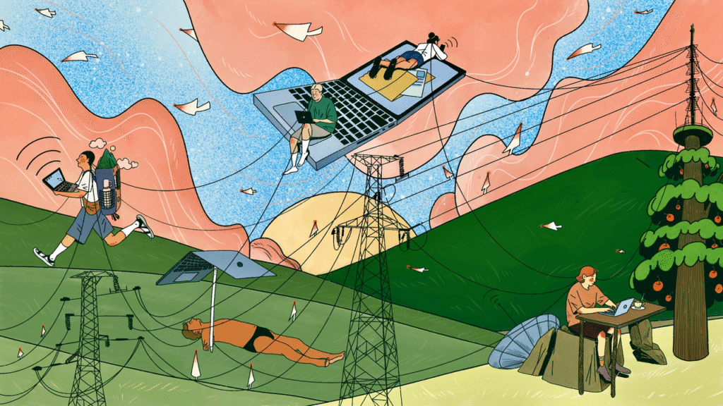
In this blog post, Harriet Humfress (a volunteer steward) exploresYutong Liu’s (artist) collection of “Digital Nomad” images which were submitted as part of the “Digital Dialogues” competition that we ran in collaboration with Digit this summer. Yutong’s images were awarded as winners in two of the categories.
Harriet gives a creative reading of Yutong’s work drawing upon her experience as a fine art student at the University of Oxford. She highlights how the “Digital Nomad” series and Yutong’s illustrative approaches centre the context of artistic creation and how the body always precedes the digital. Harriet argues that these are two features that cannot be recreated in AI-generated artwork, making Yutong’s work so fitting to visualise how digital transformation is -and isn’t- changing our existing practices.
I have a really clunky keyboard.
It’s bright green, and my gel extensions snag between the gaps, but its clack is so satisfying.
It almost looks like the keyboard in “Beyond the Cubical” (although my desk is much messier). I, too, have Post-it notes skirting my monitor, papers I’ve forgotten to read peek out sheepishly from under my trackpad, and my cables never behave, so I shove them behind the desk every time I sit down.
Before any part of us is online, we are situated. ‘Across time’ makes that felt; the trench-coated worker feels the heat from his laptop building on his thigh, the man at the printer feels the low hum through his forearm and smells the warm, inky breath of the paper, and, across the desk, a woman’s shoulders tighten and her calves pulse after hunching over a laptop for too long.
Once we are situated, our habits spill outwards into the digital realm. Our scrolls, pauses, hesitation and clicks become data that reveal us to the system more than the system reveals itself to us.Alexander Galloway argues in ‘The Interface Effect’, that “the world materialises in our image”, and “Digital Based Connection” visualises this. Yutong’s character’s all navigate the same landscape of rolling hills and threaded cables, but they exist there differently; one runs breathlessly, with his laptop outstretched, while another lies back beneath a laptop turned parasol, nonchalantly bathing in its glow. The digital realm is less like a sealed second world, but like a map we make as we move.
But, how do we get there?
The body precedes the digital
“So, we may arrive on screen as a cursor, but the work that gets us there is all shoulder, wrist, and fingertips.” – Harriet Humfress
Yutong’s images insist that the body precedes the digital. Once online, our postures and clicks are compressed into a single point of agency: the cursor. Yutong literalises this proxy with her cursor-birds; these tiny, winged cursors keep the image in motion, reminding us that digital work advances click by click.”
“The idea of the mouse–cursor birds came from thinking about how almost every action we take on acomputer involves the presence of the cursor. Without it, we can hardly do anything. So, I added them to represent the constant participation of the cursor in digital nomad work. Every “click” sets off or completes another task.” – Yutong Liu
Throughout her work, Yutong doesn’t anthropomorphise AI, she treats it almost as weather, as ambient infrastructure, or perhaps a climate.
“To me, AI is in every screen. As long as there’s a screen and a connection to the internet, AI is already there—quietly influencing and facilitating everything in the background.” – Yutong Liu In ‘Digital Based Connection’, wires drape across the hills like isobars and laptops swell into oversized furniture and characters live together with the network, loosely tethered to an apple tree-router. For Yutong, these connections are her “way of illustrating how digital nomads transmit ideas within a shared space—both physical and virtual.” She imagines that “once these ideas accumulate, the tower transforms into an apple tree, with each apple representing a spark of human thought—shining, ripe, and ready to be shared.” The network is a climate we inhabit, not a figure we meet, which is why, for Yutong, AI doesn’t need a face at all, as it is present wherever a screen is lit.
The click-clack of my keyboard will never reach this file, but it will shape how it is written as my finger gets caught, and I spam the backspace, losing my train of thought. This is what Yutong describes as “traces of experiences”; digital files don’t stain, but Yutong’s drawing situations lodge themselves into her work. These traces are why her pictures feel lived in.
AI and the ‘context debt‘
“Try to imagine unzipping your skin and stepping outside. What would step out? How would we exist without our senses?” – Harriet Humfress
iPads and digital tools are Yutong’s main mediums, and offer near infinite ‘undo’ and precision, where the artist has complete control over the machine, and are sometimes marketed as ‘frictionless’ and ‘seamless’. This precision used to play an important role in Yutong’s process, but over time, she realised that “something was missing. Those ultra-clean, overly perfect lines started to feel rigid and lifeless” and she’s consciously shifted her approach: “I’ve come to embrace a certain level of unpredictability and imperfection in my work – because that’s what gives it authenticity and emotion”.
Rather than being nostalgic for paper, Yutong’s inclusion of these “traces” allows place, time, and the body to survive a frictionless tool.
“You can find traces of experiences in the visual element of my ‘Digital Nomads’ series. My inspiration comes from life itself, and I naturally project the life I’m living into the images I create. So even though digital images don’t physically create stains like paper does, I believe a sense of place can still seep in.”– Yutong Liu
These “traces” are a breadcrumb trail. Follow it and you arrive at context.
In her Zine, ‘The Balance Between AI and Human’, Yutong muses on the role of the creative co-existing with AI. She recalls reading Adam Nemeth’s 2023 article and describes getting “chills”. What struck her was the idea that context lives in the gap between theory and practice, a space “for new narratives”.
“My art contained my context, a part that AI cannot replicate.” – Yutong Liu
AI may be able to describe or recognise the green of a lime, its bumpy skin, and sour taste, but it will never have the embodied knowledge of feeling the ache in your jaw or how saliva floods your mouth, or how the sourness contorts your face. This is the context gap that Yutong’s work operates in. A drawing made on a moving train carries a small tremor in its lines, or a green chosen under yellow café bulbs slips into olive, or how cursor-birds are read with the felt knowledge of strained eyes and a cadence of clicks. In her work, felt experience influences mark-making decisions.
Context also exists outside the body. Yutong describes how “context is also deeply rooted in cultural background […] humans can pick up the real meaning behind someone’s words through micro-expressions or subtle gestures”. Context is a kind of residue that no dataset can convincingly simulate, “something AI cannot currently understand”.
When this residue is thinned out and replaced with set definitions and statistical averages, images read as uncanny or empty. Yutong’s work explores the pushback to AI, and how this is more than just a “new moral panic”. It’s a reaction to context debt.
“The powerful rise of AI has instilled fear in many people, especially designers. […] Many fast-production, culture-less, story-less, and unoriginal companies have started laying off employees, preferring to pay AI companies to save on labour costs”. – Yutong Liu
We have seen moral panics before, and every generation thinks the next is growing up lazier, more dependent on shortcuts, and dangerously unconcerned with craftsmanship. But this cycle feels different this time, something deeper than generational bitterness. Photography and Procreate disrupted traditional expectations for what counts as “real” art, and AI takes this to the extreme by obscuring and displacing authorship and creating without emotional memory or intention.
“It’s precisely this emotional and sensory presence that prevents human-made art from feeling empty. AI- generated work is the product of code and data – produced at speed and lacking in lived experience or authentic emotion.” – Yutong Liu
Look again at the apples ripening on the router-tree, and the tiny corsor’s commute across the sky. Her metaphors feel lived in and handled and funnelled onto the glass of her iPad through the gripping of a stylus; “even with machine learning, AI can only remix what already exists, whereas human imagination is limitless”.
“Sometimes, the images generated by AI look good at first glance, but when you examine the details,they fall apart. They feel lifeless, soulless. It’s not just the vacant expressions in the characters – it’s the outlines, the brushstrokes, the composition. AI tries so hard to be ‘perfect’ that it ends up over-polished, almost sterile”. – Yutong Liu
Despite this sterility, Yutong doesn’t swear off AI or sermonise about its sins. Within her process, she treats AI as a tool and tries to “maintain a balance”, as she doesn’t want her work to “carry a strong AI shadow” but wants her ” audience to see what technology can help us achieve”. The sterility of AI often promises a neat and tidy input-output perfection, but this tidiness can’t stretch further than theory or reach out to context.
Loading up a chatbot, the input bar glows and the cursor blinks, and just out of rhythm to the clunky keys, but mimics the metronome of the typewriter-style loading of a friendly and reassuring response. It’s hard not to feel spoken to. Yutong describes how she “often imagined there was someone behind the screen who could understand me”, but in this supposed collaboration, prompts get nudged, rephrased, synonyms are traded, weights and models are adjusted, undone, redone, and the system obliges in its endless blank obedience. For Yutong, this “feels like an argument, but a very one-sided one. I was the only one talking, while the AI simply followed my instructions obediently – like a submissive assistant with no opinions or boundaries. No matter how much I ‘argued’ or tried to refine the prompt, there was always a disconnect between what I envisioned and what the AI produced.” After a dozen rounds, the almost-right images seem to pile up all glossy and neatly packaged like supermarket meat, but opening them up reveals this ‘conversation’ to be a monologue.
The system appears to understand, but what comes back seems too neat and strangely weightless, and it’s hard to name why. Try to imagine unzipping your skin and stepping outside. What would step out? How would we exist without our senses? Yutong dragged AI frameworks through the screen and into the room, in workshops to act out AI’s rules; ” I used to believe that AI only existed within computers, networks, and screens” but in these workshops “We explored AI through embodied exercises, like prompt-based drawing games or even “Pictionary”-style activities, where one person gives a prompt and another interprets it visually. These exercises helped us dig into the underlying logic of how AI works—and more importantly, how it differs from human output”. The workshops allowed participants to step into the input-output logic with their whole bodies, simulating image generation by hand.
“By investigating AI from a human, physical standpoint, I began to understand more clearly why its outputs often diverge from our expectations, even when we think our prompts are clear. Stepping away from the screen and into embodied, collaborative spaces made the learning process more playful, surprising, and insightful. That’s why I now find real value in exploring AI through workshops—it deepens my understanding in ways a purely screen–based interaction can’t.” – Yutong Liu
Embodying AI as Human-Led Choreography?
“One, two, one, two, the prompt is the cue. The AI answers with plié, jeté, toes pointed and shoulders back, cleanly executing what has been drilled into it. Yutong leads, and the AI responds with the steps it knows. But what if we fed it something new to dance to?” – Harriet Humfress
For Yutong, the act of embodying AI changed how she thought of AI within her process, as it allowed her to “access ideas and insights [she] wouldn’t have reached through screens alone. It gave me new ways to feel and think about what AI is and what it can do. AI has sparked a lot of inspiration and critical thought for me, just as other digital media have also shaped how I generate ideas and interpret the world.” From here, creating with AI seems less like a collaboration and more like a human-led choreography.
Yutong gives a name to the choreographer: the AI Feeder.
In the last pages of her Zine, Yutong sketches a pragmatic job description for her imagined role of the AI Feeder: contracted artists feed models with tightly curated images, then intervene and correct where the machine falls short, and then use Nightshade (pixel level poisoning that preserves the appearance of images but blocks re-training) on the outputs so they can’t be scraped back into the system. An AI Feeder weaves situated thought and context into the data, embedding what an AI cannot produce on its own, but can be made to follow.
“Illustrators with strong personal styles enter into contract-based collaborations[… ]The company compensates them[… ]The artists then modify parts of the images that do not accurately convey the intended information[… ]Subsequently, the company employs Nightshade[…] to protect both the company’s interests and the copyright interests of the illustrators.”– Yutong Liu
The AI Feeder’s process is less like prompt alchemy and more like rehearsal direction, marking the downbeat, setting constraints, rephrasing, and cutting. Many artist spaces demonise AI, but Yutong provides us with a radical future-facing redirect by prioritising human judgement and artistic integrity in a space where AI can often feel inevitable. She reminds us that ” AI can only generate based on what already exists. But the human mind can drift into unreal, even irrational spaces, and return with ideas no one else could have imagined. We can invent things that don’t yet exist. And I find that endlessly powerful”.
“We as humans have the power of choice, and that’s why I’m not so afraid of AI. Because I have a choice – I can choose to use AI or not in my creative process. As an illustrator, I can choose from various materials – pencils, watercolours, crayons – to assist me in my creations. In this process, any imperfect human stroke of the brush will create a different existence. In comparison, AI can only be chosen.” – Yutong Liu
By the time I have finished writing this, I’ve picked off all my gel extensions.
My keyboard feels faster and slipperier now that my nails aren’t snagging, but I still mis-typed “extensions” three times. Backspace. Backspace. Backspace.
No part of this digital stutter will appear on the screen, but it shapes the sentence anyway, just as plane turbulence skews Yutong’s curved lines in ‘Digital Based Connection’ or a shaking subway carriage misplaces a cursor bird in ‘Across Time’.
This is what ‘Digital Nomads’ so cleverly depicts; even when digital landscapes feel seamless and glossy, they are always led by the body, with a slide of a stylus or an awkward left click. The risk here isn’t that AI will replace artists, but that we give up our context. Yutong’s process resists this both through critique and through her attention to rhythms, gestures, locations, and feeling. AI might mimic or remix style or design, but it cannot feel the clack of the keys or know what it means to mistype a word three times and try again.
About the Digital Dialogues Competition
In April, the ESRC Centre for Digital Futures at Work and Better Images of AI launched a competition to reimagine the visual communication of how work is changing in the digital age. We received over 70 images to the competition from illustrators, artists, researchers, graphic designers, and photographers from all around the world, including Brazil, Hong Kong, Lebanon, France, Uganda, Argentina, Peru, Ireland, the US and the UK. The submissions thoughtfully challenged the dominant stock imagery used to depict digital transformation at work by offering more nuanced, inclusive, and grounded visual representations.
Harriet Humfress is a London-based undergraduate studying Fine Art at St Edmund Hall, Oxford. Her research explores popular beliefs and myths around AI, and how these ideas of anthropomorphism heighten anxieties around embodiment and labour. Her work covers sound and video installations along with small tactile sculptures that aim to both satirise and inform viewers about how these digital systems cannot be unlinked from human emotion and power structures. Her projects often begin with data collection through surveys and workshops to build an understanding of how people engage with AI in their everyday lives and these data sets then become the material for her works. Alongside her studio practice, Harriet’s writing and research blends both creative and critical approaches, with essays ranging from narrative-driven works such as “A chatbot walks into a therapist’s office” to co-authoring work with We and AI on challenging AI inevitability narratives.
About the artist
Yutong Liu is an award-winning illustrator from China, now based in London as a freelance creative. Her work has appeared in numerous publications and advertising campaigns for clients including The Orion Publishing Group Ltd, Ascend Design, The Alan Turing Institute × University of Edinburgh, Better Images of AI, HiShark Edu, and more. Her illustrations have been recognised by prestigious awards and exhibitions such as the World Illustration Awards (WIA), 3×3 International Illustration Awards, Applied Arts Illustration Awards, ING Discerning Eye Drawing Bursary, Beijing International Book Fair (BIBF), China Illustration Annual Conference (CIAC), the Trinity Buoy Wharf Drawing Prize, and Hiii Illustration Award. Guided by her creative philosophy—“With eyes wide open and heart unveiled—feel life, record its pulse, and embrace its wild beauty”—Yutong’s work captures moments that are both poetic and profoundly human.
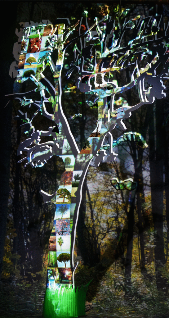
In this blog post, Laura Martinez Agudelo (one of our amazing volunteer stewards) interviews Nicole Crozier, the artist behind the image ‘Seeing the Forest for the Trees’ which was submitted as part of The Bigger Picture collection. The post explores how the image criticises, but also reflects on, the development of generative AI and what these new technologies mean for artists and the art industry. Nicole hopes the image can challenge the AI hype and misconceptions about how AI-generated art is created.
Nicole is a visual artist originally from Ottawa and she currently lives in Montreal, Quebec. She is studying for a Master’s degree in Fine Arts (Painting and Drawing) at Concordia University, and she is working hard for her thesis defence in September. Prior to moving to Montreal, she lived in Toronto for seven years, where she developed her practice and worked as an arts manager, primarily in the dance world. She decided to enroll in her current programme in order to dedicate more time to her artwork.
Art has been a part of Nicole’s life since childhood: “I first started painting when I was in grade 9. It was for me a means of expression and also… an escape from bullying at school”. While at high school, she wanted to be a journalist, but her art teacher convinced her to go to art school, which is how she ended up on this path. Nicole completed her undergraduate degree in Visual Arts at the University of Ottawa, graduating in 2013, during which time she primarily explored two artistic approaches: painting and photography. Since then, she has focused on both, “moving back and forth between them”.
She knows that her technical skills lie mainly in painting, but she admits that she is “a slow painter and it can be frustrating sometimes”. At the same time, she finds that it is also a great quality: “… just slowing down, taking time and engaging in a dialogue with the painting”. With photography, she feels the opposite because the process provides a quicker response between her and the subjects.
Besides, she is interested in playing with contrasting ways of reception of her artwork: “creating images that fall between two effects, for example seduction and repulsion… When you see an image, you may at first be attracted to something within the picture, and then repelled; not quite sure what you are looking at… I like working in between spaces, between two poles”. Let’s see how this approach converges with the idea of creating better images of AI.
The Bigger Picture Workshop
Nicole doesn’t usually explore AI contents in her artwork. She came across it in The Bigger Picture workshop that she attended through Better Images of AI, which is how she heard about the motivations behind the project to create more realistic images of AI: “I was intrigued by the prompt, given my general interest in archetypes and in understanding the world through photography. We live in a hyper image saturated society and think about ourselves so much in relation to photographs”.
She argues that, in using photography, we “view our daily lives through the camera lens, synthesizing our selves, environments, and social conditions into iconographic ways of seeing the world around us”. This idea crosses over with her first approach of AI image generators: “as an artist, that’s the main way I interact with AI: through text to image generative AI programs and trying to understand how they work and are affecting the arts industry”.
Collage and visual correlations
Although her work has changed a lot over the years, Nicole has always had an aesthetic working methodology and interest in collage. For her, collage is itself a way of creating. She loves to elaborate physical collages with paper and then photograph them. This is evident in her illustration Seeing the Forest for the Trees.
In her art practice, Nicole often starts with “a 3-dimensional collage or maquette that I light and then photograph. I like working with cut paper and finding craft supplies that have a textural quality that tips the viewer off that what they are looking at is handmade, that draws them in. I create the illusion of space and then the camera flattens it: a multitude of images I’m combining compressed into one photograph. Which is also a similar process of synthesis used by generative AI in response to text prompts, so I think there is also a visual correlation between the two”.
This is one of the reasons why Nicole became interested in the process of AI image generators as “‘sophisticated’ collage makers”, the material conditions of production and how many visual inputs produce one output. She also compares this process to the use of collage by artists in art history, such as the surrealists and how they used chance to access parts of their subconscious when making art.
“With AI (text-to-image or image-to-image models), you can reuse the same prompt and receive a different image each time, but the ’emotional’ and ‘creative’ part of the process is removed. These kinds of AI images show no signs of the subconscious role in creating: they are dead images, most often based on data poached from other artists without consent…”.
The machine would only be able to reproduce the data used to train it. For Nicole, the process of imagining and exploring visual representations is an essential part of creating images. What was then the idea behind Seeing the Forest for the Trees?
When Nicole was conceiving the image, she was thinking about how to illustrate her understanding of the way AI generators ‘create’ images. “The tree-forest relation was a good subject to work with because it is a universal metaphor for the individual versus the group, one image versus a composite image.
Large language models and generative image models compose images by training on hundreds of thousands of data and metadata items. The process of generating the final image is invisible to us, and the final image could not exist without the multitude of images that were (statistically translated) and put together. I don’t know if I was fully successful, but my contribution was an attempt to express this idea visually.”
For Nicole, the choice of the tree-forest metaphor is also related to how we position ourselves socially as individuals: “recognising ourselves as individual trees within the forest”.
The social component of AI systems is also intrinsic: “it is hard not to think about AI through the lens of how we operate in society, because we always approach things from a human perspective, and the tree-forest metaphor is one that maybe we can all easily understand”. This is why Nicole wanted to create a tree made of other trees: “It’s a forest inside a tree! And that’s where the idea first came from”.
She has also been working with handmade maquettes for a long time and she wanted to use this method and materiality to create the image including the human process of making it. Afterwards, she came up with the popular phrase that became the title of the image — a perfect match to reinforce the meaning!
Now let’s take a closer look at the image to see how it was put together.
The visual and material composition
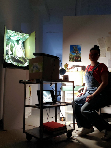
First, Nicole cut out the image of a tree from a white piece of paper. Then, she created a small scene with it in a box and projected the image of the collage of trees onto the scene, using a Photoshop mask.
Picture of Nicole in their creative environment
For the visual composition reflected on the large tree, she selected some images, free to use and without copyright restrictions, from Unsplash. She chose these images based on formal considerations: “I was trying to find images of trees with a lot of empty space around them so that you could see just one tree. The idea was to find archetypal images of trees”.
Finally, she photographed the whole composition and did some extra manipulation in Photoshop: “it was a technical choice to achieve a well-balanced image”.
The trees were chosen for their metaphorical relationship with nature and technology as well: “There are so many ways in which we can connect the idea and the visual representation of a tree with environmental and technological concerns, within the dynamic of ecosystems, understanding the branches of a tree as a network – it’s almost cliché, but I think it works really well for this topic”.
Questioning AI hype, sustainability, and the inevitability narrative
Even if Nicole doesn’t think she will make any more artwork about AI imagery specifically, she is currently considering the philosophical aspects of this subject, as well as the ethical issues of AI systems in our society:
“I have deep concerns about AI technology in general, its impact on society and whether it will be mainly beneficial or malevolent, and particularly in relation to climate change. This ethical question extends to myself and why and how I make art too. Honestly, I try to avoid using AI as much as possible…”.
She also mentions the importance of the Better Images of AI project: “I think Better Images of AI is trying to move beyond the black and white binary of imaging AI as either benevolent or malevolent. In a hyper-visual world, they are trying to provide more nuanced images to promote better visual literacy around how AI systems actually work and how they are being implemented in our society”.
Nicole knows that there is a lot of propaganda and hype surrounding AI, encouraging not only a blindly positive attitude towards it, but also the idea that it is inevitable: “the dominant discourse is that AI is here whether you like it or not. The general discourse seems to be ‘if you don’t embrace or adopt AI, you’ll be left behind in the job market’, and I think that scares some people”.
This is obviously a turning point from many different angles: technological, cultural and environmental… it touches everything. Also, many AI systems are like black boxes. We don’t fully understand the nature of the inputs and processes that generate the outputs”, not even all humanity’s labour behind.
Nicole thinks that the discourse of inevitability is irresponsible. It neglects real risk, harms and our individual and collective ability of agency: “Corporations creating these AI systems should have a regulated responsibility to ensure they are only used in ethical and beneficial ways. Though given our current neo-liberal economic climate, in which some corporations have more power and wealth than some nation states, I’m not very optimistic about the likelihood of our ability to employ these tools in ethical ways.
From my understanding, it’s just an intensive version of a colonial regime, like: “let’s gather as much information as possible about all aspects of human experience, with limited compensation – if any – to those whose data was harvested, and see what we can extract from it for profit for a limited few”.
Nicole believes this approach is environmentally expansive and extractive, given that “the huge amount of energy needed to maintain these systems is something that most people think of as ‘invisible’, but it has real and concrete effects”. Having mentioned these issues, Nicole shared some other thoughts from the perspective of the art field.
What kind of art do we want?
During our interview, some quotes were proposed for discussion. These quotes came from the book The AI Con: How to Fight Big Tech’s Hype and Create the Future We Want, by Emily M. Bender and Alex Hanna (2025), and specifically from a subsection of Chapter 5 about ‘AI and Art-Making’ (p. 103-112). This book was also discussed at the latest We and AI Book Club monthly meeting. As a visual artist, Nicole loved the idea of sharing her thoughts about it.
One of the quotes suggested to Nicole was: “There are, to date, no synthetic media machines in any medium that are based only on data collected in a way that respects existing artists”, referring to AI systems whose training data includes your own art.
Nicole said: “My understanding of what they consider to be a media machine are systems that show no respect for copyright and, while I agree with the general statement, I think there is a grey area here. I think creating your own dataset (based on your own past work or work you’ve received consent for or paid for), could be an ethical use of this technology.
AI is reshaping creative practice and Nicole knows artists who are “exploring those systems as a way of creating art, by creating their own dataset with their own work”, but she believes that “the general processes AI image generators are based around are inherently the opposite of what art is supposed to do”.
Nicole agrees with this idea and proposes that it is also useful to ask:
“Is this a type of art that we want to be creating in the first place? Is it culturally productive or regressive? Not in the sense of capitalist productivity, but… Is it actually helping or inspiring anybody? Even more importantly, is this a mirror that we can hold up to see ourselves reflected in?”.
For Nicole “the medium is the message (quoting McLuhan). Maybe AI art is art, maybe it isn’t, but… Is it really what we need? The focus on whether AI art is art is a smokescreen. What is art? Sometimes, there isn’t even a word for it; it depends on the context, the creative practices and the culture”.
Two other quotes suggested were: “Why should artists who spent years perfecting their skill be left to starve as a few technical experts who stole their work get rich off of it?” and “AI art generators are already being deployed in ways that disrupt the economic systems through which people become and sustain careers as working artists”.
Nicole thinks that people working in what is sometimes called ‘traditional artwork’, such as creating art objects for galleries, seem to be less concerned about ‘AI art’ because they feel somehow ‘untouchable’: “collectors always want paintings and physical objects. However, artists in creative industries such as illustration, design and animation are feeling the economic effects of AI much more acutely, and I have a lot of sympathy for them and their jobs. Many artistic fields are being affected…”.
She believes that there should be more critical regulation to protect those artists, their copyright and the cultural value of their work: “AI is further degrading the general public’s respect for these art forms. People often say ‘oh, my kid can do that!’ and now, with AI image generators, it’s the same idea, ‘oh, I can do that using text-to-image models’. At least for now, I think, we can still tell the difference between something made by the artistic motivation, intention and work of a person (including imagination, experience and artistic skills), and something made by using only an AI image generator. But I think the width of this uncanny valley will continue to shrink in the years to come…”.
Despite the opacity and mutability of many AI technologies, and all the questions about the latent space in the scanning and statistical process of image visualisation, and the patterns for generation,Nicole concludes by emphasising the importance of ongoing learning and reflection on the applications of AI image generators, not only in art, but also in all professional fields. She encourages us to think critically, without being deterministic, and question “what we should accept or refuse”.
Huge thanks to Nicole for her contribution, and for sharing her insights about her artwork and the challenges of creating in the context of AI image generators today.
About the artist
Nicole Crozier is a visual artist and arts manager based in Tiohtià:ke (Montreal-QC), with ties to Tkaronto (Toronto), born and bred in Adàwe (Ottawa-ON). Nicole holds a Bachelor of Fine Arts (University of Ottawa) and a graduate certificate in Arts Management (Centennial College).
About the author
Laura Martinez Agudelo is a Temporary Teaching and Research Assistant (ATER) at the University Marie & Louis Pasteur – ELLIADD Laboratory. She holds a PhD in Information and Communication Sciences. Her research interests include socio-technical devices and (digital) mediations in the city, visual methods and modes of transgression and memory in (urban) art.
Artist contributions to the Better Images of AI library have always served a really important role in relation to fostering understanding and critical thinking about AI technologies and their context. Images facilitate deeper inquiries into the nature of AI, its history, and ethical, social, political and legal implications.
When artists create better images of AI, they often have to grapple with these narratives in their attempts to more realistically portray the technology and point towards its strengths and weaknesses. Furthermore, as artists freely share these images in our library, others can benefit from learning about the artist’s own internal motivations (which are provided in the descriptions) but the images can also inspire users’ own musings.
In this series of blog posts, some of our volunteer stewards are each taking turns to choose an image from the Archival Images of AI collection and unpack the artist’s processes and explore what that image means to them.
At the end of 2024, we released the Archival Images of AI Playbook with AIxDESIGN and the Netherlands Institute for Sound and Vision. The playbook explores how existing images – especially those from digital heritage collections – can help us craft more meaningful visual narratives about AI. Through various image-makers’ own attempts to make better images of AI, the playbook shares numerous techniques which can teach you how to transform existing images into new creations.
Here, Rameez Raja unpacks ‘AI Am Over It’– Nadia Piet’s (an image-maker) own better image of AI that was created for the playbook. Rameez personally reflects on his feelings towards AI amidst a never-ending stream of AI hype and ‘LinkedIn guru hot takes’ on the latest developments in the space. Despite the increasing infiltration of AI into society, Rameez comments on how Piet’s image points to a growing resistance in society against using AI as developers steal artwork from creators, further misinformation, and challenge our sense of self.
“So, what do you think of AI?”. “I’m tired of it.”
This is the go-to question that always finds its way to me—at family dinners, in WhatsApp groups, or halfway through a drink with someone. And truthfully? It exhausts me. Not because I’m indifferent—far from it. I spend my days thinking deeply about technology, analysing platforms, working at the intersection of AI, society, and policy. But lately, I’ve been feeling the weight of it all. My brain feels like it’s buffering.
There’s something about the pace, the hype, the never-ending stream of think-pieces, hot takes, and LinkedIn gurus that leaves me exhausted. One day it’s agents, the next it’s Sora, then AutoGPT—each promising disruption, innovation, or a new dawn. And yet, behind all that noise, the human questions remain: Who is this tech serving? Who’s left out? And most of all—how are we feeling in the face of it?
That’s why Nadia Piet’s artwork, AI Am Over It, resonated with me. It comments on AI fatigue, illustrating how the overwhelming flood of tools and constant influx of headlines leaves most people feeling dizzy and disoriented. With AI icons swirling around the figure’s head, it captures the mental overload and confusion many feel as they struggle to keep up with rapid developments / the fast-paced AI landscape.
It feels like a snapshot of my inner world: a human figure—serene, stoic—surrounded by a chaotic halo of AI logos competing for attention. The AI fatigue is real. The figure—drawn from what looks like a Renaissance or alchemical manuscript—evokes an age of inquiry, mysticism, and visionary thinking. But here, he’s not discovering truths. He’s being drowned in them. He’s being submerged in signals—too many, too loud, too fast to make sense of.
AI Overload
The image captures what AI has become for so many of us: not a revelation, but a cognitive overload. The myth of AI as a rational, godlike mind—an Enlightenment fantasy—is clashing with the reality of our current AI landscape: noisy, exploitative, corporatised. The logos circling the figure don’t represent knowledge; they represent branding, monetisation, and an endless feed of skewed updates.
Another layer that struck me was that the central figure might as well be a ghost from the past. A time traveler from an era where knowledge was sacred, slow, and wrapped in ritual. The alchemists, the philosophers, the mystics—they sought truth through wonder. Today, we scrape, prompt, and automate. In Piet’s image, this archival human seems caught in a time loop, trapped in the chaos of modern signals. There’s a sadness to it. A sense of lost dialogue between worlds.
We’re not just engaging with AI anymore—we’re surrounded by it. That’s what I see in those orbiting logos. A kind of orbital trap, where our thoughts, emotions, and even our sense of self are influenced by algorithmic systems. Elon Musk’s Grok being used to clap back at posts on X is a perfect example of this cultural drift. AI isn’t just answering questions—it’s shaping how we argue, how we feel, how we relate to each other. It’s performance masked as fact-checking, surveillance disguised as help.
And while some celebrate the spread of these tools as progress, many of us are quietly turning away. There’s a kind of reverse effect happening: the more AI saturates every part of public discourse, the more we begin to tune out. When everyone is suddenly an expert, a prompt engineer, or a tech visionary, the truth becomes harder to locate. In that fog of hot takes and hype, we lose clarity. We lose trust. We lose the human signal in the noise.
Seeing Through the Hype
What ‘AI Am Over It’ does so powerfully is that it doesn’t just document the presence of AI—it critiques it. The title is a mood, a manifesto, a coping mechanism. It aligns with broader movements we’re seeing across the creative world. Take the backlash from artists like Paul McCartney or Kate Bush, who’ve criticised AI companies for using their voices or songs without permission. That outrage has led to tangible action—like amendments pushing for more transparency and economic impact assessments in AI development.
We need more of this. Because unregulated AI doesn’t just risk misinformation—it risks stagnation. Creativity becomes lazy when it’s just derivative output from a scraped dataset. Why explore new ideas when you can prompt a remix? If we lean too heavily on AI to create, to ideate, to think, we may lose touch with what it means to make something truly original. The danger isn’t just economic—it’s existential. Are we becoming passive consumers of pre-generated thought?
This is where Piet’s image becomes more than aesthetic. It’s archival. It preserves a moment of resistance, a visual reminder that AI isn’t just a tool—it’s a terrain we navigate daily, often without clear maps. And like any map, the legends matter. Whose vision is being drawn? Who controls the ink? By invoking a figure from the past, the image also invites us to reflect on the longer history of AI—its myths, its cycles of hype, and the often invisible human labour that has always underpinned technological change. Archival imagery, in this way, becomes a tool for challenging present-day narratives, reminding us that today’s ‘new’ is often built on forgotten or overlooked foundations.
And then there’s the meme-ification of it all. AI isn’t just a tool—it’s become part of our collective moodboard. The rise of “Ghiblification,” where AI generates images in the Studio Ghibli style, might seem innocent or even charming. But it’s another front in the conversation over cultural ownership. Art as aesthetic, stripped of context, style without story. These remixes flatten rather than deepen our understanding. They don’t honour artistry—they commodify it.
That’s why I keep returning to ‘AI Am Over It’. It’s not prescriptive. It doesn’t try to tell us what AI is or what we should think. It simply reflects. It holds up a mirror to our moment—messy, noisy, and at times, disillusioned. But it also quietly reminds us that we’re still here. That amidst the automation, the chaos, the acceleration, the human is not lost – just tired!
Maybe being “over it” isn’t the end. Maybe it’s the start of something else—a pause, a breath, a reorientation. A chance to find our own orbit again.
About the author
Rameez Raja (he/him) is a data analytics engineer and storyteller, passionate about AI and designing systems that foster connection for a healthier society. A UCL graduate, he is pursuing an MS in AI at the University of Bath and advocates for trustworthy communication as essential to thriving democracies and communities.
If you want to contribute to our new blog series, ‘Through My Eyes’, by selecting an image from the Better Images of AI Library and exploring what the image means to you, get in touch ([email protected]).
Artist contributions to the Better Images of AI library have always served a really important role in relation to fostering understanding and critical thinking about AI technologies and their context. Images facilitate deeper inquiries into the nature of AI, its history, and ethical, social, political and legal implications.
When artists create better images of AI, they often have to grapple with these narratives in their attempts to more realistically portray the technology and point towards its strengths and weaknesses. Furthermore, as artists freely share these images in our library, others can benefit from learning about the artist’s own internal motivations (which are provided in the descriptions) but the images can also inspire users’ own musings.
In this series of blog posts, some of our volunteer stewards are each taking turns to choose an image from the library and unpack the artist’s processes and explore what that image means to them.
Here, Joe Bourne explores Data Flock (digits) by Philipp Schmitt and reflects on how the image invites us to think about the subtleties in the relationships between AI, data, and humans. He draws attention to the image’s ambiguity that represents the complexity of data without trying to gloss over its nuances which can mislead us or prevent us from making our own judgments about information.
From Posters on Bedroom Walls to Da Vinci’s Notebooks
I assumed choosing my favourite image from the Better Images of AI collection would be a personal thing. What I didn’t expect was to find myself having to do some intense googling to track down a half-remembered exhibition poster from my teenage bedroom wall.
The image that sparked this trip down memory lane is Data Flock (digits) by Philipp Schmitt. Data Flock (digits) shows a machine learning dataset visualized spatially, in cloud-like clusters according to visual similarity of the data. Although visualizations like this one always simplify and fail to represent the data’s true complexity and nuance, they guide the researchers’ intuitions for their subject matter. The image is a ‘laptopogram’, created by exposing photographic paper using a computer screen and developed in the artist’s bathtub. The process preserves a digital artifact of AI research in silver crystals, returning a physical dimension to sterile data. Dust, scratches, and the marks left by the artist’s hands draw a connection to the role of the researchers’ subjectivity in making AI.
At first glance, it reminded me of the speculative models and scribblings on the poster for Panamarenko’s Bing of the Ferro Lusto 2000 exhibition from my teenage bedroom wall. Schmitt’s image has a similar hand-crafted and open-ended feel. Panamarenko’s sketches looked like fantastical vehicles or improbable machines, while Data flock (digits) evokes something more abstract and organic. To me, the blobs look like tiny grubs, or bacteria, maybe even buffalo from a great height. Others might see beans, or droplets, or brush marks. There’s no single right answer, and that’s part of what makes it compelling.
It also calls to mind da Vinci’s famous notebooks with flying machines and the vitruvian man: the yellowed backgrounds, the visible drafting marks and something simultaneously analytical and artistic. Like those sketches, Schmitt’s image sits at the intersection of science, art and science fiction: not to explain, but to explore. The data is clustered, sorted, and shaped, but the meaning remains open. This is what I find so captivating: that Data Flock (digits) captures the process of pattern recognition without forcing a conclusion. It’s a good reminder that even when AI or data analysis can spot patterns, we’re still the ones making sense of them. Or trying to, at least.
AI Metaphors and Meaning
There’s also something quietly organic in the image’s visual texture. To me, the ‘flocking’ resembles weather maps or wind currents: pressure systems moving across the frame. In my own research, I’ve written about the metaphors we reach for when trying to explain data-driven technologies. “The cloud” is one example: a term that implies something weightless and remote, when in fact it refers to very grounded, physical infrastructures. The language we use to describe AI is full of euphemism, metaphor and anthropomorphism, and while those can help us relate to the intangible and complex parts, systems and concepts behind data, AI and the internet, they also risk misleading us. Data flock (digits) plays with this tension: hinting at anthropomorphic movement, without giving in completely to any recognisable metaphor or cliche. The blobs in this data flock feel simultaneously natural and digital.
Something else that draws me to this image is how it reveals something of the process behind machine learning. The blobs are grouped according to visual similarity, but there’s no legend or key. You’re left to observe, to notice, to wonder. It’s an aesthetic representation of categorisation (one of the fundamental operations in data science) but without the usual gloss of objectivity or neatness. It invites ambiguity and curiosity. It shows us the work of sorting and learning. Schmitt’s own description of the image, that “visualizations like this one always simplify and fail to represent the data’s true complexity and nuance, [but] they guide the researchers’ intuitions”, gets to the heart of why I admire it. I’m always drawn to attempts to make AI or machine learning more tangible. Especially when they don’t try to smooth over the complexity.The best ones let you see the mess, the uncertainty, the weird edges that don’t quite line up. That’s where it gets interesting. This image does that. It reminds us that there is always a human: whether analysing data, interpreting visualisations, or deciding how best to communicate them. Even when making the image itself, captured by the marks, scratches and fingerprints.
Art for Art’s Sake
As well as sending me down memory lane, remembering having my mind expanded in the Hayward Gallery twenty-plus years ago, the image also led me down a wonderfully unexpected rabbit hole. I’d never heard of a laptopogram before reading Schmitt’s accompanying interpretation for this image. This discovery speaks to something that makes Better Images of AI so valuable. While its stated purpose is to improve the visuals used to represent AI in public life, it also functions as an art exhibition in its own right: Art for art’s sake. Through this project I’ve been introduced to all kinds of image-making techniques I didn’t know about before: digital collaging, archival remixing, glitch aesthetics. As someone who enjoys low-fi making and physical processes, I was delighted to learn that data flock (digits) was created by exposing photographic paper to a computer screen and developing it in a bathtub. You can see that process in the final image: in the specks, scratches, and smudges. It’s a tactile, analogue production that sits in refreshing contrast to the smooth, polished surfaces of AI-generated imagery.
The Value of Ambiguity
Finally, there’s a practical reason I keep returning to this image: it’s incredibly useful. Because it’s not tied to a specific AI use case, and because its aesthetic is so open-ended, I’ve found myself using it in presentations, slides, and publications across a range of contexts. It doesn’t tell the viewer what to think, but it allows them space to think. For a project like Better Images of AI, which aims to shift how these technologies are represented, that matters. Likelihood of adoption should be part of how we evaluate what makes an image “better.”
Data flock (digits) is a reminder that images don’t need to explain everything. Sometimes, they’re more powerful when they simply invite us to pay attention: to complexity, to process, and to the humans behind the scenes.
About the author
Joe Bourne (he/him) is doing a PhD in Speculative Design and Emerging Technologies at Imagination Lancaster, and he is a Partnership Development Lead at the Alan Turing Institute. Joe is particularly interested in public understanding and imaginings of emerging technology, and people’s hopes and fears associated to this.
If you want to contribute to our new blog series, ‘Through My Eyes’, by selecting an image from the Better Images of AI Library and exploring what the image means to you, get in touch ([email protected]).
In the blog post below, Hanna Barakat talks about her artistic process and reflections upon contributing to this collection. Hanna provides her thoughts on the challenges of creating images that communicate about AI histories and the inherent contradictions that arise when engaging in this work.
As outlined by the Better Images of AI project, normative depictions of AI continue to perpetuate negative gender and racial stereotypes about the creators, users, and beneficiaries of AI. Moreover, they misdirect attention from the harms implicit in the real-life applications of the technology. The lack of diversity—and the problematic interpretation of diversity—in AI-generated images is not merely an ‘output’ issue that can be easily fixed. Instead, it stems from deep-rooted systemic issues that reflect a long history of bias in data science.
As a result, even so-called ‘diverse’ images created by AI often end up reinforcing these harms [Fig.1]. The image below has adopted token diversity tropes like a wheelchair, different skin tones and a mix of genders – superficially appearing diverse without addressing deeper issues like context, intersectionality, and the inclusion of underrepresented groups in leadership roles. The teacher remains to be an older, able-bodied white male and the students all appear to be conventionally attractive, similarly sized individuals wearing almost matching types of clothing. The image also shows a fictional blue holographic image of a robot in the centre – misrepresenting what generative AI is and exaggerating the capabilities of the technology.
Figure 1. Image depicting an educational course on Generative AI.
As academic institutions like the Leverhulme Centre for the Future of Intelligence are exploring “vital questions about the risks and opportunities emerging with AI,” they commissioned images that reflect a more nuanced depiction of the risks and opportunities. Specifically, they requested seven images that represent the diversity in Cambridge’s teaching about AI, with the intention to use these images for courses, websites, and events programs.
Hanna’s artistic process
My process takes a holistic approach to “diversity” – aiming to avoid the “DEI-washing” images that reduce diversity to a gradient of brown bodies or tokenization of marginalized groups in the name of “inclusion” but often fail to acknowledge the positionality of the institutions utilizing such images.
Instead, my approach interrogates the development of AI technology, its history of computing in the UK, and the positionality of elite institutions such as Cambridge University to create thoughtful images about the education of AI at Cambridge.
Through digital collages of open-source archival images, this series offers a critical visual depiction of education about AI. Collage is a way of moving against the archival grain– reinserting, for example, the overlooked women who ran cryptanalysis of the Enigma Machine at Bletchley Park to surrealist depictions of a historically contextualized lecture about AI. By combining mixed media layers, my artistic process seeks to weave together historical narratives and investigate the voices systemically overlooked and/or left out.
I carefully navigated the archive and relied on visual motifs of hands, strings, shadows, and data points. Throughout the series, these elements engage with the histories of UK computing as a starting point to expose the broader sociotechnicalnatureof AI. The use of anonymous hands becomes a way of encouraging reflection upon the human labor that underpins all machines. The use of shadows symbolizes the unacknowledged labor of marginalized communities throughout the Global Majority.
It is these communities upon which technological “process” has relied upon and at whose expense “progress” has been achieved. I use an abstract interpretation of data points to symbolize the exchange of information and learning on university campuses. I was inspired by Ada Lovelace, Cavendish Labs archive (physics laboratories), which depicts photos of early histories of computing, the stories of Cambridge Language Research Unit (CLRU) run by Margaret Masterman, Jean Valentine, and the many other Cambridge-educated women at Bletchley Park that made Alan Turing’s achievements possible.
The challenges of creating images relating to the diverse history of AI
Nonetheless, I remain cautious about imbuing these images with too much subversive power. Like any nuanced undertaking, this project grapples with tension, including navigating the challenge of representing diverse bodies without tokenizing them; drawing from archival material while recognizing the imperialist incentives that shape their creation; portraying education about AI in ways that are both literal and critically reflective, particularly in contexts where racial and ethnic diversity (in the histories of UK) are not necessarily commonplace; and balancing a respect for the critical effortsof the CFI with an awareness of its positionality as an elite institution. On a practical level, I encountered challenges in accessing the limited number of images available, as many were not fully licensed for open access.
I list these tensions not to imply as a means of demonstrating hypocrisy, but, quite the opposite—to illuminate the complexities and inherent contradictions that arise when engaging in this work. By highlighting these points of friction, I am able to acknowledge the layered positionality that shapes both the process and the outcomes, emphasizing that such tensions are not obstacles to be avoided but rather essential facets of critically engaged practice.
This project grew from the desire of CFI and multiple collaborations with Better Images of AI to have better images of AI in relation to the teaching and learning we do at the Centre, and from my research into the ‘lookism’ of generative AI image models. I knew that asking for the combination of criteria to show anonymous, diverse people in images of AI learning would be tricky, but even as the project evolved to take a historical lens to reclaim lost histories, this proved to be a really difficult task for the artists.
The images created by Hanna and the entries to the prize competition showed some brilliant and unique takes on the prompt. Still, they often struggled to bring diverse people and Cambridge together. It points to the barriers of showing difference in an ethical way that doesn’t tokenise or exploit already marginalised groups – and we didn’t solve that challenge in these images, and the need for more diverse people in places like Cambridge to make these stories. However, I am hopeful that the process has been valuable to illuminate different challenges of doing this kind of work and further that the images offer alternative and exciting perspectives to the representation of diversity in learning and teaching AI at the University.”
Artist Subjectivity Statement
In creating these images which seek to depict diversity, it is imperative to address the “experience of the knower.” Thus, consistent with a critical feminist framework, I feel it is important to share my identity and positionality as it undoubtedly shapes my artistic practice and influences my approach to digital technologies.
My name is Hanna Barakat. I am a 25-year-old science & technology studies researcher and collage artist. I am a female-identifying Palestinian-American. While I was raised in Los Angeles, California, I am from Anabta, Palestine. Growing up in the Palestinian diaspora, my experience is informed by layers of systemic violence that traverse the digital-physical “divide.” I received my education from Brown University, a reputable university in the United States.
Brown University’s founders and benefactors participated in and benefited from the transatlantic slave trade. Brown University is built on the stolen lands of the Narragansett, Wôpanâak, and Pokanoket communities. In this light, I materially benefit from, and to some degree am harmed by, my location within systems of settler colonialism, whiteness, racial capitalism, Islamophobia, heteropatriarchy, and education inequality. My identity, lived experiences, and fraught relationship with technology inform my approach to artist practice–which uses visual language as a tool to (1) critically challenge normative narratives about technology development and (2) imagine cultural contextualized and localized digital futures.
May 28, 2024 – A conversation with Adrien Limousin – a photographer and visual artist, sheds light on the nuanced intersections between AI, art, and ethics. Adrien’s work delves into the opaque processes of AI, striving to demystify the unseen mechanisms and biases that shape our representations.
Adrien previously studied advertising and now is studying photography at the National Superior School of Photography (ENSP) in Arles and is particularly drawn to the language of visual art, especially from new technologies.
Adrien was drawn to the ‘Better Images of AI’‘ project after recognising the need for more nuanced and accurate representations of AI, particularly in journalism. In our conversation, I asked Adrien about his approach to creating the image he submitted to Better Images of AI (Fig 1.).
> INTERVIEWER: Can you tell me about your thinking and process behind the image you submitted?
> ADRIEN: I thought about how AI-generated images are created. The process involves taking an image from a dataset, which is progressively reduced to random noise. This noise is then “denoised” to generate a new image based on a given prompt. I wanted to try to find a breach or the other side of the opaqueness of these models. We only ever see the final result—the finished image—and the initial image. The intermediate steps, where the image is transitioning from data to noise and back, are hidden from us.
> ADRIEN: My goal with “Non-image” was to explore and reveal this hidden in-between state. I wanted to uncover what lies between the initial and final stages, which is typically obscured. I found that extracting the true noisy image from the process is quite challenging. Therefore, I created a square of random noise to visually represent this intermediate stage. It’s no longer an image and it’s also not an image yet.
Adrien’s square of random noise captures this “in-between” state, where the image is both “everything and nothing”—representing aspects of AI’s inner workings. This visual metaphor underscores the importance of making these hidden processes visible, to demystify and foster a more accurate understanding of what AI is, how it operates, and it’s real capabilities. Seeing the process Adrien discusses here also reflects the complex and collective human data that underpins AI systems. The image doesn’t originate from a single source but is a collage of countless lives and data points, both digital and physical, emphasising the multifaceted nature of AI and its deep entanglement with human experience.
When I asked Adrien about the artists who have inspired him, he highlighted how Marshall McLuhan’s seminal concept, “the medium is the message,” profoundly resonated with him.
This concept is crucial for understanding how AI is represented in the media. McLuhan argued that the medium itself—whether it’s a book, television, or image—shapes our perceptions and influences society more than the actual content it delivers. McLuhan’s work, particularly in Understanding Media (1974), explores how technology reshapes human interaction and societal structures. He warned that media technologies, especially in the electronic age, fundamentally alter our perceptions and social patterns. When applied to AI, this means that the way AI is visually represented can either clarify or obscure its true nature. Misleading images don’t just distort public understanding; they also shape how society engages with and responds to AI, emphasising the importance of choosing visuals that accurately reflect the technology’s reality and impact.
“Stereotypes inside the machine”
(Adrien).
Adrien’s work explores the complex issue of stereotypes embedded within AI datasets, emphasizing how AI often perpetuates and even amplifies these biases through discriminatory images, texts, and videos.
> ADRIEN: Speaking of stereotypes inside the machine, I tried to question that in one of the projects I started two years ago and I discovered that it’s a bit more complicated than what it first seems. AI is making discriminatory images or text or videos, yes. But once you see that you start to question the nature of the image in the dataset and then suddenly the responsibility shifts and now you start to question why these images were chosen or why these images were labelled that way in the dataset in the first place ?
> ADRIEN: Because it’s a new medium we have the opportunity to do things the right way. We aren’t doomed to repeat the same mistakes over and over. But instead we have created something even more – or at least equally discriminatory.
And even though there are adjustments made (through Reinforcement Learning from Human Feedback) they are just kind of… small patches. The issue needs to be tackled at the core.”
As Adrien points out, minor adjustments or “sticking plasters” won’t suffice when addressing biases deeply rooted in our cultural and historical contexts. As an example – Google recently attempted to reduce racial bias in their AI Gemini image algorithms. This effort was aimed at addressing long standing issues of racial bias in AI-generated images, where people of certain racial backgrounds were either misrepresented or underrepresented. However, despite these well-intentioned efforts, the changes inadvertently introduced new biases. For instance, while trying to balance representation, the algorithms began overemphasizing certain demographics in contexts where they were historically underrepresented, leading to skewed and culturally inappropriate portrayals. This outcome highlights the complexity of addressing bias in AI. It’s not enough to simply optimize in the opposite direction or apply blanket fixes; such approaches can create new problems while attempting to solve old ones. What this example underscores is the necessity for AI systems to be developed and situated within culture, history, and place.
> INTERVIEWER: Are these ethical considerations on your mind when you are using AI in your work?
> ADRIEN: Using Generative AI makes me feel complicit about these issues. So I think the way I approach it is more like trying to point out these lacks, through its results or by unravelling its inner working
“It’s the artists role to question”
(Adrien)
> INTERVIEWER: Do you feel like artists have an important role in creating the new and more accurate representations of AI?
> ADRIEN: I think that’s one of the role of the artist. To question.
> INTERVIEWER: If you can kind of imagine like what, what kind of representations we might see, or you might want to have in the future like instead of when you Google AI and it’s blue heads and you know, robots, etc.
> ADRIEN: That’s a really good question and I don’t think I have the answer, but as I thought about that, understanding the inner workings of these systems can help us make better representations. For instance, the concepts and ideas of remixing existing representations—something that we are familiar with, that’s one solution I guess to better represent Generative AI.
We discussed the challenges involved in encouraging the media to use images that accurately reflect AI.
> ADRIEN: I guess if they used stereotyped images it’s because most people have associated AI with some kind of materialised humanoid as the embodiment of AI and that’sobviously misleading, but it also takes time and effort to change mindsets, especially with such an abstract and complex technology, and that is I think one of the role of the media to do a better job at conveying an accurate vision of AI, while keeping a critical approach.
Another major factor is knowledge: journalists and reporters need to recognise the biases and inaccuracies in current AI representations to make informed choices. This awareness comes from education and resources like the Better Images of AI project, which aim to make this information more accessible to a wider audience. Additionally, there’s a need to develop new visual associations for AI. Media rely on attention-grabbing images that are immediately recognisable, we need new visual metaphors and associations that more accurately represent AI.
One Reality
> INTERVIEWER: So kind of a big question, but what do you feel is the most pressing ethical issue right now in relation to AI that you’ve been thinking about?
> ADRIEN: Besides the obvious discriminatory part of the dataset and outputs, I think one of the overlooked issues is the interface of these models. If we take ChatGPT for instance, the way there is a search bar and you put text in it expecting an answer, just like a web browser’s search bar is very misleading. It feels familiar, but it absolutely does not work in the same way. To take any output as an answer or as truth, while it is just giving the most probable next words is deceiving and I think that’s something we need to talk a bit more about.
One major problem with AI is its tendency to offer simplified answers to multifaceted questions, which can obscure complex perspectives and realities. This becomes especially relevant as AI systems are increasingly used in information retrieval and decision-making. For example, Google’s AI summarising search feature has been criticised for frequently presenting incorrect information. Additionally, AI’s tendency to reinforce existing biases and create filter bubbles poses a significant risk. Algorithms often prioritise content that aligns with users’ pre-existing views, exacerbating polarisation (Pariser, 2011). This is compounded when AI systems limit exposure to a variety of perspectives, potentially widening societal divides.
Metasynthography
(Adrien)
Adrien takes inspiration from the idea of metaphotography, which involves using photography to reflect on and critique the medium itself. In metaphotography, artists use the photographic process to comment on and challenge the conventions and practices of photography.
Building on this concept, Adrien has coined the term “meta-synthography” to describe his approach to digital art.
> ADRIEN: The term meta-synthography is one of the terms I have chosen to describe Digital arts in general. So it’s not properly established, that’s just me doing my collaging.
> INTERVIEWER: That’s great. You’re gonna coin a new word in this blog 😉
I asked Adrien what artists inspire him. He discusses the influence of Robert Ryman, a renowned painter celebrated for his minimalist approach that focuses on the process of painting itself. Ryman’s work often features layers of paint on canvas, emphasising the act of painting and making the medium and its processes central themes in his art.
> ADRIEN: I recently visited an exhibition of Robert Ryman, which kind of does the same with painting – he paints about painting on painting, with painting.
> INTERVIEWER: Love that.
> ADRIEN: I thought that’s very interesting and I very much enjoy this kind of work, it talks about the medium…It’s a bit conceptual, but it raises question about the medium… about the way we use it, about the way we consume it.
As we navigate the evolving landscape of AI, the intersection of art and technology provides a crucial perspective on the impact and implications of these systems. By championing accurate representations and confronting inherent biases, Adrien’s work highlights the essential role artists play in shaping a more nuanced and informed dialogue about AI. It’s not only important to highlight AI’s inner workings but also to recognise that imagery has the power to shape reality and our understanding of these technologies. Everyone has a role in creating AI that works for society, countering the hype and capitalist-driven narratives advanced by tech companies. Representations from communities, along with the voices of individuals and artists, are vital for sharing knowledge, making AI more accessible, and bringing attention to the experiences and perspectives often rendered invisible by AI systems and media narratives.
Adrien Limousin (interviewee) is a 25 years old french (post)photographer exploring the other side of images, currently studying at the National Superior School of Photography in Arles.
Cherry Benson (interviewer) is a Student Steward for Better Images of AI. She holds a degree in psychology from London Metropolitan University and is currently pursuing a Master’s in AI Ethics and Society at the University of Cambridge where her research centers on social AI. Her work on the intersection of AI and border control has been featured as a critical case study in the Cambridge Journal of Artificial Intelligence for how racial capitalism is deeply intertwined with the development and deployment of AI.
In this mini-series of blog posts called ‘Behind the Images’, our Stewards are speaking to some of the students that participated in the module to understand the meaning of their images, as well as the motivations and challenges that they faced when creating their own better images of AI. Based on our assessment criteria, some of the images will also be uploaded to our library for anyone to use under a creative commons licence.
In our third and final post, we go ‘Behind the Image’ with Yutong about her pieces, ‘Exploring AI’ and ‘Talking to AI’. Yutong intends that her art will challenge misconceptions about how humans interact with AI.
You can freely access and download ‘Talking to AI’ and both versions of ‘Exploring AI’ from our image library.
Both of Yutong’s images are available in our library, but as you might discover below, there were many challenges that she faced when developing these works. We greatly appreciate Yutong letting us publish her images and talking to us for this interview. We are hopeful that her work and our conversations will serve as further inspiration for other artists and academics who are exploring representations of AI.
Can you tell us a bit about your background and what drew you to the Kingston School of Art?
Yutong is from China and before starting the MA in Illustration at Kingston University, she completed an undergraduate major in Business Administration. What drew Yutong to Kingston School of Art was its highly regarded reputation for its illustration course. On another note, she enjoys how the illustration course at Kingston balances both the commercial and academic aspects of art – allowing Yutong to combine her previous studies with her creative passions.
Could you talk me through the different parts of your images and the meaning behind them?
In both of her images, Yutong wishes to unpack the interactions between humans and AI – albeit from two different perspectives.
‘Talking to AI’
Firstly, ‘Talking to AI’ focuses on more accurately representing how AI works. Yutong uses a mirror to reflect how our current interactions with AI are based on our own prompts and commands. At present, AI cannot generate content independently so it reflects the thoughts and opinions that humans feed into systems. The binary code behind the mirror symbolises how human prompts and data are translated into computer language which powers AI. Yutong has used a mirror to capture an element between humans and AI interaction that is overlooked – the blurred transition between human work to AI generation.
‘Exploring AI’
Yutong’s second image, ‘Exploring AI’ aims to shed light on the nuanced interactions that humans have with AI on multiple levels. Firstly, the text, ‘Hi, I am AI’ pays homage to an iconic phrase in programming (‘Hello World’) which is often the first thing any coder learns how to write and it also forms the foundations of a coder’s understanding of a programming language’s syntax, structure, and execution process. Yutong thought this was fitting for her image as she wanted to represent the rich history and applications of AI which has its roots in basic code.
Within ‘Exploring AI’, each grid square is used to represent the various applications of AI in different industries. The expanded text across multiple grid squares demonstrates how one AI tool can have uses across different industries – ChatGPT is a prime example of this.
However, Yutong wants to also draw attention to the figures within each square which all interact with AI in complex and different ways. For example, some of the body language of the figures depict them to be variously frustrated, curious, playful, sceptical, affectionate, indifferent, or excited towards the text, ‘Hi, I am AI’.
Yutong wants to show how our human response to AI changes and varies contextually and it is driven by our own personal conceptions of AI. From her own observations, Yutong identified that most people either have a very positive or very negative opinion towards AI – but not many feel anything in between. By including all the different emotional responses towards AI in this image, Yutong hopes to introduce greater nuance into people’s perceptions of AI and help people to understand that AI can evoke different responses in different contexts.
What was your inspiration/motivation for creating your images?
As an illustrator, Yutong found herself surrounded by artists that were fearful that AI would replace their role in society. Yutong found that people are often fearful of the unknown and things they cannot control. Therefore, being able to improve understanding of what AI is and how it works through her art, Yutong hopes that she can help her fellow creators face their fears and better understand their creative role in the face of AI.
Through her art, ‘Exploring AI’ and ‘Talking to AI’, Yutong intends to challenge misconceptions about what AI is and how it works. As an AI user herself, she has realised that human illustrators cannot be replaced by AI – these systems are reliant on the works of humans and do not yet have the creative capabilities to replace artists. Yutong is hopeful that by being better educated on how AI integrates in society and how it works, artists can interact with AI to enhance their own creativity and works if they choose to do so.
Was there a specific reason you focused on dispelling misconceptions about what AI looks like and how Chat-GPT (or other large language models) work?
Yutong wanted to focus on how AI and humans interact in the creative industry and she was driven by her own misconceptions and personal interactions with AI tools. Yutong does not intend for her images to be critical of AI. Instead, she envisages that her images can help educate other artists and prompt them to explore how AI can be useful in their own works.
Can you describe the process for creating this work?
From the outset, Yutong began to sketch her own perceptions and understandings about how AI and humans interact. The sketch below shows her initial inspiration. The point at which each shape overlaps represents how humans and AI can come together and create a new shape – this symbolises how our interactions with technology can unlock new ideas, feelings and also, challenges.
In this initial sketch, she chose to use different shapes to represent the universality of AI and how its diverse application means that AI doesn’t look like one thing – AI can underlay an automated email response, a weather forecast, or medical diagnosis.
Yutong’s initial sketch for ‘Talking to AI’
The project aims to counteract common stereotypes and misconceptions about AI. How did you incorporate this goal into your artwork?
In ‘Exploring AI’, Yutong wanted to introduce a more nuanced approach to AI representation by unifying different perspectives about how people feel, experience and apply AI in one image. From having discussions with people utilising AI in different industries, she recognised that those who were very optimistic about AI, didn’t recognise its shortfalls – and the same vice-versa. Yutong believes that humans have a role to help AI reach new technological advancements and AI can also help humans flourish. In Yutong’s own words, “we can make AI better, and AI can make us better”.
Yutong found talking to people in the industry as well as conducting extensive research about AI very important to ensure that she could more accurately portray AI’s uses and functions. She points to the fact that she used binary code in ‘Talking to AI’ after researching that this is the most fundamental aspect of computer language which underpins many AI systems.
What have been the biggest challenges in creating a ‘better image of AI’? Did you encounter any challenges in trying to represent AI in a more nuanced and realistic way?
Yutong reflects on the fact that no matter how much she rethought or restarted her ideas, there was always some level of bias in her depiction of AI because of her own subconscious feelings towards the technology. She also found it difficult to capture all the different applications of AI, as well as the various implications and technical features of the technology in a single visual image.
Through tackling these challenges, Yutong became aware of why Better Images of AI is not called ‘Best Images of AI’ – the latter would be impossible. She hopes that while she could not produce the ‘best image of AI’, her art can serve as a better image compared to those typically used in the media.
Based on our criteria for selecting images, we were pleased to accept both your images but asked you if it was possible to make amendments to ‘Exploring AI’ to make the figures more inclusive. What do you think of this feedback and was it something that you considered in your process?
In Yutong’s image, ‘Exploring AI’, Better Images of AI made a request if an additional image could be made including these figures in different colours to better reflect the diverse world that we live in. Being inclusive is very important to Better Images of AI, especially as visuals of AI and those who are creating AI, are notoriously unrepresentative.
Yutong agreed that this development would be better to enhance the image and being inclusive in her art is something she is actively trying to improve. She reflects on this suggestion by saying, ‘just as different AI tools are unique, so are individual humans’.
The two versions of ‘Exploring AI’ available on the Better Images of AI library
How has working on this project influenced your own views about AI and its impact?
During this project, Yutong has been introduced to new ideas and been able to develop her own opinions about AI based on research from academic journals. She says that informing her opinions using sources from academia was beneficial compared to relying on information provided by news outlets and social media platforms which often contain their own biases and inaccuracies.
From this project, Yutong has been able to learn more about how AI could incorporate into her future career as a human and AI creator. She has become interested in the Nightshade tool that artists have been using to prevent AI companies using their art to train their AI systems without the owner’s consent. She envisages a future career where she could be working to help artists collaborate with AI companies – supporting the rights of creators and preserving the creativity of their art.
What have you learned through this process that you would like to share with other artists and the public?
By chatting to various people interacting and using AI in different ways, Yutong has been introduced to richer ideas about the limits and benefitsof AI. Yutong challenges others to talk to people who are working with AI or are impacted by its use to gain a more comprehensive understanding of the technology. She believes that it’s easy to gain a biased opinion about AI by relying on the information shared by a single source, like social media, so we should escape from these echo chambers. Yutong believes that it is so important that people diversify who they are surrounding themselveswith to better recognise, challenge, and appreciate AI.
Yutong (she/her) is an illustrator with whimsical ideas, also an animator and graphic designer.
In this mini-series of blog posts called ‘Behind the Images’, our Stewards are speaking to some of the students that participated in the module to understand the meaning of their images, as well as the motivations and challenges that they faced when creating their own better images of AI. Based on our assessment criteria, some of the images will also be uploaded to our library for anyone to use under a creative commons licence.
In our first post, we go ‘Behind the Images’ with Ying-Chieh Lee about her images, ‘Can Your Data Be Seen’ and ‘Who is Creating the Kawaii Girl?’. Ying-Chieh hopes that her art will raise awareness of how biases in AI emerge from homogenous datasets and unrepresentative groups of developers who can create AI to marginalise members of society, like women.
‘Can Your Data Be Seen’ is not available in our library as it did not match all the criteria due to challenges which we explore below. However, we greatly appreciate Ying-Chieh letting us publish her images and talking to us. We are hopeful that her work and our conversation will serve as further inspiration for other artists and academics who are exploring representations of AI.
Can you tell us a bit about your background, and what drew you to the MA at Kingston University?
Ying-Chieh originally comes from Taiwan and has been creating art since she was about 10 years old. In her undergraduate, Ying-Chieh studied sculpture and then worked for a year. Whilst working, Ying-Chieh really missed drawing so decided to start freelance illustration but she wanted to develop her art skills further which led Ying-Chieh to Kingston School of Art.
Could you talk me through the different parts of your images and the meaning behind them?
‘Can Your Data Be Seen?’
‘Can Your Data Be Seen?’ shows figures representing different subjects in datasets, but the cast light illustrates how only certain groups are captured in the training of AI models. Furthermore, the uniformity and factory-like depiction of the figures criticises how AI datasets often quantify the rich, lived experiences of humans into data points which do not capture the nuances and diversity of many human individuals.
Ying-Chieh hopes that the image highlights the homogeneity of AI datasets and also draws attention to the invisibility of certain individuals who are not represented in training data. Those who are excluded from AI datasets are usually from marginalised communities, who are frequently surveilled, quantified and exploited in the AI pipeline, but are excluded from the benefits of AI systems due to the domination of privileged groups in datasets.
‘Who’s Creating the Kawaii Girl’
In ‘Who’s Creating the Kawaii Girl’, Ying-Chieh shows a young female character in a school uniform which represents the Japanese artistic and cultural ‘Kawaii’ style. The Kawaii aesthetic symbolises childlike innocence, cuteness, and the quality of being lovable. Kawaii culture began to rise in Japan in the 1970s through anime, manga and merchandise collections – one of the most recognisable is the Hello Kitty brand. The ‘Kawaii’ aesthetic is often characterised by pastel colours, rounded shapes, and features which evoke vulnerability, like big eyes and small mouths.
In the image, Ying-Chieh has placed the Kawaii Girl in the palm of an anonymous, sinister figure – this suggests a sense of vulnerability and power over the Girl. The faint web-like pattern on the figures and the background symbolises the unseen influence that AI has on how media is created and distributed that often reinforce stereotypes or facilitates exploitation. The image criticises the overwhelmingly male-dominated AI industry who frequently use technology and content generation tools to reinforce ideologies about women being controlled and subservient to men. For example, there has been a rise in nonconsensual deep fake pornography created by AI tools and also regressive stereotypes about gender roles being reinforced by information provided by large language models, like ChatGPT. Ying-Chieh hopes that ‘Who’s Creating the Kawaii Girl’ will challenge people to think about how AI can be misused and its potential to perpetuate harmful gender stereotypes that sexualise females.
What was the inspiration/motivation for creating your image, ‘Can Your Data Be Seen’ and ‘Who’s Creating the Kawaii Girl?’?
At the outset, Ying-Chieh wasn’t very familiar with AI or the negative uses and implications of the technology. To explore how it was being used, she looked on Facebook and found a group that was being used to share lots of offensive images of women which were generated by AI. When interrogating the group further, she realised that the group was not small, indeed, it had a large number of active users – which were mostly men. This was Ying-Chieh’s initial inspiration for the image, ‘Who’s Creating the Kawaii Girl?’.
However, this Facebook group also prompted Ying-Chieh to think deeper about how the users were able to generate these sexualised images of women and girls so easily. A lot of the images represented a very stereotypical model of attractiveness which prompted her to think about how the underlying datasets of these AI models were most probably very unrepresentative which reinforced stereotypical standards of beauty and attractiveness.
Was there a specific reason you focussed on issues like data bias and gender oppression related to AI?
Gender equality has always been something that Ying-Chieh has been passionate about, but she had never considered how the issue related to AI. She came to realise how its relationship wasn’t that different to other industries which oppress women because AI is fundamentally produced by humans and fed by data that humans have created. Therefore, the problems with AI being used to harm women are not isolated in the technology, but rooted in systemic social injustices that have long mistreated and misrepresented women and other marginalised groups.
Ying-Chieh’s sketch of the AI ‘bias loop’
In her research stages, Ying-Chieh explored the ‘bias loop’ which represents how AI models are trained on data selected by humans or derived from historical data which will create biased images. At the same time, the images created by AI will serve as new training data, which will further embed our historical biases into future AI tools. The concept of the ‘bias loop’ resonated with Ying-Chieh’s interest in gender equality and made her concerned for the uses and developments of AI which privileging some groups at the expense of others, especially where this repeats itself and causes inescapable cycles of injustice.
Can you describe the process for creating this work?
Ying-Chieh started from developing some initial sketches and engaging in discussions with Jane, the programme coordinator, about her work. As you can see below, ‘Whos’ Creating the Kawaii Girl’ has evolved significantly from its initial sketch but ‘Can Your Data Be Seen?’ has remained quite similar to Ying-Chieh’s original design.
The initial sketches of ‘Can Your Data Be Seen?’ (left) and ‘Who’s Creating the Kawaii Girl?’
Ying-Chieh also engaged in some activities during classes which helped her to learn more about AI and its ethical implications. One of these games, ‘You Say, I Draw’ involved one student describing an image and the other student drawing the image purely relying on their partner’s description without knowing what they were drawing.
This game highlighted the role that data providers and prompters play in the development of AI and challenged Ying-Chieh to think more carefully about how data was being used to train content generation tools. During the game, she realised that the personality, background, and experiences of the prompter really influenced what the resulting image looked like. In the same way, the type of data and the developers creating AI tools can really influence the final outputs and results of a system.
An image of the results from the ‘You Say, I Draw’ activity
Better Images of AI aims to counteract common stereotypes and misconceptions about AI. How did you incorporate this goal into your artwork?
Ying-Chieh’s aim was to explore and address biases present in AI models in order to contribute to the Better Images of AI mission so that the future development of AI can be more diverse and inclusive. She hopes that her illustrations will make it easier for the public to understand issues about biases in AI which are often inaccessible or shielded from wider comprehension.
Her images draw more attention to how AI’s training data is bias and how AI is being used to reinforce gender stereotypes about women. From this, Ying-Chieh hopes that further action can be taken to improve data collection and processing methods as well as more laws and rules about limits to image generation where it exploits or harms individuals.
What have been the biggest challenges of creating a ‘better image of AI’? Did you encounter any challenges in trying to represent AI in a more nuanced and realistic way?
Ying-Chieh spoke about her challenges in trying to strike the right balance between designing images that could be widely used and recognised by audiences as related to AI but also not falling into any common tropes that misrepresented AI (like robots, descending code, the colour blue). She also found it difficult to not make images too metaphorical to the extent that they may be misinterpreted by audiences.
Based on our criteria for selecting images, we were pleased to accept, ‘Who’s Creating the Kawaii Girl?’, but had the difficult decision to not upload ‘Can Your Data Be Seen’ based on the fact that it didn’t communicate and conceptualise AI enough. What do you think of this feedback and was it something that you considered in the process?
Ying-Chieh shared that she had been continuous that her images would not be easily recognisable as communicating ideas about AI throughout the design process. She made some efforts to counteract this, for example, on ‘Can Your Data Be Seen’ she made the figures all identical to represent data points and the lighter coloured lines on the faces and bodies of the figures represent the technical elements behind AI image recognition technology.
How has working on this project influenced your own views on AI and its impact?
Before starting this project, Ying-Chieh said that her opinion towards AI had been quite positive. She was largely influenced by things that she had seen and read in the news about how AI was going to benefit society. However, from her research on Facebook, she has become increasingly aware that this is not entirely true. There are many dangerous ways that AI can be used which are already lurking in the shadows of our daily lives.
What have you learned through this process that you would like to share with other artists or the public?
The biggest takeaway from this project for Ying-Chieh is how camera angles, zooming, or object positioning can strongly influence the message that an image conveys. For example, in the initial sketches of ‘Can Your Data Be Seen’, Ying-Chieh explored how she could best capture the relationship of power through different depths of perspective.
Various early sketches of ‘Can Your Data Be Seen’ from different depths of perspective
Furthermore, when exploring ideas about how to reflect the oppressive nature of AI, Ying-Chieh enlarged the shadow’s presence in the frame for ‘Who’s Creating the Kawaii Girl’. By doing this, the shadow reinforces the strong power that elite groups have over the creation of content about marginalised groups which is often hidden and kept secret from wider knowledge.
Ying-Chieh’s exploration of how the photographer’s angle can reflect different positions of power and vulnerability
Ying-Chieh Lee (she/her) is a visual creator, illustrator, and comic artist from Taiwan. Her work often focuses on women-related themes and realistic, dark-style comics.
Alina’s image, Handmade A.I., was one of the first additions to the Better Images of AI repository. The description affixed to the image on the site outlines its ‘alternative redefinition of AI’, bringing back into play the elements of human interaction which are so frequently excluded from discussions of the tech. Yet now, a few months on from the introduction of the image to the site, Alina’s work itself has undergone some ‘alternative redefinition’. This blog post explores the journey of this particular image, from the details of its conception to its numerous uses since: How has the image itself been changed, adapted in significance, semantically used?
Alina Constantin is a multicultural game designer, artist and organiser whose work focuses on unearthing human-sized stories out of large systems. For this piece, some of the principles of machine learning like interpretation, classification, and prioritisation were encoded as the more physical components of human interaction: ‘hands, mouths and handwritten typefaces’, forcing us to consider our relationship to technology differently. We caught up with Alina to discuss further the process (and meaning) behind the work.
What have been the biggest challenges in creating Better Images of AI?
Representing AI comes with several big challenges. The first is the ongoing inundation of our collective imagination with skewed imagery, falsely representing these technologies in practice, in the name of simplification, sensationalism, and our human impulse towards personification. The second challenge is the absence of any single agreed-upon definition of AI, and obviously the complexity of the topic itself.
What was your approach to this piece?
My approach was largely an intricate process of translation. To stay focused upon the ‘why of A.I’ in practical terms, I chose to focus on elements of speech, also wanting to highlight the human sources of our algorithms in hand drawing letters and typefaces.
I asked questions, and selected imagery that could be both evocative and different. For the back side of the cards, not visible in this image, I bridged the interpretive logic of tarot with the mapping logic of sociology, choosing a range of 56 words from varying fields starting with A/I to allow for more personal and specific definitions of A.I. To take this idea further, I then mapped the idea to 8 different chess moves, extending into a historical chess puzzle that made its way into a theatrical card deck, which you can play with here. You can see more of the process of this whole project here.
This process of translating A.I via my own artist’s tool set of stories/gameplay was highly productive, requiring me to narrow down my thinking to components of A.I logic which could be expressed and understood by individuals with or without a background in tech. The importance of prototyping, and discussing these ideas with audiences both familiar and unfamiliar with AI helped me validate and adjust my own understanding and representation–a crucial step for all of us to assure broader representation within the sector.
So how has Alina’s Better Image been used? Which meanings have been drawn out, and how has the image been redefined in practice?
One implementation of ‘Handmade A.I.’, on the website of one of our affiliated organisations We and AI, remains largely aligned with the artist’s reading of it. According to We and AI, the image was chosen due to its re-centring of the human within the AI conversation: the human hands still hold the cards, humanity are responsible for their shuffling, their design (though not necessarily completely in control of which ones are dealt.) Human agency continues to direct the technology, not the other way round. As a key tenet of the organisation, and a key element of the image identified by Alina, this all adds up.
https://weandai.org/, use of Alina’s image
A similar usage by the Universität Hamburg, to accompany a lecture on responsibility in the AI field, follows a similar logic. The additional slant of human agency considered from a human rights perspective again broadens Alina’s initial image. The components of human interaction which she has featured expand to a more universal representation of not just human input to these technologies but human culpability–the blood, in effect, is on our hands.
Another implementation, this time by the Digital Freedom Fund, comes with an article concerning the importance of our language around these new technologies. Deviating slightly from the visual, and more into the semantics of artificial intelligence, the use may at first seem slightly unrelated. However, as the content of the article develops, concerns surrounding the ‘technocentrism’ rather than anthropocentrism in our discussions of AI become a focal point. Alina’s image captures the need to reclaim language surrounding these technologies, placing the cards firmly back in human hands. The article directly states, ‘Every algorithm is the result of a desire expressed by a person or a group of persons’ (Meyer, 2022.) Technology is not neutral. Like a pack of playing cards, it is always humanity which creates and shuffles the deck.
This is not the only instance in which Alina’s image has been used to illustrate the relation of AI and language. The question “Can AI really write like a human?” seems to be on everyone’s lips, and ‘Handmade A.I.’ , with its deliberately humanoid typeface, its natural visual partner. In a blog post for LSE, Marco Lehner (of BR AI+) discusses employment of a GPT-3 bot, and whilst allowing for slightly more nuance, ultimately reaches a similar crux– human involvement remains central, no matter how much ‘automation’ we attempt.
Even as ‘better’ images such as Alina’s are provided, we still see the same stock images used over and over again. Issues surrounding the speed and need for images in journalistic settings, as discussed by Martin Bryant in our previous blog post, mean that people will continue to almost instinctively reach for the ‘easy’ option. But when asked to explain what exactly these images are providing to the piece, there’s often a marked silence. This image of a humanoid robot is meaningless– Alina’s images are specific; they deal in the realities of AI, in a real facet of the technology, and are thus not universally applicable. They relate to considerations of human agency, responsible AI practice, and don’t (unlike the stock photos) act to the detriment of public understanding of our tech future.