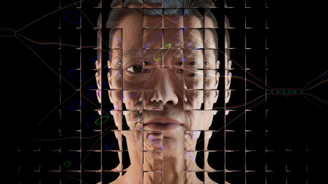
Beneath the Surface: Adrien’s Artistic Perspective on Generative AI

The image features the title "Beneath the Surface: Adrien's Artistic Perspective on Generative AI." The background consists of colourful, pixelated static, creating a visual texture reminiscent of digital noise. In the centre of the image, there's a teal rectangular overlay containing the title in bold, white text.

May 28, 2024 – A conversation with Adrien Limousin – a photographer and visual artist, sheds light on the nuanced intersections between AI, art, and ethics. Adrien’s work delves into the opaque processes of AI, striving to demystify the unseen mechanisms and biases that shape our representations.


A vibrant, abstract image from converting Street View screenshots from TIFF to JPEG, showing a pixelated, distorted classical building with columns. The sky features glitch-like, multicolored waves, blending greens, purples, pinks, and blues.

ADRIEN LIMOUSIN – Alterations (2023)

Adrien previously studied advertising and now is studying photography at the National Superior School of Photography (ENSP) in Arles and is particularly drawn to the language of visual art, especially from new technologies.

A cluster of coloured pixels made up from random gaussian noise taking up the whole canvas, representing a not denoised AI generated image; digital pointillism

Fig 1. Adrien Limousin / Better Images of AI / Non-image / CC-BY 4.0

Non-image

Adrien was drawn to the ‘Better Images of AI’‘ project after recognising the need for more nuanced and accurate representations of AI, particularly in journalism. In our conversation, I asked Adrien about his approach to creating the image he submitted to Better Images of AI (Fig 1.).


> INTERVIEWER: Can you tell me about your thinking and process behind the image you submitted?

> ADRIEN: I thought about how AI-generated images are created. The process involves taking an image from a dataset, which is progressively reduced to random noise. This noise is then “denoised” to generate a new image based on a given prompt. I wanted to try to find a breach or the other side of the opaqueness of these models. We only ever see the final result—the finished image—and the initial image. The intermediate steps, where the image is transitioning from data to noise and back, are hidden from us.

> ADRIEN: My goal with “Non-image” was to explore and reveal this hidden in-between state. I wanted to uncover what lies between the initial and final stages, which is typically obscured. I found that extracting the true noisy image from the process is quite challenging. Therefore, I created a square of random noise to visually represent this intermediate stage. It’s no longer an image and it’s also not an image yet.


Adrien’s square of random noise captures this “in-between” state, where the image is both “everything and nothing”—representing aspects of AI’s inner workings. This visual metaphor underscores the importance of making these hidden processes visible, to demystify and foster a more accurate understanding of what AI is, how it operates, and it’s real capabilities. Seeing the process Adrien discusses here also reflects the complex and collective human data that underpins AI systems. The image doesn’t originate from a single source but is a collage of countless lives and data points, both digital and physical, emphasising the multifaceted nature of AI and its deep entanglement with human experience.

A laptopogram based on a neutral background and populated by scattered squared portraits, all monochromatic, grouped according to similarity. The groupings vary in size, ranging from single faces to overlapping collections of up to twelve. The facial expressions of all the individuals featured are neutral, represented through a mixture of ages and genders.

Philipp Schmitt & AT&T Laboratories Cambridge / Better Images of AI / Data flock (faces) / CC-BY 4.0

“The medium is the message”

(McLuhan, Marshall, 1964).

When I asked Adrien about the artists who have inspired him, he highlighted how Marshall McLuhan’s seminal concept, “the medium is the message,” profoundly resonated with him.

This concept is crucial for understanding how AI is represented in the media. McLuhan argued that the medium itself—whether it’s a book, television, or image—shapes our perceptions and influences society more than the actual content it delivers. McLuhan’s work, particularly in Understanding Media (1974), explores how technology reshapes human interaction and societal structures. He warned that media technologies, especially in the electronic age, fundamentally alter our perceptions and social patterns. When applied to AI, this means that the way AI is visually represented can either clarify or obscure its true nature. Misleading images don’t just distort public understanding; they also shape how society engages with and responds to AI, emphasising the importance of choosing visuals that accurately reflect the technology’s reality and impact.

 “Stereotypes inside the machine”

(Adrien).

Adrien’s work explores the complex issue of stereotypes embedded within AI datasets, emphasizing how AI often perpetuates and even amplifies these biases through discriminatory images, texts, and videos.


> ADRIEN: Speaking of stereotypes inside the machine, I tried to question that in one of the projects I started two years ago and I discovered that it’s a bit more complicated than what it first seems. AI is making discriminatory images or text or videos, yes. But once you see that you start to question the nature of the image in the dataset and then suddenly the responsibility shifts and now you start to question why these images were chosen or why these images were labelled that way in the dataset in the first place ?

> ADRIEN:  Because it’s a new medium we have the opportunity to do things the right way. We aren’t doomed to repeat the same mistakes over and over. But instead we have created something even more – or at least equally discriminatory.

And even though there are adjustments made (through Reinforcement Learning from Human Feedback) they are just kind of… small patches. The issue needs to be tackled at the core.”

Image shows a white male in a suit facing away from the camera on a grey background. Text on the left side of the image reads “intelligent person.”

Adrien Limousin –  Human·s 2 (2022 – Ongoing)

As Adrien points out, minor adjustments or “sticking plasters” won’t suffice when addressing biases deeply rooted in our cultural and historical contexts. As an example – Google recently attempted  to reduce racial bias in their AI Gemini image algorithms. This effort was aimed at addressing long standing issues of racial bias in AI-generated images, where people of certain racial backgrounds were either misrepresented or underrepresented. However, despite these well-intentioned efforts, the changes inadvertently introduced new biases. For instance, while trying to balance representation, the algorithms began overemphasizing certain demographics in contexts where they were historically underrepresented, leading to skewed and culturally inappropriate portrayals. This outcome highlights the complexity of addressing bias in AI. It’s not enough to simply optimize in the opposite direction or apply blanket fixes; such approaches can create new problems while attempting to solve old ones. What this example underscores is the necessity for AI systems to be developed and situated within culture, history, and place.


> INTERVIEWER: Are these ethical considerations on your mind when you are using AI in your work?

> ADRIEN: Using Generative AI makes me feel complicit about these issues. So I think the way I approach it is more like trying to point out these lacks, through its results or by unravelling its inner working

“It’s the artists role to question”

(Adrien)


> INTERVIEWER: Do you feel like artists have an important role in creating the new and more accurate representations  of AI?

> ADRIEN:  I think that’s one of the role of the artist. To question.

> INTERVIEWER: If you can kind of imagine like what, what kind of representations we might see, or you might want to have in the future like instead of when you Google AI and it’s blue heads and you know, robots, etc.

> ADRIEN: That’s a really good question and I don’t think I have the answer, but as I thought about that, understanding the inner workings of these systems can help us make better representations. For instance, the concepts and ideas of remixing existing representations—something that we are familiar with, that’s one solution I guess to better represent Generative AI.


Image displays an error message from the Windows 95 operating system. The text reads ‘The belief in photographic images.exe has stopped working’.

ADRIEN LIMOUSIN System errors – (2024 – ongoing)

We discussed the challenges involved in encouraging the media to use images that accurately reflect AI.


> ADRIEN: I guess if they used stereotyped images it’s because most people have associated AI with some kind of materialised humanoid as the embodiment of AI and that’s obviously misleading, but it also takes time and effort to change mindsets, especially with such an abstract and complex technology, and that is I think one of the role of the media to do a better job at conveying an accurate vision of AI, while keeping a critical approach.


Another major factor is knowledge: journalists and reporters need to recognise the biases and inaccuracies in current AI representations to make informed choices. This awareness comes from education and resources like the Better Images of AI project, which aim to make this information more accessible to a wider audience. Additionally, there’s a need to develop new visual associations for AI. Media rely on attention-grabbing images that are immediately recognisable, we need new visual metaphors and associations that more accurately represent AI.  

One Reality


> INTERVIEWER: So kind of a big question, but what do you feel is the most pressing ethical issue right now in relation to AI that you’ve been thinking about?

> ADRIEN: Besides the obvious discriminatory part of the dataset and outputs, I think one of the overlooked issues is the interface of these models. If we take ChatGPT for instance, the way there is a search bar and you put text in it expecting an answer, just like a web browser’s search bar is very misleading. It feels familiar, but it absolutely does not work in the same way. To take any output as an answer or as truth, while it is just giving the most probable next words is deceiving and I think that’s something we need to talk a bit more about.


One major problem with AI is its tendency to offer simplified answers to multifaceted questions, which can obscure complex perspectives and realities. This becomes especially relevant as AI systems are increasingly used in information retrieval and decision-making. For example, Google’s AI summarising search feature has been criticised for frequently presenting incorrect information. Additionally, AI’s tendency to reinforce existing biases and create filter bubbles poses a significant risk. Algorithms often prioritise content that aligns with users’ pre-existing views, exacerbating polarisation (Pariser, 2011). This is compounded when AI systems limit exposure to a variety of perspectives, potentially widening societal divides.

Metasynthography

(Adrien)

Adrien takes inspiration from the idea of metaphotography, which involves using photography to reflect on and critique the medium itself. In metaphotography, artists use the photographic process to comment on and challenge the conventions and practices of photography.

Building on this concept, Adrien has coined the term “meta-synthography” to describe his approach to digital art.


> ADRIEN: The term meta-synthography is one of the terms I have chosen to describe Digital arts in general. So it’s not properly established, that’s just me doing my collaging.

> INTERVIEWER: That’s great. You’re gonna coin a new word in this blog 😉


I asked Adrien what artists inspire him. He discusses the influence of Robert Ryman, a renowned painter celebrated for his minimalist approach that focuses on the process of painting itself. Ryman’s work often features layers of paint on canvas, emphasising the act of painting and making the medium and its processes central themes in his art.


> ADRIEN: I recently visited an exhibition of Robert Ryman, which kind of does the same with painting – he paints about painting on painting, with painting.

> INTERVIEWER:  Love that.

> ADRIEN: I thought that’s very interesting and I very much enjoy this kind of work, it talks about the medium…It’s  a bit conceptual, but it raises question about the medium… about the way we use it, about the way we consume it.

Image displays a large advertising board displaying a blank white image, the background is a grey clear sky

Adrien Limousin – Lorem Ipsum (2024 – ongoing)

As we navigate the evolving landscape of AI, the intersection of art and technology provides a crucial perspective on the impact and implications of these systems. By championing accurate representations and confronting inherent biases, Adrien’s work highlights the essential role  artists play in shaping a more nuanced and informed dialogue about AI. It’s not only important to highlight AI’s inner workings but also to recognise that imagery has the power to shape reality and our understanding of these technologies. Everyone has a role in creating AI that works for society, countering the hype and capitalist-driven narratives advanced by tech companies. Representations from communities, along with the voices of individuals and artists, are vital for sharing knowledge, making AI more accessible, and bringing attention to the experiences and perspectives often rendered invisible by AI systems and media narratives.


Adrien Limousin (interviewee) is a 25 years old french (post)photographer exploring the other side of images, currently studying at the National Superior School of Photography in Arles.

Cherry Benson (interviewer) is a Student Steward for Better Images of AI. She holds a degree in psychology from London Metropolitan University and is currently pursuing a Master’s in AI Ethics and Society at the University of Cambridge where her research centers on social AI. Her work on the intersection of AI and border control has been featured as a critical case study in the Cambridge Journal of Artificial Intelligence for how racial capitalism is deeply intertwined with the development and deployment of AI.

💬 Behind the Image with Yutong from Kingston School of Art

This year, we collaborated with Kingston School of Art to give MA students the task of creating their own better images of AI as part of their final project. 

In this mini-series of blog posts called ‘Behind the Images’, our Stewards are speaking to some of the students that participated in the module to understand the meaning of their images, as well as the motivations and challenges that they faced when creating their own better images of AI. Based on our assessment criteria, some of the images will also be uploaded to our library for anyone to use under a creative commons licence. 

In our third and final post, we go ‘Behind the Image’ with Yutong about her pieces, ‘Exploring AI’ and ‘Talking to AI’. Yutong intends that her art will challenge misconceptions about how humans interact with AI.

You can freely access and download ‘Talking to AI’ and both versions of ‘Exploring AI’ from our image library.

Both of Yutong’s images are available in our library, but as you might discover below, there were many challenges that she faced when developing these works. We greatly appreciate Yutong letting us publish her images and talking to us for this interview. We are hopeful that her work and our conversations will serve as further inspiration for other artists and academics who are exploring representations of AI.

Can you tell us a bit about your background and what drew you to the Kingston School of Art?

Yutong is from China and before starting the MA in Illustration at Kingston University, she completed an undergraduate major in Business Administration. What drew Yutong to Kingston School of Art was its highly regarded reputation for its illustration course. On another note, she enjoys how the illustration course at Kingston balances both the commercial and academic aspects of art – allowing Yutong to combine her previous studies with her creative passions. 

Could you talk me through the different parts of your images and the meaning behind them?

In both of her images, Yutong wishes to unpack the interactions between humans and AI – albeit from two different perspectives.

Talking to AI’

Firstly, ‘Talking to AI’ focuses on more accurately representing how AI works. Yutong uses a mirror to reflect how our current interactions with AI are based on our own prompts and commands. At present, AI cannot generate content independently so it reflects the thoughts and opinions that humans feed into systems. The binary code behind the mirror symbolises how human prompts and data are translated into computer language which powers AI. Yutong has used a mirror to capture an element between humans and AI interaction that is overlooked – the blurred transition between human work to AI generation.

‘Exploring AI’

Yutong’s second image, ‘Exploring AI’ aims to shed light on the nuanced interactions that humans have with AI on multiple levels. Firstly, the text, ‘Hi, I am AI’ pays homage to an iconic phrase in programming (‘Hello World’) which is often the first thing any coder learns how to write and it also forms the foundations of a coder’s understanding of a programming language’s syntax, structure, and execution process. Yutong thought this was fitting for her image as she wanted to represent the rich history and applications of AI which has its roots in basic code. 

Within ‘Exploring AI’, each grid square is used to represent the various applications of AI in different industries. The expanded text across multiple grid squares demonstrates how one AI tool can have uses across different industriesChatGPT is a prime example of this.

However, Yutong wants to also draw attention to the figures within each square which all interact with AI in complex and different ways. For example, some of the body language of the figures depict them to be variously frustrated, curious, playful, sceptical, affectionate, indifferent, or excited towards the text, ‘Hi, I am AI’.

Yutong wants to show how our human response to AI changes and varies contextually and it is driven by our own personal conceptions of AI. From her own observations, Yutong identified that most people either have a very positive or very negative opinion towards AI – but not many feel anything in between. By including all the different emotional responses towards AI in this image, Yutong hopes to introduce greater nuance into people’s perceptions of AI and help people to understand that AI can evoke different responses in different contexts. 

What was your inspiration/motivation for creating your images?

As an illustrator, Yutong found herself surrounded by artists that were fearful that AI would replace their role in society. Yutong found that people are often fearful of the unknown and things they cannot control. Therefore, being able to improve understanding of what AI is and how it works through her art, Yutong hopes that she can help her fellow creators face their fears and better understand their creative role in the face of AI. 

Through her art, ‘Exploring AI’ and ‘Talking to AI’, Yutong intends to challenge misconceptions about what AI is and how it works. As an AI user herself, she has realised that human illustrators cannot be replaced by AI – these systems are reliant on the works of humans and do not yet have the creative capabilities to replace artists. Yutong is hopeful that by being better educated on how AI integrates in society and how it works, artists can interact with AI to enhance their own creativity and works if they choose to do so. 

Was there a specific reason you focused on dispelling misconceptions about what AI looks like and how Chat-GPT (or other large language models) work? 

Yutong wanted to focus on how AI and humans interact in the creative industry and she was driven by her own misconceptions and personal interactions with AI tools. Yutong does not intend for her images to be critical of AI. Instead, she envisages that her images can help educate other artists and prompt them to explore how AI can be useful in their own works. 

Can you describe the process for creating this work?

From the outset, Yutong began to sketch her own perceptions and understandings about how AI and humans interact. The sketch below shows her initial inspiration. The point at which each shape overlaps represents how humans and AI can come together and create a new shape – this symbolises how our interactions with technology can unlock new ideas, feelings and also, challenges.

In this initial sketch, she chose to use different shapes to represent the universality of AI and how its diverse application means that AI doesn’t look like one thing – AI can underlay an automated email response, a weather forecast, or medical diagnosis. 

Yutong’s initial sketch for ‘Talking to AI’

The project aims to counteract common stereotypes and misconceptions about AI. How did you incorporate this goal into your artwork? 

In ‘Exploring AI’, Yutong wanted to introduce a more nuanced approach to AI representation by unifying different perspectives about how people feel, experience and apply AI in one image. From having discussions with people utilising AI in different industries, she recognised that those who were very optimistic about AI, didn’t recognise its shortfalls – and the same vice-versa. Yutong believes that humans have a role to help AI reach new technological advancements and AI can also help humans flourish. In Yutong’s own words, “we can make AI better, and AI can make us better”. 

Yutong found talking to people in the industry as well as conducting extensive research about AI very important to ensure that she could more accurately portray AI’s uses and functions. She points to the fact that she used binary code in ‘Talking to AI’ after researching that this is the most fundamental aspect of computer language which underpins many AI systems. 

What have been the biggest challenges in creating a ‘better image of AI’? Did you encounter any challenges in trying to represent AI in a more nuanced and realistic way?

Yutong reflects on the fact that no matter how much she rethought or restarted her ideas, there was always some level of bias in her depiction of AI because of her own subconscious feelings towards the technology. She also found it difficult to capture all the different applications of AI, as well as the various implications and technical features of the technology in a single visual image. 

Through tackling these challenges, Yutong became aware of why Better Images of AI is not called ‘Best Images of AI’ the latter would be impossible. She hopes that while she could not produce the ‘best image of AI’, her art can serve as a better image compared to those typically used in the media.

Based on our criteria for selecting images, we were pleased to accept both your images but asked you if it was possible to make amendments to ‘Exploring AI’ to make the figures more inclusive. What do you think of this feedback and was it something that you considered in your process? 

In Yutong’s image, ‘Exploring AI’, Better Images of AI made a request if an additional image could be made including these figures in different colours to better reflect the diverse world that we live in. Being inclusive is very important to Better Images of AI, especially as visuals of AI and those who are creating AI, are notoriously unrepresentative.

Yutong agreed that this development would be better to enhance the image and being inclusive in her art is something she is actively trying to improve. She reflects on this suggestion by saying, ‘just as different AI tools are unique, so are individual humans’. 

The two versions of ‘Exploring AI’ available on the Better Images of AI library

How has working on this project influenced your own views about AI and its impact? 

During this project, Yutong has been introduced to new ideas and been able to develop her own opinions about AI based on research from academic journals. She says that informing her opinions using sources from academia was beneficial compared to relying on information provided by news outlets and social media platforms which often contain their own biases and inaccuracies.

From this project, Yutong has been able to learn more about how AI could incorporate into her future career as a human and AI creator. She has become interested in the Nightshade tool that artists have been using to prevent AI companies using their art to train their AI systems without the owner’s consent. She envisages a future career where she could be working to help artists collaborate with AI companies – supporting the rights of creators and preserving the creativity of their art. 

What have you learned through this process that you would like to share with other artists and the public?

By chatting to various people interacting and using AI in different ways, Yutong has been introduced to richer ideas about the limits and benefits of AI. Yutong challenges others to talk to people who are working with AI or are impacted by its use to gain a more comprehensive understanding of the technology. She believes that it’s easy to gain a biased opinion about AI by relying on the information shared by a single source, like social media, so we should escape from these echo chambers. Yutong believes that it is so important that people diversify who they are surrounding themselves with to better recognise, challenge, and appreciate AI. 

Yutong (she/her) is an illustrator with whimsical ideas, also an animator and graphic designer.

Better Images of AI’s Partnership with Kingston School of Art

An image with a light blue background that reads, 'Let's Collab!' at the top, the word 'Collab' underlined in burgandy. Below that, it says 'Better Images of AI x Kingston School of Art' with 'Kingston School of Art' in teal. Below the text is an illustration of two hands high-fiving, with black sleeves and white hands. Around the hands are burgundy stars.

This year, we were pleased to partner with Kingston’s School of Art to run an elective for their MA Illustration, Animation, and Graphic Design students to create their own ‘better images of AI’. Following this collaboration, some of the student’s images have been published in our library for anyone to use freely. Their images focus on communicating different ideas about the current state of AI – from the connection between the technology and gender oppression to breaking down the interactions between humans and AI chatbots.

In this blog post, we speak to Jane Cheadle who is the course leader for the MA Animation course at Kingston School of Art about partnering with Better Images of AI for the elective. The MA is a new course and it is focussed on critical and research-led animation design processes.

If you’re interested in running a similar module/elective or incorporating Better Images of AI’s work into your university course, we would love to hear from you – please contact info@betterimagesofai.org.

How did the collaboration with Better Images of AI come about?

AI is having an impact on various industries and the creative domain is no exception. Jane explains how she and the staff in the department were asked to work towards developing a strategy addressing the use of AI in the design school. At the same time, Jane was also in contact with Alan Warburton – a creator that works with various technologies, including computer generated imagery, AI, virtual reality, and augmented reality to develop art. Alan introduced Jane to Better Images of AI and she became interested in the work that we are doing, and how this linked to their future strategy for the use of AI in the design school.

Therefore, instead of solely creating rules about the use of AI in the school, Jane thought that working with the students to explore the challenges, limits, and benefits of the technology would be more meaningful as it would provide better learning opportunities for the students (as well as herself!) about this topic. 

Where does the elective fit within the school’s curriculum?

Kingston University’s Town House Strategy aims to prepare graduates for advances in technology which will alter our future society and workplaces. The strategy aims to equip students with enhanced entrepreneurial, digital, and creative problem-solving skills so they can better advance their careers and professional practice. As part of this strategy, Kingston University encourages collaboration and partnership with businesses and external bodies to help advance student’s knowledge and awareness of the different aspects of the working world.

As part of this, the Kingston School of Art runs a cross-disciplinary design module open to students from three different MA courses (Graphic Design, Illustration, and Animation). In this module, students are asked to think about the role of the designer now, and what it might look like in the future. The goal is to prompt students to situate their creative practice within the contemporary paradigms of precarity and uncertainty, providing space for students to understand and address issues such as climate literacy, design education, and the future of work. There are multiple electives within this module and each works with a partner external to the university.

Better Images of AI were fortunate enough to be approached by Jane to be the external partner for their elective. This elective was run by Jane as well as researcher and artist, Maybelle Peters. Jane explains that this module had a dual aim: firstly, to allow students to develop better images of AI which could be published to our library. But also, secondly, to educate students about AI and its impact on society. For Jane, it was important that when exploring AI, this was applied to the student’s own practice and positionality so they could understand how AI is influencing the creative industry as well as political, power structures more broadly.

How did the elective run?

Jane shares that there was a real divide amongst the students about their familiarity with AI and its wider context. Some students had been dabbling with AI tools and wanted to develop a position on its creative and ethical use. Meanwhile, others were not using AI at all and expressed being somewhat weary of it, alongside a real sense of amorphous fear around automated image generation and other capabilities that impact the markets for their creative works.

Better Images of AI worked with the Kingston School of Art to provide a brief for the elective, and students also used our Guide to help them understand the problems with current stock imagery that is used to illustrate AI so they could avoid these common tropes in their own work.

Following this, the students worked in special interest groups to research different aspects of AI. Each group then used this research to develop practical workshops to run with the wider class. This enabled the students to develop their own better images of AI based on what they had learnt from leading and participating in workshops and research tasks. Better Images of AI also visited Kingston School of Art to provide guidance and feedback to the students in the development stages of their images.

Some of the images that were submitted as part of the elective can be seen below. Each image shows a thoughtful approach and are so varied in nature – some are super low-fi and others are hilarious – but all the students drew upon their own design/drawing/making skills to develop their unique images. 

Why did you think it was important to partner with Better Images of AI for this elective?

As designers and image makers, we agreed that there is a responsibility to accurately and responsibly represent aspects of the world, such as AI. It was important to allow students to work with real constraints and build towards a future that they want to live in. While the brief provided to the students was to create images that accurately represent what AI looks like right now, much of the student workshops focussed on what kind of AI they wanted to see, what safeguards need to be put in place, and what power relations we might need to change in order to get there.

Jane Cheadle (she/they) is an animator, researcher and educator. Jane is currently senior lecturer and MA Animation course leader in the design school at Kingston School of Art. Both of Jane’s practice and research are cross-disciplinary and experimental with a focus on drawing, collaboration and expanded animation.  


We are super thankful to Jane and Maybelle as well as the Kingston School of Art for incorporating Better Images of AI into their elective. We are so appreciative to all the students who participated in the module and shared their work with us. Jane is excited to hopefully run the elective again and we are looking forward to more work together with the students and staff at Kingston School of Art.

This blog post is the first in a series of posts about Better Images of AI collaboration with the Kingston School of Art. In a series of mini interview blog posts, we speak to three students that participated in the elective and designed their own better images of AI. Some of the student’s images even feature in our library – you can view them here.

Handmade, Remade, Unmade A.I.

Two digitally illustrated green playing cards on a white background, with the letters A and I in capitals and lowercase calligraphy over modified photographs of human mouths in profile.

The Journey of Alina Constantin’s Art

Alina’s image, Handmade A.I., was one of the first additions to the Better Images of AI repository. The description affixed to the image on the site outlines its ‘alternative redefinition of AI’, bringing back into play the elements of human interaction which are so frequently excluded from discussions of the tech. Yet now, a few months on from the introduction of the image to the site, Alina’s work itself has undergone some ‘alternative redefinition’. This blog post explores the journey of this particular image, from the details of its conception to its numerous uses since: How has the image itself been changed, adapted in significance, semantically used? 

Alina Constantin is a multicultural game designer, artist and organiser whose work focuses on unearthing human-sized stories out of large systems. For this piece, some of the principles of machine learning like interpretation, classification, and prioritisation were encoded as the more physical components of human interaction: ‘hands, mouths and handwritten typefaces’, forcing us to consider our relationship to technology differently. We caught up with Alina to discuss further the process (and meaning) behind the work.

What have been the biggest challenges in creating Better Images of AI?

Representing AI comes with several big challenges. The first is the ongoing inundation of our collective imagination with skewed imagery, falsely representing these technologies in practice, in the name of simplification, sensationalism, and our human impulse towards personification. The second challenge is the absence of any single agreed-upon definition of AI, and obviously the complexity of the topic itself.

What was your approach to this piece?

My approach was largely an intricate process of translation. To stay focused upon the ‘why of A.I’ in practical terms, I chose to focus on elements of speech, also wanting to highlight the human sources of our algorithms in hand drawing letters and typefaces. 

I asked questions, and selected imagery that could be both evocative and different. For the back side of the cards, not visible in this image, I bridged the interpretive logic of tarot with the mapping logic of sociology, choosing a range of 56 words from varying fields starting with A/I to allow for more personal and specific definitions of A.I. To take this idea further, I then mapped the idea to 8 different chess moves, extending into a historical chess puzzle that made its way into a theatrical card deck, which you can play with here. You can see more of the process of this whole project here.

This process of translating A.I via my own artist’s tool set of stories/gameplay was highly productive, requiring me to narrow down my thinking to components of A.I logic which could be expressed and understood by individuals with or without a background in tech. The importance of prototyping, and discussing these ideas with audiences both familiar and unfamiliar with AI helped me validate and adjust my own understanding and representation–a crucial step for all of us to assure broader representation within the sector.

So how has Alina’s Better Image been used? Which meanings have been drawn out, and how has the image been redefined in practice? 

One implementation of ‘Handmade A.I.’, on the website of one of our affiliated organisations We and AI, remains largely aligned with the artist’s reading of it. According to We and AI, the image was chosen due to its re-centring of the human within the AI conversation: the human hands still hold the cards, humanity are responsible for their shuffling, their design (though not necessarily completely in control of which ones are dealt.) Human agency continues to direct the technology, not the other way round. As a key tenet of the organisation, and a key element of the image identified by Alina, this all adds up. 

https://weandai.org/, use of Alina’s image

A similar usage by the Universität Hamburg, to accompany a lecture on responsibility in the AI field, follows a similar logic. The additional slant of human agency considered from a human rights perspective again broadens Alina’s initial image. The components of human interaction which she has featured expand to a more universal representation of not just human input to these technologies but human culpability–the blood, in effect, is on our hands. 

Universität Hamburg use of Alina’s image

Another implementation, this time by the Digital Freedom Fund, comes with an article concerning the importance of our language around these new technologies. Deviating slightly from the visual, and more into the semantics of artificial intelligence, the use may at first seem slightly unrelated. However, as the content of the article develops, concerns surrounding the ‘technocentrism’ rather than anthropocentrism in our discussions of AI become a focal point. Alina’s image captures the need to reclaim language surrounding these technologies, placing the cards firmly back in human hands. The article directly states, ‘Every algorithm is the result of a desire expressed by a person or a group of persons’ (Meyer, 2022.) Technology is not neutral. Like a pack of playing cards, it is always humanity which creates and shuffles the deck. 

Digital Freedom Fund use of Alina’s image

This is not the only instance in which Alina’s image has been used to illustrate the relation of AI and language. The question “Can AI really write like a human?” seems to be on everyone’s lips, and ‘Handmade A.I.’ , with its deliberately humanoid typeface, its natural visual partner. In a blog post for LSE, Marco Lehner (of BR AI+) discusses employment of a GPT-3 bot, and whilst allowing for slightly more nuance, ultimately reaches a similar crux– human involvement remains central, no matter how much ‘automation’ we attempt.

Even as ‘better’ images such as Alina’s are provided, we still see the same stock images used over and over again. Issues surrounding the speed and need for images in journalistic settings, as discussed by Martin Bryant in our previous blog post, mean that people will continue to almost instinctively reach for the ‘easy’ option. But when asked to explain what exactly these images are providing to the piece, there’s often a marked silence. This image of a humanoid robot is meaningless– Alina’s images are specific; they deal in the realities of AI, in a real facet of the technology, and are thus not universally applicable. They relate to considerations of human agency, responsible AI practice, and don’t (unlike the stock photos) act to the detriment of public understanding of our tech future.

Branching Out: Understanding an Algorithm at a Glance

A window of three images. On the right is a photo of a big tree in a green field in a field of grass and a bright blue sky. The two on the left are simplifications created based on a decision tree algorithm. The work illustrates a popular type of machine learning model: the decision tree. Decision trees work by splitting the population into ever smaller segments. I try to give people an intuitive understanding of the algorithm. I also want to show that models are simplifications of reality, but can still be useful, or in this case visually pleasing. To create this I trained a model to predict pixel colour values, based on an original photograph of a tree.

The impetus for the most recent contributions to our image repository was described by the artist as promoting understanding of present AI systems. Rens Dimmendaal, Principal Data Scientist at GoDataDriven, discussed with Better Images of AI the need to cut through all the unnecessary complication of ideas within the AI field; a goal which he believes is best achieved through visual media. 

Discussions of the ‘black box’ of AI are not exactly new, and the recent calls for explainability statements to accompany new tech from Best Practice AI are certainly attempting to address the problem at some level. Tim Gordon writes of the greater ‘transparency’ required in the field, as well as the implicit acknowledgement that any wider impacts have been considered. Yet, for the broader spectrum of individuals whose lives are already being influenced by AI technologies, an extensive, jargon-filled document on the various inputs and outputs of any single algorithm is unlikely to provide much relief. 

This is where Dimmendaal comes in: to provide ‘understanding at a glance’ (and also to ‘make a pretty picture’, in his own words). The artist began with the example of the decision tree. All present tutorials on this topic, in his view, use datasets which only make the concept more difficult to understand–have a look at ‘decision tree titanic’ for a clear illustration of this.  Another explanation was provided by r2d3. Yet, for Rens, this still employed an overly complicated ‘usecase’. Hence, this selection of images.

Rens cites his inspiration for this particular project as Roger Johansson’s recreation of the ‘Mona Lisa’, using genetic programming. In the original, Johansson attempts to reproduce the piece with a combination of semi-transparent polygons and an evolutionary algorithm, gradually mutating the initial randomly generated polygons to move closer and closer to the original image. Rens recreated elements of this code as a starting point, then with the addition of the triptych format and implementation of a decision tree style algorithm made the works his own. 

Rens Dimmendaal / Better Images of AI / Man / CC-BY 4.0

In keeping with his motivations–making a ‘pretty picture’, but chiefly contributing to the greater transparency of AI methodologies–Dimmendaal elected the triptych to present his outputs. The mutation of the image is shown as a fluid, interactive process, morphing across the triptych from left to right, from abstraction to the original image itself. Getting a glimpse inside the algorithm in this manner allows for the ‘understanding at a glance’ which the artist wished to provide–the image shifts before our eyes, from the initial input to the final output. 

Rens Dimmendaal & David Clode / Better Images of AI / Fish / CC-BY 4.0

Rens Dimmendaal & Jesse Donoghoe / Better Images of AI / Car / CC-BY 4.0

Engaging with the decision tree was not only a practical decision, related to the prior lack of adequate tutorial, but also an artistic one. As Dimmendaal explains, ‘applying a decision tree to an actual tree was just too poetic an opportunity to let slide.’ We think it paid off… 

Dimmendaal has worked with numerous algorithmic systems previously (including: k-means, nearest neighbours, linear regression, svm) but cites this particular combination of genetic programming, decision trees and the triptych format as producing the nicest outcome. More of his work can be found both in our image repository, and on his personal website.

Whether or not a detailed understanding of algorithms is something you are interested in, you can input your own images to the tool Rens created for this project here and play around with making your own decision tree art. What do images relevant to your industry, product or interests look like seen through this process? Make sure to tag Better Images of AI in your AI artworks, and credit Rens. We’re excited to see what you come up with!

More from Better Images: Twitter | LinkedIn

More from the artist: Twitter | Linkedin

AI, Narratives, Sound and Equality

A photographic rendering of a simulated middle-aged white woman against a black background, seen through a refractive glass grid and overlaid with a distorted diagram of a neural network.

An Interview with Spencer Collins by Dr Jenn Chubb

“Sonic narratives matter but not everyone is experiencing the same thing”: What AI sounds like to a Deaf person.

In a previous post for this blog, I suggested that a failure to take into account the significance of sonic framing when considering visual narratives of AI limited the capacity to fully broaden a public understanding of AI. I now explore the potential which sound and music hold in relation to communicating the realities of AI, and what we can learn from someone who does not hear them but accesses them via different means.

Undeniably, music has power. We use it to make us feel good, to change how we think/feel, to distract us or help us concentrate, to help us run faster or slow down and relax. Music manipulates how we perceive people, concepts, or things. When music is used in storytelling, it is chosen for the resonances and emotional overtones that it brings to the topic, capable of framing a story with fear, sadness or joy (Brown & Volgsten, 2005).

In screen media, this power is used liberally to create the pace and the framing of narratives; one need look no further than the two notes and a rising tempo which has forever impacted society’s perception of sharks. When paired with factual content, like documentaries, music has the power to make the audience take sides on a narrative that is notionally objective. This is especially pertinent for new technologies, where our initial introduction and perception is shaped by the narratives presented in media and we are likely to have little direct lived experience. 

The effect of background sound and music for documentaries has been largely overlooked in research (Rogers, 2015). In particular, the effect of sonic framing for storytelling about AI is little explored, and even less so for audiences with disabilities, who may already find themselves disadvantaged by certain emerging technologies (Trewin et al., 2019)

This blog reflects on the sonic framing of Artificial Intelligence (AI) in screen media and documentary. It focuses particularly on the effects of sonic framing for those who may perceive the audio differently to its anticipated reception due to hearing loss, as part of a wider project on the sonic framing of AI in documentary. I will be drawing on a case study interview with a profoundly deaf participant, arguing that sonic narratives do matter in storytelling, but that not everyone is experiencing the same thing.

For those who perceive music either through feeling the vibrations with the TV turned up high, or described in subtitles, lighter motifs are lost and only the driving beats of an ominous AI future are conveyed. This case study also reveals that the assumed audience point of view on AI technology is likely much more negative for disabled audience members- this is not unlike the issues with imagery and AI which can serve to distract or distort. All this feeds into a wider discussion surrounding what we might refer to as responsible storytelling – fair for people with disabilities.

I had the pleasure of chatting to Spencer Collins, an experienced Equality, Diversity and Inclusion Advisor in the private, public, and NGOs sectors. We chatted about AI technologies, imaginaries of how AI might sound, and barriers to engagement, especially with regards to conversational AI. We also discussed the effect his disability has on his experience of storytelling.

“Sonic narratives matter but not everyone is experiencing the same thing.”

Spencer tells me from the start that “AI technologies are not set up for people like me.” He does so as the caption on our Zoom call churns out what most closely resembles nonsense, providing me with an early indication of some of the very real challenges Spencer faces on an everyday basis. Luckily, Spencer can lip-read and I am keen to hear what he has to say.

What becomes clear is that while AI has the potential to massively impact the lives of people living with a disability, they don’t work properly for people with disabilities yet. What is also clear is the role that imagery and sound together have in influencing perceptions of technology in storytelling.  Importantly, Spencer feels there is a need to involve people with disabilities in the development of technology and in the stories that promote it. He asks, “have companies really spoken to people with disabilities? How safe and useful is AI for people like me?”

Can you introduce yourself?

I’m Spencer, with exceptional skills and experience for more than 18 years in the private, public, and NGOs sectors. Many companies are struggling to ensure their Equality and Inclusion policies and procedures really reflect the needs of their businesses and employees, their self-esteem, perceived worth and improving company productivity. So I help with that. 

I am profoundly deaf. I come from a hearing family. I am very lucky that my mother has been so great in helping me get to the best speech therapist in the world. But it is tough. 

How do you perceive the visual representation of AI in the media?

Good question. Having grown up watching ‘Mr Benn’, the character transformed himself into another character or person in an alternate universe similar to the world of Avatar when he transformed himself to become another person. There was a lot of diversity in the play, and Avatar is supposed to be equally interesting. I am aware that there is native and Asian representation, but I wonder how AI portrays disabled characters?

I often ask myself, “Do I trust everything I see, equally so as when my hands touch something I believe what my eyes see?”

Do you have any comments on our alternative images in the BIOAI database?

Better Images of AI embraces honesty and authenticity, as well as rigorous facts for the audience. I’m interested to see how artificial intelligence converts the artist’s emotional state, brushwork, and inner state into tangible artworks by translating the work of Picasso, Frank Stella, etc into photographs, the algorithm can recognise the truth of the image. This is the question I need to observe.

There is a lot of interest in images of AI. I feel as though image and sound are intertwined. Do you have an imagination of what AI sounds like?

The hard thing about technology is that there is a gray area – it doesn’t work for everyone. The dancer in ‘Strictly come dancing’ – relies on vibrations. Deaf people can feel the vibrations, so that’s not coming from a hearing aid. 

We have a sixth sense. We are like animals. We can see sound, we can feel something. I have no hearing but superb senses, I can see in the dark, I can lip-read. We taught ourselves how to use our senses. Technology can’t identify this, it will take a long time for technology to be ready. 

I’m a musician, so I can relate to this when you describe how you ‘feel’ sound – thinking about storytelling, which uses sound so often to influence audiences, if you were to imagine science fiction, for instance, what kind of sound do you sense from these stories?

When I watch Robocop – I have always wanted to be a Pilot/Traffic Patrol, but I get a lot of rejections because of my disability. You need to have 20/20 hearing. Same with the air force – going back to Robocop, I remember some kind of AI robot, he had a power in him, like a spider-man. A strength and power. I remember when I was watching at one point it was all about the audio. You could pick up the translation from the telephone. That would be wonderful for the Deaf community. 

Interestingly the U.S. has introduced a new development where every sound can be identified for Deaf and Hard of Hearing people, so they can hear everything like any other person. It is something that you could check out.

Sometimes when watching a story, you get a physical reaction, you get a shock. Science fiction might seem very loud to me, which might make the concepts seem more frightening. 

How do you interpret sound?

Use of colour and visualizations become really important. I rely on noise, I rely on anything loud, so I can feel the vibrations. Beethoven was profoundly deaf. He cut off the legs of the piano, to hear the difference between high and low note vibrations. Space and distance from technology is important. 

Is there an argument for more immersive storytelling and tools?

VR therapy (using AI) is being used and this is a massive moment for people with a range of challenges such as dementia.

Immersive tools are not quite ready though. Think of the ‘metaverse’ – one of the questions is these ‘Minecraft’ type characters. They don’t have any body features, e.g., lips, etc, so this is not ready for people who are hard of hearing. These characters are developed for people like you, not like me. One answer is to use captions, but companies say that that would take away from what was happening around the room – this is not equal. 

The Gather-town gaming platform is another example of diverse forms of communication. The most confusing part there is people are talking, but I don’t know, I can’t tell who is talking. These platforms are very black and white.  A colour code could be helpful, so we know who is talking. 

How do we look into making sound more accessible?

The first step to investigating this kind of AI is learning how to classify music, and then how to feed this information to the machine so that it can be interpreted by Deaf users visually. In order to determine how the Deaf community currently enjoys music through vibration, and what cues they feel accurately portray the sound, is another question.

Recently I watched a film where a robot was talking and I could not tell what it was saying. I thought – if that was me – I would not have a clue, no visual clue at all. No lips, no movement. It would not do me any good.

Do you use AI in the home?

I have got Alexa – but it doesn’t recognise my speech. If I say something, it completely misunderstands me. I love music, I play all types of music but using AI Apple iTunes, it doesn’t even recognise me. It cannot play music for me. I have to use my hands. 

I know some friends have a [echo] dot that can talk…to turn the light on etc, but I can’t get it to recognise me. That is a worry when we want someone to do a job on our behalf. We don’t want gimmicks: will the product deliver 100% equally to everyone? 

Would it be useful for AI narratives to represent sound visually?

Just imagine you’re watching any music film and the closed captioning is on, but they don’t really give the sound too. Imagine if that’s on the screen too. The company will say ‘no, forget it, we don’t want more captioning over the picture’. How can you incorporate the sound and the text- I don’t have the answer to that. If there was something for sound, that would be great. 

The relationship between image and sound seems very important. For instance, documentarians tend to start with the image when they sound design a documentary about AI. In what ways do you feel they link together?

In the same way as Digital Imagery, cinema and games are made up of CGI models that give a realistic look to delight the audience through sound and image. If you go to the cinema and surround sound, oh my god, it’s amazing. You can feel it when it’s so loud. It’s fantastic. It’s an experience. I was watching Click and they created a code plugged into the guitar. Visualizing sound. Maybe that is the way forward.

Is the future of AI positive?

AI can transform the lives of disabled people. Many advances have been made but they offer too much promise to individuals. It’s crucial to bring diverse voices into the design and development of AI.

In what ways, if any, does being deaf impact your relationship with AI?

Take ‘Story Sign’ for example, which is powered by Huawei AI and developed with the European Union for the Deaf and reads children’s books and translates them into sign language. There have been impacts when the US government believes Huawei is a threat to worldwide cybersecurity. How can we tell if artificial intelligence is safe for the Deaf community? These are the questions I am concerned about.

Documentary is one instance where the story is about documenting fact – what kinds of ways might sonic narratives be used to influence the audience? Do you think they matter?

As a former DJ, I encountered a new way of experiencing music through vibrations when played from the ground to above, which challenged my audience to consider hearing vs. feeling. 

Are there any metaphors you can imagine about AI and whether there is a link between those we think of when we consider imagery?

Imaginary language uses figurative language to describe objects, actions, and ideas in a way that appeals to the physical senses and helps audiences to envision the scene as if it were real. It is not always accurate to call something an AI image. Visual and sounds can be described by action, but tastes, physical sensations, and smells can’t.

So what priorities should we have around future tech development?

We need to think about how we can compromise equally, in a fair and transparent way. I personally feel tech would make life a lot easier for people with disabilities, but from the other side, I am frightened. 

Talking about care homes and robot carers, I wonder, how will that fit someone like me? It just removes the human entirely. We are too afraid about what will happen next. There is always a fear. 

Like anything we are being watched by Big Brother, it’s the same principle for the future of AI, it’s going to be a challenge. It will work for some people, but not all of them. You have fake news saying how wonderful AI is for people with disabilities, but they don’t necessarily ask what those people want. 

Are there ways to make AI narratives more inclusive for deaf people?

It’s probably worth reading this report – technology is not an inherent ‘good for disabled people’.

Recommended: How do blind people imagine AI? 

Buzzword Buzzkill: Excitement & Overstatement in Tech Communications

An illustration of three „pixelated“ cupboards next to each other with open drawers, the right one is black

The use of AI images is not just an issue for editorial purposes. Marketing, advertising and other forms of communication may also want or need to illustrate work with images to attract readers or to present particular points. Martin Bryant is the founder of tech communications agency Big Revolution and has spent time in his career as an editor and tech writer. 

“AI falls into that same category as things like cyber security where there are no really good images because a lot of it happens in code,” he says. “We see it in outcomes but we don’t see the actual process so illustration falls back on lazy stereotypes. It’s a similar case with cyber security, you’ll see the criminal with the swag bag and face mask stooped over a keyboard and with AI there’s the red-eyed Terminator robot or it’s really cheesy robots that look like sixties sci-fi.”

The influence of sci-fi images in AI is strong and one that can make reporters and editors uncomfortable with their visal options. “ “Whenever I have tried to illustrate AI I’ve always felt like I am short changing people because it ends up being stock images or unnecessarily dystopian and that does a disservice to AI. It doesn’t represent AI as it is now. If you’re talking about the future of AI, it might be dystopian, but it might not be and that’s entirely in our hands as a species how we want AI to influence our lives,” Martin says. “If you are writing about killer robots then maybe a Terminator might be OK to use but if you’re talking about the latest innovation from DeepMind then it’s just going to distort the public understand of AI either to inflate their expectations of what is possible today or it makes them fearful for the future.” 

I should be open here about how I know Martin. We worked together for the online tech publication The Next Web where he was my managing editor and I was UK editor some years ago. We are both very familiar with the pressures of getting fast-moving tech news out online, to be competitive with other outlets and of course to break news stories. The speed at which we work in news has an impact on the choices we can make.

“If it’s news you need to get out quickly, then you just need to get it out fast and you are bound to go for something you have used in the past so it’s ready in the CMS (Content management system – the ‘back end’ of a website where text and images are added.),” Martin says. “You might find some robots or in a stock image library there will be cliches and you just have to go with something that makes some sense to readers. It’s not ideal but you hope that people will read the story and not be too influenced by the image – but a piece always needs an image.”

That’s an interesting point that Martin is making. In order to reach a readership, lots of publications rely on social media to distribute news. It was crowded when we worked together and it sometimes feels even more packed today. Think about the news outlets you follow on Twitter or Facebook, then add to this your friends, contacts and interesting people you like to follow and the amount of output they create with links to news they are reading and want to comment upon. It means we are bombarded with all sorts of images whenever we start scrolling and to stand out in this crowd, you’re going to need something really eye-catching to make someone slow down and read. 

“If it’s a more considered feature piece then there’s maybe more scope for a variety of images, like pictures of the people involved, CEOs, researchers and business leaders,” Martin says. “You might be able to get images commissioned or you can think about the content of the piece to get product pictures, this works for topics like driverless cars. But there is still time pressure and even with a feature, unless you are a well-resourced newsroom with a decent budget, you are likely to be cutting corners on images.” 

Marketing exciting AI

It’s not just the news that is hungry for images of AI. Marketing, advertising and other communications are also battling for our attention and finding the right image to pull in readers, clicks or getting people to use a product is important. Important, but is it always accurate? Martin works with and has covered news of countless startup companies, some of which use AI as a core component of their business proposition. 

“They need to think about potential outcomes when they are communicating,” he says “Say there is a breakthrough in deep neural AI or something it’s going to be interesting to academics and engineers, the average person is not going to get that because a lot of it requires an understanding of how this technology works and so you often need to push startups to think about what it could do, what they are happy with saying is a positive outcome.” 

This matches the thinking of many discussions I have had about art and the representation of AI. In order to engage with people, it can be easier to show them different topics of use and influence from agriculture to medical care or dating. These topics are far more familiar to a wider audience than a schematic for an adversarial network. But claiming an outcome can also be a thorny issue for some company leaders.

“A lot of startup founders from an academic background in AI tend to be cautious about being too prescriptive about how their technology could be used because often if they have not fully productised their work in an offering to a specific market,” Martin explains. “They need to really think about optimistic outcomes about how their tech can make the world better but not oversell it. We’re not saying it’s going to bring about world peace, but if they really think of examples of how the AI can help people in their everyday lives this will help people engage with making the leap from a tech breakthrough they don’t understand to really getting why it’s useful.” 

Overstating AI

AI now appears to be everywhere. It’s a term that has broken out from academia, through engineering and into business, advertising and mainstream media. This is great, it can mean more funding, more research, progress and ethical monitoring and attention. But when tech gets buzzy, there’s a risk that it will be overstated and misconstrued. 

“There’s definitely a sense of wanting to play up AI,” Martin says. “There’s a sense that companies have to say ‘look at our AI!’ when actually that might be overselling what is basic technology behind the scenes. Even if it’s more developed than that, they have to be careful. I think focusing on outcomes rather than technologies is always the best approach. So instead of saying ‘our amazing, groundbreaking AI technology does this’ – focusing on what outcomes you can deliver that no one else can because of that technology is far more important. 

As we have both worked in tech for so long, the buzzword buzzkill is a familiar situation and one that can end up with less excitement and more of an eyeroll. Martin shared some past examples we could learn from, “It’s so hilarious now,” he says. “A few years ago everything had to have a location element, it was the hot new thing and now the idea of an app knowing your location and doing something relevant to it is nothing. But for a while it was the hottest thing. 

“Gamification was a buzzword too. Now gamification is a feature in lots and lots of apps, Duolingo is a great example but it’s subtly used in other areas  but for a while startups would pitch themselves saying ‘we are the gamified version of X’.”

But the overuse of language and their accompanying images is far from over and it’s not just AI that suffers. “Blockchain keeps rearing its head,” Martin points out. “It’s Web3 now, slightly further along the line but the problem with Web3 and AI is that there’s a lot of serious and thoughtful work happening but people go ahead with ‘the blockchain version of X or web3 version of Y’ and because it’s not ready yet or it’s far too complicated for the mainstream, it ends up disillusioning people. I think you see this a bit with AI too but Web3 is the prime example at the moment and it’s been there in various forms for a long time now.” 

To avoid bad visuals and buzzword bingo in the reporting of AI, it’s clear through Martin’s experience that outcomes are a key way of connecting with readers. AI can be a tricky one to wrap your head around if you’re not working in tech, but it’s not that hard when it’s clearly explained.”It really helps people understand what AI is doing for them today rather than thinking of it as something mysterious or a black box of tricks,” Martin says. “That box of tricks can make you sound more competitive but you can’t lie to people about it and you need to focus on outcomes that help people understand clearly what you can do. You’ll not only help people’s understanding of your product but also the general public’s knowledge of   what AI can really do for them.”

Avoiding toy robots: Redrawing visual shorthand for technical audiences

Two pencil drawn 1960s style towy robots being scribbled out by a pencil on a pale blue background

Visually describing AI technologies is not just about reaching out to the general public, it also means getting things marketing and technical communication right. Brian Runciman is the Head of Content – British Computer Society (BCS) The Chartered Institute of IT. His audience is not unfamiliar with complex ideas, so what are the expectations for accompanying images? 

Brian’s work covers the membership magazine for BCS as well as a publicly available website full of news, reports and insights from members. The BCS membership is highly skilled, technically minded and well read – so the content on site and in the magazine needs to be appealing and engaging.  

“We view our audience as the educated layperson,” Brian says. “There’s a base level of knowledge you can assume. You probably don’t have to explain what machine learning or adversarial networks are conceptually and we don’t go into tremendous depth because we have academic journals that do this.” 

Of course writing for a technical audience also means Brian and his colleagues will get smart feedback when something doesn’t quite fit expectations. “With a membership of over 60 thousand, there are some that are very engaged with how published material is presented and quite rightly,” Brian says. “Bad imagery affects the perception of what something really is.”

So what are the rules that Brian and his writers follow? As with many publications there is a house style that they try to keep to and this includes the use of photography and natural imagery. This is common among news publications that choose this over illustration, graphics or highly manipulated images. In some cases this is used to encourage a sense of trust in the readership that images are accurate and have not been changed. This also tends to mean the use of stock images. 

“Stock libraries need to do better,” Brian observes. “When you’re working quickly and stuff needs to be published, there’s not a lot of time to make image choices and searching stock libraries for natural imagery can mean you end up with a toy robot to represent things that are more abstract.”

“Terminators still come up as a visual shorthand,” he says. “But AI and automation designers are often just working to make someone’s use of a website a little bit slicker or easier. If you use a phone or a website to interact with an automated process it does what it is supposed to do and you don’t really notice it – it’s invisible and you don’t want to see it. The other issue is that when you present AI as a robot people think it is embodied. Obviously, there is a crossover but in process automation, there is no crossover, it’s just code, like so much else is.”

Tone things down and make them relatable 

Brian’s decades-long career in publishing means he has some go-to methods for working out the best way to represent an article. “I try to find some other aspect of the piece to focus on,” he says. “So in a piece about weather modelling, we could try and show a modelling algorithm but the other word in the headline is weather and an image of this is something we can all relate to.” 

Brian’s work also means that he has observed trends in the use of images. “A decade or so ago it was more important to show tech,” he says. “In a time when that was easily represented by gadgets and products this was easier than trying to describe technologies like AI. Today we publish in times when people are at the heart of tech stories and those people need to look happy.”

Pictures of people are a good way to show the impact of AI and its target users, but it also raises other questions about diversity – especially if the images are predominantly of middle aged white men. “It’s not necessary,” says Runciman. “We have a lot of head shots of our members that are very diverse. We have people from minorities, researchers who are not white or middle aged – of which there are loads. When people say they can’t find diverse people for a panel I find it ridiculous, there are so many people out there to work with. So we tend to focus on the person who is working on a technology and not just the AI itself.”

The use of images is something that Brian sees every day for work, so what would be on his wish list when it comes to better images of AI? “No cartoon characters and minimal colour usage – something subtle,” he muses. “Skeletal representations of things – line representations of networks, rendered in subtle and fewer colours.” This nods at the cliches of blue and strange bright lights that you can find in a simple search for AI images, but as Brian points out, there are subtler ways of depicting a network and images for publishing that can still be attractive without being an eyesore.

How do blind people imagine AI? An interview with programmer Florian Beijers

A human hand touching a glossy round surface with cloudy blue texture that resembles a globe
Florian Beijers

Note: We acknowledge that there is no one way of being blind and no one way of imagining AI as a blind person. This is an individual story. And we’re interested in hearing more of those! If you are blind yourself and want to share your way of imagining AI, please get in touch with us. This interview has been edited for clarity.

Alexa: Hi Florian! Can you introduce yourself?

Florian: My name is Florian Beijers. I am a Dutch developer and accessibility auditor. I have been fully blind since birth, I use a screen reader. And I give talks, write articles and give interviews like this one.

Alexa: Do you have an imagination of Artificial Intelligence?

Florian: I was born fully blind so I have never actually learned to see images, neither do I do this in my mind or in my dreams. I think in modalities I can somehow interact with in the physical world. This is sound, tactile images, sometimes even flavours or scents. When I think of AI, it really depends on the type of AI. If I think of Siri I just think of an iPhone. If I think of (Amazon) Alexa, I think of an Amazon Echo.

It really depends on what domain the AI is in

I am somehow proficient in knowing how AI works. I generally see scrolling code or a command line window with responses going back and forth. Not so much an actual anthropomorphic image of, say, Cortana or like these Japanese Anime. It really depends on what domain the AI is in.

Alexa: When you read news articles about AI and they have images there, do you skip these images or do you read their alt text?

Florian: Often they don’t have any alts, or a very generic alt like “image of computer screen” or something like that. Actually, it’s so not on my radar. When you first asked me that question about one week ago – “Hey we’re researching images of AI in the news” – I was like: Is that a thing?

(laughter)

Florian: I had no clue that that was even happening. I had no idea that people make up their own images for AI. I know in Anime or in Manga, there’s sometimes this evil AI that’s actually a tiny cute girl or something.

I had no idea that people make up their own images for AI

Alexa: Oh yes, AI images are a thing! Especially the images that come from these big stock photo websites make up such a big part of the internet. We as a team behind Better Images of AI say: These images matter because they shape our imagination of these technologies. Just recently there was an article about an EU commission meeting about AI ethics and they illustrated it with an image of the Terminator …

(laughter)

Alexa: … I kid you not, that happens all the time! And a lot of people don’t have the time to read the full article and what they stick with is the headline and the image, and this is what stays in their heads. And in reality, the ethical aspects mentioned in the article were about targeted advertisements or upload filters. Stuff that has no physical representation whatsoever and it’s not even about evil, conscious robots. But this has an influence on people’s perception of AI: Next time they hear somebody say “Let’s talk about the ethics of AI”, they think of the Terminator and they think “I have nothing to add to this discussion” but actually they might have because it’s affecting them as well!

Florian: That is really interesting because in 9 out of 10 times this just goes right by me.

Alexa: You are quite lucky then!

Florian: Yes, I am kind of immune to this kind of brainwashing.

Alexa: But you know what the Terminator looks like?

Florian: Yeah, I mean I’ve seen the movie. I’ve watched it once with audio description. But even if I am not told what it looks like I make it a generic robot with guns…

Alexa: Do you own a smart speaker?

Florian: Yes. I currently have a Google Home. I am looking into getting an Amazon Alexa Echo Dot as well. I enjoy hacking on them as well like creating my own skills for them.

Alexa: In the past, I did some research on how voice assistants are anthropomorphised and how they’re given names, a gender, a character and whole detailed backstories by their makers. All this storytelling. And the Google Assistant stood out because there’s less of this storytelling. They didn’t give it a human name, to begin with.

Two smart speakers: A Google home and an Amazon Echo. Image: Jonas Nordström CC BY 2.0

Florian: No it’s just “Google”. It’s like you are literally talking to a corporation.

Alexa: Which is quite transparent! I like it. Also in terms of gender, they have different voices, at least in the US, they are colour-coded instead of being named “female” or “male”.

Florian: It’s a very amorphous AI, it’s this big block of computing power that you can ask questions to. It’s analogous to what Google has always been: The search giant, you can type things into it and it spits answers back out. It’s not really a person.

Alexa: Yeah, it’s more like infrastructure.

Florian: Yeah, a supercomputer.

Alexa: I wondered if you were using a voice assistant like Amazon Alexa that is more heavily anthropomorphised and has all this character. How would you imagine this entity then?

Florian: Difficult. Because I know kind of how things work AI-wise, I played with voice assistants in the past. That makes it really hard to give it the proper Hollywood finish of having an actual physical shape.

Alexa: Maybe for you, AI technology has a more acoustic face than a visual appearance?

Florian: Yes! The shape it has is the shape it’s in. The physical device it’s coming from. Cortana is just my computer, Siri is just my phone.

The shape AI has is the shape it’s in

Alexa: Would you say that there is a specific sound to AI?

Florian: Computers have been talking to me ever since I can remember. This is essentially just another version of that. When Siri first started out it used the voice from VoiceOver (the iOS screen reader). Before Siri got its own voice it used a voice called Samantha, that’s a voice that’s been in computers since the 1990s. It’s very much normal for devices to talk at me. That’s not really a special AI thing for me.

A sound example of a screen reader

Alexa: When did you start programming?

Florian: Pretty much since I was 10 years old when I did a little HTML tutorial that I found on the web somewhere. And then off and on through my high school career until I switched to studying informatics. I’ve been a full-time developer since 2017.

Computers have been talking to me ever since I can remember

Alexa: I think how I first got in touch with you on Twitter was via a post you did about screenreaders for programmers, there was a video and I was mind-blown how fast everything is.

Florian: It’s tricky! Honestly, I haven’t mastered it to the point where other blind programmers have. I use a Braille display, which is a physical device that shows you line by line in Braille. I use that as a bit of a help. I know people, especially in the US, who don’t use Braille displays. Here in Europe it’s generally a bit better arranged in terms of getting funding for these devices, because these devices are prohibitively expensive, like 4000-6000 Euros. In the Netherlands, the state will pay for those if you’re sufficiently beggy and blindy. Over in the US, that’s not as much of a given. A lot of people tend not to deal with Braille. Braille literacy is down as a result of that over there.

I use a Braille display to get more of a physical idea of what the code looks like. That helps me a lot with bracket matching and things like that. I do have to listen out for it as well otherwise things just go very slowly. It’s a bit of a combination of both.

Alexa: So a Braille display is like an actual physical device?

Florian: It’s a bar-shaped device on which you can show a line of Braille characters at a time. Usually, it’s about 40 or 80 characters long. And you can pan and scroll through the currently visible document.

I use a Braille display to get more of a physical idea of what the code looks like

Alexa: How do you get the tactile response?

Florian: It’s like tiny little pins that go up and down. Piezo cells. The dots for the Braille characters come up and fall as new characters replace them. It’s a refreshable line of Braille cells.

A person's hands using a Braille display on a desk next to a regular computer keyboard
A person using a braille display. Image: visualpun.ch, CC BY-SA 2.0, https://www.flickr.com/photos/visualpunch/

Alexa: Would that work for images as well? Could you map the pixels to those cells on a Braille display?

Florian: You could and some people have been trying that. Obviously the big problem there is that the vast majority of blind people will not know what they’re looking at, even if it’s tactile. Because they lack a complete frame of reference. It’s like a big 404.

(laughing)

Florian: In that sense, yes you could. People have been doing that by embossing it on paper. Which essentially swells the lines and slopes out of a particular type of thick paper, which makes it tactile. This is done for example for mathematical graphs and diagrams. It wouldn’t be able to reproduce colour though.

Alexa: You are a web accessibility expert. What are some low hanging fruits that people can pick when they’re developing websites?

Florian: If you want to be accessible to everyone, you want to make sure that you can navigate and use everything from the keyboard. You want to make sure that there is a proper organizational hierarchy. Important images need to have an alt text. If there’s an error in a form a user is filling out, don’t just make it red, do something else as well, because of blind and colourblind people. Make sure your form fields are labelled. And much more!

Alexa: Florian, thank you so much for this interview!


Links

Florian on Twitter: @zersiax
Florian’s blog: https://florianbeijers.xyz/
Article: “A vision of coding without opening your eyes”
Article: “How to Get a Developer Job When You’re Blind: Advice From a Blind Developer Who Works Alongside a Sighted Team” on FreeCodeCamp.org
Youtube video “Blindly coding 01”:  https://www.youtube.com/watch?v=nQCe6iGGtd0
Audio example of a screen reader output: https://soundcloud.com/freecodecamp/zersiaxs-screen-reader

Other links

Accessibility on the web: https://developer.mozilla.org/en-US/docs/Learn/Accessibility/What_is_accessibility
Screen reader: https://en.wikipedia.org/wiki/Screen_reader
Refreshable Braille display: https://en.wikipedia.org/wiki/Refreshable_braille_display
Paper embossing: https://www.perkinselearning.org/technology/blog/creating-tactile-graphic-images-part-3-tips-embossing

Cover image:
“Touching the earth” by Jeff Kubina from Columbia, Maryland, CC BY-SA 2.0 https://creativecommons.org/licenses/by-sa/2.0, via Wikimedia Commons