Visually describing AI technologies is not just about reaching out to the general public, it also means getting things marketing and technical communication right. Brian Runciman is the Head of Content – British Computer Society (BCS) The Chartered Institute of IT. His audience is not unfamiliar with complex ideas, so what are the expectations for accompanying images?
Brian’s work covers the membership magazine for BCS as well as a publicly available website full of news, reports and insights from members. The BCS membership is highly skilled, technically minded and well read – so the content on site and in the magazine needs to be appealing and engaging.
“We view our audience as the educated layperson,” Brian says. “There’s a base level of knowledge you can assume. You probably don’t have to explain what machine learning or adversarial networks are conceptually and we don’t go into tremendous depth because we have academic journals that do this.”
Of course writing for a technical audience also means Brian and his colleagues will get smart feedback when something doesn’t quite fit expectations. “With a membership of over 60 thousand, there are some that are very engaged with how published material is presented and quite rightly,” Brian says. “Bad imagery affects the perception of what something really is.”
So what are the rules that Brian and his writers follow? As with many publications there is a house style that they try to keep to and this includes the use of photography and natural imagery. This is common among news publications that choose this over illustration, graphics or highly manipulated images. In some cases this is used to encourage a sense of trust in the readership that images are accurate and have not been changed. This also tends to mean the use of stock images.
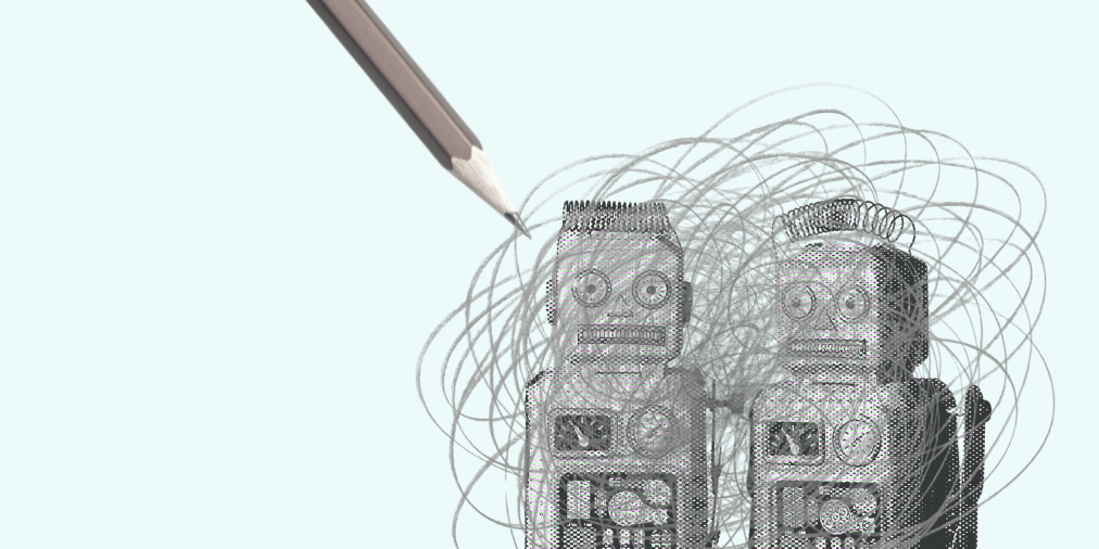
“Stock libraries need to do better,” Brian observes. “When you’re working quickly and stuff needs to be published, there’s not a lot of time to make image choices and searching stock libraries for natural imagery can mean you end up with a toy robot to represent things that are more abstract.”
“Terminators still come up as a visual shorthand,” he says. “But AI and automation designers are often just working to make someone’s use of a website a little bit slicker or easier. If you use a phone or a website to interact with an automated process it does what it is supposed to do and you don’t really notice it – it’s invisible and you don’t want to see it. The other issue is that when you present AI as a robot people think it is embodied. Obviously, there is a crossover but in process automation, there is no crossover, it’s just code, like so much else is.”
Tone things down and make them relatable
Brian’s decades-long career in publishing means he has some go-to methods for working out the best way to represent an article. “I try to find some other aspect of the piece to focus on,” he says. “So in a piece about weather modelling, we could try and show a modelling algorithm but the other word in the headline is weather and an image of this is something we can all relate to.”
Brian’s work also means that he has observed trends in the use of images. “A decade or so ago it was more important to show tech,” he says. “In a time when that was easily represented by gadgets and products this was easier than trying to describe technologies like AI. Today we publish in times when people are at the heart of tech stories and those people need to look happy.”
Pictures of people are a good way to show the impact of AI and its target users, but it also raises other questions about diversity – especially if the images are predominantly of middle aged white men. “It’s not necessary,” says Runciman. “We have a lot of head shots of our members that are very diverse. We have people from minorities, researchers who are not white or middle aged – of which there are loads. When people say they can’t find diverse people for a panel I find it ridiculous, there are so many people out there to work with. So we tend to focus on the person who is working on a technology and not just the AI itself.”
The use of images is something that Brian sees every day for work, so what would be on his wish list when it comes to better images of AI? “No cartoon characters and minimal colour usage – something subtle,” he muses. “Skeletal representations of things – line representations of networks, rendered in subtle and fewer colours.” This nods at the cliches of blue and strange bright lights that you can find in a simple search for AI images, but as Brian points out, there are subtler ways of depicting a network and images for publishing that can still be attractive without being an eyesore.