In April, the ESRC Centre for Digital Futures at Work (Digit) and Better Images of AI (BIoAI) launched a competition to reimagine the visual communication of how work is changing in the digital age.
We received over 70 images to the competition from illustrators, artists, researchers, graphic designers, and photographers from all around the world, including Brazil, Hong Kong, Lebanon, France, Uganda, Argentina, Peru, Ireland, the US and the UK. The submissions thoughtfully challenged the dominant stock imagery used to depict digital transformation at work by offering more nuanced, inclusive, and grounded visual representations.
Entrants submitted their images to reflect four themes: digital adoption, digital inclusion, changing employment contracts and working conditions, and digital dialogues. These were derived from the ‘Digital Dialogues’ report of Digit’s 5 year research programme which investigated ongoing impacts of digital transformation on people’s daily lives.
“Collectively, these images prompt us to think more deeply about the multifaceted impacts of the digital transformation of work. They offer us more thoughtful, nuanced and varied ways of seeing and imagining the changes already taking place. By making them freely available through the Better Images of AI library, we hope they will also play a small part in helping to shape the emergent digital work ecosystem, by helping to shape the wider conversation.It has been a great experimental vehicle to communicate the academic evidence from our research to the broadest audience. We hope this will ignite further discussions about these emerging trends” – ProfessorJacqueline O’Reilly, Co-Director of Digit
The BIoAI team conducted an initial short list of images for judges to score. The panel came together to discuss their scores and select a series of winners and runners-up that they thought best reflected the complexity, diversity, and real-world implications of digital transformation at work. The judging panel was composed of experts from creative, research, technical, and union backgrounds:
Niels Bonde (digital artist and academic fellow)
Bhumika Billa (legal academic and creative)
Chanell Daniels (Responsible AI manager at Digital Catapult)
Tania Duarte (Better Images of AI, Founder of We and AI)
Rob Keery (CMO at Anything is Possible and Jagged Edge AI)
Michael Luck (Deputy Vice-Chancellor at University of Sussex)
Jacqueline O’Reilly (Co-Director of Digit)
Maninder Paul (AI Strategist)
Nick Scott (AI Director at Unions 21)
Nina Wakeford (Professor of Art)
Ben Wodeki (Technology Reporter)
As a result of the strength and number of competition entries, the judges awarded an additional ‘highly commended’ prize.
We would like to thank all the artists who entered the competition, including many who kindly donated their submissions to the Better Images of AI library. This means that a wider selection of over 20 images are available under a Creative Commons license for anyone to use for free with attribution.
“We have been overwhelmed to receive such a diverse range of submissions that provided rich interpretations of Digit’s research and illustrate really interesting aspects of digital transformation, that don’t make it into stock image libraries. A special thank you to the judges, Digit, and ESRC who have also supported and contributed invaluably to the competition. We look forward to seeing these new images being used by the Better Images of AI’ Image library’s users to illustrate news articles and comment related not only to digital transformation and the future of work, but also some of the broader questions they raise about the increasing use of AI in the workplace.” – Tania Duarte, Founder of We and AI, for Better images of AI
The winners
GRAND PRIZE: Yutong Liu – “Digital Nomads: Across Time“
Yutong Liu & Digit / https://betterimagesofai.org / https://creativecommons.org/licenses/by/4.0/
“Across time, the sun never sets. Exploitation? Oppression? Or convenience?A group of people work around the tower, hailing from different places and time zones. While they enjoy greater freedom in choosing their working hours, they also face the challenges of time differences. This is the precarious balance of digital nomadism.”
“The image is intended to represent independent data gig workers who work in isolation not only from the larger project with which they might be engaged (e.g., flagging graphic images for video platforms, tagging data for commercial AI systems or weapon systems) but also from other human workers (through distance, physical separation, or technological buffers like headphones).”
WINNER #2: Yutong Liu – “Digital Nomads: Digital-Based Connection”
Yutong Liu & Digit / https://betterimagesofai.org / https://creativecommons.org/licenses/by/4.0/
“Thanks to advancements in digital technology, people can now work from various places, including those closer to nature, reflecting a shift in work environments. However, at the same time, birds resembling mouse cursors are causing chaos in the sky. Through this imagery, I highlight the challenges and unknown risks brought by such digital communities.”
“I wanted to illustrate how digital transformation can make it more difficult for young people to gain the skills required for entry level jobs. The goalposts being moved, as it were, as a result of AI adoption.”
“The image illustrates the experimental integration of AI into human workplaces, drawing on the metaphor of “stochastic parrots” to represent generative AI tools. The glitchy AI parrots assist with analyzing, sorting, and sense-making tasks, but their presence is varied. Some AI are leashed, symbolizing attempts at control, while others respond to human commands more autonomously.”
“This image explores the paradox of digital transformation in the workplace. 1 or 2 knowledge workers, running inside a wheel embedded within a computer mouse, struggle to keep pace as a powerful hand (representing employers or capitalistic forces).”
RUNNER UP #2 (JOINT): Leo Lau – “Knowledge Sweatshop”
Leo Lau & Digit / https://betterimagesofai.org / https://creativecommons.org/licenses/by/4.0/
“This image illustrates digital transformation gone wrong, where technology becomes a tool for intensified extraction. Instead of liberating labour, automation can lock workers into more exhausting cycles of output, without increasing agency or rewards.”
RUNNER UP #2 (JOINT): Julieta Longo – ”Digitalisation and Moonlighting”
Julieta Longo & Digit / https://betterimagesofai.org / https://creativecommons.org/licenses/by/4.0/
“The image represents both the possibilities and the risks of work digitalisation, particularly for mothers and people with caregiving responsibilities. Platform-based work and remote work are presented as activities that may help reconcile paid and unpaid labor, though this reconciliation often involves tensions.”
“It evokes a time when mobile devices were tools of aspiration and accessibility, yet now symbolize obsolescence. The depicted phone represents both an entry point to digital life and a marker of technological disparity—while some communities have moved on to advanced smart devices and constant connectivity, others remain tethered to outdated tools.”
“A brightly coloured office populated with all kinds of people working at connected desks. There are computer screens and networks in the air in clouds. The image shows the connectivity of a digitally transformed workplace.”
HIGHLY COMMENDED: Reihaneh Golpayegani – ”Employment in Frames”
‘Employment in Frames’ by Reihaneh Golpayegani
“This image was intended to convey multiple concepts, the storyboard style was chosen to draw attention to changed working conditions—while also touching on socio-economic inequalities and workplace technology adoption. The blurring of work and personal life is emphasised in two separate illustrations as one of the most relatable implications of digital transformation.”
In the coming weeks, we’ll be posting a series of deep dives into the artwork and artists that entered our ‘Digital Dialogues Art Competition’. These posts will explore the ideas behind the entries, the creative processes involved, and the broader themes about digital transformation that we’ve seen emerge across the submissions.
We’ll also be sharing feedback from the judges and organisers, offering insight into how decisions were made and how the competition itself was designed, reflecting on the criteria and the reasons specific choices were made.
Artist contributions to the Better Images of AI library have always served a really important role in relation to fostering understanding and critical thinking about AI technologies and their context. Images facilitate deeper inquiries into the nature of AI, its history, and ethical, social, political and legal implications.
When artists create better images of AI, they often have to grapple with these narratives in their attempts to more realistically portray the technology and point towards its strengths and weaknesses. Furthermore, as artists freely share these images in our library, others can benefit from learning about the artist’s own internal motivations (which are provided in the descriptions) but the images can also inspire users’ own musings.
In this series of blog posts, some of our volunteer stewards are each taking turns to choose an image from the Archival Images of AI collection and unpack the artist’s processes and explore what that image means to them.
At the end of 2024, we released the Archival Images of AI Playbook with AIxDESIGN and the Netherlands Institute for Sound and Vision. The playbook explores how existing images – especially those from digital heritage collections – can help us craft more meaningful visual narratives about AI. Through various image-makers’ own attempts to make better images of AI, the playbook shares numerous techniques which can teach you how to transform existing images into new creations.
Here, Rameez Raja unpacks ‘AI Am Over It’– Nadia Piet’s (an image-maker) own better image of AI that was created for the playbook. Rameez personally reflects on his feelings towards AI amidst a never-ending stream of AI hype and ‘LinkedIn guru hot takes’ on the latest developments in the space. Despite the increasing infiltration of AI into society, Rameez comments on how Piet’s image points to a growing resistance in society against using AI as developers steal artwork from creators, further misinformation, and challenge our sense of self.
“So, what do you think of AI?”. “I’m tired of it.”
This is the go-to question that always finds its way to me—at family dinners, in WhatsApp groups, or halfway through a drink with someone. And truthfully? It exhausts me. Not because I’m indifferent—far from it. I spend my days thinking deeply about technology, analysing platforms, working at the intersection of AI, society, and policy. But lately, I’ve been feeling the weight of it all. My brain feels like it’s buffering.
There’s something about the pace, the hype, the never-ending stream of think-pieces, hot takes, and LinkedIn gurus that leaves me exhausted. One day it’s agents, the next it’s Sora, then AutoGPT—each promising disruption, innovation, or a new dawn. And yet, behind all that noise, the human questions remain: Who is this tech serving? Who’s left out? And most of all—how are we feeling in the face of it?
That’s why Nadia Piet’s artwork, AI Am Over It, resonated with me. It comments on AI fatigue, illustrating how the overwhelming flood of tools and constant influx of headlines leaves most people feeling dizzy and disoriented. With AI icons swirling around the figure’s head, it captures the mental overload and confusion many feel as they struggle to keep up with rapid developments / the fast-paced AI landscape.
It feels like a snapshot of my inner world: a human figure—serene, stoic—surrounded by a chaotic halo of AI logos competing for attention. The AI fatigue is real. The figure—drawn from what looks like a Renaissance or alchemical manuscript—evokes an age of inquiry, mysticism, and visionary thinking. But here, he’s not discovering truths. He’s being drowned in them. He’s being submerged in signals—too many, too loud, too fast to make sense of.
AI Overload
The image captures what AI has become for so many of us: not a revelation, but a cognitive overload. The myth of AI as a rational, godlike mind—an Enlightenment fantasy—is clashing with the reality of our current AI landscape: noisy, exploitative, corporatised. The logos circling the figure don’t represent knowledge; they represent branding, monetisation, and an endless feed of skewed updates.
Another layer that struck me was that the central figure might as well be a ghost from the past. A time traveler from an era where knowledge was sacred, slow, and wrapped in ritual. The alchemists, the philosophers, the mystics—they sought truth through wonder. Today, we scrape, prompt, and automate. In Piet’s image, this archival human seems caught in a time loop, trapped in the chaos of modern signals. There’s a sadness to it. A sense of lost dialogue between worlds.
We’re not just engaging with AI anymore—we’re surrounded by it. That’s what I see in those orbiting logos. A kind of orbital trap, where our thoughts, emotions, and even our sense of self are influenced by algorithmic systems. Elon Musk’s Grok being used to clap back at posts on X is a perfect example of this cultural drift. AI isn’t just answering questions—it’s shaping how we argue, how we feel, how we relate to each other. It’s performance masked as fact-checking, surveillance disguised as help.
And while some celebrate the spread of these tools as progress, many of us are quietly turning away. There’s a kind of reverse effect happening: the more AI saturates every part of public discourse, the more we begin to tune out. When everyone is suddenly an expert, a prompt engineer, or a tech visionary, the truth becomes harder to locate. In that fog of hot takes and hype, we lose clarity. We lose trust. We lose the human signal in the noise.
Seeing Through the Hype
What ‘AI Am Over It’ does so powerfully is that it doesn’t just document the presence of AI—it critiques it. The title is a mood, a manifesto, a coping mechanism. It aligns with broader movements we’re seeing across the creative world. Take the backlash from artists like Paul McCartney or Kate Bush, who’ve criticised AI companies for using their voices or songs without permission. That outrage has led to tangible action—like amendments pushing for more transparency and economic impact assessments in AI development.
We need more of this. Because unregulated AI doesn’t just risk misinformation—it risks stagnation. Creativity becomes lazy when it’s just derivative output from a scraped dataset. Why explore new ideas when you can prompt a remix? If we lean too heavily on AI to create, to ideate, to think, we may lose touch with what it means to make something truly original. The danger isn’t just economic—it’s existential. Are we becoming passive consumers of pre-generated thought?
This is where Piet’s image becomes more than aesthetic. It’s archival. It preserves a moment of resistance, a visual reminder that AI isn’t just a tool—it’s a terrain we navigate daily, often without clear maps. And like any map, the legends matter. Whose vision is being drawn? Who controls the ink? By invoking a figure from the past, the image also invites us to reflect on the longer history of AI—its myths, its cycles of hype, and the often invisible human labour that has always underpinned technological change. Archival imagery, in this way, becomes a tool for challenging present-day narratives, reminding us that today’s ‘new’ is often built on forgotten or overlooked foundations.
And then there’s the meme-ification of it all. AI isn’t just a tool—it’s become part of our collective moodboard. The rise of “Ghiblification,” where AI generates images in the Studio Ghibli style, might seem innocent or even charming. But it’s another front in the conversation over cultural ownership. Art as aesthetic, stripped of context, style without story. These remixes flatten rather than deepen our understanding. They don’t honour artistry—they commodify it.
That’s why I keep returning to ‘AI Am Over It’. It’s not prescriptive. It doesn’t try to tell us what AI is or what we should think. It simply reflects. It holds up a mirror to our moment—messy, noisy, and at times, disillusioned. But it also quietly reminds us that we’re still here. That amidst the automation, the chaos, the acceleration, the human is not lost – just tired!
Maybe being “over it” isn’t the end. Maybe it’s the start of something else—a pause, a breath, a reorientation. A chance to find our own orbit again.
About the author
Rameez Raja (he/him) is a data analytics engineer and storyteller, passionate about AI and designing systems that foster connection for a healthier society. A UCL graduate, he is pursuing an MS in AI at the University of Bath and advocates for trustworthy communication as essential to thriving democracies and communities.
If you want to contribute to our new blog series, ‘Through My Eyes’, by selecting an image from the Better Images of AI Library and exploring what the image means to you, get in touch (info@betterimagesofai.org).
Explore other posts in the ‘Through My Eyes’ Series
Artist contributions to the Better Images of AI library have always served a really important role in relation to fostering understanding and critical thinking about AI technologies and their context. Images facilitate deeper inquiries into the nature of AI, its history, and ethical, social, political and legal implications.
When artists create better images of AI, they often have to grapple with these narratives in their attempts to more realistically portray the technology and point towards its strengths and weaknesses. Furthermore, as artists freely share these images in our library, others can benefit from learning about the artist’s own internal motivations (which are provided in the descriptions) but the images can also inspire users’ own musings.
In this series of blog posts, some of our volunteer stewards are each taking turns to choose an image from the library and unpack the artist’s processes and explore what that image means to them.
Here, Joe Bourne explores Data Flock (digits) by Philipp Schmitt and reflects on how the image invites us to think about the subtleties in the relationships between AI, data, and humans. He draws attention to the image’s ambiguity that represents the complexity of data without trying to gloss over its nuances which can mislead us or prevent us from making our own judgments about information.
From Posters on Bedroom Walls to Da Vinci’s Notebooks
I assumed choosing my favourite image from the Better Images of AI collection would be a personal thing. What I didn’t expect was to find myself having to do some intense googling to track down a half-remembered exhibition poster from my teenage bedroom wall.
The image that sparked this trip down memory lane is Data Flock (digits) by Philipp Schmitt. Data Flock (digits) shows a machine learning dataset visualized spatially, in cloud-like clusters according to visual similarity of the data. Although visualizations like this one always simplify and fail to represent the data’s true complexity and nuance, they guide the researchers’ intuitions for their subject matter. The image is a ‘laptopogram’, created by exposing photographic paper using a computer screen and developed in the artist’s bathtub. The process preserves a digital artifact of AI research in silver crystals, returning a physical dimension to sterile data. Dust, scratches, and the marks left by the artist’s hands draw a connection to the role of the researchers’ subjectivity in making AI.
At first glance, it reminded me of the speculative models and scribblings on the poster for Panamarenko’s Bing of the Ferro Lusto 2000 exhibition from my teenage bedroom wall. Schmitt’s image has a similar hand-crafted and open-ended feel. Panamarenko’s sketches looked like fantastical vehicles or improbable machines, while Data flock (digits) evokes something more abstract and organic. To me, the blobs look like tiny grubs, or bacteria, maybe even buffalo from a great height. Others might see beans, or droplets, or brush marks. There’s no single right answer, and that’s part of what makes it compelling.
It also calls to mind da Vinci’s famous notebooks with flying machines and the vitruvian man: the yellowed backgrounds, the visible drafting marks and something simultaneously analytical and artistic. Like those sketches, Schmitt’s image sits at the intersection of science, art and science fiction: not to explain, but to explore. The data is clustered, sorted, and shaped, but the meaning remains open. This is what I find so captivating: that Data Flock (digits) captures the process of pattern recognition without forcing a conclusion. It’s a good reminder that even when AI or data analysis can spot patterns, we’re still the ones making sense of them. Or trying to, at least.
AI Metaphors and Meaning
There’s also something quietly organic in the image’s visual texture. To me, the ‘flocking’ resembles weather maps or wind currents: pressure systems moving across the frame. In my own research, I’ve written about the metaphors we reach for when trying to explain data-driven technologies. “The cloud” is one example: a term that implies something weightless and remote, when in fact it refers to very grounded, physical infrastructures. The language we use to describe AI is full of euphemism, metaphor and anthropomorphism, and while those can help us relate to the intangible and complex parts, systems and concepts behind data, AI and the internet, they also risk misleading us. Data flock (digits) plays with this tension: hinting at anthropomorphic movement, without giving in completely to any recognisable metaphor or cliche. The blobs in this data flock feel simultaneously natural and digital.
Something else that draws me to this image is how it reveals something of the process behind machine learning. The blobs are grouped according to visual similarity, but there’s no legend or key. You’re left to observe, to notice, to wonder. It’s an aesthetic representation of categorisation (one of the fundamental operations in data science) but without the usual gloss of objectivity or neatness. It invites ambiguity and curiosity. It shows us the work of sorting and learning. Schmitt’s own description of the image, that “visualizations like this one always simplify and fail to represent the data’s true complexity and nuance, [but] they guide the researchers’ intuitions”, gets to the heart of why I admire it. I’m always drawn to attempts to make AI or machine learning more tangible. Especially when they don’t try to smooth over the complexity.The best ones let you see the mess, the uncertainty, the weird edges that don’t quite line up. That’s where it gets interesting. This image does that. It reminds us that there is always a human: whether analysing data, interpreting visualisations, or deciding how best to communicate them. Even when making the image itself, captured by the marks, scratches and fingerprints.
Art for Art’s Sake
As well as sending me down memory lane, remembering having my mind expanded in the Hayward Gallery twenty-plus years ago, the image also led me down a wonderfully unexpected rabbit hole. I’d never heard of a laptopogram before reading Schmitt’s accompanying interpretation for this image. This discovery speaks to something that makes Better Images of AI so valuable. While its stated purpose is to improve the visuals used to represent AI in public life, it also functions as an art exhibition in its own right: Art for art’s sake. Through this project I’ve been introduced to all kinds of image-making techniques I didn’t know about before: digital collaging, archival remixing, glitch aesthetics. As someone who enjoys low-fi making and physical processes, I was delighted to learn that data flock (digits) was created by exposing photographic paper to a computer screen and developing it in a bathtub. You can see that process in the final image: in the specks, scratches, and smudges. It’s a tactile, analogue production that sits in refreshing contrast to the smooth, polished surfaces of AI-generated imagery.
The Value of Ambiguity
Finally, there’s a practical reason I keep returning to this image: it’s incredibly useful. Because it’s not tied to a specific AI use case, and because its aesthetic is so open-ended, I’ve found myself using it in presentations, slides, and publications across a range of contexts. It doesn’t tell the viewer what to think, but it allows them space to think. For a project like Better Images of AI, which aims to shift how these technologies are represented, that matters. Likelihood of adoption should be part of how we evaluate what makes an image “better.”
Data flock (digits) is a reminder that images don’t need to explain everything. Sometimes, they’re more powerful when they simply invite us to pay attention: to complexity, to process, and to the humans behind the scenes.
About the author
Joe Bourne (he/him) is doing a PhD in Speculative Design and Emerging Technologies at Imagination Lancaster, and he is a Partnership Development Lead at the Alan Turing Institute. Joe is particularly interested in public understanding and imaginings of emerging technology, and people’s hopes and fears associated to this.
If you want to contribute to our new blog series, ‘Through My Eyes’, by selecting an image from the Better Images of AI Library and exploring what the image means to you, get in touch (info@betterimagesofai.org).
Explore other posts in the ‘Through My Eyes’ Series
Dominik sheds light on the importance of theBetter Images of AI library which fosters a more informed, nuanced public understanding of AI by breaking the stronghold of the “deep blue sublime” aesthetic with more diverse and meaningful representations of AI.
Dominik also draws attention to the algorithms which perpetuate the dominance of familiar and sensationalist visuals and calls for movements which reshape media systems to make better images of AI more visible in public discourse.
AI promises innovation, yet its imagery remains trapped in the past. Deep-blue, sci-fi-inflected visuals have flooded public media, saturating our collective imagination with glowing, retro-futuristic interfaces and humanoid robots. These “deep blue sublime” [1] images, which draw on a steady palette of outdated pop-cultural tropes and clichés, do not merely depict AI — they shape how we think about it, reinforcing grand narratives of intelligence, automation, and inevitability [2]. It takes little to acknowledge that the AI discussed in public media is far from the ethereal, seamless force these visuals disclose. Instead, the term generally refers to a sprawling global technological enterprise, entangled with labor exploitation, ecological extraction, and financial speculation [3–10] — realities conspicuously absent from its dominant public-facing representations.
The widespread rise of these images is suspended against intensifying “AI hype” [11], which has been compared to historical speculative investment bubbles [12,13]. In my recent research [1,14,15], I join a growing body of research looking into images of AI [16–21], to explore how AI images operate at the intersection of aesthetics and politics. My overarching ambition has been to contribute an integrated account of the normative and the empirical dimensions of public images of AI to the literature. I’ve explored how these images matter politically and ethically, inseparable from the pathways they take in real-time, echoing throughout public digital media and wallpapering it in seen-before denominations of blue monochrome.
Rather than measuring the direct impact of AI imagery on public awareness, my focus has been on unpacking the structural forces that produce and sustain these images. What mechanisms dictate their circulation? Whose interests do they serve? How might we imagine alternatives? My critique targets the visual framing of AI in mainstream public media — glowing, abstract, blue-tinted veneers seen daily by millions on search engines, institutional websites, and in reports on AI innovation. These images do not merely aestheticize AI; they foreclose more grounded, critical, and open-ended ways of understanding its presence in the world.
The Intentional Mindlessness of AI Images
Google Images search results for “artificial intelligence”. January 14, 2025. Search conducted from an anonymised instance of Safari. Search conducted from Amsterdam, Netherlands.
Recognizing the ethico-political stakes of AI imagery begins with acknowledging that what we spend our time looking at, or not looking beyond, matters politically and ethically. The currently pervasive images of AI make us look somewhere, at the cost of a somewhere else. The sheer volume of these images, and their dominance in public media, slot public perception into repetitive grooves dominated by human-like robots, glowing blue interfaces, and infinite expanses of deep-blue intergalactic space. By monopolizing the sensory field through which AI is perceived, they reinforce sci-fi clichés, and more importantly, obscure the material realities — human labor, planetary resources, material infrastructures, and economic speculation — that drive AI development [22,23].
In a sense, images of AI could be read as operational [24–27], enlisted in service of an operation which requires them to look, and function, the way they do. This might involve their role in securing future-facing AI narratives, shaping public sentiment towards acceptance of AI innovation, and supporting big tech agendas for AI deployment and adoption. The operational nature of AI imagery means that these images cannot be studied purely as an aesthetic artifact, or autonomous works of aesthetic production. Instead, these images are minor actors, moving through technical, cultural and political infrastructures. In doing so, individual images do not say or do much per se – they are always already intertwined in the circuits of their economic uptake, circulation, and currency; not at the hands of the digital labourers who created them, but of the human and algorithmic actors that keep them in circulation.
Simultaneously, the endurance of these images is less the result of intention than of a more mindless inertia. It quickly becomes clear how these images do not reflect public attitudes, nor of their makers; anonymous stock-image producers, digital workers mostly located in the global South [28]. They might reflect the views of the few journalistic or editorial actors that choose the images in their reporting [29], or are simply looking to increase audience engagement through the use of sensationalist imagery [30]. Ultimately, their visibility is in the hands of algorithms rewarding more of the same familiar visuals over time [1,31], of stock image platforms and search engines, which maintain close ties with media conglomerates [32], which, in turn, have long been entangled with big tech [33]. The stock images are the detritus of a digital economy that rewards repetition over revelation: endlessly cropped, upscaled, and regurgitated “poor images” [34], travelling across cyberspace as they become recycled, upscaled, cropped, reused, until they are pulled back into circulation by the very systems they help sustain [15,28].
AI as Ouroboros: Machinic Loops and Recursive Aesthetics
As algorithms increasingly dictate who sees what in the public sphere [35–37], they dictate not only what is seen but also what is repeated. Images of AI become ensnared in algorithmic loops, which sediment the same visuality over time on various news feeds and search engines [15]. This process has intensified with the proliferation of generative AI: as AI-generated content proliferates, it feeds on itself—trained on past outputs, generating ever more of the same. This “closing machinic loop” [15,28] perpetuates aesthetic homogeneity, reinforcing dominant visual norms rather than challenging them. The widespread adoption of AI-generated stock images further narrows the space for disruptive, diverse, and critical representations of AI, making it increasingly difficult for alternative images to surface in public visibility.
ChatGPT 4o output for query: “Produce an image of ‘Artificial Intelligence’”. 14 January 2025.
Straddling the Duality of AI Imagery
In critically examining AI imagery, it is easy to veer into one of two deterministic extremes — both of which risk oversimplifying how these images function in shaping public discourse:
Overemphasizing Normative Power:
This approach risks treating AI images as if they have autonomous agency, ignoring the broader systems that shape their circulation. AI images appear as sublime artifacts—self-contained objects for contemplation, removed from their daily life as fleeting passengers in the digital media image economy. While the production of images certainly exerts influence in shaping socio-technical imaginaries [38,39], they operate within media platforms, economic structures, and algorithmic systems that constrain their impact.
2. Overemphasizing Materiality:
This perspective reduces AI to mere infrastructure, seeing images as passive reflections of technological and industrial processes, rather than an active participant in shaping public perception. From this view, AI’s images are dismissed as epiphenomenal, secondary to the “real” mechanisms of AI’s production: cloud computing, data centers, supply chains, and extractive labor. In reality, AI has never been purely empirical; cultural production has been integral to AI research and development from the outset, with speculative visions long driving policy, funding, and public sentiment [40].
Images of AI are neither neutral nor inert. The current diminishing potency of glowing, sci-fi-inflected AI imagery as a stand-in for AI in public media suggests a growing fatigue with their clichés, and cannot be untangled from a general discomfort with AI’s utopian framing, as media discourse pivots toward concerns over opacity, power asymmetries, and scandals in its implementation [29,41]. A robust critique of the cultural entanglements of AI requires addressing both its normativecommitments (promises made to the public), and its empirical components (data, resources, labour; [6]).
Toward Better Images: Literal Media & Media Literacy
Given the embeddedness of AI images within broader machinations of power, the ethics of AI images are deeply tied to public understanding and awareness of such processes. Cultivating a more informed, critical public — through exposure to diverse and meaningful representations of AI — is essential to breaking the stronghold of the deep blue sublime.
At the individual level, media literacy equips the public to critically engage with AI imagery [1,42,43]. By learning to question the visual veneers, people can move beyond passive consumption of the pervasive, reductive tropes that dominate AI discourse. Better images recalibrate public perception, offering clearer insights into what AI is, how it functions, and its societal impact.The kind of images produced are equally important. Better images would highlight named infrastructural actors, document AI research and development, and/or, diversify the visual associations available to us, loosening the visual stronghold of the currently dominant tropes.
This greatly raises the bar for news outlets in producing original imagery of didactic value, which is where open-source repositories such as Better Images of AI serve as invaluable resources. This crucially bleeds into the urgency for reshaping media systems, making better images readily available to creators and media outlets, helping them move away from generic visuals toward educational, thought-provoking imagery. However, creating better visuals is not enough; they must become embedded into media infrastructure to become the norm rather than the exception.
Given the above, the role of algorithms cannot be ignored. As mentioned above, algorithms drive what images are seen, shared, and prioritized in public discourse. Without addressing these mechanisms, even the most promising alternatives risk being drowned by the familiar clichés. Rethinking these pathways is essential to ensure that improved representations can disrupt the existing visual narrative of AI.
Efforts to create better AI imagery are only as effective as their ability to reach the public eye and disrupt the dominance of the “deep blue sublime” aesthetic in public media. This requires systemic action—not merely producing different images in isolation, but rethinking the networks and mechanisms through which these images are circulated. To make a meaningful impact, we must address both the sources of production and the pathways of dissemination. By expanding the ways we show, think about, and engage with AI, we create opportunities for political and cultural shifts. A change in one way of sensing AI (writing / showing / thinking / speaking) invariably loosens gaps for a change in others.
Seeing AI ≠ Believing AI
AI is not just a technical system; it is a speculative, investment-driven project, a contest over public consensus, staged by a select few to cement its inevitability [44]. The outcome is a visual regime that detaches AI’s media portrayal from its material reality: a territorial, inequitable, resource-intensive, and financially speculative global enterprise.
Images of AI come from somewhere (they are products of poorly-paid digital labour, served through algorithmically-ranked feeds), do something (torque what is at-hand for us to imagine with, directing attention away from AI’s pernicious impacts and its growing inequalities), and go somewhere (repeat themselves ad nauseam through tightening machinic loops, numbing rather than informing; [16]).
The images have left few fooled, and represent a missed opportunity for adding to public sensitisation and understanding regarding AI. Crucially, bad images do not inherently disclose bad tech, nor do good images promote good tech; the widespread adoption of better images of AI in public media would not automatically lead to socially good or desirable understandings, engagements, or developments of AI. That remains the issue of the current political economy of AI, whose stakeholders only partially determine this image economy. Better images alone cannot solve this, but they might open slivers of insight into AI’s global “arms race.”
As it stands, different visual regimes struggle to be born. Fostering media literacy, demanding critical representations, and disrupting the algorithmic stranglehold on AI imagery are acts of resistance. If AI is here to stay, then so too must be our insistence on seeing it otherwise — beyond the sublime spectacle, beyond inevitability, toward a more porous and open future.
About the author
Dominik Vrabič Dežman (he/him) is an information designer and media philosopher. He is currently at the Departments of Media Studies and Philosophy at the University of Amsterdam. Dominik’s research interests include public narratives and imaginaries of AI, politics and ethics of UX/UI, media studies, visual communication and digital product design.
References
1. Vrabič Dežman, D.: Defining the Deep Blue Sublime [Internet]. SETUP; (2023). 2023. https://web.archive.org/web/20230520222936/https://deepbluesublime.tech/
2. Burrell, J.: Artificial Intelligence and the Ever-Receding Horizon of the Future [Internet]. Tech Policy Press. (2023). 2023 Jun 6. https://techpolicy.press/artificial-intelligence-and-the-ever-receding-horizon-of-the-future/
3. Kponyo, J.J., Fosu, D.M., Owusu, F.E.B., Ali, M.I., Ahiamadzor, M.M.: Techno-neocolonialism: an emerging risk in the artificial intelligence revolution. TraHs [Internet]. (2024 [cited 2025 Feb 18]. ). https://doi.org/10.25965/trahs.6382
4. Leslie, D., Perini, A.M.: Future Shock: Generative AI and the International AI Policy and Governance Crisis. Harvard Data Science Review [Internet]. (2024 [cited 2025 Feb 18]. ). https://doi.org/10.1162/99608f92.88b4cc98
5. Regilme, S.S.F.: Artificial Intelligence Colonialism: Environmental Damage, Labor Exploitation, and Human Rights Crises in the Global South. SAIS Review of International Affairs. 44:75–92. (2024. ). https://doi.org/10.1353/sais.2024.a950958
6. Crawford, K.: The atlas of AI power, politics, and the planetary costs of artificial intelligence [Internet]. (2021). https://www.degruyter.com/isbn/9780300252392
7. Sloane, M.: Controversies, contradiction, and “participation” in AI. Big Data & Society. 11:20539517241235862. (2024. ). https://doi.org/10.1177/20539517241235862
8. Rehak, R.: On the (im)possibility of sustainable artificial intelligence. Internet Policy Review [Internet]. ((2024 Sep 30). ). https://policyreview.info/articles/news/impossibility-sustainable-artificial-intelligence/1804
9. Wierman, A., Ren, S.: The Uneven Distribution of AI’s Environmental Impacts. Harvard Business Review [Internet]. ((2024 Jul 15). ). https://hbr.org/2024/07/the-uneven-distribution-of-ais-environmental-impacts
10. : What we don’t talk about when we talk about AI | Joseph Rowntree Foundation [Internet]. (2024). 2024 Feb 8. https://www.jrf.org.uk/ai-for-public-good/what-we-dont-talk-about-when-we-talk-about-ai
11. Duarte, T., Barrow, N., Bakayeva, M., Smith, P.: Editorial: The ethical implications of AI hype. AI Ethics. 4:649–51. (2024. ). https://doi.org/10.1007/s43681-024-00539-x
12. Singh, A.: The AI Bubble [Internet]. Social Science Encyclopedia. (2024). 2024 May 28. https://www.socialscience.international/the-ai-bubble
13. Floridi, L.: Why the AI Hype is Another Tech Bubble. Philos Technol. 37:128. (2024. ). https://doi.org/10.1007/s13347-024-00817-w
14. Vrabič Dežman, D.: Interrogating the Deep Blue Sublime: Images of Artificial Intelligence in Public Media. In: Cetinic E, Del Negueruela Castillo D, editors. From Hype to Reality: Artificial Intelligence in the Study of Art and Culture. Rome/Munich: HumanitiesConnect; (2024). https://doi.org/10.48431/hsah.0307
15. Vrabič Dežman, D.: Promising the future, encoding the past: AI hype and public media imagery. AI Ethics [Internet]. (2024 [cited 2024 May 7]. ). https://doi.org/10.1007/s43681-024-00474-x
16. Romele, A.: Images of Artificial Intelligence: a Blind Spot in AI Ethics. Philos Technol. 35:4. (2022. ). https://doi.org/10.1007/s13347-022-00498-3
17. Singler, B.: The AI Creation Meme: A Case Study of the New Visibility of Religion in Artificial Intelligence Discourse. Religions. 11:253. (2020. ). https://doi.org/10.3390/rel11050253
18. Steenson, M.W.: A.I. Needs New Clichés [Internet]. Medium. (2018). 2018 Jun 13. https://web.archive.org/web/20230602121744/https://medium.com/s/story/ai-needs-new-clich%C3%A9s-ed0d6adb8cbb
19. Hermann, I.: Beware of fictional AI narratives. Nat Mach Intell. 2:654–654. (2020. ). https://doi.org/10.1038/s42256-020-00256-0
20. Cave, S., Dihal, K.: The Whiteness of AI. Philos Technol. 33:685–703. (2020. ). https://doi.org/10.1007/s13347-020-00415-6
21. Mhlambi, S.: God in the image of white men: Creation myths, power asymmetries and AI [Internet]. Sabelo Mhlambi. (2019). 2019 Mar 29. https://web.archive.org/web/20211026024022/https://sabelo.mhlambi.com/2019/03/29/God-in-the-image-of-white-men
22. : How to invest in AI’s next phase | J.P. Morgan Private Bank U.S. [Internet]. Accessed 2025 Feb 18. https://privatebank.jpmorgan.com/nam/en/insights/markets-and-investing/ideas-and-insights/how-to-invest-in-ais-next-phase
23. Jensen, G., Moriarty, J.: Are We on the Brink of an AI Investment Arms Race? [Internet]. Bridgewater. (2024). 2024 May 30. https://www.bridgewater.com/research-and-insights/are-we-on-the-brink-of-an-ai-investment-arms-race
24. Paglen, T.: Operational Images. e-flux journal. 59:3. (2014. ).
25. Pantenburg, V.: Working images: Harun Farocki and the operational image. Image Operations. Manchester University Press; p. 49–62. (2016).
26. Parikka, J.: Operational Images: Between Light and Data [Internet]. (2023). 2023 Feb. https://web.archive.org/web/20230530050701/https://www.e-flux.com/journal/133/515812/operational-images-between-light-and-data/
28. Romele, A., Severo, M.: Microstock images of artificial intelligence: How AI creates its own conditions of possibility. Convergence: The International Journal of Research into New Media Technologies. 29:1226–42. (2023. ). https://doi.org/10.1177/13548565231199982
29. Moran, R.E., Shaikh, S.J.: Robots in the News and Newsrooms: Unpacking Meta-Journalistic Discourse on the Use of Artificial Intelligence in Journalism. Digital Journalism. 10:1756–74. (2022. ). https://doi.org/10.1080/21670811.2022.2085129
30. De Dios Santos, J.: On the sensationalism of artificial intelligence news [Internet]. KDnuggets. (2019). 2019. https://www.kdnuggets.com/on-the-sensationalism-of-artificial-intelligence-news.html/
31. Rogers, R.: Aestheticizing Google critique: A 20-year retrospective. Big Data & Society. 5:205395171876862. (2018. ). https://doi.org/10.1177/2053951718768626
32. Kelly, J.: When news orgs turn to stock imagery: An ethics Q & A with Mark E. Johnson [Internet]. Center for Journalism Ethics. (2019). 2019 Apr 9. https://ethics.journalism.wisc.edu/2019/04/09/when-news-orgs-turn-to-stock-imagery-an-ethics-q-a-with-mark-e-johnson/
33. Papaevangelou, C.: Funding Intermediaries: Google and Facebook’s Strategy to Capture Journalism. Digital Journalism. 0:1–22. (2023. ). https://doi.org/10.1080/21670811.2022.2155206
34. Steyerl, H.: In Defense of the Poor Image. e-flux journal [Internet]. (2009 [cited 2025 Feb 18]. ). https://www.e-flux.com/journal/10/61362/in-defense-of-the-poor-image/
35. Bucher, T.: Want to be on the top? Algorithmic power and the threat of invisibility on Facebook. New Media & Society. 14:1164–80. (2012. ). https://doi.org/10.1177/1461444812440159
36. Bucher, T.: If…Then: Algorithmic Power and Politics. Oxford University Press; (2018).
37. Gillespie, T.: Custodians of the internet: platforms, content moderation, and the hidden decisions that shape social media. New Haven: Yale University Press; (2018).
38. Jasanoff, S., Kim, S.-H., editors.: Dreamscapes of Modernity: Sociotechnical Imaginaries and the Fabrication of Power [Internet]. Chicago, IL: University of Chicago Press; Accessed 2022 Jun 26. https://press.uchicago.edu/ucp/books/book/chicago/D/bo20836025.html
39. O’Neill, J.: Social Imaginaries: An Overview. In: Peters MA, editor. Encyclopedia of Educational Philosophy and Theory [Internet]. Singapore: Springer Singapore; p. 1–6. (2016). https://doi.org/10.1007/978-981-287-532-7_379-1
40. Law, H.: Computer vision: AI imaginaries and the Massachusetts Institute of Technology. AI Ethics [Internet]. (2023 [cited 2024 Feb 25]. ). https://doi.org/10.1007/s43681-023-00389-z
41. Nguyen, D., Hekman, E.: The news framing of artificial intelligence: a critical exploration of how media discourses make sense of automation. AI & Soc. 39:437–51. (2024. ). https://doi.org/10.1007/s00146-022-01511-1
42. Woo, L.J., Henriksen, D., Mishra, P.: Literacy as a Technology: a Conversation with Kyle Jensen about AI, Writing and More. TechTrends. 67:767–73. (2023. ). https://doi.org/10.1007/s11528-023-00888-0
43. Kvåle, G.: Critical literacy and digital stock images. Nordic Journal of Digital Literacy. 18:173–85. (2023. ). https://doi.org/10.18261/njdl.18.3.4
44. Tacheva, Z., Appedu, S., Wright, M.: AI AS “UNSTOPPABLE” AND OTHER INEVITABILITY NARRATIVES IN TECH: ON THE ENTANGLEMENT OF INDUSTRY, IDEOLOGY, AND OUR COLLECTIVE FUTURES. AoIR Selected Papers of Internet Research [Internet]. (2024 [cited 2025 Feb 18]. ). https://doi.org/20250206083707000
Artist contributions to the Better Images of AI library have always served a really important role in relation to fostering understanding and critical thinking about AI technologies and their context. Images facilitate deeper inquiries into the nature of AI, its history, and ethical, social, political and legal implications.
When artists create better images of AI, they often have to grapple with these narratives in their attempts to more realistically portray the technology and point towards its strengths and weaknesses. Furthermore, as artists freelyshare these images in our library, others can benefit from learning about the artist’s own internal motivations (which are provided in the descriptions) but the images can also inspire users’ own musings.
In this series of blog posts, some of our volunteer stewards are each taking turns to choose an image from the Archival Images of AI collection and unpack the artist’s processes and explore what that image means to them.
At the end of 2024, we released the Archival Images of AI Playbook with AIxDESIGN and the Netherlands Institute for Sound and Vision. The playbook explores how existing images – especially those from digital heritage collections – can help us craft more meaningful visual narratives about AI. Through various image-makers’ own attempts to make better images of AI, the playbook shares numerous techniques which can teach you how to transform existing images into new creations.
Here, Zoya Yasmine unpacks ‘Ways of Seeing’– Nadia Piet’s (an image-maker) own better image of AI that was created for the playbook. Zoya comments on how it is a really valuable image to depict the way that text-to-image generators ‘learn’ how to generate their output creations. Zoya considers how this image relates to copyright law (she’s a bit of an intellectual property nerd) and the discussions about whether AI companies should be able to use individual’s work to train their systems without explicit consent or remuneration.
This diptych contrasts human and computational ways of seeing: one riddled with memory and meaning, the other devoid of emotional association and capable of structural analysis. The left pane shows an illustration from Tom Seidmann-Freud’s Book of Hare Stories (1924) which portrays a whimsical, surreal scene that is both playful and uncanny. On the right, the illustration is reduced to a computational rendering, with each of its superpixels (16×16) fragmented and sorted by visual complexity with a compression algorithm.
Copyright and training AI systems
Training AI systems requires substantial amounts of input data – from images, videos, texts and other content. Based on the data from these materials, AI systems can ‘learn’ how to make predictions and provide outputs. However, lots of these materials used to train AI systems are often protected by copyright owned by another parties which raises complex questions about ownership and the legality of using such data without permission.
In the UK, Getty Images filed a lawsuit against Stability AI (developers of a text-to-image model called Stable Diffusion) claiming that 7.3 million of its images were unlawfully scrapped from its website to train Stability AI’s model. Similarly, Mumsnet has launched a legal complaint against OpenAI, the developer of ChatGPT, accusing the AI company of scraping content from its site (with over 6 billion words shared by community members) without consent.
The UK’s Copyright, Designs and Patents Act 1998 (the Act) provides companies like Getty Images and Mumsnet with copyright protection over their databases and assets. So unless an exception applies, permission (through a license) is required if other parties wish to reproduce or copy the content. Section 29(A) of the Act provides an exception which permits copies of any copyright protected material for the purposes of Text and Data Mining (TDM) without a specific license. But, this lenient provision is fornon-commercial purposes only. Although the status of AI systems like Stable Diffusion and ChatGPT have not been tested before the courts yet, they are likely to fall outside the scope of non-commercial purposes.
TDM is the automated technique used to extract and analyse vast amounts of online materials to reveal relationships and patterns in the data. TDM has become an increasingly valuable tool to train lucrative generative AI systems on mass amounts of materials scraped from the Internet. It becomes clear that AI models cannot be developed or built efficiently without input data that has been created by human artists, researchers, writers, photographers, publishers, and creators. However, as much of their works are being used without payment or attribution by AI companies, big tech companies are essentially ‘freeriding’on the works of the creative industry who have invested significant time, effort, and resources into producing such rich works.
How does this image relate to current debates about copyright and AI training?
When I saw this image, it really prompted me to think about the training process of AI systems and the purpose of the copyright system. ‘Ways of Seeing’ has stimulated my own thoughts about how computational models ‘learn’ and ‘see’ in contrast to human creators.
Text-to-image AI generators (like Stable Diffusion or Midjourney) are repeatedly trained on thousands of images which allow the models to ‘learn’ to identify patterns, like what common objects and colours look like, and then reproduce these patterns when instructed to create new images. While Piet’s image has been designed to illustrate a ‘compression algorithm’ process, I think it also serves as a useful visual to reflect how AI processes visual data computationally, reducing it to pixels, patterns, or latent features.
It’s important to note that often the images generated by AI models will not necessarily be exact copies of the original images used in the training process – but instead, they serve as statistical approximations of training data which have informed the model’s overall understanding of how objects are represented.
It’s interesting to think about this in relation to copyright and what this legal framework serves to protect. Copyright stands to protect the creative expression of works – for example, the lighting, exposure, filter, or positioning of an image – but not the ideas themselves. The reason that copyright law focuses on these elements is because they reflect the creator’s own unique thoughts and originality. However, as Piet’s illustration can usefully demonstrate, what is significant about the AI training process for copyright law is that often TDM is often not used to extract the protected expression of the materials.
To train AI models, it is often the factual elementsof the work that might be the most valuable (as opposed to the creative aspects). The training process relies on the broad visual features of the images, rather than specific artistic choices. For example, when training text-to-image models, TDM is not often used to extract data about the lighting techniques which are employed to make an image of a cat particularly appealing. Instead, the accessibility to images of cats which detail the features that resemble a cat (fur, whiskers, big eyes, paws) are what’s important. In Piet’s image, the protectable parts of the illustration from the ‘Book of Hare Stories’ would subsist in the artistic style and execution – for example, the way that the hare and other elements are drawn, the placement and interaction of the elements, and the overall design of the image.
The specific challenge for copyright law is that AI companies are unable to capture these ‘unprotectable’ factual elements of materials without making a copy or storing the protected parts (Lemley and Casey, 2020). I think Nadia’s image really highlights the transformation of artwork into fragmented ‘data’ for training systems which challenges our understanding of creativity and originality.
My thoughts above are not to suggest that AI companies should be able to freely use copyright protected works as training data for their models without remunerating or seeking permission from copyright owners. Instead, the way that TDM and generative AI ‘re-imagine’ the value of these ‘unprotectable’ elements means that AI companies still freeride on creator’s materials. Therefore, AI companies should be required to explicitly license copyright-protected materials used to train their systems so creators are provided with proper control over their works (you can read more about my thoughts here).
Also, I do not deny that there are generative AI systems that aim to reproduce a particular artist’s style – see here. In these instances, I think it would be easier to prove that there was copyright infringement since these are a clear reproduction of ‘protected elements’. However, if this is not the purpose of the AI tool, developers try to avoid the outputs replicating training data too similarly as this can open them up more easily to copyright infringement for both the input (as discussed in this piece) but also the output image (see here for a discussion).
My favourite part of Nadia Piet’s image
I think my favourite part of the image is the choice of illustration used to represent computational processing. As Nadia writes in her description, Tom Seidmann-Freud’s illustration depicts a “whimsical, surreal scene that is both playful and uncanny”. Tom, an Austrian-Jewish painter and children’s book author and illustrator (and also Sigmund Freud’s niece), led a short life and she died of an overdose of sleeping pills in 1930 at age 37 after the death of her husband a few months prior.
After Tom’s death, the Nazis came to power and attempted todestroy much of the art she had created as part of the purge of Jewish authors. Luckily, Tom’s family and art lovers were able to preserve much of her work. I think Nadia’s choice of this image critiques what might be ‘lost’ when rich, meaningful art is reduced to AI’s structural analysis.
In a similar vein, Nadia has used Seidmann-Freud’s art as a way to explore new parallels with technology like AI which would not have been thought about at the time the work was created. In addition, Nadia’s work serves as an invitation to see and understand AI differently, and like Berges, her work supports artists around the world.
The value of Nadia’s ‘better image of AI’ for copyright discussions
As Nadia writes in the description, Tom Seidmann-Freud’s illustration was derived from the Public Domain Review, where it is written that “Hares have been known to serve as messengers between the conscious world and the deeper warrens of the mind”. From my perspective, Nadia’s whole image acts as a messenger to convey information about the two differing modes of seeing between humans and AI models.
We need better images of AI like this. Especially for the purposes of copyright law so we can have more meaningful and informed conversations about the nature of AI and its training processes. All too often, in conversations about AI and creativity, images used depict humanoid robots painting on a canvas or hands snatching works.
These images create misleading visual metaphors that suggest that AI is directly engaging in creative acts in the same way that humans do. Additionally, visuals showing AI ‘stealing’ works reduce the complex legal and ethical debates around copyright, licensing, and data training to overly simplified, fear-evoking concepts.
Thus, better images of AI, like ‘Ways of Seeing’, can serve a vital role as a messenger to represent the reality of how AI systems are developed. This paves the way for more constructive legal dialogues around intellectual property and AI that protect creator’s rights, while allowing for the development of AI technologies based on consented, legally acquired datasets.
About the author
Zoya Yasmine (she/her) is a current PhD student exploring the intersection between intellectual property, data, and medical AI. She grew up in Wales and in her spare time she enjoys playing tennis, puzzling, and watching TV (mostly Dragon’s Den and Made in Chelsea). Zoya is also a volunteer steward for Better Images of AI and part of many student societies including AI in Medicine, AI Ethics, Ethics in Mathematics & MedTech.
This post was also kindly edited by Tristan Ferne – lead producer/researcher at BBC Research & Development.
If you want to contribute to our new blog series, ‘Through My Eyes’, by selecting an image from the Archival Images of AI collection and exploring what the image means to you, get in touch (info@betterimagesofai.org)
Explore other posts in the ‘Through My Eyes’ Series
Artist contributions to the Better Images of AI library have always served an important role to foster understanding and critical thinking about AI technologies and their context. Images facilitate deeper inquiries into the nature of AI, its history, and ethical, social, political and legal implications.
When artists create better images of AI, they often have to grapple with these narratives in their attempts to more realistically portray the technology and point towards its strengths and weaknesses. Furthermore, as artists freelyshare these images in our library, others can benefit from learning about the artist’s own internal motivations (which are provided in image descriptions) but the images can also inspire users’ own musings.
In our blog series, “Through My Eyes”, some of our volunteer stewards take turns selecting an image from the Archival Images of AI collection. They delve into the artist’s creative process and explore what the image means to them—seeing it through their own eyes.
At the end of 2024, we released the Archival Images of AI Playbook with AIxDESIGN and the Netherlands Institute for Sound and Vision. The playbook explores how existing images – especially those from digital heritage collections – can help us craft more meaningful visual narratives about AI. Through various image-makers’ own attempts to make better images of AI, the playbook shares numerous techniques which can teach you how to transform existing images into new creations.
Here, Laura Martinez Agudelo shares her personal reflections on ‘Weaving Wires 1’ – Hanna Barakat’s own better image of AI that was created for the playbook. Laura comments on how the image uncovers the hiddenNavajo women’s laborbehind the assembly of microchips in Silicon Valley – inviting us to confront the oppressive cultural conditions of conception, creation and mediation of the technology industry’s approach to innovation.
Weaving wires 1by Hanna Barakat is about hidden histories of computer labor. As it is explained in the image’s description, her digital collage is inspired by the history of computing in the 1960s in Silicon Valley, where the Fairchild Semiconductor company employed Navajo women for intensive tasks such as assembling microchips. Their work (actually with their hands and their digits) was a way for these women to provide for their families in an economically marginalized context.
At that time, this labor was made to be seen as a way to legitimize the transfer of the weaving cultural practices to contribute to technological innovation. This legitimation appears to be an illusion, to converge the unchanging character of weaving as heritage, with the constant renewal of global industry, but it also presupposes the non-recognition of Navajo women’s labor and a techno-cultural and gendered transaction. Their work is diluted in meaning and action, and overlooked in the history of computing.
In Weaving wires 1, we can see a computer monitor with circuit board patterns on the screen, and a juxtaposed woven design. Then, two potential purposes dialogue with the woman sitting at the edge of the screen, suspended in a white background: is the woman stitching or fixing or even both as she weaves and prolongs the wires? These blue wires extend from the monitor, keyboard and beyond. The woman seems to be modifying or constructing a digital landscape with her own hands, leading us to remember the place where these materialities come from, and the memories they connect to.
Since my mother tongue is Spanish, a distant memory of the word “Navajo” and the image of weaving women appeared. “Navajo” is a Spanish adaptation of the Tewa Pueblo word navahu’u, which means “farm fields in the valley”. The Navajo people call themselves Diné, literally meaning “The People”. At this point, I began to think about the specific socio-spatial conditions of Navajo/Diné women at that time and their misrepresentation today. When I first saw the collage, I felt these cables crossing my own screen. Many threads began to unravel in my head in the form of question marks. I wondered how older and younger generations of Navajo/Diné women have experienced (and in other ways inherited) this hidden labor associated with the transformation of the valley and their community. This image disrupts as a visual opposition to the geographic and social identification of Silicon Valley as presented, for example, in the media. So now, these wires expand the materiality to reveal their history. Hanna creatively represents the connection between key elements of this theme. Let’s explore some of her artistic choices.
Recoded textures as visual extensions
Hanna Barakat is a researcher, artist and activist who studies emerging technologies and their social impact. I discovered her work thanks to the Archival Images of AI project (Launch & Playtest). Weaving wires 1 is part of a larger project from Hanna where a creative dialogue between textures and technology is proposed. Hanna plays with intersections of visual forms to raise awareness of the social, racial and gender issues behind technologies.Weaving wires 1reconnected me with the importance of questioning the human and material extractive conditions in which technological devices are produced.
As a lecturer in (digital) communication, I’m often looking for visual support on topics such as the socio-economic context in which the Internet appears, the evolution of the Web, the history of computer culture, and socio-technical theories and examples to study technological innovation, its problems and ethical challenges. The visual narratives are mostly uniform, and the graphic references are also gendered. Women’s work is most of the time misrepresented (no, those women in front of the big computers are not just models or assistants, they have full names and they are the official programmers and coders. Take a look at the work of Kathy/Kathryn Kleiman… Unexplored archives are waiting for us !).
When I visually interacted with Weaving wires 1 and read its source of inspiration (I actually used and referenced the image for one of my lectures), I realized once again the need to make visible the herstory (term coined in the 1960s as a feminist critique of conventional historiography) of technological innovation. Sometimes, in the rush of life in general (and in specific moments like the preparation of a lecture in my case), we forget to take some time and distance to convene other ways of exploring and sharing knowledge (with the students) and to recreate the modalities of approaching some essential topics for a better understanding of the socio-technical metamorphosis of our society.
Going beyond assumed landmarks
In order to understand hidden social realities, we might question our own landmarks. For me, “landmarks” could be both consciously (culturally) confirmed ideas and visual/physical evidence of the existence of boundaries or limits in our (representation of) reality. Hanna’s image proposes an insight into the importance of going beyond some established landmarks. This idea, as a result of the artistic experience, highlights some questions such as : where did the devices we use every day come from and whose labour created them? And in what others forms are these conditions extended through time and space, and for whom ? You might have some answers, references, examples, or even names coming to mind right now.
InWeaving wires 1, and in Hanna’s artistic contribution, several essential points are raised. Some of them are often missing in discourses and practices of emerging technologies like AI systems : the recognition of the human labor that supports the material realities of technological tools, the intersection of race and gender, the roots of digital culture and industry, and the need to explore new visual narratives that reflect technology’s real conditions of production.
Fix, reconnect and reimagine
Hanna uses the digital collage (but also techniques such as juxtaposition, overlayering and/or distortion – she explains her approach with examples in her artist log). She explores ways to honor the stories she conjures up by rejecting colonial discourses. For me, in the case of Weaving wires 1, these wires connect to our personal experiences with technological devices and memories of the digital transformation of our society. They could also represent the need to imagine and construct together, as citizens, more inclusive (technological) futures.
A digital landscape is somewhere there, or right in front of us.Weaving wires 1 will be extended by Hanna in Weaving wives 2 to question the meaning of the valley landscape itself and its borders. For now, some other transversal questions appear (still inspired by her first image) about deterministicapproaches to studying data-driven technology and its intersection with society: what fragments or temporalities of our past are we willing and able to deconstruct? Which ones filter the digital space and ask for other ways of understanding? How can we reconnect with the basic needs of our world if different forms of violence (physical and symbolic), in this case in human labor, are not only hidden, but avoided, neglected or unrepresented in the socio-digital imaginary?
It is such a necessary discussion to face our collective memory and the concrete experiences in between. Weaving wires 1 invites us to confront the oppressive cultural conditions of conception, creation and mediation of the technology industry’s approach to innovation.With this image, Hanna brings us a meaningful contribution. She deconstructs simplistic assumptions and visual perspectives to actually create ‘better images of AI’!
About the author
Laura Martinez Agudelo is a Temporary Teaching and Research Assistant (ATER) at the University Marie & Louis Pasteur – ELLIADD Laboratory. She holds a PhD in Information and Communication Sciences. Her research interests include socio-technical devices and (digital) mediations in the city, visual methods and modes of transgression and memory in (urban) art.
This post was also kindly edited by Tristan Ferne – lead producer/researcher at BBC Research & Development.
If you want to contribute to our new blog series, ‘Through My Eyes’, by selecting an image from the Archival Images of AI collection and exploring what the image means to you, get in touch (info@betterimagesofai.org)
Explore other posts in the ‘Through My Eyes’ Series
At the end of 2024, we launched a public competition with Cambridge Diversity Fund calling for images that reclaimed and recentred the history of diversity in AI education at the University of Cambridge.
We were so grateful to receive such a diverse range of submissions that provided rich interpretations of the brief and focused on really interesting elements of AI history.
Dr Aisha Sobey set and judged the challenge, which was enabled by funding from Cambridge Diversity Fund. Entries were judged on meeting the brief, the forms of representation reflected in the image, appropriateness, relevance, uniqueness, and visual appeal.
We are delighted to announce the winners and their winning entries:
This image is inspired by Virginia Woolf’s A Room of One’s Own. According to this essay, which is based on her lectures at Newnham College and Girton College, Cambridge University, two things are essential for a woman to write fiction: money and a room of her own. This image adds a new layer to this concept by bringing it into the Al era.
Just as Woolf explored the meaning of “women and fiction”, defining “women and AI” is quite complex. It could refer to algorithms’ responses to inquiries involving women, the influence of trending comments on machine stereotypes, or the share of women in big tech. The list can go on and involve many different experiences of women with AI as developers, users, investors, and beyond. With all its complexity, Woolf’s ideas offer us insight: Allocating financial resources and providing safe spaces-in reality and online- is necessary for women to have positive interactions with AI and to be well-represented in this field.
Reihaneh Golpayegani is a law graduate and digital art enthusiast. Reihaneh is interested in exploring the intersection of law, art, and technology by creating expressive artworks and pursuing my master’s studies in this area.
Commendation Prize
Awarded to Janet Turra for ‘Ground Up and Spat Out’
The outputs of Large Language Models do seem uncanny often leading people to compare the abilities of these systems to thinking, dreaming or hallucinating. This image is intended to be a tongue-in-cheek dig, suggesting that AI is at its core, just a simple information ‘meat grinder,’ feeding off the words, ideas and images on the internet, chopping them up and spitting them back out. The collage also makes the point that when we train these models on our biased, inequitable world the responses we get cannot possibly differ from the biased and inequitable world that made them.
Janet Turra is a photographer, ceramicist and mixed media artist based in East Cork, Ireland. Her fine arts career spans over 25 years, a career which has taken many turns in rhythm with the changing phases of her life. Continually challenging the concept of perception, however, her art has taken on many themes including self, identity, motherhood and more recently our perception of AI and how it relates to the female body.
Background to the competition
Cambridge and LCFI researchers have played key roles in identifying how current stock images of AI can perpetuate negative gender and racial stereotypes about the creators, users, and beneficiaries of AI.
The winning entries will be used for outward-facing posting on social media, University of Cambridge websites, internal communications on student sites and Virtual Learning Environments. They will also be made available for wider Cambridge programs to use for their teaching and events materials. They are also both available in the Better Images of AI libraryhere and here for anyone to freely download and use under a Creative Commons License.
“This project grew from the desire of CFI and multiple collaborations with Better Images of AI to have better images of AI in relation to the teaching and learning we do at the Centre, and from my research into the ‘lookism’ of generative AI image models. I am hopeful that the process has been valuable to illuminate different challenges of doing this kind of work and further that the images offer alternative and exciting perspectives to the representation of diversity in learning and teaching AI at the University.” – Aisha Sobey, University of Cambridge (Postdoctoral Researcher)
An additional collection of images from Hanna
As part of this project, collage artist and scholar, Hanna Barakat, was commissioned to design a collection of images which draw upon her work researching AI narratives and marginalised communities to uncover and reclaim diverse histories. You can find the collection in the Better Images of AI library and we’ll also be releasing an additional blog post which focuses on Hanna’s collection as well as the challenges/reflections on this competition brief.
Call for images: Reclaiming and Recentering the History of Diversity in AI Education at the University of Cambridge
Cambridge and LCFI researchers have played key roles in identifying how current stock images of AI can perpetuate negative gender and racial stereotypes about the creators, users, and beneficiaries of AI. Following on from this, a project has been set up to increase the visible diversity of the images used to represent AI teaching and events programs in Cambridge.
The first phase of the project was to commission exciting collage artist and emerging technologies scholar Hanna Bakarat to provide a set of images, drawing on her work of researching AI narratives to uncover and reclaim diverse histories.
We’re now delighted to collaborate to open up the challenge and to invite public submissions of ‘stock quality’ images by the 30th of December 2024 (11:59PM UTC). The competition can be entered by the University of Cambridge (UK) community, but also anyone who wishes to contribute to improving narratives about how teaching and learning about AI related fields can be conceptualised.
The recent release of the new Archival Images of AI Playbook means that even those with no artistic or design background can have a go, or existing designers and art students can bring their own ideas and add to making more inclusive and less exclusionary images.
In addition to our thanks for adding to the visual discourse, University of Cambridge have made. available a couple of prizes:
First Prize: £250
Commendation Prize: £100
Entries will be judged by representatives of Better Images of AI, LFCI and University of Cambridge.
Further Information
The Leverhulme Centre for the Future of Intelligence and the University Diversity Fund want to increase the diversity of the images that are used to represent AI-related teaching and event programmes in the University of Cambridge.
The entries will be judged on the following criteria:
How the images reflect the brief: ‘reclaiming and recentering the history of diversity in AI education in the University of Cambridge’
The inclusion of creative or surprising elements in the image
The appropriateness of the image to be used for teaching and events
These include images used for outward-facing posting on social media, University of Cambridge websites, internal communications on student sites and Virtual Learning Environments. They will also be made available for wider Cambridge programs to use for their teaching and events materials. Those agreed will also be added to the Better Images of AI website on a Creative Commons licence with artist attribution and available for wider public download.
Licences
You can use any techniques and source materials that work for your vision. However, all materials need to have the correct license for use and you need to have full ownership of the end product, so we recommend using images from the Creative Commons Portal with a ‘free to be used and remixed’ license’.
Privacy
Please also ensure to anonymise people if they are featured in images.
Techniques / style
Any techniques and approaches are welcome as long as they result in high quality digital images. This can include digital art, photography, collage, illustration and also invite artists to use different image techniques using the Archival Images of AI Playbook. We do have specifications around the use of AI image generators, see below.
AI generated Art
Although inclusion in the Better Images of AI library is not necessarily essential for the winning entry, the library will only accept submissions which use Adobe Firefly (which uses consented images, compensates artists and labels as AI generated), with licensed or original images as visual prompts.
Format
Entries must be in a .png file and submitted to info@betterimagesofai.org. The winning entries will be made available for open access use under a creative comms non-profit licence through the University of Cambridge, and ideally also in the Better Images of AI library. Entrants may also be contacted to include their image in the open-access collection with honourable mention.
Key dates
Competition opens: 9th of December 2024 (9:00AM UTC)
Competition closes: 30th December 2024 (11:59PM UTC)
Archival Images of AI project enables the creation of meaningful and compelling images of AI
New playbook includes 38 pages of guidance and sources of free to use archive images
Showcases methods and tips for remixing archive images which can be used by anyone
Inspirational artists have created free-to-use examples of their own interpretations of AI
LONDON / AMSTERDAM 4th December 2024: As AI continues to make headlines and evolve in ways that impact the general public, global critical AI research community AIxDESIGN has released a research-informed playbook for remixing free and open licence images to create better images of artificial intelligence. It uses techniques that anyone can apply without the use of AI image generators.
Producing accurate images of AI – whether this is technically accurate or suitable for any given narrative or situation, is not always easy without an illustrator or access to a wide variety of images that can be easily edited or remixed. AIxDESIGN, in partnership with Netherlands Institute for Sound & Vision with inspiration from Better Images of AI and support from We and AI have released a playbook as a guide to address this challenge by working with free images from consented archives around the world and artists immersed in expressing their experiences and understanding of the technology.
The playbook includes vital information about the use of archive images as well as details about the creation and representation of artificial intelligence through visual narratives. The project builds on the principles outlined in Better Images of AI: A Guide for Users and Creators that explain why accuracy is important when it comes to communicating these technologies to the wider public.
By making poor choices about how AI is visualised, communications from media to marketing often risk misinforming or misleading the public about how it works, what it means and the impact it can have. The playbook offers new ways to interpret images of AI by engaging with cultural archives to explore historical and social context. It also has sources of visual stimuli and motifs that can be used freely and with open licences by anyone seeking to illustrate their writing or communicate AI news and reflection.
A highly creative and reflective selection of artists and researchers have contributed to the guide to offer tutorials and examples, including:
Hanna Bakarat, researcher, activist and collage artist. She’s been deep in researching narratives of AI and exploring collage as an act of resistance.
Cristóbal Ascencio, a Mexican visual artist. As a photographer, his practice explores new forms of image making such as virtual reality, data manipulation and photogrammetry.
Zeina Saleem, graphic designer interested in data beautification and the aesthetics of algorithmic distortion.
Dominika Čupková, interdisciplinary artist and researcher connecting the dots between AI, art, design and feminism.
Nadia Piet, Nadia is an independent researcher, designer, and co-founder and creative director of AIxDESIGN.
The playbook is available for anyone to download and is accompanied by detailed artist logs available at https://aixdesign.co/posts/archival-images-of-ai. Readers can explore the works’ origins and development and input from Eryk Salvaggio, Cees Martens, Isabel Beirigo, Monique Groot, Danny van Zuijlen, Alice Isaac, Anne Fehres and Luke Conroy.
The playbook is launched at an interactive event where attendees have an opportunity to test and play with the techniques and interact with the artists.
A varied and powerful selection of over 25 of the images created by the artists will be added to the free Better Images of AI image library where any individual or publication can use the images for free.
The Netherlands Institute for Sound & Vision is a knowledge institute in the field of media culture and audiovisual archiving. It specialises in cultural programming, educational offering and research that makes media heritage available, searchable and relevant. Learn more at https://www.beeldengeluid.nl/en.
About AIxDESIGN
AIxDESIGN (AIxD) is a global community of designers, researchers, creative technologists, and activists using AI in pursuit of creativity, justice and joy and living lab exploring participatory, slow, and more-than-corporate AI. Learn more at aixdesign.co.
About Better Images of AI Better Images of AI is a global non-profit collaboration which curates and commissions stock images that avoid perpetuating unhelpful myths about artificial intelligence, downloadable for free. It provides guidelines and research and creates a space for imaging and creating more inclusive, transparent and realistic visual representations of AI themes and technologies, avoiding overused cliches and alienating, disempowering tropes. It was launched in 2021 with input from a global community of researchers, practitioners and institutions including BBC R&D and coordinated by We and AI.
Drawing on films and documentaries about big data, machine learning and AI, including analysis of the sociological and critical theory of AI, ‘Screening Big Data: Films That Shape Our Algorithmic Literacy‘ by Gerald Sim discusses the role of popular media in the formation of algorithmic literacy.
In this blog post, Jenn Chubb explains how Sim’s book provides a rich and vital analysis of the socio-political dimensions of stories and visuals about AI which challenge audiences to think more carefully about the motivations and interests behind tech-driven media.
Having spent the past few years researching stories about AI and forgotten or overlooked aspects of AI literacy, I am delighted to read Gerald Sim’s book ‘Screening big data: films that shape our algorithmic literacy.’ I have seen all of the films he discusses and have only begun to scratch the surface of the messages they propagate. In this book, Sim goes further and demonstrates in a sophisticated way how films and documentaries about AI are directing the public response. He calls for the reader to identify the influence of these stories, guiding the reader to decode the motivations and interests behind tech-driven stories.
For those of us concerned about theimagery associated with AI, there is so much to learn from this book. In addition to framing the book in terms of ‘cinema’s reliance on visuality’, Sim writes that “research in science communication has long held that visual literacy is crucial.” In fact, the images we see on screen are an important part of how the public form opinions about technology because they are often ideologically framed and carefully curated. Understanding this requires a critical “visual literacy” and countervisuality that media scholars, drawing on film theory, use to challenge the seemingly transparent portrayals of technology in the media.
The book cover of ‘Screening Bid Data: Films That Shape Our Algorithmic Literacy’ by Gerald Sim
I will start by saying that Sim has a politically sharp lens, and skillfully makes connections between culture, technology, and politics, challenging the reader to question whose interests popular culture serves. The films in question are close readings of; ‘Minority Report’, ‘Moneyball’, ‘The Social Dilemma’ and ‘Coded Bias’, and they make for great case studies. If I am being picky, the latter documentaries carry even greater responsibility not to adopt problematic framings, which Sim acknowledges. Yet according to Sim there is a commonality; they are reflective of a network of media and technology institutions which are exerting political power in favour of their own interests.
Screening Big Data begins with a pointed example. It’s not an example from science fiction (in fact, Sim is clear that his focus is on narrow AI and algorithms, not the stuff of superintelligence or AGI). Instead, the book begins with the example of polling data, used to exemplify that algorithms have a political and human backbone.This is a useful device, because in the same way, films don’t just entertain; they propagate powerful ideologies. For Sim, stories aren’t neutral, they’re influential and drive public attitudes, spark policy discussions, and even sway governmental perspectives. Films, documentaries, and media coverage become, as Sim frames it, cultural drivers of ideology.It is particularly refreshing to me that Screening Big Data avoids Hollywood’s usual focus on superintelligent AI tropes, such as those seen in ‘Ex Machina’ or ‘Blade Runner.’ As he rightly points out there has been great work on this by scholars working on the Global AI Narratives project and more. Instead, Sim examines narrow forms of AI and machine learning – e.g. the systems currently impacting society, from facial recognition to predictive policing. These technologies, what Cathy O’Neill called “Weapons of Math Destruction”, shape real, everyday lives in ways that go largely unexamined.
Algorithmic and social imaginaries
From this position, Sim borrows from Science and Technology (STS) literature and Frankfurt School of critical theory to consider the effects of film on public perception. With respect to the former, Sim argues that films contribute to what sociologists call ‘algorithmic imaginaries’ or more simply put, the ways in which one might conceptualise and understand the potential and risks of algorithms. He draws on the works of scholars like Sheila Jasanoff and Taina Bucher to explore how these cultural narratives reinforce ideas about AI’s role in society. Sim’s account of the imaginary is rich, a lesson in algorithmic literacy itself.
However, Sim also notes the narrow focus of these portrayals, which often sidelines the broader societal impacts in favour of dramatic dystopian futures or reductive narratives. As Sim implies, the stories or scenes which reinforce polarisation are often the ones that get ‘stuck’ in cultural time and space. ‘Minority Report’ is a prime example of this, often praised for its predictive depictions of technology, that of spatial computing, biometric scanners, and gesture-based interfaces, much of which has endured and entered the real world today. Such depictions stick in the public consciousness, framing technology in polarising terms – either a dystopian threat or as an empowering tool.
Technomedia industrial complex
I mentioned in my introduction that Sim’s argument is framed in such a way that suggests these films are reflective of a network of media and technology institutions exerting political power in favour of their own interests. He explores the ‘technomedia industrial complex’, a web of media and tech institutions, in which companies like Google, Netflix, and Facebook wield significant power. This is really at the heart of his book and I am convinced by his articulation of the films as vehicles which ‘peddle industry ideology’, technological fantasy (however prescient) and documentaries that simplify complex issues especially concerning science communication.
One such ideology has a long history – Films like ‘Moneyball’, for example, depict data as a ‘moral and virtuous truth,’ and present data scientists as objective crusaders while downplaying the biases and ethical questions surrounding AI. This framing resonates with me – Sim has chosen examples which exemplify the assumption that data scientists are objective number crunchers, which, he states, provides ‘cover from scrutiny’. Apparently, it’s the qualitative aspect that needs fixing, (isn’t that always the case?) – the human is qualitative, the machine is quantitative – and the human fails. Social science is in question, hard science is not. As a qualitative type who relies on ‘anecdotes and adhoc thinking’ (..!..), I am convinced that these narratives reinforce the longstanding two cultures debate. So too, they cause us to reflect on how we imagine the role of the scientist… (Clue, are they really all data geeks who can’t possibly grasp ethics…?)
One might think that including two documentaries would make for an interesting counterpoint to the stuff of fiction. However while both raise technological literacy about pervasive technologies they also arise from the techlash. Sim explains that the documentary ‘The Social Dilemma’, dramatises the dangers of algorithms but risks framing technology as something beyond human control, an idea that allows tech companies to shirk responsibility. I could not be in more agreement concerning the framing of this documentary which opens with an apology for opening Pandora’s box by the very people who opened it and plays into the tropes that humans have no control whatsoever. Meanwhile, ‘Coded Bias’ which rightly tackles facial recognition biases can be criticised for simplifying complex geopolitical issues by focusing on surveillance concerns in countries like China without the same scrutiny on Western practices. The extent to which this is entirely supportive of our algorithmic literacy is then rightly questioned.
What difference does it make?
“The narrow truth about whether traditional film genres have been superseded may seem insignificant, but their continued relevance provides good reason to be wary of techno-determinist braggadocio and of how easy it is to be caught in the slipstream of techno-optimist celebration and techno-libertarian currents.”
I think it’s important to note that Sim is not critical of the films for their artistic merit. He is simply calling for reflection on how they impact us. If I had to criticise, Sim’s book could focus more on the social and subtle emotional cues in the films. For instance, the dominance of white men narrating, or the manipulative musical scores directing our emotions towards the binary positions he warns us about. I might also look for further contrast in the cases used – for instance to seek counterpoints in the framings of AI across commercial vs ‘art-house’ films where intention will be very different. Perhaps that is where we might find strong examples to guide a more considered, responsible and nuanced approach to storytelling.
But that really is another story. His provocation extends beyond simply understanding AI. While critical, it is optimistic and stands for civic and public mobilisation and a shift toward resistance such as that described by scholars Dan McQuillan and Kate Crawford toward disingenuous mantras of tech companies. In fact, I take comfort in the ways that Sim frames his view of the collective response to AI.
“If you would indulge in some optimism of a different sort, I might venture that what the integrity of genres reveals, is that we are more resilient to capitalist atomization than we realise.”
These films direct our individual and collective response to technology, subtly encouraging acceptance or resistance. To respond requireseducation of algorithmic technology and an avoidance of its reification. We do well to scrutinise the technopolitics of storytelling and to critically engage with the media we consume to reveal the political and economic interests going on behind the scenes. This book is a crucial read for anyone interested in the hype of AI, and should be indispensable to anyone researching or teaching the socio-political and cultural aspects of AI in Higher Education.
Dr Jenn Chubb is a Lecturer in the Department of Sociology at the University of York, UK. Jenn’s research explores the societal and ethical implications of science and technology with a particular focus on the public perception of AI across the domains of science policy, education, health and the creative industries.
In this mini-series of blog posts called ‘Behind the Images’, our Stewards are speaking to some of the students that participated in the module to understand the meaning of their images, as well as the motivations and challenges that they faced when creating their own better images of AI. Based on our assessment criteria, some of the images will also be uploaded to our library for anyone to use under a creative commons licence.
In our first post, we go ‘Behind the Images’ with Ying-Chieh Lee about her images, ‘Can Your Data Be Seen’ and ‘Who is Creating the Kawaii Girl?’. Ying-Chieh hopes that her art will raise awareness of how biases in AI emerge from homogenous datasets and unrepresentative groups of developers who can create AI to marginalise members of society, like women.
‘Can Your Data Be Seen’ is not available in our library as it did not match all the criteria due to challenges which we explore below. However, we greatly appreciate Ying-Chieh letting us publish her images and talking to us. We are hopeful that her work and our conversation will serve as further inspiration for other artists and academics who are exploring representations of AI.
Can you tell us a bit about your background, and what drew you to the MA at Kingston University?
Ying-Chieh originally comes from Taiwan and has been creating art since she was about 10 years old. In her undergraduate, Ying-Chieh studied sculpture and then worked for a year. Whilst working, Ying-Chieh really missed drawing so decided to start freelance illustration but she wanted to develop her art skills further which led Ying-Chieh to Kingston School of Art.
Could you talk me through the different parts of your images and the meaning behind them?
‘Can Your Data Be Seen?’
‘Can Your Data Be Seen?’ shows figures representing different subjects in datasets, but the cast light illustrates how only certain groups are captured in the training of AI models. Furthermore, the uniformity and factory-like depiction of the figures criticises how AI datasets often quantify the rich, lived experiences of humans into data points which do not capture the nuances and diversity of many human individuals.
Ying-Chieh hopes that the image highlights the homogeneity of AI datasets and also draws attention to the invisibility of certain individuals who are not represented in training data. Those who are excluded from AI datasets are usually from marginalised communities, who are frequently surveilled, quantified and exploited in the AI pipeline, but are excluded from the benefits of AI systems due to the domination of privileged groups in datasets.
‘Who’s Creating the Kawaii Girl’
In ‘Who’s Creating the Kawaii Girl’, Ying-Chieh shows a young female character in a school uniform which represents the Japanese artistic and cultural ‘Kawaii’ style. The Kawaii aesthetic symbolises childlike innocence, cuteness, and the quality of being lovable. Kawaii culture began to rise in Japan in the 1970s through anime, manga and merchandise collections – one of the most recognisable is the Hello Kitty brand. The ‘Kawaii’ aesthetic is often characterised by pastel colours, rounded shapes, and features which evoke vulnerability, like big eyes and small mouths.
In the image, Ying-Chieh has placed the Kawaii Girl in the palm of an anonymous, sinister figure – this suggests a sense of vulnerability and power over the Girl. The faint web-like pattern on the figures and the background symbolises the unseen influence that AI has on how media is created and distributed that often reinforce stereotypes or facilitates exploitation. The image criticises the overwhelmingly male-dominated AI industry who frequently use technology and content generation tools to reinforce ideologies about women being controlled and subservient to men. For example, there has been a rise in nonconsensual deep fake pornography created by AI tools and also regressive stereotypes about gender roles being reinforced by information provided by large language models, like ChatGPT. Ying-Chieh hopes that ‘Who’s Creating the Kawaii Girl’ will challenge people to think about how AI can be misused and its potential to perpetuate harmful gender stereotypes that sexualise females.
What was the inspiration/motivation for creating your image, ‘Can Your Data Be Seen’ and ‘Who’s Creating the Kawaii Girl?’?
At the outset, Ying-Chieh wasn’t very familiar with AI or the negative uses and implications of the technology. To explore how it was being used, she looked on Facebook and found a group that was being used to share lots of offensive images of women which were generated by AI. When interrogating the group further, she realised that the group was not small, indeed, it had a large number of active users – which were mostly men. This was Ying-Chieh’s initial inspiration for the image, ‘Who’s Creating the Kawaii Girl?’.
However, this Facebook group also prompted Ying-Chieh to think deeper about how the users were able to generate these sexualised images of women and girls so easily. A lot of the images represented a very stereotypical model of attractiveness which prompted her to think about how the underlying datasets of these AI models were most probably very unrepresentative which reinforced stereotypical standards of beauty and attractiveness.
Was there a specific reason you focussed on issues like data bias and gender oppression related to AI?
Gender equality has always been something that Ying-Chieh has been passionate about, but she had never considered how the issue related to AI. She came to realise how its relationship wasn’t that different to other industries which oppress women because AI is fundamentally produced by humans and fed by data that humans have created. Therefore, the problems with AI being used to harm women are not isolated in the technology, but rooted in systemic social injustices that have long mistreated and misrepresented women and other marginalised groups.
Ying-Chieh’s sketch of the AI ‘bias loop’
In her research stages, Ying-Chieh explored the ‘bias loop’ which represents how AI models are trained on data selected by humans or derived from historical data which will create biased images. At the same time, the images created by AI will serve as new training data, which will further embed our historical biases into future AI tools. The concept of the ‘bias loop’ resonated with Ying-Chieh’s interest in gender equality and made her concerned for the uses and developments of AI which privileging some groups at the expense of others, especially where this repeats itself and causes inescapable cycles of injustice.
Can you describe the process for creating this work?
Ying-Chieh started from developing some initial sketches and engaging in discussions with Jane, the programme coordinator, about her work. As you can see below, ‘Whos’ Creating the Kawaii Girl’ has evolved significantly from its initial sketch but ‘Can Your Data Be Seen?’ has remained quite similar to Ying-Chieh’s original design.
The initial sketches of ‘Can Your Data Be Seen?’ (left) and ‘Who’s Creating the Kawaii Girl?’
Ying-Chieh also engaged in some activities during classes which helped her to learn more about AI and its ethical implications. One of these games, ‘You Say, I Draw’ involved one student describing an image and the other student drawing the image purely relying on their partner’s description without knowing what they were drawing.
This game highlighted the role that data providers and prompters play in the development of AI and challenged Ying-Chieh to think more carefully about how data was being used to train content generation tools. During the game, she realised that the personality, background, and experiences of the prompter really influenced what the resulting image looked like. In the same way, the type of data and the developers creating AI tools can really influence the final outputs and results of a system.
An image of the results from the ‘You Say, I Draw’ activity
Better Images of AI aims to counteract common stereotypes and misconceptions about AI. How did you incorporate this goal into your artwork?
Ying-Chieh’s aim was to explore and address biases present in AI models in order to contribute to the Better Images of AI mission so that the future development of AI can be more diverse and inclusive. She hopes that her illustrations will make it easier for the public to understand issues about biases in AI which are often inaccessible or shielded from wider comprehension.
Her images draw more attention to how AI’s training data is bias and how AI is being used to reinforce gender stereotypes about women. From this, Ying-Chieh hopes that further action can be taken to improve data collection and processing methods as well as more laws and rules about limits to image generation where it exploits or harms individuals.
What have been the biggest challenges of creating a ‘better image of AI’? Did you encounter any challenges in trying to represent AI in a more nuanced and realistic way?
Ying-Chieh spoke about her challenges in trying to strike the right balance between designing images that could be widely used and recognised by audiences as related to AI but also not falling into any common tropes that misrepresented AI (like robots, descending code, the colour blue). She also found it difficult to not make images too metaphorical to the extent that they may be misinterpreted by audiences.
Based on our criteria for selecting images, we were pleased to accept, ‘Who’s Creating the Kawaii Girl?’, but had the difficult decision to not upload ‘Can Your Data Be Seen’ based on the fact that it didn’t communicate and conceptualise AI enough. What do you think of this feedback and was it something that you considered in the process?
Ying-Chieh shared that she had been continuous that her images would not be easily recognisable as communicating ideas about AI throughout the design process. She made some efforts to counteract this, for example, on ‘Can Your Data Be Seen’ she made the figures all identical to represent data points and the lighter coloured lines on the faces and bodies of the figures represent the technical elements behind AI image recognition technology.
How has working on this project influenced your own views on AI and its impact?
Before starting this project, Ying-Chieh said that her opinion towards AI had been quite positive. She was largely influenced by things that she had seen and read in the news about how AI was going to benefit society. However, from her research on Facebook, she has become increasingly aware that this is not entirely true. There are many dangerous ways that AI can be used which are already lurking in the shadows of our daily lives.
What have you learned through this process that you would like to share with other artists or the public?
The biggest takeaway from this project for Ying-Chieh is how camera angles, zooming, or object positioning can strongly influence the message that an image conveys. For example, in the initial sketches of ‘Can Your Data Be Seen’, Ying-Chieh explored how she could best capture the relationship of power through different depths of perspective.
Various early sketches of ‘Can Your Data Be Seen’ from different depths of perspective
Furthermore, when exploring ideas about how to reflect the oppressive nature of AI, Ying-Chieh enlarged the shadow’s presence in the frame for ‘Who’s Creating the Kawaii Girl’. By doing this, the shadow reinforces the strong power that elite groups have over the creation of content about marginalised groups which is often hidden and kept secret from wider knowledge.
Ying-Chieh’s exploration of how the photographer’s angle can reflect different positions of power and vulnerability
Ying-Chieh Lee (she/her) is a visual creator, illustrator, and comic artist from Taiwan. Her work often focuses on women-related themes and realistic, dark-style comics.
This year, we were pleased to partner with Kingston’s School of Art to run an elective for their MA Illustration, Animation, and Graphic Design students to create their own ‘better images of AI’. Following this collaboration, some of the student’s images have been published in our library for anyone to use freely. Their images focus on communicating different ideas about the current state of AI – from the connection between the technology and gender oppression to breaking down the interactions between humans and AI chatbots.
In this blog post, we speak to Jane Cheadle who is the course leader for the MA Animation course at Kingston School of Art about partnering with Better Images of AI for the elective. The MA is a new course and it is focussed on critical and research-led animation design processes.
If you’re interested in running a similar module/elective or incorporating Better Images of AI’s work into your university course, we would love to hear from you – please contact info@betterimagesofai.org.
How did the collaboration with Better Images of AI come about?
AI is having an impact on various industries and the creative domain is no exception. Jane explains how she and the staff in the department were asked to work towards developing a strategy addressing the use of AI in the design school. At the same time, Jane was also in contact with Alan Warburton – a creator that works with various technologies, including computer generated imagery, AI, virtual reality, and augmented reality to develop art. Alan introduced Jane to Better Images of AI and she became interested in the work that we are doing, and how this linked to their future strategy for the use of AI in the design school.
Therefore, instead of solely creating rules about the use of AI in the school, Jane thought that working with the students to explore the challenges, limits, and benefits of the technology would be more meaningful as it would provide better learning opportunities for the students (as well as herself!) about this topic.
Where does the elective fit within the school’s curriculum?
Kingston University’s Town House Strategy aims to prepare graduates for advances in technology which will alter our future society and workplaces. The strategy aims to equip students with enhanced entrepreneurial, digital, and creative problem-solving skills so they can better advance their careers and professional practice. As part of this strategy, Kingston University encourages collaboration and partnership with businesses and external bodies to help advance student’s knowledge and awareness of the different aspects of the working world.
As part of this, the Kingston School of Art runs a cross-disciplinary design module open to students from three different MA courses (Graphic Design, Illustration, and Animation). In this module, students are asked to think about the role of the designer now, and what it might look like in the future. The goal is to prompt students to situate their creative practice within the contemporary paradigms of precarity and uncertainty, providing space for students to understand and address issues such as climate literacy, design education, and the future of work. There are multiple electives within this module and each works with a partner external to the university.
Better Images of AI were fortunate enough to be approached by Jane to be the external partner for their elective. This elective was run by Jane as well as researcher and artist, Maybelle Peters. Jane explains that this module had a dual aim: firstly, to allow students to develop better images of AI which could be published to our library. But also, secondly, to educate students about AI and its impact on society. For Jane, it was important that when exploring AI, this was applied to the student’s own practice and positionality so they could understand how AI is influencing the creative industry as well as political, power structures more broadly.
How did the elective run?
Jane shares that there was a real divide amongst the students about their familiarity with AI and its wider context. Some students had been dabbling with AI tools and wanted to develop a position on its creative and ethical use. Meanwhile, others were not using AI at all and expressed being somewhat weary of it, alongside a real sense of amorphous fear around automated image generation and other capabilities that impact the markets for their creative works.
Better Images of AI worked with the Kingston School of Art to provide a brief for the elective, and students also used our Guide to help them understand the problems with current stock imagery that is used to illustrate AI so they could avoid these common tropes in their own work.
Following this, the students worked in special interest groups to research different aspects of AI. Each group then used this research to develop practical workshops to run with the wider class. This enabled the students to develop their own better images of AI based on what they had learnt from leading and participating in workshops and research tasks. Better Images of AI also visited Kingston School of Art to provide guidance and feedback to the students in the development stages of their images.
Some of the images that were submitted as part of the elective can be seen below. Each image shows a thoughtful approach and are so varied in nature – some are super low-fi and others are hilarious – but all the students drew upon their own design/drawing/making skills to develop their unique images.
Why did you think it was important to partner with Better Images of AI for this elective?
As designers and image makers, we agreed that there is a responsibility to accurately and responsibly represent aspects of the world, such as AI. It was important to allow students to work with real constraints and build towards a future that they want to live in. While the brief provided to the students was to create images that accurately represent what AI looks like right now, much of the student workshops focussed on what kind of AI they wanted to see, what safeguards need to be put in place, and what power relations we might need to change in order to get there.
Jane Cheadle (she/they) is an animator, researcher and educator. Jane is currently senior lecturer and MA Animation course leader in the design school at Kingston School of Art. Both of Jane’s practice and research are cross-disciplinary and experimental with a focus on drawing, collaboration and expanded animation.
We are super thankful to Jane and Maybelle as well as the Kingston School of Art for incorporating Better Images of AI into their elective. We are so appreciative to all the students who participated in the module and shared their work with us. Jane is excited to hopefully run the elective again and we are looking forward to more work together with the students and staff at Kingston School of Art.
This blog post is the first in a series of posts about Better Images of AI collaboration with the Kingston School of Art. In a series of mini interview blog posts, we speak to three students that participated in the elective and designed their own better images of AI. Some of the student’s images even feature in our library – you can view them here.
In this blog post, Anna Nadibaidze explores the main themes found across common visuals of AI in the military domain. Inspired by the work and mission of Better Images of AI, she argues for the need to discuss and find alternatives to images of humanoid ‘killer robots’. Anna holds a PhD in Political Science from the University of Southern Denmark (SDU) and is a researcher for the AutoNorms project, based at SDU.
The integration of artificial intelligence (AI) technologies into the military domain, especially weapon systems and the process of using force, has been the topic of international academic, policy, and regulatory debates for more than a decade. The visual aspect of these discussions, however, has not been analysed in depth. This is both puzzling, considering the role that images play in shaping parts of the discourses on AI in warfare, and potentially problematic, given that many of these visuals, as I explore below, misrepresent major issues at stake in the debate.
In this piece I provide an overview of the main themes that one may observe in visual communication in relation to AI in international security and warfare, discuss why some of these visuals raise concerns, and argue for the need to engage in more critical reflections about the types of imagery used by various actors in the debate on AI in the military.
This blog post is based on research conducted as part of the European Research Council funded project “Weaponised Artificial Intelligence, Norms, and Order” (AutoNorms), which examines how the development and use of weaponised AI technologies may affect international norms, defined as understandings of ‘appropriateness’. Following the broader framework of the project, I argue that certain visuals of AI in the military, by being (re)produced via research communication and media reporting, among others, have potential to shape (mis)perceptions of the issue.
Why reflecting upon images of AI in the military matters
As with the field of AI ethics more broadly, critical reflections on visual communication in relation to AI appear to be minimal in global discussions about autonomous weapon systems (AWS)—systems that can select and engage targets without human intervention—which have been ongoing for more than a decade. The same can be said for debates about responsible AI in the military domain, which have become more prominent in recent years (see, for instance, the initiative of the Responsible AI in the Military Domain Summit held first in 2023, with another edition due in 2024).
Yet, examining visuals deserves a place in the debate on responsible AI in the military domain. It matters because, as argued by Camila Leporace on this blog, images have a role in constructing certain perceptions, especially “in the midst of the technological hype”. As pointed out by Maggie Mustaklem from the Oxford Internet Institute, certain tropes in visual communication and reporting about AI disconnect the technological developments in that area and how people, in particular the broader public, understand what the technologies are about. This is partly why the AutoNorms project blog refrains from using the widely spread visual language of AI in the military context and uses images from the Better Images of AI library as much as possible.
Main themes and issues in visualizing military applications of AI
Many of the visuals featured in research communication, media reporting, and publications about AI in the military domain speak to the tropes and clichés in images of AI more broadly, as identified by the Better Images of AI guide.
One major theme is anthropomorphism, as we often see pictures of white or metallic humanoid robots that appear holding weapons, pressing nuclear buttons, or marching in troops like soldiers with angry or aggressive expressions, as if they could express emotions or be ‘conscious’ (see examples here and here).
In some variations, humanoids evoke associations with science fiction, especially the Terminator franchise. The Terminator is often referenced in debates about AWS, which feature in a substantial part of the research on AI in international relations, security, and military ethics. AWS are often called ‘killer robots’, both in academic publications and media platforms, which seems to encourage the use of images of humanoid ‘killer robots’ with red eyes, often originating from stock image databases (see examples here, here, and here). Some outlets do, however, note in captions that “killer robots do not look like this” (see here and here).
Sci-fi also acts as a point of reference for policymakers, as evidenced, for example, by US official discourses and documents on AWS. As an illustration, some of these common tropes were visually present at the conference “Humanity at the Crossroads: Autonomous Weapons Systems and the Challenge of Regulation” which brought together diplomats, civil society, academia, and other actors to discuss the potential international regulation of AWS in April 2024 in Vienna.
Half-human half-robot projected on the wall and a cut-out of a metallic robot greeting participants at the entrance of the Vienna AWS conference. Photos by Anna Nadibaidze.
The colour blue also often features in visual communication about AI in warfare, together with abstract depictions of running code, algorithms, or computing technologies. This is particularly distinguishable in stock images used for blogs, conferences, or academic book cover designs. As Romele and Rodighiero write on this blog, blue might be used because it is calming, soothing, and also associated with peace, encouraging some accepting reaction from viewers, and in this way promoting certain imaginaries about AI technologies.
Examples of covers for recently published academic books on the topic of AI in international security and warfare.
There are further distinct themes in visuals used alongside publications about AI in warfare and AWS. A common trope features human soldiers in an abstract space, often with a blue (and therefore calming) background or running code, wearing a virtual reality headset and presumably looking at data (see examples here and here). One such visual was used for promotional material of the aforementioned REAIM Summit, organised by the Dutch Government in 2023.
Screenshot of the REAIM Summit 2023 website homepage (www.reaim2023.org). The image is credited to the US Naval Information Warfare Center Pacific, public domain.
Finally, many images feature military platforms such as uncrewed aerial vehicles (UAVs or drones) flying alone or in swarms, robotic ground vehicles, or quadruped animal-shaped robots, either depicted alone or together with human soldiers. Many of them are prototypes or models of existing systems tested and used by the United States military, such as the MQ-9 Reaper (which does not classify as an AWS). Most often, these images are taken from the visual repository of the US Department of Defense, given that the photos released by the US government are in the public domain and therefore free to use with attribution (see examples here, here, and here). Many visuals also display generic imagery from the military, for instance soldiers looking at computer screens, sitting in a control room, or engaging in other activities (see examples here, here, and here).
However, there are several issues associated with some of the common visuals explored above. As AI researcher and advocate for an AWS ban Stuart Russell points out, references to the Terminator or sci-fi are inappropriate for the debate on AI in the military because they suggest that this is a matter for the future, whereas the development and use of these technologies is already happening.
Sci-fi references and humanoids might also give the impression that AI in the military is about replacing humans with ‘conscious’ machines that will eventually fight ‘robot wars’. This is misleading because the debate surrounding the integration of AI into the military is mostly not about robots replacing humans. Armed forces around the world plan to use AI for a variety of purposes, especially as part of humans interacting with machines, often called ‘teaming’. The debate and actors participating in it should therefore focus on the various legal, ethical, and security challenges that might arise as part of these human-machine interactions, such as a distributed form of agency.
Further, images of ‘killer robots’ often invoke a narrative of ‘uprising’ which is common in many works of popular culture and where humans lose control of AI, as well as determinist views where humans have little influence over how technology impacts society. Such visual tropes overshadow (human) actors’ decisions to develop or use AI in certain ways, as well the political and social contexts surrounding those decisions. Portraying weaponised AI in the form of robots turning against their creators problematically presents this is an inevitable development, instead of highlighting choices made by developers and users of these technologies.
It should be noted that many outlets have moved on from using ‘killer robot’ imagery and sci-fi clichés when publishing about AI in warfare. Some more realistic depictions are being increasingly used. For instance, a recent symposium on military AI published by the platform Opinio Juris features articles illustrated with generic photos of soldiers, drones, or fighter jets.
Images of military personnel looking at data on computer screens are arguably not as problematic because they convey a more realistic representation of the integration of AI into the military domain. But this still means often relying on the same sources: stock imagery and public domain websites such as the US government’s collections. It also means that AI technologies are often depicted in a military training or experimental setting, rather than a context where they could potentially be used, such as an actual conflict, not hidden with a generic blue background.
There are some understandable challenges, such as researchers not getting a say in the images used for their books or articles, or the reliance on free, public domain images, which is common in online journalism. However, as evidenced by the use of sci-fi tropes in major international conferences, a reflection on what are ‘responsible’ and ‘appropriate’ visuals for the debate on AI in the military and AWS is lacking.
Images of robot commanders, the Terminator, or soldiers with blue flashy tablets miss the point that AI in the military is about changing dynamics of human-machine interaction, which involve various ethical, legal, and security implications for agency in warfare. As with images of AI more broadly, there is a need to expand the themes in visuals of AI in security and warfare, and therefore also the types of sources used. Better images of AI would include humans who are behind AI systems and humans that might be potentially affected by them—both soldiers and civilians (e.g. some images and photos depict destroyed civilian buildings, see here, here, or here). Ultimately, imagery about AI in the military should “reflect the realistically messy, complex, repetitive and statistical nature of AI systems” as well as the messy and complex reality of military conflict and the security sphere more broadly.
The author thanks Ingvild Bode, Qiaochu Zhang and Eleanor Taylor (one of our Student Stewards) for their feedback on earlier drafts of this blog.
Better Images of AI is delighted to be working with Cambridge University’s AI Ethics Society to create a community of Student Stewards. The Student Stewards are working to empower people to use more representative images of AI and celebrate those who lead by example. The Stewards have also formed a valuable community to help Better Images of AI connect with its artists and develop its image library.
What is Cambridge University’s AI Ethics Society?
The Cambridge University AI Ethics Society (CUAES) is a group of students from the University of Cambridge who share a passion for advancing the ethical discourse surrounding AI. Each year, the society choses a campaign to support and introduces its members to the issues that these organisations are trying to solve through events and workshops. In 2023, CUAES supported Stop Killer Robots. This year, the Society chose to support Better Images of AI.
The Society’s Reasons for Supporting Better Images of AI
The CUAES committee really resonated with Better Images of AI’s mission. The impact that visual media can have on public discourse about AI has been overlooked – especially in academia where there is a focus on written word. Nevertheless, stock images of humanoid robots, white men in suits and the human brain all embed certain values and preconceptions about what AI is and who makes it. CUAES believes that Better Images of AI can help cultivate more thoughtful and constructive discussions about AI.
Members of the CUAES are privileged enough to be fairly well-informed about the nuances of AI and its ethical implications. Nevertheless, the Society has recognised that even its own logo of a robot incorporates reductive imagery that misrepresents the complexities and current state of AI. Therefore, from oversights in its own decisions, CUAES saw that further work needed to be done.
CUAES is eager to share the importance of Better Images of AI to industry actors, but also members of the public whose perceptions will likely be shaped the most by these sensationalist images. CUAES hopes that by creating a community of Student Stewards, they can disseminate Better Images of AI’s message widely and work together to revise their logo to better reflect the Society’s values.
The Birth of the Student Steward Initiative
Better Images of AI visited the CUAES earlier this year to introduce members to its work and encourage students to think more critically about how AI is represented. During the workshop, participants were given the tough task to design their own images of AI – we saw everything from illustrations depicting how generative AI models are trained to the duality of AI being symbolised by the ying and yang. The students who attended the workshop were fascinated by Better Images of AI’s mission and wanted to use their skills and time to help – this was the start of the Student Steward community.
A few weeks after this workshop, individuals were invited to a virtual induction to become Student Stewards so they could introduce more nuanced understandings of AI to the wider public. Whilst this initiative has been borne out of CUAES, students (and others) from all around the globe are invited to join the group to shape a more informed and balanced public perception of AI.
The Role of the Student Stewards
The Student Stewards are on the frontline of spreading Better Images of AI’s mission to journalists, researchers, communications professionals, designers, and the wider public. Here are some of the roles that they champion:
The Guidance Role: if our Student Stewards see images of AI that are misleading, unrepresentative or harmful, they will attempt to contact authors and make them aware of the Better Images of AI Library and Guide. The Stewards hope that they can help to raise awareness of the problems associated with the images used and guide authors towards alternative options that avoid reinforcing dangerous AI tropes.
The Gratitude Role: we realise that it is equally as important to recognise instances where authors have used images from the Better Images of AI library. Images from the library have been spotted in international media, adopted by academic institutions and utilised by independent writers. Every decision to opt for more inclusive and representative images of AI plays a crucial role in raising awareness of the nuances of AI. Therefore, our Stewards want to thank authors for being sensitive to these issues and encourage the continuous of the library.
Connecting with artists: the stories and motivations behind each of the images in our library are often so interesting and thought provoking. Our Student Stewards will be taking the time to connect with artists that contribute images to our library. By learning more about how artists have been inspired to create their works, we can better appreciate the diverse perspectives and narratives that these images provide to wider society.
Helping with image collections: Better Images of AI carefully selects the images that are chosen to be published in its library. Each image is scrutinised against the different requirements to ensure that they avoid reinforcing harmful stereotypes and embody the principles of honesty, humanity, necessity and specificity. Our Student Stewards will be assisting with many of the tasks that are involved from submission to publication, including liaising with artists, data labelling, evaluating initial submissions, and writing image descriptions.
Sharing their views: Each of our Student Stewards come with different interests related to AI and its associated representations, narratives, benefits and challenges. We are eager for our students to share their insights on our blog to introduce others to new debates and ideas in these domains.
As Better Images of AI is a non-profit organisation, our community of Stewards operate on a voluntary basis but this does allow for flexibility around your other commitments. Stewards are free to take on additional tasks based on their own availability and interests and there are no minimum time requirements for undertaking this role – we are just grateful for your enthusiasm and willingness to help!
If you are interested in becoming a Student Steward at Better Images of AI, please get in touch. You do not need to be affiliated with the University of Cambridge or be a student to join the group.
We and AI have teamed up with AIxDesign to commission three artists to encourage a better understanding of AI. Thanks to AI4Media’s support, each of the successful artists will be offered a €1,500 stipend for their contributions. The resulting images will be added to the Better Images of AI gallery for free and public use.
The main aim is to create a set of imagery that avoids perpetuating unhelpful myths about artificial intelligence (AI) by inviting artists from different backgrounds to develop better images while tackling questions such as:
Is the image representing a particular part of the technology or is it trying to tell a wider story?
Does it help people understand the technology and is it an accurate representation?
Each commissioned artist will work independently to create images, meeting two times with the project team to present concepts, ask questions, and receive feedback as we iterate towards the final images.
If you find this challenge exciting, take a look at the 🔗open call and apply by 25th September (midnight, CET)!
The wonderful team at AIxDESIGN are also running a series of info sessions throughout September in case you want to know more:
7th September, 6pm CET / 12pm EST / 9am PST
14th September, 11am CET / 6pm Philippines
21st September, 6pm CET / 12pm EST / 9am PST
To join one of the info sessions, follow the “Open call and application” button above and find the RSVP links under “Project timeline”.
Since 2021, We and AI have been curating informative and engaging images through the Better Images of AI project. Better Images of AI challenges common misconceptions about AI, thereby enabling more fruitful discussions. Our continued public engagement initiatives and research have shown that images for responsible and explainable AI are still hard to come by, and we always welcome artists to help solve this problem. The challenges posed in the open call result from research conducted in collaboration with AI4Media and funded by AHRC.
AIxDESIGN are a self-organised community of over 8,000 computationally curious people who work in the open and are dedicated to conducting critical AI design research for people (not profit). We warmly welcome their alliance, and their continued work informing AI with feminist thought and a philosophy of care.
We also applaud AI4Media’s efforts not only to encourage and enable the development and adoption of AI systems across media industries, but also to engage with how the media can better represent AI.
We are delighted to start releasing some useful new images donated by the Data Hazards project into our free image library. The images are stills from an animated video explaining the project, and offer a refreshing take on illustrating AI and data bias. They take an effective and creative approach to making visible the role of the data scientist and the impact of algorithms, and the project behind the images uses visuals in order to improve data science itself. Project leaders Dr Nina Di Cara and Dr Natalie Zelenka share some background on Data Hazards labels, and the inspiration behind the animation behind the new images.
Data science has the potential to do so much for us. We can use it to identify new diseases, streamline services, and create positive change in the world. However, there have also been many examples of ways that data science has caused harm. Often this harm is not intended, but its weight falls on those who are the most vulnerable and marginalised.
Often too, these harms are preventable. Testing datasets for bias, talking to communities affected by technology or changing functionality would be enough to stop people from being harmed. However, data scientists in general are not well trained to think about ethical issues, and even though there are other fields that have many experts on data ethics, it is not always easy for these groups to intersect.
The Data Hazards project was developed by Dr Nina Di Cara and Dr Natalie Zelenka in 2021, and aims to make it easier for people from any discipline to talk together about data science harms, which we call Data Hazards. These Hazards are in the form of labels. Like chemical hazards, we want Data Hazards to make people stop and think about risk, not to stop using data science at all.
Yasmin Dwiputri & Data Hazards Project / Better Images of AI / Managing Data Hazards / CC-BY 4.0
By making it easier for us all to talk about risks, we believe we are more likely to see them early and have a chance at preventing them. The project is open source, so anyone can suggest new or improved labels which mean that we can keep responding to new and changing ethical landscapes in data science.
The project has now been running for nearly two years and in that time we have had input from over 100 people on what the Hazard labels should be, and what safety precautions should be suggested for each of them. We are now launching Version 1.0 with newly designed labels and explainer animations!
Chemical hazards are well known for their striking visual icons, which many of us see day-to-day on bottles in our homes. By having Data Hazard labels, we wanted to create similar imagery that would communicate the message of each of the labels. For example, how can we represent ‘Reinforces Existing Bias’ (one of the Hazard labels) in a small, relatively simple image?
Image of the ‘Reinforces Existing Bias’ Data Hazard label
We also wanted to create some short videos to describe the project, that included a data scientist character interacting with ‘AI’ and had the challenge of deciding how to create a better image of AI than the typical robot. We were very lucky to work with illustrator and animator Yasmin Dwiputri, and Vanessa Hanschke who is doing a PhD at the University of Bristol in understanding responsible AI through storytelling.
We asked Yasmin to share some thoughts from her experience working on the project:
“The biggest challenge was creating an AI character for the films. We wanted to have a character that shows the dangers of data science, but can also transform into doing good. We wanted to stay away from portraying AI as a humanoid robot and have a more abstract design with elements of neural networks. Yet, it should still be constructed in a way that would allow it to move and do real-life actions.
We came up with the node monster. It has limbs which allow it to engage with the human characters and story, but no facial expressions. Its attitude is portrayed through its movements, and it appears in multiple silly disguises. This way, we could still make him lovable and interesting, but avoid any stereotypes or biases.
As AI is becoming more and more present in the animation industry, it is creating a divide in the animation community. While some people are praising the endless possibilities AI could bring, others are concerned it will also replace artistic expressions and human skills.
The Data Hazard Project has given me a better understanding of the challenges we face even before AI hits the market. I believe animation productions should be aware of the impact and dangers AI can have, before only speaking of innovation. At the same time, as creatives, we need to learn more about how AI, if used correctly, and newer methods could improve our workflow.”
Now that we have the wonderful resources created we have been able to release them on our website and will be using them for training, teaching and workshops that we run as part of the project. You can view the labels and the explainer videos on the Data Hazards website. All of our materials are licensed as CC-BY 4.0 and so can be used and re-used with attribution.
We’re also really excited to see some on the Better Images of AI website, and hope they will be helpful to others who are trying to represent data science and AI in their work. A crucial part of AI ethics is ensuring that we do not oversell or exaggerate what AI can do, and so the way we visualise images of AI is hugely important to the perception of AI by the public and being able to do ethical data science!
On 24 January, the Better Images of AI project launched a Guide for Users and Creators of images of AI at a reception in London. The aim of the Guide is to lay out some key findings from Dr Kanta Dihal’s research Better Images of AI: Research-Informed Diversification of Stock Imagery of Artificial Intelligence, in a format which makes it easy for users, creators and funders of images relating to AI to refer to.
Mark Burey, Head of Marketing and Communications at the Alan Turing Institute, welcomed an audience of AI communicators, researchers, journalists, practitioners and ethicists. The Alan Turing Institute, the UK’s national institute for data science and artificial intelligence, hosted the event and is one of the Better Images of AI’s key founding supporters.
Dr Kanta Dihal at the Leverhulme Centre for the Future of Intelligence, the University of Cambridge, introduced the Guide, summarised the contents, and gave an overview of the research project.
This Guide presents the results of a year-long study into alternative ways of creating images of AI. The research, led by Dr Dihal, included roundtable and workshop conversations with over 100 experts from a range of different fields. Participants from media and communications, the tech sector, policy, research, education and the arts dug down into the issues surrounding how we communicate visually and appraised the utility and impact of the images already published in the Better Images of AI library.
Dr Dihal took the opportunity to thank the many research participants in attendance, as well as the team at We and AI who coordinated the Arts and Humanities Research funded project, and expressed appreciation to BBC R&D for donations in kind.
Finishing the presentations was Tania Duarte, who managed the research project team at We and AI and who also coordinates the global community which makes up the Better Images of AI collaboration. Tania highlighted the contributions of the volunteers and non-profit organisations who have contributed to the mission to explore how to create more realistic, varied and inclusive images of AI. Their drive to address various issues caused by the misconceptions fuelled by current trends in visual messaging about AI has been inspiring and informative.
Tania expressed the hope that recommendations from Dr Dihal’s new research will motivate funders and sponsors to support the Better Images of AI project to be able to meet the demand for more images. The Guide describes the need expressed by participants’ images of a greater diversity of perspectives, covering more topics, and offering more image choices within those topics. This need is also voiced by the users of the gallery, a selection of which Tania shared during the presentation, many of which have now used all the images and have yet to easily find more.
Organisations which have used images from the Better Images of AI library
The Q&A with the audience became a fascinating discussion with the expert audience, with topics including the use of AI-generated images, typing robots to illustrate ChatGPT and the design of assistive robots.
Taking QuestionsThe event teamGetting ready
A pdf version of Better Images of AI: A Guide for Users and Creators is now available to download here.
You can download images free on Creative Commons licences here.
For more detailed advice on creating specific briefs and working with designers, the team at Better Images of AI can be commissioned to work on visual communications projects.
Once again, we thank the research participants, attendees, project team and wider community for helping to provide this Guide, which we hope will help increase the provision and use of better images of AI!
The BBC Research and Development team asked hundreds of children this question as part of their Get Curious event at the Manchester Science Festival. The event aimed to help children and families understand what AI is and share the interesting ways that it is used at the BBC.
“What do you think AI looks like?”
That was the question we posed to hundreds of children and families passing through the 2022 Manchester Science Festival at the Science and Industry Museum. Representing the work of BBC R&D, we set up shop in the main hall, primed with demos of intelligent wildlife cameras used on BBC productions, and interactive games that explain how AI works.
However, one task was something that all ages could have a go at. We handed each passerby a post it note, asked them to draw what they thought artificial intelligence looked like, and encouraged them to stick it on our wall of AI images.
As well as being an artsy refuge from the busy museum, this collective mind map-come-collaborative art project had a purpose. We wanted to to see how early unhelpful AI image tropes set in, and explore what inspiration can be taken from the youngest of all generations in creating Better Images of AI.
So, with an empty wall, we started collecting drawings.
With such a range of ages and understanding of artificial intelligence, a lot of this exercise involved the team helping kids understand what AI is and where they might come across it. Getting a 7-year-old to understand what you meant by AI called for a lot of obvious reference points. Talking about apps on smartphones, and voice assistants like Alexa both proved to be useful, and of course, robots! As a result, plenty of sketches of iPads, smart speakers and wacky androids lined the wall.
Some drawings were also inspired by our other activities demonstrating AI. Many latched on to the idea of birds and smart cameras from our wildlife identification demo. A few also tried to represent the confusion seen when AI comes across something it is not trained to recognise.
The older children at the festival were also curious about what was going on under the hood. “But how does it actually work?”. These explanations and discussions prompted more literal interpretations of what AI looks like. An overworked laptop, computer chips and even sketches of the streams of coded data.
A number of drawings pulled from the biological tropes of AI, including the classic disembodied brain to make a comparison with human intelligence. Another sketch used a DNA double helix, presumably to represent a kind of ‘programmed’ intelligence. Other less helpful tropes also emerged; to one participant, the answer to “what do you think AI looks like?” was the Meta logo.
My favourite image of AI from the festival came from a father trying to explain AI to his son. “AI is just like…” He paused, before suggesting:
“Magic?”
The two then sketched an image that perfectly encapsulated the wonder of AI, along with the mystery that many feel when faced with results from ‘black box’ algorithms. A rabbit appearing from a magician’s hat.
At the end of the day, we were left with a wall containing over one hundred creative images of AI. I was also left with two conclusions. Firstly, people’s images of AI are shaped heavily by how AI has been explained to them. If the explanation contains certain tropes, so will their understanding of what AI looks like.
Secondly, asking children, families, and other non-technical people the simple question of “what do you think AI looks like?” showed how curious the public really are about AI. The imaginative responses to this question provide fresh inspiration of what to do — and what not to do — when creating images of AI.
About the Authors
Ben Hughes is a research engineer at BBC R&D. His work in AI and ML has involved research in music information retrieval and creating experiences for explaining machine learning to the general public. The latter work has led to school workshops and outreach on AI education.
Tristan Ferne is the lead producer for the Internet Research & Future Services team where he develops and runs projects that use technology and design to prototype the future of media. He has over 15 years experience in R&D for the web, TV and radio.
Learn more about this project
This project was conducted as part of a BBC R&D’s Get Curious event at the Manchester Science Festival. The event aimed to help children and families understand what AI is and share the interesting ways that it is used at the BBC.
Three new workshops have been announced in September and October by the Better Images of AI project team. We will once again bring a range of AI practitioners and communicators together with artists and designers working in different creative fields, to explore in small groups how to represent artificial intelligence technologies and impacts in more helpful ways.
Following a first insightful initial workshop in July, we’re inviting anyone in relevant fields to apply to join the remaining workshops,- taking place both online and in person. We are particularly interested in hearing from journalists who write about AI. However if you are interested in critiquing and exploring new images in an attempt to find more inclusive, varied and realistic visual representations of AI, we would like to hear from you!
Our next workshops will be held on:
Monday 12 September, 3.30 – 5.30pm UTC+1 – ONLINE
Wednesday 28 September, 3 – 5pm UTC+1 – ONLINE
Thursday 6 October, 2:30 – 4:30pm UTC+1 – IN PERSON – The Alan Turing Institute, British Library 96 Euston Road London NW1 2DB
If you would like to attend or know anyone in these fields, email research@betterimagesofai.org, specifying which date. Please include some information about your current field and ideally a link to an online profile or portfolio.
The workshops will look at approaches to meet the criteria of being a ‘better image of AI’, identified by stakeholders at earlier roundtable sessions.
The discussions in all four workshops will inform an Arts and Humanities Research Council-funded research project undertaken by the Leverhulme Centre for the Future of Intelligence, the University of Cambridge and organised by We and AI.
Our first workshop was held on 25 July, and brought together over 20 individuals from creative arts, communications, technology and academia to discuss sets of curated and created images of AI and to explore the next steps in meeting the needs identified in providing better images of AI moving forward.
The four workshops follow a series of roundtable discussions, which set out to examine and identify user requirements for helpfully communicating visual narratives, metaphors, information and stories related to AI.
The first workshop was incredibly rich in terms of generating creative ideas and giving feedback on gaps in current imagery. Not only has it surfaced lots of new concepts for the wider Better Images of AI to work on, but the series of workshops will also form part of a research paper to be published in January 2023. This process is really critical to ensuring that our mission to communicate AI in more inclusive, realistic and transparent ways is informed by a variety of stakeholders and underpinned by good evidence.
Dagmar Monett, Head of the Computer Science Department at Berlin School of Economics and Law and one of the July workshop attendees, said: “”Better Images of AI also means better AI: coming forward in AI as a field also means creating and using narratives that don’t distort its goals nor obscure what is possible from its actual capacities. Better Images of AI is an excellent example of how to do it the right way.”
The academic research project is being led by Dr Kanta Dihal, who has published many related books, journal articles and papers related to emerging technology narratives and public perceptions.
The workshops will ultimately contribute to research-informed design brief guidance, which will then be made freely available to anyone commissioning or selecting images to accompany communications – such as news articles, press releases, web communications, and research papers related to AI technologies and their impacts.
To register interest: Email our team at research@betterimagesofai.org, letting us know which date you’d like to attend and giving us some information about your current field as well as a link to your LinkedIn profile or similar.
Dreaming Beyond AI is a multi-disciplinary and collaborative web-based project bringing together artists, researchers, activists, and policymakers to create new narratives and visions around AI technologies. The project aims to enable understanding of the impact AI technologies have on inequity, and questioning mainstream AI narratives as well as imposed visions of the future.
I spoke to Nushin Yazdani, Raziye Buse Çetin and Iyo Bisseck about their approaches to visualizing different aspects of AI and the challenge of imagining plural and positive visions of our future with technology.
Alexa: How would you describe “Dreaming Beyond AI” in your own words?
Iyo: Fluidity.
Nushin: Liquidity.
Nushin: Maybe also: Making the interdependencies visible, going away from this top-down, either-or. That’s what we’re aiming for: The pluriverse of ideas, visions, and narratives.
Buse: The process of collaboration is also something that we paid attention to and thought about how we can do it differently. We thought about how can we embody the values we are preaching, like intersectionality, and inclusivity, against patriarchal white supremacist work culture that is focused on productivity and past record of institutionalized success. We have been lucky enough to receive support for this project. I have been invited by Nushin to the project although I had not been involved with projects at the intersection of tech & art before; so when we were choosing our collaborators and artists we also asked how can we extend the same values and trust, how can we minimize our attachment to patriarchal, capitalist parameters of “success” and “reliability”?
Alexa: That was also my impression, that it’s less than a website and more like a platform that invites people to contribute…
Buse: I am a bit cautious with the word “platform”. I mean we’re still using this term but trying to find another, similar to a “container”, a “space”, a recipient for people to come together in a way that makes their work, contributions, stories, and standpoints visible.
Nushin: The wish or idea for us is – I can speak for the whole group I think – this is not something that we only invite people to but that people can also approach us with their ideas and their wishes. We can make it, as Buse said, like a container, so everybody can fill it, not just us. Not in a kind of exclusive way but more everybody is invited to contribute.
Alexa: I am intrigued by this “container” term, it appears a lot, also as kind of a metaphor for technology in general. Compared to this idea of technology as a stick, a weapon, this tool thingy – the opposite would be the container. There is this sci-fi author, Ursula LeGuin. You told me that her essay “The carrier bag theory of fiction” from 1986 was one of the foundational inspirations for the project. Could you tell me more about how it matters to you?
Buse: Of course! Ursula LeGuin says that maybe the first technology that we had was not a weapon but a recipient, a carrier bag in which we could collect our things, because we were living as nomads, going from place to place. What is a more important invention than this?
We thought that this approach is missing when we talk about technology in the sense of “go fast and break things” and “disrupt” and aggressively change the market, predict and optimize, etc. We need to come back and go deeper into creating space for other visions.
Scene from “2001 – A space odyssey” – The monkeys find a bone and start hitting each other
When we think about what is considered a technology, I feel it’s very much gendered and intertwined with capitalism and this myth of weapons. If you look at the most developed AI applications it’s in the domain of the military. The military applications of technology basically drive where technology is going overall. And I go into a little bit of a spiritual realm with this but for me it also makes me think of masculine and feminine energy. Not in the sense of gender but maybe like “yin and yang” in Eastern spiritual traditions. In the sense that one is outwards looking and outwards going, achieving, going to Mars, etc. While the other is mostly… magnetic, receptive, and reflective, and creates nothingness but space within that nothingness… nurturing like nature, the Earth, and similar archetypes.
Alexa: When you said the words “magnetic” and “receptive” and “fluidity” I really felt the links to the visuals! These concepts are very well reflected in the designs. What was the process of transforming the visual concepts into the actual design and 3D graphics?
Iyo: It was a bit complicated because we wanted our design to be accessible in a way. The real question was how to create an experience while still letting the opportunity for people that are not comfortable with technology just try it. We talked about relationality and ll the things being related and connected. We wanted to avoid the image of the brain to represent AI because it lacks the potential for transformation. I talk about fluidity because we really like the water as a way to be one at the moment and alone at another moment, and have the possibility to connect and disconnect and see it through time.
Nushin: Maybe I can add to the water imagery a little bit. There is such a whole body of knowledge but our idea is to elevate some drops of knowledge that we think are in this context missing but really important to showcase which are other narratives of what AI could be. Of what technology could be for us. Showing specific drops of ideas that come from this whole collective knowledge of the world, from different places. Showing knowledge that is maybe not the knowledge of academia or what the industry accepts as proper knowledge.
Screenshot of “Dreaming Beyond AI” (experiential Pluriverse view)
Alexa: Was there concrete inspiration in terms of visual vibe?
Nushin: As Buse said, this idea of Ursula Le Guin’s contrary to this vision of what is technology as something that has corners or is fixed or is a concrete thing.. we tried to turn it around visually and bring it closer to nature and making it this thing that is maybe not hard and pointy and hurtful but more something that is soft and can adjust to things that are coming, is flexible…
Buse: We also want to help and support people to understand what AI is. The project aimyths.org is a great inspiration for that too. Understanding what is actually happening, questioning, beyond technology. For example when we’re discussing “algorithmic bias” it’s a question of social justice and inequity in our systems, and not only something that is in the interpersonal realm. And we were thinking about how to design a space where everything can coexist. We thought of visiting the website as a journey for the navigator. The first frame when you enter the website represents the status quo. Then you go into the Pluriverse – that’s also a reference that we like, it is a term that comes from Arturo Escobar’s thinking. How things are connected to each other, the patterns in each water drop. It’s basically linked to the topic that we are exploring.
Alexa: I am curious about your thoughts regarding the designs/moods of the different sections/aspects (e.g. “Intelligence”, “Patterns”)! How did you come up with the specific designs and colour schemes? What were you aiming to communicate?
Buse: In general we wanted the visual imagery to be “reminiscent” of the themes (e.g. “AI violence”, “intelligence” etc.) that we were exploring. When this is not easy or when we were actually trying to question, unpack, (re)define the usual interpretations of these concepts we sometimes also opted for what would be perceived as “the opposite” or “not usual” way of depicting the concept in question. Different colours, patterns, and images are also visual cues about how the word, concept, or idea makes us feel because we believe “knowledge” doesn’t exclude feeling.
Iyo: To represent the themes, I collaborated with Nushin and Buse who gave me names of moods, and feelings, to get an idea of the theme. The idea behind this was not to represent them in a frontal way, but that forms a basis for a more general interpretation.
We can go over each of these theme designs one by one. I can tell you about the words of the moods and feelings and talk a bit about the choice of images.
Patterns
Iyo: The first idea of this repeating pattern is that of the enclosure, which to some extent can lock in repeating, normalized patterns. Then what I appreciated while trying it is the great transparency of this theme.
Once inside, it is one of the places where you can see the landscape the most, and where this landscape communicates with the grid. In this representation, there was the idea of being able to go further, to have a view of one’s environment while making explicit the trap that this can create.
Machine Vision & Feeling
Iyo: For this texture, I was instructed to have something related to the eye.
I was inspired by the representation of thermal cameras to represent the machine vision.
These thermal cameras are also used in research laboratories to recognize emotions. Although this use is questionable, I found that the graphic universe that emerged could correspond to Machine vision and feeling.
Intelligence
Iyo: I believe that this visual is not definitive. Intelligence is complex, dynamic and contextual. That’s why we opted for vagueness in this visual.
AI Violence
Iyo: For this theme, I was given the word pink. I thought of technology that is sold as inherently progressive and innocent – en rose – and the violence it creates being hidden inside this rose-tinted vision.
Refusal
Iyo: For this theme, I took the cross to symbolize refusal. Repetition of the motif, affirmation of this refusal, inevitable refusal. Technological refusal is generally a taboo, again because it is widely considered inherently progressive. The cross is strong and straightforward and also provoking. I wanted to amplify our right to refuse.
AI & Relationality
Buse: Rhizome, mycelium networks, connectedness.
Planet Earth & Outrastructure
Iyo: The texture of this theme is related to the earth, the inspirations were around something earthy and mossy.
Future-Present Vibrations
Iyo: For this, the words were: “colourful, fun”. The chosen visual is optimistic and vibrant.
Alexa: For me, there is always a tension between representing AI or technology as it is like now versus visions of the future and the technology we want to have. With the BIOAI image database, we have some red flags. That would be e.g. really futuristic depictions in this very common sci-fi aesthetic. But I feel that there is also a big need for better visions, better futures of technology and of AI especially. I feel that your project is also about preferable futures and the images and the aesthetics are trying to provide an alternative. Was there some tension as well in representation or being afraid of becoming too futuristic or was that something that you wanted?
Nushin: I think we’re all brought up with these images of what technology could be. Either: “Robots are gonna rule us”, this very dystopic Black mirror vision. Or: AI is gonna solve humanity’s problems, like it is now depicted as a major option to “solve” the climate crisis. It’s already such a big step to get away from this imagery and see them as just possible depictions but not the ones that definitely have to come. And it’s so much harder to show plural and positive visions that could be there. It seems the dystopian vision is so much easier to depict and imagine, since we see it in the media so much. I think that’s actually pretty crazy that it’s so much easier to imagine all these things that could go wrong than actually collectively working on what we could imagine.
Buse: the intention is not only to create this repertoire of positive visions but basically try to open a space and a place where people can feel good in their bodies to be able to imagine something else. I think that’s hard when you’re just in front of your laptop and you’re stuck in a kind of trauma response which is either freeze, fight or flight. Because we are disconnected from our bodies, feelings and sensations in an auto-pilot mode and our neurocognitive, neurobiological “weaknesses” are exploited via dark patterns, all the scrolling, notifications, design that pushes you to feel urgency, urge to buy…. You’re overstimulated then, you can’t be like “Oh, let me imagine something positive about the future” – I don’t think that it’s possible on autopilot mode. This is usually how we serve “information” (again in a very limited conception of information). Even though you don’t look at anything or read anything just looking at the “Dreaming Beyond AI” Website on a big screen if you have one, listening to the sound and making the meditations at the beginning; first of all it calms you down and brings you back to your body. And ideally, hopefully, this would just make you feel something, maybe relaxed enough to be able to envision something else, relaxed enough to ask yourself some questions. Maybe it would make something resonate with you so that you can join us in imagining or just feel inspired.
Alexa: An open question. What do you wish for the media representation of AI, do you have short-cut solutions that people could implement to make it better?
Iyo: What is really interesting for me is the process to make it, more than the results. When we think about Artificial Intelligence and Machine Learning there’s a lot about the result and efficiency. What’s interesting to me is adding a reflection on the data extraction process. Who extracts them? Where is it extracted from? Who owns the data? What type of data is extracted in what context? For what purpose? What I find important is really the whole process of digitization and extraction of our data. To analyze it and observe the existence of domination relationships in this process in order to find alternatives to do otherwise. Even before questioning their efficiency.
Alexa: Showing more of the process behind it and how it’s made?
Iyo: Yes, but also allow its democratization. To allow people to create, understand, select and own their data because behind these issues there are questions of power. So what I would like to see in relation to the media representation of AI is really that this representation can be created by a large number of people, especially by people marginalized by the existing representations.
Alexa: Buse, Nushin and Iyo – Thank you so much for the interview!
Nushin Yazdani (Concept, Curation) Nushin Isabelle Yazdani is a transformation designer, artist, and AI design researcher. She works with machine learning, design justice, and intersectional feminist practices, and writes about the systems of oppression of the present and the possibilities for just and free futures. At Superrr Lab, Nushin works as a project manager on creating feminist tech policies. With her collective dgtl fmnsm, she curates and organizes community events at the intersection of technology, art, and design. Nushin has lectured at various universities, is a Landecker Democracy Fellow and a member of the Design Justice Network. She has been selected as one of 100 Brilliant Women in AI Ethics 2021.
Raziye Buse Çetin (Concept, Curation) R. Buse Çetin is an AI researcher, consultant, and creative. Her work revolves around the ethics, impact, and governance of AI systems. Buse’s work aims to demystify the intersectional impact of AI technologies through research, policy advocacy, and art. Watch: Buse’s TEDx talk “Why is AI a Social Justice Issue?”.
Iyo Bisseck (Webdesign & Development) Iyo Bisseck is a Paris-based designer, researcher, artist and coder extraordinaire. She holds a BA in media interaction design from ECAL in Lausanne and an MA in virtual and augmented reality research from Institut Polytechnique Paris. Interested in the biases showing the link between technologies and systems of domination, she explores the limits of virtual worlds to create alternative narratives.
Sarah Diedro Jordão (communications strategy) Sarah Diedro Jordão is a communications strategist, a social justice activist, and a podcast producer. She was formerly a UN Women and Youth Ambassador, has served as a strategic advisor to the North-South Center of the Council of Europe on intersectionality in policymaking. Sarah currently works as a freelance consultant in storytelling, communications strategy, event moderation, and educational workshop creation.
The AIHub coffee corner captures the musings of AI experts over a short conversation. As a Founding Supporter of Better Images of AI, and having previously advised on using relevant images to promote AI research (in our guide to avoid hype), it made sense to use the opportunity to discuss better images of AI!
The representation of AI in the media has long been a problem, with blue brains, white robots, and flying maths – usually completely unrelated to the content of the article – featuring heavily. We were therefore please to support Better Image of AI’s gallery of free-to-use images which they hope will increase public understanding around the different aspects of AI, and enable more meaningful conversations.
Sabine: There are lots of aspects we can consider when thinking about AI images: 1. How can we source or design better images for AI? 2. How should AI be represented pictorially in articles, blogs etc? 3. What’s the problem with images in AI? 4. What do we need to consider whenthinking about portraying AI in images?
Oskar: Another question to consider is: 5. What is the purpose of the image, and what is the context in which the image appears?
I think this makes a big difference actually. Some things need to be contextualised, we need to consider the purpose of the article, and so on. In my experience with the media, 50% of the time they report technically incorrectly, or at least partially incorrectly. This seems to be a kind of “law of nature”, an invariant. As a result, the only difference that you care about is whether an article portrays a positive or a negative attitude towards the AI topics mentioned. I always say, “OK, I don’t care too much about the incorrectness from a scientific point of view, as it seems quite unavoidable; if it’s a positive mood I can go with it”. So I think we need contextualisation, to determine whether the picture is useful.
Carles: In terms of designing images, I was thinking about a similar concept to a hackathon but for a design school. Teams of designers, or individual designers, could propose images which represented different views or concepts within AI. It could be connected to an award. I would approach young people in design schools with concrete proposals, and have those as the object of the hackathon.
Do you have an idea of the concepts we are missing?
Carles: I mean, we need to think about what kind of AI we are representing. Maybe solving a particular problem, or explaining a problem and some of the techniques that are being used for that. And then, after we give the designers a short explanation of that concept, we ask them to bring back some designs.
Sabine: With robotics it’s slightly easier because you can show a robot, or you can show a robot doing something. The AI one is a challenge because a lot of it is abstract. It could be that a lot of these images are slightly abstract. Would the media pick those up as something they use for their articles? Or, do we need more people in our AI images?
I was recently trying to find pictures for a report that we’re working on and I was desperately looking for pictures of people using robots for applications, and it’s really hard to get images that include the people plus the technology. You either have an abstract technology, or you have the application. You never really have that interface. So, maybe we need to stage this – photographers that spend a week taking photos of people working with the technology.
Oskar: What I actually like are comics – short cartoons which have two or three elements and a small conversation which points out something very clearly or even drastically. I have collected a number of these. They can portray a point very well. Again, what’s the purpose? If it’s a journalist writing an article about an aspect of AI then of course they look for a picture that’s attractive to a general audience, just to get them attracted to the article, no matter if the relation to the article is relevant or not. From a more scientific point of view, for scientifically oriented contexts, I like these cartoons which really highlight key issues.
Sabine: Schematics to explain the concepts then. Maybe we need some better schematics just to explain the basic concepts of AI.
What are the challenges you face as a researcher? If a journalist needs a pretty picture of your own research to put at the top, what do you usually send them?
Oskar: Sometimes I have photographers come to my lab and we take nice pictures of the robots and people. The problem with robots is that people look at the hardware and don’t see the software which makes the intelligence. So, I always try to make the software more visible – usually this typically involves using big screens where we visualise the inside of the robot’s “brain”, for example. We show the localisation and how the environment is perceived, and so on.
Michael: I was going to say graphs because that’s how I want to communicate. But, that’s not great…
Sabine: Maybe it’s not impossible to show a graph. We just need someone who’s an expert in data visualisation who could make them look really pretty. In the way that it looks almost like a picture. Maybe there’s ways we can beautify figures so that they are acceptable as an image in the media.
Anna: In our institute we are lucky because we have a graphical designer employed here. So, we can put them in touch with the researchers and they can discuss the topic and she can create graphics or photographs. It’s great for us because we run a lot of projects and these have a lot of graphical elements. Also, there are a lot of articles we need images for, so it’s very beneficial to have something like this in-house.
Sabine: The New York Times does this with their articles. They have an artist who makes really abstract pictures for these articles, that can represent just a little bit of it, but it does the job. More artist engagement is a good idea.
Oskar: Actually, graphs can be interesting as well. For example, see the work of David Kriesel, who was a former member of a RoboCup team in the Humanoid league. He was the one who detected this famous xerox scanner error, and he’s also invited as a speaker at Chaos Computer Club. He does data analysis of lots of things, for example he’s looked at Coronavirus data, and he did an analysis of the German train company, the Deutsche Bahn. He has postings on LinkedIn which are very highly rated. His talks on YouTube on data analysis get many views, so I think if you combine data with interesting insights and conclusions, you can make it attractive to a large audience.
Anything we should ban? Brains, the Terminator…
Oskar: When I talk to a general audience about robots, it’s a good sign if they think about industrial robots, but usually they think about the Terminator. And if it’s not terminating their life, it’s terminating their workplace, they may fear.
Sabine: I have noticed robotics being used a lot as a portrayal for AI even if the topic has nothing to do with robotics. I always find that interesting because there is a bit of a separation between robotics and AI depending on what field of AI you’re looking at. And yet, the robots get used a lot as images. I guess because it’s a bit more visual.
Any final thoughts on how we could source good images?
Carles: I agree with Anna. I think we should approach graphic designers and schools and give them a purpose – it could be a final year assignment to get a variety of images.
Oskar: Maybe we could get a list of key statements where there are typically misunderstandings around AI and robotics. We could explain the background to the designers, and they could come up with a graphical visualisation.
You can see more of AIHub’s work on their website, and more from the Better Images of AI gallery here.
The use of AI images is not just an issue for editorial purposes. Marketing, advertising and other forms of communication may also want or need to illustrate work with images to attract readers or to present particular points. Martin Bryant is the founder of tech communications agency Big Revolution and has spent time in his career as an editor and tech writer.
“AI falls into that same category as things like cyber security where there are no really good images because a lot of it happens in code,” he says. “We see it in outcomes but we don’t see the actual process so illustration falls back on lazy stereotypes. It’s a similar case with cyber security, you’ll see the criminal with the swag bag and face mask stooped over a keyboard and with AI there’s the red-eyed Terminator robot or it’s really cheesy robots that look like sixties sci-fi.”
The influence of sci-fi images in AI is strong and one that can make reporters and editors uncomfortable with their visal options. “ “Whenever I have tried to illustrate AI I’ve always felt like I am short changing people because it ends up being stock images or unnecessarily dystopian and that does a disservice to AI. It doesn’t represent AI as it is now. If you’re talking about the future of AI, it might be dystopian, but it might not be and that’s entirely in our hands as a species how we want AI to influence our lives,” Martin says. “If you are writing about killer robots then maybe a Terminator might be OK to use but if you’re talking about the latest innovation from DeepMind then it’s just going to distort the public understand of AI either to inflate their expectations of what is possible today or it makes them fearful for the future.”
I should be open here about how I know Martin. We worked together for the online tech publication The Next Web where he was my managing editor and I was UK editor some years ago. We are both very familiar with the pressures of getting fast-moving tech news out online, to be competitive with other outlets and of course to break news stories. The speed at which we work in news has an impact on the choices we can make.
“If it’s news you need to get out quickly, then you just need to get it out fast and you are bound to go for something you have used in the past so it’s ready in the CMS (Content management system – the ‘back end’ of a website where text and images are added.),” Martin says. “You might find some robots or in a stock image library there will be cliches and you just have to go with something that makes some sense to readers. It’s not ideal but you hope that people will read the story and not be too influenced by the image – but a piece always needs an image.”
That’s an interesting point that Martin is making. In order to reach a readership, lots of publications rely on social media to distribute news. It was crowded when we worked together and it sometimes feels even more packed today. Think about the news outlets you follow on Twitter or Facebook, then add to this your friends, contacts and interesting people you like to follow and the amount of output they create with links to news they are reading and want to comment upon. It means we are bombarded with all sorts of images whenever we start scrolling and to stand out in this crowd, you’re going to need something really eye-catching to make someone slow down and read.
“If it’s a more considered feature piece then there’s maybe more scope for a variety of images, like pictures of the people involved, CEOs, researchers and business leaders,” Martin says. “You might be able to get images commissioned or you can think about the content of the piece to get product pictures, this works for topics like driverless cars. But there is still time pressure and even with a feature, unless you are a well-resourced newsroom with a decent budget, you are likely to be cutting corners on images.”
Marketing exciting AI
It’s not just the news that is hungry for images of AI. Marketing, advertising and other communications are also battling for our attention and finding the right image to pull in readers, clicks or getting people to use a product is important. Important, but is it always accurate? Martin works with and has covered news of countless startup companies, some of which use AI as a core component of their business proposition.
“They need to think about potential outcomes when they are communicating,” he says “Say there is a breakthrough in deep neural AI or something it’s going to be interesting to academics and engineers, the average person is not going to get that because a lot of it requires an understanding of how this technology works and so you often need to push startups to think about what it could do, what they are happy with saying is a positive outcome.”
This matches the thinking of many discussions I have had about art and the representation of AI. In order to engage with people, it can be easier to show them different topics of use and influence from agriculture to medical care or dating. These topics are far more familiar to a wider audience than a schematic for an adversarial network. But claiming an outcome can also be a thorny issue for some company leaders.
“A lot of startup founders from an academic background in AI tend to be cautious about being too prescriptive about how their technology could be used because often if they have not fully productised their work in an offering to a specific market,” Martin explains. “They need to really think about optimistic outcomes about how their tech can make the world better but not oversell it. We’re not saying it’s going to bring about world peace, but if they really think of examples of how the AI can help people in their everyday lives this will help people engage with making the leap from a tech breakthrough they don’t understand to really getting why it’s useful.”
Overstating AI
AI now appears to be everywhere. It’s a term that has broken out from academia, through engineering and into business, advertising and mainstream media. This is great, it can mean more funding, more research, progress and ethical monitoring and attention. But when tech gets buzzy, there’s a risk that it will be overstated and misconstrued.
“There’s definitely a sense of wanting to play up AI,” Martin says. “There’s a sense that companies have to say ‘look at our AI!’ when actually that might be overselling what is basic technology behind the scenes. Even if it’s more developed than that, they have to be careful. I think focusing on outcomes rather than technologies is always the best approach. So instead of saying ‘our amazing, groundbreaking AI technology does this’ – focusing on what outcomes you can deliver that no one else can because of that technology is far more important.
As we have both worked in tech for so long, the buzzword buzzkill is a familiar situation and one that can end up with less excitement and more of an eyeroll. Martin shared some past examples we could learn from, “It’s so hilarious now,” he says. “A few years ago everything had to have a location element, it was the hot new thing and now the idea of an app knowing your location and doing something relevant to it is nothing. But for a while it was the hottest thing.
“Gamification was a buzzword too. Now gamification is a feature in lots and lots of apps, Duolingo is a great example but it’s subtly used in other areas but for a while startups would pitch themselves saying ‘we are the gamified version of X’.”
But the overuse of language and their accompanying images is far from over and it’s not just AI that suffers. “Blockchain keeps rearing its head,” Martin points out. “It’s Web3 now, slightly further along the line but the problem with Web3 and AI is that there’s a lot of serious and thoughtful work happening but people go ahead with ‘the blockchain version of X or web3 version of Y’ and because it’s not ready yet or it’s far too complicated for the mainstream, it ends up disillusioning people. I think you see this a bit with AI too but Web3 is the prime example at the moment and it’s been there in various forms for a long time now.”
To avoid bad visuals and buzzword bingo in the reporting of AI, it’s clear through Martin’s experience that outcomes are a key way of connecting with readers. AI can be a tricky one to wrap your head around if you’re not working in tech, but it’s not that hard when it’s clearly explained.”It really helps people understand what AI is doing for them today rather than thinking of it as something mysterious or a black box of tricks,” Martin says. “That box of tricks can make you sound more competitive but you can’t lie to people about it and you need to focus on outcomes that help people understand clearly what you can do. You’ll not only help people’s understanding of your product but also the general public’s knowledge of what AI can really do for them.”
Pictures of Artificial Intelligence often remove the human side of the technology completely, removing all traces of human agency. Better Images of AI seeks to rectify this. Yet, picturing the AI workforce is complex and nuanced. Our new images from Humans in the Loopattempt to present more of the positive side, as well as bringing the human back into the centre of AI’s global image.
The ethicality of AI supply chains is not something newly brought under fire. Yet, separate from the material implications of its production, the ‘new digital assembly line’, which Mary L. Gray and Siddarth Suri explore in their book Ghost Work, holds a much more immediate (and largely unrecognised) human impact. In particular, the all-too-frequent exploitation characterising so-called ‘Clickwork’. Better Images of AI has recently coordinated with award-winning social enterprise Humans in the Loop to attempt to rectify this endemic removal of the human from discussions; with a focus on images concerning the AI supply chain, and the field of artificial intelligence more broadly.
‘Clickwork’, more appropriately referred to as ‘data work’ is an umbrella term, signifying a whole host of human involvements in AI production. One of the areas in which human input is most needed is that of data annotation, an activity that provides training data for Artificial Intelligence. What used to be considered “menial” and “low-skilled” work is today a nascent field with its own complexities and skills requirements, involving extensive training. However, tasks such as this, often ‘left without definition and veiled from consumers who benefit from it’ (Gray & Suri, 2019), result in these individuals finding themselves relegated to the realm of “ghost work”.
While the nature of ‘ghost work’ is not inherently positive or negative, the resultant lack of protection which these data workers are subject to can produce some highly negative outcomes. Recently Time Magazine uncovered some practices which were not only being hidden, but deliberately misrepresented. The article collates testimonies fromSama employees, contracted as outsourced Facebook content moderators. These testimonials reveal a workplace characterised by ‘mental trauma, intimidation, and alleged suppression’. The article ultimately concludes that through the hidden quality of this sector of the supply chain, Facebook profits through exploitation, and through the exportation of trauma away from the West and instead toward the developing world.
So how can we help to mitigate these associated risks of ‘ghost work’ within the AI supply chain? It starts with making the invisible, visible. As Noopur Raval (2021) puts it, to collectively ‘identify and interrupt the invisibility of work’ constitutes an initial step towards undermining the ‘deliberate construction and maintenance of “screens of invisibility”‘. To counter the prevalent images of AI, circulated as an extension of ‘AI imperialism’ within the West- an idea further engaged with by Karen Hao (2022)– which remove any semblance of human agency or production, and conceal the potential for human exploitation, we were keen to show the people involved in creating the technology.
These people are very varied and not just the homogenous Silicon Valley types portrayed in popular media. They include silicon miners, programmers, data scientists, product managers, data workers, content moderators, managers and many others from all around the globe; these are the people who are the intelligence behind AI. Our new images from Humans in the Loop attempt to challenge wholly negative depictions of data work, whilst simultaneously bringing attention to the exploitative practices and employment standards within the fields of data labelling and annotation. There is still, of course, work to do, as the Founder, Iva Gumnishika detailed in the course of our discussion with her. The glossy, more optimistic look at data work which these images present must not be taken as licence to excuse the ongoing poor working conditions, lack of job stability, or exposure to damaging or traumatic content which many of these individuals are still facing.
As well meeting our aim of portraying the daily work at Humans in the Loop and to showcase the ‘different faces behind [their] projects’, our discussions with the Founder gave us the opportunity to explore and communicate some of the potential positive outcomes of roles within the supply chain. These include the greater flexibility which employment such as data annotation might allow for, in contrast to the more precarious side of gig-style working economies.
In order to harness the positive potential of new employment opportunities, especially those for displaced workers, Human in the Loop’s navigates major geopolitical factors impacting their employees (for example the Taliban government in Afghanistan, the embargoes on Syria, and more recently the war in Ukraine). Gumnishika also described issues connected with this brand of data work such as convincing ‘clients to pay dignified wages for something that they perceive as “low-value work”’ and attempting to avoid the ‘race to the bottom’ within this arena. Another challenge is in allowing the workers themselves to acknowledge their central role in the industry, and what impact their work is having. When asked what she would identify as the central issue within present AI supply chain structures, her emphatic response was that ‘AI is not as artificial as you would think!’. The cloaking of the hundreds of thousands of people working to verify and annotate the data, all in the name of selling products as “fully autonomous”, and possessing “superhuman intelligence”, only acts to the detriment of its very human components. By including more of the human faces behind AI, as a completely normal/necessary part of it, Gumnishkahopes to trigger the unveiling of AI’s hidden labour inputs. In turn, by sparking widespread recognition of the complexity, value, and humanity behind work such as data annotation and content moderation–as in the case of Sama– the ultimate goal is an overhaul of data workers’ employment conditions, wages and acknowledgement as a central part of AI futures.
In our gallery we attempt to represent both sides of data work, and Max Gruber, another contributor to the Better Images of AI gallery, engages with the darker side of gig-work in greater depth through his work, included in our main gallery and below. It presents ‘clickworkers’ as they predominantly are currently – precariously paid workers in a digital gig economy, performing monotonous work for little to no compensation. His series of photographs depict 3D printed figures, stationed in front of their computers to the uncomfortable effect of quite literally illustrating the term “human resources”, as well as the rampant anonymity which perpetuates exploitation in the area. The figure below ‘Clickworker 3d-printed’ is captioned as ‘anonymized, almost dehumanised’, the obscuration of the face and identical ‘worker’ represented in the background of the image, all cementing the individual’s status as unacknowledged labour in the AI supply chain.
Max Gruber / Better Images of AI / Clickworker 3d-printed / CC-BY 4.0
We can contrast this with the stories behind Human in the Loop’s employees.
Nacho Kamenov & Humans in the Loop / Better Images of AI / Data annotators labeling data / CC-BY 4.0
This image, titled ‘Data annotators labelling data’ immediately offers up two very real data workers, faces clear and contribution to the production of AI clearly outlined. The accompanying caption details the function of data annotation, when it is needed, what purpose it serves; there is no masking, no hidden element to their work, as previously.
Gumnishka shares that some of the people who appear on the images have continued their path as migrants and refugees to other European countries, for example the young woman in the blog cover photo. Others have other jobs (one of the pictures shows an architect although now having found work in her field, continues to come to training and is part of the community. For others like the woman in the colourful scarf, it becomes their main source of livelihood and they are happy to pursue it as a career.
Through adding the human faces back into the discussions surrounding artificial intelligence we see not just the Silicon Valley or business-suited tech workers we occasionally see in pictures, but the vast armies of workers across the world, many of them women, many of them outside of the West.
The image below is titled ‘A trainer instructing a data annotator on how to label images’. This helps address the lack of clarity on what exactly datawork entails, and the level of training, expertise and skill required to carry it out. This image engages directly with this idea, showing some of the extensive training required in visible action, in this case by the Founder herself.
Nacho Kamenov & Humans in the Loop / Better Images of AI / A trainer instructing a data annotator on how to label images / CC-BY 4.0 (Also used as cover image)
Although these images do not of course accurately represent the experience of all data workers, in combination with the increasing awareness of conditions enabled by contributions such as the recent Times article, or the work by Gray and Suri, by Kate Crawford in her book Atlas of AI, and with the counterbalance provided by Max Gruber’s images, the addition of the photographs from Humans in the Loop provides inspiration for others.
We hope to keep adding images of the real people behind AI, especially those most invisible at present. If you work in AI, could you send us your pictures, and how could you show the real people behind AI? Who is still going unnoticed or unheard? Get involved with the project here: https://betterimagesofai.org/contact.
Visually describing AI technologies is not just about reaching out to the general public, it also means getting things marketing and technical communication right. Brian Runciman is the Head of Content – British Computer Society (BCS) The Chartered Institute of IT. His audience is not unfamiliar with complex ideas, so what are the expectations for accompanying images?
Brian’s work covers the membership magazine for BCS as well as a publicly available website full of news, reports and insights from members. The BCS membership is highly skilled, technically minded and well read – so the content on site and in the magazine needs to be appealing and engaging.
“We view our audience as the educated layperson,” Brian says. “There’s a base level of knowledge you can assume. You probably don’t have to explain what machine learning or adversarial networks are conceptually and we don’t go into tremendous depth because we have academic journals that do this.”
Of course writing for a technical audience also means Brian and his colleagues will get smart feedback when something doesn’t quite fit expectations. “With a membership of over 60 thousand, there are some that are very engaged with how published material is presented and quite rightly,” Brian says. “Bad imagery affects the perception of what something really is.”
So what are the rules that Brian and his writers follow? As with many publications there is a house style that they try to keep to and this includes the use of photography and natural imagery. This is common among news publications that choose this over illustration, graphics or highly manipulated images. In some cases this is used to encourage a sense of trust in the readership that images are accurate and have not been changed. This also tends to mean the use of stock images.
“Stock libraries need to do better,” Brian observes. “When you’re working quickly and stuff needs to be published, there’s not a lot of time to make image choices and searching stock libraries for natural imagery can mean you end up with a toy robot to represent things that are more abstract.”
“Terminators still come up as a visual shorthand,” he says. “But AI and automation designers are often just working to make someone’s use of a website a little bit slicker or easier. If you use a phone or a website to interact with an automated process it does what it is supposed to do and you don’t really notice it – it’s invisible and you don’t want to see it. The other issue is that when you present AI as a robot people think it is embodied. Obviously, there is a crossover but in process automation, there is no crossover, it’s just code, like so much else is.”
Tone things down and make them relatable
Brian’s decades-long career in publishing means he has some go-to methods for working out the best way to represent an article. “I try to find some other aspect of the piece to focus on,” he says. “So in a piece about weather modelling, we could try and show a modelling algorithm but the other word in the headline is weather and an image of this is something we can all relate to.”
Brian’s work also means that he has observed trends in the use of images. “A decade or so ago it was more important to show tech,” he says. “In a time when that was easily represented by gadgets and products this was easier than trying to describe technologies like AI. Today we publish in times when people are at the heart of tech stories and those people need to look happy.”
Pictures of people are a good way to show the impact of AI and its target users, but it also raises other questions about diversity – especially if the images are predominantly of middle aged white men. “It’s not necessary,” says Runciman. “We have a lot of head shots of our members that are very diverse. We have people from minorities, researchers who are not white or middle aged – of which there are loads. When people say they can’t find diverse people for a panel I find it ridiculous, there are so many people out there to work with. So we tend to focus on the person who is working on a technology and not just the AI itself.”
The use of images is something that Brian sees every day for work, so what would be on his wish list when it comes to better images of AI? “No cartoon characters and minimal colour usage – something subtle,” he muses. “Skeletal representations of things – line representations of networks, rendered in subtle and fewer colours.” This nods at the cliches of blue and strange bright lights that you can find in a simple search for AI images, but as Brian points out, there are subtler ways of depicting a network and images for publishing that can still be attractive without being an eyesore.
Have you ever noticed how often we use metaphors in our day-to-day language? The words we use matter, and metaphorical language paints mental pictures imbued with hidden and often misplaced assumptions and connotations. In looking at the impact of metaphorical images to represent the technologies and concepts covered within the term artificial intelligence, it can be illuminating to drill down into one element of AI – that of data.
In this report, we explore why and how public conversations about personal data don’t work. We suggest what must change to better include children for the sustainable future of the UK national data strategy.
Our starting point is the influence of common metaphorical language: how does the way we talk about data affect our understanding of it? In turn, how does this inform policy choices, and how children feel about the use of data about them in practice?
Metaphors are routinely used by the media and politicians to describe something as something else. This brings with it associations made in response in the reader or recipient. We don’t only see the image but receive the author’s opinion or intended meaning on something.
Metaphors are very often used to influence the audience’s opinion. This is hugely important because policymakers often use metaphors to frame and understand problems – the way you understand a problem has a big impact on how you respond to it and construct a solution.
Looking at children’s policy papers and discussions about data in Parliament since 2010, we worked with Julia Slupska to identify three metaphor groups most commonly used to describe data and its properties.
We found that a lot of academic and journalistic debates frame data as ‘the new oil’, for example; while some others describe it as toxic residue or nuclear waste. The range of metaphors used by politicians is more narrow and rarely as critical.
Through our research, we’ve identified the three most prominent sets of metaphors for data used in reports and policy documents. These are:
Fluid: data can flow or leak
A resource/fuel: data can be mined, can be raw, data is like oil
Body or bodily residue: data can be left behind by a person like footprints; data needs protecting
In our workshop at The Warren Youth Project , the participants used all of our identified metaphors in different ways. Some talked about the extraction of data being destructive, while others compared it to a concept that follows you around from the moment you’re born. Three key themes emerged from our discussions:
Misrepresentation: the participants felt that data was often inaccurate, or used by third parties as a single source of truth in decision-making. In these cases, there was a sense that they had no control over how they were perceived by law enforcement and other authority figures.
Power hierarchies and abuses of power: this theme came out via numerous stories about those with authority over the participants having seemingly unfettered access to their data, thus enforcing opaque processes, leaving the participants powerless and with no control.
The use of data ‘in your best interest’: there was unease expressed over data being used or collected for reasons that were unclear and defined by adults, leaving children with a lack of agency and autonomy.
When looking into how children are framed in data policy, we found they are most commonly represented as criminals or victims, or simply missing in the discussion. The National Data Strategy makes a lot of claims of how data can be of use to society in the UK, but only mentions children twice and mostly talks about data like it is a resource to be exploited for economic gain.
The language in this strategy and other policy documents is alienating and dehumanises children into data points for the purpose of predicting criminal behaviour or to attempt to protect them from online harm. The voices of children themselves are left out of the conversation entirely. We propose new and better ways to talk about personal data.
To learn more about our research, watch this video (produced by Matt Hewett) in which I discuss the findings. It breaks down exactly what the three groups were, how the experiences which young people and children had related to data linked back to those three groups, and how changing the metaphors we use when we talk about data could be key to inspiring better outcomes for the whole of society.
We also recommend looking at the full report on the Defend Digital Me website here.
The following is based on an excerpt of the upcoming book “Self-imposed Algorithmic Thoughtlessness and the Automation of Crime Control”, Nomos/Hart 2022 by Lucia Sommerer
Language is never innocent: words possess a secondary memory, which in the midst of new meanings mysteriously persists.
Roland Barthes1
The societal, as well as the scholarly discussion about new technologies, is often characterized by the use of metaphors and analogies. When it comes to the legal classification of new technologies, Crootof even speaks of a ‘battle of analogies’2. Metaphors and analogies offer islands of familiarity when legally navigating through the floods of complex technological evolution. Metaphors often begin where the intuitive understanding of new technologies ends.3 The less familiar we feel with a technology, the greater our need for visual language as a set of epistemic crutches. The words that we choose to describe our world, however, have a direct influence on how we perceive the world.4 Wittgenstein even argues that they represent the boundaries of our world.5 Metaphors and analogies are never neutral or ‘innocent’, as Barthes puts it, but come with ‘baggage’6, i.e. metaphors in the digital realm are loaded with the assumptions of the analogue world from which the imagery is borrowed.7 Consider the following question about one of the most widespread metaphors on the subject of algorithms, the black box:
What do you see before your inner eye, when you hear the term ‘black box’?
Some people may think of a monolithic, robust, opaque, dark and square figure.
What few people will see is humans.
This demonstrates both the strengths and the weaknesses of the black box image and thus its Janus-headedness. In the discussion about algorithms, the black box narrative was originally intended as a ‘wake-up call’8 to direct our attention – through memorable visual language – towards certain risks of algorithmic automation; namely towards the risks of a loss of (human) control and understandability. The black box terminology successfully fulfils this task.
But it also threatens to obscure our view of the people behind algorithmic systems and their value judgements. The black box image conceals an opportunity to control the human decisions behind an algorithmic system and falsely suggests that algorithms are independent of human prejudices. By drawing attention to one problem area of the use of algorithms (non-transparency), the black box narrative threatens to distract from others (controllability, hidden human value judgements, lack of neutrality). The term black box hides the fact that algorithms are complex socio-technical systems9 that are based on a multitude of different human decisions10. Further, by presenting algorithmic technology as a monolithic, unchangeable and incomprehensible black box, connotations such as ‘magical’ and ‘oracular’ often arise.11 Instead of provoking criticism, such terms often lead to awe and ultimately surrender to the opacity of the black box. Our options for dealing with algorithms are reduced to ‘use vs. do not use’. Opportunities that would allow for nuances in the human design process of the black box go unnoticed. The inner processes of the black box as a system are sealed off from humans and attributed an inevitability that strongly resembles the inevitability of the forces of nature; forces that can be ‘tamed’ but never systematically controlled.12 The black box narrative also ascribes such problematic inevitability to negative side effects such as the discriminatory effects of an algorithm. This view diverts attention away from the very human-made sources of algorithmic discriminatory behaviour (e.g. selection of training data). The black box narrative in its most widespread form – namely as an unreflected catchphrase – paradoxically achieves the opposite of what it is intended to do; namely, to protect us from a loss of control over algorithms.
In reality it is, however, possible to disclose a number of human value judgements that stand behind even supposed black box algorithm, for example, through logging requirements in the design phase or output testing.
The challenge posed by the regulation of algorithms, therefore, is more appropriately described as an ‘algorithmic veil’ than a black box; an ‘algorithmic veil’ that is placed over human decisions and values. One advantage of the metaphor of the veil is that it almost inherently invites us to lift it. A black box, on the other hand, does not contain such a prompt. Quite the opposite: a black box indicates that an attempt to gain any insight whatsoever is unlikely to succeed. The metaphors we use in the discussion about algorithms, therefore, can directly influence what we think is possible in terms of algorithm regulation. By conjuring up the image of the flowing fabric of an algorithmic veil, which only has to be lifted, instead of a massive black box, which has to be broken open, my intention is not to minimize the challenges of algorithm regulation. Rather, the veil should be understood as an invitation to society, programmers and scholars: instead of talking about what algorithms ‘do’ (as if they were independent actors), we should talk about what the human programmers, statisticians, and data scientists behind the algorithm do. Only when this perspective is adopted can algorithms be more than just ‘tamed’, i.e., systematically controlled by regulation.
1 Roland, Writing Degree Zero, New York 1968, 16. 2 Thomson-DeVeaux FiveThirtyEight v. 29.5.2018, https://perma.cc/YG65-JAXA. 3 So-called cognitive metaphor, cf. Drewer, Die kognitive Metapher als Werkzeug des Denkens. Zur Rolle der Analogie bei der Gewinnung und Vermittlung wissenschaftlicher Erkenntnisse, Tübingen 2003. 4 Lakoff/Johnson, Metaphors We Live By, Chicago 2003; Jäkel, Wie Metaphern Wissen schaffen: die kognitive Metapherntheorie und ihre Anwendung in Modell-Analysen der Diskursbereiche Geistestätigkeit, Wirtschaft, Wissenschaft und Religion, Hamburg 2003. 5 Wittgenstein, Tractatus Logico-Philosophicus – Logisch-Philosophische Abhandlung, Berlin 1963, Satz 5.6. 6 Lakoff/Wehling, „Auf leisen Sohlen ins Gehirn.“ Politische Sprache und ihre heimliche Macht, 4. Aufl., Heidelberg 2016, 1 ff. speak of the so-called ‘Issue Defining Frame’. 7 See for example how metaphors differently relate to the data we unconsciously leave behind on the Internet: data as the ‘new oil’ (Mayer-Schönberger/Cukier, Big Data – A Revolution that will transform how we live, work and think, New York 2013, 20), ‘data waste’ (Harford, Significance 2014, 14 (15)) or ‘data extortion’ (Singer/Maheshwari The New York Times v. 25.4.2017, https://perma.cc/9VF8-J7F7). A metaphor’s starting point has great significance for the outcome of a discussion, as Behavioral Economics Research under the heading of ‘Anchoring’ has shown, see Kahneman, Thinking, Fast and Slow, London 2011, 119 ff. 8 In this sense, Pasquale, The Black Box Society – The Secret Algorithms That Control Money and Information, Cambridge et al. 2015. 9 Cf. Simon, in: Floridi (Hrsg.), The Onlife Manifesto – Being Human in a Hyperconnected Era, Heidelberg et al. 2015, 145 ff., 146; for the corresponding work of the Science & Technology Studies see Simon, Knowing Together: a Social Epistemology for Socio-Technical Epistemic Systems, Diss. Univ. Wien, 2010, 61 ff. m.w.N.. 10 See Lehr/Ohm, UCDL Rev. 2017, 653 (668) (‘Out of the ether apparently springs a fully formed “algorithm”’) . 11 Elish/boyd, Communication Monographs 2017, 1 (6 ff.);Garzcarek/Steuer, Approaching Ethical Guidelines for Data Scientists, arXiv 2019, https://perma.cc/RZ5S-P24W (‘algorithms act very similar to ancient oracles’); science fiction framing and a reference to the book/film Minority Report, in which human oracles predict murders with the help of technology, are also frequently found; see Brühl/Steinke Süddeutsche Zeitung v. 4.3.2019, https://perma.cc/6J55-VGCX; Stroud Verge v. 19.2.2014, http://perma.cc/T678-AA68. 12 Similarly, as early as 20 years ago, Nissenbaum, Science and Engineering Ethics 1996, 25 (34).
Note: We acknowledge that there is no one way of being blind and no one way of imagining AI as a blind person. This is an individual story. And we’re interested in hearing more of those! If you are blind yourself and want to share your way of imagining AI, please get in touch with us. This interview has been edited for clarity.
Alexa: Hi Florian! Can you introduce yourself?
Florian: My name is Florian Beijers. I am a Dutch developer and accessibility auditor. I have been fully blind since birth, I use a screen reader. And I give talks, write articles and give interviews like this one.
Alexa: Do you have an imagination of Artificial Intelligence?
Florian: I was born fully blind so I have never actually learned to see images, neither do I do this in my mind or in my dreams. I think in modalities I can somehow interact with in the physical world. This is sound, tactile images, sometimes even flavours or scents. When I think of AI, it really depends on the type of AI. If I think of Siri I just think of an iPhone. If I think of (Amazon) Alexa, I think of an Amazon Echo.
It really depends on what domain the AI is in
I am somehow proficient in knowing how AI works. I generally see scrolling code or a command line window with responses going back and forth. Not so much an actual anthropomorphic image of, say, Cortana or like these Japanese Anime. It really depends on what domain the AI is in.
Alexa: When you read news articles about AI and they have images there, do you skip these images or do you read their alt text?
Florian: Often they don’t have any alts, or a very generic alt like “image of computer screen” or something like that. Actually, it’s so not on my radar. When you first asked me that question about one week ago – “Hey we’re researching images of AI in the news” – I was like: Is that a thing?
(laughter)
Florian: I had no clue that that was even happening. I had no idea that people make up their own images for AI. I know in Anime or in Manga, there’s sometimes this evil AI that’s actually a tiny cute girl or something.
I had no idea that people make up their own images for AI
Alexa: Oh yes, AI images are a thing! Especially the images that come from these big stock photo websites make up such a big part of the internet. We as a team behind Better Images of AI say: These images matter because they shape our imagination of these technologies. Just recently there was an article about an EU commission meeting about AI ethics and they illustrated it with an image of the Terminator …
(laughter)
Alexa: … I kid you not, that happens all the time! And a lot of people don’t have the time to read the full article and what they stick with is the headline and the image, and this is what stays in their heads. And in reality, the ethical aspects mentioned in the article were about targeted advertisements or upload filters. Stuff that has no physical representation whatsoever and it’s not even about evil, conscious robots. But this has an influence on people’s perception of AI: Next time they hear somebody say “Let’s talk about the ethics of AI”, they think of the Terminator and they think “I have nothing to add to this discussion” but actually they might have because it’s affecting them as well!
Florian: That is really interesting because in 9 out of 10 times this just goes right by me.
Alexa: You are quite lucky then!
Florian: Yes, I am kind of immune to this kind of brainwashing.
Alexa: But you know what the Terminator looks like?
Florian: Yeah, I mean I’ve seen the movie. I’ve watched it once with audio description. But even if I am not told what it looks like I make it a generic robot with guns…
Alexa: Do you own a smart speaker?
Florian: Yes. I currently have a Google Home. I am looking into getting an Amazon Alexa Echo Dot as well. I enjoy hacking on them as well like creating my own skills for them.
Alexa: In the past, I did some research on how voice assistants are anthropomorphised and how they’re given names, a gender, a character and whole detailed backstories by their makers. All this storytelling. And the Google Assistant stood out because there’s less of this storytelling. They didn’t give it a human name, to begin with.
Two smart speakers: A Google home and an Amazon Echo. Image: Jonas Nordström CC BY 2.0
Florian: No it’s just “Google”. It’s like you are literally talking to a corporation.
Alexa: Which is quite transparent! I like it. Also in terms of gender, they have different voices, at least in the US, they are colour-coded instead of being named “female” or “male”.
Florian: It’s a very amorphous AI, it’s this big block of computing power that you can ask questions to. It’s analogous to what Google has always been: The search giant, you can type things into it and it spits answers back out. It’s not really a person.
Alexa: Yeah, it’s more like infrastructure.
Florian: Yeah, a supercomputer.
Alexa: I wondered if you were using a voice assistant like Amazon Alexa that is more heavily anthropomorphised and has all this character. How would you imagine this entity then?
Florian: Difficult. Because I know kind of how things work AI-wise, I played with voice assistants in the past. That makes it really hard to give it the proper Hollywood finish of having an actual physical shape.
Alexa: Maybe for you, AI technology has a more acoustic face than a visual appearance?
Florian: Yes! The shape it has is the shape it’s in. The physical device it’s coming from. Cortana is just my computer, Siri is just my phone.
The shape AI has is the shape it’s in
Alexa: Would you say that there is a specific sound to AI?
Florian: Computers have been talking to me ever since I can remember. This is essentially just another version of that. When Siri first started out it used the voice from VoiceOver (the iOS screen reader). Before Siri got its own voice it used a voice called Samantha, that’s a voice that’s been in computers since the 1990s. It’s very much normal for devices to talk at me. That’s not really a special AI thing for me.
A sound example of a screen reader
Alexa: When did you start programming?
Florian: Pretty much since I was 10 years old when I did a little HTML tutorial that I found on the web somewhere. And then off and on through my high school career until I switched to studying informatics. I’ve been a full-time developer since 2017.
Computers have been talking to me ever since I can remember
Alexa: I think how I first got in touch with you on Twitter was via a post you did about screenreaders for programmers, there was a video and I was mind-blown how fast everything is.
Florian: It’s tricky! Honestly, I haven’t mastered it to the point where other blind programmers have. I use a Braille display, which is a physical device that shows you line by line in Braille. I use that as a bit of a help. I know people, especially in the US, who don’t use Braille displays. Here in Europe it’s generally a bit better arranged in terms of getting funding for these devices, because these devices are prohibitively expensive, like 4000-6000 Euros. In the Netherlands, the state will pay for those if you’re sufficiently beggy and blindy. Over in the US, that’s not as much of a given. A lot of people tend not to deal with Braille. Braille literacy is down as a result of that over there.
I use a Braille display to get more of a physical idea of what the code looks like. That helps me a lot with bracket matching and things like that. I do have to listen out for it as well otherwise things just go very slowly. It’s a bit of a combination of both.
Alexa: So a Braille display is like an actual physical device?
Florian: It’s a bar-shaped device on which you can show a line of Braille characters at a time. Usually, it’s about 40 or 80 characters long. And you can pan and scroll through the currently visible document.
I use a Braille display to get more of a physical idea of what the code looks like
Alexa: How do you get the tactile response?
Florian: It’s like tiny little pins that go up and down. Piezo cells. The dots for the Braille characters come up and fall as new characters replace them. It’s a refreshable line of Braille cells.
A person using a braille display. Image: visualpun.ch, CC BY-SA 2.0, https://www.flickr.com/photos/visualpunch/
Alexa: Would that work for images as well? Could you map the pixels to those cells on a Braille display?
Florian: You could and some people have been trying that. Obviously the big problem there is that the vast majority of blind people will not know what they’re looking at, even if it’s tactile. Because they lack a complete frame of reference. It’s like a big 404.
(laughing)
Florian: In that sense, yes you could. People have been doing that by embossing it on paper. Which essentially swells the lines and slopes out of a particular type of thick paper, which makes it tactile. This is done for example for mathematical graphs and diagrams. It wouldn’t be able to reproduce colour though.
Alexa: You are a web accessibility expert. What are some low hanging fruits that people can pick when they’re developing websites?
Florian: If you want to be accessible to everyone, you want to make sure that you can navigate and use everything from the keyboard. You want to make sure that there is a proper organizational hierarchy. Important images need to have an alt text. If there’s an error in a form a user is filling out, don’t just make it red, do something else as well, because of blind and colourblind people. Make sure your form fields are labelled. And much more!
Alexa: Florian, thank you so much for this interview!
Images of AI have been a problem rattling around my mind for many years. As a degree student studying AI, I naturally read a tonne of articles where the writing was excellent but the images did not match.
For decades as a reporter and editor covering technology stories, AI news would come and go but I was limited and frustrated by the options I had to illustrate stories. Now as an MA Illustration student I find myself returning to the problem and working on creating options so that other editors and picture desks have more to work with. It’s not a blame game, there is an ecosystem that desperately needs fresh input to break a cycle of cliches.
It’s not a blame game, there is an ecosystem that desperately needs fresh input to break a cycle of cliches.
Put in brief terms, many reporters don’t choose images to go with their stories, picture editors don’t always have anything other than stereotypes to put on their stories, photographers are often commissioned to shoot work that reinforces those stereotypes. The bottom line is that readers and content consumers get white robots, terminators and flying maths because it takes time and money, focus and expertise to change this and while good media outlets still need to attract readers by publishing quickly, they often take what they can get and move on.
Being one person working to try and change a visual language sometimes felt like an exercise in hubris. Frankly, it feels lonely! I have interviewed so many people, chatted with AI practitioners and other artists, and searched for other people working to solve the problem or change the ratio of images.
Work that affects society and is pushing for a visual cultural shift needs to be done collaboratively – which is precisely how I love to work.
Better Images of AI means I am not chasing this on my jack jones. The project brings together people of passion and expertise. We all know the problem and we can move beyond griping about it and actually work on solutions. Working with BBC R&D and Better Images of AI means working collaboratively. You can banish the idea of an artist who hides in the attic making paintings for years alone. Work that affects society and is pushing for a visual cultural shift needs to be done collaboratively – which is precisely how I love to work.
I have written more about my frustrations and my journey in a previous blog post which talks about the challenge of embodying AI. If you make work about AI or have ideas that would contribute to the stock photography and rendering work, make sure you get in touch.
I’ve been consulting with BBC R&D to work with artists as this project progresses and bring editorial and artistic views to help steer things. The first artist has been commissioned by BBC R&D, the wonderful Alan Warburton who is excellent in his execution, visionary in his ideas generation and a total pro to work with. You should follow his work.
In the coming year I hope to be able to work with more artists to explore this field and eventually, image by image, I think we can create images that will start to change how people perceive this technology and draw away from those images that for so many years have been one of my points of editorial frustration.
Non-profit collaboration starts to make and distribute more accurate and inclusive visual representations of AI
Follows research showing that current popular images of AI using themes like white human-like robots and glowing brains and blue backgrounds create barriers to understanding of technology, trust, and diversity
Available for technical, science, news and general media and marketing communications
December 14, 2021 08:00 AM Coordinated Universal Time (UTC)
LONDON, UK. Today sees the launch of Better Images of AI Image Library, which makes available the first commissioned and curated stock images of artificial intelligence (AI) in response to various research studies which have substantiated concerns about the negative impacts of the existing available imagery.
betterimagesofai.org is a collaboration between various global academics, artists, diversity advocates, and non-profit organisations. It aims to help create a more representative and realistic visual language for AI systems, themes, applications and impacts. It is now starting to provide free images, guidance and visual inspiration for those communicating on AI technologies.
At present, the available downloadable images on photo libraries, search engines, and content platforms are dominated by a limited range of images, for example, those based on science fiction inspired shiny robots, glowing brains and blue backgrounds. These tropes are often used as inspiration even when new artwork is commissioned by media or tech companies.
The first few images to be released on the library showcase different approaches to visually communicating technologies such as computer vision and natural language processing and to communicating themes such as the role of ‘click workers’ who annotate data use in machine learning training and other human input to machine learning.
Better Images of AI is coordinated by We and AI and includes research, development and artistic input from BBC R&D, with academic partners Leverhulme Centre for the Future of Intelligence. Founding supporters of the initiative include the Ada Lovelace Institute, The Alan Turing Institute, The Institute for Human-Centred AI, Digital Catapult, International Centre for Ethics in the Sciences and Humanities (IZEW), All Tech is Human, Feminist Internet and the Finnish Center for Artificial Intelligence (FCAI). These organisations will advise on the creation of images, ensuring that social and technical considerations and expertise underpin the creation and distribution of compelling new images.
“The images that depict AI play a fundamental role in shaping how we perceive it. Those perceptions shape the ways AI is built, designed, used and adopted. To ensure these technologies work for people and society we must develop more representative, inclusive, diverse and realistic images of AI. The Ada Lovelace Institute is delighted to be a Founding Supporter of the Better Images of AI initiative.”
“Images of white plastic androids, Terminators, and blue brains have been increasingly widely criticized for misinforming people about what AI is, but until now there has been a huge lack of suitable alternative images. I am incredibly excited to see the Better Images of AI project leading the way in providing these alternatives.”
“The images we use to describe and represent AI shape not only how it is understood in the public imaginary, but also how we build, interact with and subvert it. Better Images is trying to intervene in the picturing of AI so we can expand beyond the biases and lack of imagination embedded in today’s stock imagery.”
Images are not just decoration – especially in today’s fast-paced media environment, headlines and illustrations count at least as much as the actual story. But while it’s easy to call out bad stock photos, it’s very hard to find good alternatives. I’m extremely happy to see an initiative like the Better Images of AI filling a huge gap in the way we can communicate about AI without perpetuating harmful misconceptions and mystification of AI.
“Visual representation of artificial intelligence greatly influences our overall conception of how AI is impacting society, along with signalling inclusion of who is, and who should be, involved in the process. Given the ubiquitous nature of AI and its broad impact on most every aspect of our lives, Better Images of AI is a much-needed shift away from the intimidatingly technical and often mystical portrayal of AI that assumes an unwarranted neutrality. AI is made by humans and all humans should feel welcome to participate in the conversation around it.”
“We have found that misconceptions about AI make it hard for people to be aware of the impact of AI systems in their lives, and the human agency behind them. Myths about sentient robots are fuelled by the pictures they see, which are overhyped, futuristic, colonial, and distract from the real opportunities and issues. That’s why We and AI are so pleased to have coordinated this project which will build greater public engagement with AI, and support more trustworthy AI.”
The Better Images of AI project has so far been funded by volunteers at We and AI and BBC R&D, and now invites sponsors, donations in kind and other support in order to grow the repository and ensure that more images from artists from underrepresented groups, and from the global south can be included.
Better Images of AI invites interest from organisations who wish to know more about the briefs developed as part of the project and to get involved in working with artists to represent their AI projects. They also wish to make contact with artists and art organisations who are interested in joining the project.
We and AI are a UK non-profit organisation engaging, connecting and activating communities to make AI work for everybody. Their volunteers develop programmes including the Race and AI Toolkit, and AI Literacy & AI in Society workshops. They support a greater diversity of people to get involved in shaping the impact and opportunities of AI systems. Website: https://weandai.org/ Email: hello (at) weandai.org
In working towards providing better images of AI, BBC R&D are commissioning some artists to create stock pictures for open licence use. Working with artists to find more meaningful and helpful yet visually compelling ways to represent AI has been at the core of the project.
The first artist to complete his commission is London-based Alan Warburton. Alan is a multidisciplinary artist exploring the impact of software on contemporary visual culture. His hybrid practice feeds insight from commercial work in post-production studios into experimental arts practice, where he explores themes including digital labour, gender and representation, often using computer-generated images (CGI).
His artwork has been exhibited internationally at venues including BALTIC, Somerset House, Ars Electronica, the National Gallery of Victoria, the Carnegie Museum of Art, the Austrian Film Museum, HeK Basel, Photographers Gallery, London Underground, Southbank Centre and Channel 4. Alan is currently doing a practice-based PhD at Birkbeck, London looking at how commercial software influences contemporary visual cultures.
Warburton’s first encounters with AI are likely familiar to us all through the medium of disaster and science fiction films that presented assorted ideas of the technology to broad audiences through the late 1990s and early 2000s.
As an artist, Warburton says it is over the past few years that technological examples have jumped out for him to help create his work. “In terms of my everyday working life, I suppose that rendering – the process of computing photorealistic images – has always been an incredibly slow and complex process but in the last four or five years various pieces of software that are part of the rendering process have begun to incorporate AI technologies in increasing degrees,” he says. “AI noise reduction or things like rotoscoping are affected as the very mundane labour-intensive activities involved in the work of an animator and visual effects artists or image manipulator have been sped up.
“AI has also affected me in the way it has affected everyone else through smart phone technology and through the way I interact with services provided by energy companies or banks or insurance people. Those are the areas that are more obscured, obtuse or mysterious because you don’t really see the systems. But with image processing software I have an insight into the reality of how AI is being used.”
Warburton’s knowledge of software and AI tools has ensured that he is able to critically analyse which tools are beneficial. “I have been quite discriminatory in the way I use AI tools. There’s workflow tools that speed things up as well as image libraries and 3D model libraries. But the latter ones provide politically charged content even though it’s not positioned as such. Presets available in software will give you white skinned caucasian bodies and allow you to photorealistically simulate people but, for example, there’s hair simulation algorithms that default to caucasian hair. There’s this variegated tapestry of AI software tools, libraries, databases that you have to be discriminatory in the use of or be aware of the limitations and bias and voice those criticisms.”
The artist’s personal use of technology is also careful and thought through. “I don’t have my face online,” he says. “There’s no content of me speaking online, I don’t have photographs online. That’s slightly unusual for someone who works as an artist and has necessary public engagement as part of my job, but I’m very aware that anything I put online can be used as training data – if it’s public domain (materials available to the public as a whole, especially those not subject to copyright or other legal restrictions) then it’s fair game.
“Whilst my image is unlikely to be used for nefarious ends or contribute directly to a problematic database, there’s a principle that I stick to and I have stuck to for a very long time. There’s some control over my data, my presence and my image that I like to police although I am aware that my data is used in ways that I don’t understand. Keeping control over that data requires labour, you have to go through all of the options in consent forms and carefully select what you are willing to give away and not. Being discriminatory about how your data is used to construct powerful systems of control and AI is a losing game. You have to some extent to accept that your participation with these systems relies on you giving them access to your data.”
When it comes to addressing the issues of AI representation in the wider world, Warburton can see the issues that need to be solved and acknowledges that there is no easy answer. “Over the past five or ten years we have had waves of visual interpretations of our present moment,” he says. “Unfortunately many of those have reached back into retro tropes. So we’ve had vaporwave and post-internet aesthetics and many different Tumblr vibes trying to frame the present visual culture or the technological now but using retro imagery that seemed regressive.
“We don’t have a visual language for a dematerialised culture.”
“We don’t have a visual language for a dematerialised culture. It’s very difficult to represent the culture that comes through the conduit of the smartphone. I think that’s why people have resorted to these analogue metaphors for culture. We may have reached the end of these attempts to describe data or AI culture, we can’t use those old symbols anymore and yet we still don’t have a popular understanding of how to describe them. I don’t know if it’s even possible to build a language that describes the way data works. Resorting to metaphor seems like a good way of solving that problem but this also brings in the issue of abstraction and that’s another problem.”
Alan’s experience and interest in this field of work have led to some insightful and recognisable visualisations of how AI operates and what is involved, which can act as inspiration for other artists with less knowledge of the technology. Future commissions from BBC R&D for the Better Images of AI project will enable other artists to use their different perspectives to help evolve this new visual language for dematerialised culture.
Most of the criticism concerning stock images of AI focuses on their cliched and kitschy subjects. But what if a major ethical problem was not in the subjects but rather in the background? What if a major issue was, for instance, the abundant use of the color blue in the background of these images? This is the thesis we would like to discuss in detail in this post.
Stock images are usually ignored by researchers because they are considered the “wallpaper” of our consumer culture. Yet, they are everywhere. Stock images of emerging technologies such as AI (but also quantum computing, cloud computing, blockchain, etc.) are widely used, for example, in science communication and marketing contexts: conference announcements, book covers, advertisements for university masters, etc. There are at least two reasons for us to take these images seriously.
The first reason is “ethical-political” (Romele, forthcoming). It is interesting to note that even the most careful AI ethicists pay little attention to the way AI is represented and communicated, both in scientific and popular contexts. For instance, a volume of more than 800 pages like the Oxford Handbook of Ethics of AI (Dubber, Pasquale, and Das 2020) does not contain any chapter dedicated to the representation and communication, textual or visual, of AI; however, the volume’s cover image is taken from iStock, a company owned by Getty Images. 1 The subject of it is a classic androgynous face made of “digital particles” that become a printed circuit board. The most interesting thing about the image, however, is not its subject (or figure, as we say in art history) but its background, which is blue. I take this focus on the background rather than the figure from the French philosopher Georges Didi-Huberman (2005) and, in particular, from his analysis of Fra Angelico’s painting.
Fresco “Annunciation” by Fra Angelico in San Marco, Florence (Public domain, via Wikimedia Commons)
Didi-Huberman devotes some admirable pages to Fra Angelico’s use of white in his fresco of the Annunciation painted in 1440 in the convent of San Marco in Florence. This white, present between the Madonna and the Archangel Gabriel, spreads not only throughout the entire painting but also throughout the cell in which the fresco was painted. Didi-Huberman’s thesis is that this white is not a lack, that is, an absence of color and detail. It is rather the presence of something that, by essence, cannot be given as a pure presence, but only as a “trace” or “symptom”. This thing is none other than the mystery of the Incarnation. Fra Angelico’s whiteness is not to be understood as something that invites absence of thought. It is rather a sign that “gives rise to thought,”2 just as the Annunciation was understood in scholastic philosophy not as a unique and incomprehensible event, but as a flowering of meanings, memories, and prophecies that concern everything from the creation of Adam to the end of time, from the simple form of the letter M (Mary’s initial) to the prodigious construction of the heavenly hierarchies.
The image above collects about 7,500 images resulting from a search for “Artificial Intelligence” in Shutterstock. It is an interesting image because, with its “distant viewing,” it allows the background to emerge on the figure. In particular, the color of the background emerges. Two colors seem to dominate these images: white and blue. Our thesis is that these two colors have a diametrically opposed effect to Fra Angelico’s white. If Fra Angelico’s white is something that “gives rise to thought,” the white and blue in the stock images of AI have the opposite effect.
Consider the history of blue as told by French historian Michel Pastoureau (2001). He distinguishes between several phases of this history: a first phase, up to the 12th century, in which the color was almost completely absent; an explosion of blue between the 12th and 13th centuries (consider the stained glass windows of many Gothic cathedrals); a moral and noble phase of blue (in which it became the color of the dress of Mary and the kings of France); and finally, a popularization of blue, starting with Young Werther and Madame Bovary and ending with the Levi’s blue jeans industry and the company IBM, which is referred to as the Big Blue. To this day, blue is the statistically preferred color in the world. According to Pastoureau, the success of blue is not the expression of some impulse, as could be the case with red. Instead, one gets the impression that blue is loved because it is peaceful, calming, and anesthetizing. It is no coincidence that blue is the color used by supranational institutions such as UN, UNESCO, and European Community, as well as Facebook and Meta, of course. In Italy, the police force is blue, which is why policemen are disdainfully called “Smurfs”.
If all this is true, then the problem with stock AI images is that, instead of provoking debate and “disagreement,” they lead the viewer into forms of acceptance and resignation. Rather than equating experts and non-experts, encouraging the latter to influence innovation processes with their opinions, they are “screen images”—following the etymology of the word “screen,” which means “to cover, cut, and separate”. The notion of “disagreement” or “dissensus” (mésentente in French) is taken from another French philosopher, Jacques Rancière (2004), according to whom disagreement is much more radical than simple “misunderstanding (malentendu)” or “lack of knowledge (méconnaissance)”. These, as the words themselves indicate, are just failures of mutual understanding and knowledge that, if treated in the right way, can be overcome. Interestingly, much of the literature interprets science communication precisely as a way to overcome misunderstanding and lack of knowledge. Instead, we propose an agonistic model of science communication and, in particular, of the use of images in science communication. This means that these images should not calm down, but rather promote the flourishing of an agonistic conflict (i.e., a conflict that acknowledges the validity of the opposing positions but does not want to find a definitive and peaceful solution to the conflict itself).3 The ethical-political problem with AI stock images, whether they are used in science communication contexts or popular contexts, is then not the fact that they do not represent the technologies themselves. If anything, the problem is that while they focus on expectations and imaginaries, they do not promote individual or collective imaginative variations, but rather calm and anesthetize them.
This brings me to my second reason for talking about stock images of AI, which is “aesthetic” in nature. The term “aesthetics” should be understood here in an etymological sense. Sure, it is a given that these images, depicting half-flesh, half-circuit brains, variants of Michelangelo’s The Creation of Adam in human-robot version, etc., are aesthetically ugly and kitschy. But here I want to talk about aesthetics as a “theory of perception”—as suggested by the Greek word aisthesis, which means precisely “perception”. In fact, we think there is a big problem with perception today, particularly visual perception, related to AI. In short, I mean that AI is objectively difficult to depict and hence make visible. This explains, in our opinion, the proliferation of stock images.
We think there are three possible ways to depict AI (which is mostly synonymous with machine learning) today: (1) the first is by means of the algorithm, which in turn can be embedded in different forms, such as computer code or a decision tree. However, this is an unsatisfactory solution. First, because it is not understandable to non-experts. Second, because representing the algorithm does not mean representing AI: it would be like saying that representing the brain means representing intelligence; (2) the second way is by means of the technologies in which AI is embedded: drones, autonomous vehicles, humanoid robots, etc. But representing the technology is not, of course, representing AI: nothing actually tell us that this technology is really AI-driven and not just an empty box; (3) finally, the third way consists of giving up representing the “thing itself” and devoting ourselves instead to expectations, or imaginaries. This is where we would put most of the stock images and other popular representations of AI.4
Now, there is a tendency among researchers to judge (ontologically, ethically, and aesthetically) images of AI (and of technologies in general) according to whether they represent the “thing itself” or not. Hence, there is a tendency to prefer (1) to (2) and (2) to (3). An image is all the more “true,” “good,” and “aesthetically appreciable” the closer it is (and therefore the faithful it is) to the thing it is meant to represent. This is what we call “referentialist bias”. But referentialism, precisely because of what we said above, works poorly in the case of AI images, because none of these images can really come close to and be faithful to AI. Our idea is not to condemn all AI images, but rather to save them, precisely by giving up referentialism. If there is an aesthetics (which, of course, is also an ethics and ontology) of AI images, its goal is not to depict the technology itself, namely AI. If anything, it is to “give rise to thought,” through depiction, about the “conditions of possibility” of AI, i.e., its techno-scientific, social-economic, and linguistic-cultural implications.
Alongside theoretical work such as the one we discuss above, we also try to conduct empirical research on these images. We showed earlier an image that is the result of quali-quantitative analysis we have conducted on a large dataset of stock images. In this work, we first used the web crawler Shutterscrape, which allowed us to download massive numbers of images and videos from Shutterstock. We obtained about 7,500 stock images for the search “Artificial Intelligence”. Second, we used PixPlot, a tool developed by Yale’s DH Lab.5 The result is accessible through the link in the footnote.6 The map is navigable: you can select one of the ten clusters created by the algorithm and, for each of them, you can zoom and de-zoom, and choose single images. We also manually labeled the clusters with the following names: (1) background, (2) robots, (3) brains, (4) faces and profiles, (5) labs and cities, (6) line art, (7) Illustrator, (8) people, (9) fragments, and (10) diagrams.
Finally, there’s another little project of which we are particularly fond. It is the Instagram profile ugly.ai.7 Inspired by existing initiatives such as the NotMyRobot!8 Twitter profile and blog, ugly.ai wants to monitor the use of AI stock images in science communication and marketing contexts. The project also aims to raise awareness among both stakeholders and the public of the problems related to the depiction of AI (and other emerging technologies) and the use of stock imagery for it.
In conclusion, we would like to advance our thesis, which is that of an “anaesthetics” of AI stock images. The term “anaesthetics” is a combination of “aesthetics” and “anesthetics.” By this, we mean that the effect of AI stock images is precisely one that, instead of promoting access (both perceptual and intellectual) and forms of agonism in the debate about AI, has the opposite consequence of “putting them to sleep,” developing forms of resignation in the general public. Just as Fra Angelico’s white expanded throughout the fresco and, beyond the fresco, into the cell, so it is possible to think that the anaesthetizing effects of blue expand to the subjects, as well as to the entire media and communication environment in which these AI images proliferate.
On the agonistic model, inspired by Chantal Mouffe’s philosophy, in science and technology, see Popa, Blok, and Wessenlink (2020)
Needless to say, this is an idealistic distinction, in the sense that these levels are mostly overlapping: algorithm codes are colored, drones fly over green fields and blue skies that suggest hope and a future for humanity, and stock images often refer, albeit vaguely, to existing technologies (touch screens, networks of neurons, etc.)
https://rodighiero.github.io/AI-Imaginary/# Another empirical work, which we did with other colleagues (Marta Severo —Paris Nanterre University, Olivier Buisson —Inathèque and Claude Mussou —Inathèque) consisted in using a tool called Snoop, developed by the French Audiovisual Archive (INA) and the French National Institute for Research in Digital Science and Technology (INRIA), and also based on an AI algorithm. While with PixPlot the choice of the clusters is automatic, with Snoop the classes are decided by the researcher and the class members are found by the algorithm. With Snoop, we were able to fine-tune PixPlot’s classes, and create new ones. For instance, we have created the class “white robots” and, within this class, the two subclasses of female and infantine robots.
Dubber, M., Pasquale, F., and Das, S. 2020. The Oxford Handbook of Ethics of AI. Oxford: Oxford University Press.
Pastoureau, M. 2001. Blue: The History of a Color. Princeton: Princeton University Press.
Popa, E.O., Blok, V. & Wessenlik, R. 2020. “An Agonistic Approach to Technological Conflict”. Philosophy & Technology.
Rancière, J. 2004. Disagreement: Politics and Philosophy. Minneapolis: Minnesota University Press.
Ricoeur, P. 1967. The Symbolism of Evil. Boston: Beacon Press.Romele, A. forthcoming. “Images of Artificial Intelligence: A Blind Spot in AI Ethics”. Philosophy & Technology.
Image credits
Title image showing the painting “l’accord bleu (RE 10)”, 1960 by Yves Klein, photo by Jaredzimmerman (WMF), CC BY-SA 3.0 https://creativecommons.org/licenses/by-sa/3.0, via Wikimedia Commons
About us
Alberto Romele is research associate at the IZEW, the International Center for Ethics in the Sciences and Humanities at the University of Tübingen, Germany. His research focuses on the interaction between philosophy of technology, digital studies, and hermeneutics. He is the author of Digital Hermeneutics (Routledge, 2020).
Dario Rodighiero is FNSF Fellow at Harvard University and Bibliotheca Hertziana. His research focuses on data visualization at the intersection of cultural analytics, data science, and digital humanities. He is also lecturer at Pantheon-Sorbonne University, and recently he authored Mapping Affinities (Metis Presses 2021).
This blog post is based on Singler, B (2020) “The AI Creation Meme: A Case Study of the New Visibility of Religion in Artificial Intelligence Discourse” in Religions 2020, 11(5), 253; https://doi.org/10.3390/rel11050253
Few images are as recognisable or as frequently memed as Michelangelo’s Creazione di Adamo (Creation of Adam), a moment from his larger artwork that arches over the Sistine Chapel in Vatican City. Two hands, fingers nearly touching, fingertip to fingertip, a heartbeat apart in the moment of divine creation. We have all seen it reproduced with fidelity to the original or remixed with other familiar pop-culture forms. We can find examples online of god squirting hand sanitiser into Adam’s hand for a Covid-era message. Or a Simpsons cartoon version with Homer as god, reaching out towards a golden remote control. Or George Lucas reaching out to Darth Vader. This creation moment is also reworked into other mediums: the image has been remade with paperclips, satsuma sections, or embroidered as a patch for jeans. Some people have tattooed the two hands nearly touching on their skin, bringing it into their bodies. The diversity of uses and re-uses of the Creation of Adam speak to its enduring cultural impact.
Photography of Michelangelo’s fresco painting “The creation of Adam” which forms part of the Sistine Chapel’s ceiling
My particular interest in the meme-ing of the Creation of Adam is because of its ‘AI Creation’ form, which I have studied by collecting a corpus of 79 indicative examples found online (Singler 2020a). As with some of the above examples, the focus is often narrowed to just the hands and forearms of the subjects. The representation of AI in my corpus came in two primary forms: an embodied robotic hand or a more ethereal, or abstract, ‘digital’ hand. The robotic hands were either jointed white metal and plastic hands or fluid metallic hands without joints – reminiscent of the liquid, shapeshifting, T-1000 model from Terminator 2: Judgement Day (1991). In examples with digital hands, they were either formed with points of light or vector lines. The human hands in the AI Creation Meme also had characteristics in common: almost all were male and Caucasian in skin tone. Some might argue that this replicates how Michelangelo and his contemporaries envisaged Adam and the Abrahamic god. But if we can re-imagine these figures in Simpson’s yellow or satsuma orange, then there are intentional choices being made here about race, representation, and privilege.
The colour blue was also significant in my sample. Grieser’s work (2017) on the popularity of Blue Brains in neuroscience imagery, which applies an “aesthetics of religion” approach, was relevant to this aspect of the AI Creation Meme. She argues that such colour choices and their associations – for instance, blue with “seriousness and trustworthiness”, the celestial and heavenly, and its opposition to dark and muted colours and themes – “target the level of affective attitudes rather than content and arguments” (Grieser 2017, p260). Background imagery also targeted affective attitudes: cosmic backgrounds of galaxies and star systems, cityscapes with skyscrapers, walls of binary text, abstract shapes in patterns such as hexagons, keyboards, symbols representing the fields that employ AI, and more abstract shapes in the same blue colour palette. The more abstract examples were used in more philosophical spaces, while the more business-orientated meme remixes were found more often on business, policy, and technology-focused websites, suggesting active choice in aligning the specific AI Creation meme with the location in which it was used. These were frequently spaces commonly thought of as ‘secular’ – technology and business publications, business consultancy firms, blog posts about fintech, bitcoin, eCommerce, or the future of eCommerce, or the future of work. What then of the distinction between the religious and the secular?
That the original Creation of Adam is a religious image is without question – although its obviously specific to a specific view of a monotheistic god. As a part of the larger work in the Sistine chapel, it was intended to “introduce us to the world of revelation”, according to Pope John Paul II (1994). But such images are not merely broadcasting a message; meaning-making is an interactive event where the “spectator’s well of previous experiences” interplays with the object itself (Helmers 2004, p 65). When approaching an AI Creation Meme, we bring our own experiences and assumptions, including the cultural memory of the original form of the image and its message of monotheistic creation. This is obviously culturally specific, and we might think about what a religious AI Creation Meme from a non-monotheistic faith would look like, as well as who is being excluded in this imaginary of the creation of AI. But this particular artwork has had impact across the world. Even in the most remixed form, we know broadly who is meant to be the Creator and who is the Created, and that this moment is intended to be the very act of Creation.
Some of the AI Creation Memes even give greater emphasis to this moment, with the addition of a ‘spark of life’ between the human hand and the AI hand. The cultural narrative of the ‘spark of life’ likely begins with the scientific works of Luigi Galvani (1737 – 1789). He experimented with animating dead frogs’ legs with electricity and likely inspired Mary Shelley’s Frankenstein. In the 19th Century, the ‘spark of life’ then became a part of the account of the emergence of all life on earth from the ‘primordial soup’ of “ammonia and phosphoric salts, lights, heat, electricity etc.” (Darwin 1871). Grieser also noted such sparks in her work on ‘Blue Brain’ imagery in neuroscience, arguing that such motifs can be seen as perpetuating the aesthetic forms of a “religious history of electricity”, which involves visualising conceptions of communication with the divine (Grieser 2017, p. 253).
Finding such aesthetics, informed by ideology, in what are commonly thought of as ‘secular’ spaces, problematises the distinction between the secular and the religious. In the face of solid evidence against a totalising secularisation and in favour of religious continuity and even flourishing, some interpretations of secularisation have instead focused on how religions have lost control over their religious symbols, rites, narratives, tropes and words. So, we find figures in AI discourse such as Ray Kurzweil being proclaimed ‘a Prophet’, or people online describing themselves as being “Blessed by the Algorithm” when having a particularly good day as a gig economy worker or a content producer, or in general (Singler 2020). These are the religious metaphors we also live by, to paraphrase Lakoff and Johnson (1980).
The virality of humour and memetic culture is also at play in the AI Creation Meme. I’ve mentioned some of the examples where the original Creation Meme is remixed with other pop culture elements, leading to absurdity (the satsuma creation meme is a new favourite of mine!). The AI Creation Meme is perhaps more ‘serious’ than these, but we might see the same kind of context-based humour being expressed through the incongruity of replacing Adam with an AI. Humour though can lead legitimation through a snowballing effect, as something that is initially flippant or humorous can become an object that is indicated towards in more serious discourse. I’ve previously made this argument in relation to New Religious Movements that emerge from jokes or parodies of religion (Singler 2014), but it is also applicable to religious imagery used in unexpected places that gets a conversation started or informs the aesthetics of an idea, such as AI.
The AI Creation meme also inspires thoughts of what is being created. The original Creation of Adam is about the origin of humanity. In the AI Creation Meme, we might be induced to think about the origins of post-humanity. And just as the original Creation of Adam leads us to think on fundamental existential questions, the AI Creation Meme partakes of posthumanism’s “repositioning of the human vis-à-vis various non-humans, such as animals, machines, gods, and demons” (Sikora 2010, p114), and it leads us into questions such as ‘Where will the machines come from?’, ‘What will be our relationship with them?’, and the apocalyptic again, ‘what will be at the end?’. Subsequent calls for our post-human ‘Mind Children’ to spread outwards from the earth might be critiqued as the “seminal fantasies of [male] technology enthusiasts” (Boss 2020, p39), especially as, as we have noted, the AI Creation Meme tends to show ‘the Creator’ as a white male.
However, there are opportunities in critiquing these tendencies and tropes; as with the post-human narrative, we can be alert to what Graham describes as the “contingencies of the boundaries by which we separate the human from the non-human, the technological from the biological, artificial from natural” (2013, p1). Elsewhere I have remarked on the liminality of AI itself and how we might draw on the work of anthropologists such as Victor Turner and Mary Douglas, as well as the philosopher Julia Kristeva, to understand how AI is conceived of, sometimes apocalyptically, as a ‘Mind out of Place” (Singler 2019) as people attempt to understand it in relation to themselves. Paying attention to where and how we force such liminal beings and ideas into specific shapes and what those shapes are can illuminate our preconceptions and biases.
Likewise, the common distinction between the secular and the religious is problematised by the creative remixing of the familiar and the new in the AI Creation Meme. For some, a boundary between these two ‘domains’ is a moral necessity; some see religion as a pernicious irrationality that should be secularised out of society for the sake of reducing harm. There can be a narrative of collaboration in AI discourse, a view that the aims of AI (the development and improvement of intelligence) and the aims of atheism (the end of irrationalities like religion) are sympathetic and build cumulatively upon each other. So, for some, illustrating AI with religious imagery can be anathema. Whether or not we agree with that stance, we can use the AI Creation Meme as an example to question the role of such images in how the public comes to trust or distrust AI. For some, AI as a god or as the ‘child’ of humankind is a frightening idea. For others, it is reassuring and utopian. In either case, this kind of imagery might obscure the reality of current AI’s very un-god-like flaws, the humans currently involved in making and implementing AI, and what biases these humans have that might lead to very real harms.
Bibliography
Boss, Jacob 2020. “For the Rest of Time They Heard the Drum.” In Theology and Westworld. Edited by Juli Gittinger and Shayna Sheinfeld. Lanham, MD: Rowman & Littlefield.
Darwin, Charles 1871. “Letter to Joseph Hooker.” in The Life and Letters of Charles Darwin, Including an Autobiographical Chapter. London, UK: John Murray, vol. 3, p. 18.
Graham, Elaine 2013. “Manifestations of The Post-Secular Emerging Within Discourses Of Posthumanism.” Unpublished Conference Presentation Given at the ‘Imagining the Posthuman’ Conference at Karlsruhe Institute of Technology, July 7–8. Available online: http://hdl.handle.net/10034/297162 (accessed 3 April 2020).
Grieser, Alexandra 2017. “Blue Brains: Aesthetic Ideologies and the Formation of Knowledge Between Religion and Science.” In Aesthetics of Religion: A Connective Concept. Edited by A. Grieser and J. Johnston. Berlin and Boston: De Gruyter.
Helmers, Marguerite 2004. “Framing the Fine Arts Through Rhetoric”. In Defining Visual Rhetoric. Edited by Charles Hills and Maguerite Helmers. Mahweh: Lawrence Erlbaum, pp. 63–86.
Lakoff, George, and Johnson, Mark (1980) Metaphors we Live by, Chicago, USA: University of Chicago Press
Pope John Paul II. 1994. “Entriamo Oggi”, homily preached in the mass to celebrate the unveiling of the restorations of Michelangelo’s frescoes in the Sistine Chapel, 8 April 1994, available at http://www.vatican.va/content/john-paul-ii/en/homilies/1994/documents/hf_jpii_ hom_19940408_restauri-sistina.html (accessed on 19 May 2020)
Sikora, Tomasz 2010. “Performing the (Non) Human: A Tentatively Posthuman Reading of Dionne Brand’s Short Story ‘Blossom’”. Available online: https://depot.ceon.pl/handle/123456789/2190 (accessed 30 March 2020).
Singler, Beth 2020. “‘Blessed by the Algorithm’: Theistic Conceptions of Artificial Intelligence in Online Discourse” In Journal of AI and Society. doi:10.1007/s00146-020-00968-2.
Singler, Beth 2019. “Existential Hope and Existential Despair in AI Apocalypticism and Transhumanism” in Zygon: Journal of Religion and Science 54: 156–76.
Singler, Beth 2014 “‘SEE MOM IT IS REAL’: The UK Census, Jediism and Social Media”, in Journal of Religion in Europe, (2014), 7(2), 150-168. https://doi.org/10.1163/18748929-00702005
The ‘Better Images of AI’ project is so important, as typically, portrayals of AI can be seen to reinforce established and polarised views, which can distract from the pressing issues of today, but we rarely question how AI sounds…
We are researching the sonic framing of AI narratives. In this blog post, we ask, in what ways does a failure to consider the sonic framing of AI influence or undermine attempts to broaden public understanding of AI? Based on our preliminary impressions, we argue that the sonic framing of AI is just as important as other narrative features and propose a new programme of research. We use some brief examples here to explore this.
The role of sonic framing on AI narratives and public perception
Music is useful. We employ music every day to change how we feel, how we think, to distract us, to block out unwanted sound, to help us run faster, to relax, to help us understand, and to send signals to others. Decades of music psychology research have already parsed the many roles music can serve in our everyday lives. Indeed, the idea that music is ‘functional’ or somehow useful has been with us since antiquity. Imagine receiving a cassette tape in the post from someone filled with messages of love: music transmits information and messages. Music can also be employed to frame how we feel about things. Or, written another way, music can manipulate how we feel about certain people, concepts, or things. As such, when we decide to use music to ‘frame’ how we wish a piece of storytelling to be perceived, attention and scrutiny should be paid to the resonances and emotional overtones that music brings to a topic. AI is one such topic and a topic that is heavily subject to hype. This is arguably an inevitable condition of innovation at least at inception, but while the future with AI is so clearly shaped by stories told about AI, the music chosen may also ‘obscure views of the future.’
Affective AI and its role in storytelling
30 years ago, documentarian Michael Rabiger quite literally wrote the book on documentary filmmaking. Now in it’s 7th edition, Directing the Documentary explores the role and responsibility of the filmmaker in presenting factual narratives to an audience. Crucially, Rabiger discusses the use of music in documentary film saying it should never be used to ‘inject false emotion’ thus giving the audience an unreal or amplified or biased view of proceedings. What is the function of a booming calamitous impact sound signalling the obliteration of all humankind at the hands of a robot if not to inject falsified or heightened emotion? Surely this serves only to reinforce dominant narratives of fear and robot uprising – the likes of science fiction. If we are to live alongside AI, as we are already doing, we must consider ways to promote positive emotions to move us away from the human vs machine tropes which are keeping us, well, stuck.
Moreover, we wonder about the notions of authenticity, transparency and explainability. Despite attempts to increase AI literacy through citizen science and initiatives about AI explainability, documentaries and think pieces that promote public engagement with AI and purport to promote ‘understanding’ are often riddled with issues of authenticity or a lack of transparency doing precisely nothing to educate the public. Complex concepts like neural nets, quantum computing, Bayesian probabilistic networks etc. must be reduced (necessarily so) to a level whereby a non-specialist viewer can glean some understanding of the topic. In this course retelling of ‘facts’, composers and music supervisors have an even more crucial role in aiding nuanced comprehension; yet we find ourselves faced with the current trend for bombast, extravagance and bias when it comes to soundtracking AI. Indeed, as much as attention needs to be paid to those who are creating AI technologies to mitigate a creeping bias, attention also needs to be paid to those who are composing music for the same reasons.
Eerie AI?
Techno-pessimism is reinforced by portrayals of AI in visual and sound media – suggestive of a dystopian future. Eerie music in film, for instance, can reinforce a view of AI uprising or express some form of subtle manipulation by AI agents. Casting an ear over the raft of AI documentaries in recent years, we can observe the trend for approaches to sonic framing which reinforce dominant tropes. At the extreme, Mark Crawford’s original score from Netflix’s The Social Dilemma (which is a documentary/drama) is a prime example of this in action. A track titled ‘Am I Really That Bad?’ begins as a childish waltz before gently morphing into a disturbing carnival-esque horror soundtrack. The following track ‘Server Room’ is merely a texture full of throbbing basses, Hitchcock-style string screeches, atonal vibraphones, and rising tension that serves only to make the listener uncomfortable. Alternatively, ‘Theremin Lullaby’ offers up luscious utopian piano textures Max Richter would be proud of, before plunging us into ‘The Sliding Scale’, a cut that comes straight from Tron: Legacy with its chugging bass and blasts of noise and static. Interestingly, in a behind the scenes interview with the composer, we learn that the ‘expert’ cast of the Social Dilemma were interviewed and guided the sound design. However, the film received much criticism for being sensationalist and the cast themselves were criticised as former tech giant employees hiding in plain sight. If these unsubtle, polarised positions are the only sonic fayre on offer, we should be questioning who is shaping music and the extent to which it is being used to actively manipulate audience impressions of AI.
Of course, there are other forms of story and documentaries about AI which are less subject to dramatisation. Some examples exist where sound designers, composers and filmmakers are employing the capabilities afforded by music to help demonstrate complex ideas and support the experience of the viewer in a nuanced manner. A recent episode of the BBC’s Click programme uses a combination of image and music to demonstrate supervised machine learning techniques to great effect. Rather than the textural clouds of utopian AI or the dystopian future hinted (or screamed) at by overly dramatic Zimmer-esque scores, the composer Bella Saer and engineer Yoad Nevo create a musical representation of the images, providing positive and negative aural feedback for the machine learning process. Here, the music transforms into a sonic representation of the processes we are witnessing being played out on the screen. Perhaps this represents the kinds of narratives society needs.
Future research
We don’t yet have the answers, only impressions. It remains a live research and development question as to how far sonic framing influences public perception of AI and we are working on documentary as a starting point. As we move closer to understanding the influence of representation in AI discourse, it surely becomes a pressing matter. Just as the BBC is building and commissioning an image repository of more inclusive and representative images of AI, we hope to provoke discussion about how we can bring together creative and technology industries to reframe how we audibly communicate and conceptualise AI.
Still, a question remains about the stories being told about AI, who is telling them and how they are told. Going forward, our research will investigate and test these ideas, by interviewing composers and sound designers of AI documentaries. As for this blog, we encourage you to pay attention to how AI sounds in the next story you are told about AI or when you see an image. We call for practitioners to dig a little deeper when sonically framing AI.
About us
Dr Jenn Chubb (@JennChubb) is Research Fellow at the University of York, now with XR Stories. She is interested in all things ethics, science and stories. Jenn is researching sonic framing of AI in narratives and sense making. Jenn plays deliberately heavy and haunting music in a band called This House is Haunted.
Dr Liam Maloney (@liamtmaloney) is an Associate Lecturer in Music & Sound Recording at the University of York. Liam is interested in music, society, disco, and what streaming is doing to our listening habits. When he has a minute to spare he also makes ambient music.
Jenn and Liam decided not to use any robot related images. Title image “soundwaves” by seth m (CC BY-NC-ND 2.0)
A version of this post was previously published on the BBC R&D blog by Tristan Ferne, Henry Cooke and David Man
We have noticed that news stories or press releases about AI are often illustrated with stock photos of shiny gendered robots, glowing blue brains or the Terminator. We don’t think that these images actually represent the technologies of AI and ML that are in use and being developed. Indeed, we think these are unhelpful stereotypes; they set unrealistic expectations, hinder wider understanding of the technology and potentially sow fear. Ultimately this affects public understanding and critical discourse around this increasingly influential technology. We are working towards better, less clichéd, more accurate and more representative images and media for AI.
Try going to your search engine of choice and search for images of AI. What do you get?
What are the issues?
The problems with stock images of AI has been discussed and analysed a number of times already and there are some great articles and papers about it that describe the issues better than we can. The Is Seeing Believing? project asks how we can evolve the visual language of AI. The Real Scandal of AI also identifies issues with stock photos. The AI Myths project, amongst other topics, includes a feature on how shiny robots are often used to represent AI.
The style of the existing images is often influenced by science fiction and there are many visual cliches of technology, such as 0s and 1s or circuit boards. The colour blue is predominant – it seems to be representing technology, but blue can also be seen as representing male-ness. The frequent representation of brains associate these images with human intelligence, although much AI and ML in use today is far removed from human intelligence. Robots occur frequently, but AI applications are very often nothing to do with robots or embodied systems. The robots are often white or they’re sexualised female representations. We also often see “evil” robots from popular culture, like the Terminator.
What is AI?
From reviewing the research literature and by interviewing AI engineers and developers we have identified some common themes which we think are important in describing AI and ML and that could help when thinking about imagery.
AI is all based on maths, statistics and probabilities
AI is about finding patterns and connections in data
AI works at a very large scale, manipulating almost unimaginable amounts of data
AI is often very complex and opaque and it’s hard to explain how it works. It’s even hard for the experts and practitioners to understand exactly what’s going on inside these systems
Most AI systems in use today only really know about one thing, it is “narrow” intelligence
AI works quite differently to the human brain, in some ways it is an alien non-human intelligence
AI systems are artificial and constructed and coded by humans
AI is a sociotechnical system; it is combinations of computers and humans, creating, selecting and processing the data
AI is quite invisible and often hidden
AI is increasingly common, becoming pervasive, and affects almost all of us in so many areas. It can be powerful when connected to systems of power and affects individuals, society and the world
We would like to see more images that realistically portray the technology and point towards its strengths, weaknesses, context and applications. Maybe they could…
Represent a wider range of humans and human cultures than ‘caucasian businessperson’ or ‘humanoid robot’
Represent the human, social and environmental impacts of AI systems
Reflect the realistically messy, complex, repetitive and statistical nature of AI systems
Accurately reflect the capabilities of the technology: generally applied to specific tasks and are not of human-level intelligence
Show realistic applications of AI
Avoid monolithic or unknowable representations of AI systems
Avoid using electronic representations of human brains, or robots
Towards better images
In creating new stock photos and imagery we need to consider what makes a good stock photo. Why do people use them and how? Is the image representing a particular part of the technology or is it trying to tell a wider story? What emotional response should the viewers have when looking at it? Does it help them understand the technology and is it an accurate representation
Consider the visual style; a diagram, a cartoon or a photo each brings different attributes and will communicate ideas in different ways. Imagery is often used to draw attention so it may be important to create something that has impact and is recognisable. A lot of existing stock photos of AI may be misrepresentative and unhelpful, but they are distinctive and impactful and you know them when you see them.
Some of the themes we’ve seen develop from our work include:
Putting humans front and centre, and showing AI as a helper, a tool or something to be harnessed.
Showing the human involvement in AI; in coding the systems or creating the training data.
Positively reinforcing what AI can do, rather than showing the negative and dangerous aspects.
Showing the input and outputs and how human knowledge is translated into data.
Making the invisible visible.
AI getting things wrong
Some of the interesting metaphors used include sieves and filters (of data), friendly ghosts, training circus animals, social animals, like bees or ants with emergent behaviours, child-like learning or the past predicting the future.
A new image representing datasets, creating order and digitisation
This is just a starting point and there is much more thinking to be done, sketches to be drawn, ideas to be harnessed, definitions agreed on and metaphors minted.
A coalition of partners are working on this, including BBC R&D, We and AI, and several independent researchers and academics including Creative Technologist Alexa Steinbrück, AI Researcher Buse Çetin, Research Software Engineer Yadira Sanchez Benitez, Merve Hickok and Angela Kim. Ultimately we aim to create a collection of better stock photos for AI; we’re starting to look for artists to commission and we’re looking for more partners to work with. Please get in touch if you’re interested in working with us.
Icon credits Complexity by SBTS from the Noun Project Octopus by Atif Arshad from the Noun Project pattern by Eliricon from the Noun Project watch world by corpus delicti from the Noun Project sts by Nithinan Tatah from the Noun Project narrowing by andriwidodo from the Noun Project Error 404 by Aneeque Ahmed from the Noun Project box icon by Fithratul Hafizd from the Noun Project Ghost by Pelin Kahraman from the Noun Project stack by Alex Fuller from the Noun Project Math by Ralf Schmitzer from the Noun Project chip by Chintuza from the Noun Project


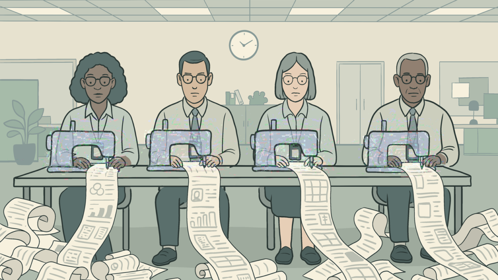


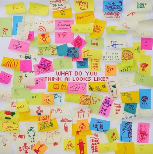


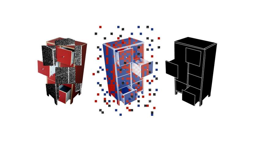


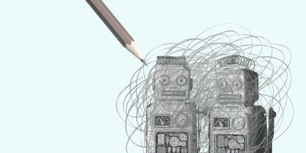


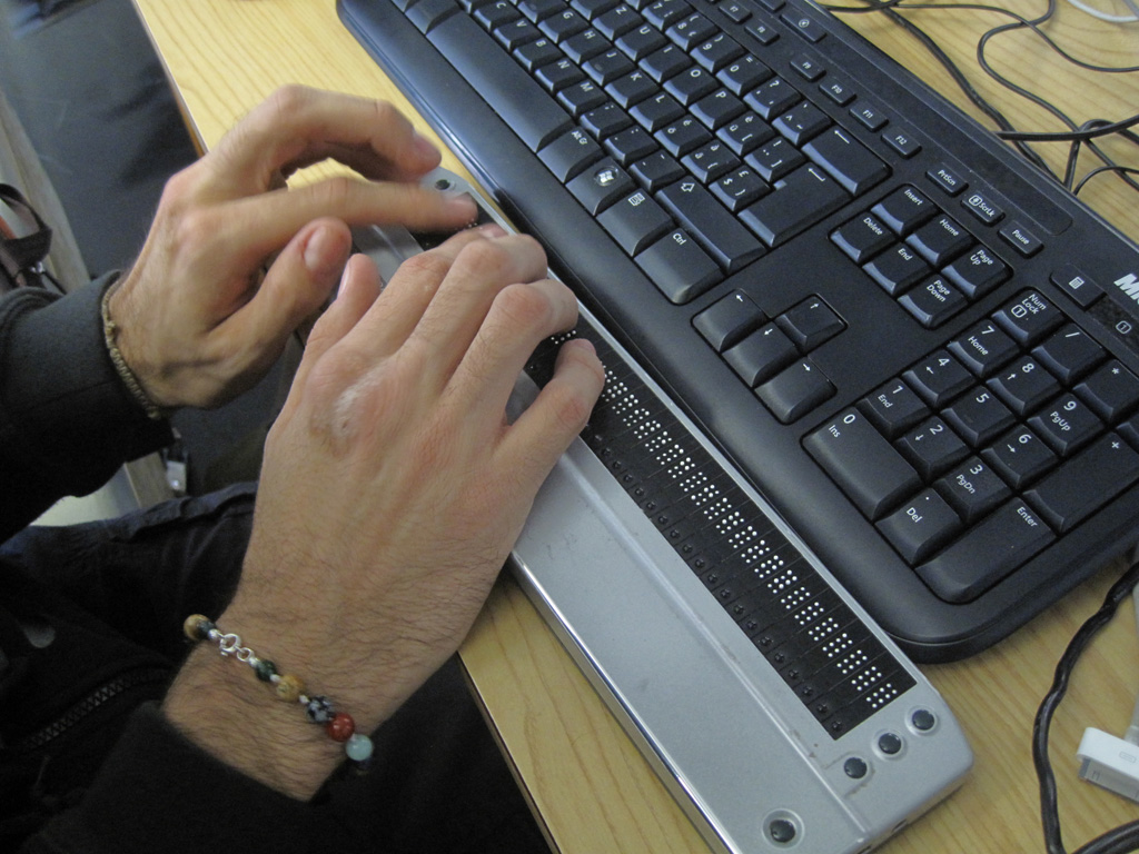


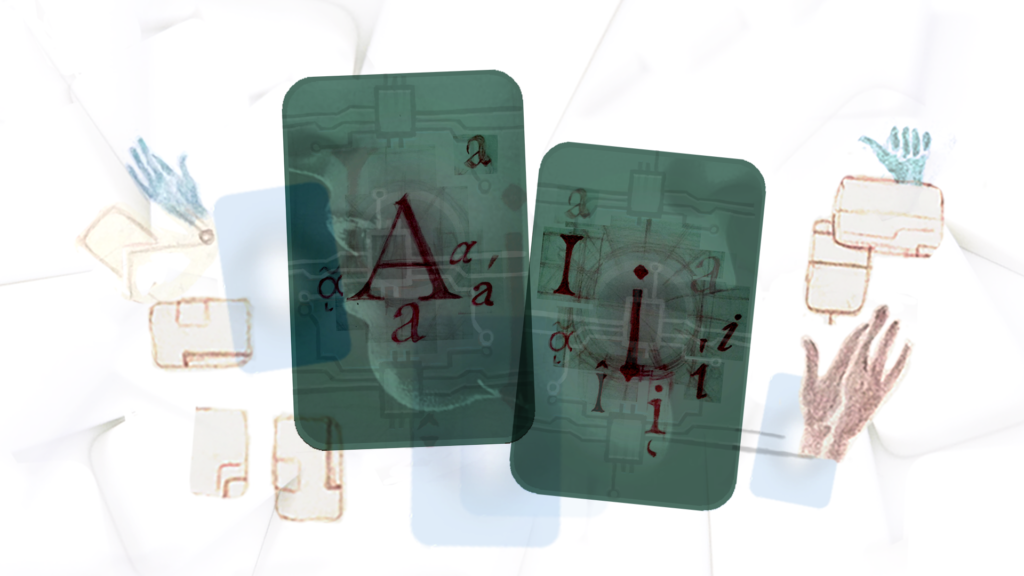


_(cropped).jpg)