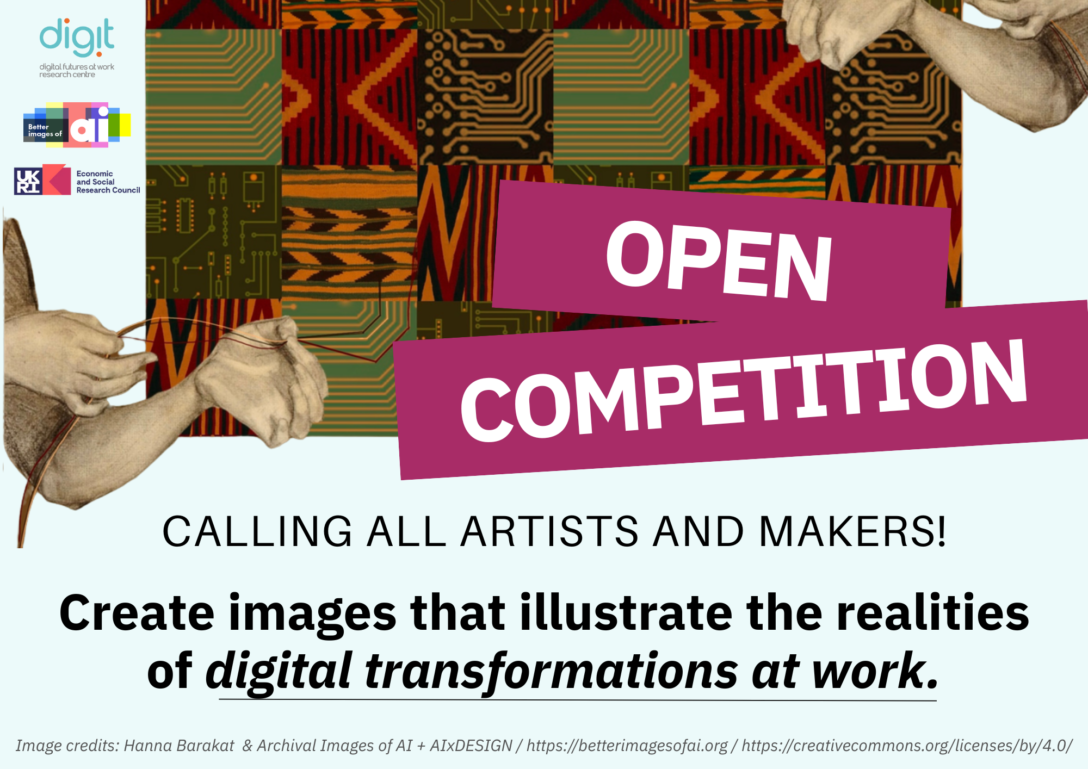
ANNOUNCEMENT
Calling all artists and makers!
The ESRC Digital Futures at Work Research Centre (Digit) and Better Images of AI (BIoAI) are delighted to announce a competition to reimagine the visual communication of how work is changing in the digital age. The Digit Centre has undertaken a significant five year research programme culminating in insights about real-world digital transformations currently impacting people’s daily lives.
ARTISTS BRIEF
Section 1: Aims of the Competition
To visually capture the digital transformation of work and digital dialogues around these changes. We will offer eight prizes for new visual images across four themes from the report:
- Digital Adoption
- Digital Inclusion
- Changing employment contracts and working conditions
- Digital Dialogues
We invite the creative community to illustrate the realities of these themes. By reflecting on the research findings, artists can help visually communicate and build better understandings about how digital technologies are shaping changes in the workplace.
Digit is teaming up with the non-profit Better Images of AI (BIoAI) collaboration and free image library – to bring visuals created for the competition to the attention of a global audience of media, education and content creators.
BIoAI will make selected entries free to use on Creative Commons licences to better frame and illustrate the wider debates seen in public articles and content about the future of work in the digital age.
Section 2: Entry Information
Key Dates
UPDATE 18th May 2025: The deadline is being extended to allow entries to be submitted by 23:59 on 18th May 2025 in ANY time zone.
- Competition Opens: Wednesday 9th April 2025
- Competition Closes: Sunday 18th May 2025 (23:00 UTC)
- Winners Notified: Friday 20th June 2025
- Public Announcement: w/c 7th July 2025
Key Details
Prizes
– Grand prize: £600
– Winner: 4 x £400 prizes
– Runner-up: 4 x £300 prizes
Please note that funds not received in GBP Sterling will be subject to reductions due to foreign exchange fees.
Eligibility
– Open to everyone over the age of 18 at the time of submission or interaction with the project
– Students, amateurs, and professionals from across all creative fields are welcomed
– Global entries from around the world are welcomed but will need to ensure that they can receive payment, and be responsible for legal and practical requirements related to receiving payments in their countries.
– Entries from collaborations or commercial organisations are eligible
– Prizes are for original artwork created for exclusive use of the competition. Submissions should be the artist’s own original work and should not infringe upon any third party’s intellectual property. If submissions include elements such as images, graphics and other materials created by others (e.g., in a collage or mixed-media work) the artist must have the appropriate rights or licenses to use them.
– Multiple entries are welcome
Formats
Static digital files of images created by (but not limited to) the following methods are encouraged:
– Digital art, 3D rendering
– Photography
– Collage, remixing
– Illustration
– High quality photographs of sculpture, craft, or 3D artworks
– Printmaking
– Painting, drawing
Please note that images created using AI image generators are subject to certain conditions which are detailed in the next section.
Use of AI and AI image generators
AI-generated artworks will only be eligible if:
-Original artwork by the submitting artist is used as the visual prompt and style
-The image generator used to create the image:
- Has only consented art used in its training
- Compensates artists with work in its training set
- Marks all images as generated
(Currently Public Diffusion has been recommended but alternatives which meet these criteria can be discussed).
-The way the image generator has been used in the process is described within the image documentation provided.
-Processes which use AI but are not text-to-image AI image generators (such as found in digital editing platforms) are admissible. For example background remove, expand, filters.
Judging criteria
Entries will be scored based on meeting a combination of criteria including:
– Visual and aesthetic impact
– Meeting the brief and reflecting the research
– Originality and creativity
– Avoidance of unhelpful tropes
– Communicating the themes from the research findings
Judging panel
Entries will be shortlisted then judged by a panel of experts in different fields including creative, communications, technical or digital and work. Judges’ decisions will be final.
Use of images
-A condition of accepting a prize as a winning entry is that the image copyright will be transferred to University of Sussex.
-The image may also be made available in the Better Images of AI image library on a Creative Commons licence 4.0. This allows for commercial adaptation and use, but requires every use to be credited to the artist and project.
-Images which do not win or accept prizes remain the property of the artist, but may be offered the opportunity to be included in the Better Images of AI library, and shared on the Digit website.
Inclusivity
-Entries are encouraged from individuals from all groups, communities and backgrounds.
-Entrants are encouraged to contact the team if they have accessibility requirements and require information or submission in a different format.
Publicity
-Winning entries will be publicised and selected winners may have the option for potential further publicity.
-Entries that are unsuccessful, but are deemed to model and inspire in accordance with the aims of the competition may also be given the opportunity to be featured in publicity.
Prize Payment
-We aim to pay winners by 30 June 2025. They will need to submit an invoice or receipt to receive payment.
-Winners from outside the UK will be subject to foreign currency conversion fees of roughly 3%.
-We and AI LTD will administer all prize payments on behalf of the Digit Centre at the University of Sussex.
Data Sharing
Entrants will be asked for:
– Name and email for correspondence only
– (Optional) The entrant’s name and website (if applicable) may be published with your competition entry on social media, the Better Images of AI library, and other news forms.
Section 3: Submission Process
- Submission is by filling out this Form which will need to be received by Sunday 18th May 2025 (23:00 UTC).
- If you log in to Google you can start and return to the form at any time, otherwise we suggest you have all information ready before you fill it in. In either case it will need to be submitted by the deadline.
- If you have any accessibility requirements please contact info@betterimagesofai.org so alternative arrangements can be made.
- You can submit as many entries as you like, as long as you provide all the relevant information for each of the images.
- Files will need to be submitted as .PNG files size 2560×1440. As images can be very large, we ask for links to image files.
- Alongside your image, you will also be asked to provide a short description and answer some brief questions relating to the development process, the transfer of intellectual property, and your background (optional).
- You will be able to submit up to 5 images through the form, if you wish to enter more images please get in touch so we can help facilitate this with you.
- If you change your mind about entering, get in touch and we will remove your entry.
Please make sure you have read the following sections with details of the brief thoroughly before starting or submitting your entry.
Section 4: Background to the Brief
The aim of the competition is to contribute to wider public understanding of the ways in which AI-enabled technologies are changing work. Creating images which will increase such understanding requires a thoughtful consideration of the landscape of digital transformation and AI at work, which is the focus of Digit’s research.
Background to Organisations
About Digit:
Digit stands for the Digital Futures At Work Research Centre, and was established in 2020 with investment from The UKRI Economic and Social Research Council (ERSC), a UK government funded research and innovation body.
A number of researchers based at universities led by the University of Sussex Business School and Leeds University Business School, with the universities of Cambridge, Aberdeen, Manchester and Monash, and the Institute for the Future of Work have been examining the way that digital technologies are reshaping work. They have been looking at the impact on employers, workers and their representatives, job seekers and governments. Their aim is to inform current debates about the future of work and develop a compelling, empirical basis for effective policy-making.
Digit is the organisation funding the competition and setting the brief. You can find out more about Digit here.
About Digital Dialogues:
One of the key outputs of Digit’s research is the ‘Digital Dialogues’ report, summarising findings from the Centre’s research on digital transformation at work. The findings identify the key challenges now facing governments, businesses, trade unions, civil society organisations, and workers – and how they are shaping the future of work.
These are the findings that the competition seeks to illustrate visually. You can find out more about the report here.
About Better Images of AI:
Better Images of AI is non-profit project and website which includes:
- a free image library
- articles about visual representations of AI
- research and guidance on how to communicate about AI and technology in more realistic, transparent and inclusive ways.
BIoAI is an open and global collaboration between several individuals and non-profit organisations and institutes. They are united by a shared aim to enable better conversations and understanding of AI by replacing misleading but dominant science fiction imagery of AI with more useful (and less exclusionary and biased images).
Some of the partners include BBC R&D, LCFI, Digital Catapult, Scottish AI Alliance, AI Sweden, Finnish Centre for Artificial Intelligence and others, as well as individual activists, artists and academics. Better Images of AI is coordinated and maintained by We and AI, a UK non-profit focused on critical AI literacy.
The project has been highly influential with images used by hundreds of content producers communicating about AI including global news media and content creators, and viewed at least 2,000,000 times.
Useful links:
- Why we need Better Images of AI
- Better Images of AI Image Library
- Articles about approaches to creating Better Images of AI
- Guide to Creating Better Images of AI
- Playbook for remixing images from archive material (optional)
Better Images of AI have written this creative brief based on their research and experience in this area. They are always keen to maintain longer term relationships with artists interested in this area.
The role of stock images in shaping discourse
Stock images are photography or other images which are licensed for use via various library sites. They are used for a number of different purposes such as to accompany news media or features articles, to accompany online communications such as newsletters or websites, to illustrate reports or research, to decorate events spaces, slide presentations and books. They are found based on keywords, and stock image libraries buy images and copyright from mainly professional commercial artists which they know will be commercially successful. Often this means signifying the keyword in question in a recognisable and popular way.
For complex and evolving subjects references to recognisable images can be influenced by historic or existing popular cultural media representations. Commercially successful images are often striking, compelling and provide a provocative visual shorthand to communicate the idea. However, too often, images of AI have become self-referential and endlessly copied and reworked cliches, without being connected to the lived realities of the topic. The resulting dominance of common aesthetics and iconography is oversimplistic and misinforms public perceptions and understanding of the topics.
Future of Work and digital transformation are areas in which most images found in stock image libraries are often not really reflective of the topics they are being used to illustrate. Images about AI often contain robots or brains, but instead could be much more meaningfully represented by the themes from Digit’s research, which looks at how people and organisations are using or being impacted by AI and other technologies at work.
Stock images are used by journalists, writers, editors, content creators, thought leaders, artists, commentators, academics, educators, public, private, and third sector communications and marketing departments.
As such, creating new, fresher images of digital work (and resulting challenges) which are informed by the realities which the research explores will:
- Help society at large to increase understanding of the way work is changing
- Facilitate more meaningful and informed discussions about how we respond
- Encourage users and viewers to think critically about the challenges uncovered
- Create a set of images which fill gaps in representing topics related to AI
Current representations of digital work
In contrast with much existing imagery which reinforces hype and speculation about the diffusion of AI through the economy, the competition aims to produce a range of images that better visualise the ways in which AI and digital technologies are transforming work in practice and its impacts for different groups of workers, employers, trade unions and communities.
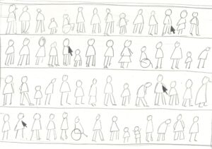
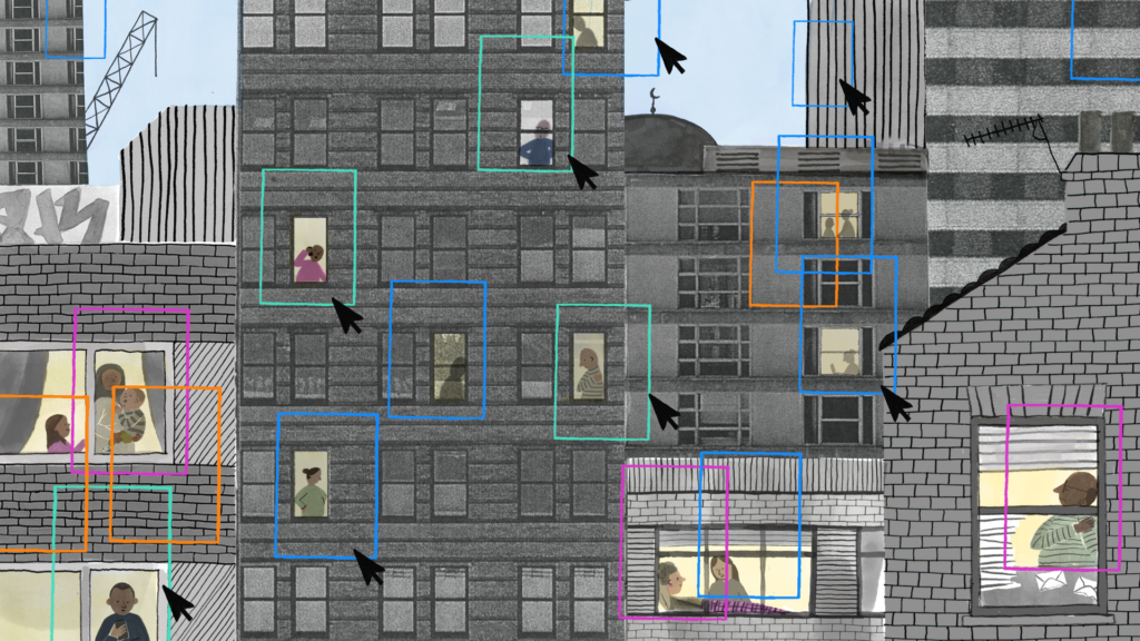
Our research identifies some of the real problems and opportunities for ordinary working people and those looking for work that can be understood in the here and now. However, the imagery available to illustrate how work might be changing is limited. It is often focused on the technology in sanitised high tech warehouses, white collar business environments, or on young ‘digital nomads’ in beautiful locations. We urgently need a wider range of images that can help society to visualise real world transformations that are already underway—and how this impacts on people in their working and daily lives.
Google image searches for ‘Future of Work’ often result in white, science fiction robots, indicating that workers will be replaced by robots:


“Digital transformation” searches show a lot of “Minority Report” style images, with white suited people virtually orchestrating holographic elements by pressing icons, not showing any of the real world people, processes, or real technologies involved.


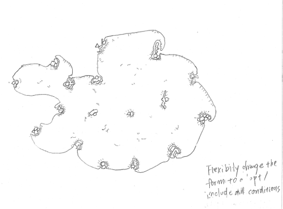
The challenge is to come up with new ways of portraying digital transformations by focusing instead on the realities, examples, places, characteristics and impacts.
You can find out more about these realities in the following section: The Four Themes.
Section 5: The Four Themes
To help focus ideas and narrow down the amount of research needed to enter, we are proposing four themes related to the research. You can enter images for one or multiple themes. In each one we are asking you to either consider your perspective or how you might visually explore the following questions:
1. Digital Adoption
Finding: Digital adoption is still patchy and investment in digital skills training is low
- Only just over a third of employers had invested in new digital technologies and non-adopters were hesitant about investing in the near future.
- Some small firms in particular are at risk of falling behind.
- While employers were finding it difficult to recruit workers with the necessary skills, there was limited investment in training.
- In manufacturing and finance organisations we found that AI is being used for specific (often repetitive tasks) tasks but has not, as yet, resulted in job losses.
- However, AI use in some creative and digital small businesses suggests that young people may find it harder to gain the level of digital skills required for entry level jobs.
Feel free to come up with your way of visualising the challenge and recommendation area. Or you might wish to consider the following:
- How we are adopting technologies either in specific situations or collectively
- Whether they are helpful, or control and restrain us
- Whether they are helping us think creatively or helping us all think the same way
- Which capabilities or practices might it be improving, and which might it be reducing or degrading
- The factors that influence adoption rates
2. Digital Inclusion
Digital exclusion is creating and exacerbating new forms of inequality
- ‘Digital by default’ welfare policies are a barrier to work for jobseekers with low levels of digital literacy. These barriers include data poverty, a reliance on smart phones for complex tasks rather than computers, dependence on shared devices, and reliance on intermediaries to get online.
- Digital technologies can also help to build inclusionary ways of working that particularly benefit women, disabled people and ethnic minorities. However, people from these groups can also experience downsides of digitalisation.
Feel free to come up with your way of visualising the challenge and recommendation area. Or you might wish to consider the following:
- Examples of what it means for digital at work to be for the benefit of all, and who the all are
- How you can include people in the change
- Who has currently have been left behind – What fields they work in, and how it happens, and what their exclusion looks like
3. Employment Contracts
Finding: Technology adoption is facilitating experimentation with how, when and where people work, as firms adopt new business models and/or working time arrangements.
- Some platform companies have established ‘privatised’ forms of social and employment protections (like sick pay), but these provide less protection for the self-employed compared to standard ‘worker’ or ‘employee’ contracts
- Impacts can vary in different sectors: most musicians do not earn much from streaming; travel content creators experience precarious income streams; quick commerce companies are moving from direct employment to self-employed contractors.
- Positive experiments include agile working in the NHS and a four-day working week that can enable organisations and individuals to benefit.
Feel free to come up with your way of visualising the challenge and recommendation area. Or you might wish to consider the following:
- What kind of contracts are now becoming common, and what does this mean for workers?
- What digital jobs might be good jobs? (Consider for example, digital nomads, content creators who have the freedom to travel and flexibility, and others who have found new ways of working)
- Or whether we are becoming digital slaves – tied to automated schedules and surveillance and managed by algorithm
- Whether we can have both types of jobs at once, and what the gap looks like
- What does changes mean for relationships between workers and employers
4. Digital Dialogues
Supporting more extensive, society-wide, inclusive, ‘digital dialogues’ will be key to improve productivity, wellbeing and inclusion
- Questions about how to accelerate responsible adoption of technology in public and private sectors should go hand in hand with questions about how to harness technology to improve people’s everyday working lives.
- Our research shows that giving workers a voice can help to realise and share the benefits of technology at work.
Feel free to come up with your way of visualising the challenge and recommendation area. Or you might wish to consider the following:
- What it means to talk about technology, and who is included
- Whether everyone who is involved who should be
- If not, who is decision making or consultation limited to?
- What it might look like to have meaningful or equitable conversations about digital transformation and the future of work
All themes
For all themes, you may wish to ask yourself one or more of the following questions to help with representing intangible or disembodied concepts:
- What industry am I interested in?
- Who is involved in the technology? How can we represent them authentically?
- Who else is involved? How? And where?
- Are there processes or technologies which can be represented?
- How can you accurately reflect the properties of data and technology – for example the statistical vs emotional nature of AI?
- How can you be realistic about the capabilities and performance of technologies?
- Are you more interested in communicating physical elements, or concepts?
- What is usually visible and invisible to people?
- What mood do you want to convey? Are you optimistic/ positive or pessimistic/ critical?
- Who do you think would benefit from seeing this picture and why?
- Do you want to focus on a particular detail, or wider social or technical systems?
- What concerns or reassures you? What excites or depresses you?
- How might you convey nuance, ambiguity or tensions?
- What are the wider people, social, environmental or economic implications?
Section 6: Creative approach and requirements
We welcome a range of approaches to visualising the themes and challenges, drawing on your own practice and ideas.
A (non-exhaustive) list of approaches we welcome:
- Remixing or collage from existing materials (AIoAI)
- Realism – showing a scene
- New metaphors – conveying concepts through more familiar references
- Showing the output of any digital technologies used in the creation of the image
- Storytelling
- Iconography – creating new visual shortcuts or language to signify aspects you want to address
- Focus on portraying very specific use cases, examples, industries, technologies
Key criteria
In all cases, we are looking for images which:
- Convey current digital work or transformation as it is now, not in the future
- Are visually compelling and high quality – they could realistically be in a commercial image library
- Show the AI or technology in the picture somehow so people looking can see it is about digital / tech/ AI
- Are original work, accompanied by a roughly 75 to 250 word description of what is in the picture, how it relates to the (named) theme and what technique you have used
- (Optional) reflect the significance of people (for example, in designing, governing, contributing to, or being impacted by digital work)
IMPORTANT: WHAT NOT TO INCLUDE
Based on research leading to the Guide to Better Images of AI, which should be read before you start, here is a list of things to avoid in your entry:
- Human brains
- Science fiction (usually white) robots
- Anthropomorphism
- ‘Creation of Adam’ touching hands
- Unnecessary use of the colour blue to signify AI
- Science fiction references or speculative future/fantasy
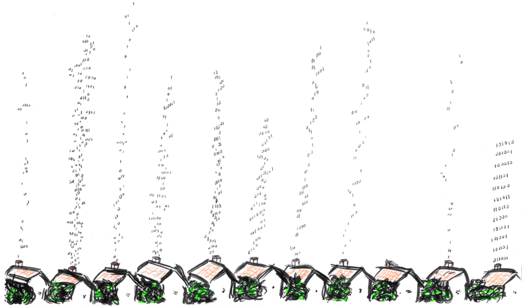
- Descending code
- Unnecessary white people in suits
- Unnecessary holography
- Magical or monolithic representations of AI
Section 7: Contact and Briefing Session
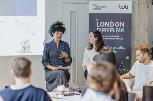
An online briefing session will be held on Thursday 17th April at 12pm UTC +1 and is now available for you to watch below.
Please contact info@betterimagesofai.org if you have any questions not answered above.