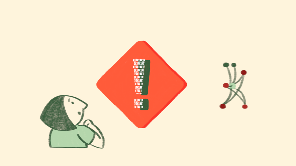
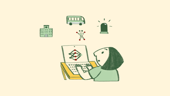
We are delighted to start releasing some useful new images donated by the Data Hazards project into our free image library. The images are stills from an animated video explaining the project, and offer a refreshing take on illustrating AI and data bias. They take an effective and creative approach to making visible the role of the data scientist and the impact of algorithms, and the project behind the images uses visuals in order to improve data science itself. Project leaders Dr Nina Di Cara and Dr Natalie Zelenka share some background on Data Hazards labels, and the inspiration behind the animation behind the new images.
Data science has the potential to do so much for us. We can use it to identify new diseases, streamline services, and create positive change in the world. However, there have also been many examples of ways that data science has caused harm. Often this harm is not intended, but its weight falls on those who are the most vulnerable and marginalised.
Often too, these harms are preventable. Testing datasets for bias, talking to communities affected by technology or changing functionality would be enough to stop people from being harmed. However, data scientists in general are not well trained to think about ethical issues, and even though there are other fields that have many experts on data ethics, it is not always easy for these groups to intersect.
The Data Hazards project was developed by Dr Nina Di Cara and Dr Natalie Zelenka in 2021, and aims to make it easier for people from any discipline to talk together about data science harms, which we call Data Hazards. These Hazards are in the form of labels. Like chemical hazards, we want Data Hazards to make people stop and think about risk, not to stop using data science at all.

By making it easier for us all to talk about risks, we believe we are more likely to see them early and have a chance at preventing them. The project is open source, so anyone can suggest new or improved labels which mean that we can keep responding to new and changing ethical landscapes in data science.
The project has now been running for nearly two years and in that time we have had input from over 100 people on what the Hazard labels should be, and what safety precautions should be suggested for each of them. We are now launching Version 1.0 with newly designed labels and explainer animations!
Chemical hazards are well known for their striking visual icons, which many of us see day-to-day on bottles in our homes. By having Data Hazard labels, we wanted to create similar imagery that would communicate the message of each of the labels. For example, how can we represent ‘Reinforces Existing Bias’ (one of the Hazard labels) in a small, relatively simple image?
We also wanted to create some short videos to describe the project, that included a data scientist character interacting with ‘AI’ and had the challenge of deciding how to create a better image of AI than the typical robot. We were very lucky to work with illustrator and animator Yasmin Dwiputri, and Vanessa Hanschke who is doing a PhD at the University of Bristol in understanding responsible AI through storytelling.
We asked Yasmin to share some thoughts from her experience working on the project:
“The biggest challenge was creating an AI character for the films. We wanted to have a character that shows the dangers of data science, but can also transform into doing good. We wanted to stay away from portraying AI as a humanoid robot and have a more abstract design with elements of neural networks. Yet, it should still be constructed in a way that would allow it to move and do real-life actions.
We came up with the node monster. It has limbs which allow it to engage with the human characters and story, but no facial expressions. Its attitude is portrayed through its movements, and it appears in multiple silly disguises. This way, we could still make him lovable and interesting, but avoid any stereotypes or biases.
As AI is becoming more and more present in the animation industry, it is creating a divide in the animation community. While some people are praising the endless possibilities AI could bring, others are concerned it will also replace artistic expressions and human skills.
The Data Hazard Project has given me a better understanding of the challenges we face even before AI hits the market. I believe animation productions should be aware of the impact and dangers AI can have, before only speaking of innovation. At the same time, as creatives, we need to learn more about how AI, if used correctly, and newer methods could improve our workflow.”
Yasmin Dwiputri
Now that we have the wonderful resources created we have been able to release them on our website and will be using them for training, teaching and workshops that we run as part of the project. You can view the labels and the explainer videos on the Data Hazards website. All of our materials are licensed as CC-BY 4.0 and so can be used and re-used with attribution.
We’re also really excited to see some on the Better Images of AI website, and hope they will be helpful to others who are trying to represent data science and AI in their work. A crucial part of AI ethics is ensuring that we do not oversell or exaggerate what AI can do, and so the way we visualise images of AI is hugely important to the perception of AI by the public and being able to do ethical data science!


Cover image by Yasmin Dwiputri & Data Hazards Project / Better Images of AI / AI across industries / CC-BY 4.0

