In this blog post, Laura Martinez Agudelo (one of our amazing volunteer stewards) interviews Nicole Crozier, the artist behind the image ‘Seeing the Forest for the Trees’ which was submitted as part of The Bigger Picture collection. The post explores how the image criticises, but also reflects on, the development of generative AI and what these new technologies mean for artists and the art industry. Nicole hopes the image can challenge the AI hype and misconceptions about how AI-generated art is created.
You can freely access and download ‘Seeing the Forest for the Trees’ from our image library here.
From roots to branches
Nicole is a visual artist originally from Ottawa and she currently lives in Montreal, Quebec. She is studying for a Master’s degree in Fine Arts (Painting and Drawing) at Concordia University, and she is working hard for her thesis defence in September. Prior to moving to Montreal, she lived in Toronto for seven years, where she developed her practice and worked as an arts manager, primarily in the dance world. She decided to enroll in her current programme in order to dedicate more time to her artwork.
Art has been a part of Nicole’s life since childhood: “I first started painting when I was in grade 9. It was for me a means of expression and also… an escape from bullying at school”. While at high school, she wanted to be a journalist, but her art teacher convinced her to go to art school, which is how she ended up on this path. Nicole completed her undergraduate degree in Visual Arts at the University of Ottawa, graduating in 2013, during which time she primarily explored two artistic approaches: painting and photography. Since then, she has focused on both, “moving back and forth between them”.
She knows that her technical skills lie mainly in painting, but she admits that she is “a slow painter and it can be frustrating sometimes”. At the same time, she finds that it is also a great quality: “… just slowing down, taking time and engaging in a dialogue with the painting”. With photography, she feels the opposite because the process provides a quicker response between her and the subjects.
Besides, she is interested in playing with contrasting ways of reception of her artwork: “creating images that fall between two effects, for example seduction and repulsion… When you see an image, you may at first be attracted to something within the picture, and then repelled; not quite sure what you are looking at… I like working in between spaces, between two poles”. Let’s see how this approach converges with the idea of creating better images of AI.
The Bigger Picture Workshop
Nicole doesn’t usually explore AI contents in her artwork. She came across it in The Bigger Picture workshop that she attended through Better Images of AI, which is how she heard about the motivations behind the project to create more realistic images of AI: “I was intrigued by the prompt, given my general interest in archetypes and in understanding the world through photography. We live in a hyper image saturated society and think about ourselves so much in relation to photographs”.
She argues that, in using photography, we “view our daily lives through the camera lens, synthesizing our selves, environments, and social conditions into iconographic ways of seeing the world around us”. This idea crosses over with her first approach of AI image generators: “as an artist, that’s the main way I interact with AI: through text to image generative AI programs and trying to understand how they work and are affecting the arts industry”.
Collage and visual correlations
Although her work has changed a lot over the years, Nicole has always had an aesthetic working methodology and interest in collage. For her, collage is itself a way of creating. She loves to elaborate physical collages with paper and then photograph them. This is evident in her illustration Seeing the Forest for the Trees.
In her art practice, Nicole often starts with “a 3-dimensional collage or maquette that I light and then photograph. I like working with cut paper and finding craft supplies that have a textural quality that tips the viewer off that what they are looking at is handmade, that draws them in. I create the illusion of space and then the camera flattens it: a multitude of images I’m combining compressed into one photograph. Which is also a similar process of synthesis used by generative AI in response to text prompts, so I think there is also a visual correlation between the two”.
This is one of the reasons why Nicole became interested in the process of AI image generators as “‘sophisticated’ collage makers”, the material conditions of production and how many visual inputs produce one output. She also compares this process to the use of collage by artists in art history, such as the surrealists and how they used chance to access parts of their subconscious when making art.
“With AI (text-to-image or image-to-image models), you can reuse the same prompt and receive a different image each time, but the ’emotional’ and ‘creative’ part of the process is removed. These kinds of AI images show no signs of the subconscious role in creating: they are dead images, most often based on data poached from other artists without consent…”.
The machine would only be able to reproduce the data used to train it. For Nicole, the process of imagining and exploring visual representations is an essential part of creating images. What was then the idea behind Seeing the Forest for the Trees?
The source of inspiration

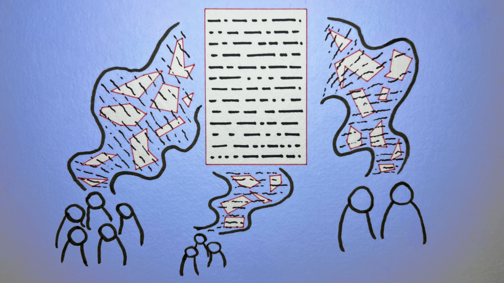
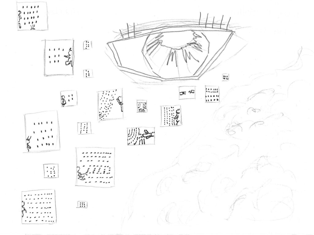
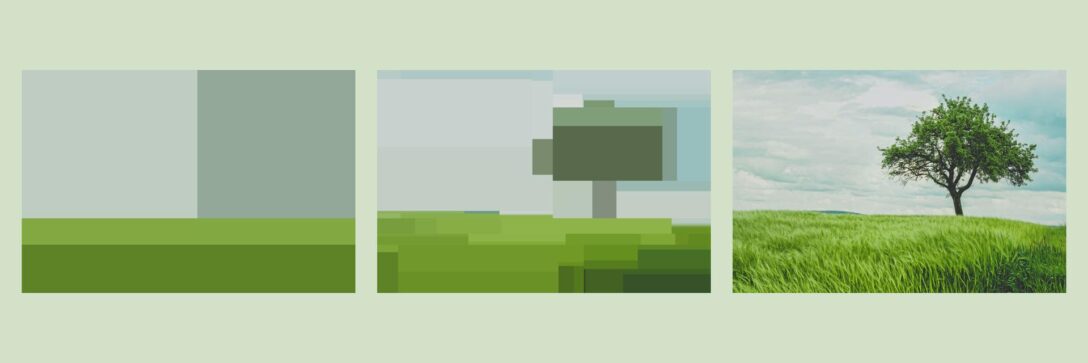
Nicole Crozier & The Bigger Picture / Better Images of AI / CCBY-4.0
When Nicole was conceiving the image, she was thinking about how to illustrate her understanding of the way AI generators ‘create’ images. “The tree-forest relation was a good subject to work with because it is a universal metaphor for the individual versus the group, one image versus a composite image.
Large language models and generative image models compose images by training on hundreds of thousands of data and metadata items. The process of generating the final image is invisible to us, and the final image could not exist without the multitude of images that were (statistically translated) and put together. I don’t know if I was fully successful, but my contribution was an attempt to express this idea visually.”
For Nicole, the choice of the tree-forest metaphor is also related to how we position ourselves socially as individuals: “recognising ourselves as individual trees within the forest”.
The social component of AI systems is also intrinsic: “it is hard not to think about AI through the lens of how we operate in society, because we always approach things from a human perspective, and the tree-forest metaphor is one that maybe we can all easily understand”. This is why Nicole wanted to create a tree made of other trees: “It’s a forest inside a tree! And that’s where the idea first came from”.
She has also been working with handmade maquettes for a long time and she wanted to use this method and materiality to create the image including the human process of making it. Afterwards, she came up with the popular phrase that became the title of the image — a perfect match to reinforce the meaning!
Now let’s take a closer look at the image to see how it was put together.
The visual and material composition
First, Nicole cut out the image of a tree from a white piece of paper. Then, she created a small scene with it in a box and projected the image of the collage of trees onto the scene, using a Photoshop mask.

Picture of Nicole in their creative environment
For the visual composition reflected on the large tree, she selected some images, free to use and without copyright restrictions, from Unsplash. She chose these images based on formal considerations: “I was trying to find images of trees with a lot of empty space around them so that you could see just one tree. The idea was to find archetypal images of trees”.
Finally, she photographed the whole composition and did some extra manipulation in Photoshop: “it was a technical choice to achieve a well-balanced image”.
The trees were chosen for their metaphorical relationship with nature and technology as well: “There are so many ways in which we can connect the idea and the visual representation of a tree with environmental and technological concerns, within the dynamic of ecosystems, understanding the branches of a tree as a network – it’s almost cliché, but I think it works really well for this topic”.
Questioning AI hype, sustainability, and the inevitability narrative
Even if Nicole doesn’t think she will make any more artwork about AI imagery specifically, she is currently considering the philosophical aspects of this subject, as well as the ethical issues of AI systems in our society:
“I have deep concerns about AI technology in general, its impact on society and whether it will be mainly beneficial or malevolent, and particularly in relation to climate change. This ethical question extends to myself and why and how I make art too. Honestly, I try to avoid using AI as much as possible…”.
She also mentions the importance of the Better Images of AI project: “I think Better Images of AI is trying to move beyond the black and white binary of imaging AI as either benevolent or malevolent. In a hyper-visual world, they are trying to provide more nuanced images to promote better visual literacy around how AI systems actually work and how they are being implemented in our society”.
Nicole knows that there is a lot of propaganda and hype surrounding AI, encouraging not only a blindly positive attitude towards it, but also the idea that it is inevitable: “the dominant discourse is that AI is here whether you like it or not. The general discourse seems to be ‘if you don’t embrace or adopt AI, you’ll be left behind in the job market’, and I think that scares some people”.
This is obviously a turning point from many different angles: technological, cultural and environmental… it touches everything. Also, many AI systems are like black boxes. We don’t fully understand the nature of the inputs and processes that generate the outputs”, not even all humanity’s labour behind.
Nicole thinks that the discourse of inevitability is irresponsible. It neglects real risk, harms and our individual and collective ability of agency: “Corporations creating these AI systems should have a regulated responsibility to ensure they are only used in ethical and beneficial ways. Though given our current neo-liberal economic climate, in which some corporations have more power and wealth than some nation states, I’m not very optimistic about the likelihood of our ability to employ these tools in ethical ways.
From my understanding, it’s just an intensive version of a colonial regime, like: “let’s gather as much information as possible about all aspects of human experience, with limited compensation – if any – to those whose data was harvested, and see what we can extract from it for profit for a limited few”.
Nicole believes this approach is environmentally expansive and extractive, given that “the huge amount of energy needed to maintain these systems is something that most people think of as ‘invisible’, but it has real and concrete effects”. Having mentioned these issues, Nicole shared some other thoughts from the perspective of the art field.
What kind of art do we want?
During our interview, some quotes were proposed for discussion. These quotes came from the book The AI Con: How to Fight Big Tech’s Hype and Create the Future We Want, by Emily M. Bender and Alex Hanna (2025), and specifically from a subsection of Chapter 5 about ‘AI and Art-Making’ (p. 103-112). This book was also discussed at the latest We and AI Book Club monthly meeting. As a visual artist, Nicole loved the idea of sharing her thoughts about it.
One of the quotes suggested to Nicole was: “There are, to date, no synthetic media machines in any medium that are based only on data collected in a way that respects existing artists”, referring to AI systems whose training data includes your own art.
Nicole said: “My understanding of what they consider to be a media machine are systems that show no respect for copyright and, while I agree with the general statement, I think there is a grey area here. I think creating your own dataset (based on your own past work or work you’ve received consent for or paid for), could be an ethical use of this technology.
AI is reshaping creative practice and Nicole knows artists who are “exploring those systems as a way of creating art, by creating their own dataset with their own work”, but she believes that “the general processes AI image generators are based around are inherently the opposite of what art is supposed to do”.
About AI ‘Art’, Bender and Hanna mention in their book an idea expressed by Dr. Johnathan Flowers in an interview for Episode 4: Is AI Art Actually ‘Art’? (Mystery AI Hype Theater 3000, podcast audio, October 26, 2022): “the purpose of art is to signal a particular kind of intention and to convey a particular type of experience, and this is precisely what AI art lacks”.
Nicole agrees with this idea and proposes that it is also useful to ask:
“Is this a type of art that we want to be creating in the first place? Is it culturally productive or regressive? Not in the sense of capitalist productivity, but… Is it actually helping or inspiring anybody? Even more importantly, is this a mirror that we can hold up to see ourselves reflected in?”.
For Nicole “the medium is the message (quoting McLuhan). Maybe AI art is art, maybe it isn’t, but… Is it really what we need? The focus on whether AI art is art is a smokescreen. What is art? Sometimes, there isn’t even a word for it; it depends on the context, the creative practices and the culture”.
Two other quotes suggested were: “Why should artists who spent years perfecting their skill be left to starve as a few technical experts who stole their work get rich off of it?” and “AI art generators are already being deployed in ways that disrupt the economic systems through which people become and sustain careers as working artists”.
Nicole thinks that people working in what is sometimes called ‘traditional artwork’, such as creating art objects for galleries, seem to be less concerned about ‘AI art’ because they feel somehow ‘untouchable’: “collectors always want paintings and physical objects. However, artists in creative industries such as illustration, design and animation are feeling the economic effects of AI much more acutely, and I have a lot of sympathy for them and their jobs. Many artistic fields are being affected…”.
She believes that there should be more critical regulation to protect those artists, their copyright and the cultural value of their work: “AI is further degrading the general public’s respect for these art forms. People often say ‘oh, my kid can do that!’ and now, with AI image generators, it’s the same idea, ‘oh, I can do that using text-to-image models’. At least for now, I think, we can still tell the difference between something made by the artistic motivation, intention and work of a person (including imagination, experience and artistic skills), and something made by using only an AI image generator. But I think the width of this uncanny valley will continue to shrink in the years to come…”.
Despite the opacity and mutability of many AI technologies, and all the questions about the latent space in the scanning and statistical process of image visualisation, and the patterns for generation, Nicole concludes by emphasising the importance of ongoing learning and reflection on the applications of AI image generators, not only in art, but also in all professional fields. She encourages us to think critically, without being deterministic, and question “what we should accept or refuse”.
Huge thanks to Nicole for her contribution, and for sharing her insights about her artwork and the challenges of creating in the context of AI image generators today.
About the artist

Nicole Crozier is a visual artist and arts manager based in Tiohtià:ke (Montreal-QC), with ties to Tkaronto (Toronto), born and bred in Adàwe (Ottawa-ON). Nicole holds a Bachelor of Fine Arts (University of Ottawa) and a graduate certificate in Arts Management (Centennial College).
About the author
Laura Martinez Agudelo is a Temporary Teaching and Research Assistant (ATER) at the University Marie & Louis Pasteur – ELLIADD Laboratory. She holds a PhD in Information and Communication Sciences. Her research interests include socio-technical devices and (digital) mediations in the city, visual methods and modes of transgression and memory in (urban) art.